With the arrival of spring, and summer right around the corner, designers are turning to a whole new roster of colours to brighten up spaces and embrace the beauty of sunny days. Whether you’re planning an interior makeover, or looking to add some personality to your patio with colourful textiles, we’ve got the colours to ensure your space is right on trend. See the 10 colours making a major splash this summer in the design world, and how to pair them with Pantone’s 2017 Colour of the Year.
Greenery
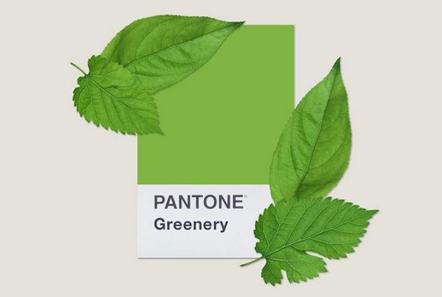
Designated its colour of the year for 2017 by Pantone, Greenery is a versatile, fresh colour that’s ideally suited for spring and summer. “Anything that you can create that gives you that feeling of really being immersed in nature is a good thing,” says Pantone Color Institute’s executive director Leatrice Eiseman. Pantone’s greenery can add a touch of, well, greenery when used as a wall covering, sofa or chair, and in accent pieces such as throws and cushions. “The colour green is often associated with regeneration, growth and prosperity so it is the ideal colour to incorporate into your home to help you unwind and recharge. Combine with different textures to create depth and a sense of coziness,” adds Kasia Wiktorowicz of Valspar paint.
Pale Dogwood
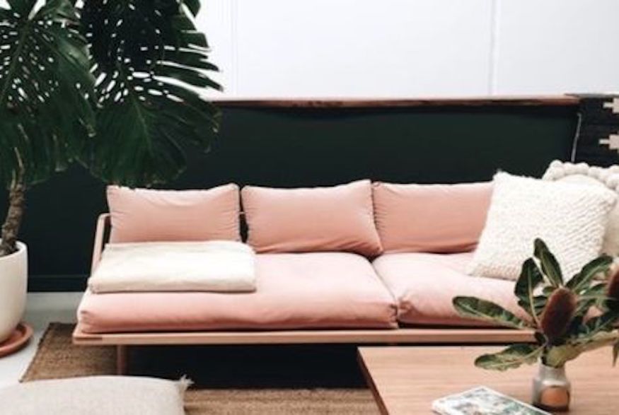
Similar to Pantone’s Rose Quartz – which was one of its two colours of the year for 2016 – Pale Dogwood is similarly a popular choice. “Designers are working in a season where they’re thinking of lightness and airiness,” explains Pantone’s Eiseman, which makes it a fantastic choice to provide a feminine feel in a bedroom or other area.
Primrose Yellow
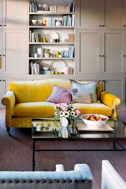
Bright and sunny, Primrose Yellow is imbued with “heat and vitality,” says Leatrice Eiseman, executive director of the Pantone Color Institute. Primrose Yellow is such a strong colour, warns Jaime Rummerfield, co-owner of interiors firm Woodson & Rummerfield’s House of Design, that she thinks “it’s better in doses,” and recommends Primrose Yellow for accent pieces, as well as in textiles, upholstery, art and wall coverings.
Flame
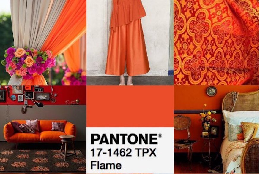
If you’re looking for a dramatic, impact-making colour that will bring the “wow factor” into a room, then look no further than Pantone’s Flame. This red-based orange, notes Pantone, “is gregarious and fun loving. Flamboyant and vivacious, this wonderfully theatrical shade adds fiery heat to the spring 2017 palette.” Whether used in draperies and throws, furniture or wall coverings, Flame is a eye-catching hue that will not be ignored.
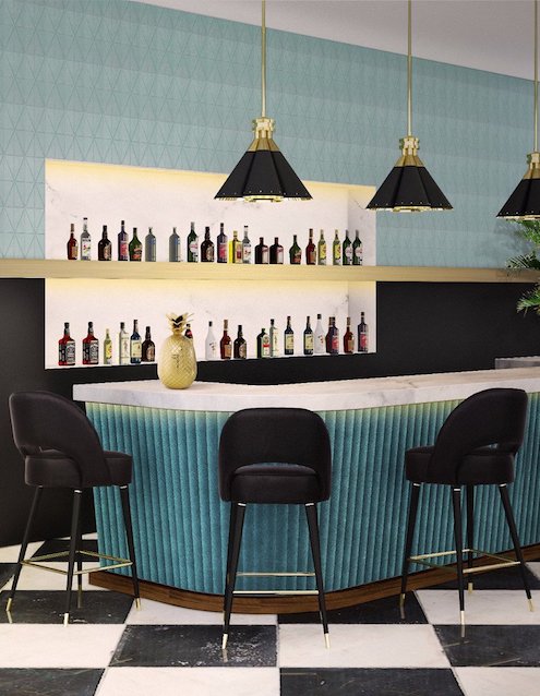
Island Paradise
Cool and calming, Pantone describes Island Paradise as “a refreshing aqua that calls to mind a change of scenery. A cool blue green shade that speaks to our dream of the great escape… emblematic of tropical settings and our desire to unwind.”
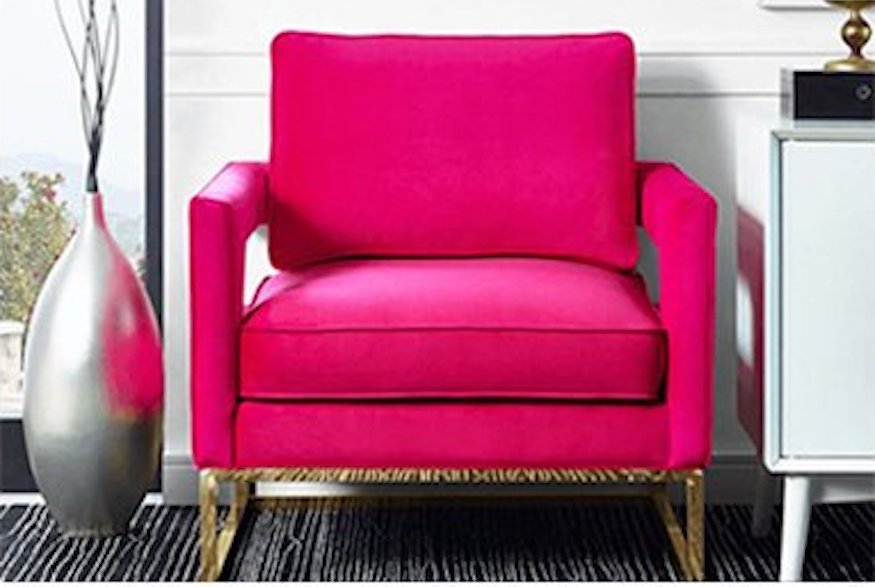
Pink Yarrow
Pink Yarrow is a bright, strong colour that will add excitement, and pairs wonderfully with Pantone’s Island Paradise to create a sunny, summertime feel. Described by Pantone as “a whimsical, unignorable hue that tempts and tantalizes,” Pink Yarrow is also “bold, attention getting and tempestuous… a stimulating colour that lifts spirits and gets the adrenaline going.”
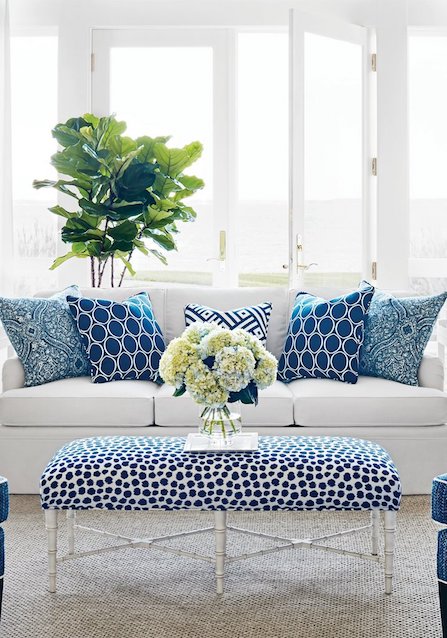
Lapis Blue
Pantone Color Institute’s Leatrice Eiseman points out that “blues are anchoring colours…and give us reason to calm down a bit.” In fact, Pantone’s Lapis Blue makes a splash in cushions, and brings a strong energy that will enhance a bright, open room. The colour will also complement other tones in the spring/summer palette to create a bright, summery feel.
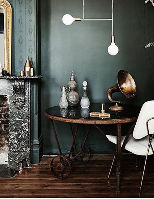
Kale
“We refer to [Kale] as ‘oxygenating,’ taking a breath of fresh air,” explains Pantone Color Institute’s executive director Leatrice Eiseman. “The world of architecture is also in on the trend given the breadth of vertical gardens, rooftop greenery and leafy plazas cropping up in new commercial buildings from New York to Dubai,” while Pantone describes the colour “another foliage-based green that conjures up our desire to connect to nature, similar to the more vivacious Greenery. And, just as we see in nature, this lush and fertile natural green shade provides the perfect complementary background to the more vibrant tones in the palette.”
Niagara
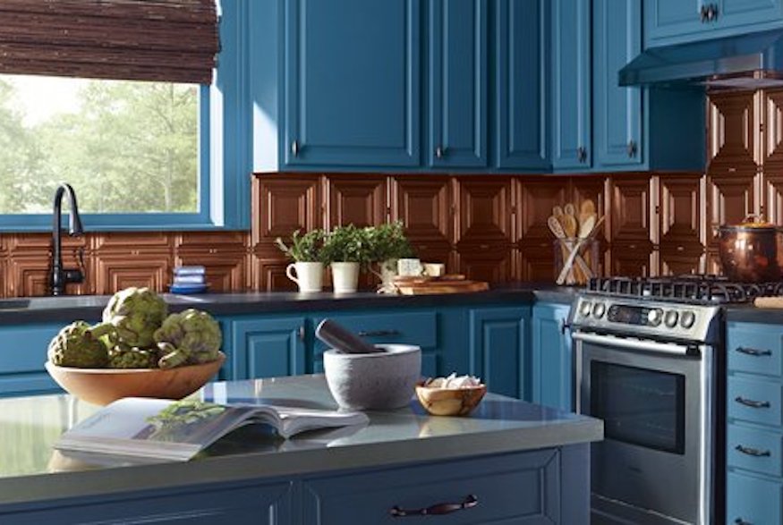
Pantone’s deep, rich blue Niagara is an ideal summertime colour, both inside and out, described by Pantone as “the prevalent colour for spring 2017… a classic denim-like blue that speaks to our desire for ease and relaxation.” Niagara is a versatile colour that adds drama to a space, whether it’s as a wall colour or, as pictured here, in kitchen cabinetry, or as a bed covering or couch colour.
Hazelnut
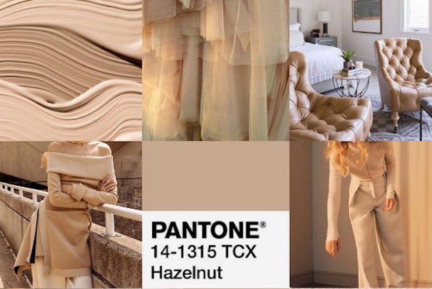
Pantone’s Hazelnut is “a quintessential neutral with a warm undertone,” says Pantone Color Institute’s Eiseman of the colour that Pantone describes as “a key neutral for spring. This shade brings to mind a natural earthiness. Unpretentious and with an inherent warmth, Hazelnut is a transitional colour that effortlessly connects the seasons.”
HGTV your inbox.
By clicking "SIGN UP” you agree to receive emails from HGTV and accept Corus' Terms of Use and Corus' Privacy Policy.


