
Employing colour to a home is tricky business (and we don’t mean incorporating a peppy toss cushion or two and leaving it at that). Layering in healthy doses of bold look-at-me shades that reflect a homeowner’s personal style while staying timeless is daunting, yes, but it’s also totally doable. Just ask designers Kyla Bidgood and Kristine Hageland of design firm Bidgood & Co Interiors, who worked their rainbow magic to create a modern-meets-playful home for one young family in Victoria, BC.
Photography: Janis Nicolay
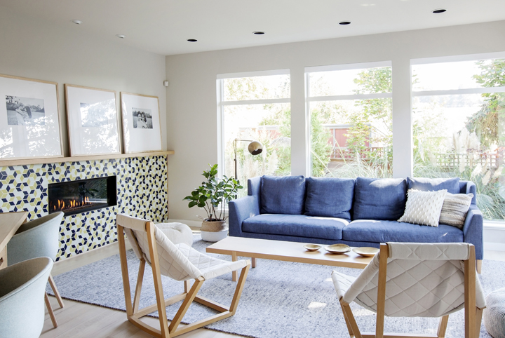
“There’s colour in every room,” says Kyla Bidgood. “But the home isn’t saturated in colour to the point where it’s overwhelming.” The designers achieved this delicate balance by keeping the walls neutral and injecting vibrant shades through everything from mosaic tiles to key furniture pieces. Take the great room’s electric blue sofa, for instance. “A bold statement piece like this infuses colour into a space without having to paint the walls something intense,” she says. “Blue is also a colour most people like long term.”
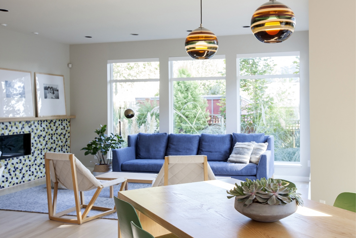
The wife’s penchant for modern Scandinavian decor also helped dictate the home’s overall aesthetic. And while many homeowners prefer to decorate their abode in one clean sweep, this couple’s approach was quite different: Rather than spreading their budget throughout the entire home, they took on one room at a time in order to invest in high-quality forever pieces.
The homeowners are more than happy to wait for the perfect piece – no matter how long it takes.
“They were willing to wait several months for things to come from Europe in order to get the look they wanted,” Kyla says. “They’re more than happy to wait for the perfect piece – no matter how long it takes.”
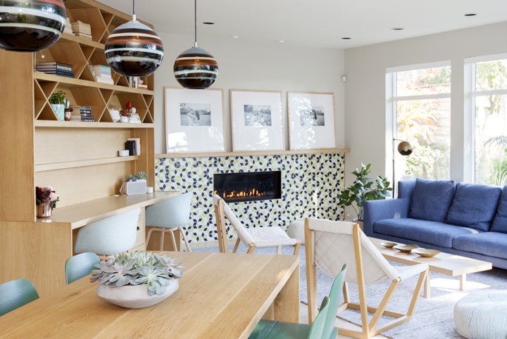
The open-concept great room was the first area to undergo a radiant revamp. In addition to the bold blue sofa, the space was outfitted with sleek and casual pieces that don’t interrupt the room’s flow. The sculptural white lounge chairs with slender wooden frames are striking, even despite their small scale. They can sit proudly on their own in the middle of the room without adding clutter or looking out of place.
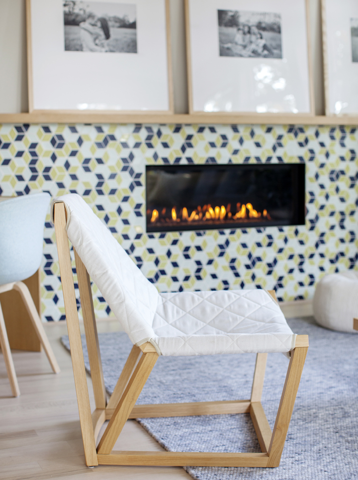
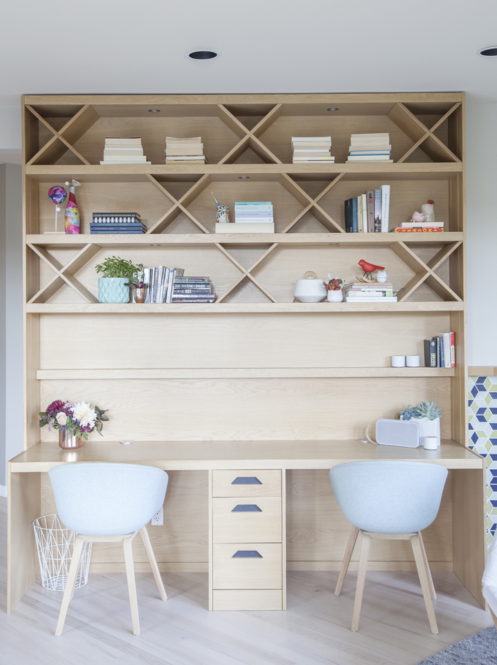
Then there’s the room’s show-stopping geometric fireplace surround that spans the entire wall. The unit, which acts as an oversized art piece, also connects to the custom built-in bookshelf. Thoughtful design decisions like this make the bright and airy space feel even larger. The designers also maximized square footage by attaching the long white-oak dining table to the kitchen island – though you’d never know it from these images. “We still wanted the table to feel like a standalone piece that can live in both the kitchen and dining area,” Kyla says.
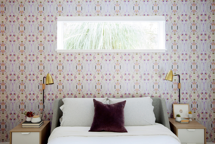
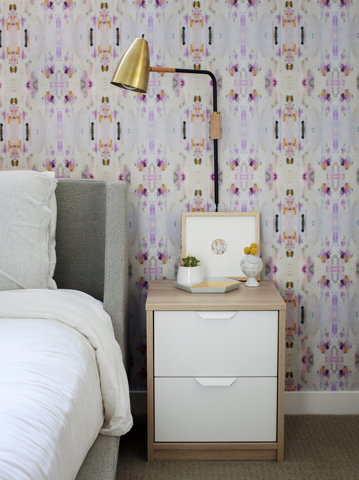
Once the great room was perfected, the design duo took on the two guest rooms in the basement (which, for the record, might just go down as the most stylish and cheerful guest suites we’ve ever seen). The dreamy pink room’s gorgeous kaleidoscope-inspired feature wall was crafted using custom wallpaper designed by local artist Lauren Mycroft along with graphic designer Sarah MacNeill and Kyla herself. Zoom in close, and you’ll notice the paper is actually made up of delicate brushstrokes. “It’s such an amazing splash of colour,” says Kyla. “Everything else in the room is quite simple, but the wallpaper speaks volumes.”
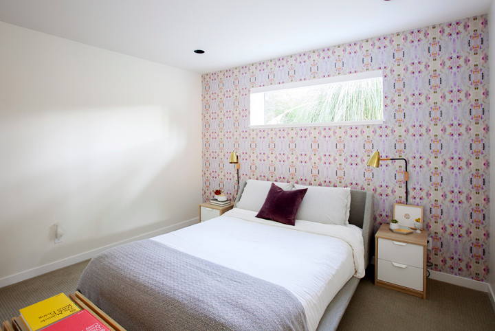
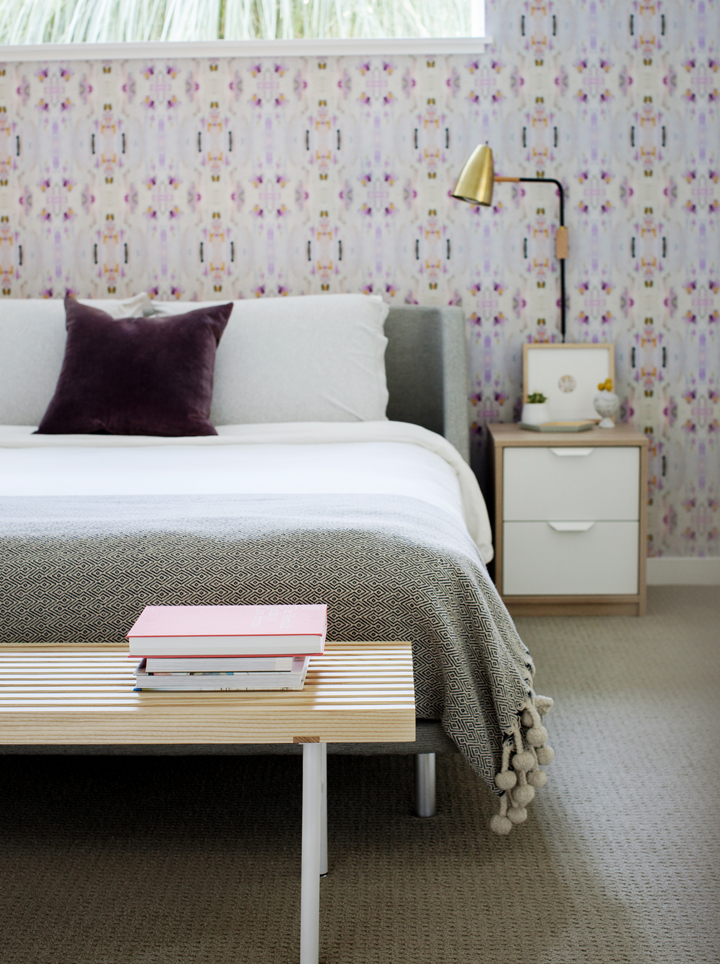
As for how to give statement wallpaper staying power? Easy: “Sometimes pattern can point you toward a certain period – like damask. It was really popular at one time, but now we can look at it and say: ‘oh yah that’s from 2006′”, says Kyla. “Whereas colour blocking is more timeless.”
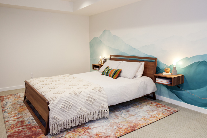
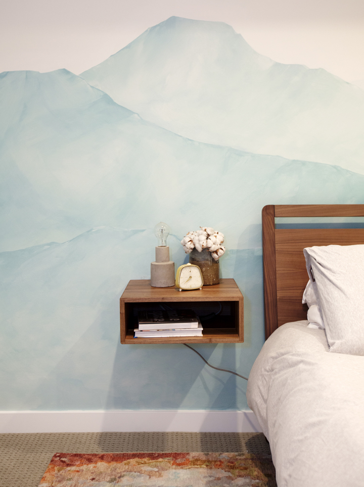
The second guest room boasts a more earthy and bohemian vibe. Though there are contrasting elements at play, the calming blue wall mural (also the work of Laura Mycroft) and fiery orange area rug feel tailor-made for each other, cementing the fact that enviable style is well worth the wait.
Next on the list? Finishing the home’s formal dining room and main upstairs bedrooms. We can’t wait to see what these intrepid designers dream up next.
Fast Five with Designer Kyla Bidgood:
- Something forever on trend: Quality.
- Biggest design faux pas: Knockoffs. So tacky.
- Trend that needs to retire: Cheap modern looks… products that are too glossy etc.
- Go-to source for inspiration: Australian designers. Much of their work is so colourful, friendly and approachable.
- Three things every stylish room needs: Area rug, plants and artwork.
Resource Guide:
Interior Design: Bidgood & Co Interiors | Photography: Janis Nicolay
LIVING ROOM: Fireplace Tile: Heath Ceramics | Sofa: Chester Fields | Area Rug: Salari Fine Carpet Collection | White Lounge Chairs: Spencer Interiors | Desk Chairs: Hay | Dining Chairs: Muuto | Custom Desk, Shelving and Dining Table: Strong Construction Group | Floor Lamp: West Elm | Pendant Lights: Siemon and Salazar | Belly Basket: Pigeonhole Home Store | Tom Dixon Bowl Set (on coffee table): Gabriel Ross | Flowers and Succulents: Rook & Rose
PINK GUEST BEDROOM: Bed Frame: Chester Fields | Bench: Chester Fields | Wall Lamps: OneFortyThree | Geometric Tray (on dresser): Hay | Toss Cushion: Pigeonhole Home Store | Flowers: Rook & Rose
BLUE GUEST BEDROOM: Bed Frame: Chester Fields | Floating Shelves: The Modern Shop | Patterned Rug: Salari Fine Carpet Collection
HGTV your inbox.
By clicking "SIGN UP” you agree to receive emails from HGTV and accept Corus' Terms of Use and Corus' Privacy Policy.


