Oh IKEA, you are truly the great equalizer. From college kids to DINKs, you are the go-to for high-minded design with a low-shock-factor price tag. When Toronto designer Natalie Chong, of Nest Design Studio, was tasked with designing and furnishing a two-bedroom Empire condo from scratch, with a tight budget of $10,000, she booked it to IKEA. With her big blue bag in hand, she scooped up everything from bohemian pendant lights to streamlined seating (not to mention the IKEA mirror that luxury design shops have been known to hang in their stores!). Tour the full space for Natalie’s incredible IKEA finds, her tricks for expanding small spaces and the most gorgeous condo entryway you’ll ever see (you’ll be recreating this look in every hallway of your home!).
Published April 3, 2017, Updated July 22, 2019
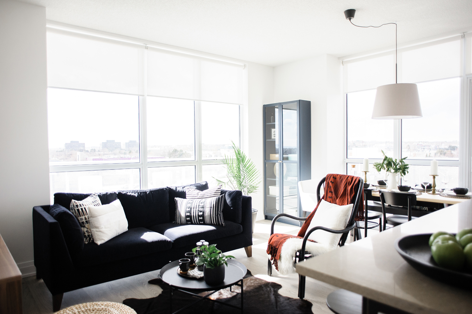
The Job
This two-bedroom condo in Oakville by Empire has the stuff Instagram hearts are made of, but it certainly didn’t start off this way. When a hip, young couple took ownership of the empty modern home, they knew it would need a keen eye to furnish the tight rooms and tricky layout and bring some personality to the bare white walls.
Related: See How a Toronto Beaches Semi Stuck in the ’90s Was Reinvigorated With Style

Meet Natalie
Enter Natalie Chong, a Toronto-based designer known for her modern-meets-cozy interiors, in chic and sophisticated colour palettes. Natalie designs the sort of spaces that you can easily imagine yourself living in and often find yourself daydreaming about (and madly hunting for on Pinterest…). Natalie took to the challenge of designing the two-bedroom condo with gusto (unlimited budgets are great and all, but tight purse strings can often bring about major creativity) and the finished result is a must-see!
Related: You’ll Want to Steal the Fine Finishes and Eclectic Art in This Modern Boho Home
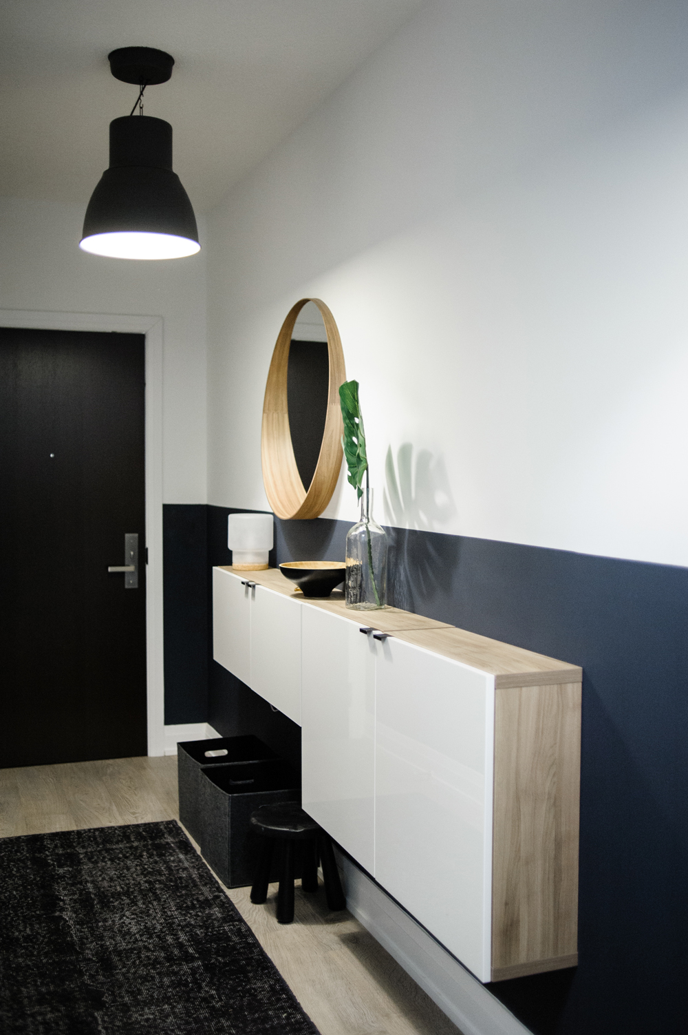
Welcome Home
The condo entryway is an unusually long hallway, so it offered Natalie the chance to introduce the mood and style of the home right from the get-go, while still packing in some additional small-space storage.
Related: The Victorian Era is Still Alive in This 106-Year-Old Carriage House in Montreal
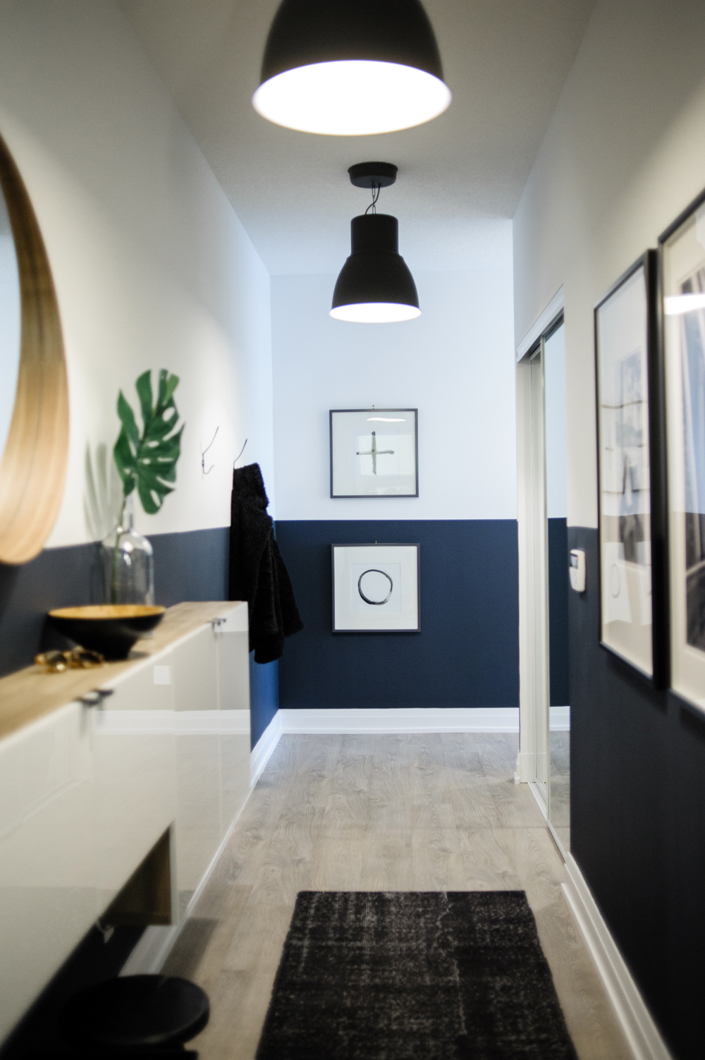
Where Style Meets Function
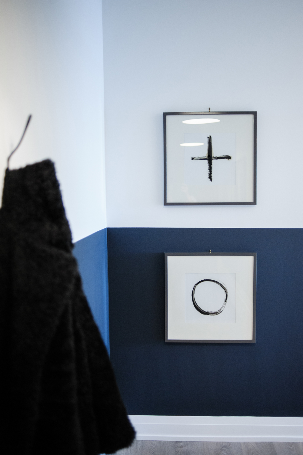
White walls in a narrow entryway quickly fall victim to scuffs from shoes and grocery bags, so Natalie opted to paint the lower half of the walls a deep navy blue. This practical design choice also introduces the colour palette for the whole condo (and saves a pretty penny versus customary wainscotting).
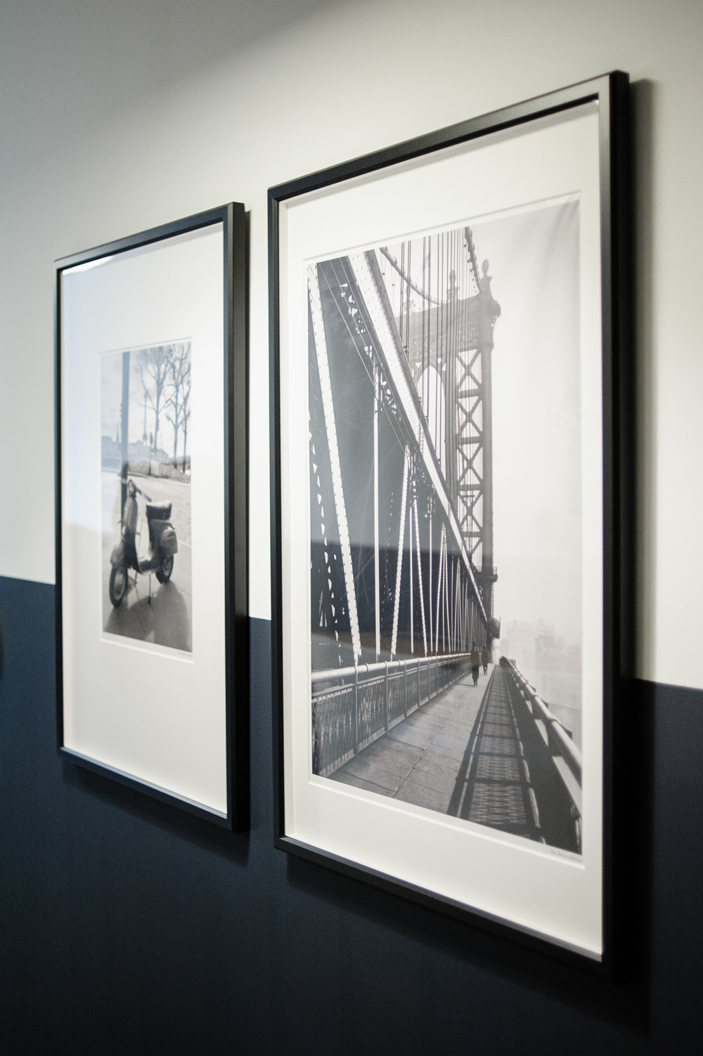
Ground Breaking Prints
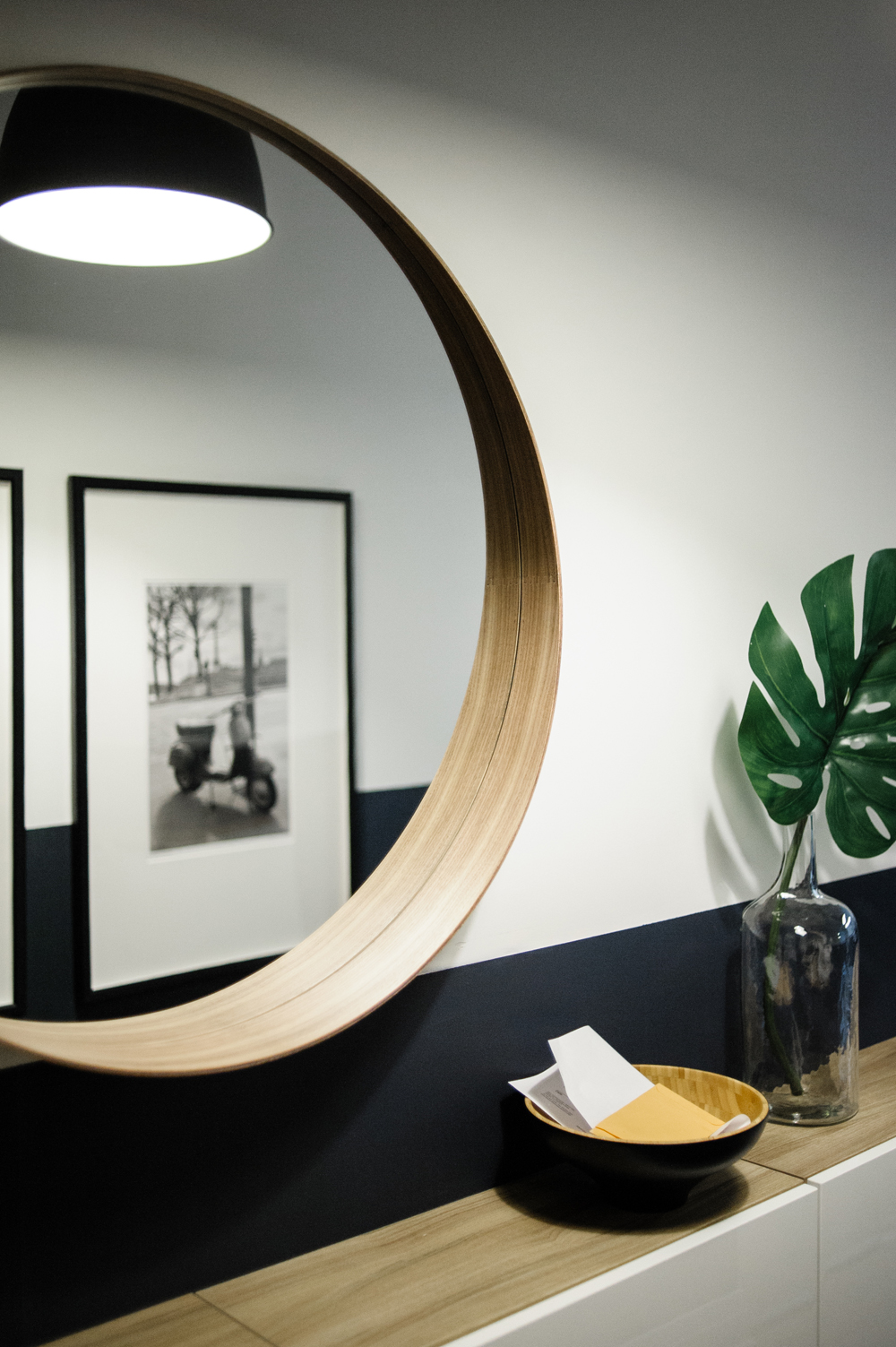
To alleviate tunnel vision in the extra-long entryway, Natalie hung black and white photography. The prints break the lines of the navy-meets-white walls and add a little bit of wanderlust to the modern condo.
The Mirror of All Mirrors
Every entryway needs a mirror (it’s your last chance to wipe lipstick from your teeth or fix askew shirt buttons) and every entryway could benefit from this mirror, the STOCKHOLM, arguably IKEA’s most popular design.
Related: IKEA Recreates Iconic Living Rooms From ‘The Simpsons,’ ‘Friends’ and ‘Stranger Things’
Creative Storage Solutions
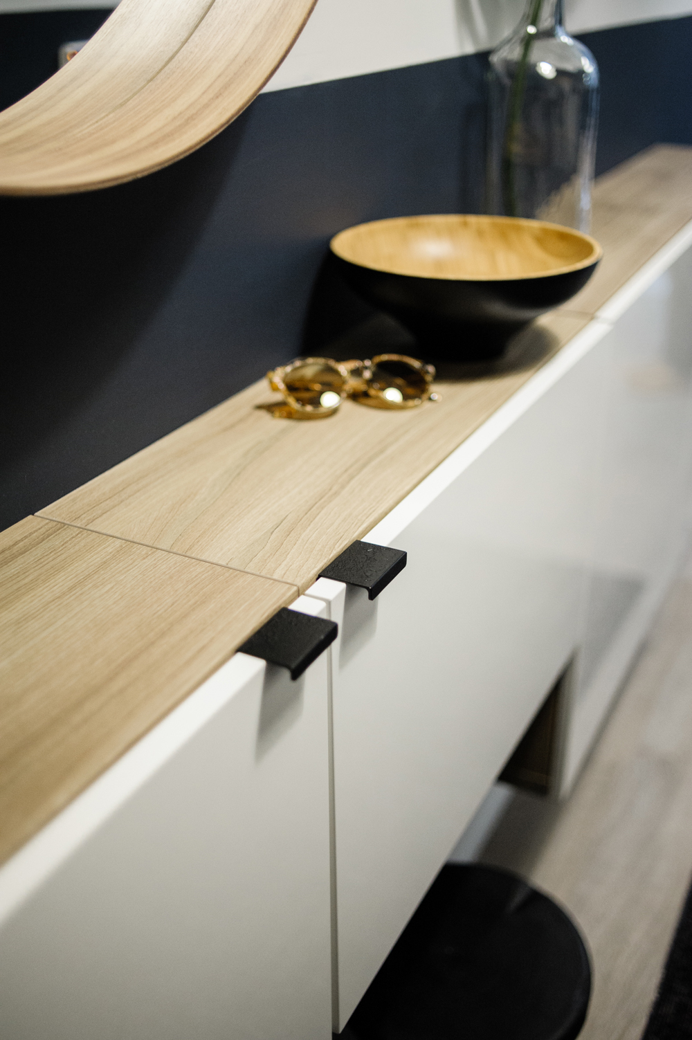
Condo owners take note: even the tightest hallway can make room for a narrow console table. This wall-mounted option leaves space for a little stool (perfect for yanking off winter boots) and storage bins for outdoor or pet accessories. Natalie chose two-tone floating cabinetry and spray painted the hardware black for a modern contrast.
Opposites Attract
Just beyond a trio of coat hooks, Natalie stacked two playful prints that emphasize the perfectly balanced space.
Make Yourself at Home
The homeowners planned for a revolving door of visitors, so their second bedroom needed to work as a fully functioning guest room. Natalie carefully selected pieces that would ensure the space was inviting and cozy, but not overly personal.
Small but Mighty
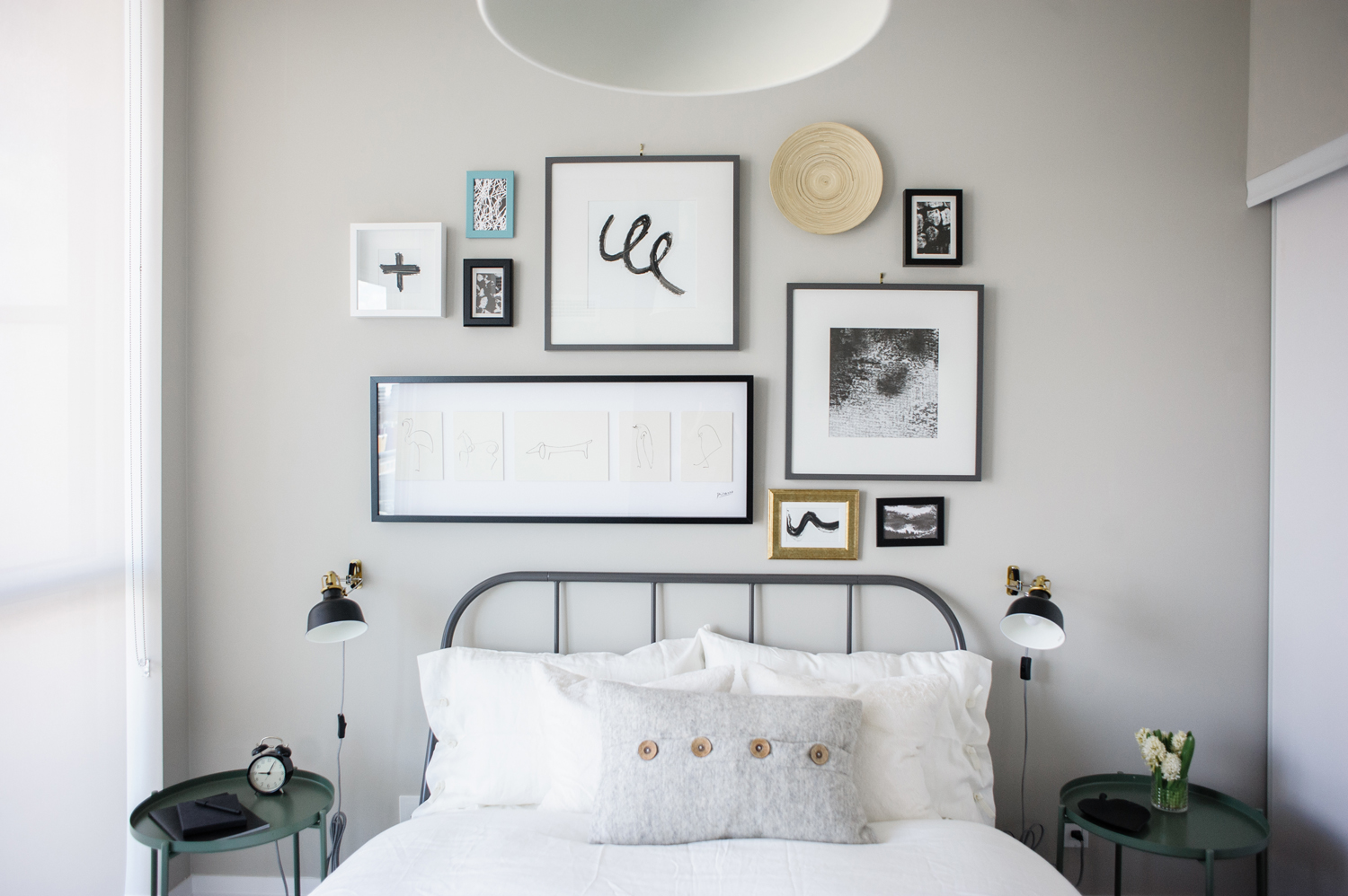
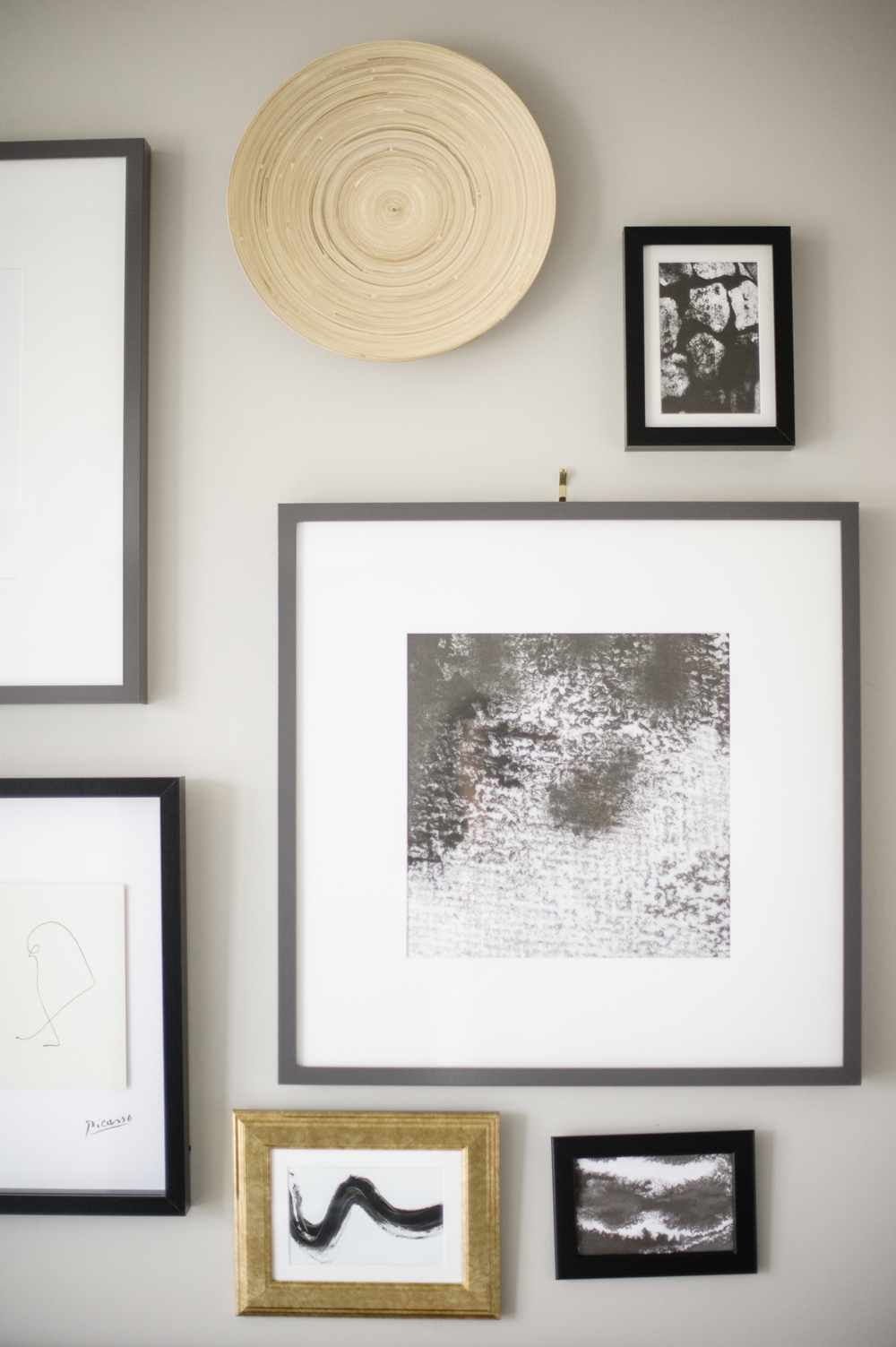
The small guest bedroom left little room for furniture beyond a bed and side tables, so Natalie relied on a gallery wall to imbue the room with a modern-meets-industrial style. She framed black and white prints in a medley of grey, black and gold frames.
Planning for the Future
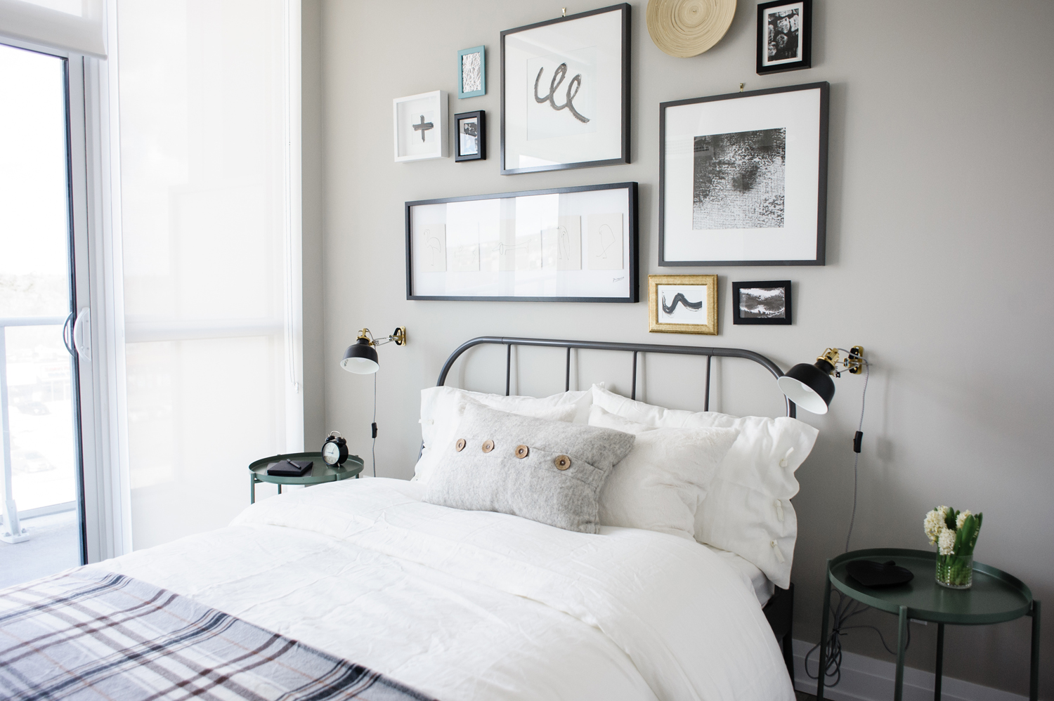
With the knowledge that the guest bedroom might become a nursery in the future, Natalie stuck with affordable furnishings that the homeowners wouldn’t mind parting with. She sourced the IKEA KOPARDAL bed and the GLADOM tray tables, which add just a hint of colour, in muted dark green.

Wakeup Call
To play up the boutique hotel vibes of the little guest bedroom, Natalie accessorized the bedside tables with hotel staples: a notebook and pen and the chic little IKEA DEKAD alarm clock. The only thing missing is a “Do Not Disturb” sign for the bedroom door.
Hostess Points
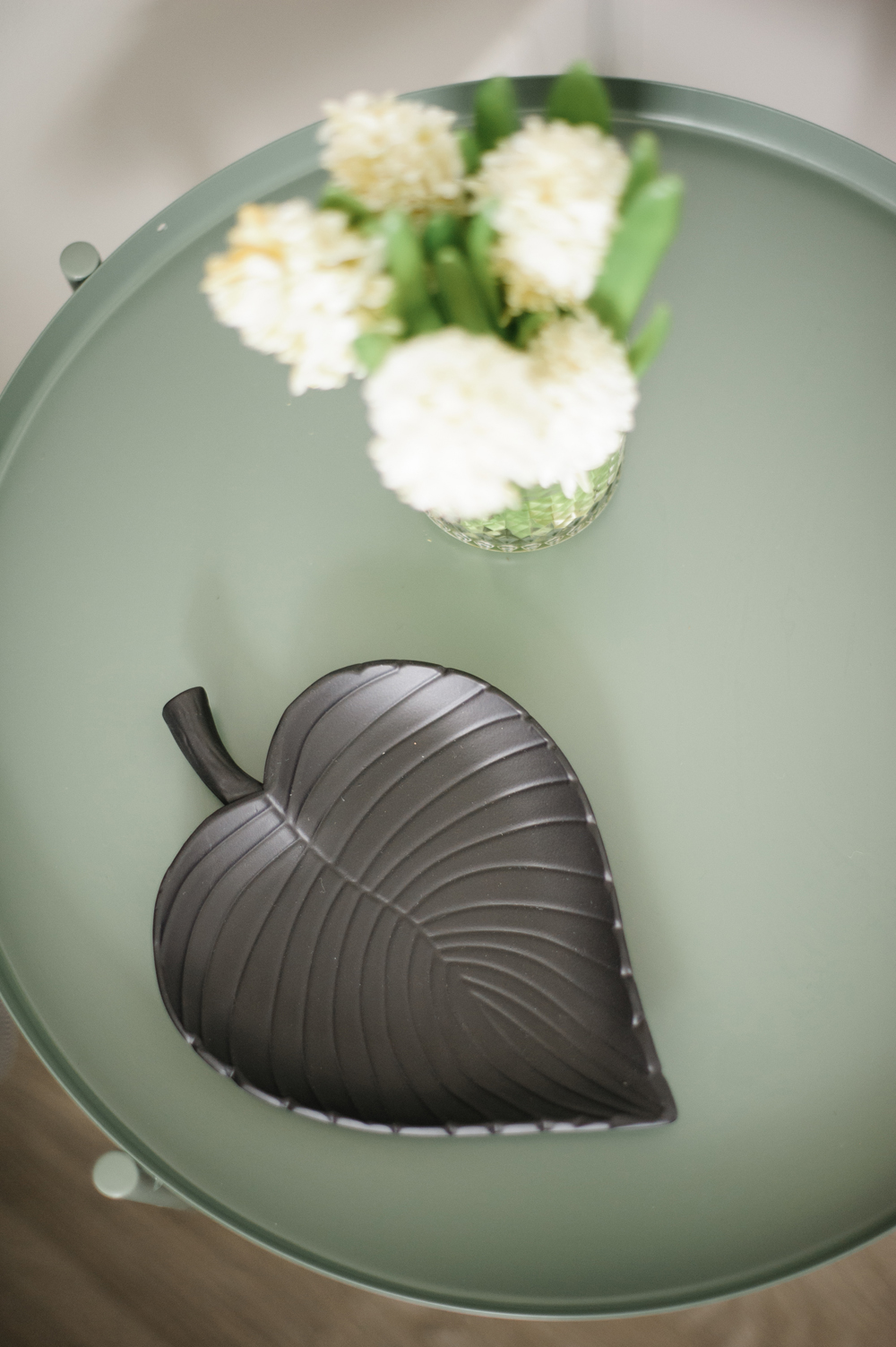
No guest bedroom is complete without fresh flowers by the bed. Natalie sticks to the modern theme with a simple cluster of white hyacinths.
Related: IKEA’s 15 Most Popular Products: Which Ones Do You Own?
Little Details, Big Impact
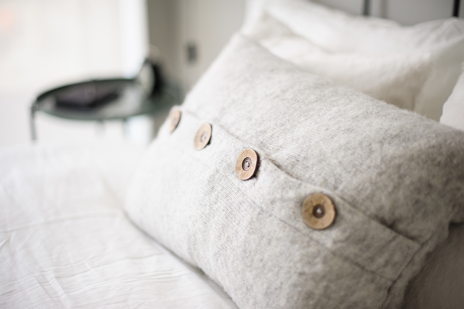
After painting the walls a soft grey and selecting furniture with a vintage vibe, Natalie layered a mix of textures and accessories to bring the room to life. It’s the details that will amplify a room’s style, and this cozy IKEA TVEBLAD pillow with wood button embellishment reads: cool and cozy, exactly what you want out of a guest bedroom.
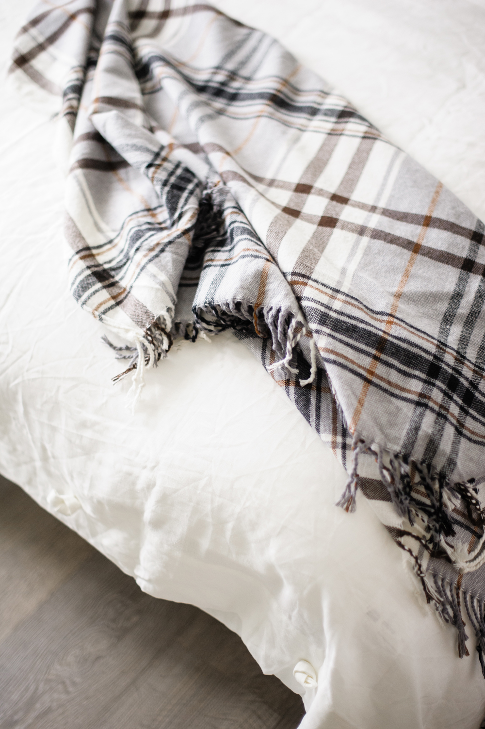
A Throw That’s All Mine
The HERMINE IKEA throw is a simple addition that pulls the room together. Against a solid white bedspread, white pillows and a solid grey accent cushion, this plaid throw brings some much-needed depth and personality.
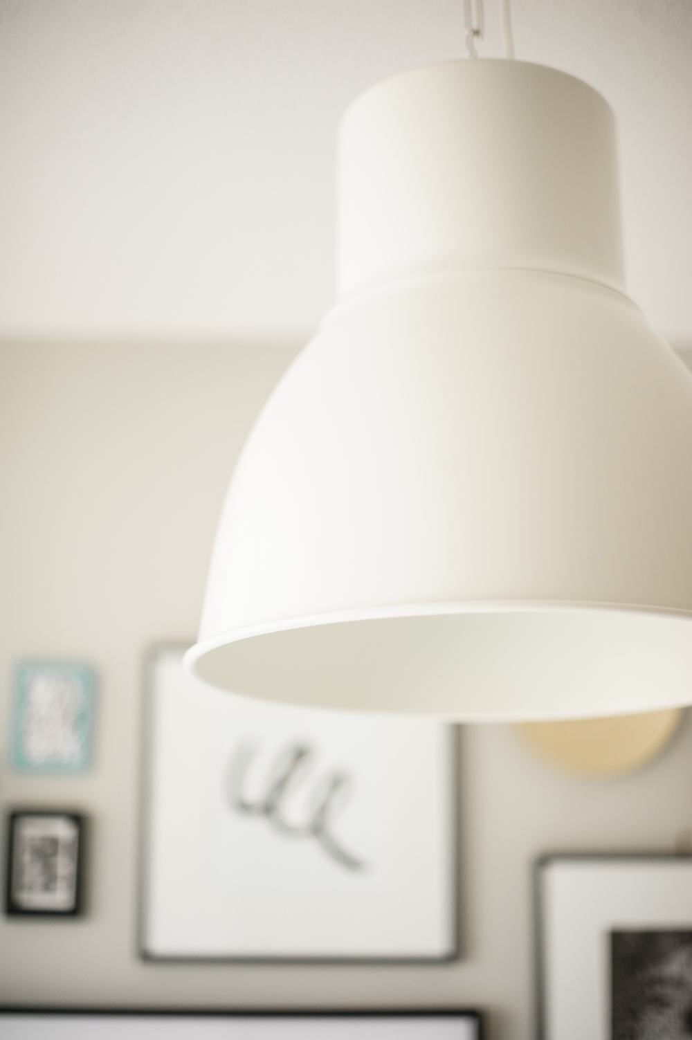
Industrial Chic
The HEKTAR pendant lamp is a little bit vintage, a little bit industrial and totally perfect for bringing the blank-slate condo to life.
Related: The 8 Coolest Lighting Trends That Will Transform Any Room
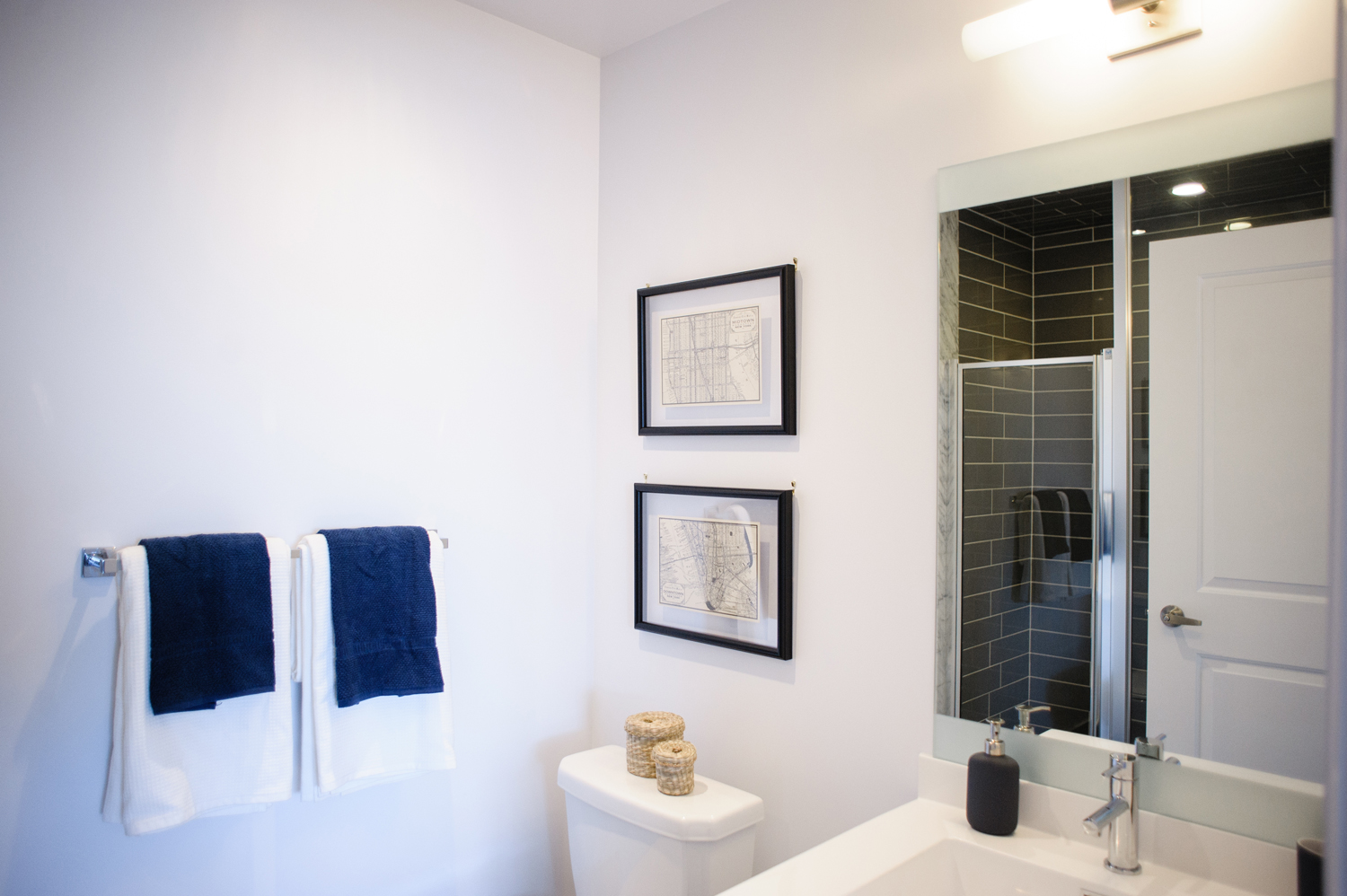
Bare Minimum
Natalie had not one, but two bathrooms to decorate in the condo and she kept the design minimal for both. A pair of prints, solid towels and sparse accessories keep the guest bathroom feeling clean and organized and helps to showcase that fantastic black subway tile in the shower!
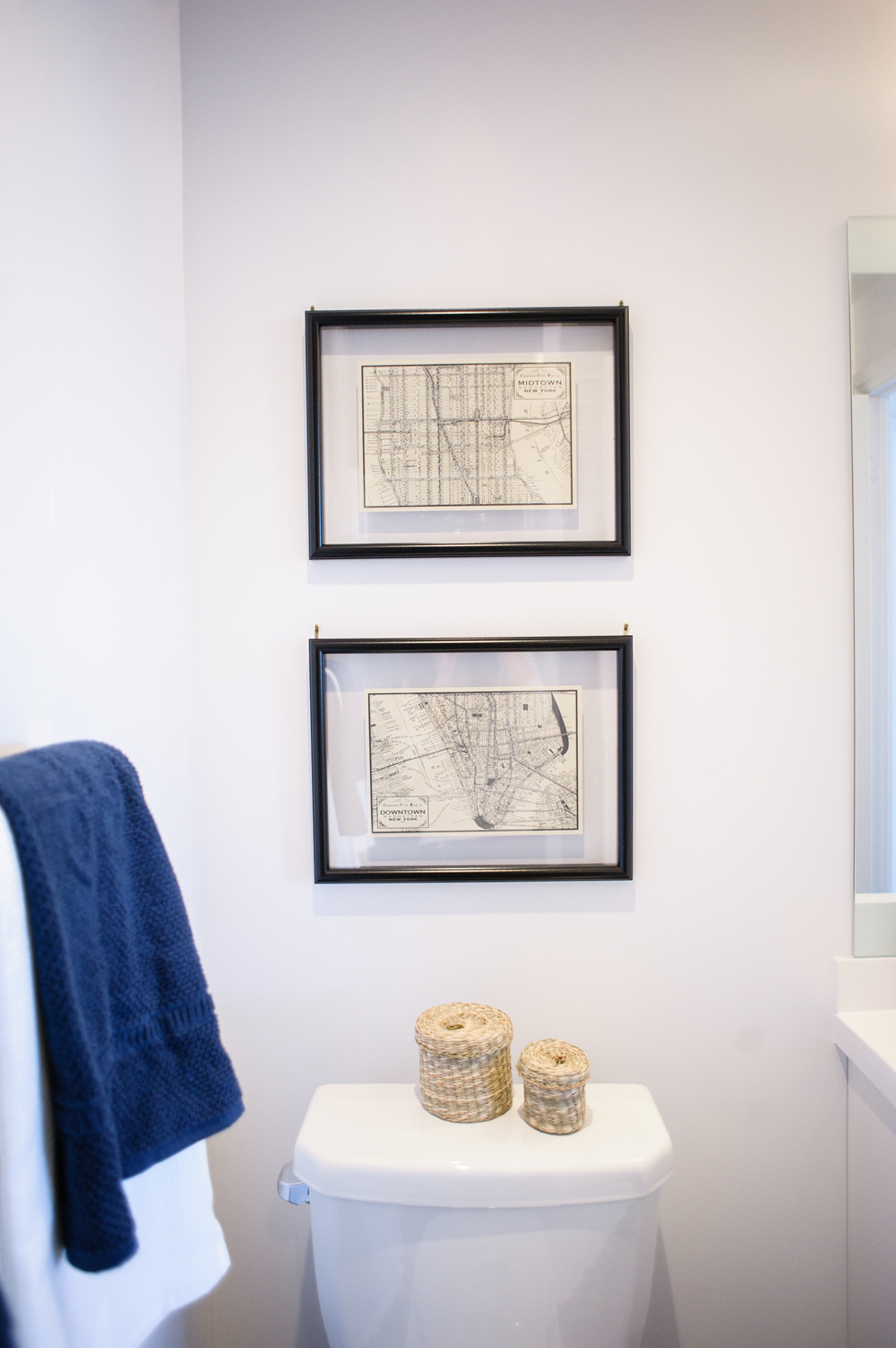
Old Meets New
We love the juxtaposition of vintage-inspired GEMLA prints paired with a clean, modern backdrop. The floating frames help balance the weathered-looking maps!
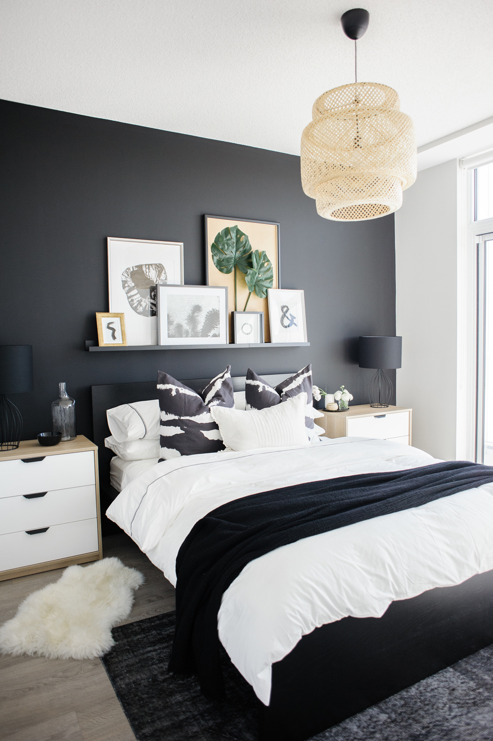
The Boutique Bedroom
Natalie’s inspiration for the master bedroom was a boutique hotel. She wanted it to feel chic and curated, while also comfortable and cozy. Her first order of business was painting a matte black statement wall to frame the bed and side tables.
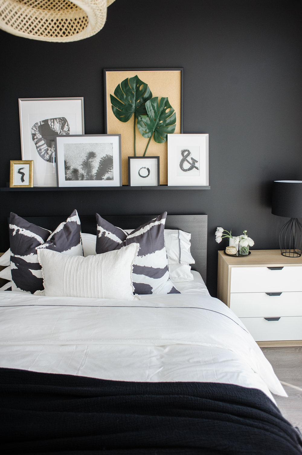
The Casual Gallery Wall
With little budget to spend on statement furniture, Natalie relied on artwork to bring personality and a touch of colour to the room. She created a casual gallery wall, assembled on a floating shelf. The beauty of this installation is that artwork and decor can be easily swapped in and out with the seasons or depending on the homeowner’s current taste.
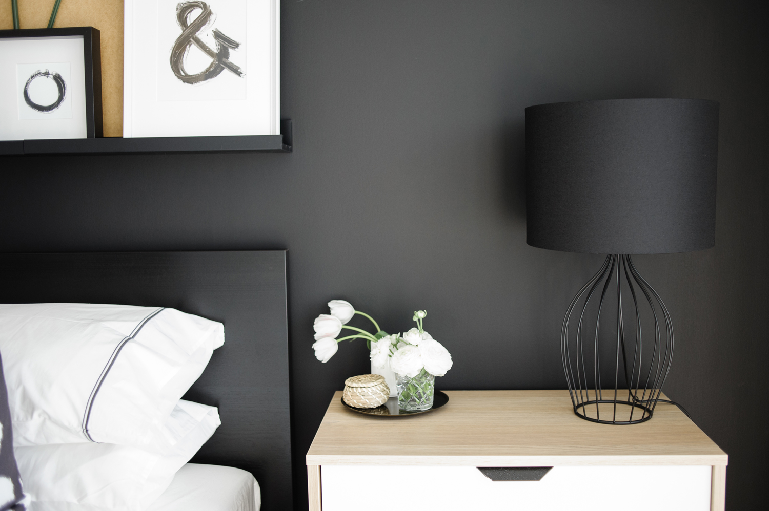
Dress for Success
Natalie took advantage of the space she had on either side of the bed and opted for IKEA’s ASKVOLL dressers over side tables. This provides extra surface space for lighting, books and accessories and a convenient drawer to hide everything away in when guests pop by.
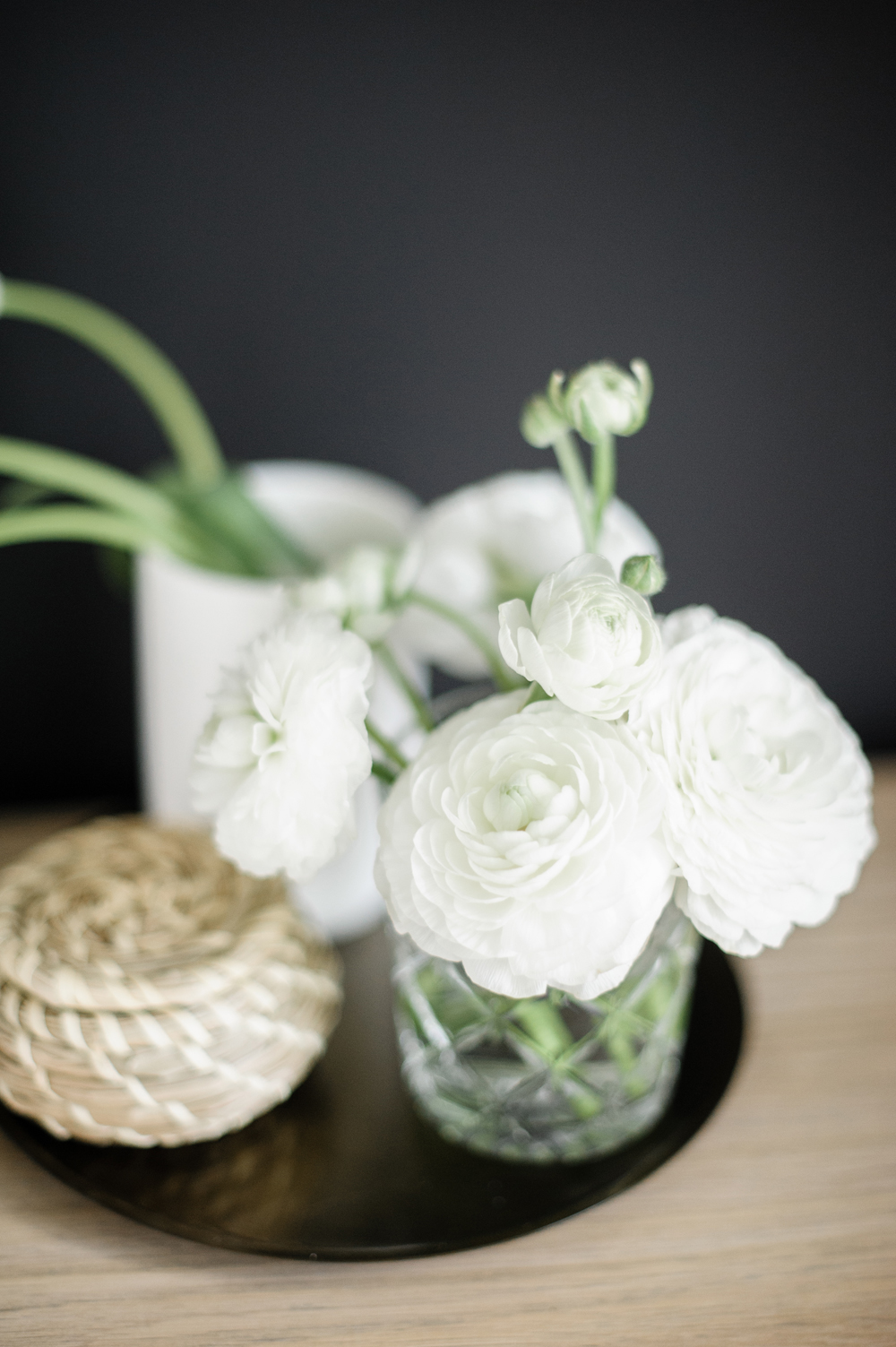
Must-Have Blooms
We love the striking contrast of these white ranunculus against the stark black wall. The homeowners can continue to play with colour and contrast, introducing yellow, pink or even purple to add a spark of colour.
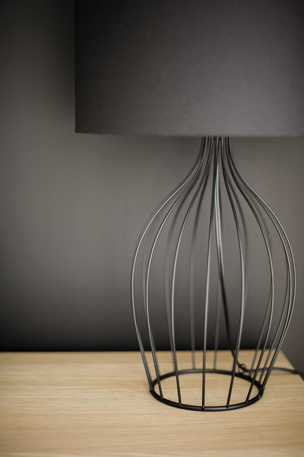
Barely There Lighting
Natalie found the perfect lamps to sit against the black statement wall. IKEA’s slender HOLMLIDEN practically disappears, perched in front of the black backdrop. It doesn’t distract from the gallery wall in any way.
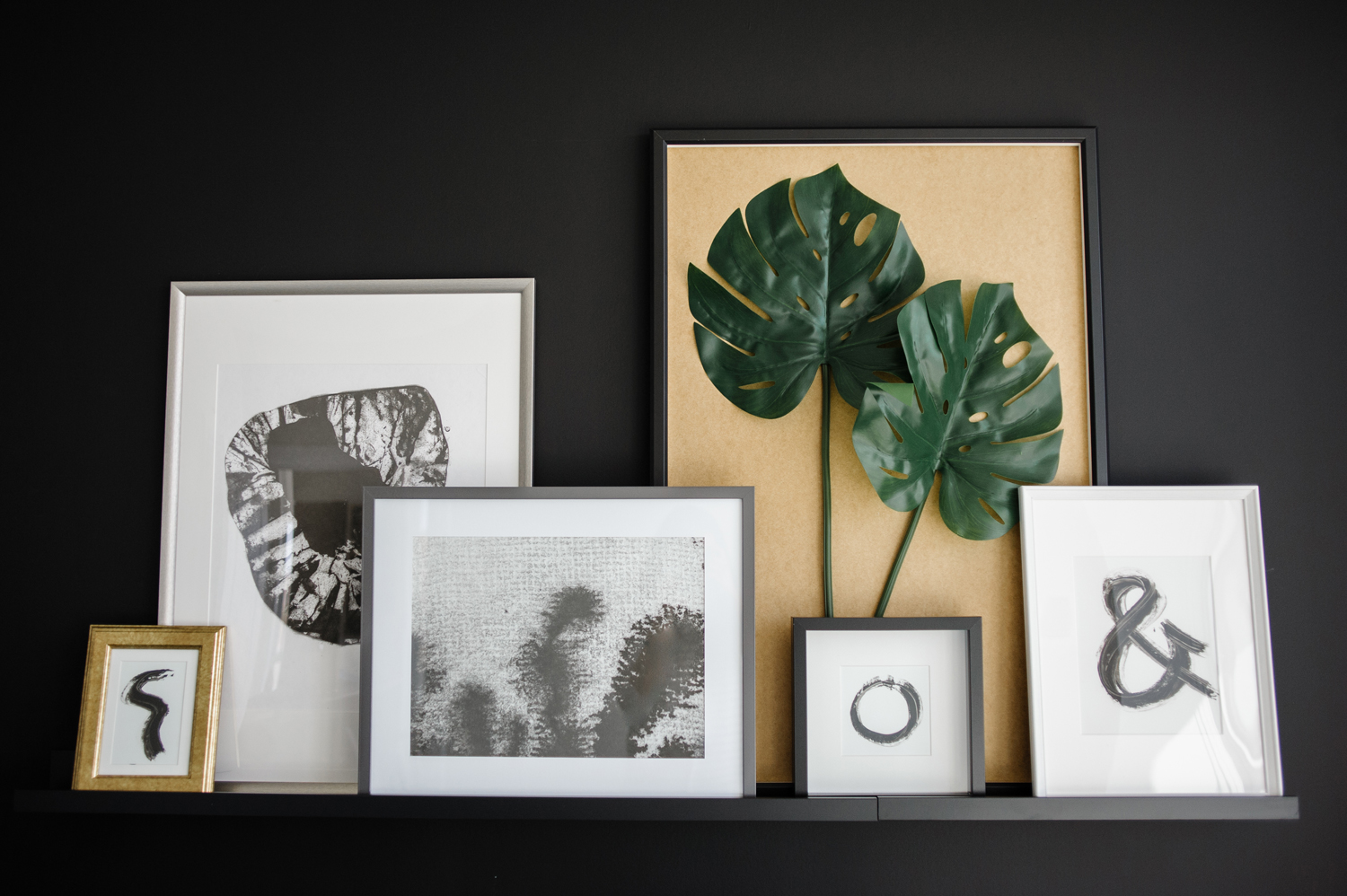
Tropical Infusions
The master bedroom is almost entirely black and white, but this tiny touch of green pops against a gold backdrop and lends a tropical vibe to the hip gallery wall.
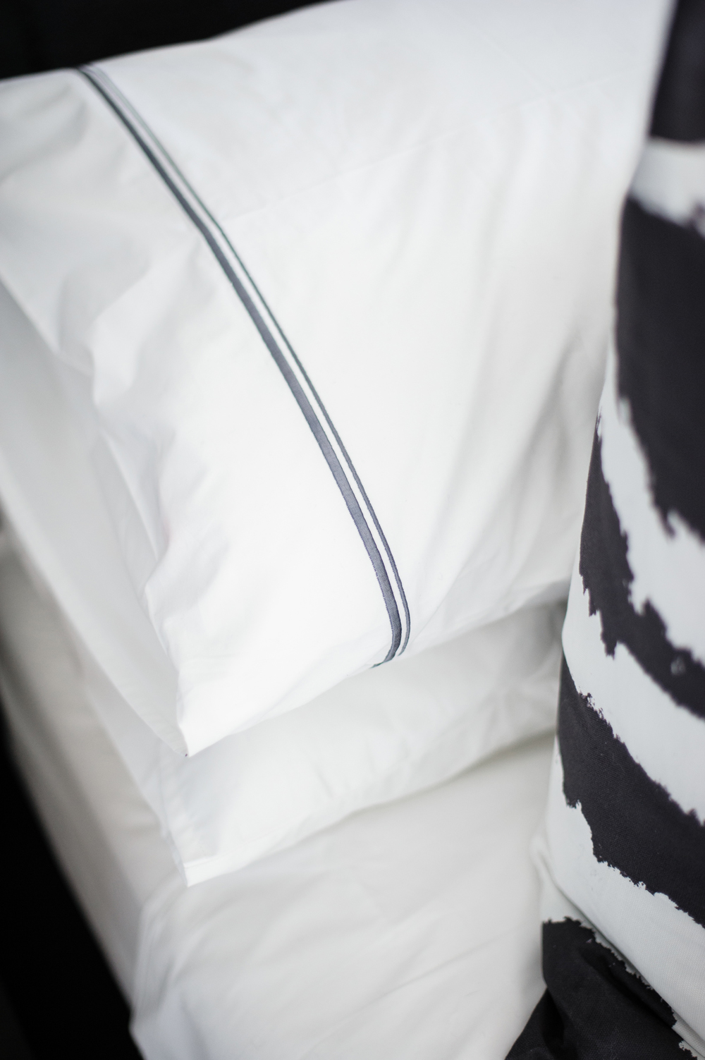
Artful Stacking
The true secret to making a bedroom feel like a hotel suite? It’s all about how you make the bed! Natalie artfully stacks two standard pillows and rests a decorative pillow in front.
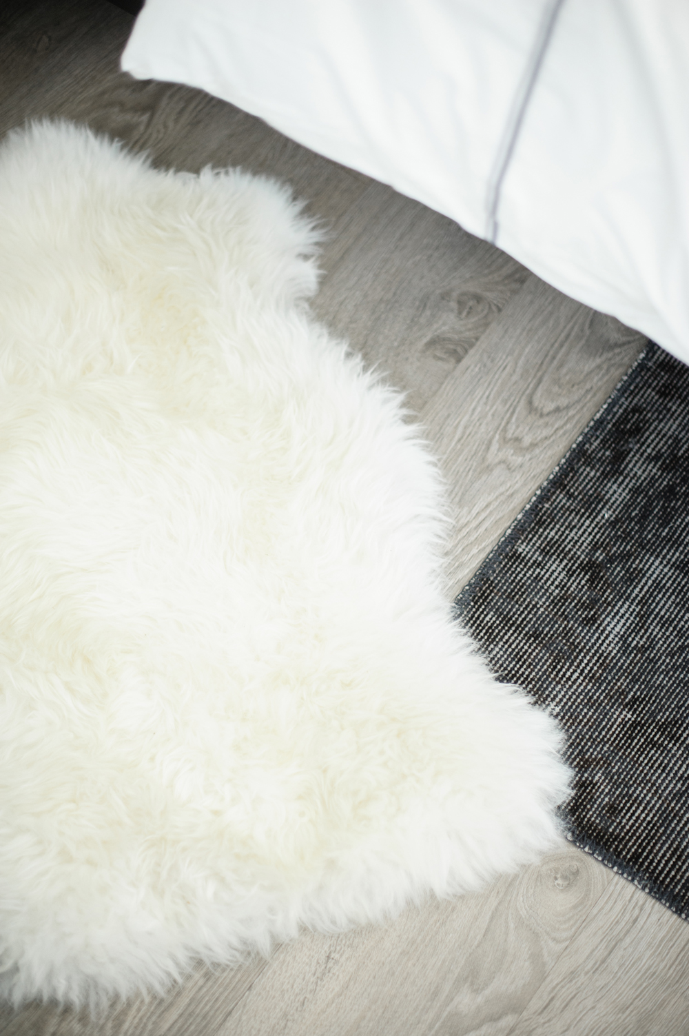
Layered Textures
The condo had gorgeous grey wood floors to begin with, but Natalie layered IKEA’s classic RENS sheepskin throw and a black rug in the master bedroom to ensure it was extra cozy on cold mornings.
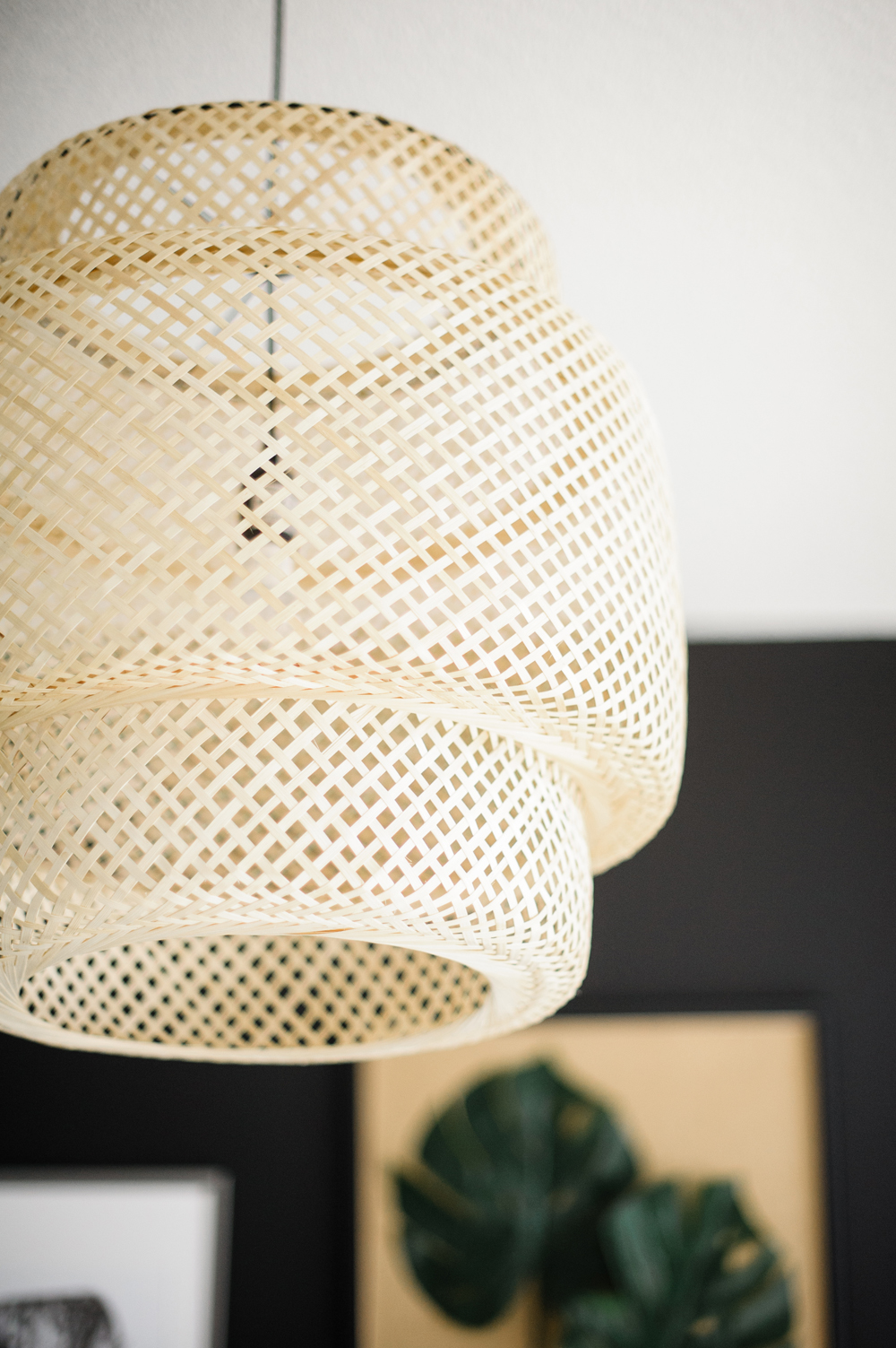
Far Off Inspiration
Natalie was careful to keep the master bedroom’s style more modern than anything else, but the SINNERLIG bamboo light pendant was the perfect addition to provide just a hint of boho tropics!
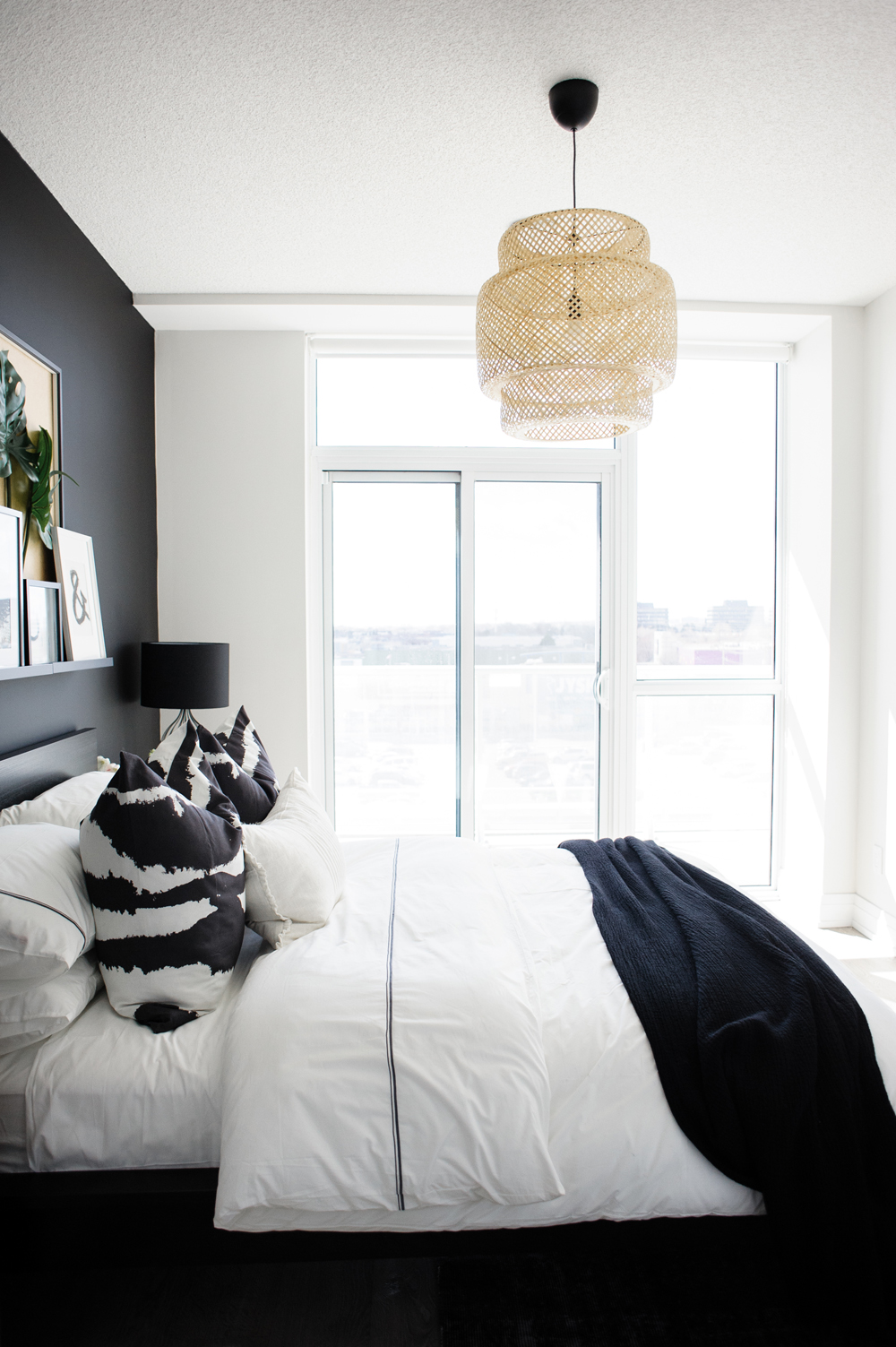
Begin With the Basics
The beauty of this room is in its simplicity. It’s a small space, but Natalie still managed to give it a strong personality.
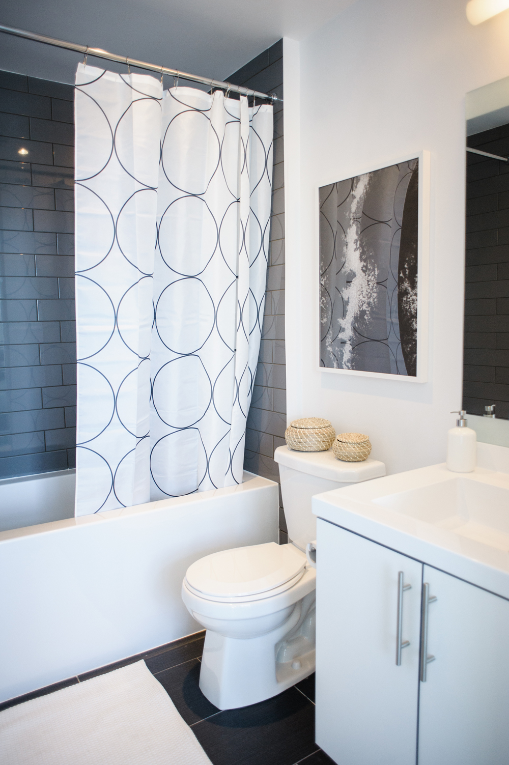
The Master Bath
Natalie played up graphics in the bathroom, with a circular pattern on the shower curtain that amplified the glossy grey subway tile.
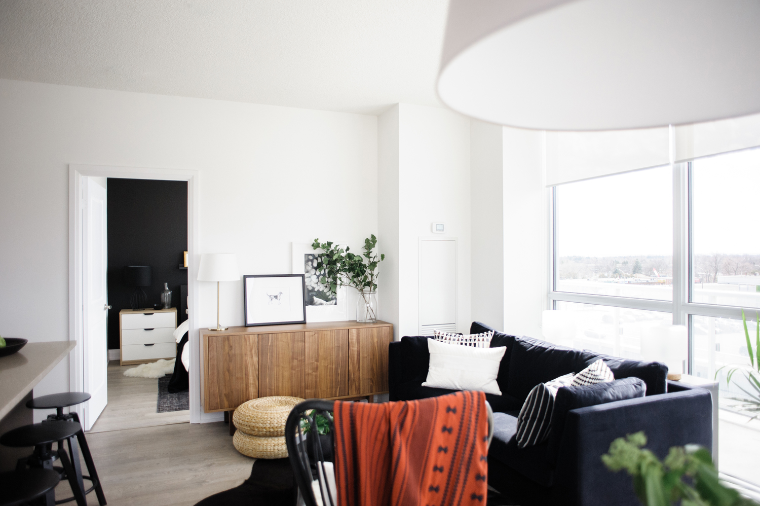
The Bright and Beautiful Living Room
Natalie’s greatest challenge in the condo was the open-concept main area. She needed to create three distinct spaces that still felt cohesive. She relied on a unified colour palette to achieve cohesion, but used furniture and textiles to delineate the living room from the kitchen. (A tip from Natalie: rugs are a great tool for separating one space from another!).
Related: 10 Downsides to Open-Concept Living You’ve Never Considered
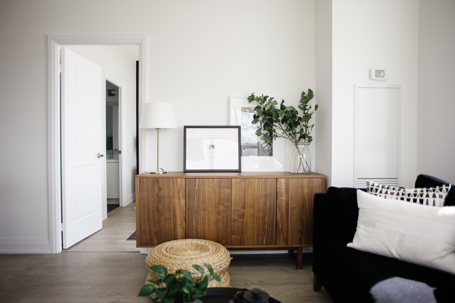
Double Duty Storage
Natalie selected IKEA’s STOCKHOLM sideboard to fit perfectly into a living room alcove. It offers hidden storage and a beautiful surface for displaying artwork and decor.
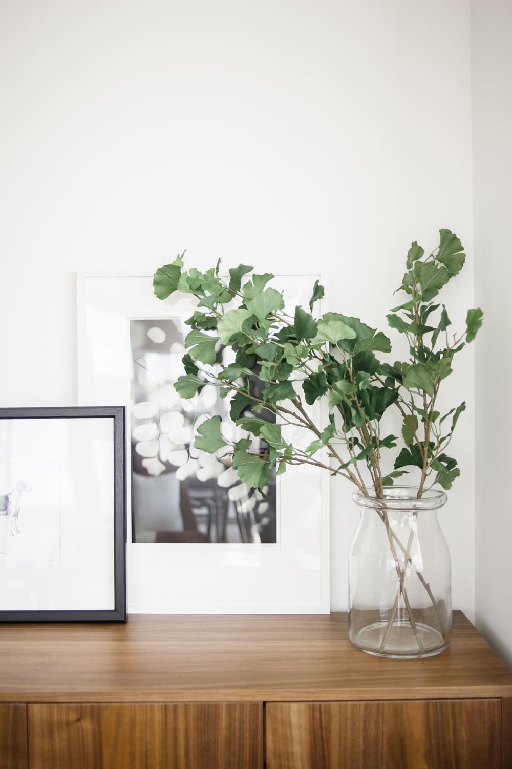
A Hint of Spring
A cluster of green leaves can go a long way to add a little life to a space (and they’re a fraction of the cost of flowers!).
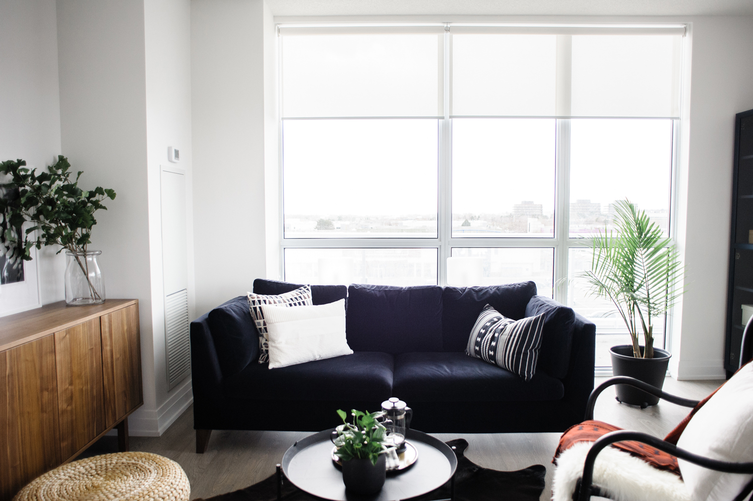
Simplicity is Key
Natalie stuck with the black and white colour combo for the living room furniture, with the black STOCKHOLM sofa and the STORSELE armchair topped with a sheepskin throw. It’s the perfect base for patterns, plants and a hint of red!

It’s All in the Details
Natalie knows the success of a room comes down to the styling and ensuring every seat has cozy cushions or a throw tossed over its back to invite homeowners and guests to sit back and relax.

Unique Prints and Patterns
The simple black and white backdrop of solids allows this decorative burnt orange throw to really pop and command attention in the living room.

Improvised Seating
Tight on space? Natalie tried to limit the number of large pieces she introduced to the living room, but created optional seating for extra guests with these neatly stacked floor cushions. They can easily be tucked away into a corner and brought out for parties. Plus, they add a gorgeous braided texture to the design of the room!
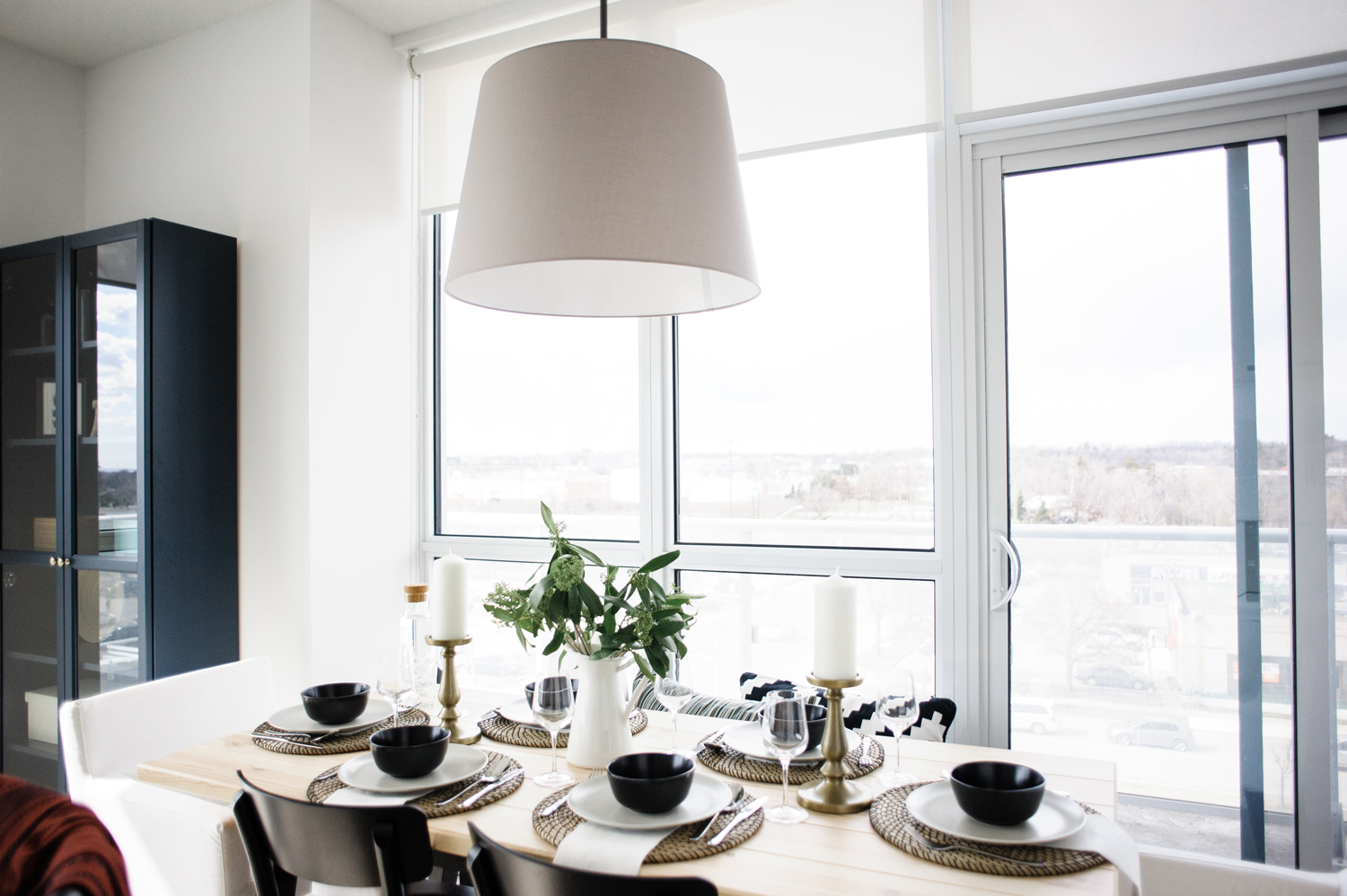
The Dining Room
The narrow space left for the dining area was a tricky one to work with and Natalie was determined to sit at least six at the table. She mixed and matched seating, placing a bench along one side (next to the window) and armchairs on either end. This allows for three to squeeze in along the bench and for those elegant dining chairs to do double duty in the living room if needed.
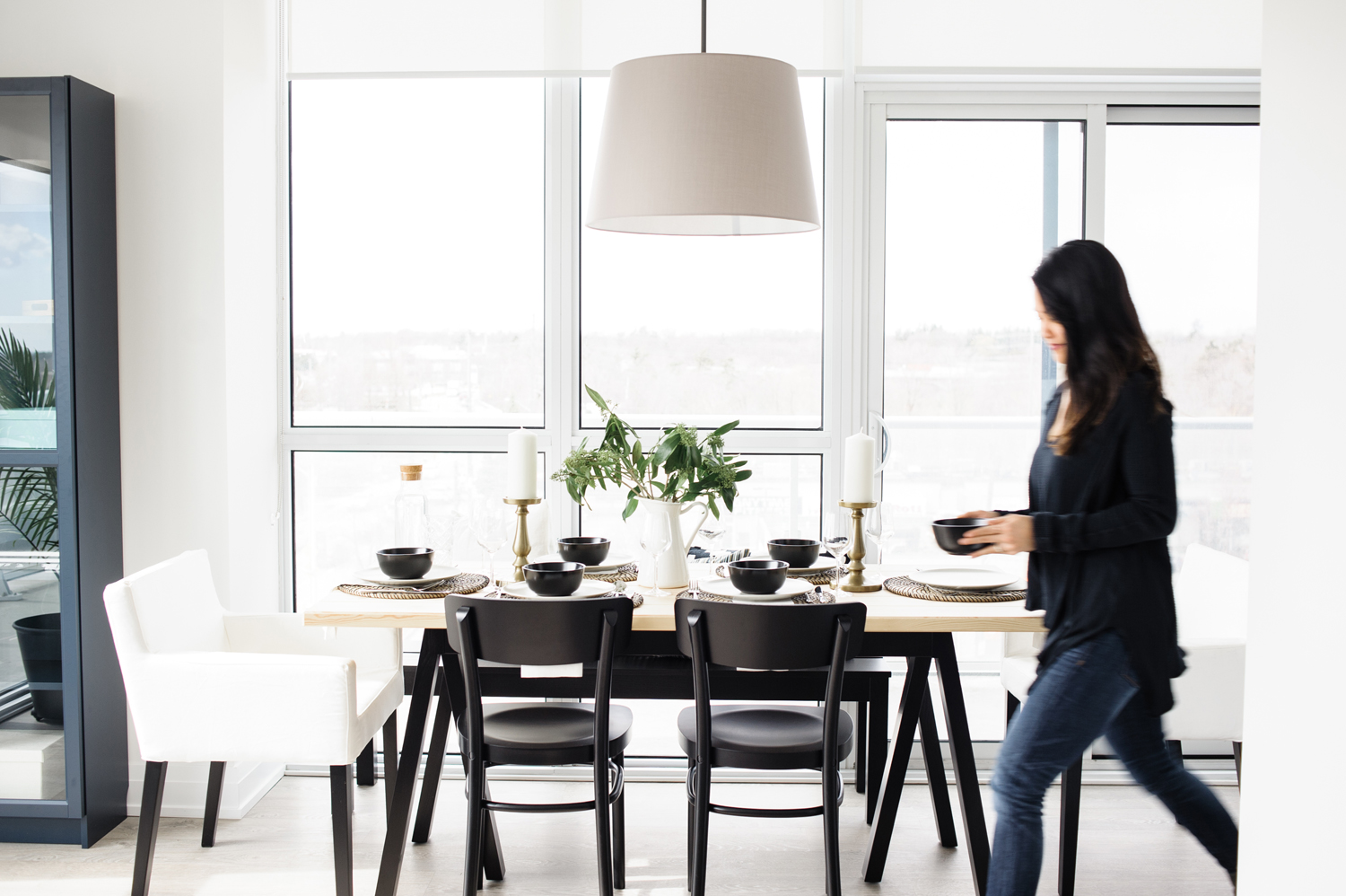
All Set
A beautiful black and white table setting, with a touch of gold detail, helps this space to truly shine!
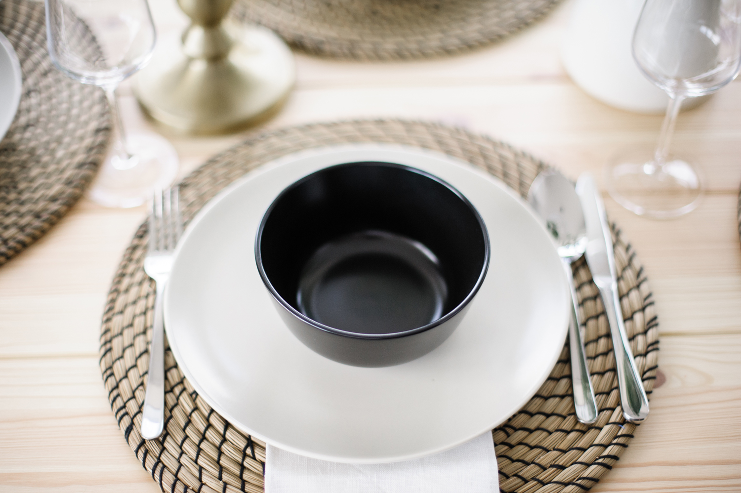
Mixed Materials
We love how these LATTAD woven chargers have a touch of black that pulls the entire set together!

An Eye for Design
Whether picking out big-picture pieces or getting every angle right on a dining table, Natalie has incredible taste and never misses a detail.
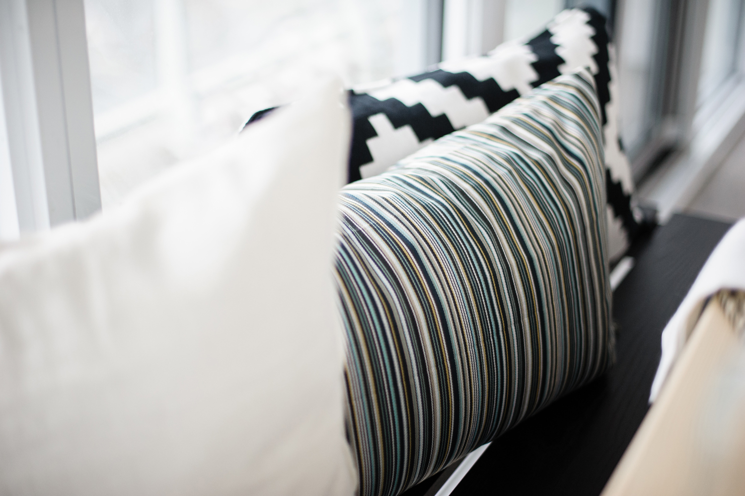
A Play on Patters
By sticking to a simple colour scheme, Natalie’s able to introduce a multitude of prints through pillows on the dining bench.
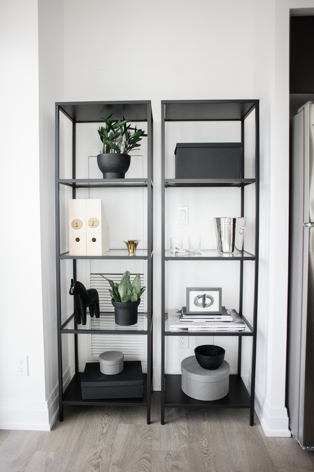
Statement Storage
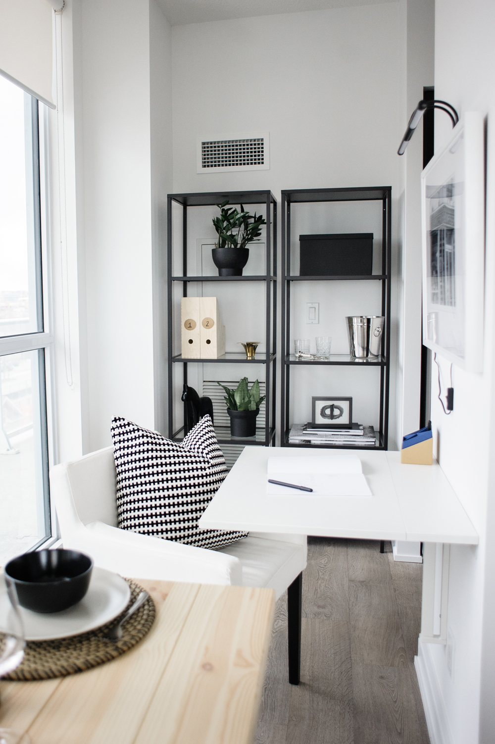
Natalie relied on a mix of open and closed storage pieces to make up for the lack of closets in the condo. These shelves are perfect for displaying decor, artwork or a makeshift bar.
The “Home Office”
The homeowners required a space where they could occasionally work from, so Natalie designed this makeshift office in a nook off the kitchen. A desk folds up from the wall and a dining chair conveniently pivots to work as a desk chair.
Related: Our Editors Share Their Best Work-From-Home Secrets
Inspiration Sparks
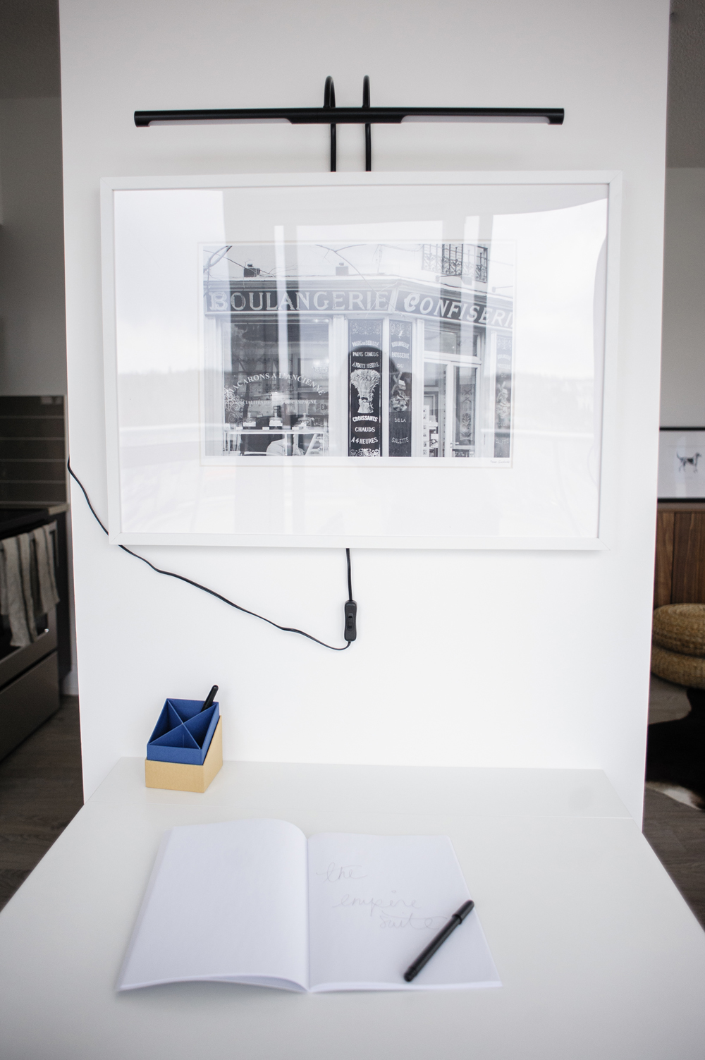
A simple black and white print hangs over the makeshift desk. It’s the perfect little piece to give the “office” a stronger sense of purpose, while not making it too obvious. When hosting dinner parties, the homeowners can easily tuck the desk away and no one will know it’s there!
The Kitchen
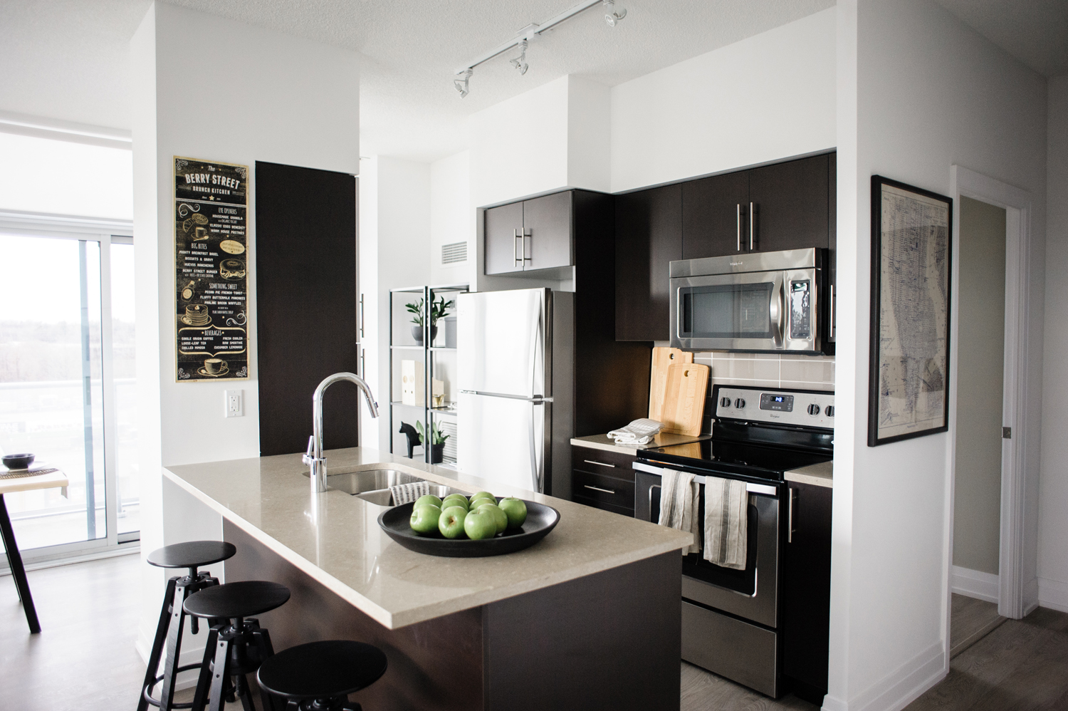
Natalie managed to take the builder-basic kitchen design and after adding a few careful pieces, some artwork and cutting boards, bring it to life.
Pull up a Chair
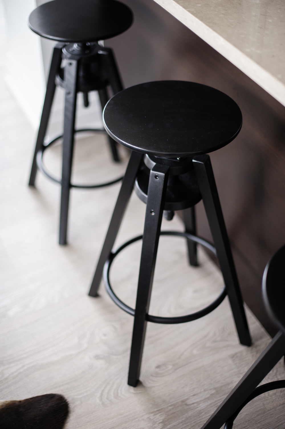
For the dark, modern kitchen, a set of DALFRED black stools fit seamlessly under the counter (and, once again, double as seating for the living room).
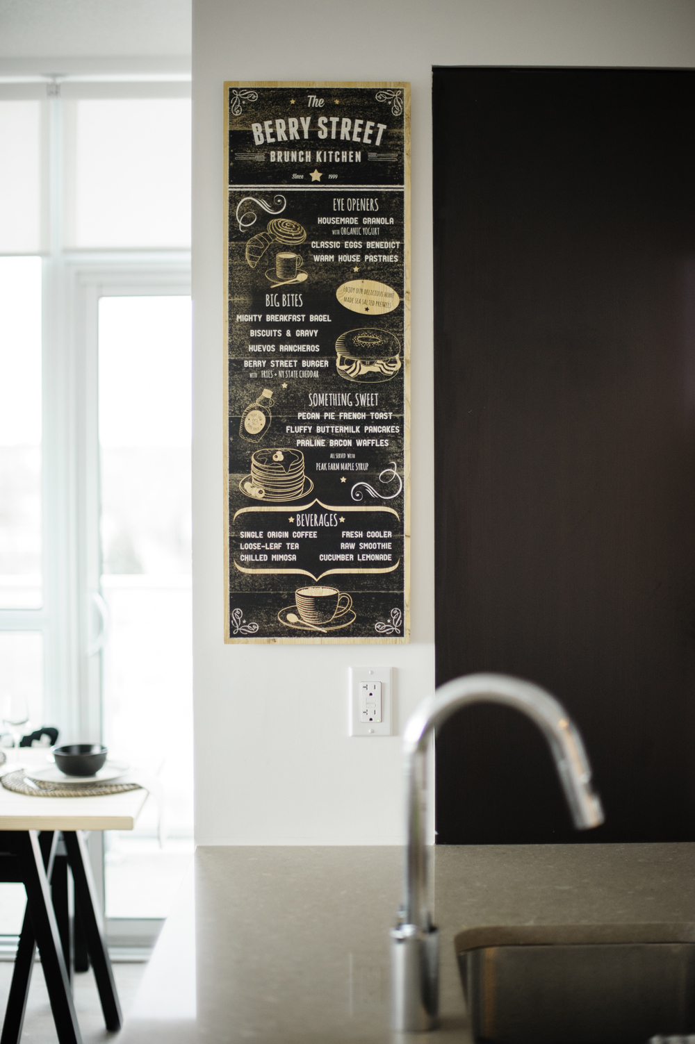
Best in Brunch
The vintage-inspired LOKABRUNN menu board is a playful addition to the kitchen (but will set expectations high for visitors!).

Handy and Healthy
Natalie clusters a healthy snack within hands reach, that conveniently adds a splash of colour to the otherwise black and brown kitchen.

Home Sweet Home
Natalie came right under budget with the two-bedroom condo and the homeowners have a space that’s chic, functional and totally their own.
Related: California Meets Sweden in This 1950s Hamilton Bungalow
HGTV your inbox.
By clicking "SIGN UP” you agree to receive emails from HGTV and accept Corus' Terms of Use and Corus' Privacy Policy.


