Randi and Neil may have loved their small two-storey home when they first moved in, but after having two kids, the space suddenly felt cramped, with little storage space and disorganized chaos at every turn. Suffice to say, the couple was ready to look elsewhere. Cue Jillian Harris and the Love it or List it Vancouver crew, who swooped in to give the home a bright and beautiful facelift, all while adding functionality and genius small space solutions. Here’s how the design team transformed the abode into a contemporary organizer’s dream.
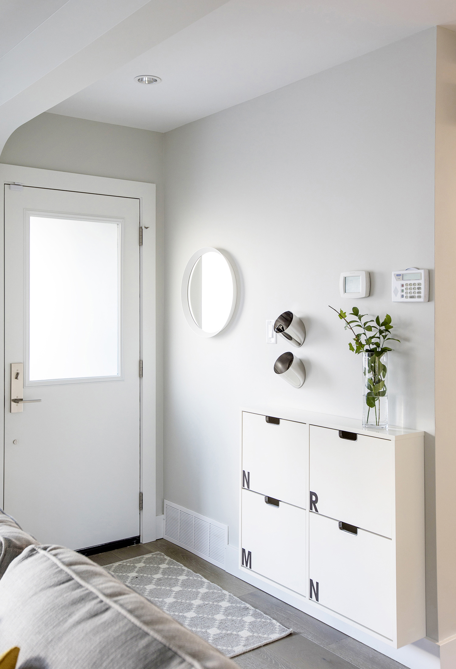
Brighter Welcome
The previous entryway wasn’t doing this home any favours. And while designer Jillian Harris couldn’t change the overall layout, she did help to define the area with a small welcome mat and a space-saving shoe storage unit featuring an initial for each family member on its cabinet doors. Two stainless steel key-catchers above add a modern touch.
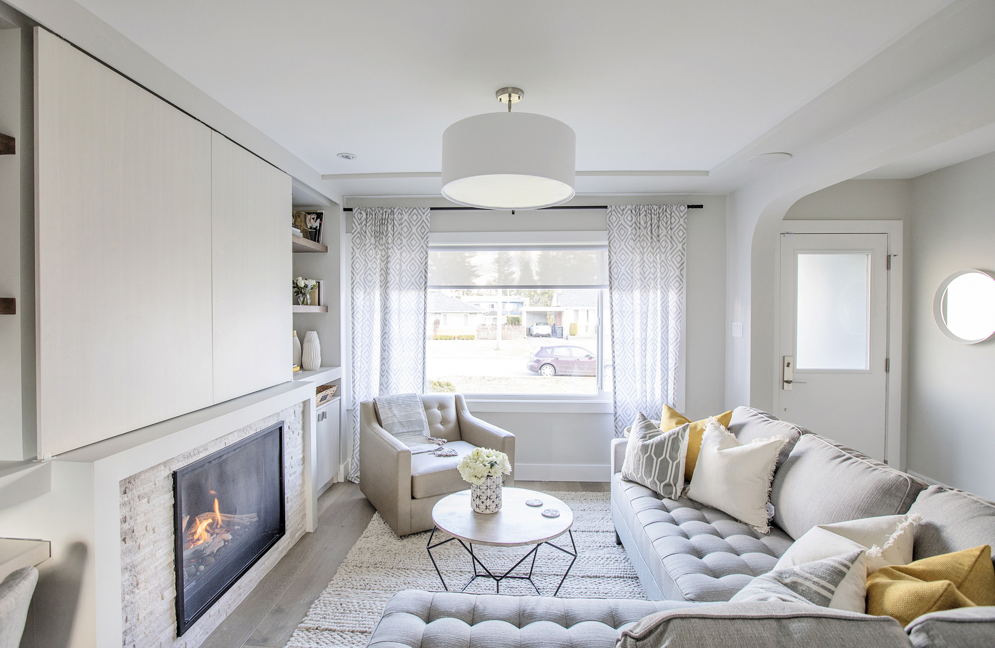
Modern Living Room
Fresh paint and an oversized sectional brighten up the living room, transforming it into a luxurious and contemporary hangout. A matching armchair provides extra seating, while a large picture window allows for plenty of natural light to come through.
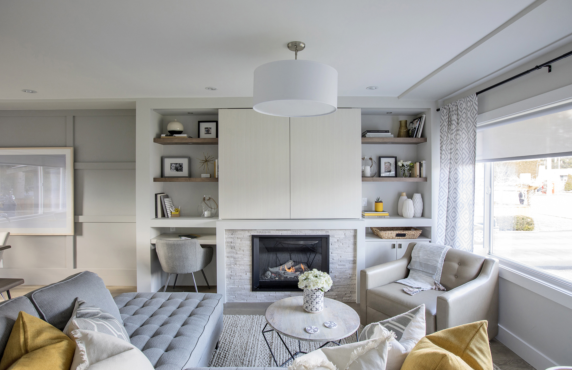
New Fireplace
We love the fireplace’s simple white stone surround, which ties into the rest of the room’s neutral scheme. The two panels above cleverly conceal a flatscreen TV and are flanked by built-in storage units complete with a customized pull-out desk.
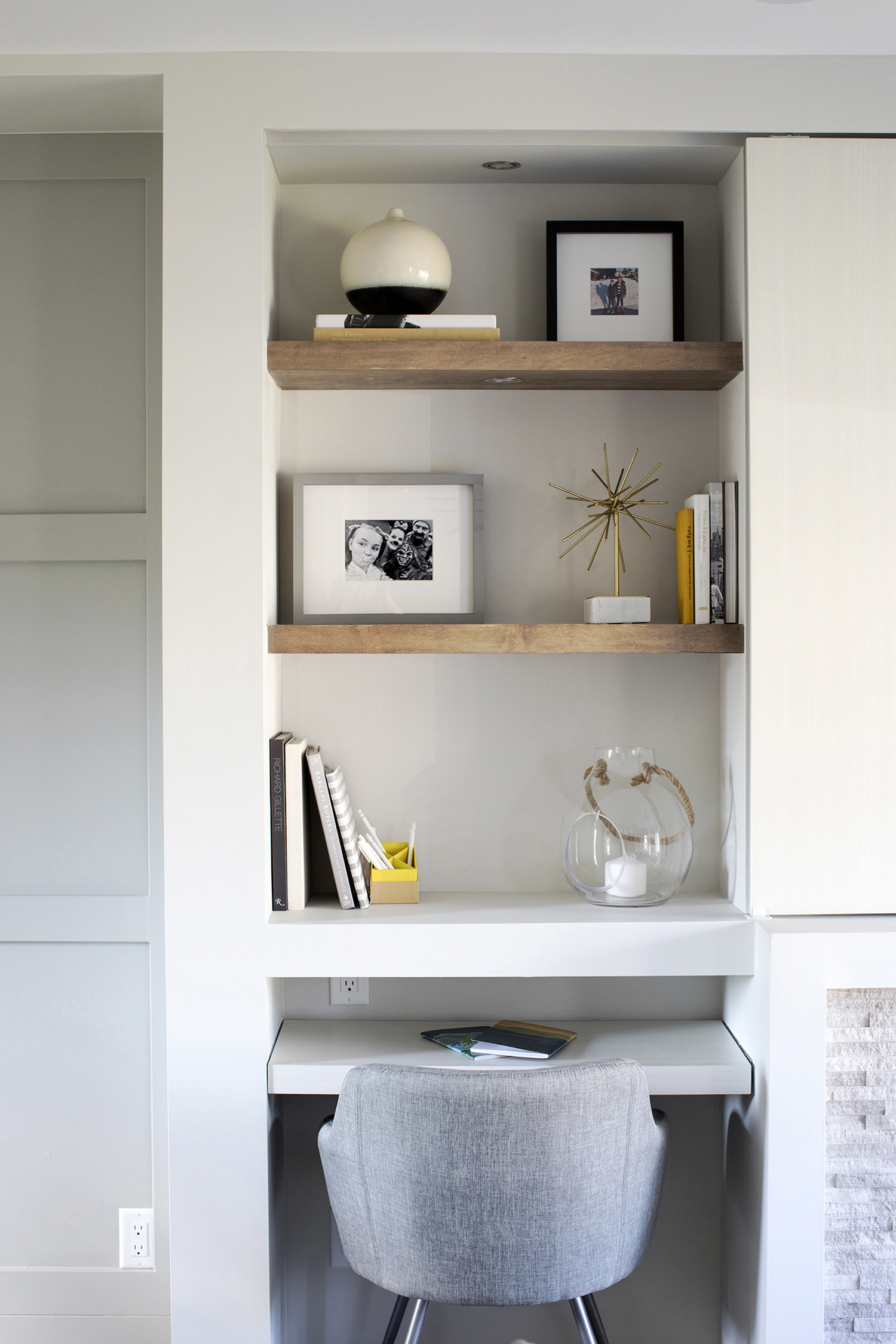
Floating Shelves
These open wood shelves add instant design appeal without taking up much real estate. Now Randi and Neil have bonus space to store their family’s belongings and knickknacks in a thoughtful and artistic way.
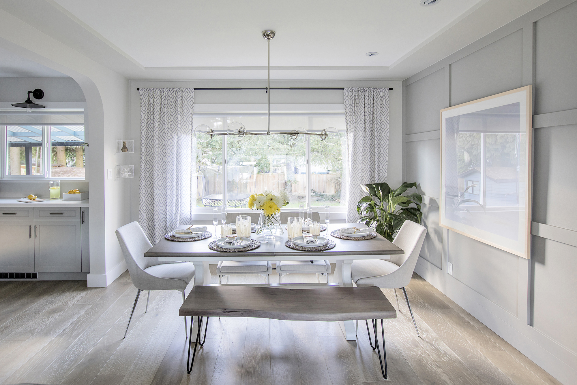
Picture-Perfect Dining
This table, complete with an artful wooden bench, helps to define the open-concept dining room while offering plenty of seating. Now, the family can easily entertain with more than enough room for guests. The pretty wire-brushed flooring throughout allows for an easy flow from one room to the next.
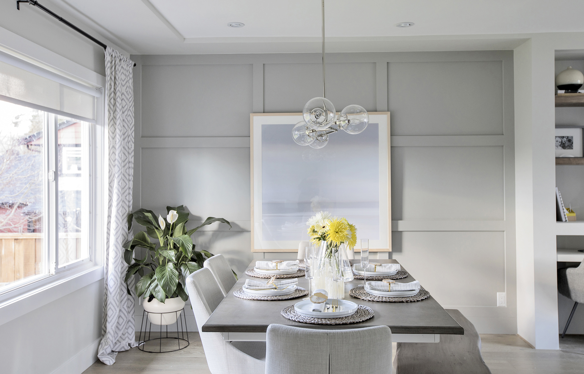
Finishing Details
The design team added decorative trim to the dining room wall, which lends architectural interest and creates an elegant accent wall. The large painting also gives the room a modern gallery-like effect. Meanwhile, another large window maximizes the natural light, with a large potted plant in the corner completing the look.
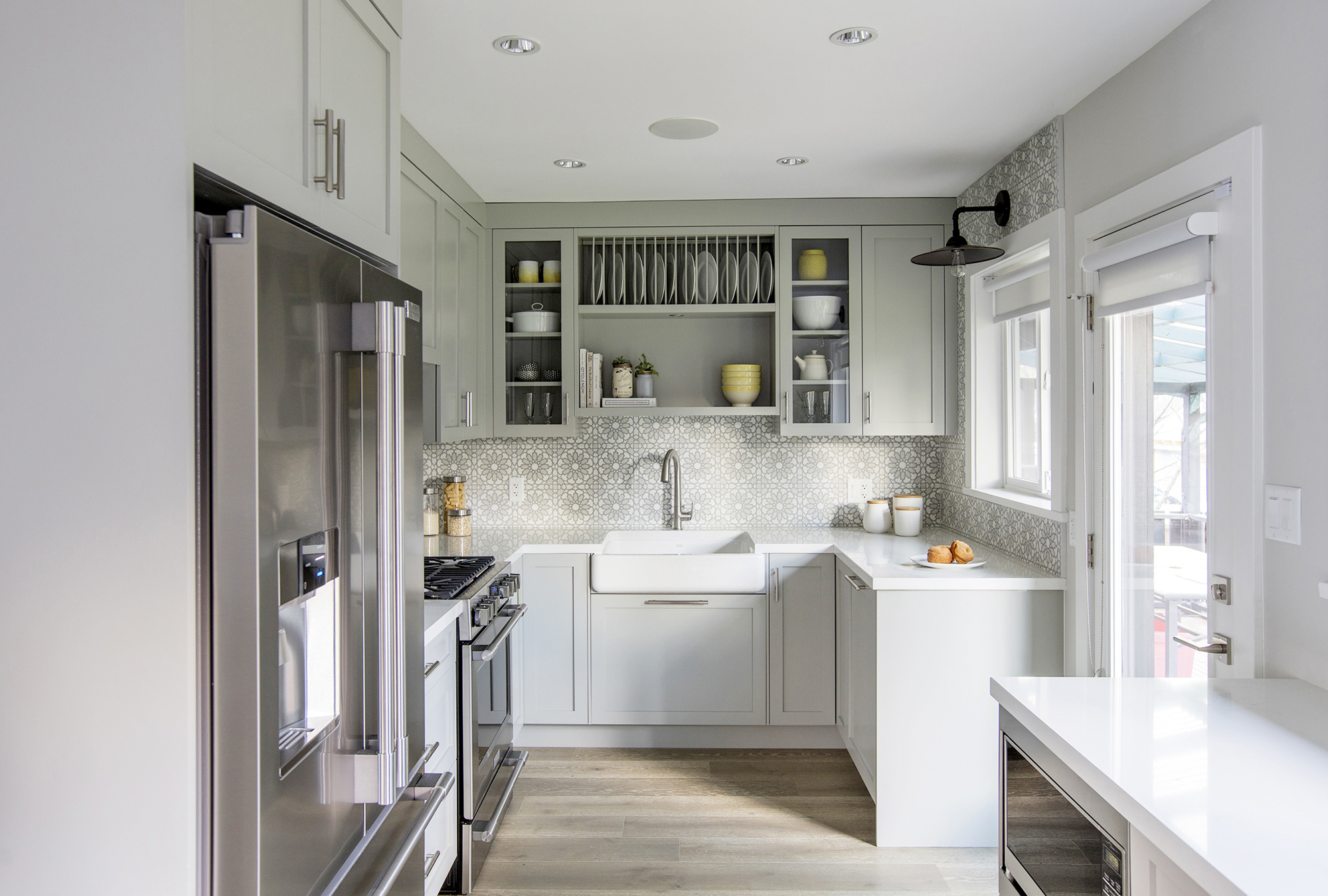
Creative Kitchen
The heart of the house is located off the dining room, where the hardwood flooring continues and bright new countertops and colourful cabinets catch the eye. New stainless-steel appliances and a brilliant walk-out leading to the backyard polish off the space.
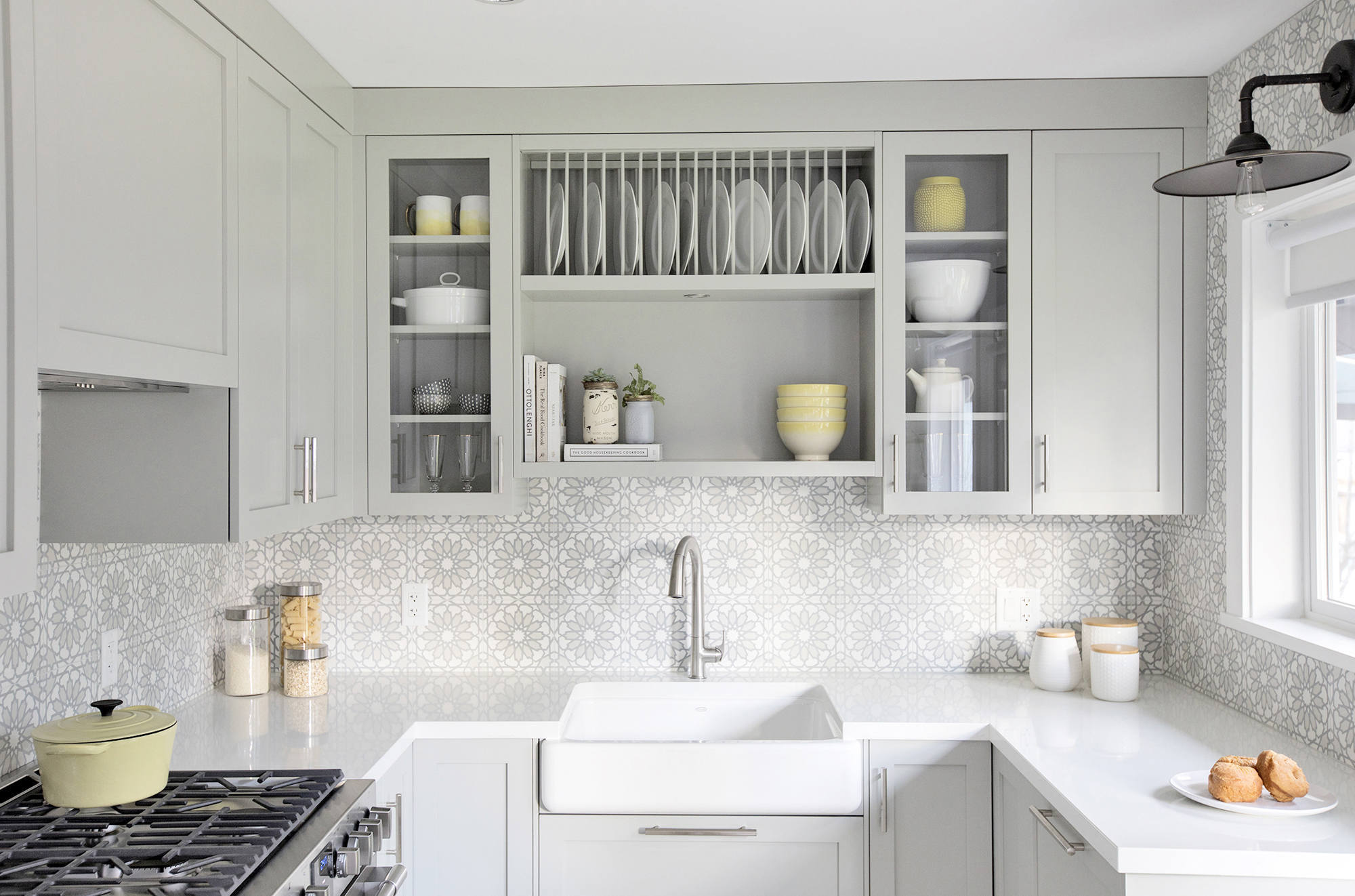
Built-In Organization
The built-in storage unit above the new farmhouse sink adds tons of function and an interesting design element. It’s a great way to separate dishes while also keeping the space from feeling too boxed in with too many solid cabinets.
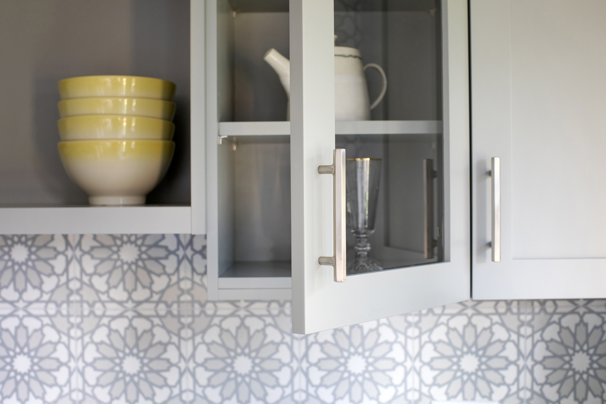
Mix and Match
By alternating between solid and glass doors (as well as open shelves), Jillian added an artistic touch to this kitchen that draws the eye and opens up the space in all the right ways.
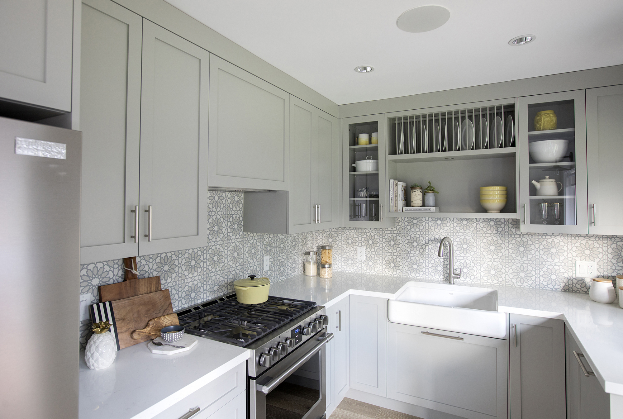
Extended Storage
Jillian extended the cabinets as high as they could go, and while they don’t actually reach the ceiling, you barely notice thanks to the painted trim in the same colour as the doors.
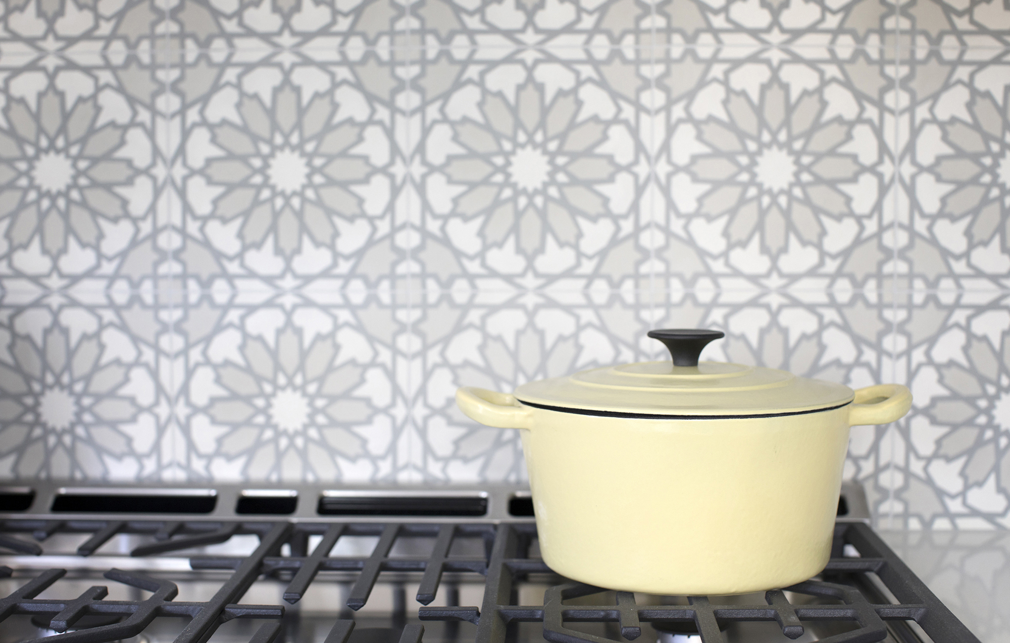
Funky Backsplash
We love the mosaic design of this backsplash, which feels modern and sleek thanks to its neutral palette.
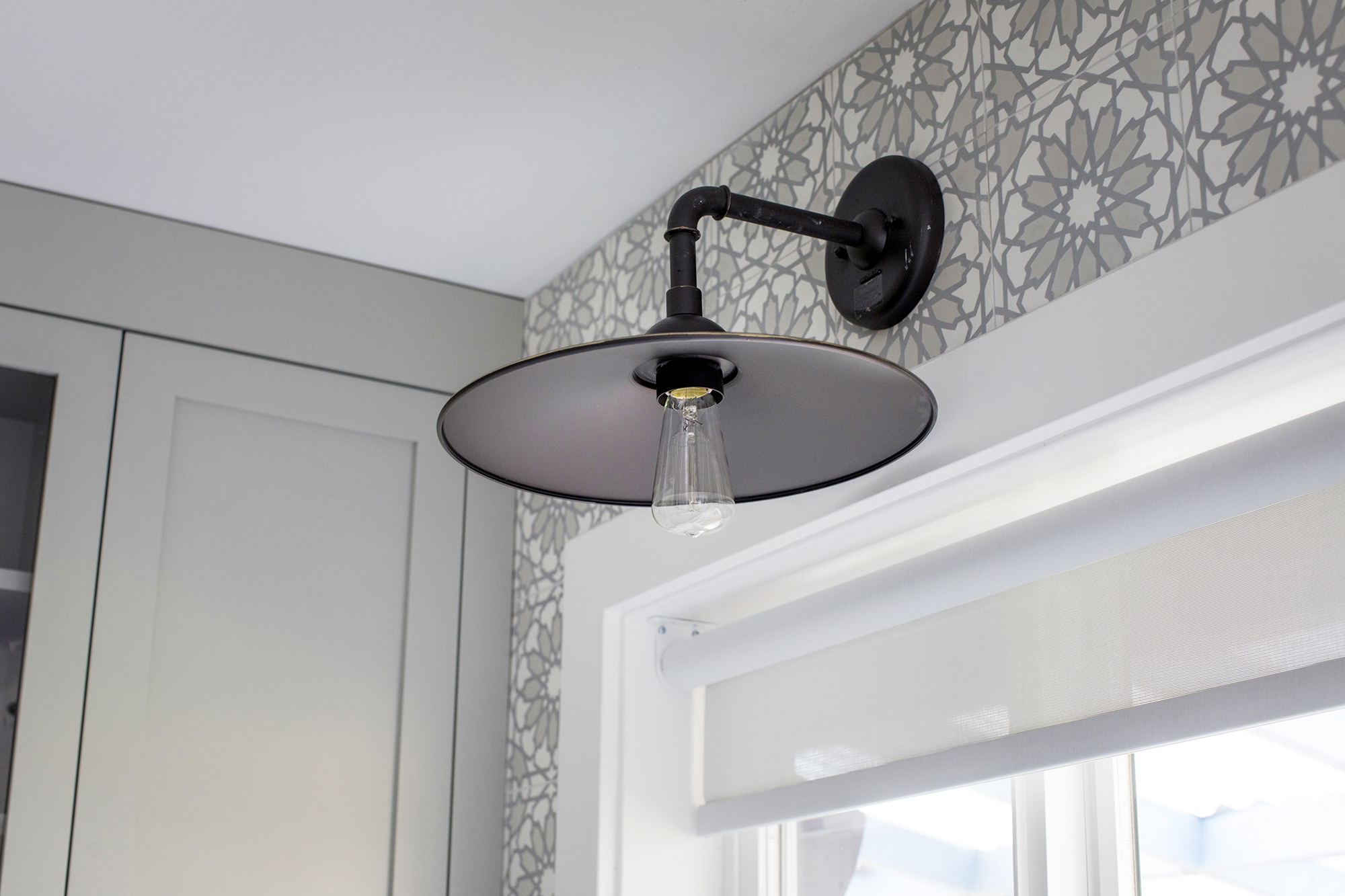
Unique Lighting
We’re never ones to underestimate the power of a statement light fixture – and neither is Jillian. This model adds an industrial, outdoorsy vibe to the kitchen while still keeping with the space’s contemporary aesthetic.
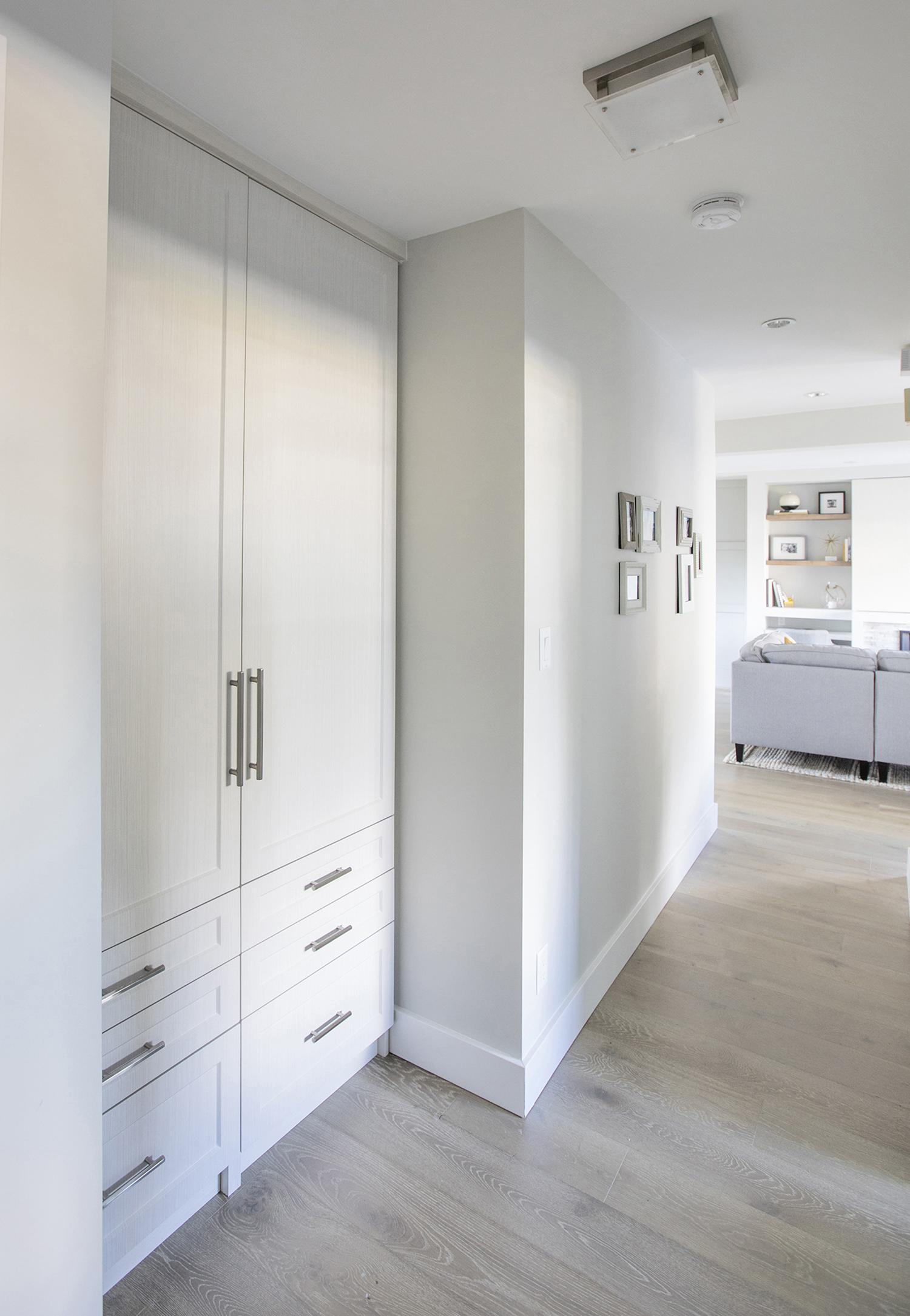
Redesigned Hallway
In order to max out on storage for this family, Jillian repositioned a few closets and added this brilliant customized unit, which takes up zero space yet offers tons of organizing potential.
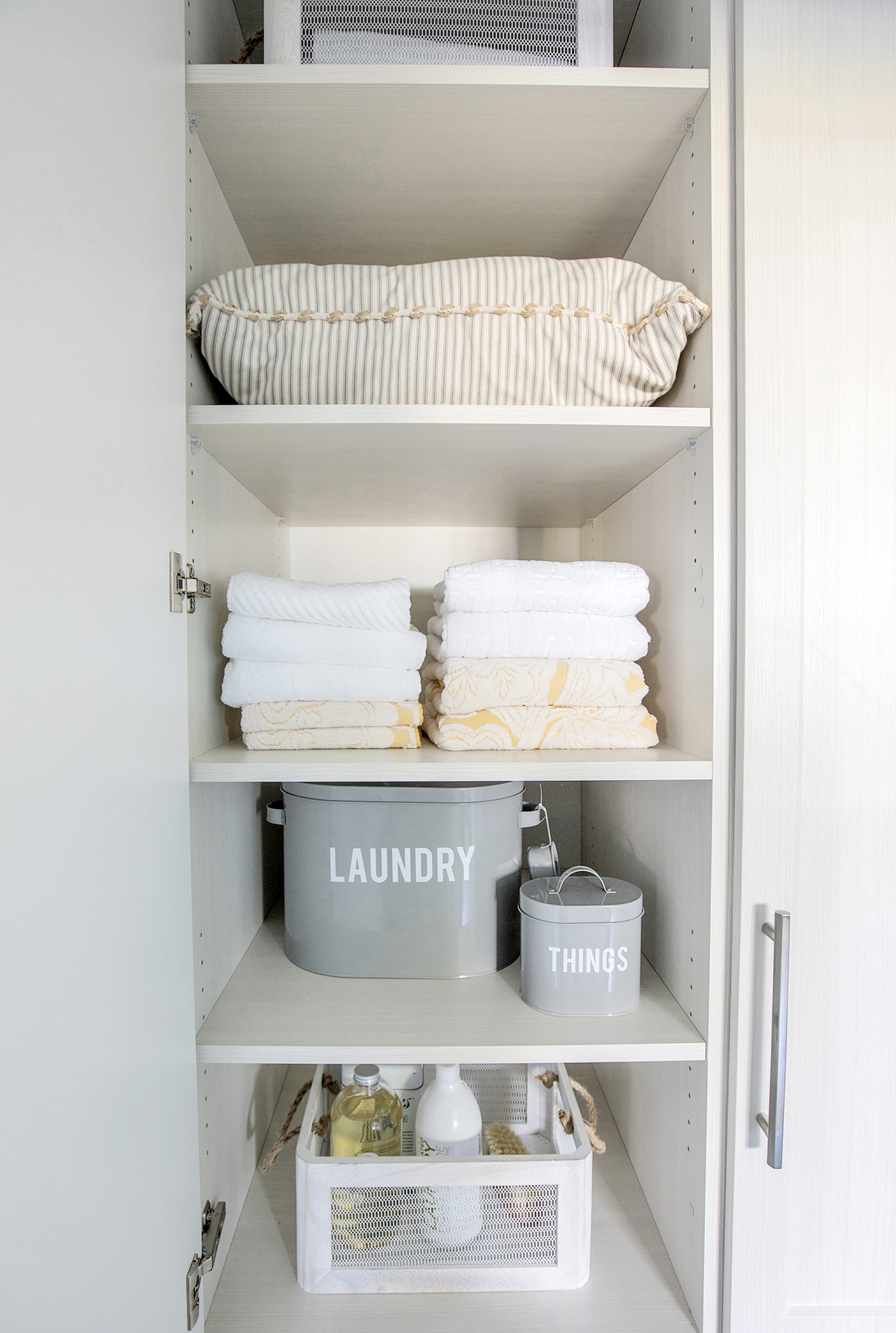
Storage, Storage, Storage
Everything from linens to toiletries and other random items the family might need to tuck away store easily on these oversized shelves, simplifying the family’s everyday lives and creating a little more serenity.
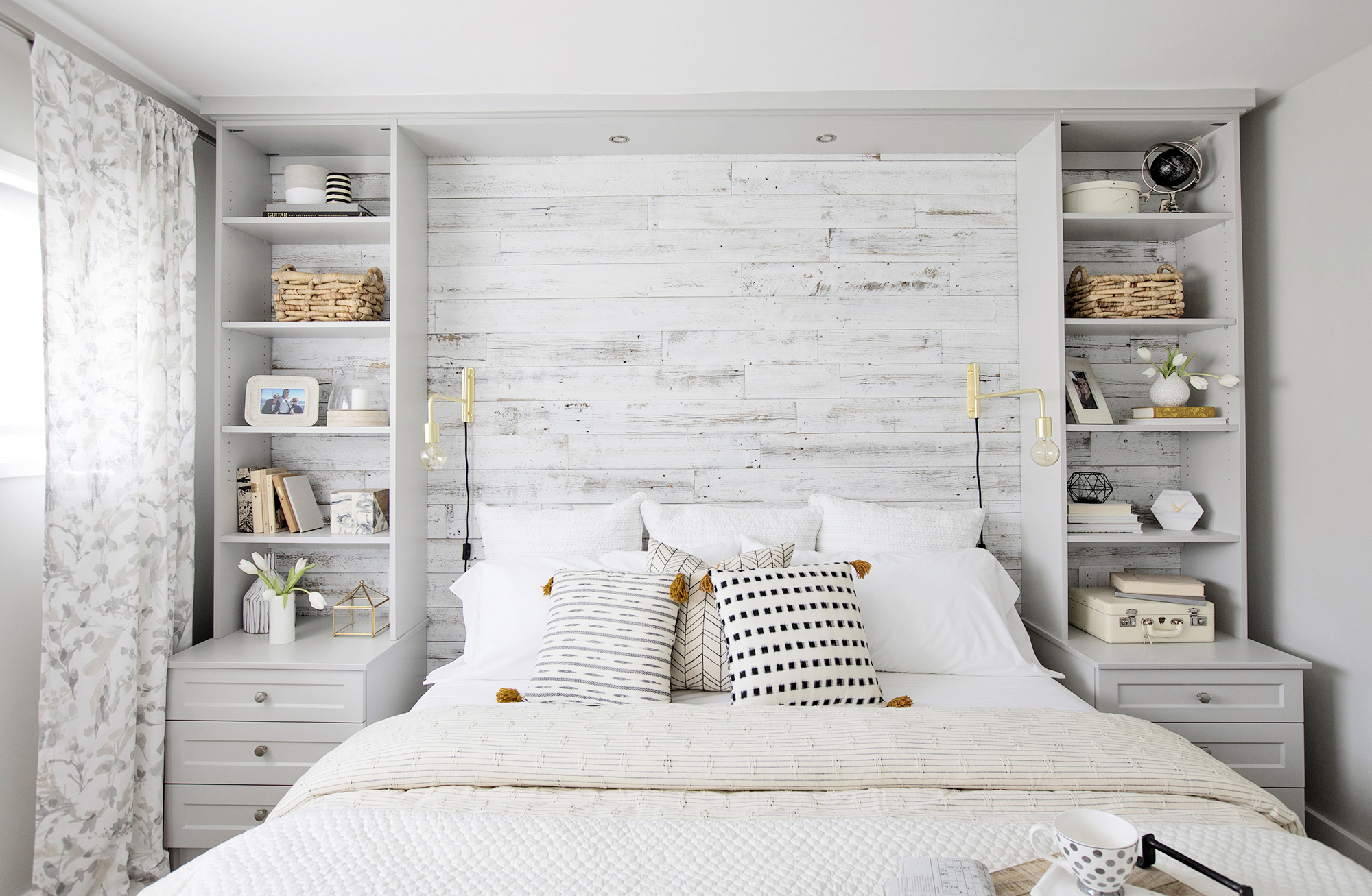
Newly Designed Master
In order to give Randi and Neil a sanctuary away from the chaos of it all, Jillian redesigned this crafty bedroom with a beautiful feature wall made of white-washed barn board.
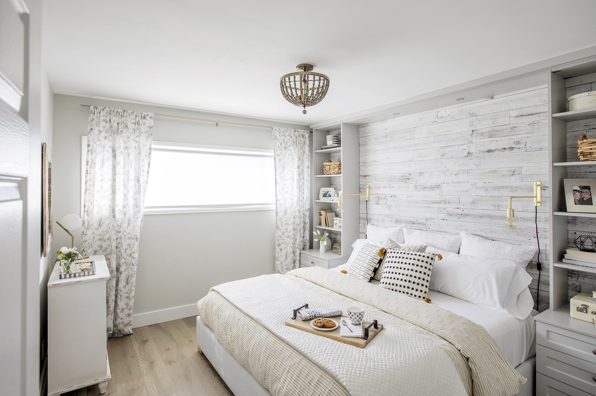
Dreamy Slumbers
Tons of natural light streams through the extended window to play off the creams and whites of the furniture and textiles. And when the sun goes down? The funky gold wall-mounted reading lamps do the trick.
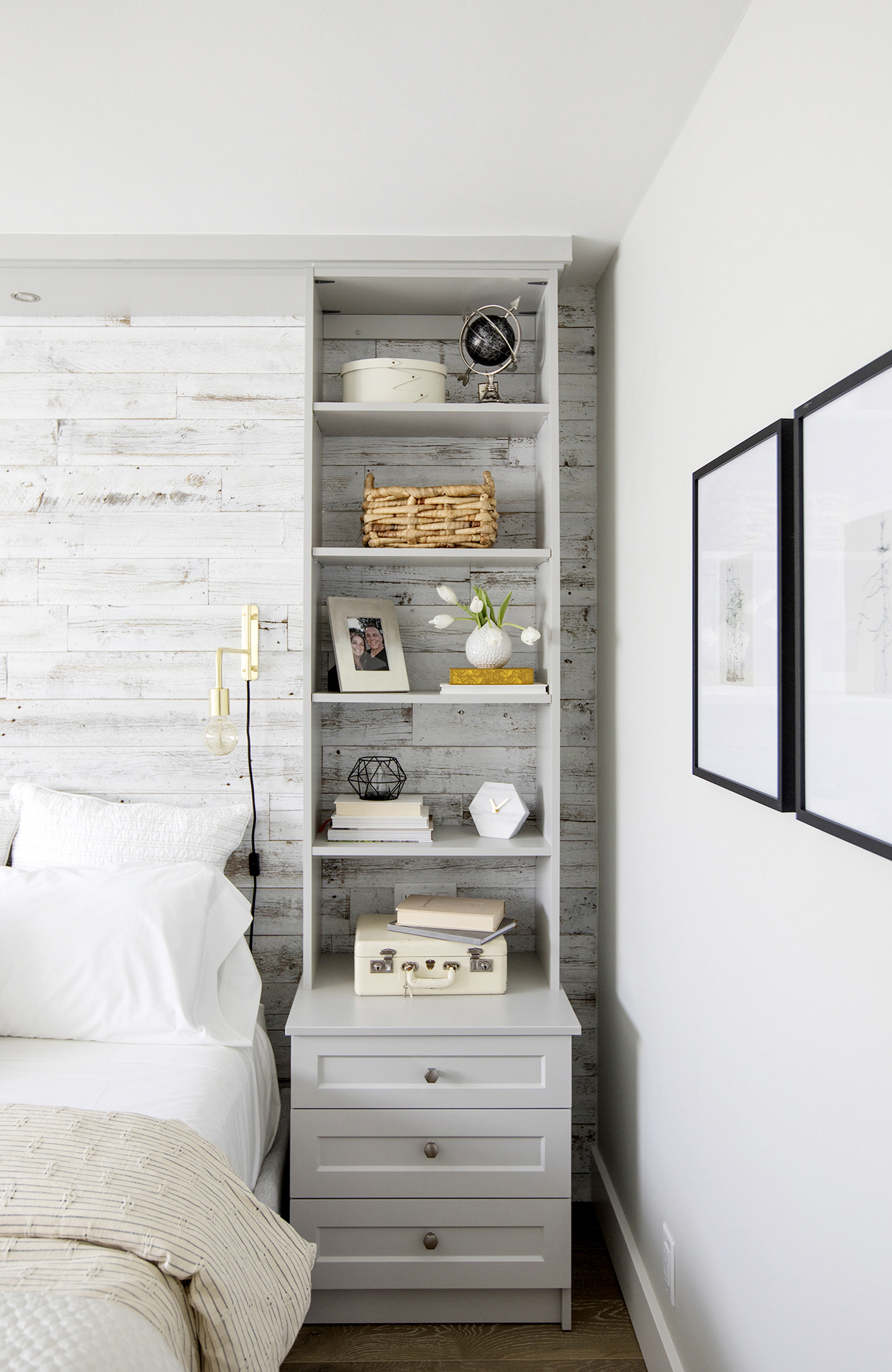
Extra Storage
Jillian opted for a whole lot more than standard night tables. The designer cleverly extended the look all the way to the ceiling by attaching custom built-in open shelves that seamlessly flow into the design of the feature wall.
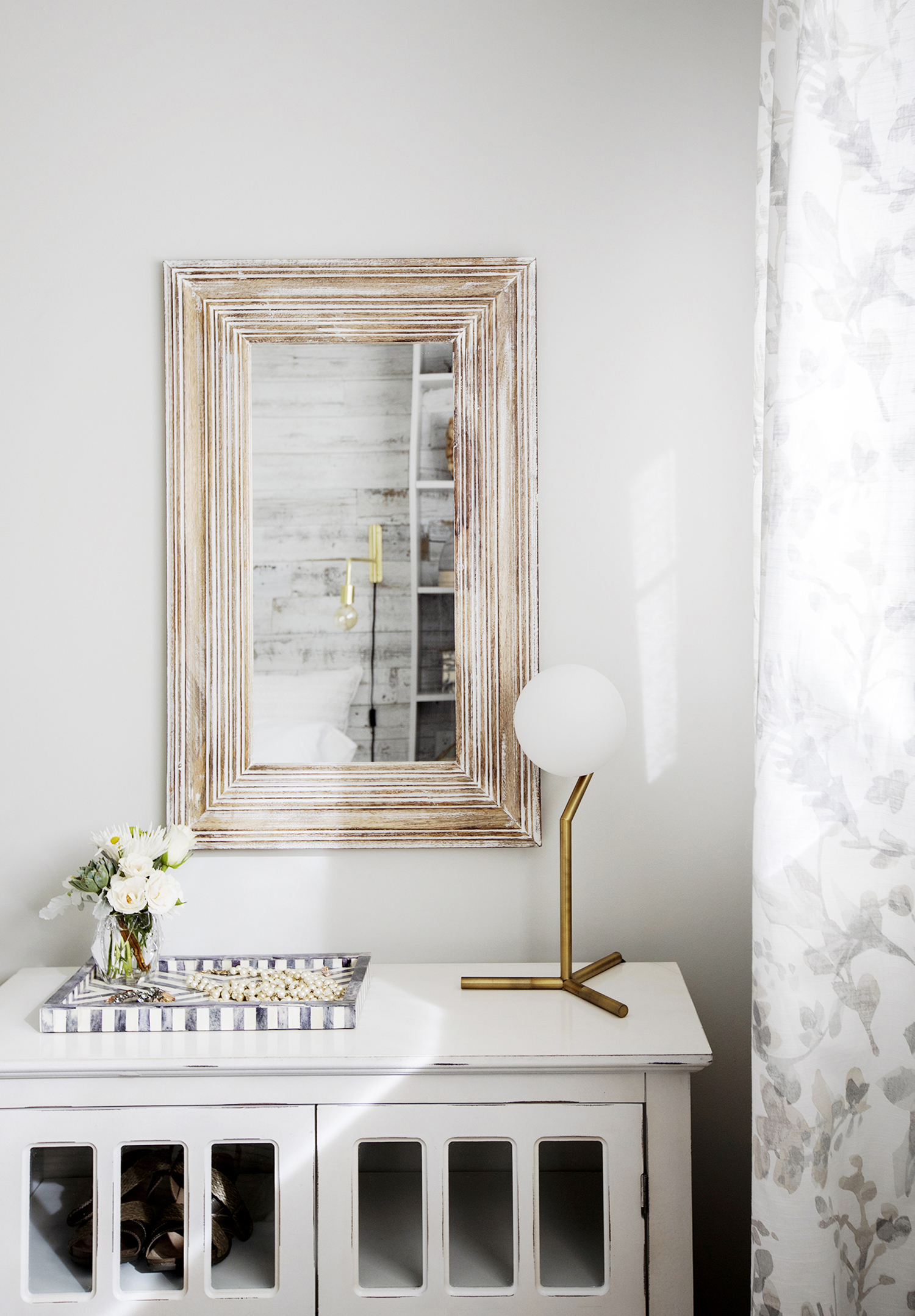
Dressing Table
A small gold mirror hung above a pretty timeworn hutch serves as a dressing table for Randi, with a contemporary lamp and interesting tray adding tons of design appeal to the overall look.
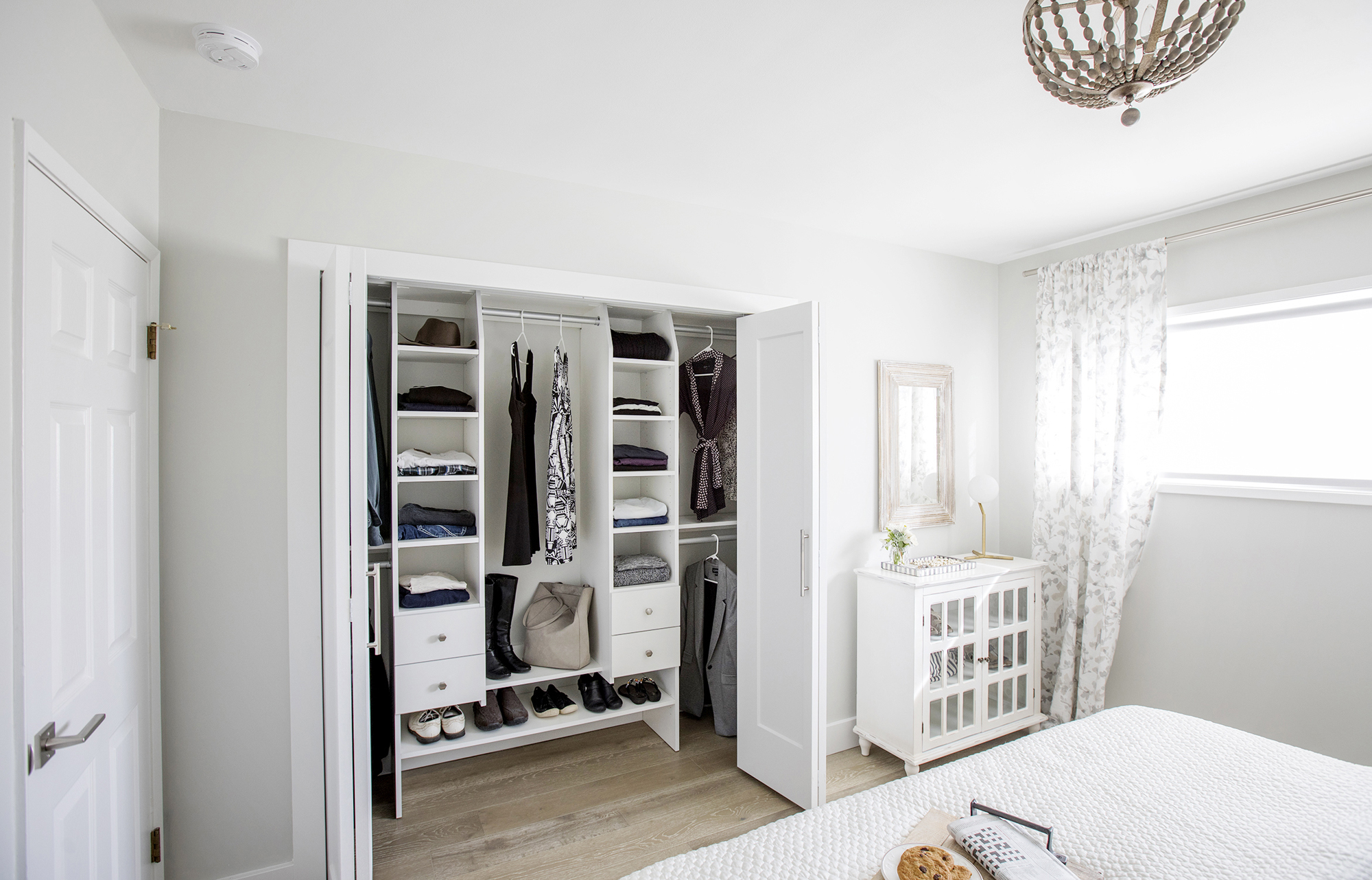
Organized Living
Jillian even added extra organizing solutions to the couple’s closet. While Randi and Neil did decide to list their home in the end to gain more space (and another bathroom!), we’re sure this house won’t be on the market for long. It is, after all, the perfect place to conquer clutter once and for all.
HGTV your inbox.
By clicking "SIGN UP” you agree to receive emails from HGTV and accept Corus' Terms of Use and Corus' Privacy Policy.


