If you think beach houses should be simple and white, this robustly elegant but super comfortable Naples, Florida residence will make you think again. Masterminded by Toronto designer Jeffrey Fisher, the 4,500-square-foot new-build is a paean to the power of fabric and colour, something the homeowners craved. “The clients’ Toronto home is more formal, so they wanted this getaway to feel relaxed but still special and, at all costs, avoid a showroom look.” In the end, Jeffrey stayed true (north) to the owners’ design vision and, like any good Canadian, introduced some patriotic artwork.

Make an Entrance
The new-build home looks like it’s always been there thanks to landscaping that features a variety of lush greenery and a smart mix of lighting styles, from pathway spots to sconces and overhead options.
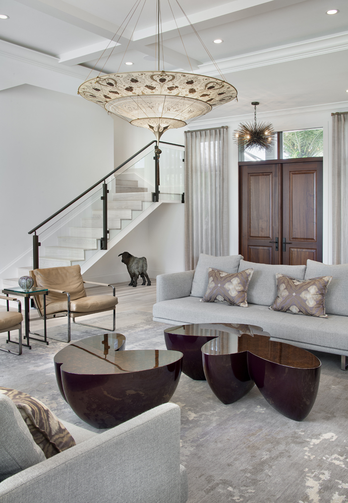
Good Fortune
The living room eschews obvious bells and whistles in favour of chic statement pieces like a Fortuny pendant lamp, sculptural pod-style coffee tables and streamlined Knoll sofas. The low-slung leather chairs, once used in the owners’ old office headquarters, layer in a personal touch.

True Patriot Love
If you’re like us, your eye is immediately drawn to the Canadian flag painting by Toronto artist Charles Pachter. It’s a nod to the owners’ birthplace and a graphic element amongst the serene living room. Jeffrey credits its sophisticated yet inviting look in part to the furniture. “It’s visually interesting and actually comfortable.”
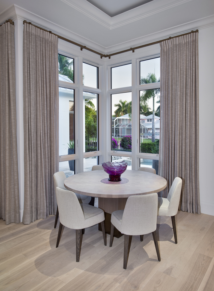
Well Rounded
In the open floor plan’s dining area, designer Jeffrey Fisher nixed an expected rectangular table in favour of a round style. “It tucks nicely in the corner so there’s no clutter and it offers a view to the pool.” It also suits the owners’ lifestyle. “They’re more likely to have guests for cocktails and then dine out.”

Going Grey
The all-white kitchen is punctuated with a grey-based island that’s a whopping 11 x 5 feet. “I like how the grey grounds the kitchen and references the colour of the home’s interior doors.” Staggered chandeliers illuminate the island’s expansive white marble top.
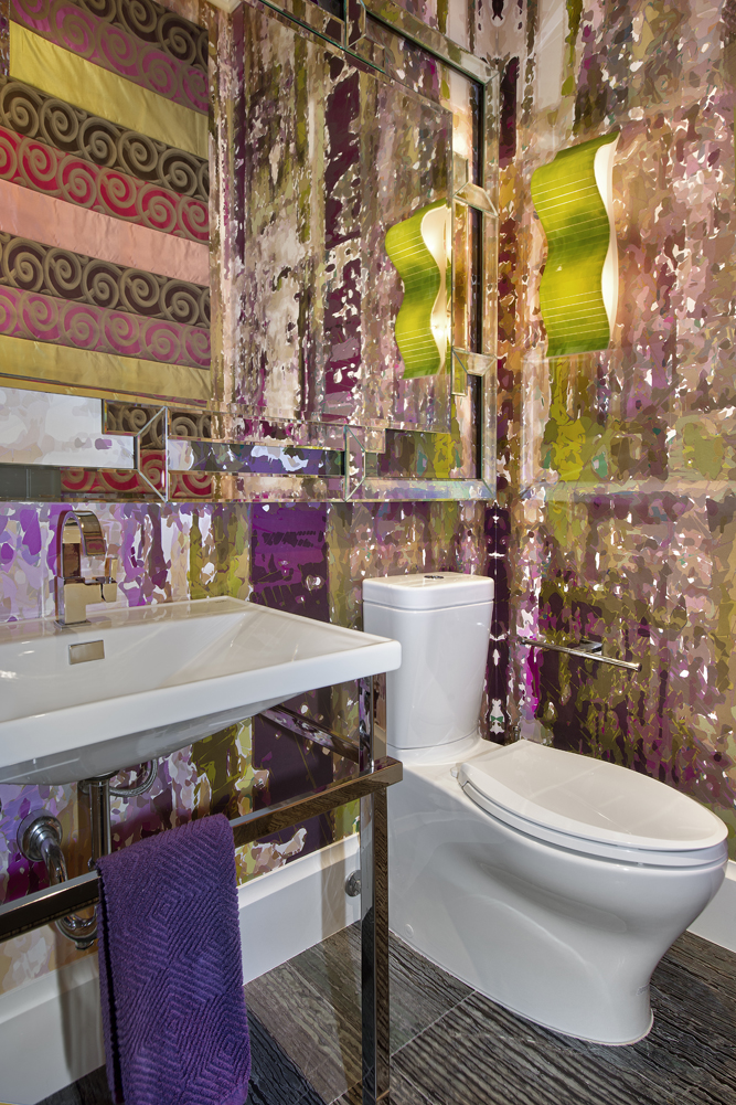
Artistic License
“I like a powder room to make a strong statement and this one does just that,” says Jeffrey. The show-stopping Yo Yo Designs wallpaper is a visual delight that’s accented by the curvy acid-green sconce and perfectly purple hand towel.
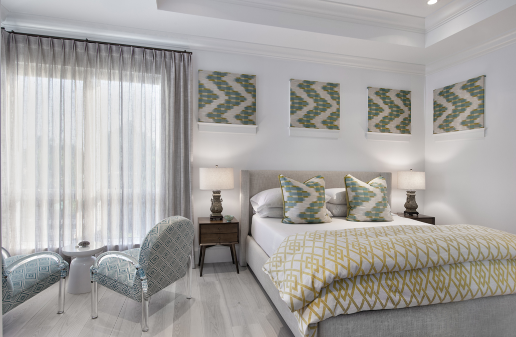
Window Display
The windows above the bed in this guest room presented a design challenge. “I was dead set against white blinds or shutters,” says Jeffrey. “So I invented ‘window lids’: squares of fabric upholstered onto MDF boards and held in place atop the window casings with Velcro.” They create visual interest and can be easily removed as desired.
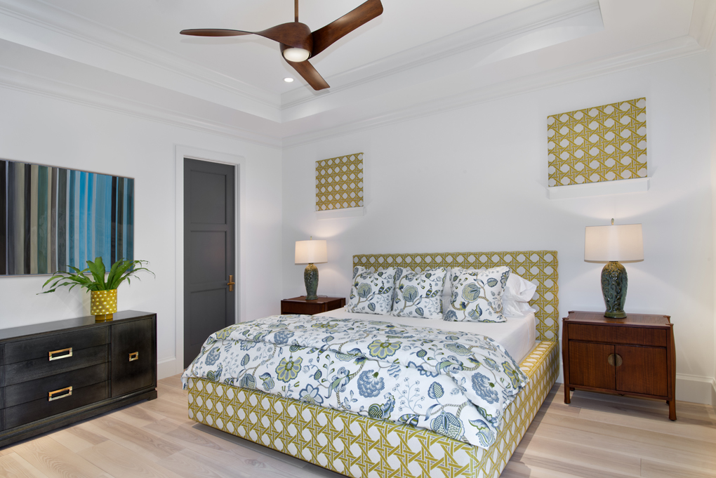
Beachy Keen
“The cane-print fabric in this guest room recalls Palm Beach, rattan furniture and Old Florida decor,” says Jeffrey. Its whimsy is grounded by the grey-stained vintage dresser (picked up in Toronto) and new nightstands. The door, like all of the home’s interior doors, is painted in Benjamin Moore’s Iron Mountain.
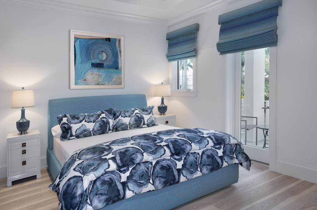
Blue Mood
Blue, one of the designer’s favourite hues, is layered in this guest room in varying tones and fabrications. The custom-made bed is upholstered in vinyl raffia and the duvet cover is a homegrown score. “I had trouble finding a fabric I liked, until one day I was at Hudson’s Bay and spied this bold and ready-made duvet cover.”
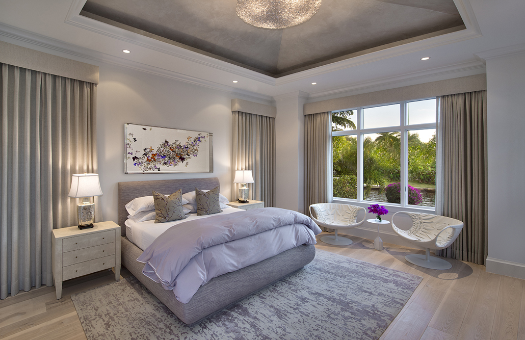
Suite Retreat
Jeffrey’s eye for detail is evident in the master bedroom’s vaulted ceiling. “I had a lavender-grey finish applied to it, then capped it off with an exquisite chandelier.” The eye candy continues below where Jeffrey commissioned artwork of hand-painted, feather butterflies by Juan Carlos Collada and added sculptural leather swivel chairs.
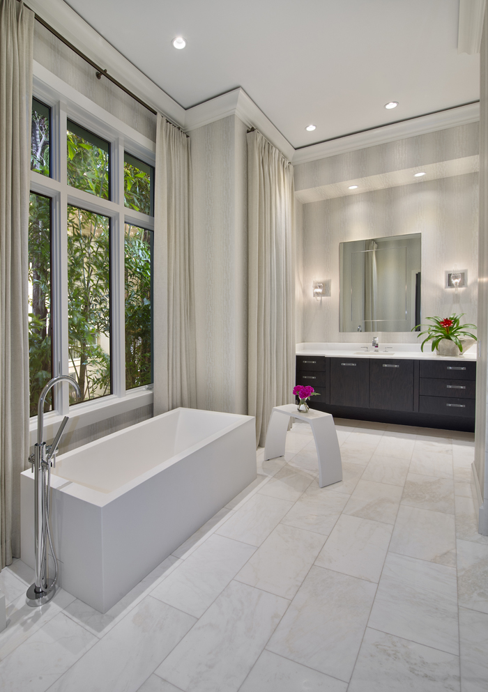
Master Class
The pale master bathroom is enlivened with a custom dark-wood vanity. The room’s straight lines, from the stunning contemporary vessel tub to the marble-tiled floor, are tempered by the soft folds of the drapery, an unexpected but sophisticated (and practical) choice here.
Study in Fabric
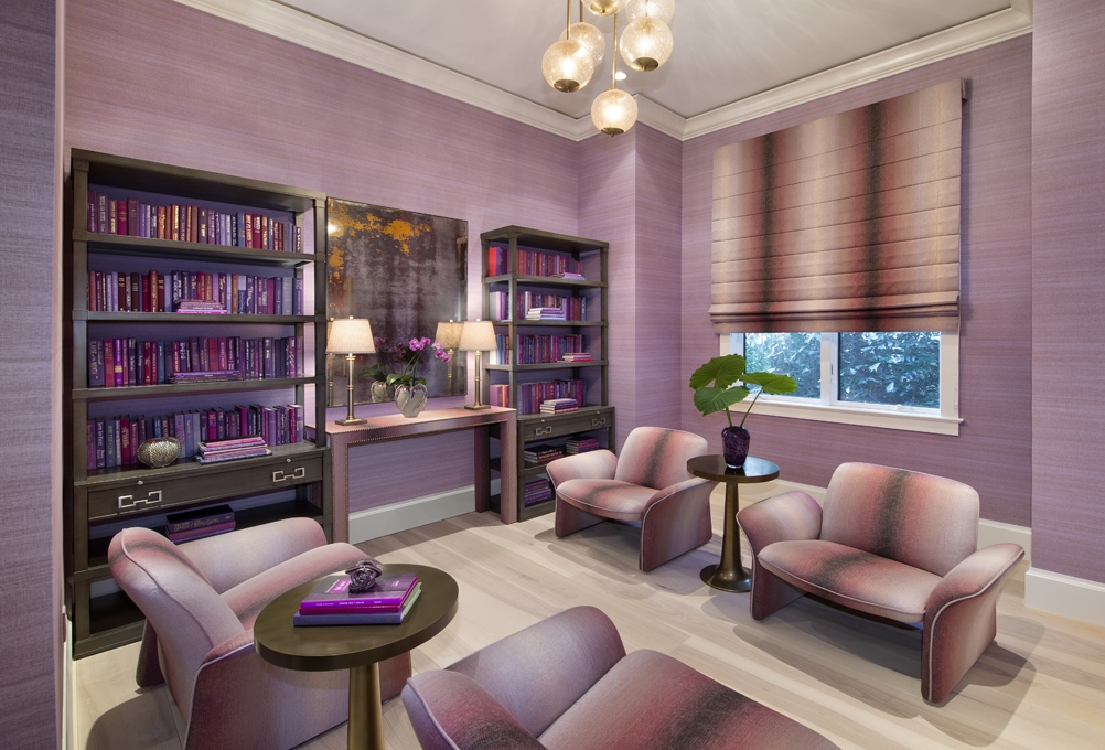
The study is a glorious departure from utilitarian. “I wanted a room with monotone colours, and I love ombre fabrics.” The same fabric on the chairs and shade feels bold and fresh. Jeffrey focused on comfy and stylish seating (there’s no desk or office chair in sight) knowing that laptops and small devices are the new way to work.

Purple Reigns
Even the books in the study prescribe to Jeffrey’s penchant for purple monotones. The repetition of one colour, in varying shades, has a luxurious layered effect, while the symmetry of the shelves, lamps and chairs are in keeping with an orderly work space.
Boutique Chic
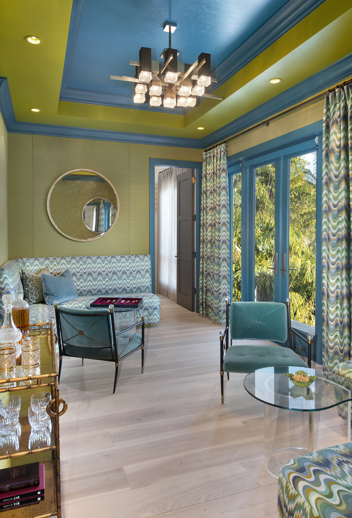
Jeffrey reimagined a simple second-floor room as a powerhouse of colour and pattern. “I created a lounge inspired by boutique hotels in London,” he says. Patterned Jonathan Adler fabric (on the banquette and drapes) is complemented by chartreuse fabric-lined walls and an extravagant ceiling. “Plain white just wouldn’t do here.”
Mosaic Marvel
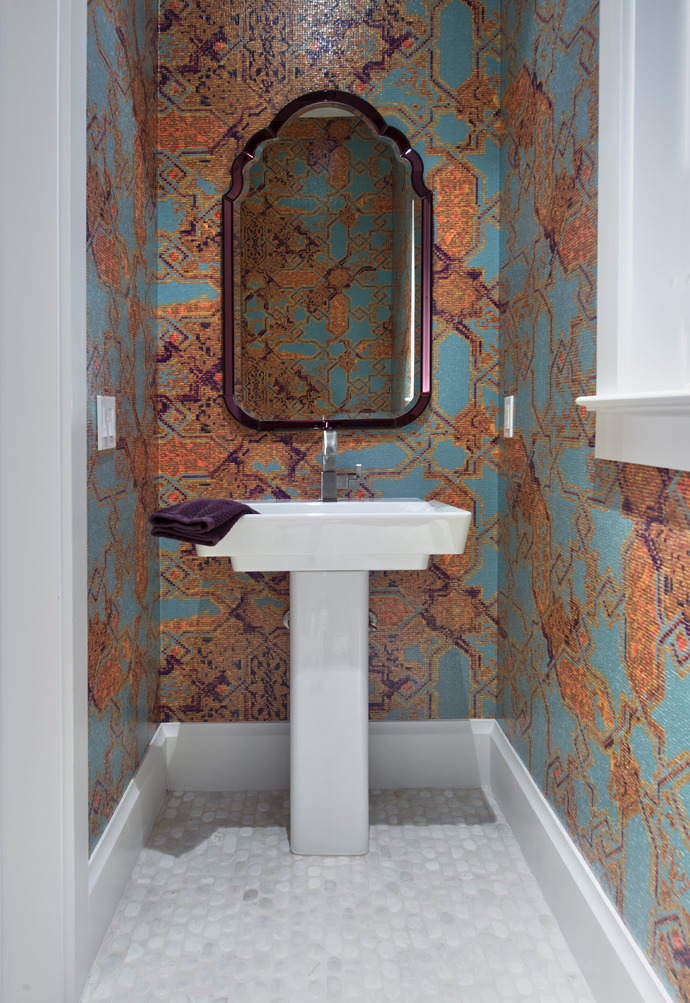
While the pool powder room walls look like tiled works of art that could be found in a souk, they’re actually wallpapered with a vinyl covering by Elitis. The pebbled marble floor is a groovy foil to the mosaic effect of the walls.
Inside Out
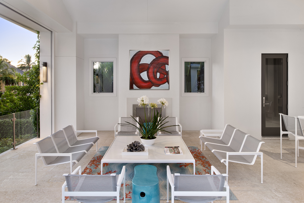
Though sleek in silhouette, this outdoor Knoll furniture is heavy duty. “It seems slight but it fits all body types and because this space isn’t large, I didn’t want bulky furniture with cushions,” says Jeffrey. “By keeping it streamlined, we’ve managed to accommodate 10 bums when the house is full.”
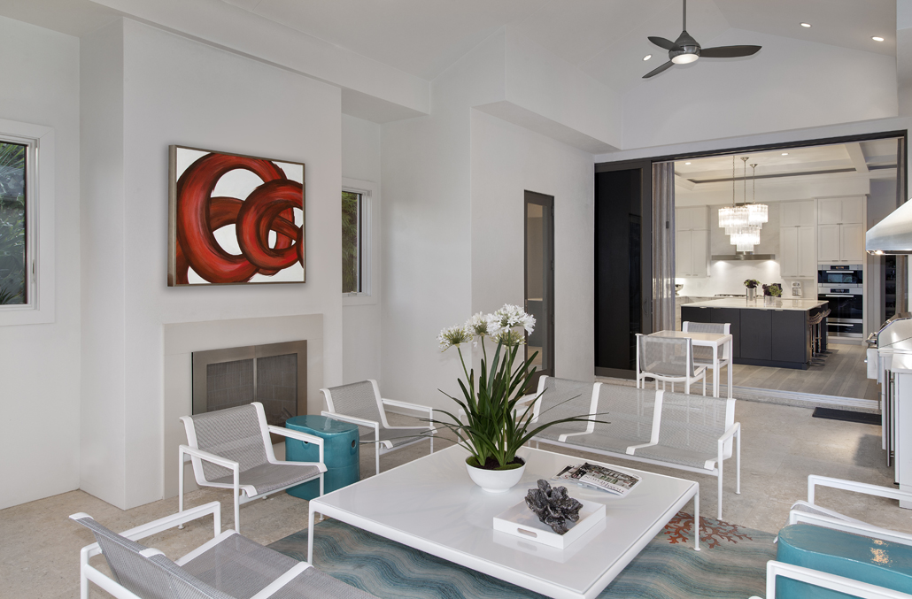
The Great Outdoors
The covered outdoor seating area is the preferred perch for viewing the nearby canal and watching dolphins fish for their lunch. “It’s common to have an outdoor fireplace in any Naples new-build,” says Jeffrey, who made this area anything but common with contemporary furniture and bold abstract art.
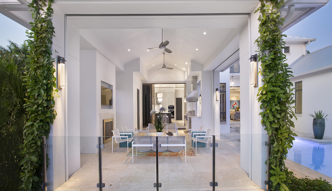
Room with a View
Glass panels blur the line between indoors and out and keep sightlines unimpeded. Simple ivy boughs flank the space and add just the right amount of greenery.
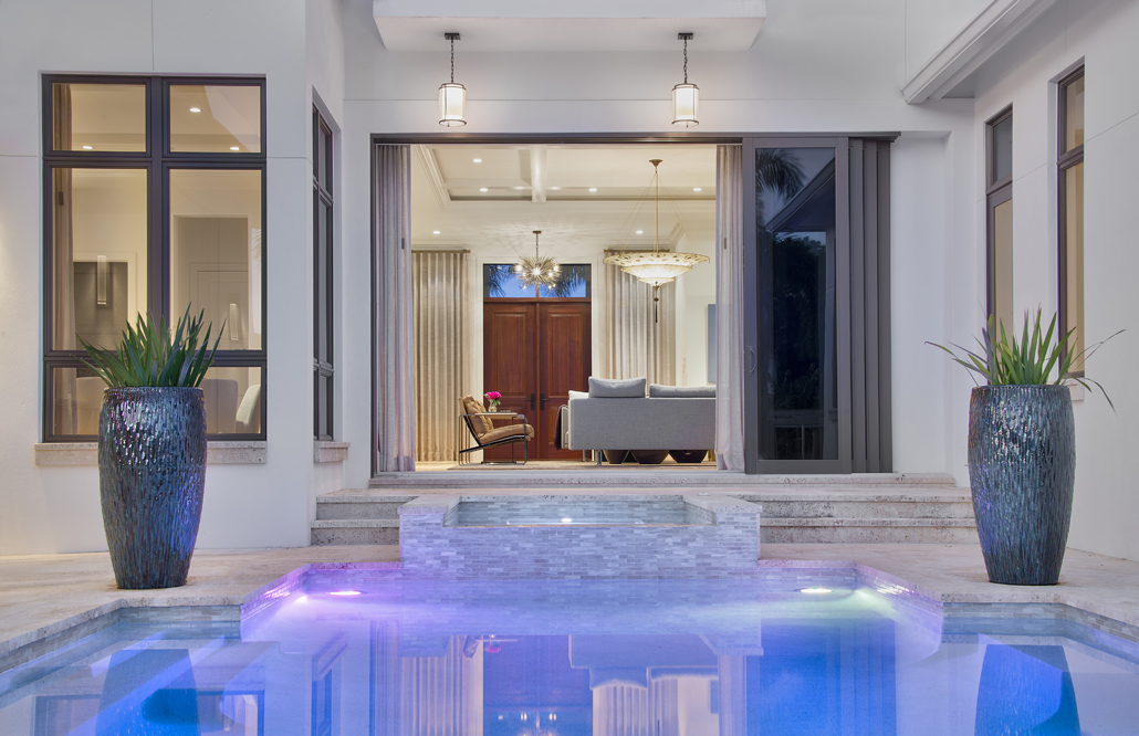
Splash Out
Well-placed lighting (up above and under water) ensure the pool is part of the sightline from the entryway and living room. Simple planters filled with grass demarcate the deck area without detracting from the watery focal point.

Centre Court
From this angle, the home’s capacity for entertaining is in full view. “My clients wanted a home that was relaxed and welcoming. They’re very social and love entertaining.” The exterior’s pale finish and clean lines make the pool and interior rooms that much more inviting.

Take a Seat
Since the pool acts as the courtyard of the home, it was important to ensure the space around it was maximized. The landscaped platforms flanking the top of the pool provide the perfect place for loungers and a bit of privacy from the front of the home.
HGTV your inbox.
By clicking "SIGN UP” you agree to receive emails from HGTV and accept Corus' Terms of Use and Corus' Privacy Policy.


