Samantha Pynn helps sellers Kelly and Frank transform their mismatched, dark dining room and overly blue kitchen into a bright and airy space (perfect for any family!) before the couple’s next open house.
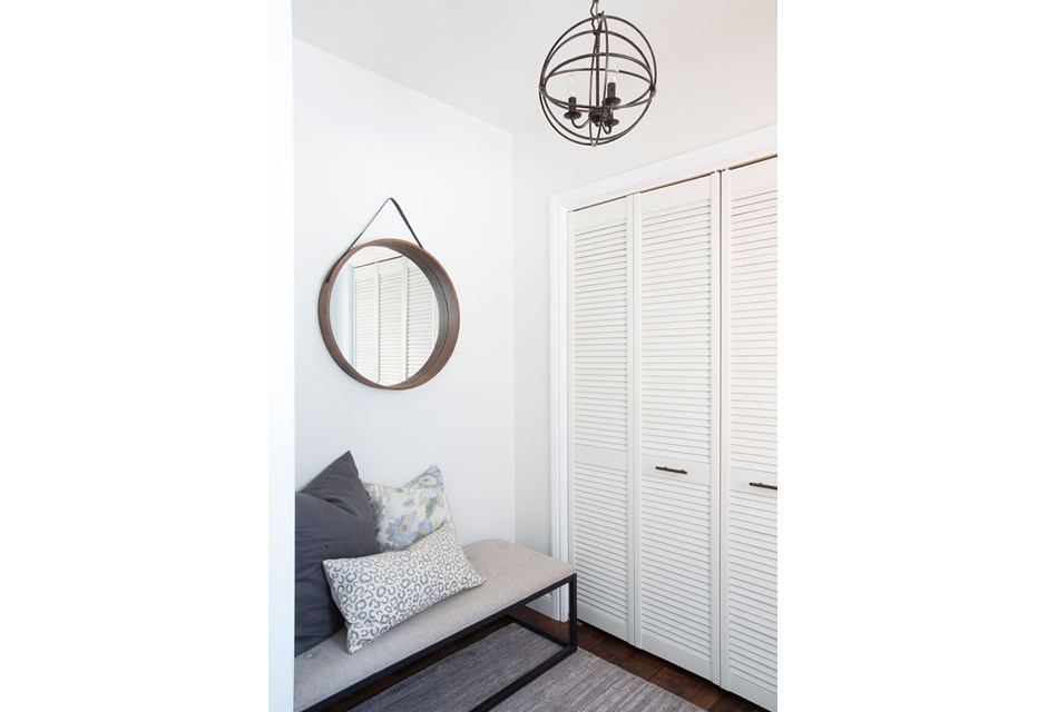
A Bright New Foyer
The foyer is the first thing prospective homebuyers will see. It should be clean, bright and welcoming (hence the fresh coat of paint!) with small personal touches (like the mismatched throw pillows on the inviting bench). An artful mirror and chandelier add modern appeal.
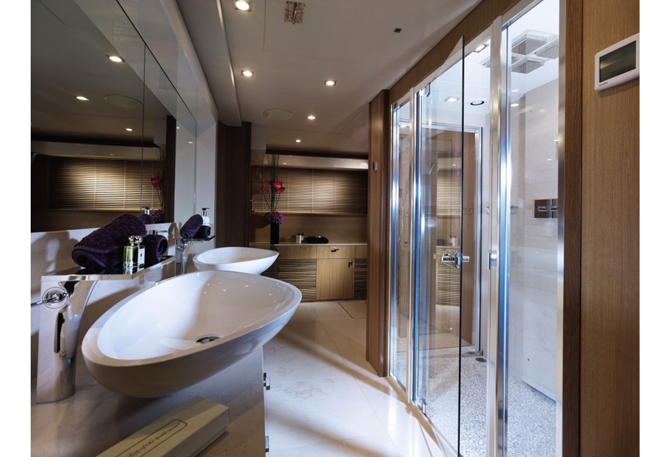
Opt for a White Bathroom
When it comes to bathrooms, white reigns supreme. With these clean lines, built-in hand towel racks and small finishing touches like the flowers and soaps, any potential buyer will see a finished room they won’t have to touch.
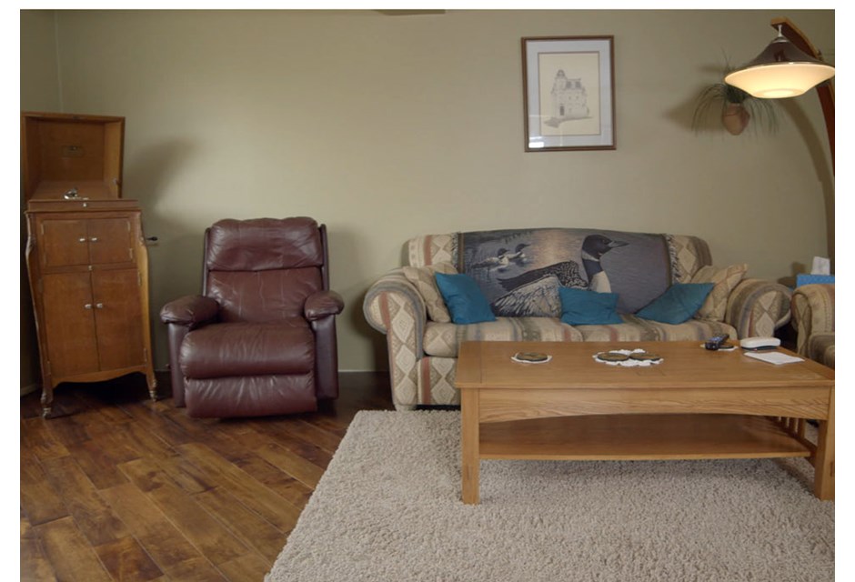
Mismatched Dreams
Frank’s penchant for mismatched furniture meant Kelly had to decorate around several random pieces. The result? A cluttered, haphazard room that comes across as dark and uninviting.
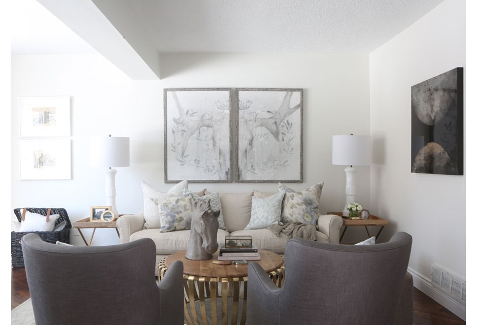
Open Up the Possibilities
Afterwards, with the softest coat of grey and a few neutral pieces, suddenly prospective buyers can seem themselves living in this space and will begin to envision how they’d set up their own pieces.
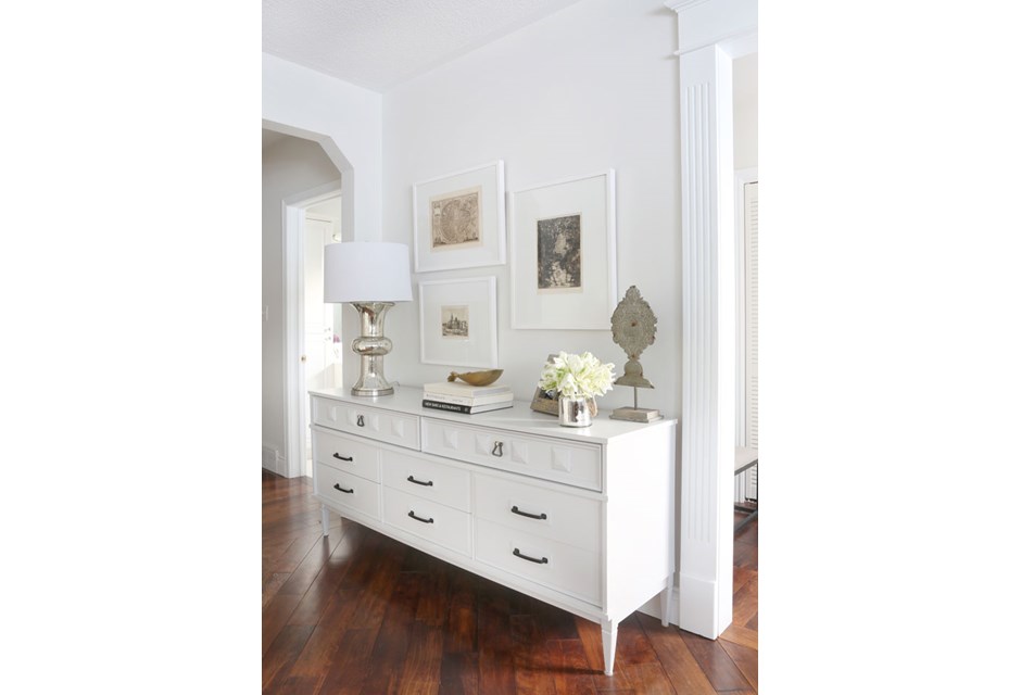
Use That Random Wall
Make the most out of a random wall with a hutch or dresser that doubles as storage. With a few small personal elements on top to round it all out, this inspires a space that can be lived in, but still pretty.
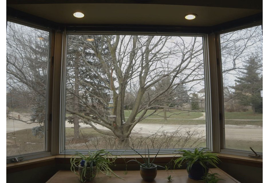
Know Your Selling Points
Before the overhaul, this beautiful bay window was just screaming for a treatment.
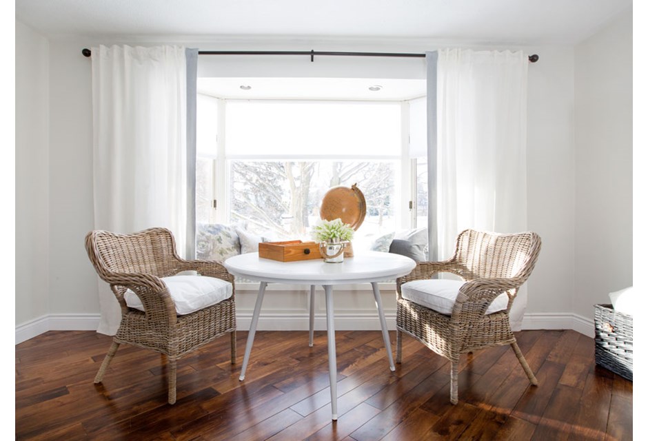
And Be Sure to Use Them
Afterwards, with some bright new curtains and a built-in bench, a bay window because the room’s talking point. Adding a small table and chairs not only allows for more people watching, but it opens up the spot for an impromptu games night or two.
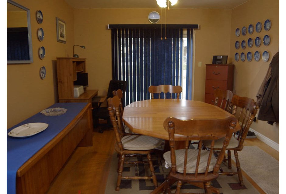
Dining in the Dark
Dark wood, yellow walls and blue trim made this sallow space feel more like a cross between an office boardroom and a cottage than the family’s dining room — where real memories are made.
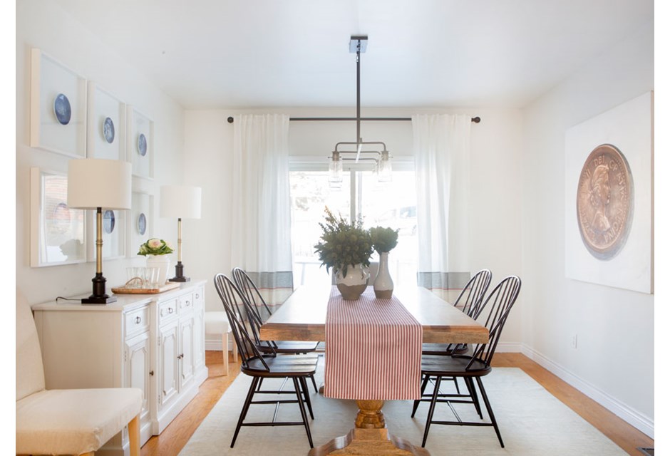
White and Bright
Afterwards? A bright coat of paint, new curtains and a large table open up the room while showing potential buyers that tons of people can fit around the table for all of those good memories to come.
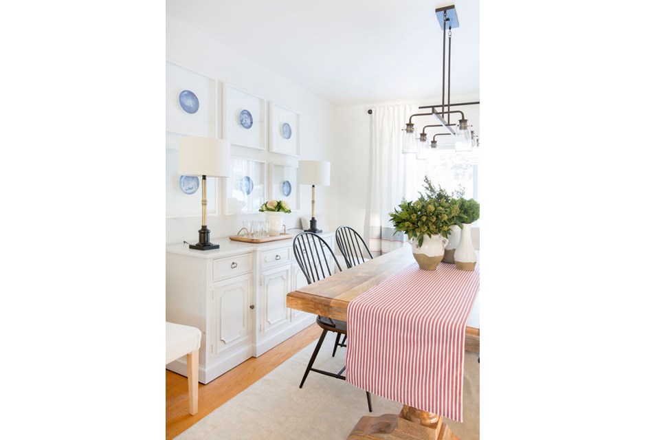
Making Art
Those beautiful plates that Kelly had hanging before instantly become an art piece when popped into shadow boxes. Now that’s how you do blue!
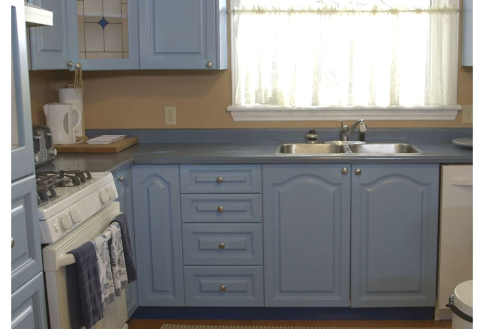
Feeling Blue
You’d have to be a really big fan of blue to want to move into this kitchen space as it was before Samantha got her hands on it.
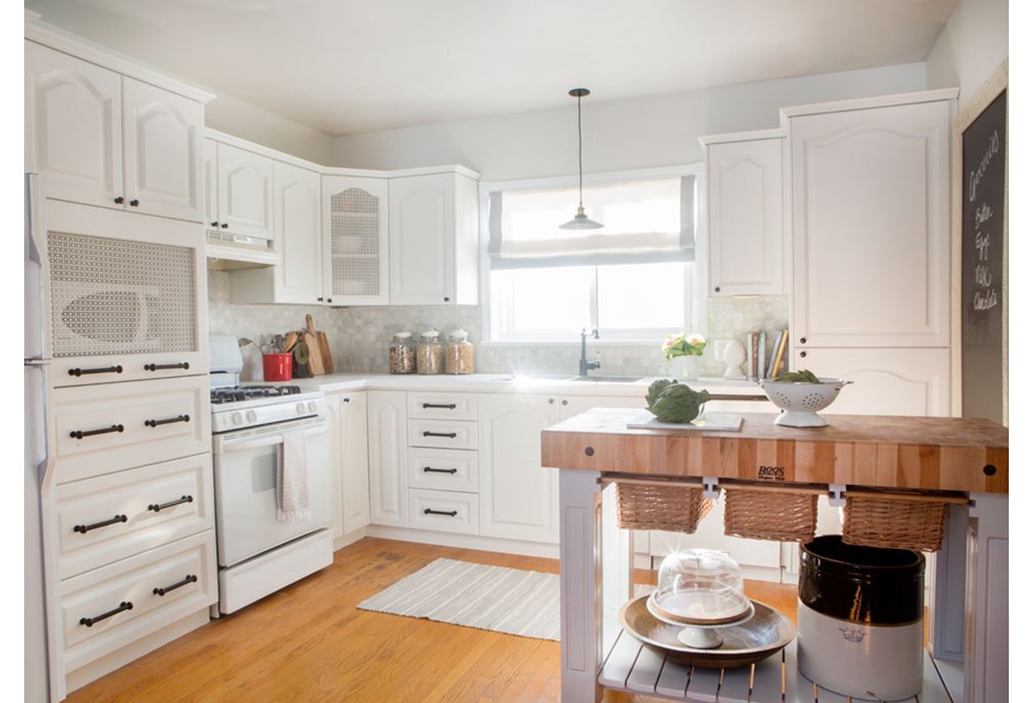
Move-in Kitchen
Just look at what a difference some white cabinets, elegant touches of trim and a rolling island can make. If you can’t afford new kitchen cabinets, consider painting dark ones with a fresh coat of white paint. This way, buyers can move in without feeling as though they’re going to have to live through an expensive and messy kitchen reno, and just focus on what a nice kitchen they’ll have to entertain in instead.
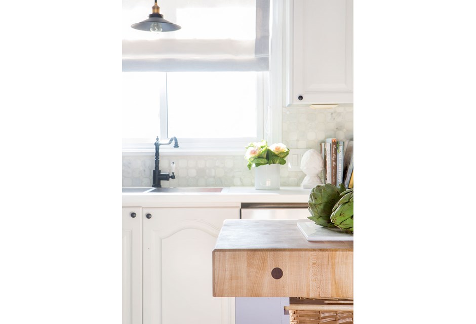
A Marble Must
Adding a touch of marble backsplash not only makes the kitchen feel complete, but it ups the elegance factor too.
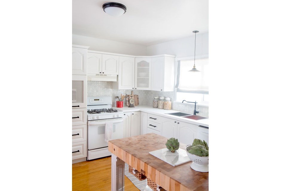
Cute Cupboards
Before, an outdated stained glass window gave us the blues. Afterwards, the mesh pattern on the corner cupboard and microwave cubby add art and appeal.
HGTV your inbox.
By clicking "SIGN UP” you agree to receive emails from HGTV and accept Corus' Terms of Use and Corus' Privacy Policy.


