With a baby on the way, Leilani’s life was about to change completely – so her cramped living space needed some major changes, too. Using smart saves and a little DIY ingenuity, designer Samantha Pynn and contractor Sebastian Clovis transformed Leilani’s crowded home into a beachy dream for her new family.
Save My Reno airs Tuesdays at 9 and 9:30PM e/p on HGTV Canada and is available online Wednesday morning at HGTV.ca.
New Baby, New Baby Home
Time was not on homeowner Leilani’s side. With her husband set to arrive in two-and-a-half months and her baby due in just four months, Leilani wanted to transform her cramped home to accommodate her growing family – but her previous attempts at renos were far from successful. Luckily, Leilani could call on her best friend Cheyenne and the Save My Reno team to work their magic with her $50,000 renovation budget.
Kitchen Nightmare
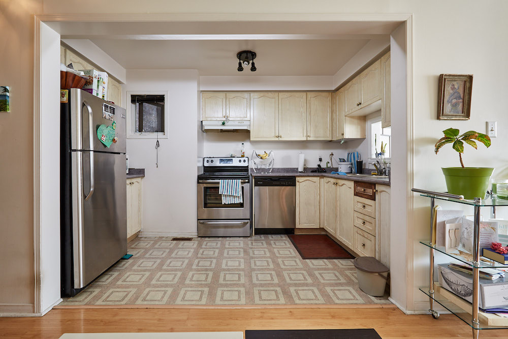
While Leilani’s home actually had more than enough space for her new family, it wasn’t laid out to make the most of it. A prime example? The kitchen was dark, outdated and disjointed from the living and dining spaces – far from the airy, island-inspired feel that Leilani was going for.
Let There Be Light
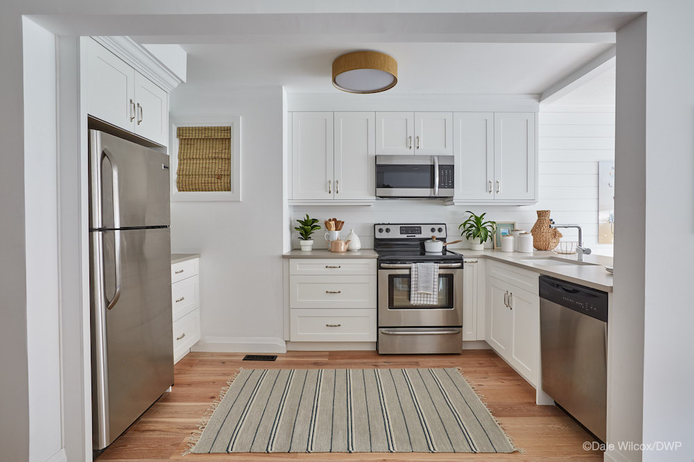
Sebastian and Cheyenne gutted Leilani’s kitchen, installing bright white cabinets and new countertops to create a light, airy feel. To help keep the budget in check, the team kept Leilani’s stainless steel appliances for the revamped kitchen design.
Related: 15 Simple Things to Make You Cozier and Happier in Your Kitchen
Just Passing Through
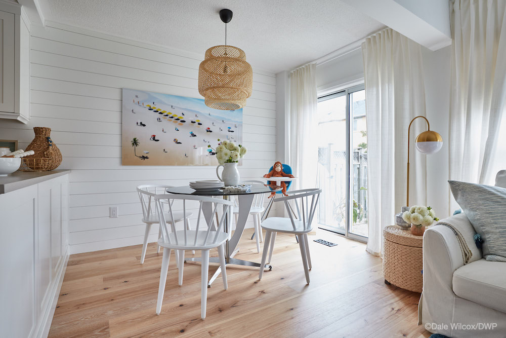
To connect the kitchen and dining space, the team opened up the once-miniscule cutout to create an open pass through – letting light flow from the sliding glass doors straight into the kitchen. Tying it all together, new white shiplap walls brought texture to the dining space, while Leilani’s old round dining table was repurposed to suit the new space.
A Smart Swap
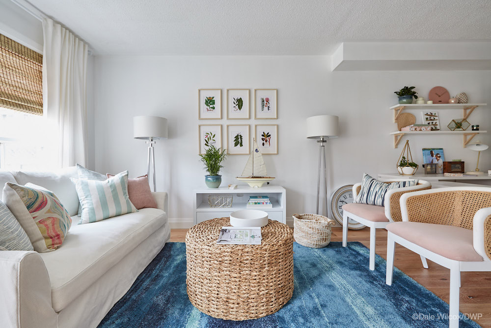
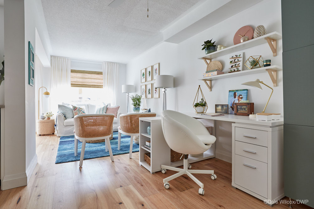
One of the biggest-impact design decisions the team made was to flip the dining space and the living space. Placing the dining area beside the kitchen enhances the flow through the home – maximizing space.
From the Ground Up
To keep the airy island-inspired feel flowing throughout the main living spaces, the team used
hickory floors with a touch of a white wash in the kitchen, dining area, living room and office.
Related: 10 Rookie Flooring Mistakes to Avoid During Your Next Reno
Over Worked
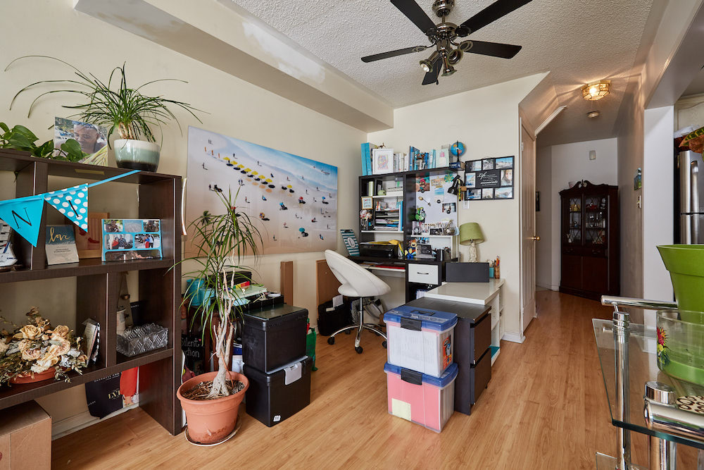
As a teacher, Leilani needs a functional workspace – but her previous office area was literally holding her back with shelves and files trapping her in the corner.
Related: 15 Insanely Stylish Small Home Office Ideas to Copy
Work From Home
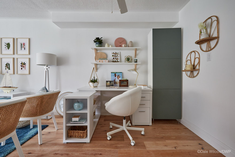
By simply reconfiguring the furniture, the team created a more efficient, useful office area for Leilani that flows perfectly with the rest of the room.
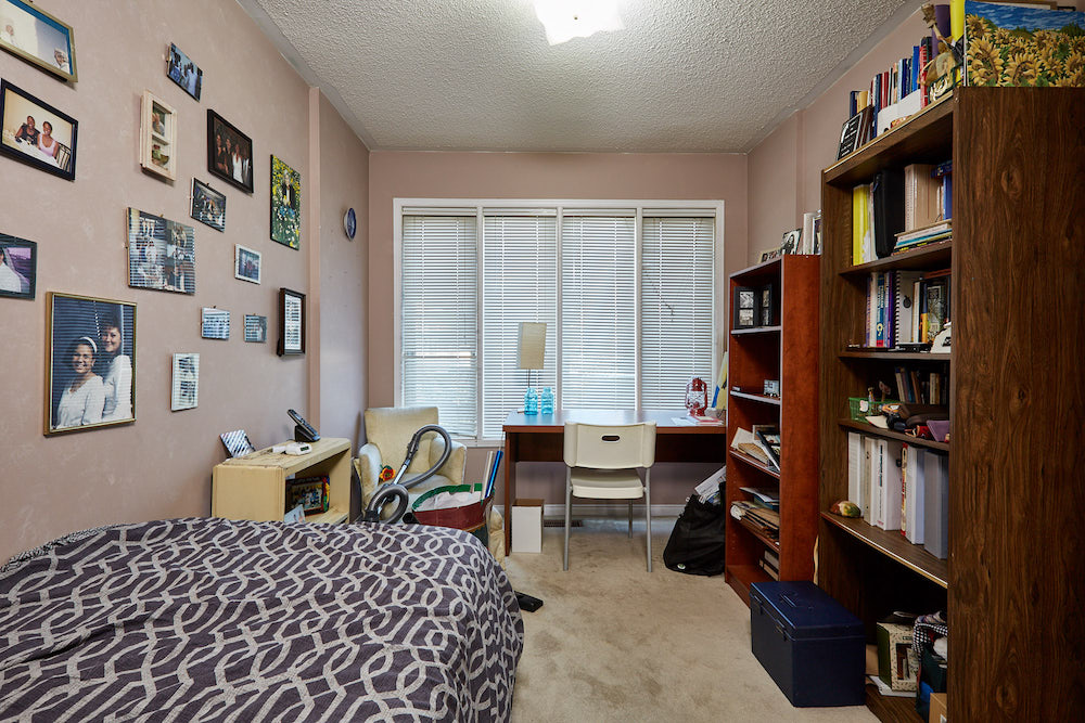
Making Space for Baby
Upstairs, Leilani’s spare room was destined to become her baby’s nursery – but a mix of excess furniture, dark colours and a blocked closet made it hard for her imagine it as her little one’s new room.
Related: 10 Bedroom Organization Tips That Practically Do the Cleaning for You
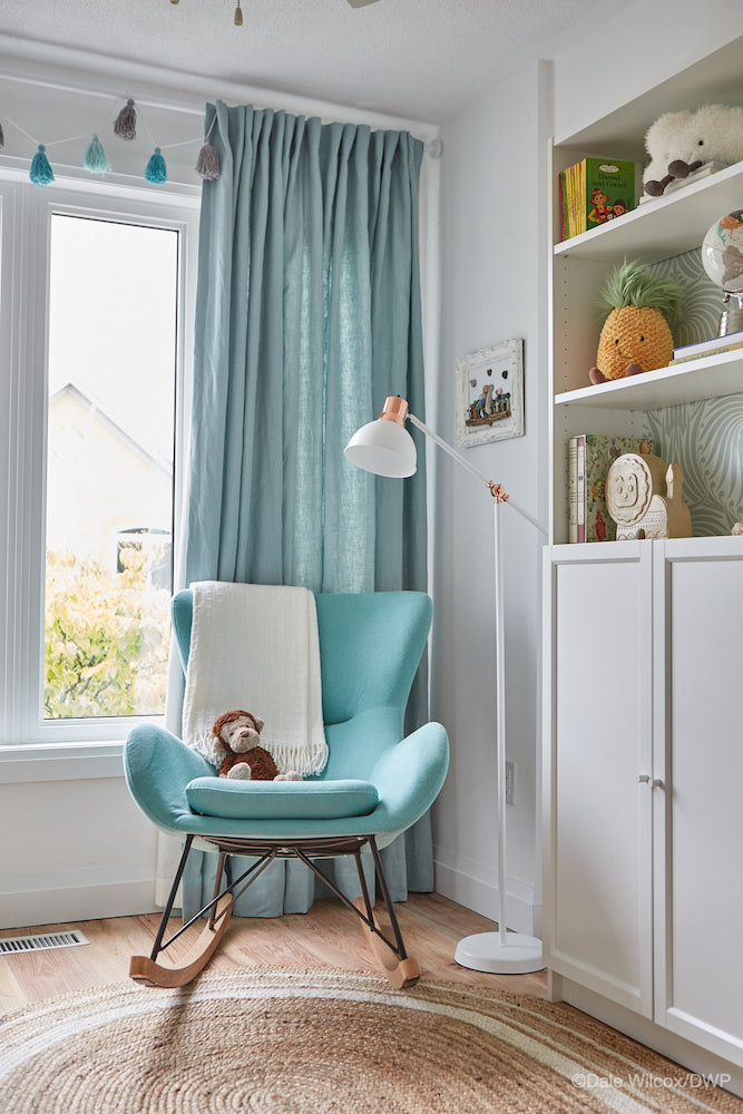
Island Inspiration
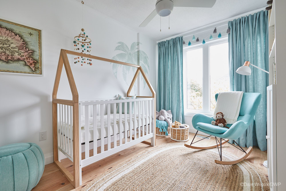
White walls, turquoise accents and smart storage transformed the spare room into a totally tranquil, cozy nursery that echoes Samantha’s island-inspired downstairs decor scheme.
Related: 15 Design Tricks to Help Baby Sleep Through the Night
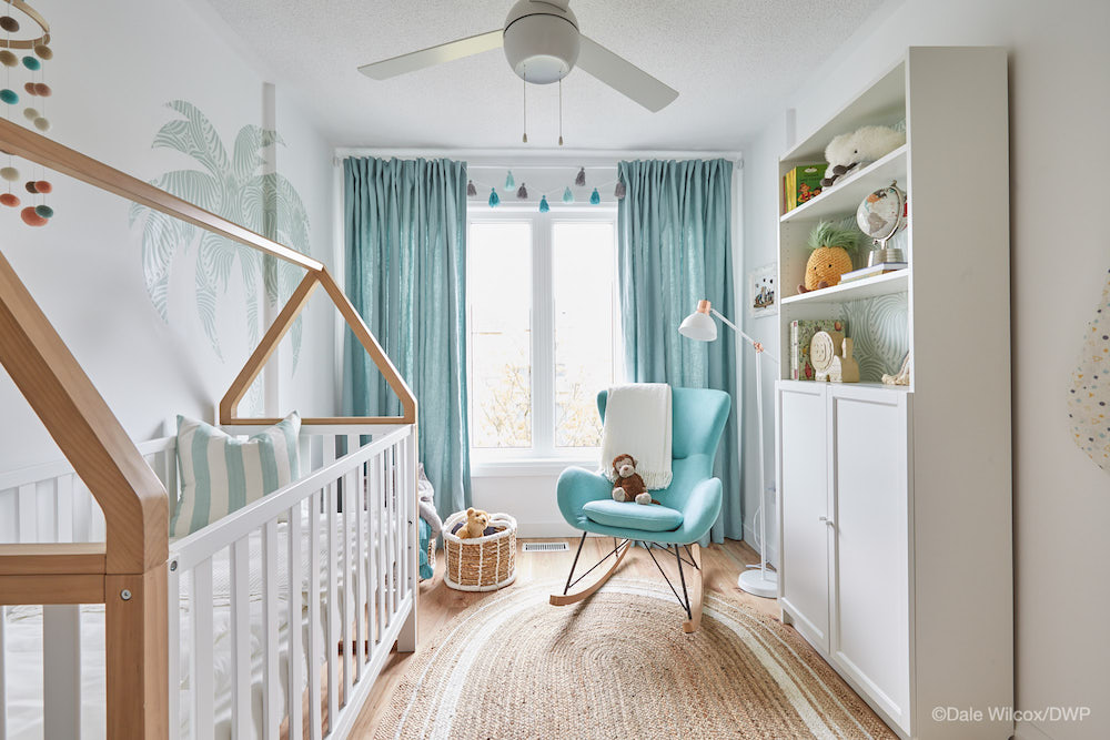
Bright and Airy
To make the most of the compact space, Sebastian also hand-crafted a space-saving changing station that attaches to the crib when it’s needed – and hangs on the wall for storage when it’s not.
Related: 11 Practical Tips to Decorating Your Baby’s Nursery
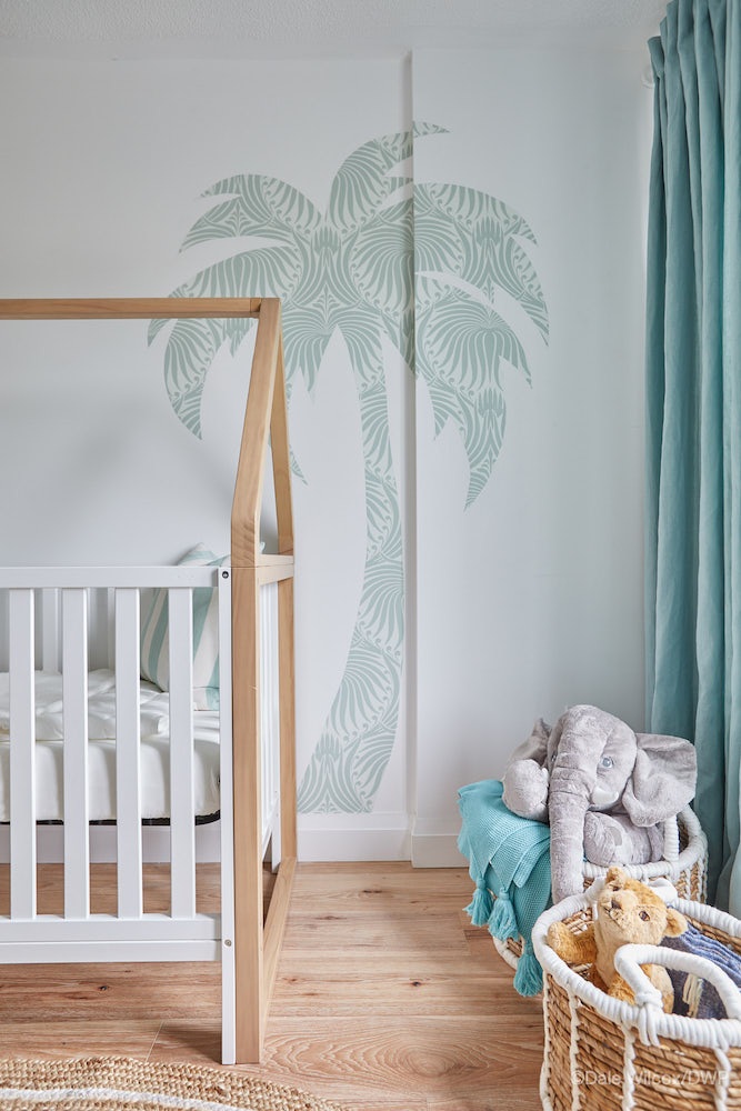
Beachy-Keen for Baby
Another special DIY touch? Using leftover wallpaper, Samantha and Leilani DIYed a custom wall decal in the shape of a palm tree – bringing the beachy downstairs theme into the nursery.
HGTV your inbox.
By clicking "SIGN UP” you agree to receive emails from HGTV and accept Corus' Terms of Use and Corus' Privacy Policy.


