It had been a while since Karen and Matt were able to focus on updating their home decor and design; they were too busy having kids! But with the kids slightly older and the couple ready to tackle a main floor renovation, they found that their needs outnumbered their $60,000 budget. So it was Sabrina Smelko and Sebastian Clovis to the rescue with Save My Reno. Here’s how the design and contractor duo transformed the abode into a jewel-toned oasis, while saving the homeowners more than $10,000.
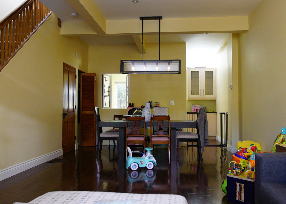
Before: Dark and Narrow
The light colours and open concept of this living space weren’t enough to give it a modern appeal. Add in some closed-off stairs and this room feels boxy and old.
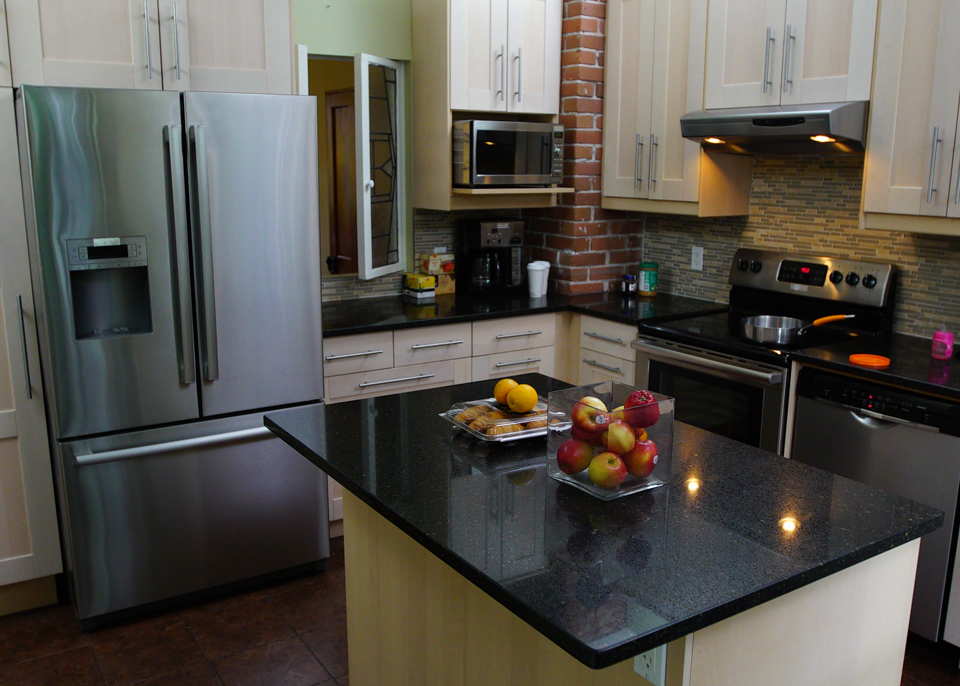
Before: Tiny Kitchen
The kitchen isn’t bad, but there’s definitely a lot squeezed into a tiny space. It’s also not the most functional area for a family to use, and the finishes feel tired and outdated.
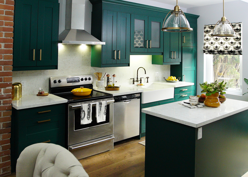
After: A Crown Jewel
Sabrina and Sebastian were able to give the space a bright and modern renovation by reusing may of the kitchen’s former elements and giving the design a few slight tweaks. It’s amazing what a splash of bright paint will do on some old cabinets, no?
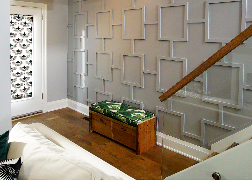
After: A Warm Welcome
New stairs with a customized glass railing may have cost a little bit of extra money, but the resulting showstopper was definitely worth it. Add in an architectural design with this pretty wall and suddenly the main floor has a real statement piece that’s bound to impress any and all guests.
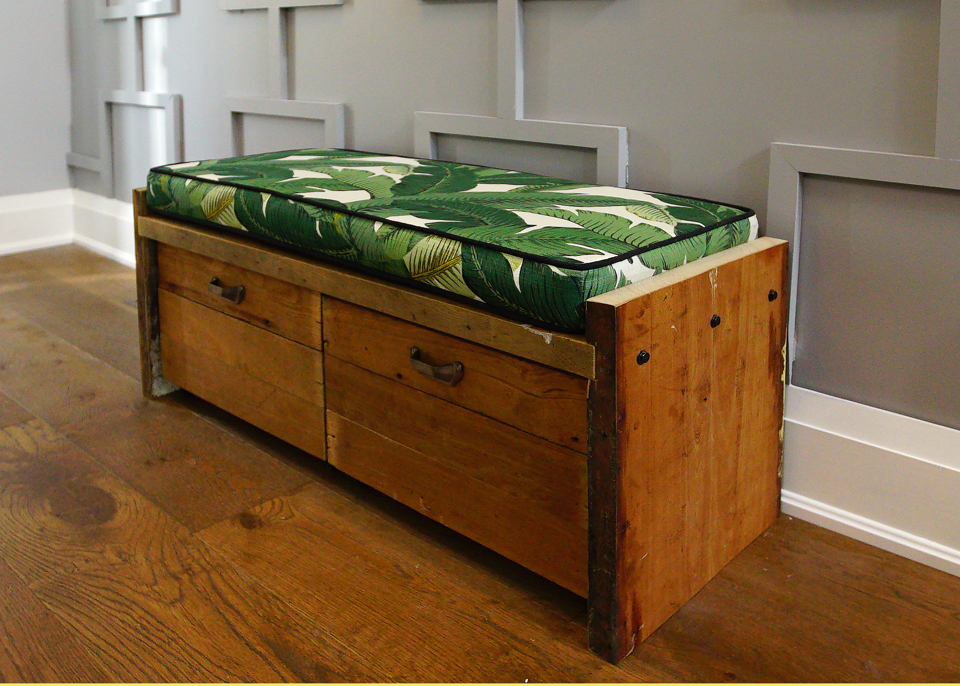
After: A Custom Bench
Rather than let all of that lumber from the unusable old stairs to go waste, Sabrina built this custom bench that would easily retail for a couple of hundred dollars. The green fabric fits in with the rest of the space while the wood itself adds instant charm and history to the foyer.
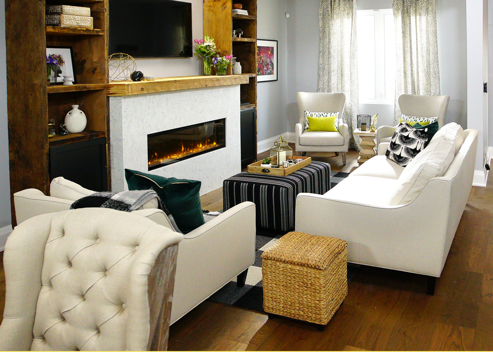
After: A Cozy Family Room
This family needed a space to congregate together and hang out, which Sebastian and Sabrina were definitely able to provide. The neutral furniture is played up by pops of colour while natural wood elements tie it all together with a modern but rustic twist.
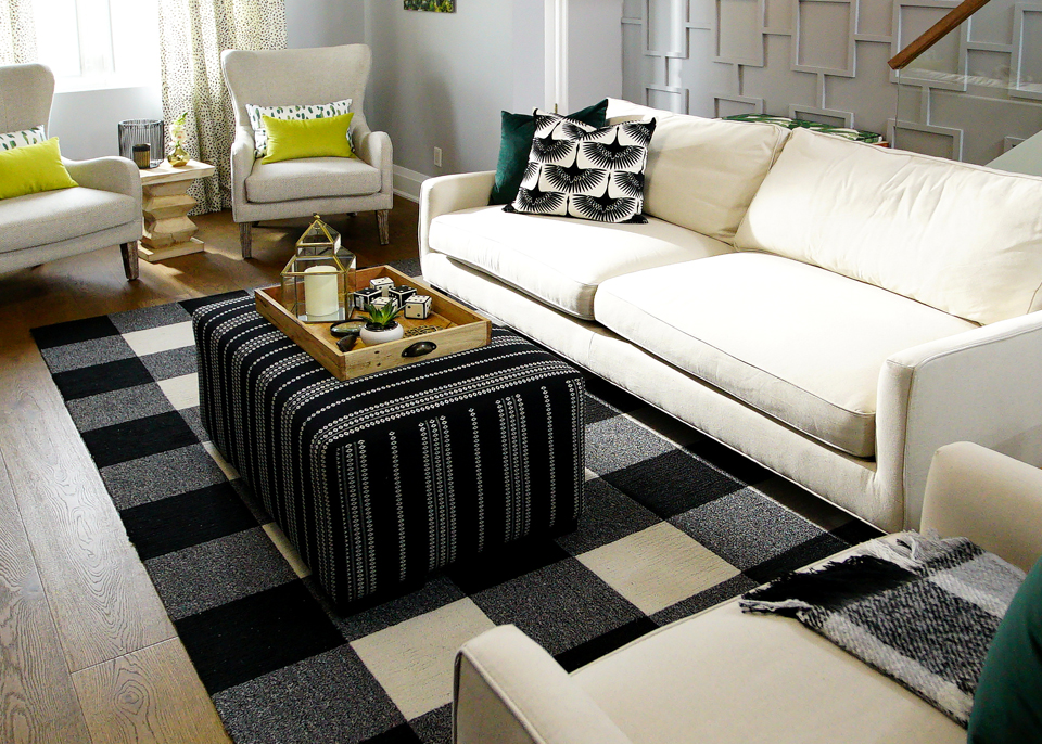
After: Neutrals with a Touch of Colour
This living room space is cozy but modern thanks to the monochromatic colour scheme. Sabrina then tied in pops of green to match the open-concept kitchen and give the main floor an easy flow. Below the updated floors keep the entire space streamlined and add a rich effect.
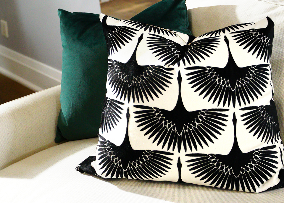
After: Custom Pillows
Why buy a whack of new throw pillows when you can simply make your own? Sabrina matched these throws by treating them with fabrics in the same jewel and monochromatic colours from the kitchen and entranceway, tying the living room into the rest of the space.
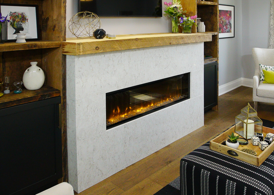
After: A New Fireplace
A gorgeous new fireplace was a must-have for these homeowners, but that didn’t mean they had to break the bank on a gas version. Not when an electric fireplace adds this kind of design appeal. Add in a rustic wooden board for the mantel and some sturdy shelves, and suddenly these homeowners have yet another feature wall to write home about.
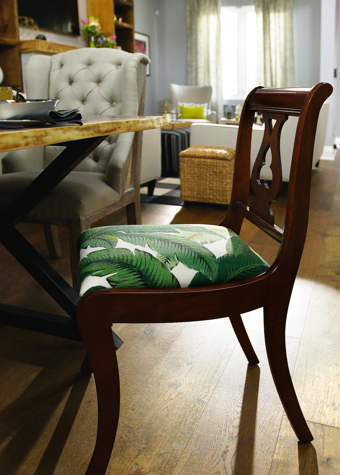
After: Secondhand Love
The homeowners wanted to save some money on a dining set so they tasked Sabrina with updating an antique. She proved she was up to the task with these pretty new cushions that match some of the other design elements in the house. The end result is a gorgeous, jewelled main floor with plenty of natural elements to help this family feel modern and completely at home.
HGTV your inbox.
By clicking "SIGN UP” you agree to receive emails from HGTV and accept Corus' Terms of Use and Corus' Privacy Policy.


