After living in their 4,421-square-foot abode for a decade, these homeowners craved a change. The couple, parents of three young teen girls (and two golden doodles), wanted a colourful refresh, as well as a more modern kitchen, updated bathrooms and a basement recreation space their daughters would love. They entrusted Kirby Armstrong, principal at Devise Design Inc., with their vision. “Much of the house had been well kept,” says the designer, “so my team and I made a concerted effort to blend in our additions with the existing features to avoid it looking like a partial renovation.” They succeeded in spades… and just wait until you see the rec room.
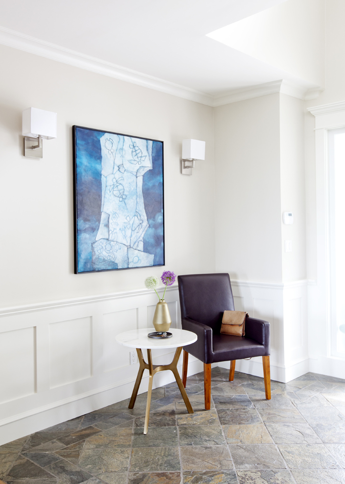
Clean Slate
“The entry hall’s slate tile flooring was an original element that felt fresh once we lightened up the walls and introduced a brass and marble side table,” says designer Kirby Armstrong. “The satin nickel wall sconces framing the clients’ existing art were a purposeful mixing of metals above the earth tones of the flooring.”

Table Talk
In the kitchen’s eating area, the designer came up with an ingenious way to fulfill the clients’ desire for a central craft and food prep zone. “Rather than have a long table that might be left cluttered, we sourced a more intimate-sized one and added a bar-height square second island,” he says. It provides a working area for one of the daughters, who is an aspiring cake decorator.
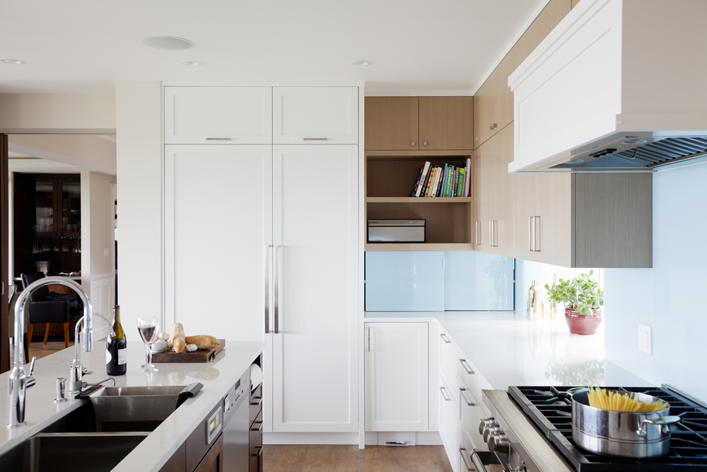
Glass Act
A watery-hued backsplash enlivens the kitchen’s neutral tones. “I wanted to add a splash of colour here,” says Kirby. “The south facing windows look out onto the ocean, so I mirrored the colours of green and blue in a back-painted glass.” The result is a seamless backsplash that’s both modern and easy to clean.
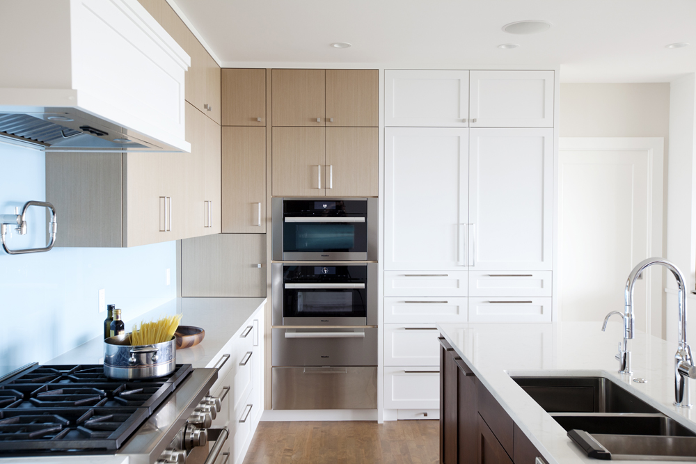
That’s Entertainment
The kitchen was designed with the family’s penchant for entertaining in mind. A pasta tap, additional ovens and warming drawers are just some of the dishy perks. To keep the look light and bright, Kirby mixed white doors with light veneer slab ones. “They break up the large U-shaped layout, while the island’s darker stained cabinetry matches the adjacent rooms.”
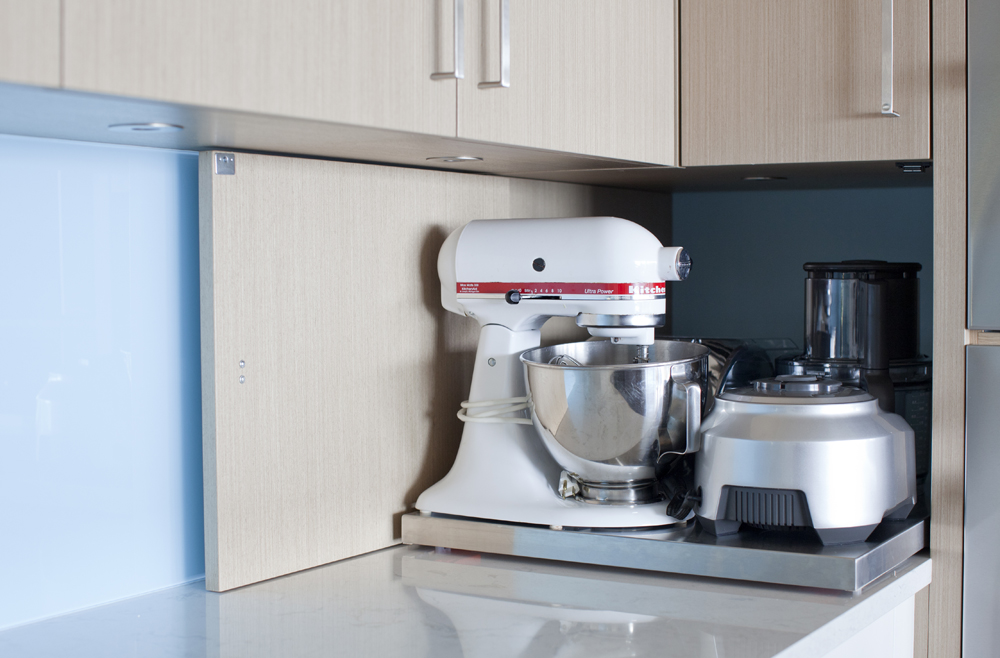
Slide Show
This appliance garage, at one end of the kitchen’s back wall, is concealed behind a flip-out cabinet door. “All of the clients’ small appliances easily slide in and out to reduce clutter.”
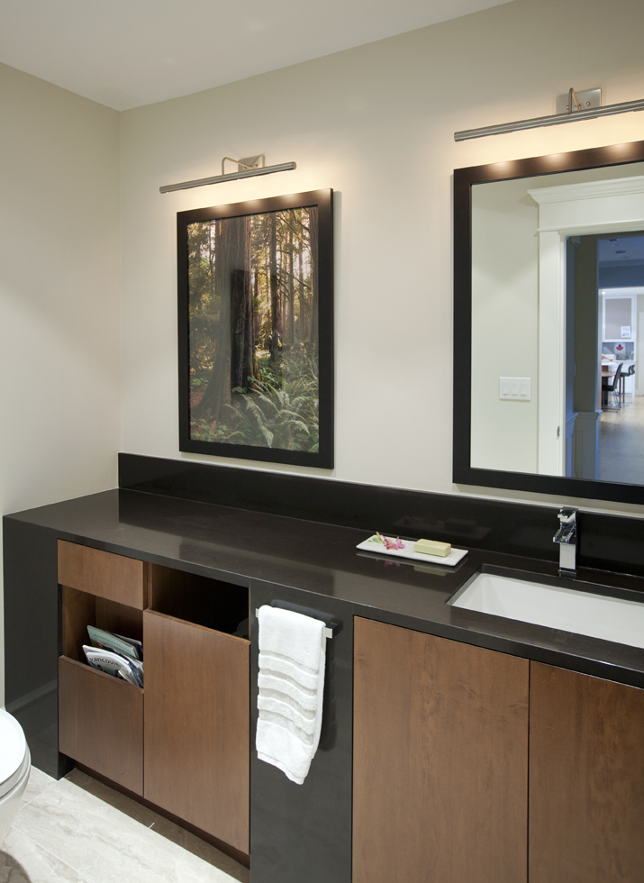
Framework
“The home’s powder room was long and skinny, so we changed the toilet’s orientation to utilize the length of the space,” says Kirby. The custom vanity, which spans the entire wall, even includes a built-in magazine rack. The designer chose the photograph (snapped by a local artist) for the way it invokes the feeling of looking out a window into the forest. “I balanced this with the mirror and framed them both to blur the distinction between the two.”
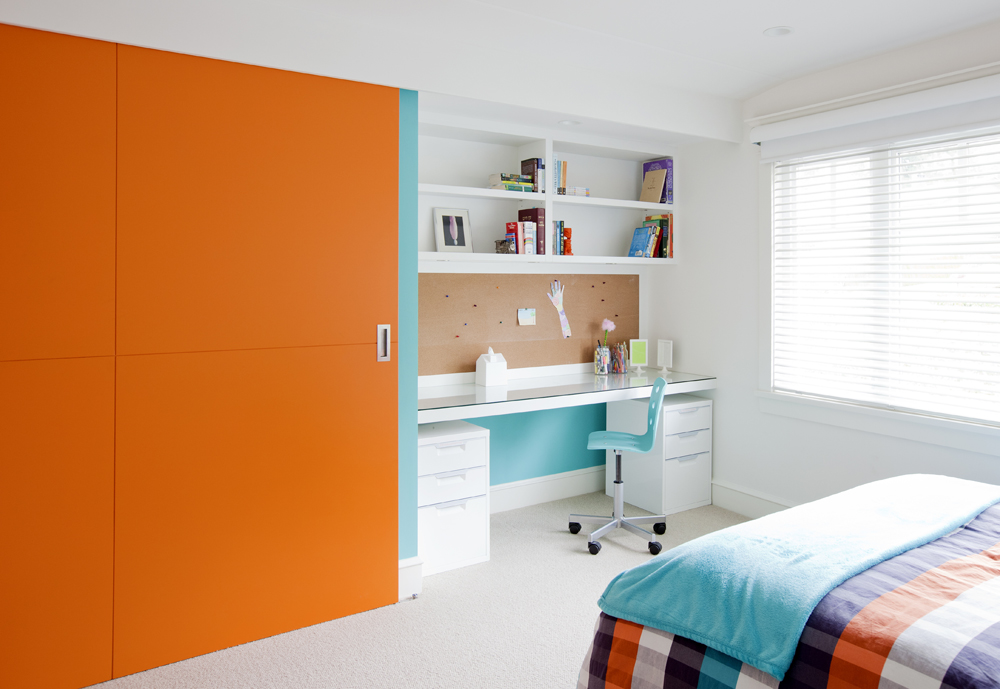
Colour Burst
Tired closet accordion doors in one of the girl’s bedrooms got a mega makeover. “We designed a large sliding door that would hide the desk area when revealing clothing, and vise-versa,” says Kirby. “Thanks to its size, the door needed to be built out of four panels, so it seemed like a great opportunity for some drama!”
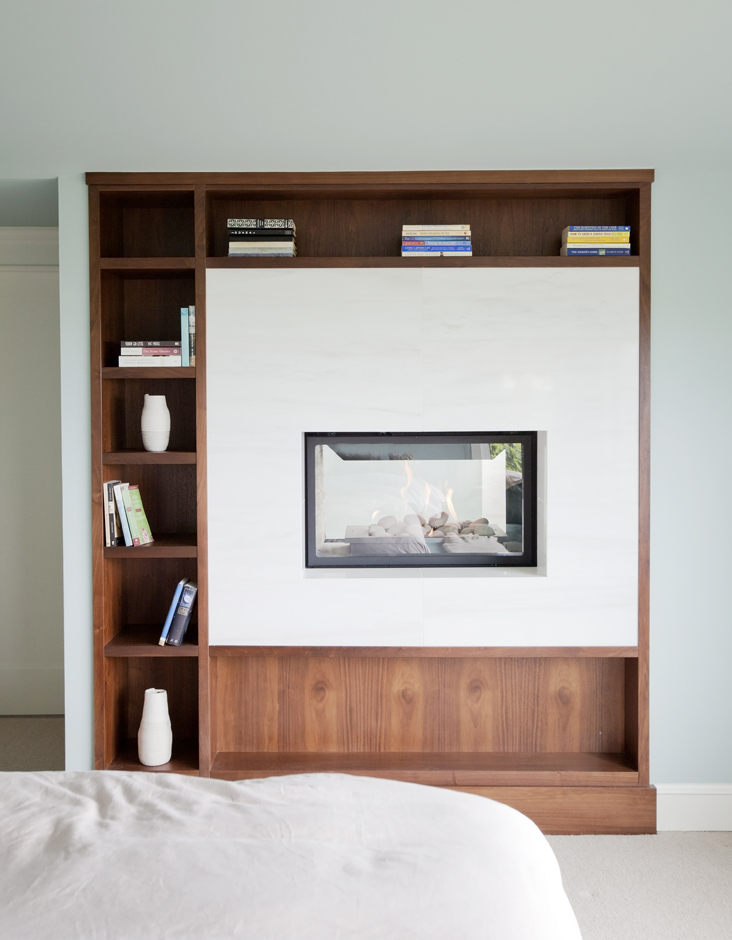
Double Vision
In the master bedroom, a two-way fireplace looks beyond to the ensuite bathroom. It’s framed by shelving, in both rooms, for displaying knick-knacks and books.
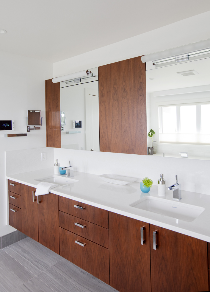
Walnut Grove
Flat-sawn walnut cabinetry was chosen to add warmth to the master ensuite, and nicely punctuate the mirrors. The floating vanity has an LED strip light underneath, which acts as a night light for the room. Kirby chose grey porcelain tiles for the floor. He says, “They offer the natural silt formations of a vein-cut travertine with a more modern colouring.”
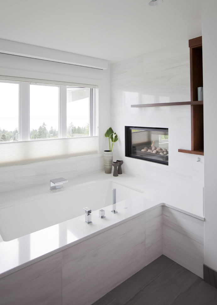
Marble Mantel
The marble-ensconced master ensuite is serenely beautiful. “I chose matte-finished Dolomite, a type of marble, to give the walls a soft but elegant look,” says Kirby.
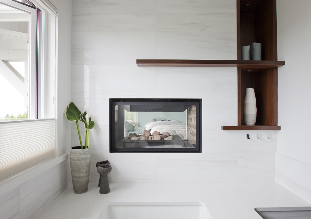
Fire and Water
Both luxurious and practical, a fireplace at the foot of the tub signals spa-like sumptuousness.
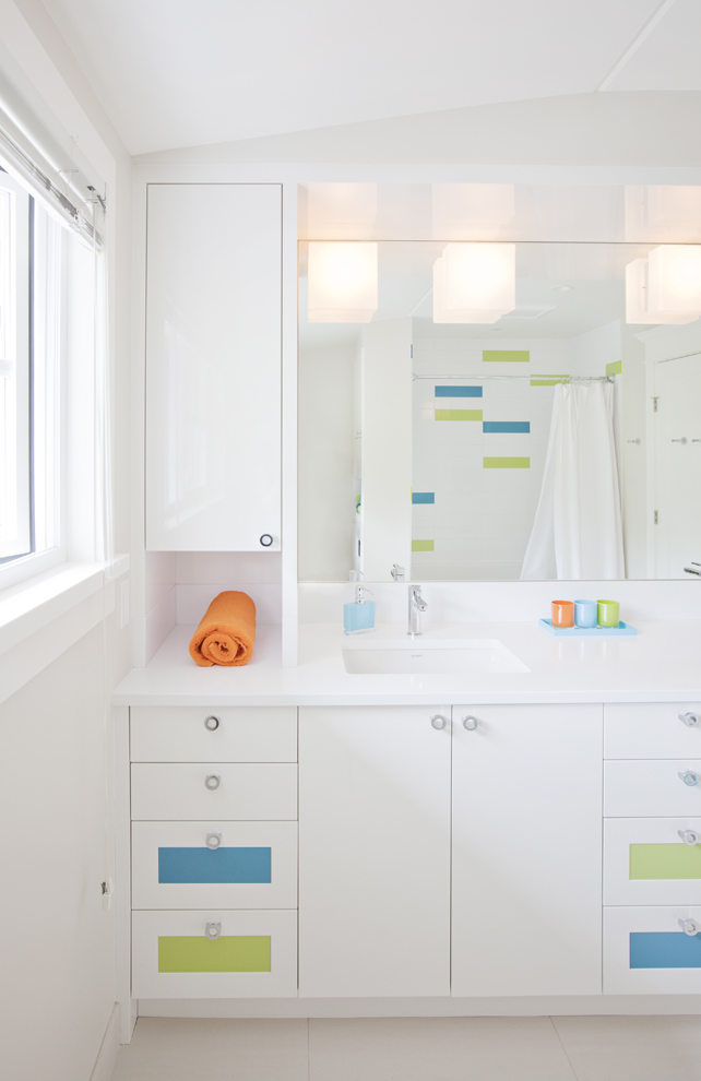
Colour Block
“Above all, we wanted the girls’ bathroom to feel bright and fresh, so we chose a primarily white palette and interjected teal and blue tiles for some colour,” says Kirby, who couldn’t resist sourcing matching towels and glasses for the room.
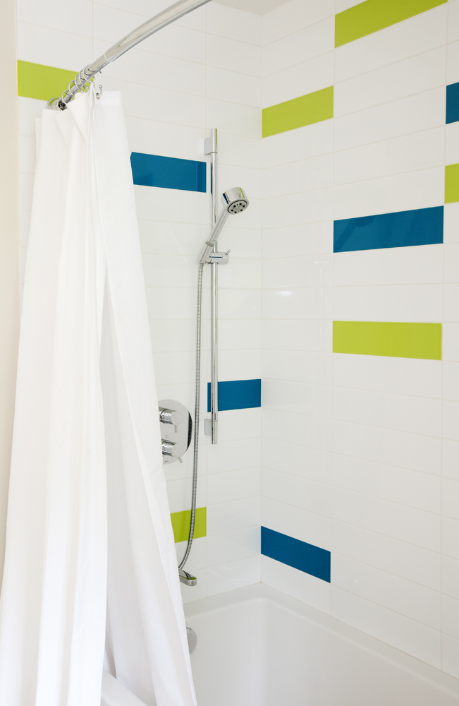
Water Colours
The shots of green and blue continue behind the curtain and all the way up the shower wall.
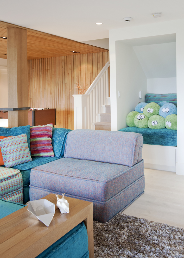
Reading Nook
The space beside the basement stairs was enclosed and fitted with custom cushions and reading lights to create the most inviting and cozy spot for the girls. It also houses some treasured family additions. Read on…
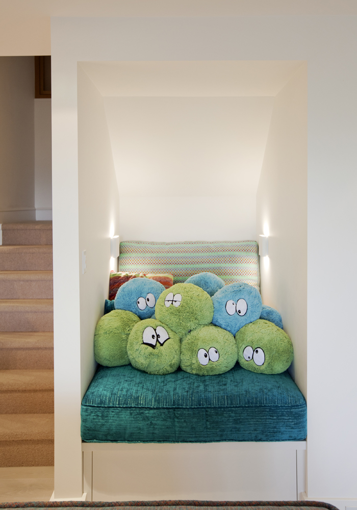
Pillow Faces
Round pillows from Winners received the girls’ artistic talents. “They went online and sourced black and white felt to transform the plush pillows into cartoon-like creatures,” says Kirby. “I’ve since learned that they’ve named each and every one of them!”
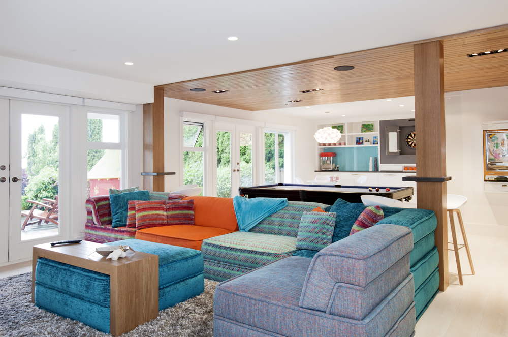
Go Configure
The basement features a custom six-piece sectional that can be configured to suit the family’s needs (it’s also command central for sleepovers and movie parties).The unexpected colours happened organically. “Teals and oranges proved to be family favourites, so we naturally selected from this scheme.”
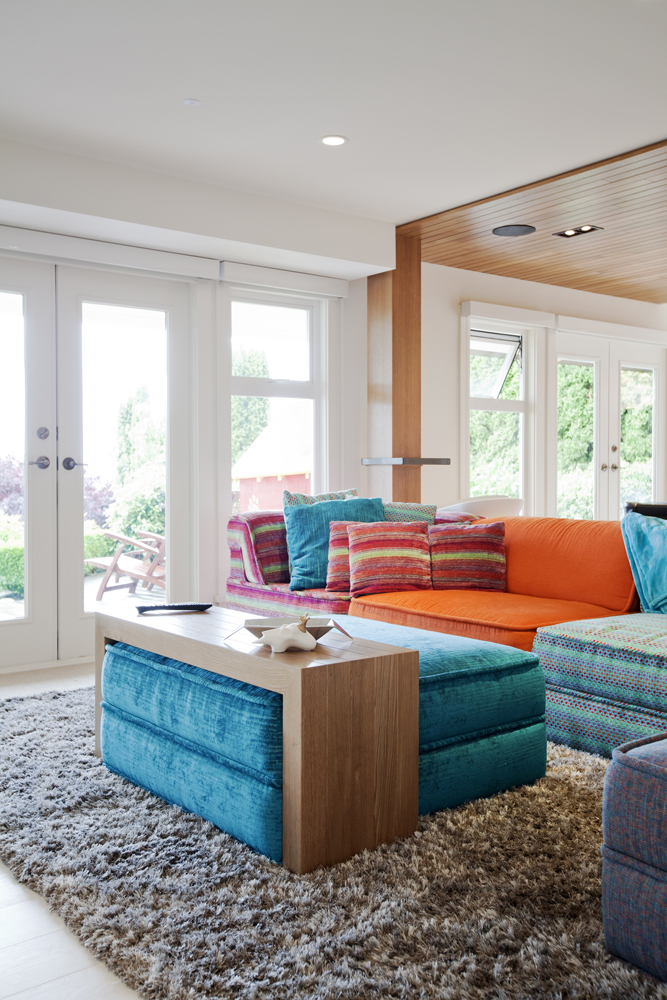
Slider Menu
A custom white-oak table pressure fits the sectional’s ottoman. “The design provides a practical table surface, while still allowing a soft space for putting feet up.”
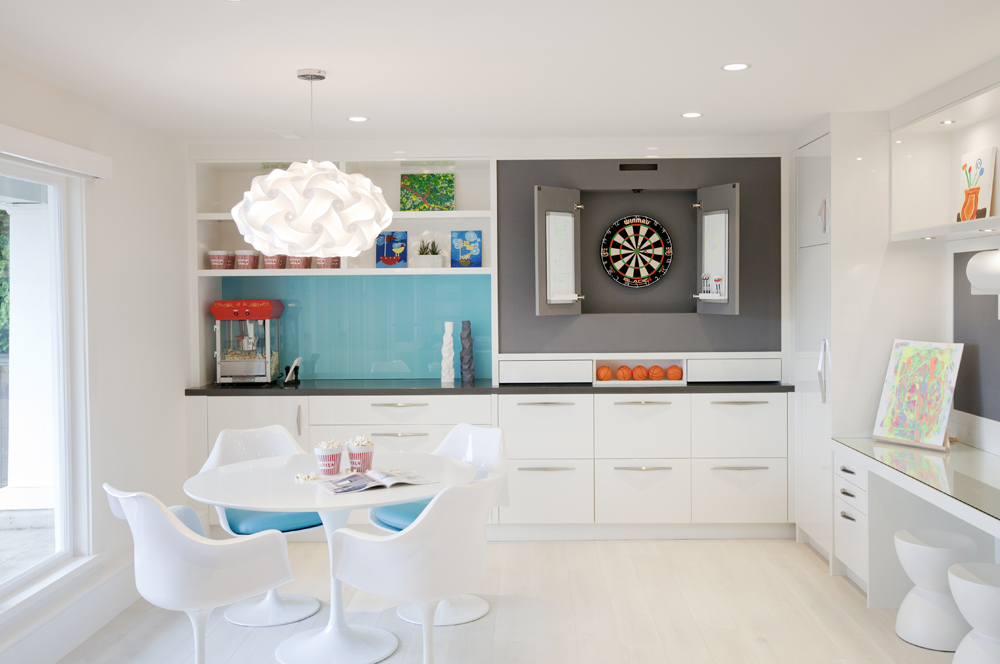
Snack Time
One end of the open-plan basement features a dart board, mini basketball area and snack station complete with a popcorn machine. A replica of the iconic Tulip table is the perfect place for board games and munching on snacks.
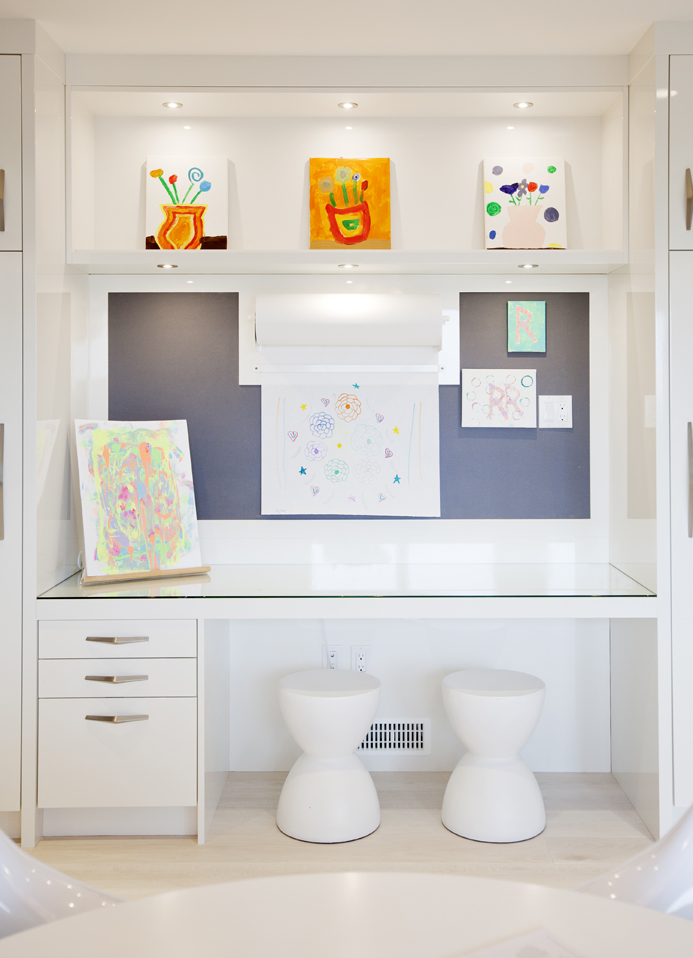
Creative Niche
This nook (which sits opposite the tulip table) serves as a dedicated craft station. “The wall above the desk is fitted with Forbo, a rubberized pinboard material that’s a colourful and sleeker alternative to cork,” says Kirby. Attached to it is a roll-out paper dispenser imported from England that lets the girls choose how big their artwork will be.
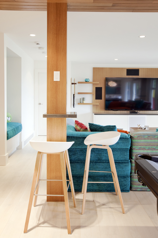
Pool Table
A small shelf wraps around a support beam and acts like a table. “It’s right beside the pool table so the girls can leave drinks here while they play or sit on the stools to watch TV.”
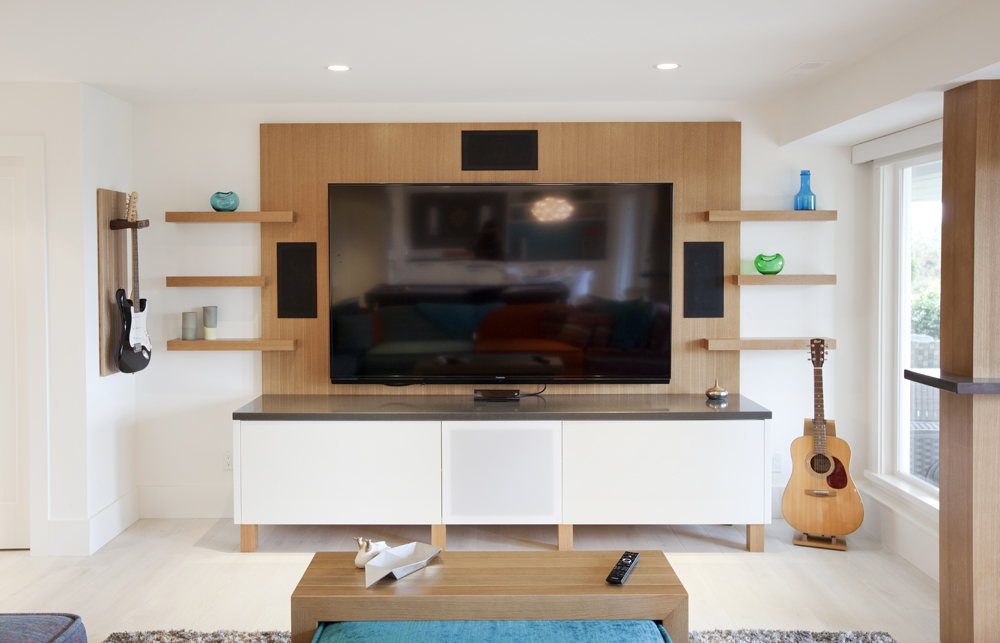
Screen Time
The large 85″ television is framed by a stained wood panel flanked by floating shelves. The multi-tasking cabinet below holds a stereo system and gaming consoles, along with a sound board and mixer with hook ups for guitars and microphones for family talent shows.
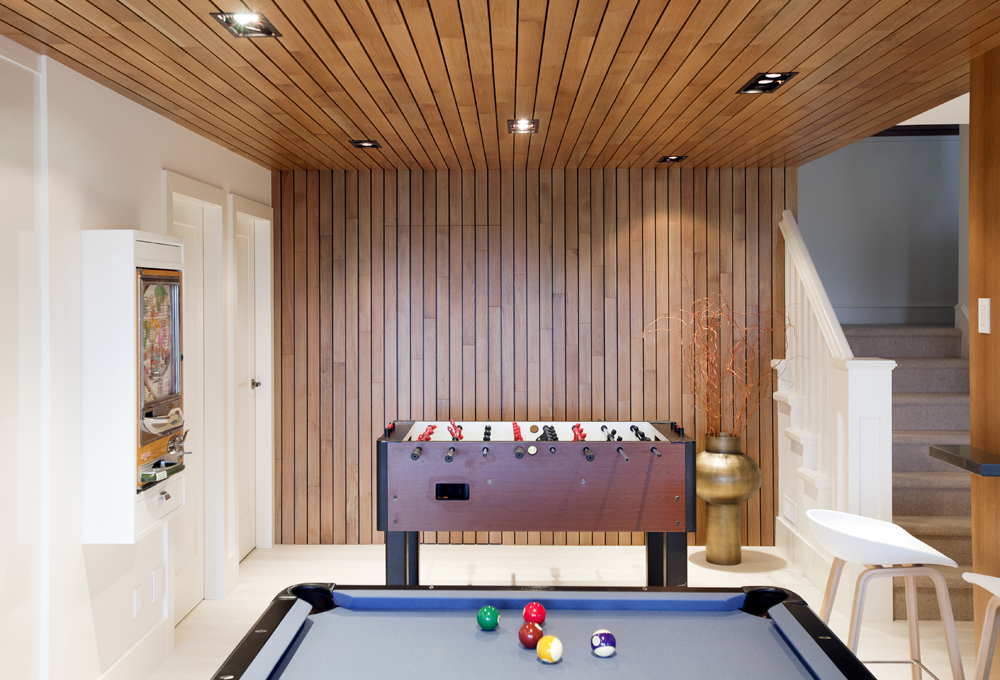
Warming Trend
The rich stain of the white-oak wall and ceiling add warmth the to mostly white basement and subtly demarcate the games end of the space without closing it in.
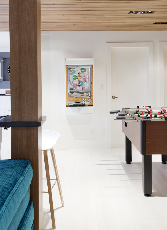
Games On
Opposite the pool table, the games continue with foosball and a Pachinko machine. “The owners really wanted the basement to be an exciting recreation space that the girls, and their friends, would be drawn to in the coming years.”
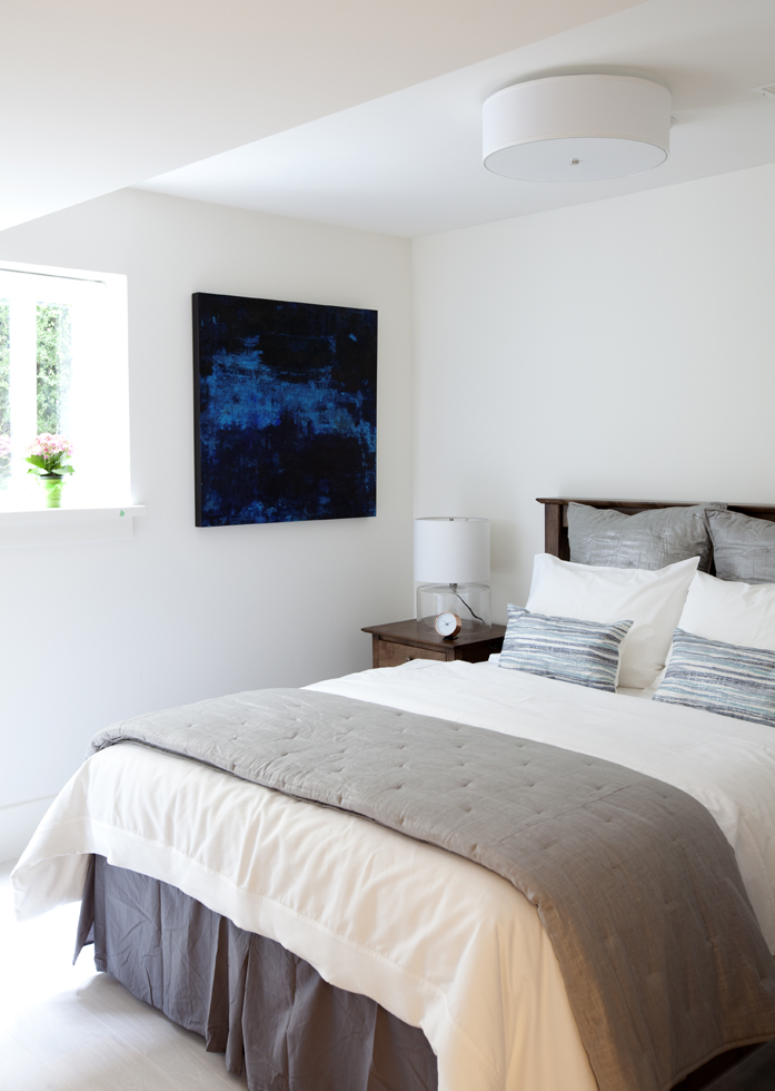
Artistic Flair
The basement guest room boasts creature comforts like tactile bedding and fresh flowers, as well as a painting by local artist Miriam Aroeste.
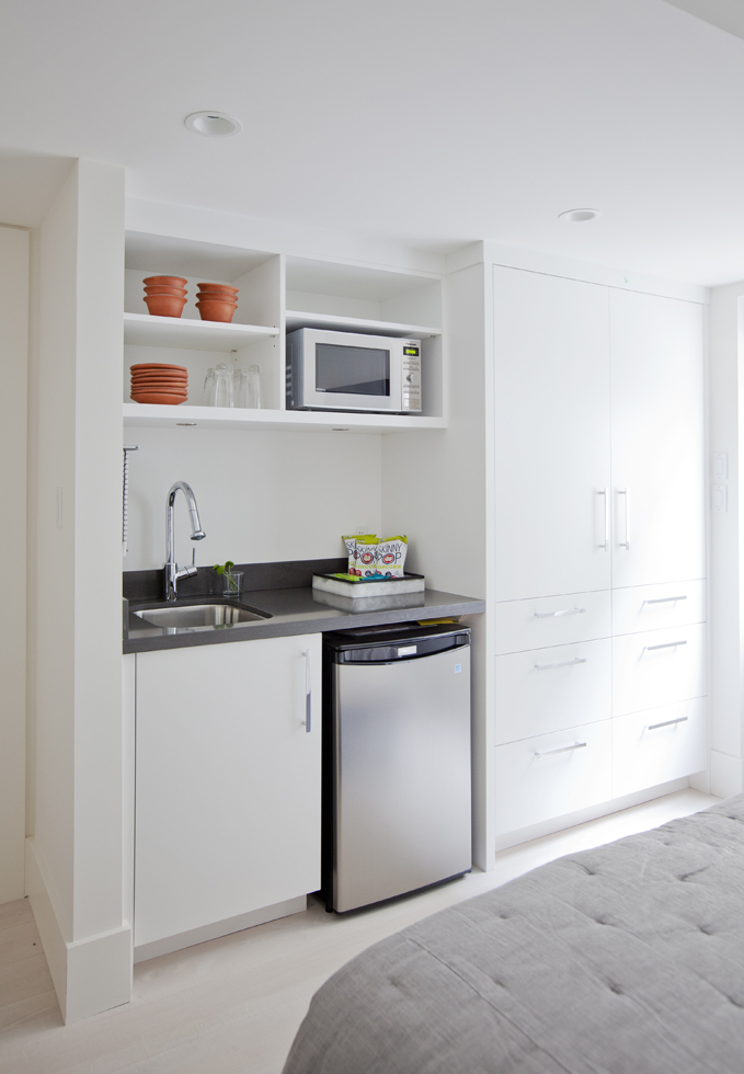
Suite Digs
“We built a kitchenette in the guest room to give it the feel of a small hotel suite,” says Kirby. Guests can help themselves to the amenities without going to the kitchen upstairs or disturbing the family.
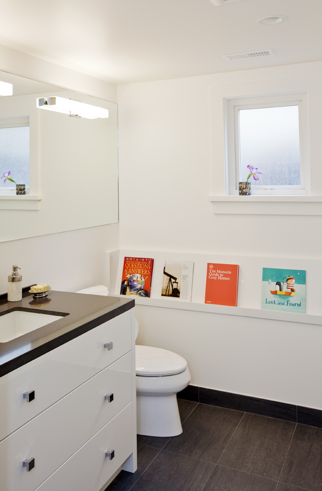
Reading Room
In the guest bathroom, a low slanted shelf is both functional and fun to look at. The colourful book covers act like artwork and can be changed according to the girls’ whims or the guest’s preferences.
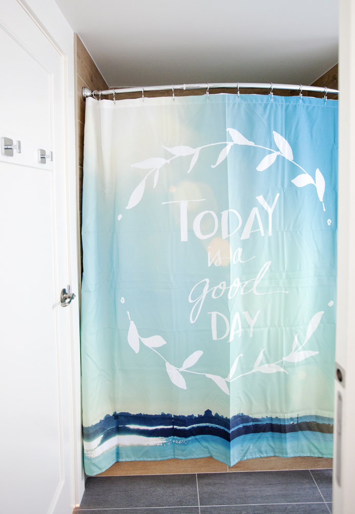
Curtain Call
The girls were very much involved in the makeover’s design decisions. This cheerful shower curtain, which hangs in the basement bathroom, was found by one of them online.
HGTV your inbox.
By clicking "SIGN UP” you agree to receive emails from HGTV and accept Corus' Terms of Use and Corus' Privacy Policy.


