When Amy Highton and her husband Jordan – she’s a photographer, he’s a constructor manager – first stumbled upon their super tiny house, it was a total snore. The cottage by the railway tracks, situated in Calgary’s oldest community of Inglewood and Ramsay, was “two rooms wide,” as Amy describes it, and felt basic. Undeterred, the couple (who have renovated three houses together) worked over six months to turn it into a stylish, art-filled pad for their pack: sons Sullivan, 11, and Flynn, 9; their dog, June, and cat, Wilder. Incredibly enough, the project came together with modest materials and DIY gusto. Those wraparound shelves! That wood-panelled foyer with skateboard parking! So many curves! Keep flipping to read about this family’s inspiring renovation journey. Pssst… check out the video tour here.
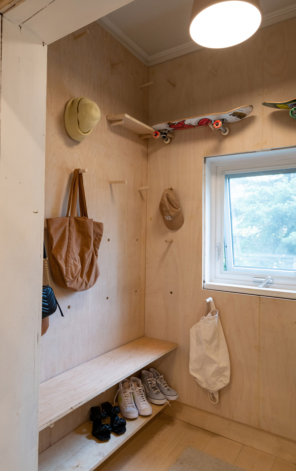
Board Room
“When we bought the house, it had been renovated a few times,” says Amy. “It looked like a McDonald’s – it was red, yellow and green. It was wild!” The foyer, seen here, was a shade of lime. Amy cloaked it in budget-friendly plywood and dowels, creating simple storage for shoes, hats, backpacks – and even skateboards (it’s the boys’ favourite pastime).
Related: A Look Back at Our Most Beautiful Home Tours of 2021
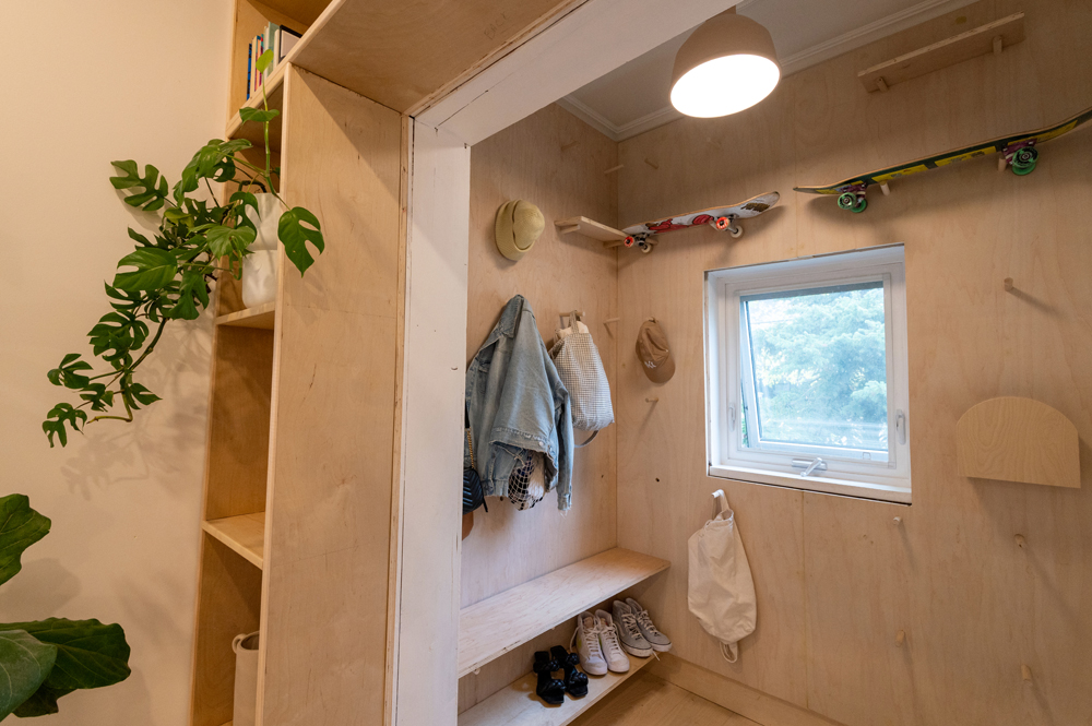
Inspiration From Down Under
Here’s a closer view of the foyer, and a peek into the adjoining living room. For cohesion, the couple carried the plywood theme inside. “We wanted an Australian beach-house vibe, since we’re both from the west coast [B.C. to be exact],” says Amy of the 922-square-foot home. Originally built in 1908, the house would have housed railway workers.
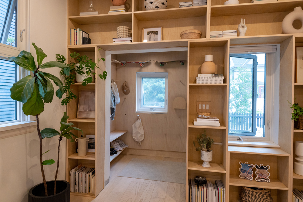
Very Cool Vestibule
“It took six months to finish the house,” says Amy. “We did everything by ourselves and my husband works out of town. He’s here on weekends.” Using $300 worth of maple plywood, the couple created this wraparound shelving unit that Amy first drew out on paper, and Jordan then built. “We’re wing-it people!” After building a practice box, they launched into the project.
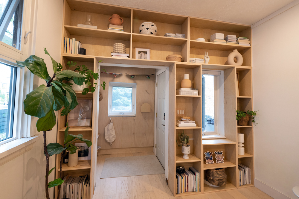
Everything in its Place
An orderly mix of books, frames, vases and art from the couple’s travels live harmoniously in the built-ins off the front entrance. In a polarizing move, Amy flipped the books over to conceal their spines. “Being a photographer, I need a calm and open palette,” she says, though she admits that books that haven’t been read are usually visible.
Dream Big
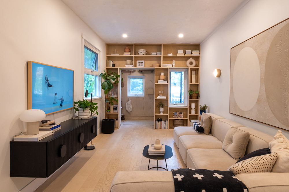
Instead of a jumble of itty-bitty artwork, Amy chose a large-scale piece to put over the couch. She bought the abstract – which feels authentically mid-century modern – for a steal at HomeSense. Its sandy tones look custom made for the room.
Related: How a Couple Turned This 1,100-Square-Foot Bungalow Into a Minimalist’s Dream
A Sporty Crew
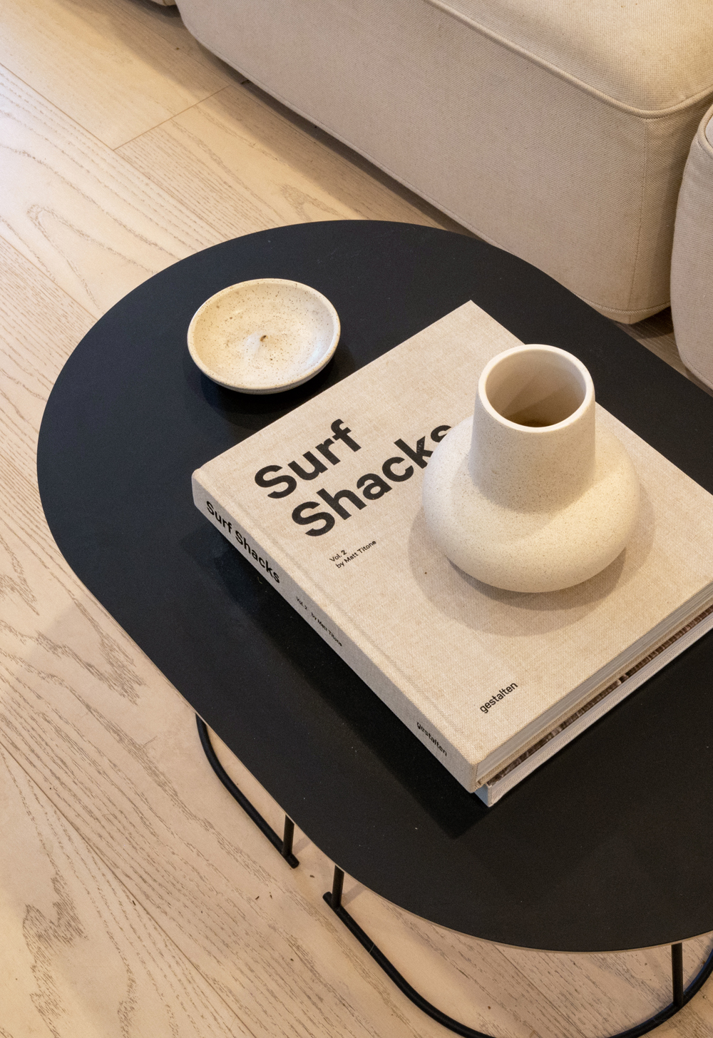
The family skis, snowboards, skateboards and surfs, so naturally they have this coffee-table book. “Our oldest son loves to surf. We do lots of trips to Sayulito, Mexico, our alternate universe,” laughs Amy.
Airy Calm
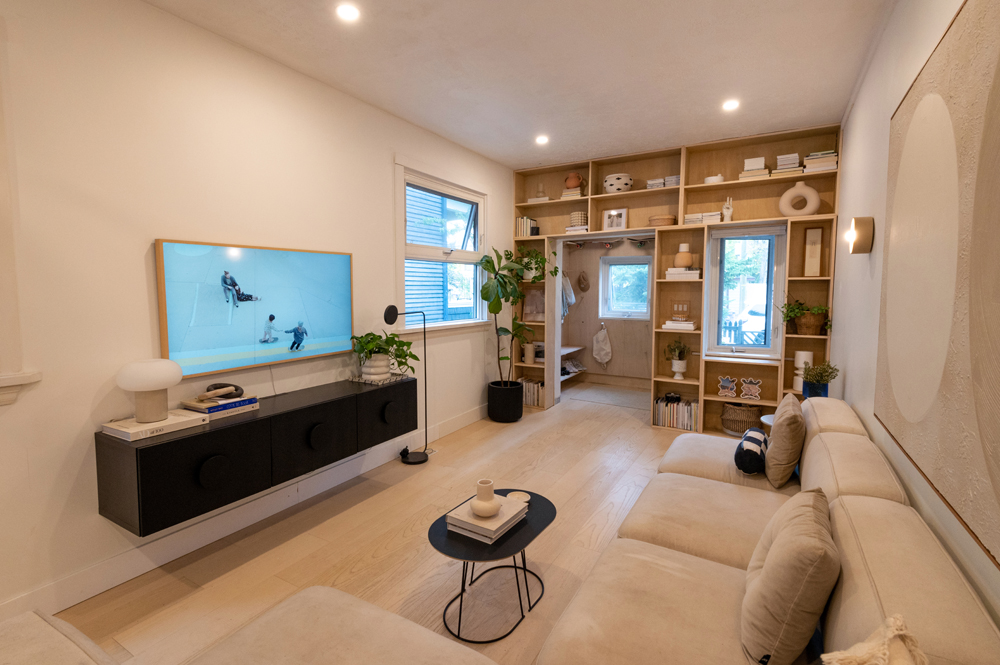
A monochromatic palette maintains a sense of quietude throughout the home. The couple ran engineered ash hardwood from Twelve Oaks throughout the main floor to keep the calm theme going.
Related: This BC Beach House Makes a Splash With Seaside Chic Style
Sofa So Good
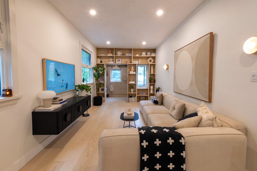
The sofa is from the Calgary store Revolve Furnishings. “We scoured to find one like that – it was a random find a long time ago,” she says. “We like that there’s no arms. You see our whole house when you walk in and it would feel too busy otherwise.” Best of all, the entire family fits on it.
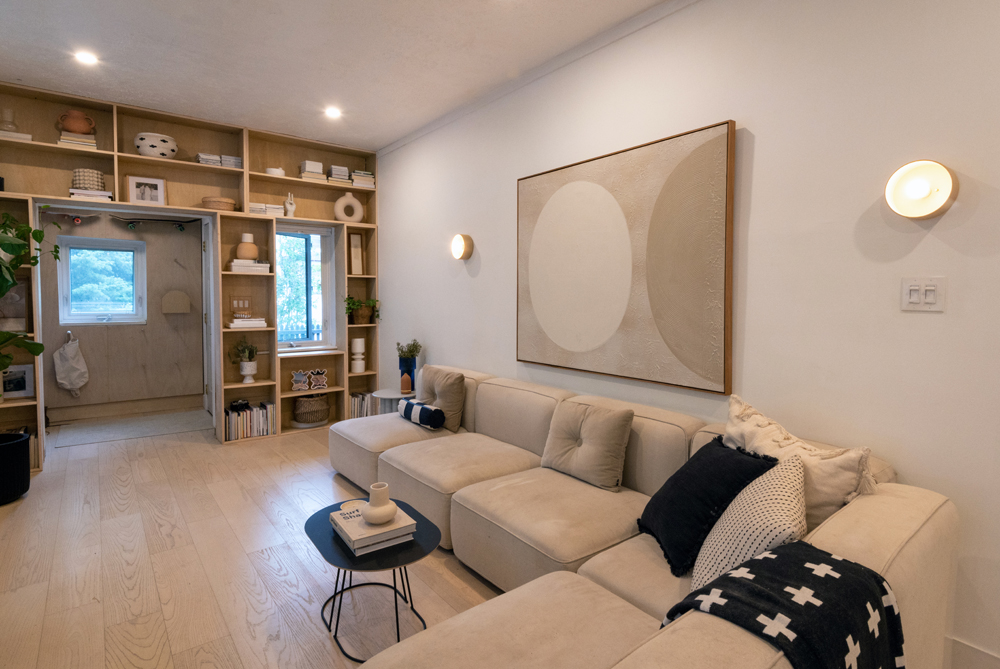
Illuminating Idea
The sconces flanking the sofa are from Etsy. Amy likes to support independent makers and small businesses. Because they’re wall mounted, they don’t hog precious floor space.
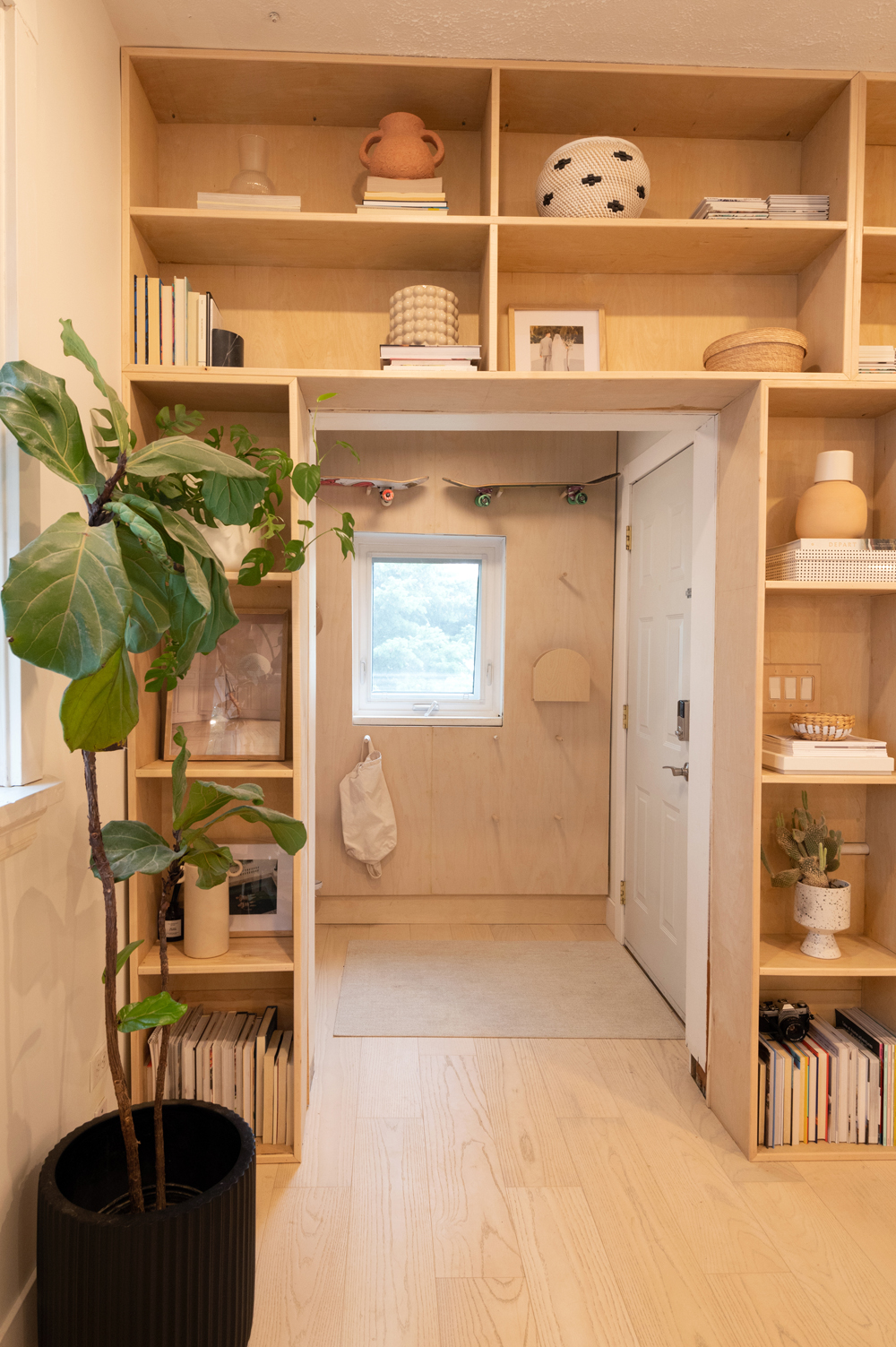
Basic Beauty
Here’s a better view of the shelves. Amy recommends picking up random vases on travels in the same palette, so that they feel like a set of sorts. There’s also breathing room within the boxes, so the shelving system doesn’t look visually loud and cluttered.
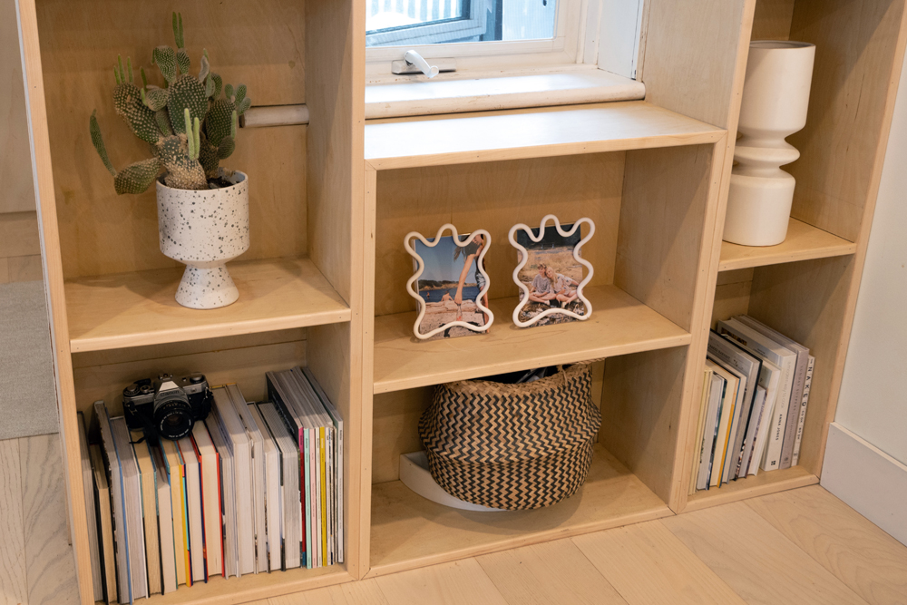
Taking Shape
Minimalist life hack: decorate with dynamic-shaped accessories, such as the wavy frames and twisted vases, that are neutral but not boring, like Amy did here. It’s a great way to add texture without being overly conspicuous and taking away from the minimalist vibe.

Such a Knob
Sure, anyone can pick up a Besta unit from IKEA and slap it on the wall. But Amy went one step further by tweaking the original with oversized knobs from the Australian company So Watt. She loves their quirk factor. The same handles are seen in the kitchen, too.
Related: 10 Decorating Mistakes That Are Making Your Home Look Cluttered
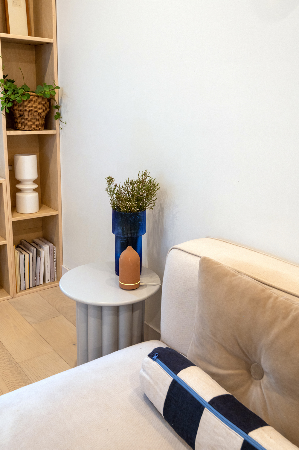
Sweat The Small Stuff
Details make this small space sing. This on-trend fluted side table is from West Elm and adds a fun moment to the end of the sofa. “I love H&M vases,” she says of the blue one seen here.
Related: 10 Cozy Reading Nook Ideas Every Bookworm Will Love
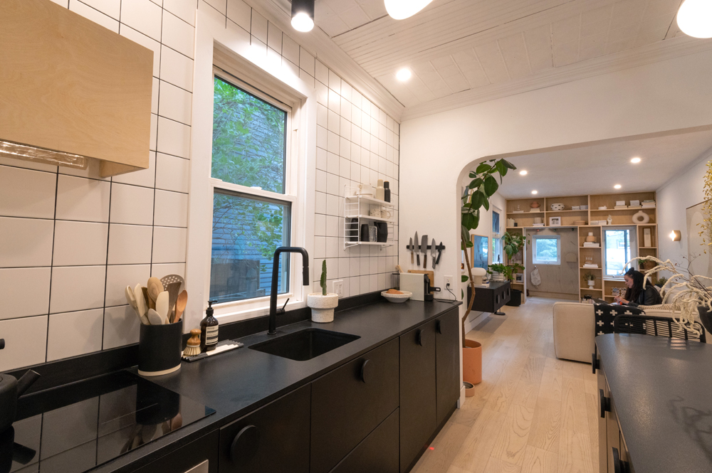
Round it Out
“There used to be a full wall to the bedroom here,” says Amy, who preferred an open-plan layout. Everyone loves an arch, hence the curve, which was created using drywall. Amy also brought modernist beauty to the home by opting for a bold black kitchen from IKEA.
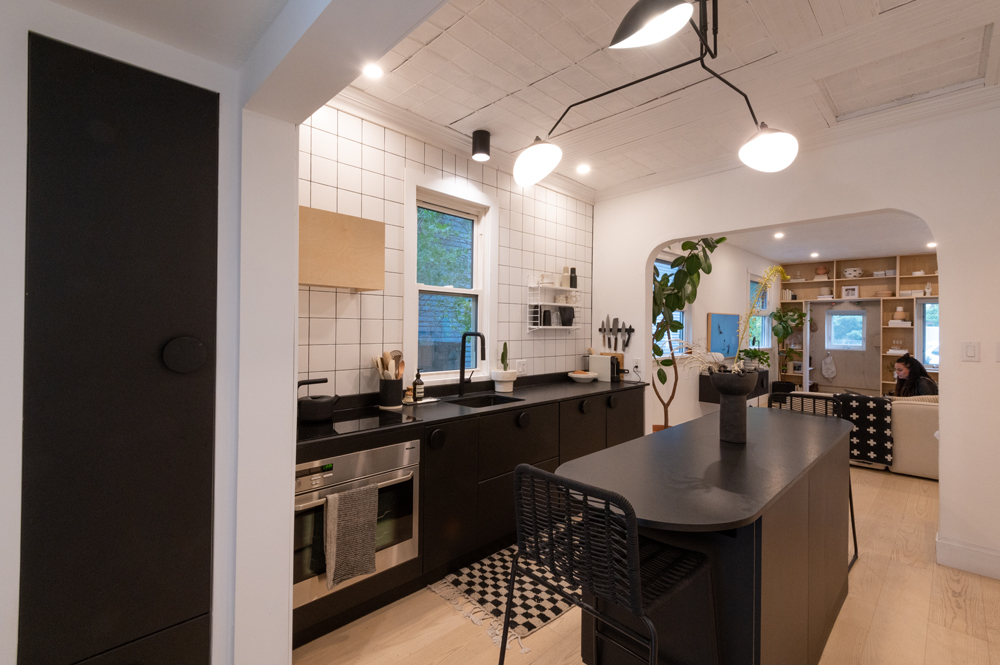
Round it Out Some More!
Did you know that you can soften the lines of your island by asking? It’s true, and it doesn’t cost any more than square corners. That’s what Amy tells us, anyway. “When you order your slab, the counter formatters come and you can ask them to round out the edges. It’s not more expensive,” she says. They cut out a foam version first, and then shape out the actual counter.
Related: 15 Kitchen Renovations That Real Estate Agents Hate
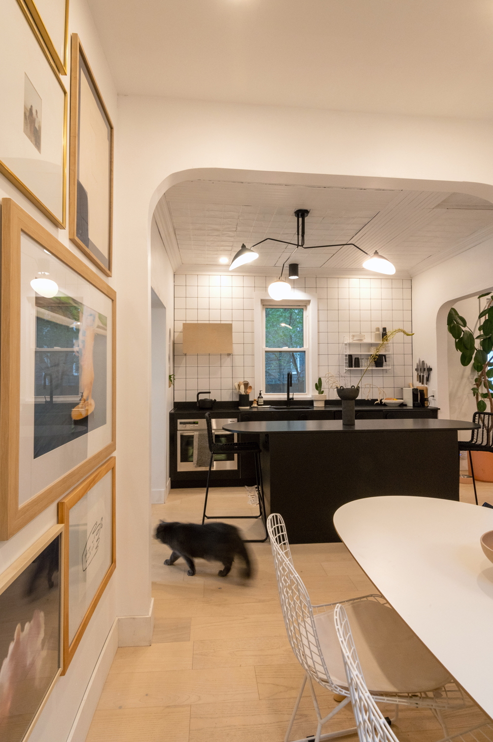
Dining Vantage
Wilder, the cat, struts through the kitchen like a boss. From this angle, you can really see why going black makes so much sense. That island has attitude!
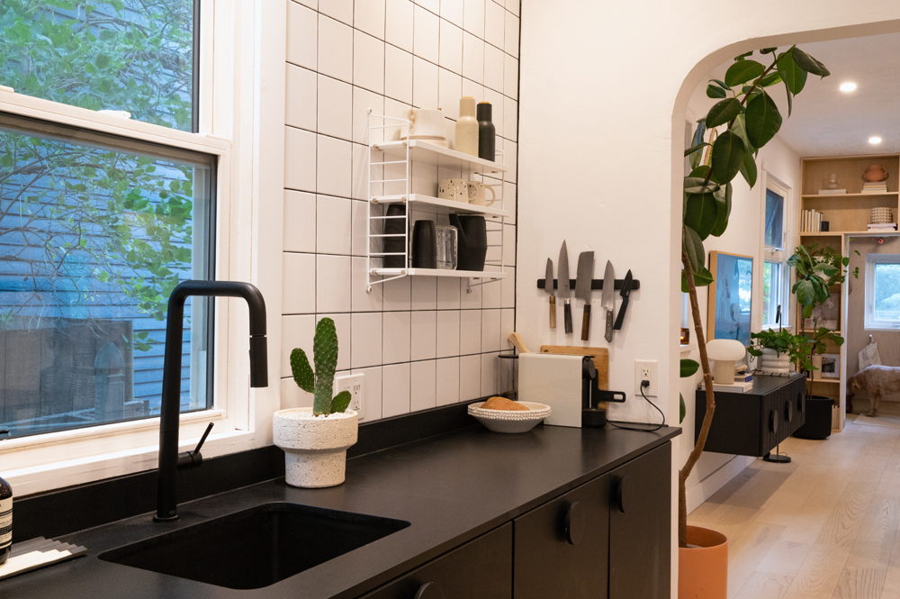
Chic Simplicity
Amy prefers clean-lined accessories over busy ones. The String shelf – a classic, flexible Finnish design that you can add onto – is from Kit Interiors.
Related: 15 Bad Kitchen Habits That Are Affecting Your Health
Neat Nook
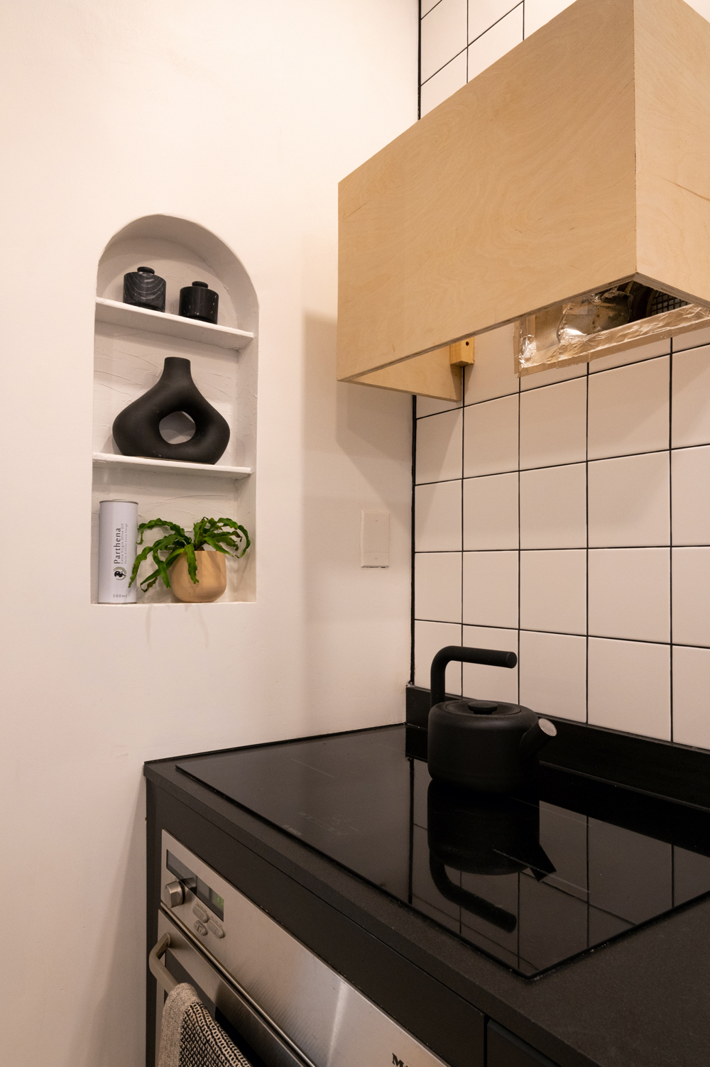
“It’s beachy and conceals the vent,” says Amy of her wooden vent hood, yet another fabulous DIY moment in her house. Budget plywood to the rescue, again! She also turned a once-ugly inset spice rack into a cool, arched spot to display pretty vases and plants. By the way, that rad black vase – Amy clearly has a thing for them – is from H&M. The Fellow Clyde Kettle is from Cook Culture.
Heads Up
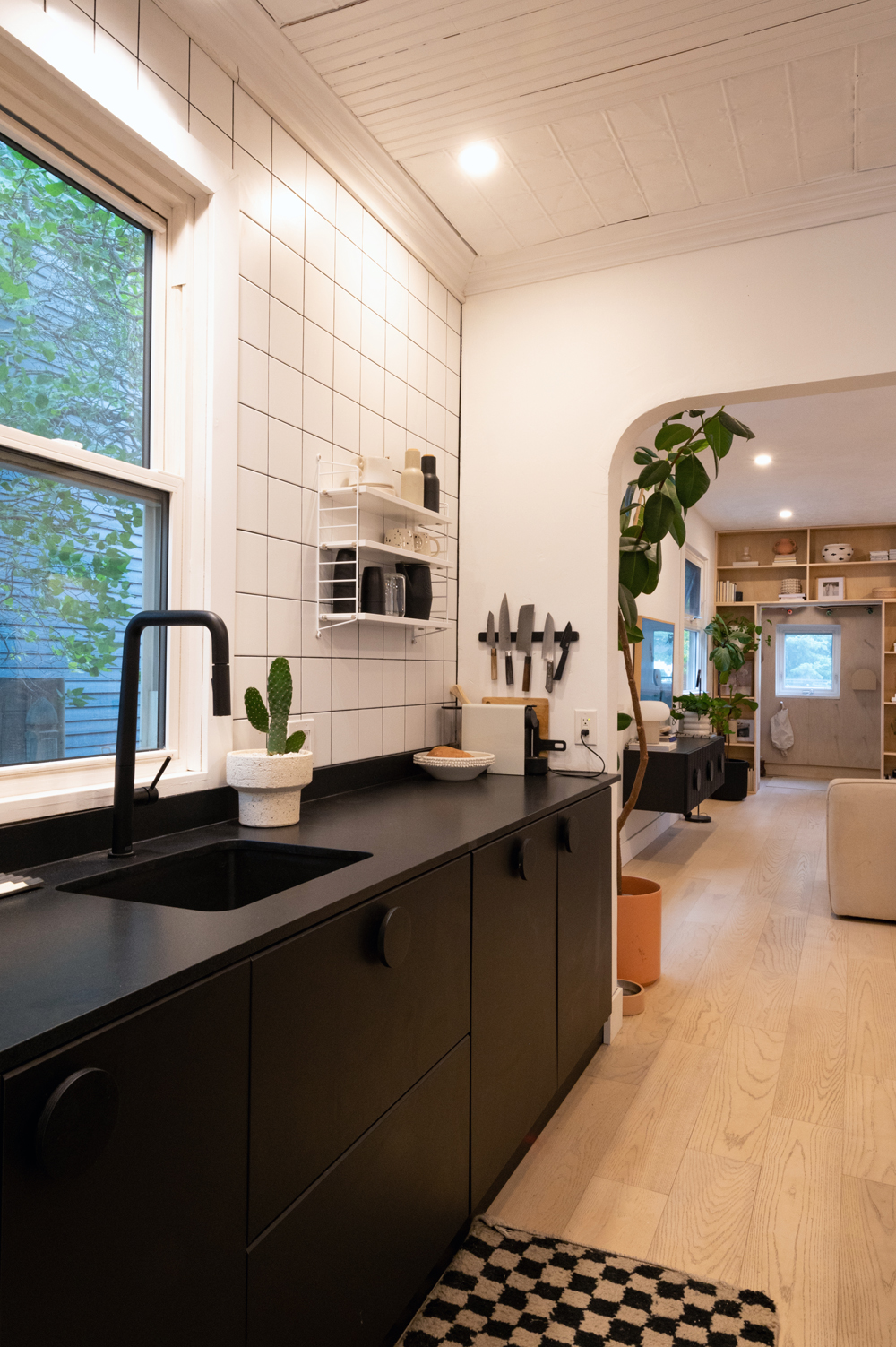
“Black is so different,” says Amy of the dramatic kitchen, which sports black-granite countertops in a leather finish. “We wanted to emphasize the ceiling height, and keep the space visually open, so we didn’t go with uppers,” she adds. Budget-friendly square tile, dressed in black grout, is carried to the ceiling to also draw the eye upwards.
Related: Inspiring Property Brothers Kitchen Transformation Trends to Keep an Eye On
Ceiling Makeover
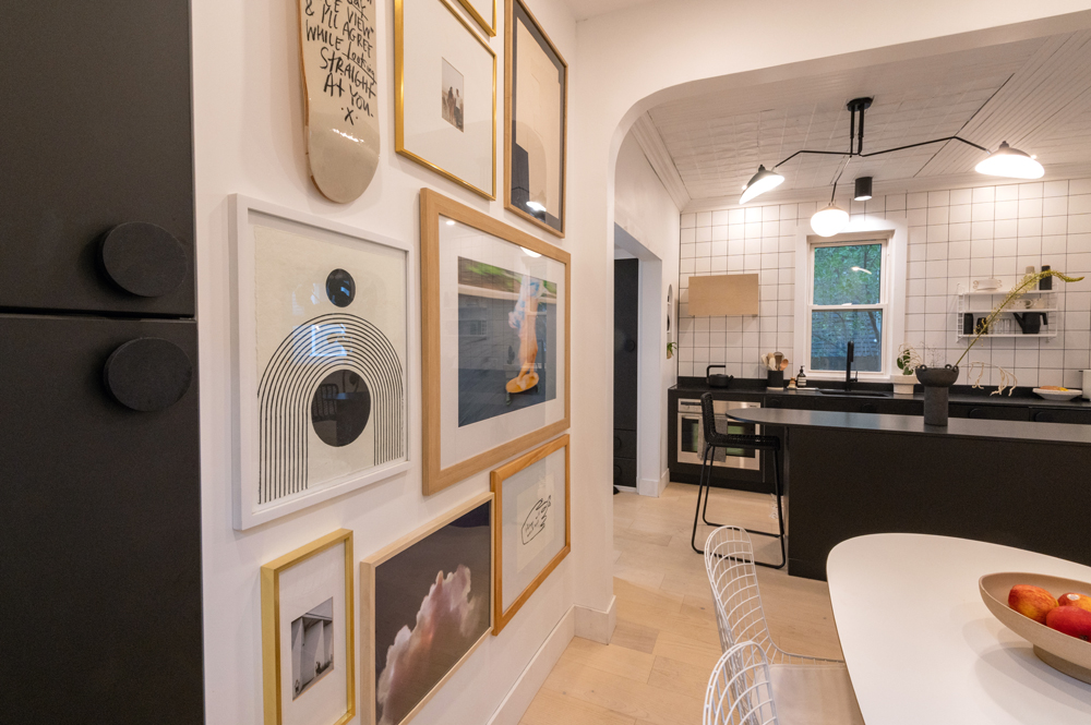
“There used to be an ugly silver-tin ceiling over the kitchen that was added after, not from the 1900s,” says Amy. “We liked that it’s weird and painted it over for textural punch.”
Related: From Kitchens to Living Rooms: Minimalist Design Style Ideas, Room By Room
Fake it With Drapery
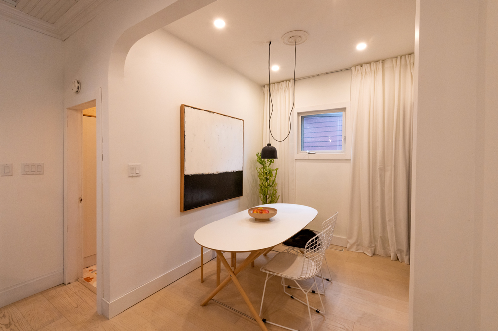
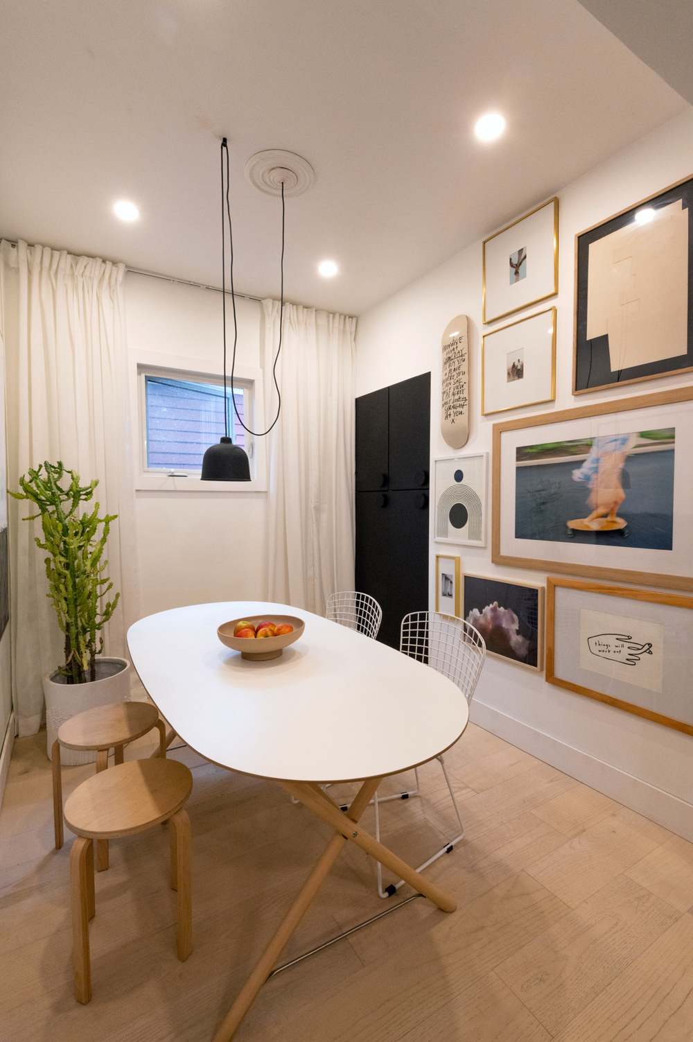
Amy put up flowing floor-to-ceiling drapes on tracks to fake the illusion of a large window. This is where the third bedroom used to be located, by the way. We love this cute, little dining nook much better – particularly, that sassy rope pendant light.
Gallery-Wall Goals
Clumped artwork – or a gallery wall – is an easy way to make a big impact. Be sure to map out the gallery’s layout first and try to ensure the gaps between are even to keep the collection harmonious. “The skateboard is my favourite,” says Amy. “It’s by Blacklist, an Australian artist. He does fun, graffiti art.” The moody purple abstract is by Dan Hobday through Etsy.
Related: This Calgary Loft Delights With Whimsical Goodies, Original Art and Fortifying Pattern
Clean-Lined and Cool
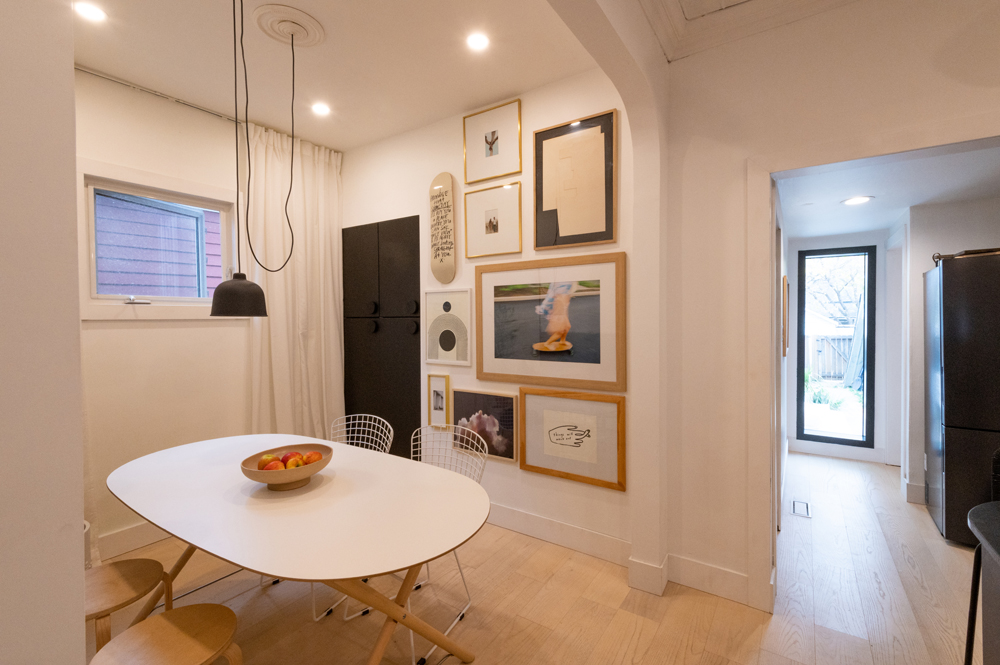
Tranquil and cool, the house isn’t overstuffed but instead filled with a mix of simple curated pieces. The dining set is from IKEA and has classic Scandinavian neat lines. Two types of chairs lend a casual vibe and keep things interesting.
Closet Switch-Up
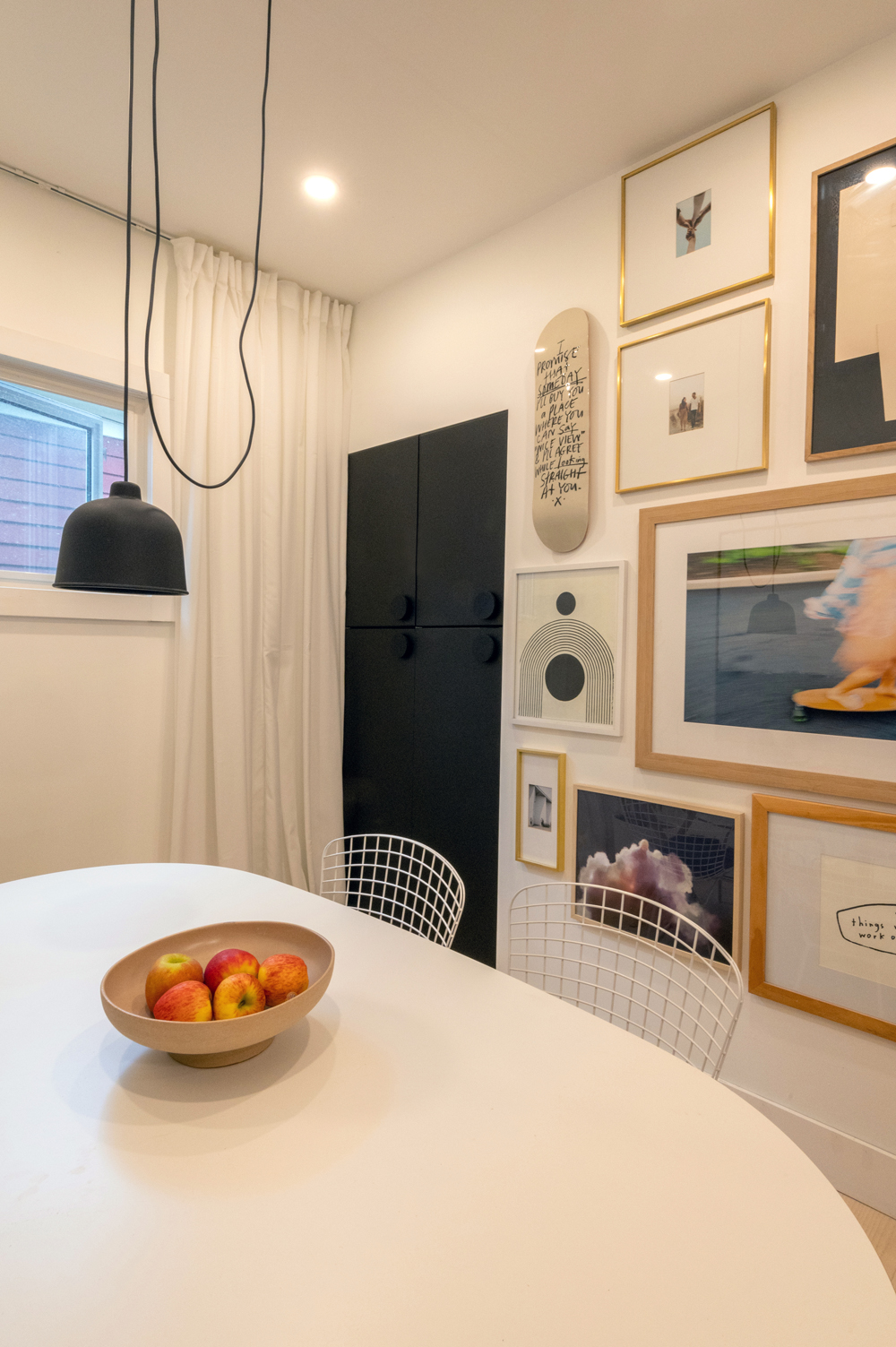
The previous bedroom had a closet, so Amy replaced the doors with Sektion fronts from IKEA and added So Watt knobs from Australia. Voila, chic dining room storage!
Personal Style
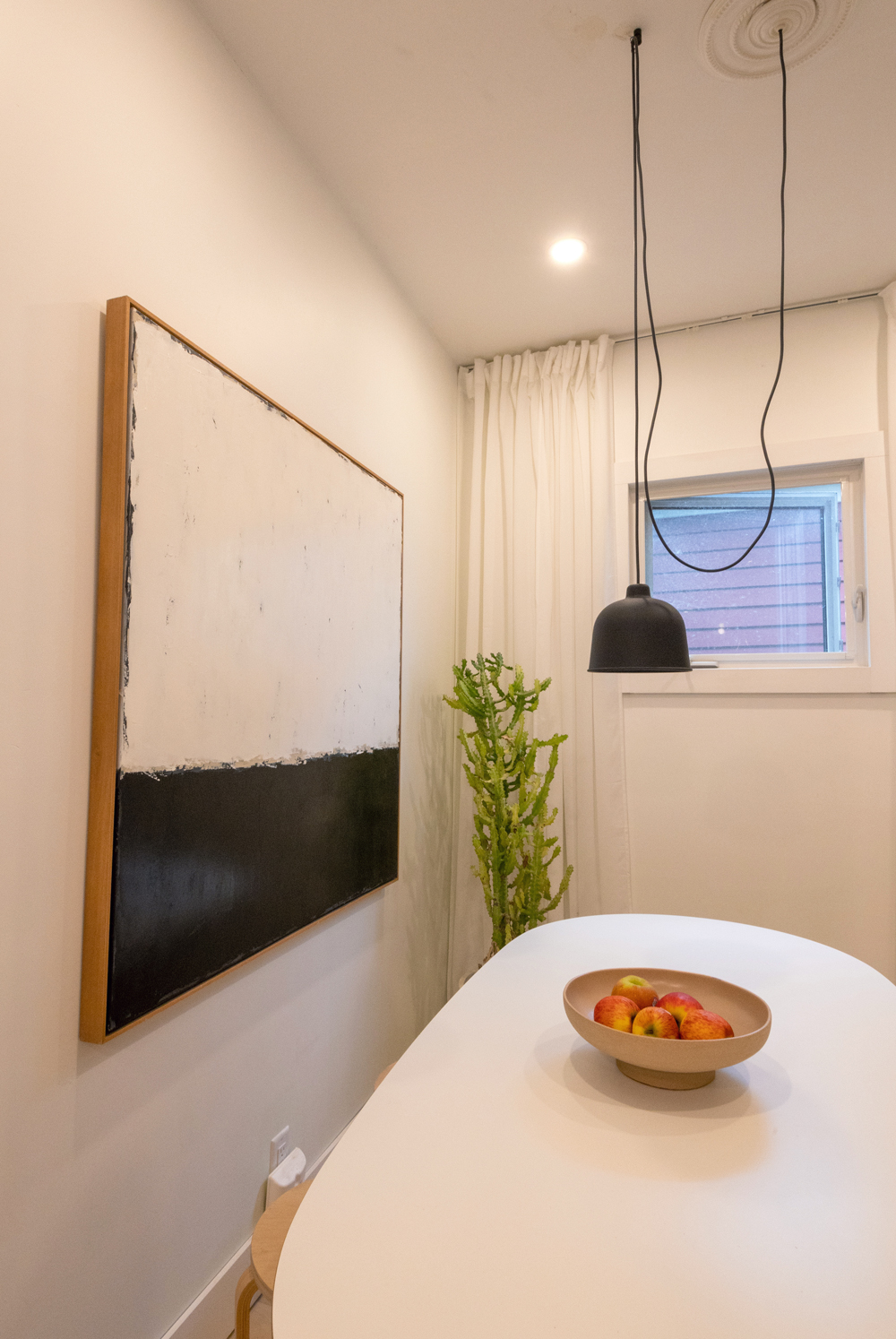
Artwork throughout the home gives it one-of-a-kind personality. This two-toned abstract is – wait for it – HomeSense. It lends graphic punch, and it’s easy on the wallet. Win-win.
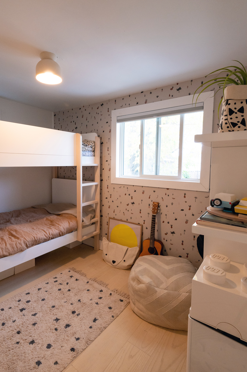
Sibling Revelry
The couple’s kids, Sullivan and Flynn, have always bunked down together and are best buddies. Aw! “We had three bedrooms and they begged us to share,” says Amy. So, she knocked down the original third bedroom’s walls to create a dining room instead. The streamlined bunkbed from Babyletto is unfussy and functional in the space.
Related: 10 of the Most Adorable Kids’ Rooms We’ve Ever Seen
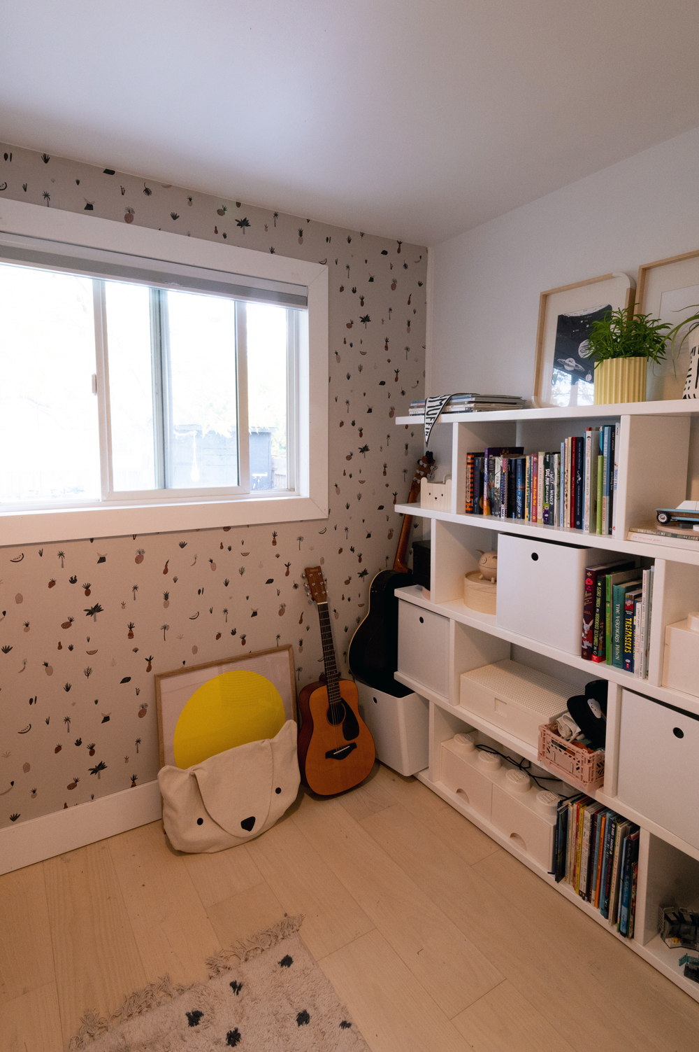
Fun Wallpaper
“It’s a hard age, nine and 11, because they’re not into little kids’ stuff or decorating,” says Amy. To inject big-boy fun into the room, she settled on a fruit print wallpaper Fruiticana from Ferm Living. “We spend a lot of time in Mexico, so it’s a nod to our trips. It’s tropical but neutral colours. And it doesn’t feel babyish.” Restricting the print to one wall also means the room doesn’t feel busy. Amy snapped up the CB2 bookshelf on Facebook Marketplace.
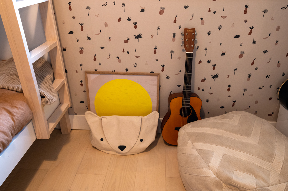
Cute Accessories
A bear canvas bag is an adorable storage solution in the boys’ bedroom. They keep their Lego tucked inside it.
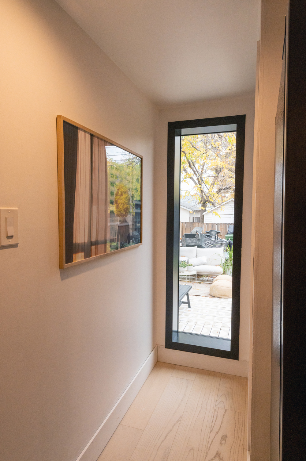
Patio Peek
When in doubt, punch in a window. That was Amy’s rationale when faced with this previously dark corner. She added the gorgeous, black-trimmed window (trend alert!) that lures in the light. The floor-to-ceiling silhouette beautifully frames the patio. One of Amy’s photographs is shown in the hallway.
Related: Summer Staycation: The Coziest Patio Furniture Perfect for Small Spaces
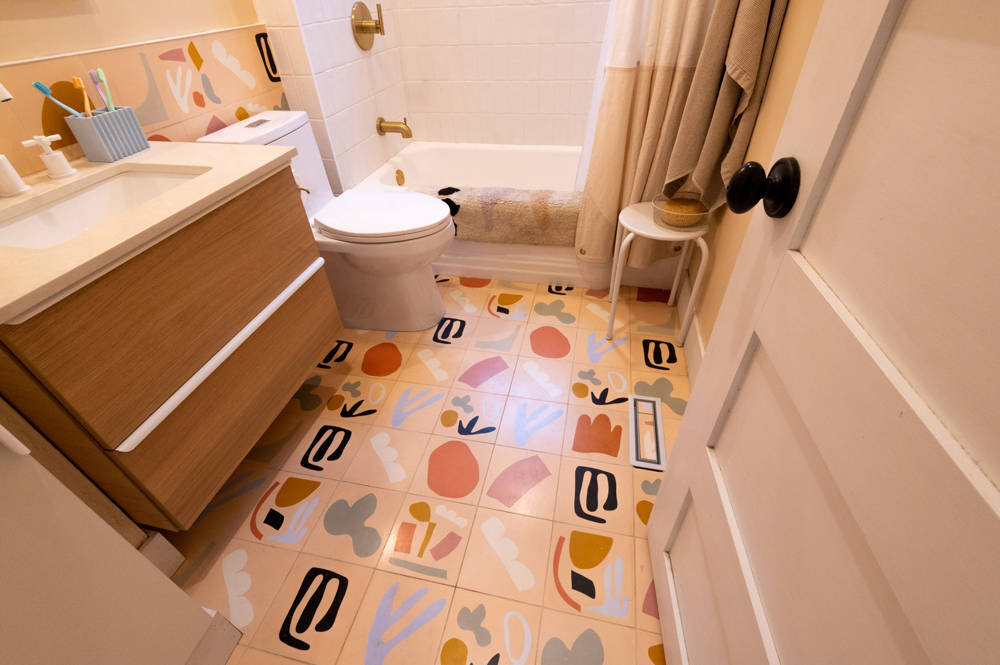
Fun Underfoot
Amy is smitten with these playful floor tiles, The Aurora Collection, by the artist Alex Proba through the California company Concrete Collaborative. “They’re laidback but different,” she says. “It adds a pop of colour and fun on a muted beachy backdrop.
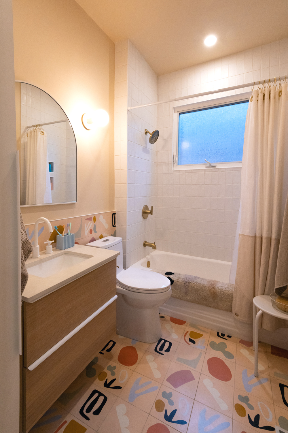
The Bathroom’s Bits
In addition to the wild tiles, the personality-packed bathroom gets a lift from the white faucet (a twist on the usual), the crescent mirror and brushed brass plumbing hardware.
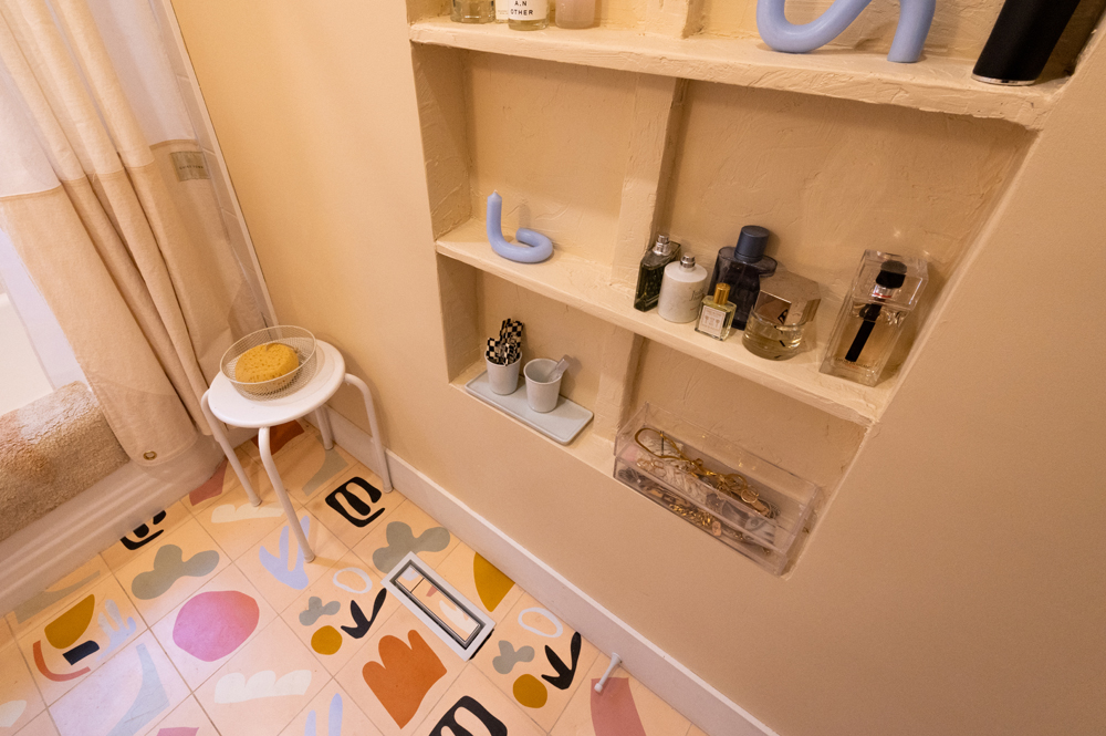
Stylin’ Shelves
The original gloomy bathroom had a door hiding the shelves. Amy revamped it by removing the door, creating an arch (you’ll see that in the next slide) and plastering the inside. Only nice things are displayed, including wavy lavender candles from Woo To See You that speak to Amy’s love of the idiosyncratic.
Related: Trust Us – These Modern Bathroom Design Ideas Have Major Staying Power
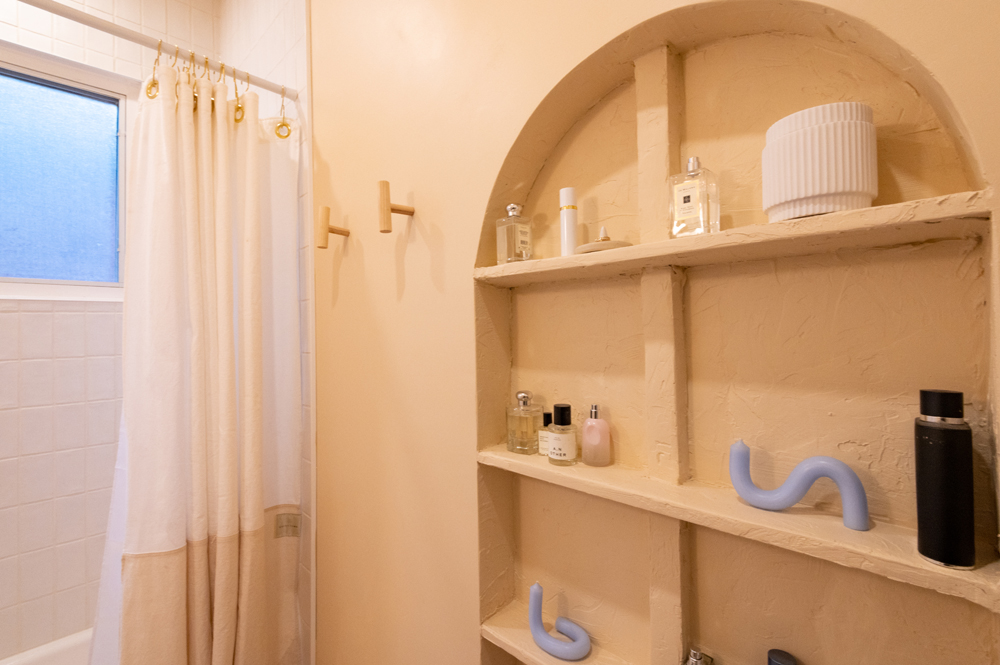
Continuity is Cool
“We replicated the arch a few times throughout,” says Amy of the recessed shelves. The walls themselves are a thrilling peachy hue to reinforce that beachy feel.
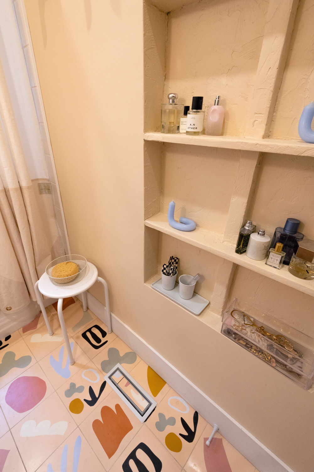
Storage Smarts
The slim acrylic storage box from HomeSense holds Amy’s jewellery. Pro tip: only display pretty things.
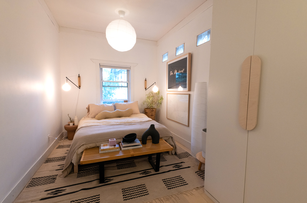
Compact Comfort
Mounted side lamps from EQ3 are stylish space-savers in the couple’s bedroom. A graphic rug punches up the space, and a sinewy lumbar pillow continues the curvy theme. This house is full of them! Three glass blocks above the artwork resemble clerestory windows. (They’re original.)
Related: 17 Basement Bedroom Decorating Ideas That’ll Make You Forget You’re Underground
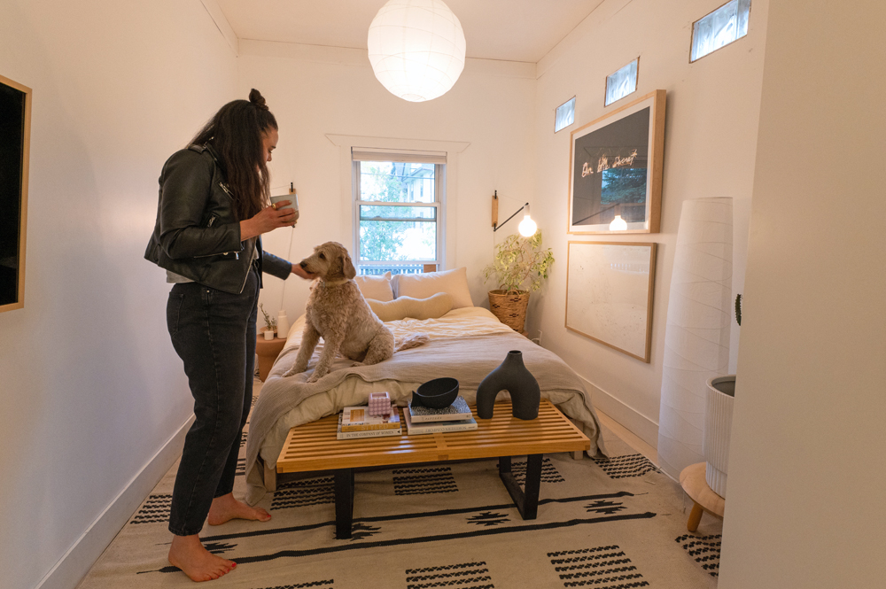
Home is Where the Dog is
June and Amy share a sweet moment in the bedroom. Home may be small, but Amy’s family loves it. “We think of our neighbourhood and community and the outdoors as our home,” she says. “We’re close to the river. It’s walkable and bikeable. We spend time in the mountains, too.”
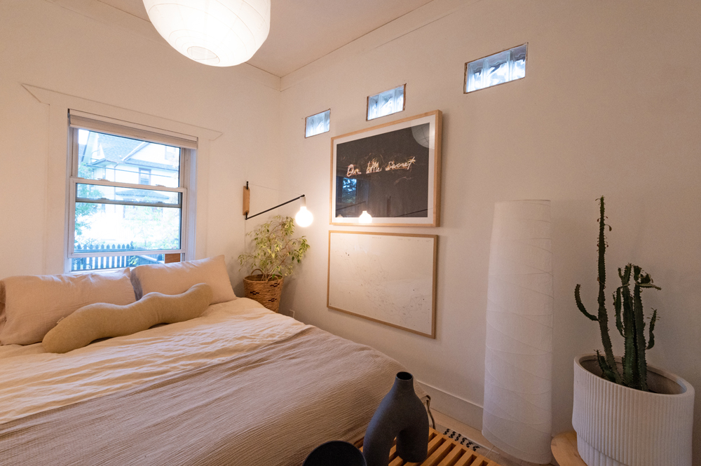
Sleep Zone
Artwork, a motif throughout the home, lends tons of personality. “The neon piece is from HomeSense; the bottom one is a map of Mexico we got from a little home shop in the town we got married in (Sayulita) and had it custom-framed,” says Amy.
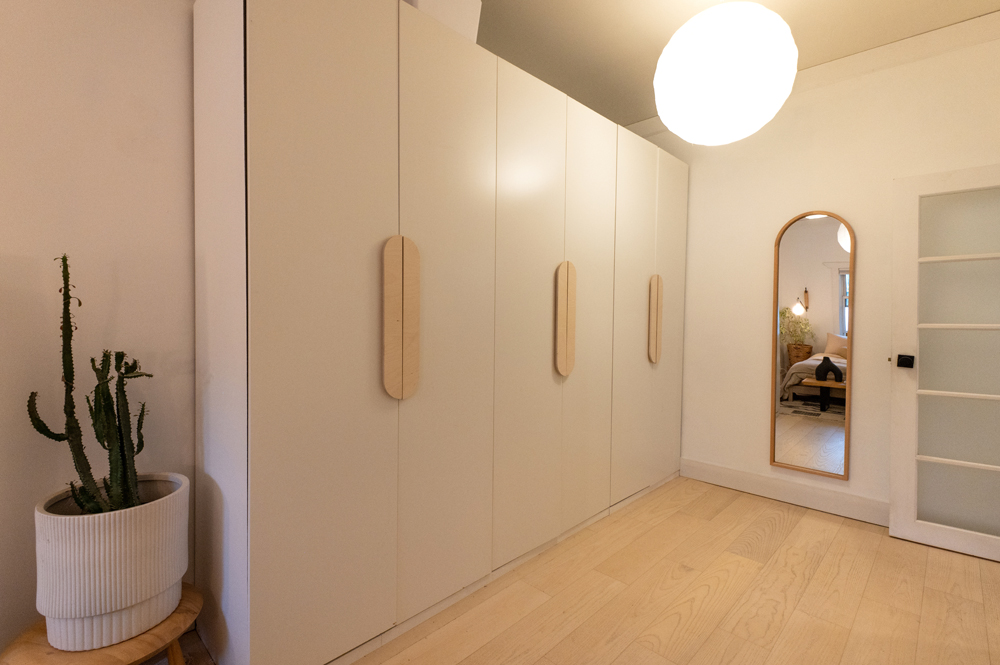
Terrific Tweak
The house came with these IKEA closets in the bedroom. “They had brown fronts, so we replaced them with the white ones and added oversized handles from So Watt, the Australian company,” says Amy. The white and wood swap feels much more suitable to the overall beachy, calm vibes throughout.
Related: The 20 Best Bedroom Plants to Help You Get a Better Sleep
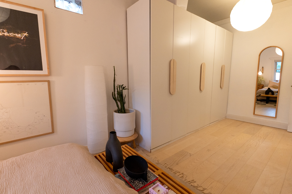
Curves Ahead
“The bedroom is super narrow and long, so it’s an awkward shape,” notes Amy. Nonetheless, the room just work thanks to the cohesive palette and simple, modern furnishings. There’s another curve on the mirror!
Related: Tour the Busy Alberta Home of The DIY Mommy and Her Family
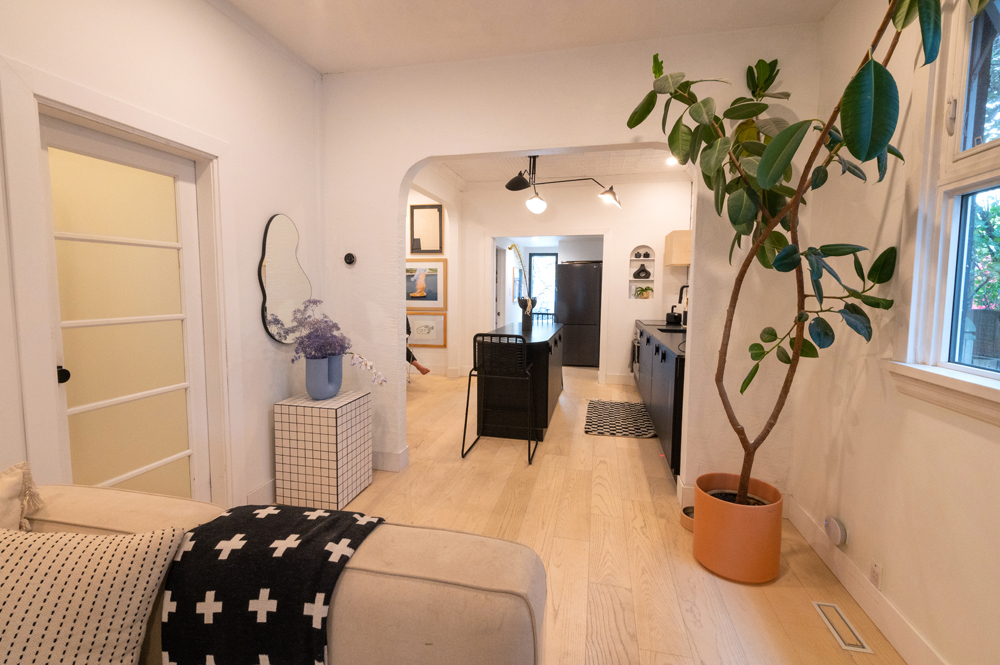
A Wider View
The long, thin layout of this breezy home allows you to see all the way to the back of the house, from its airy living room to the stunning black-framed floor-to-ceiling back window.
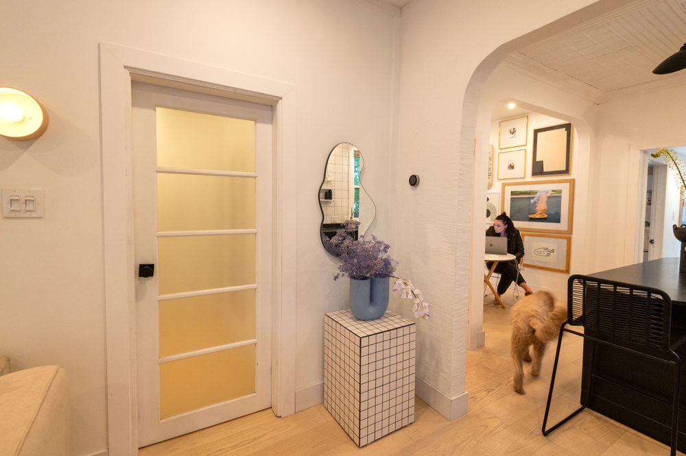
Adding it Up
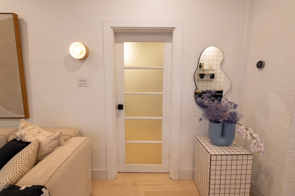
Amy and June hang out in the newly renovated home that the couple took down to the studs. The frosted door leads to the primary bedroom. Amy estimates the entire renovation cost about $50,000. And if you can believe it, the family lived through the chaos. “The kids were eating on plywood countertops and the floor – our kids do a lot with us. They love it!” says Amy.
A Fab Vignette
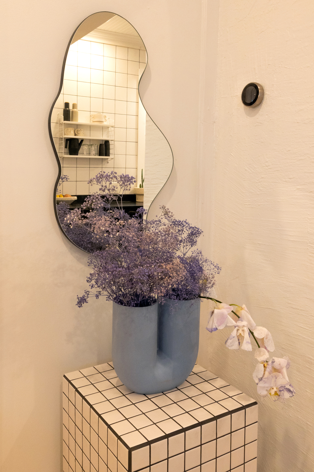
Amy fell in love with this tiled table that just so happens to match her kitchen backsplash. She was going to try making one, but figured she’d leave it to the pros. She bought this off a couple that makes them on Facebook Marketplace. It’s a perfect perch for the Finnish Muuto vase, a sculpture that deserves its own turn in the spotlight.
Related: This Breathtaking Kitchen Wall Art Trend is Taking Over Social Media
Creating Interest
Here’s another view of that vignette that creates a pause-and-enjoy moment in the hallway similar to what you’d find in an art gallery. Who says you need a giant home to appreciate sculpture?
HGTV your inbox.
By clicking "SIGN UP” you agree to receive emails from HGTV and accept Corus' Terms of Use and Corus' Privacy Policy.


