When David purchased a home for his family after a single day of house hunting, he failed to mention to his wife that the kitchen was far from perfect. After struggling to work around the ugly countertop, limited counter space, and groutless backsplash, David and his wife Wemi called in the professionals to help them conquer their claustrophobic kitchen. Enter Sabrina Smelko and Sebastian Clovis of Save My Reno, who designed a bright and modern kitchen with an open-concept feel for the desperate couple. Here’s how they made the kitchen feel triple its size, giving David and Wemi their dream kitchen makeover, and saving them $15,000 in the process!
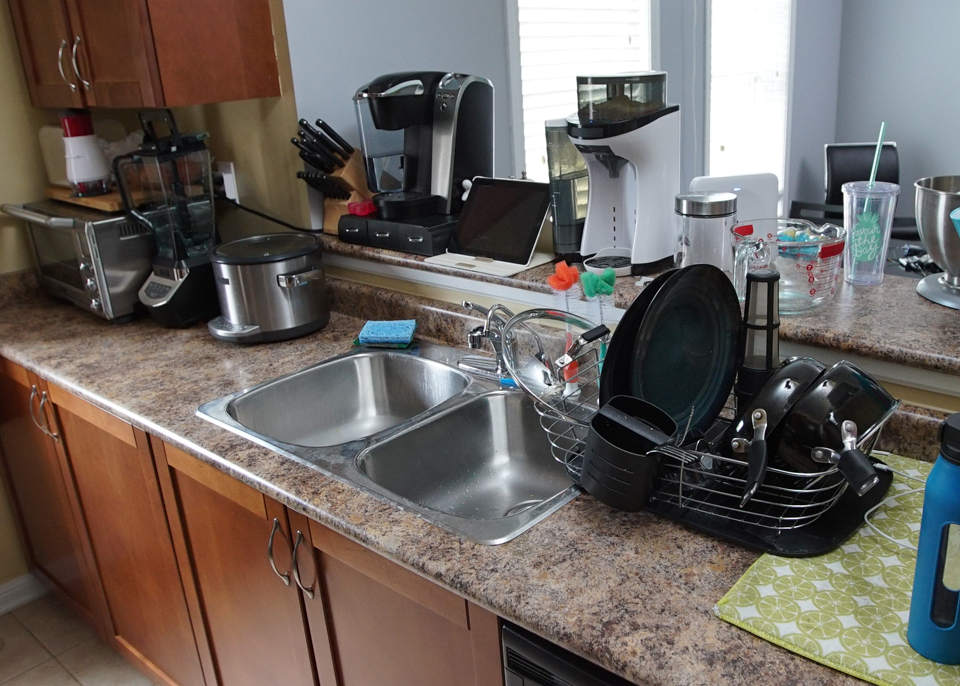
Before: Cluttered and Dysfunctional
The homeowners obviously loved using their kitchen — so much so that there was barely any room for their appliances and dishes, never mind any actual prep space. With every spare inch of counter space taken and zero storage below, this design needed to go.
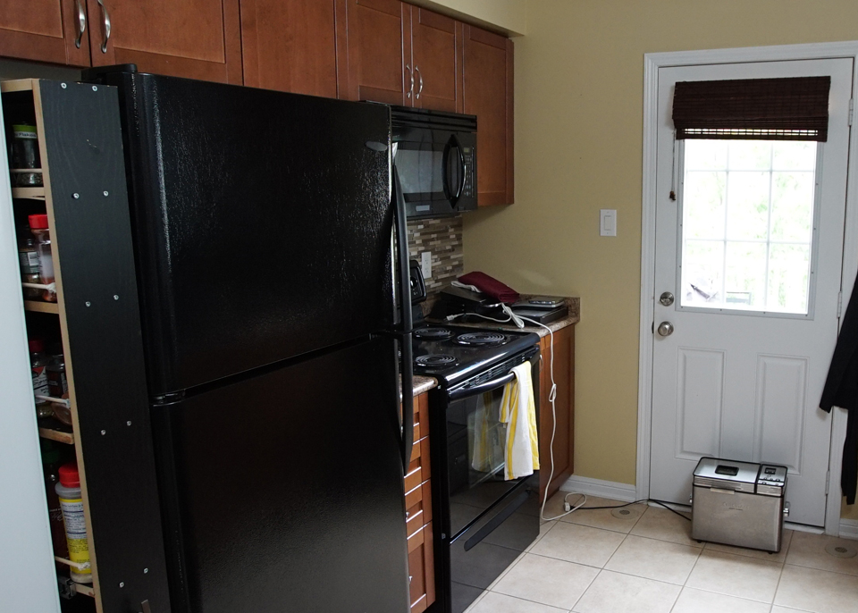
Before: Dark and Outdated
The bread maker on the floor isn’t the only unsightly item in this kitchen. Even though the cabinets and appliances are fairly new, they’re too dark and drab for this small, closed off space. Add in completely dysfunctional storage (note the “spice rack” beside the fridge) and this is pretty much a hot mess.
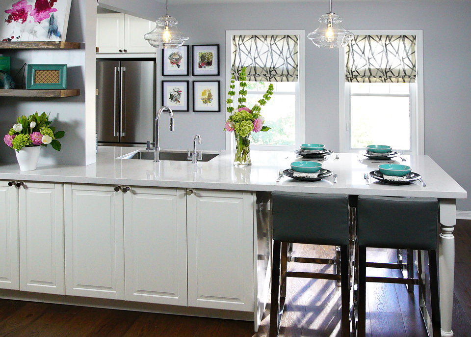
After: Two in One
The team removed that awkward wall and extended the kitchen into the dining room instead, which meant they could create an open-concept feel, add tons of bonus storage and even take advantage of a little extra natural light to brighten the space up.
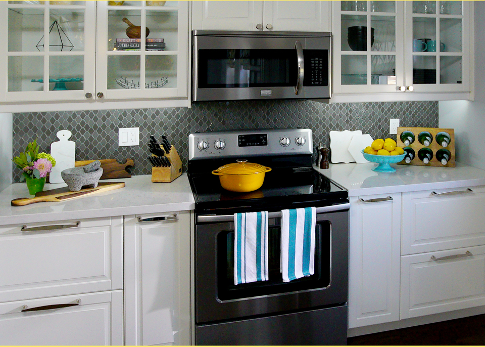
After: Modern Appeal
Bright white overlay cabinets below and open-concept doors above help the space to feel modern, fresh and large. Sabrina and Sebastian managed save the homeowners a little bit of money by selling off the old appliances, and the oversized draws add tons of bonus storage. Above the pretty backsplash is simple and cost-effective, and adds a fun texture to the space.
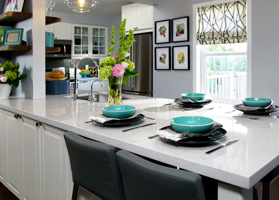
After: A Better Flow
Before when the David and Wemi cooked together they would run into each other because the space was so confined. By getting rid of the centre counter and moving the faucet to one side, Sebastian pretty much tripled the space and functionality.
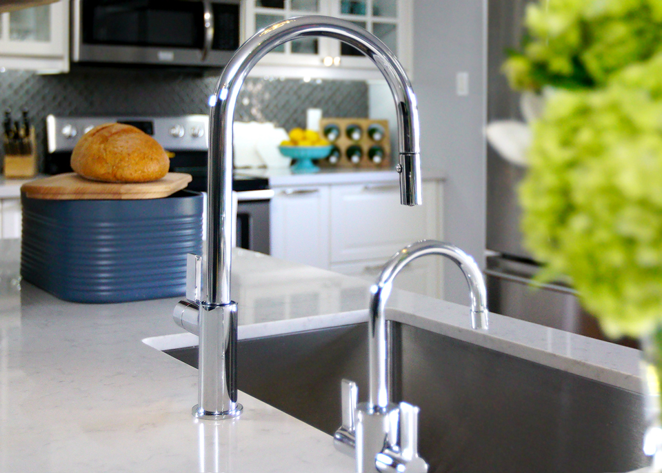
After: Simple Finishes
When upgrading your hardware you don’t need to break the bank in order to add a modern touch. Sabrina and Sebastian opted for less expensive finishing touches like this faucet, which still looks brilliant with the rest of the modern updates but doesn’t cost a pretty penny.
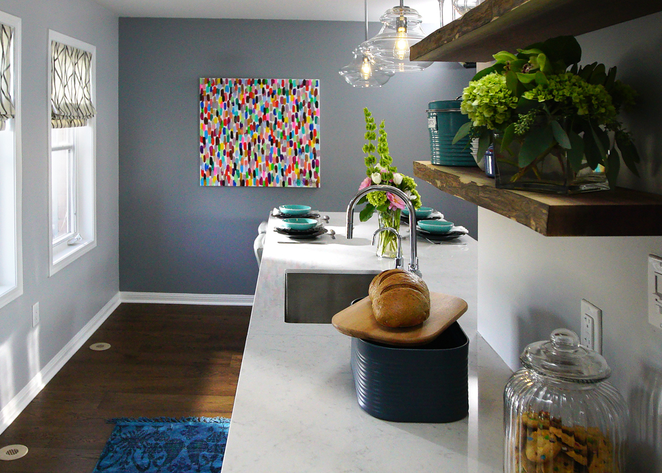
After: An Extended Countertop
Even though Sabrina originally designed a drop-down table at the end of this counter, David changed his mind halfway through the process. In the end they extended the counter instead to create a uniform space that serves a dual purpose: more prep space, but it doubles as a dining room. Below the engineered hardwood throughout helps with the flow and adds a rich finish, all at a much lower cost.
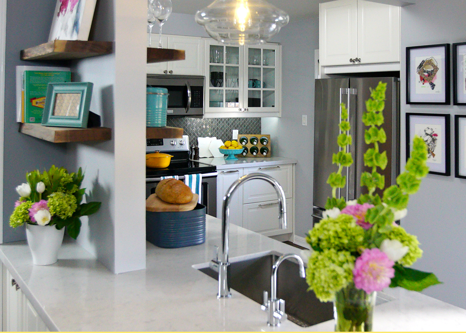
After: An Artful Centrepiece
Rather than remove this integral support wall and install beams (which could cost thousands), Sabrina and Sebastian created an artful shelf installation instead. With sturdy floating shelves on both sides of the wall there’s a little bit of extra storage and display room now available, and it looks purposeful and crafty rather than cluttered and cramped.
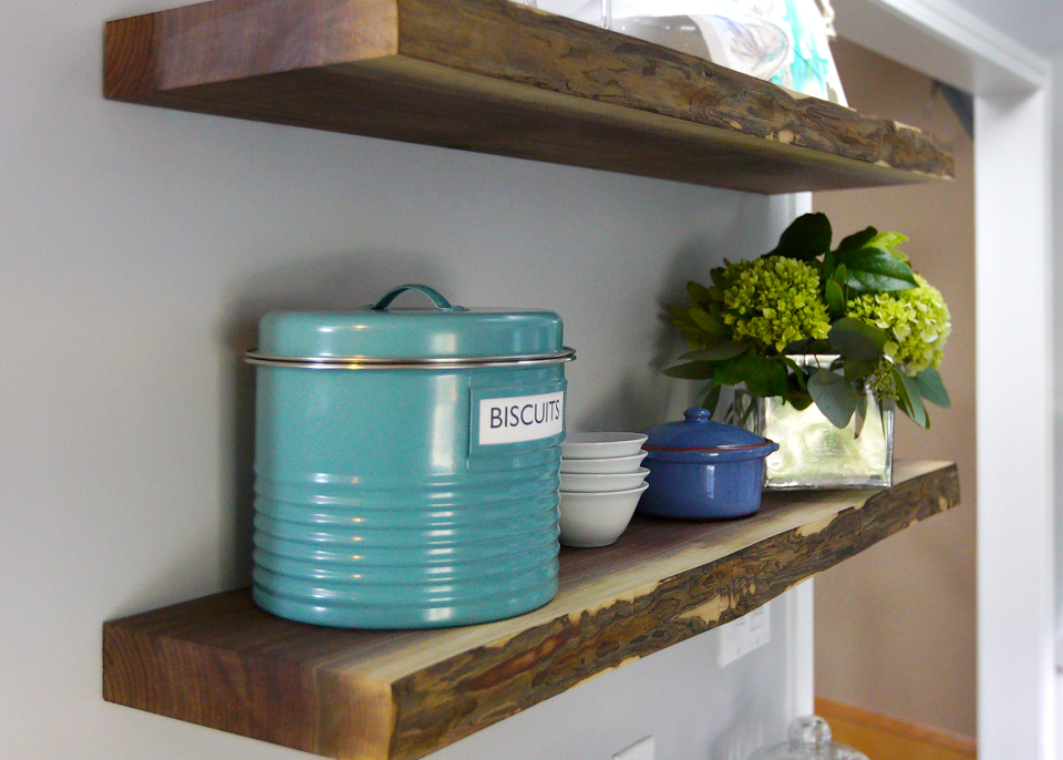
After: Repurposed Shelves
Remember that original drop down table? Because David changed his mind halfway through Sabrina had already had it built. So rather than let that money and design go to waste she and Wemi transformed the piece into beautiful shelves instead. With just a little stain they were easily converted to add a modern, cottage-like effect to this wall.
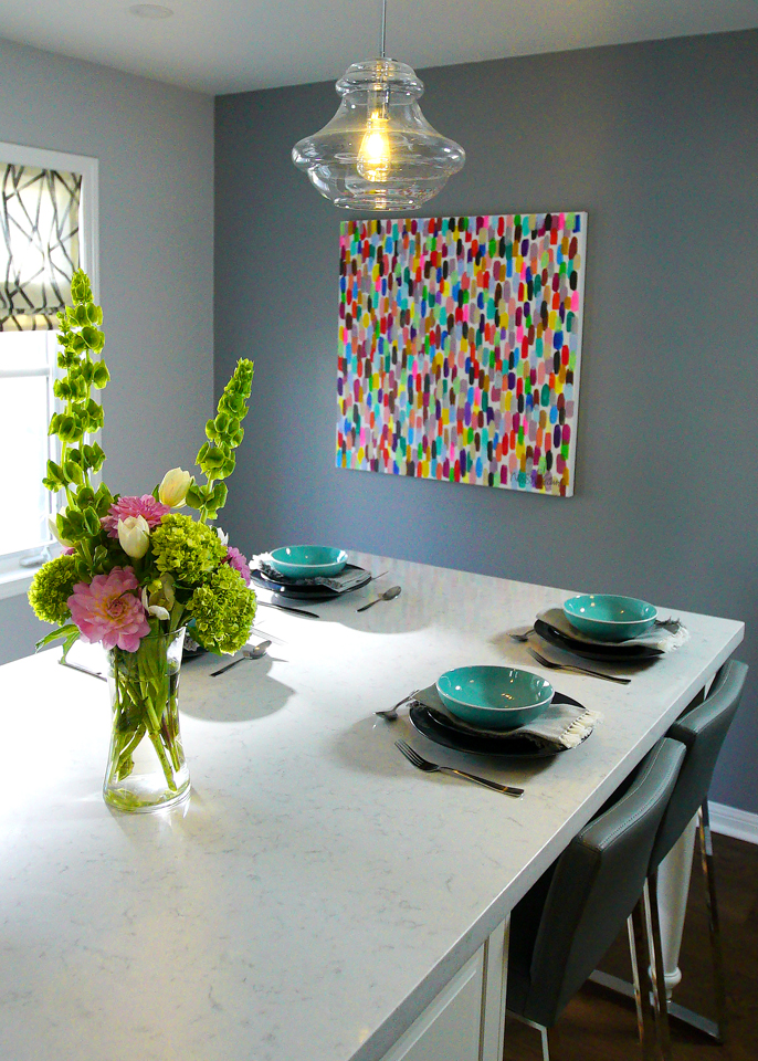
After: Spacious Dining
The old dining room felt narrow and closed in. But by opening up the space and letting it flow with the kitchen it now feels like a natural extension instead of an afterthought. The large painting adds a pop of modern colour and the bar seating seats four; perfect of this little family of three.
HGTV your inbox.
By clicking "SIGN UP” you agree to receive emails from HGTV and accept Corus' Terms of Use and Corus' Privacy Policy.


