After making it through the red-hot real estate market in 2015 with multiple bidding war battle scars, this Toronto couple purchased a detached brick house in Corso Italia for $750,000. Now, settled into their new neighbourhood, we find out how Armando and Emily uncovered a surprise third floor attic (talk about a value add!) and managed to turn a century-old fixer-upper into a stunning family home. (The kitchen pantry will leave you speechless.)
The Gut Job
The renovation project took a year and half to complete, which was longer than anticipated. “We can describe the improvements we made in three words: total gut job,” explains the couple. “Everything was in its original state from 1929, including nob and tube electrical, an oil tank and lack of air conditioning.”
The Secret Retreat
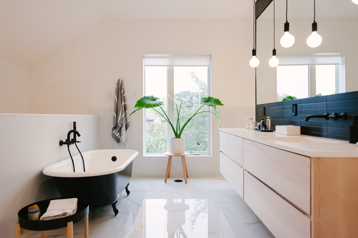
A surprise large attic space with soaring ceiling height allowed the couple to create a walk-in closet and spectacular spa-like en suite accessible from a private staircase in the master bedroom. “A secret retreat, as we like to call it,” notes one of the owners.
Black, White and Beautiful
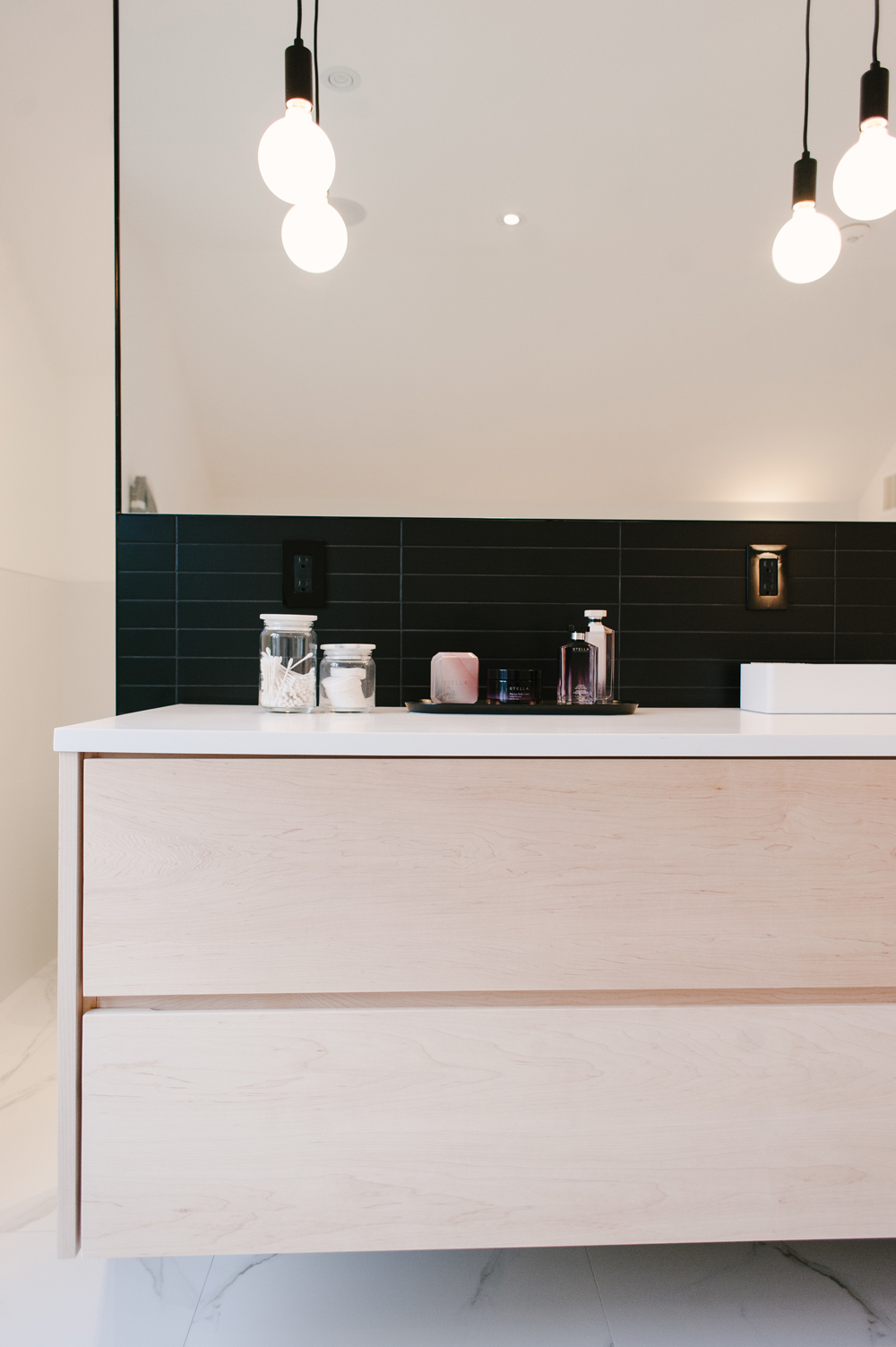
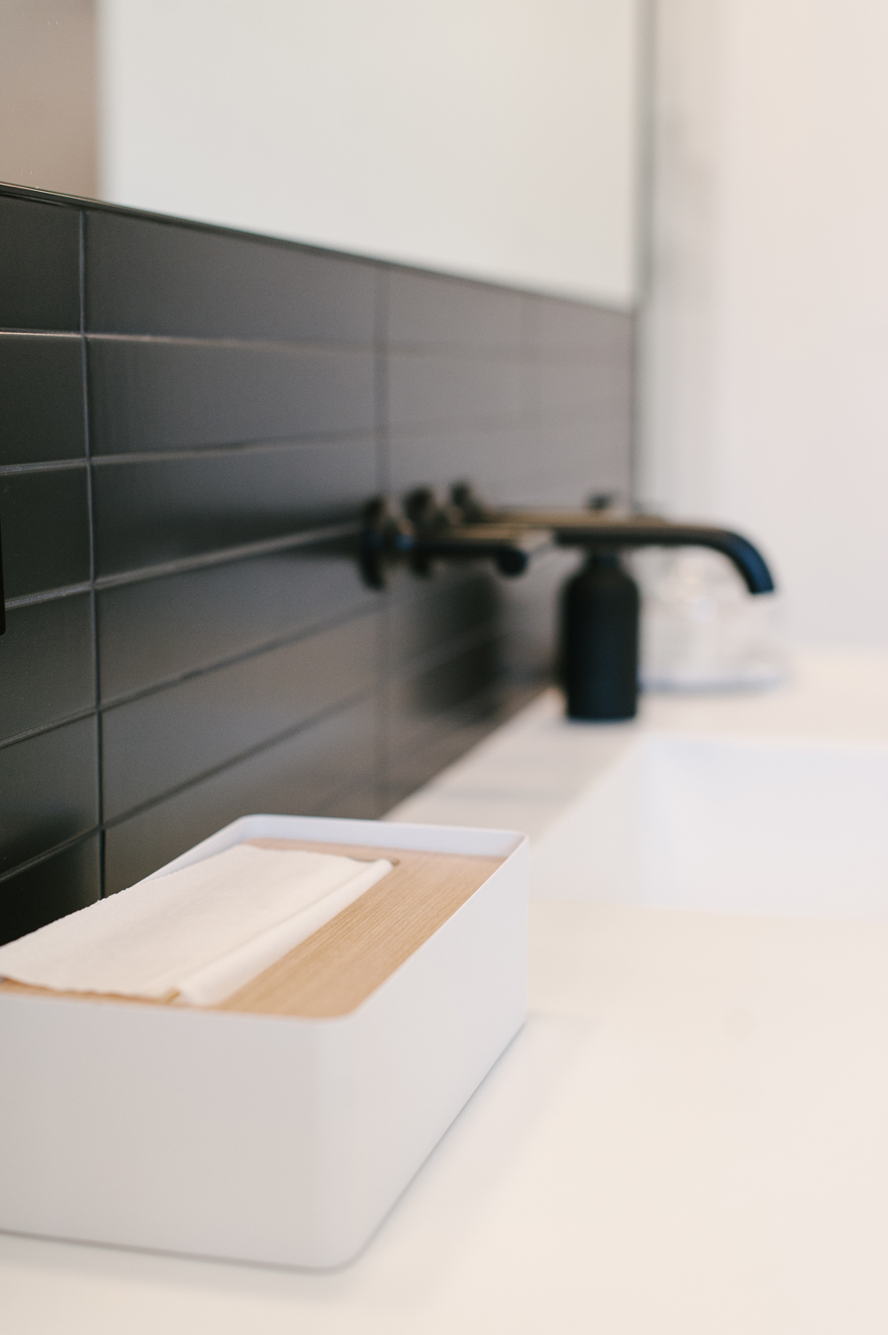
A black subway tile backsplash paired with black grout gave the sleek white bathroom and modern finish. Black mounted hardware blends seamlessly against its backdrop for a look that’s completely calming in its minimalism.
The Dream Discovery
“We decided to add a third floor addition after we realized there was enough ceiling height in the attic for Armando to comfortably walk through without slouching,” says Emily. “The huge attic was a hidden gem-we had no idea it was there and the discovery was a dream for me as I always wanted a closet large enough to fit all my clothes and shoes.
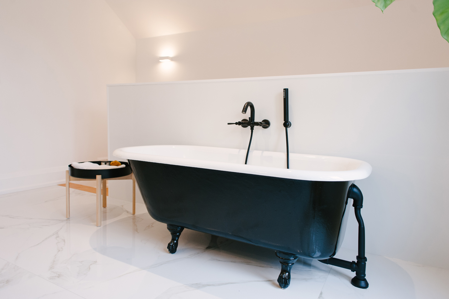
A Refinished and Fabulous Cast Iron Tub
An original cast iron tub was refinished and relocated to the couple’s master ensuite on the third floor.
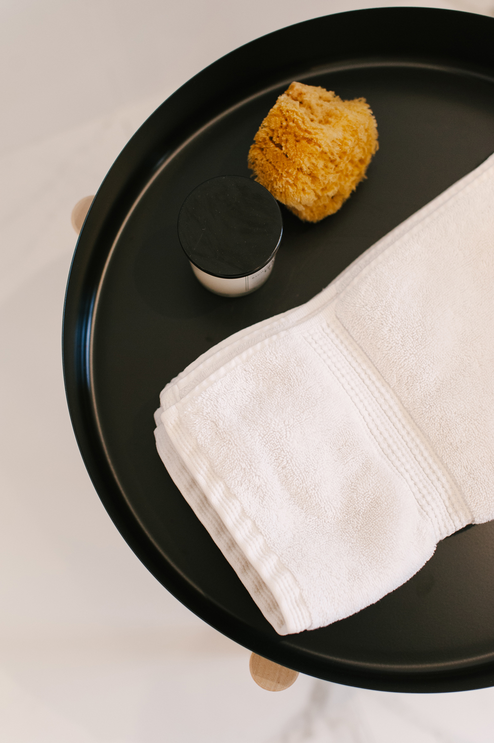
Bathroom Styling 101
A hip black side table that houses a select few pieces of decor is the finishing touch to transforming a utilitarian bathroom into a truly serene spa experience.
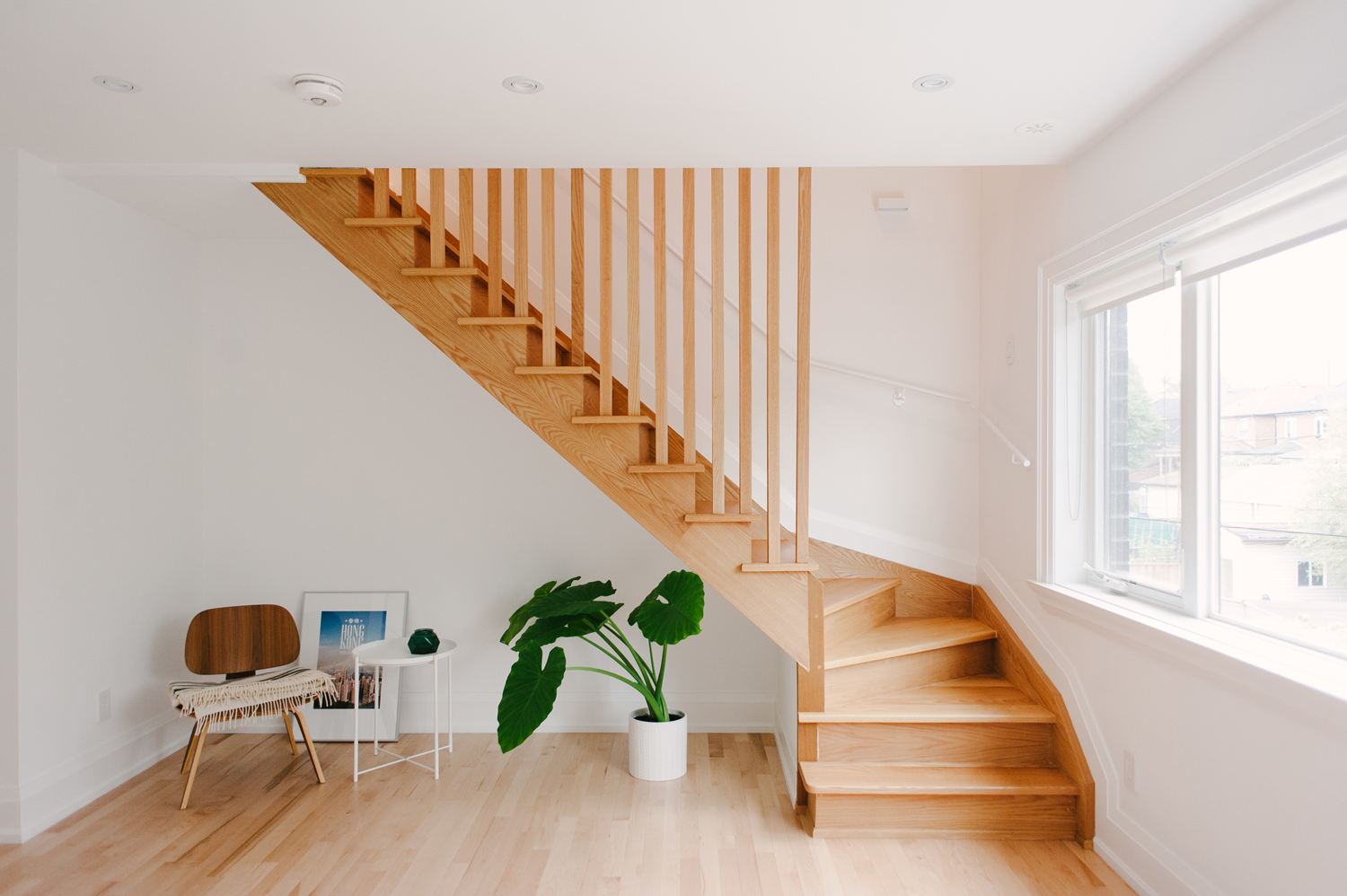
A Sleek and Sneaky Staircase
Creating the private staircase to access the transformed attic and third floor addition from the master bedroom allowed the couple to make use of the found space without having to sacrifice bedroom space elsewhere on the second floor.
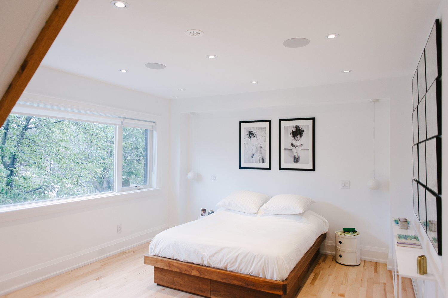
A Minimalist Master Bedroom
Emily and Armando’s vibe of a modern oasis trickled down from the spa master bath to their bedroom, where white walls are punctuated sparingly by black and white photography and art prints, touches of green decor and a rich wood bed frame.
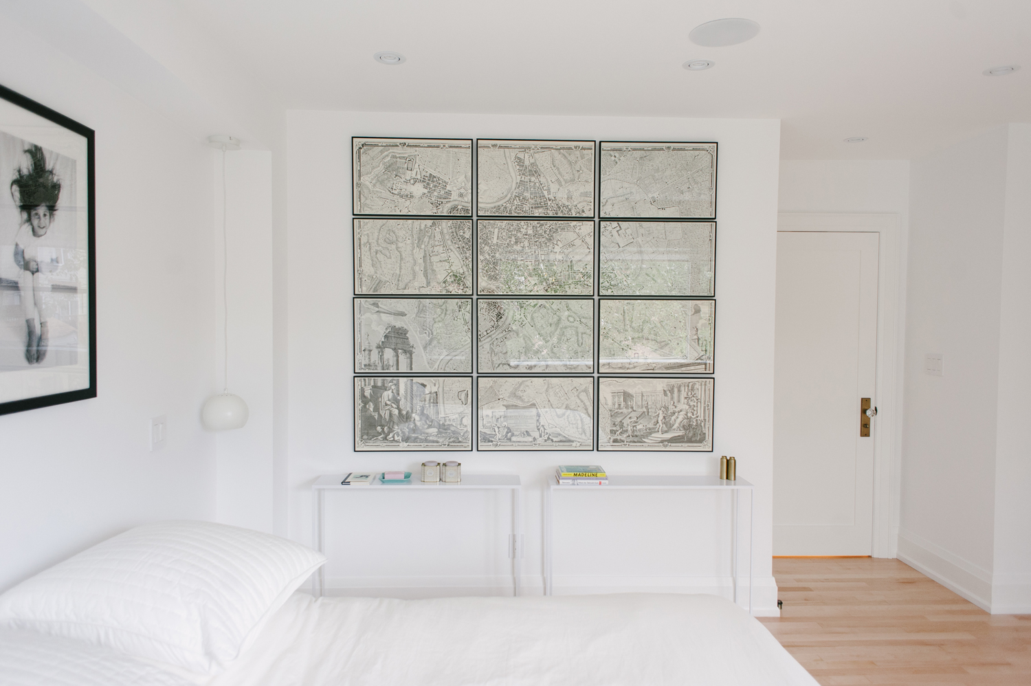
Styled with Souvenirs
Avid travellers, the couple drew design inspiration from years of shared adventures around the globe. Sentimental souvenirs and objets d’art are strewn throughout the home.
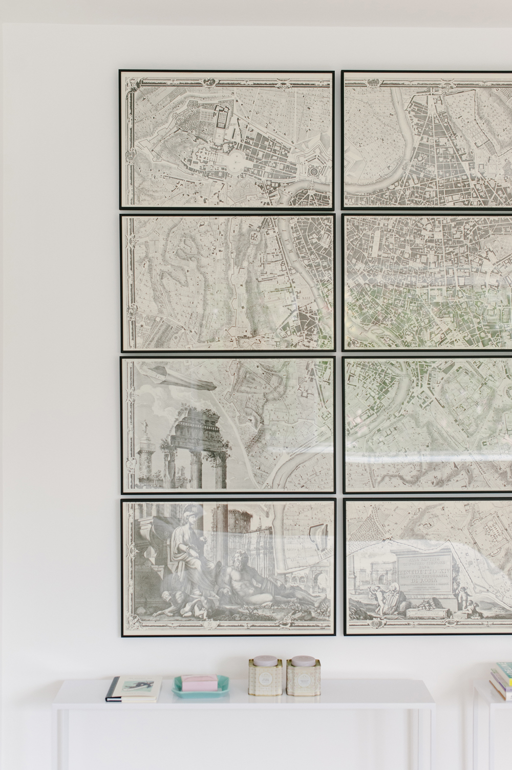
Roman Holiday
A large-scale map of Rome was salvaged by the owners from an architectural firm and hangs prominently in the master bedroom.
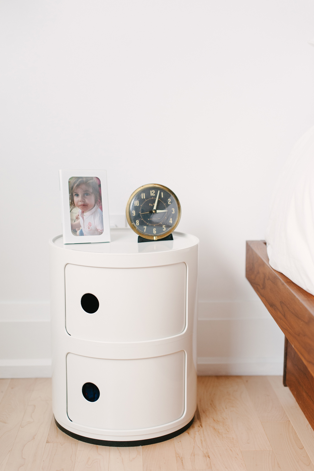
Time-Honoured Decor
While modern architecture and furniture governs the majority of the home, a few vintage accents add a touch of history to the home, and give a nod to its original craftsmen style.
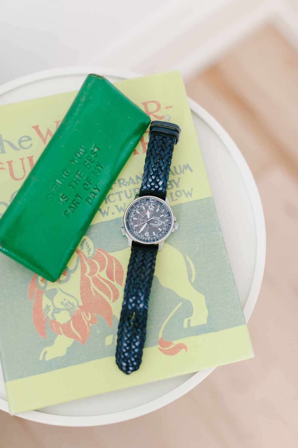
Lush Accents
With so few colours featured throughout the home, the few that were used truly pop. Plants are a predominant source of accent colour and we love how this bright green glasses case carries that pattern through to the bedside tables.
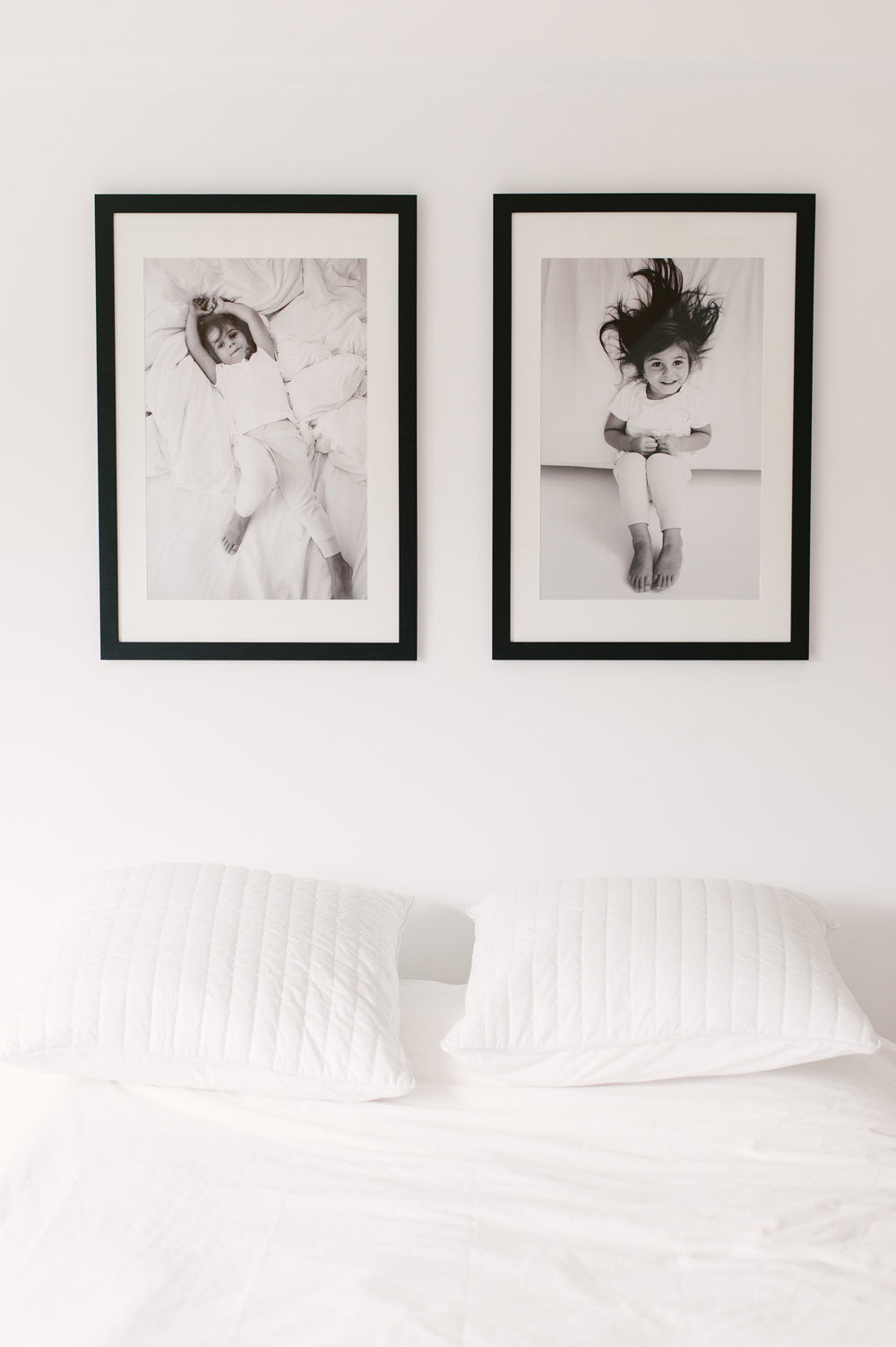
Art With Heart
When it came to selecting artwork to hang over their bed, Emily and Armando didn’t have to hunt for very long. Two simple but playful black and white photos of their daughter playing in a bed fit the space perfectly, and emphasize the cozy and dreamy aesthetic of their all-white bedding.
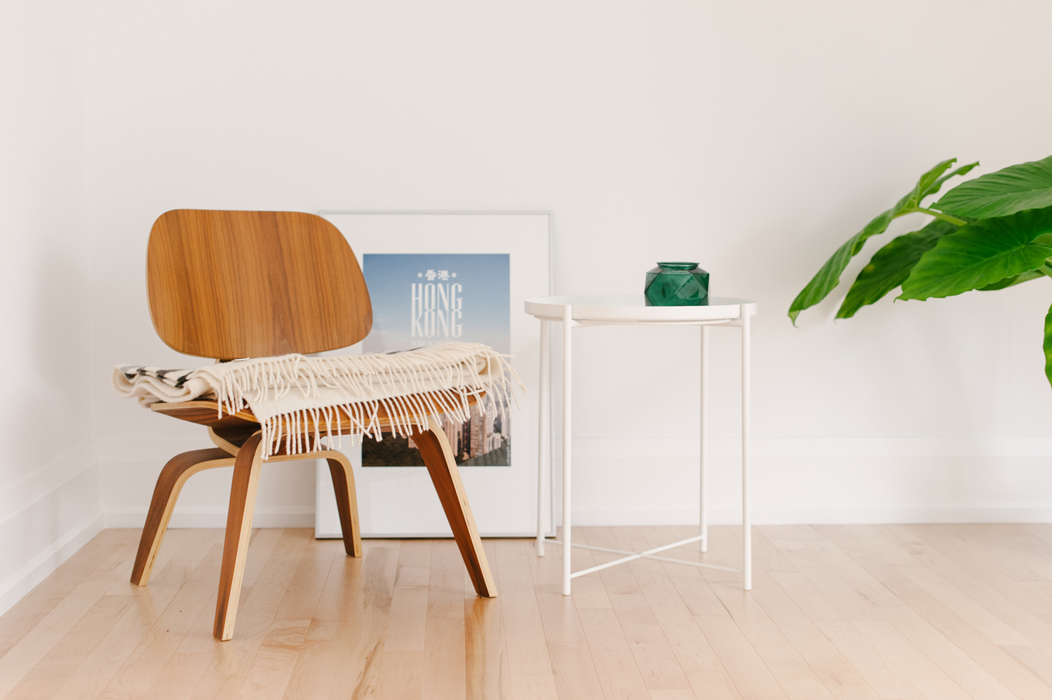
A Casual Corner
An Eames lounge chair with a simple white side table and plant are all that’s needed to strike a scene in the nook under the stairs.
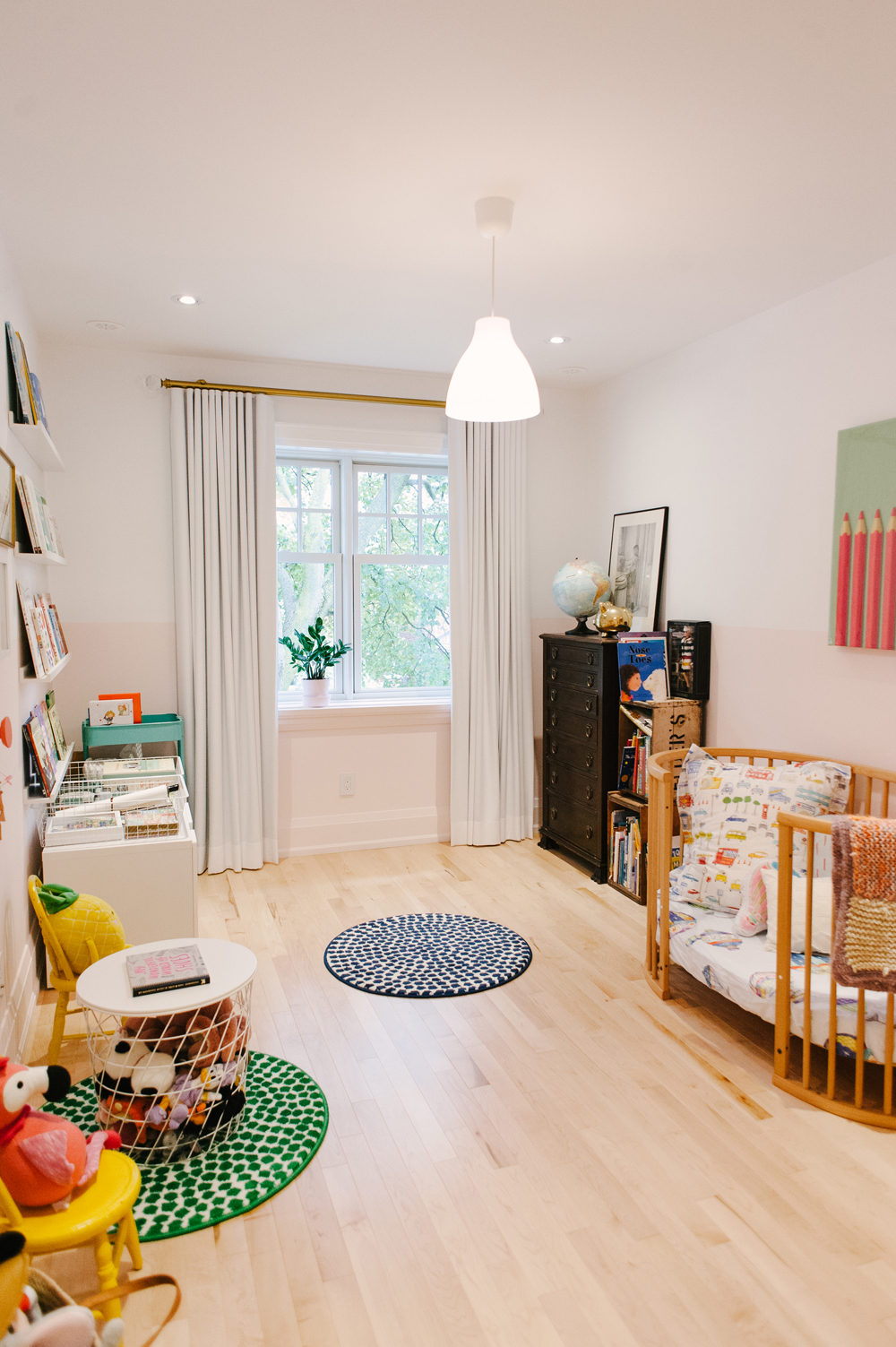
A Sweet Room for a Little Girl
Colour and whimsy abound in two-year-old Penelope’s room.
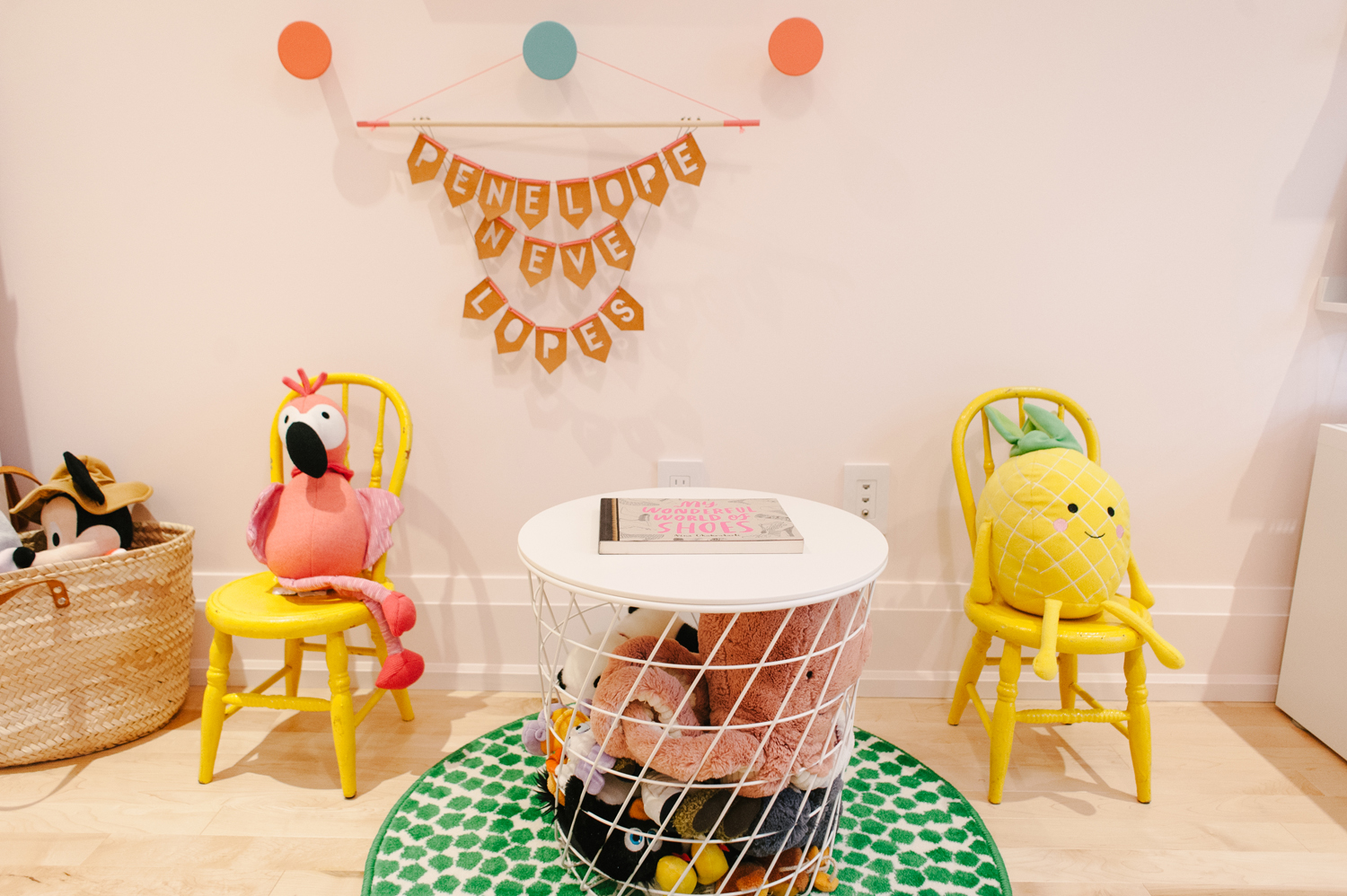
The Gang’s All Here
An oversized basket and modern wire side table make for easy storage for Penelope’s impressive collection of stuffed animals, but her favourites, a preppy pink flamingo and a chipper yellow pineapple, sit on two identical vintage chairs.
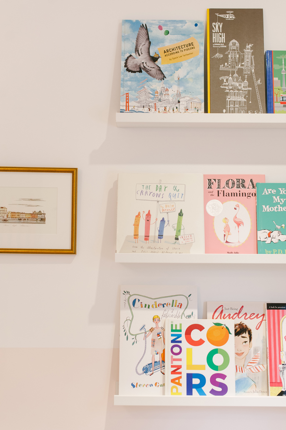
For the Bookworm
Open floating white shelves are a sweet way to add even more colour to a nursery or playroom. Plus, if hung low enough, they’re easy for little ones to retrieve books from.
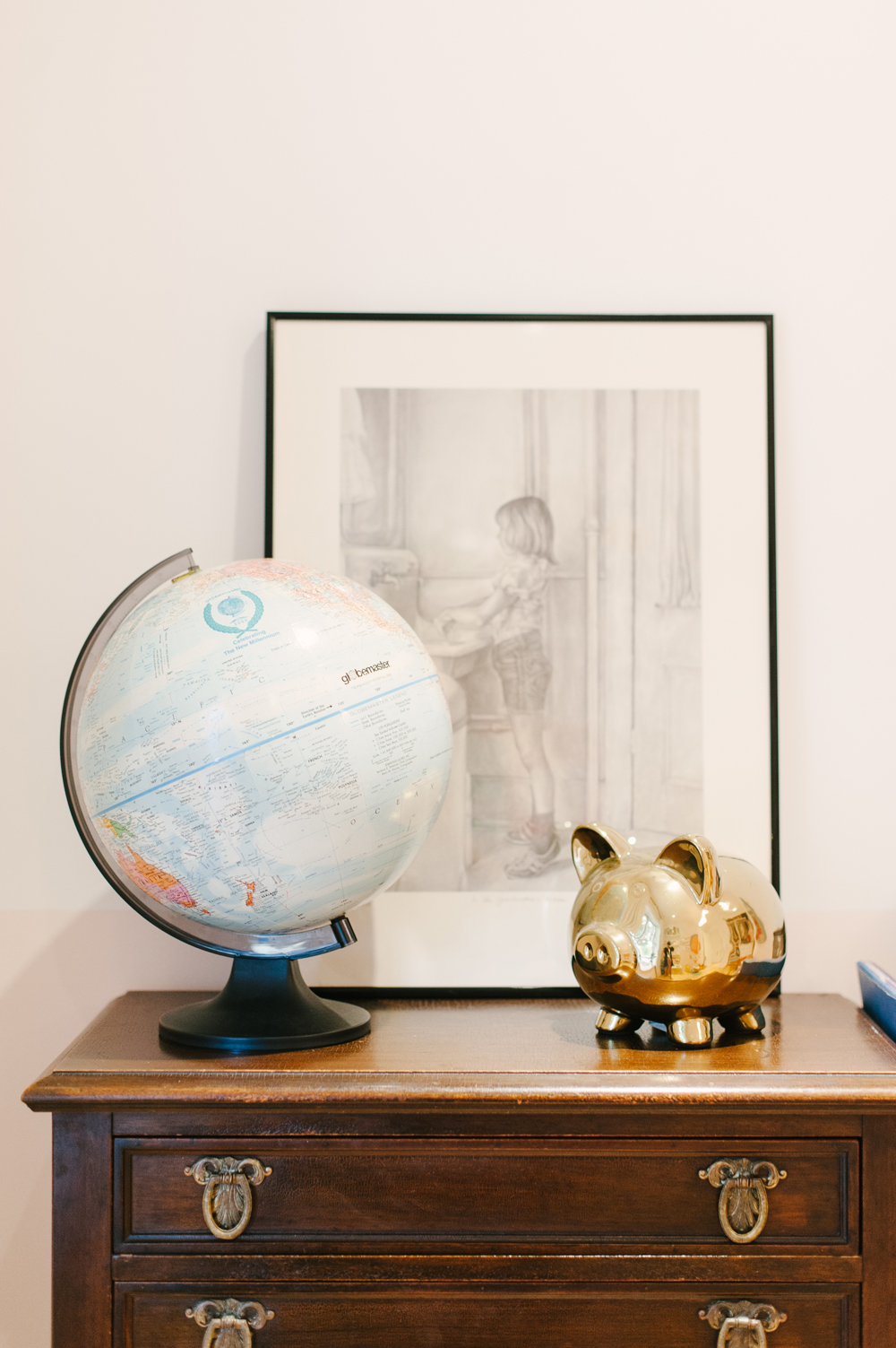
The World is Your Oyster
A vintage globe on an antique dresser gives a nod to Emily and Armando’s lust for travel, and hopefully will inspire the same in their daughter Penelope!
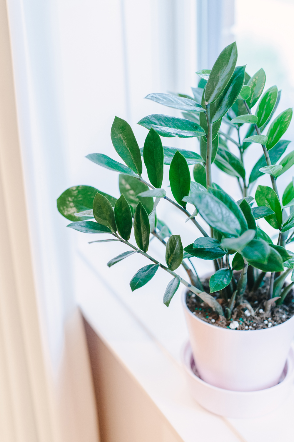
A Breath of Fresh Air
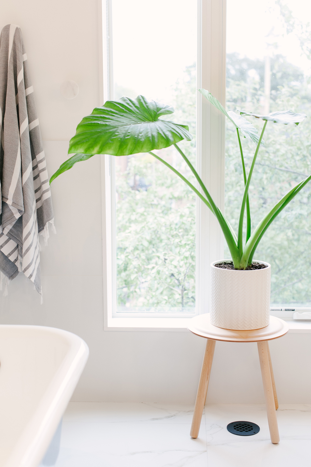
As the temperatures drop in Canada, indoor plants are all the more important to breathe a little life and colour into our homes.
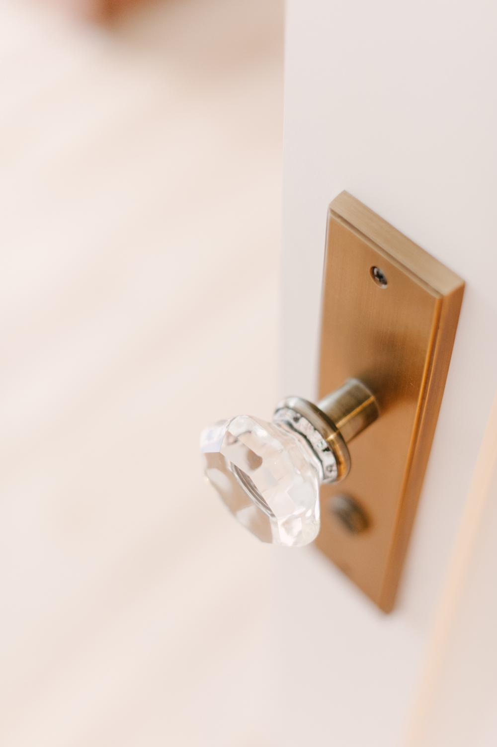
Polished Accents
Clean and modern hardware like this crystal door knob adds a touch of glamour and elegance to the home. Against the sleek white backdrop of the home’s architecture, it’s the epitome of luxury and femininity.
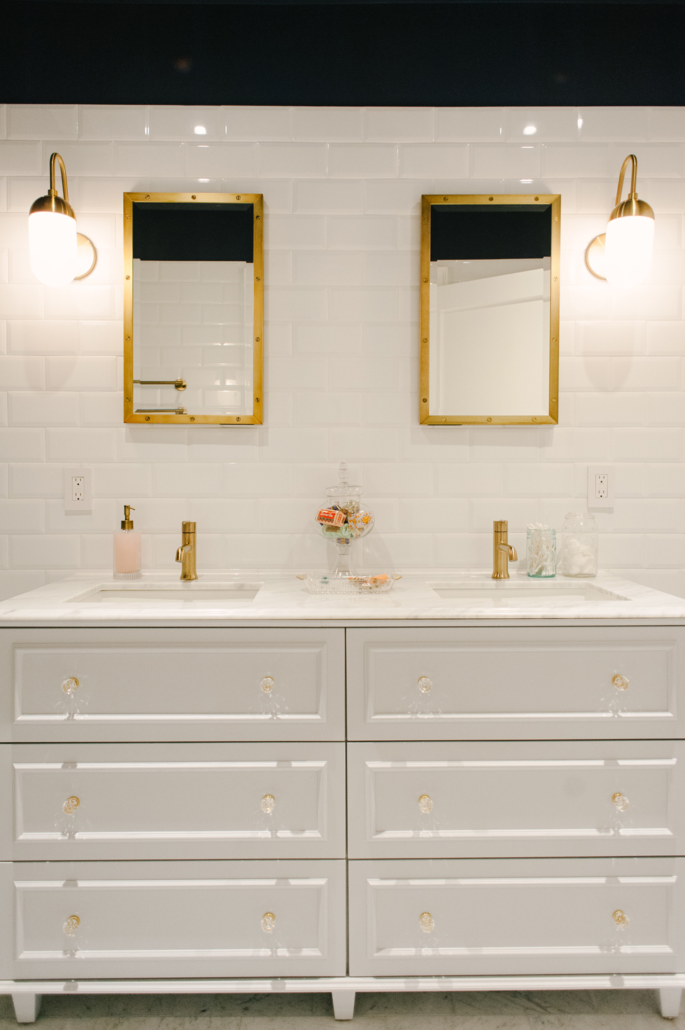
A Bathroom That Sparkles
The couple designed the custom double vanity in the second floor bathroom, which sparkles with crystal and brass fixtures.
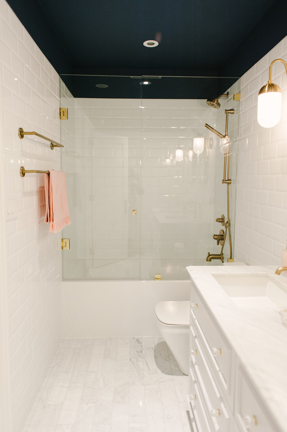
An Unexpected Ceiling Colour
To imbue the white and gold bathroom with a touch of drama, the ceiling was painted with a rich, solid black. The unexpected choice helps to steer the space away from feeling overly precious.
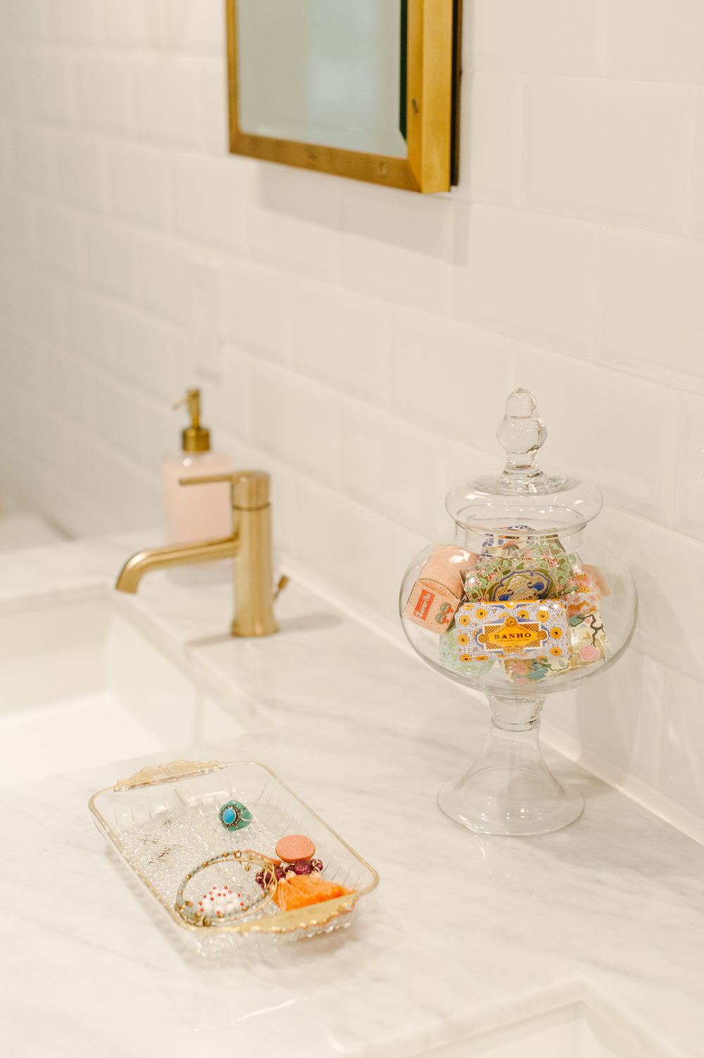
Hints of Portugal
A colourful assortment of Portuguese Claus Porto soaps take on an air of decor placed in a chic glass canister, while a little dish beside it holds colourful bits of jewellery. It’s these few accents, along with a pink soap canister and towel, that solidify this space as chic, elegant and admittedly girly.
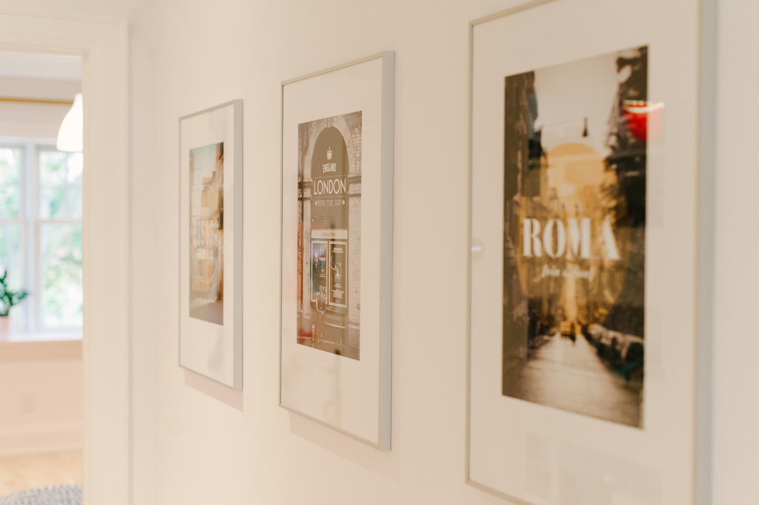
For the Love of Travel
Emily and Armando’s sense of wanderlust is echoed in almost every room of the home, including this second floor hallway where European city posters hang neatly in a row.
A Grand Entrance
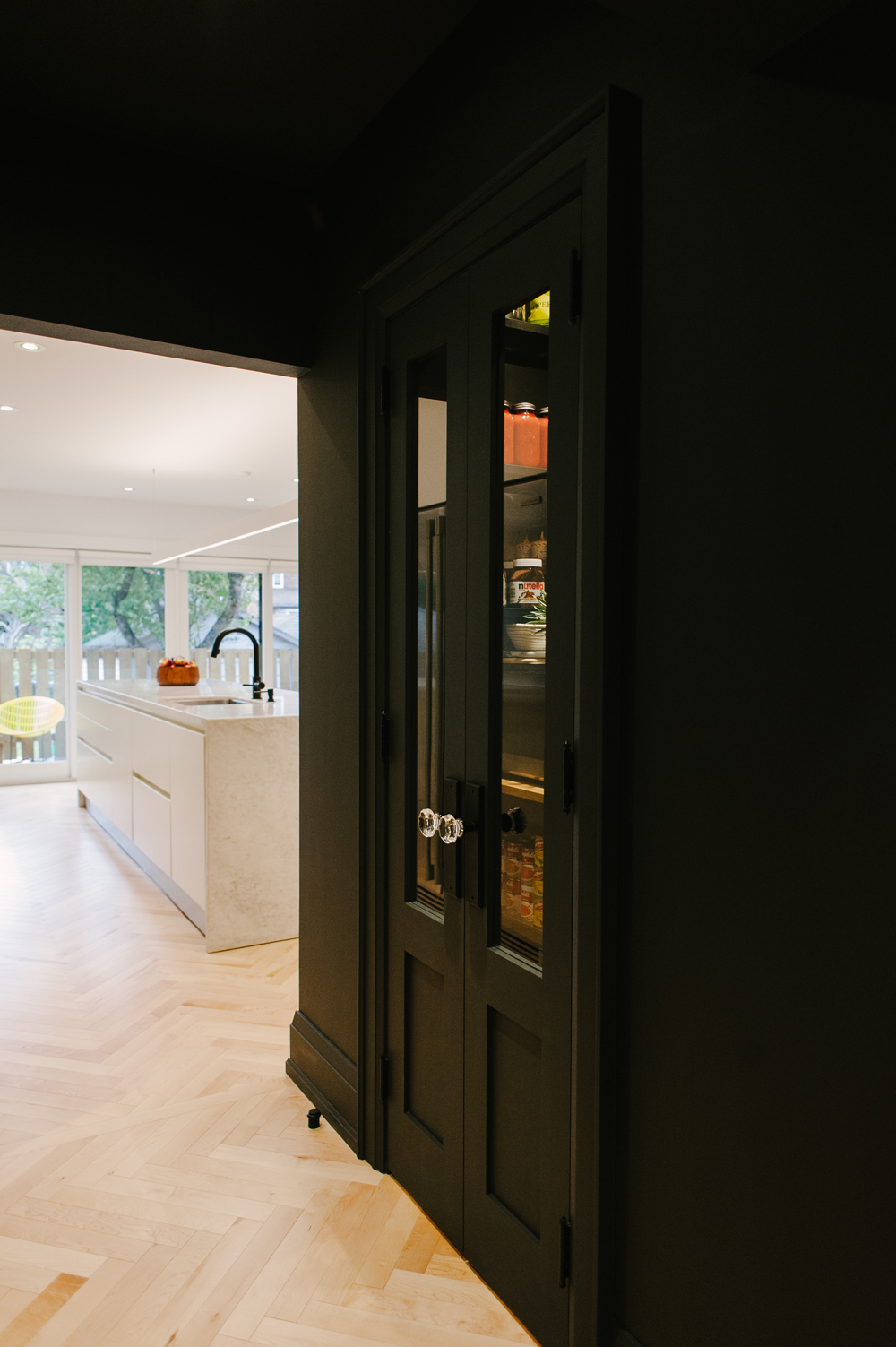
Down on the main floor, the kitchen received the most dramatic face lift during the renovation, and gives a dramatic first impression in the form of a black hallway and pantry that lead into the white open space at the very back of the home.
A Modern Kitchen with Seafood on the Menu
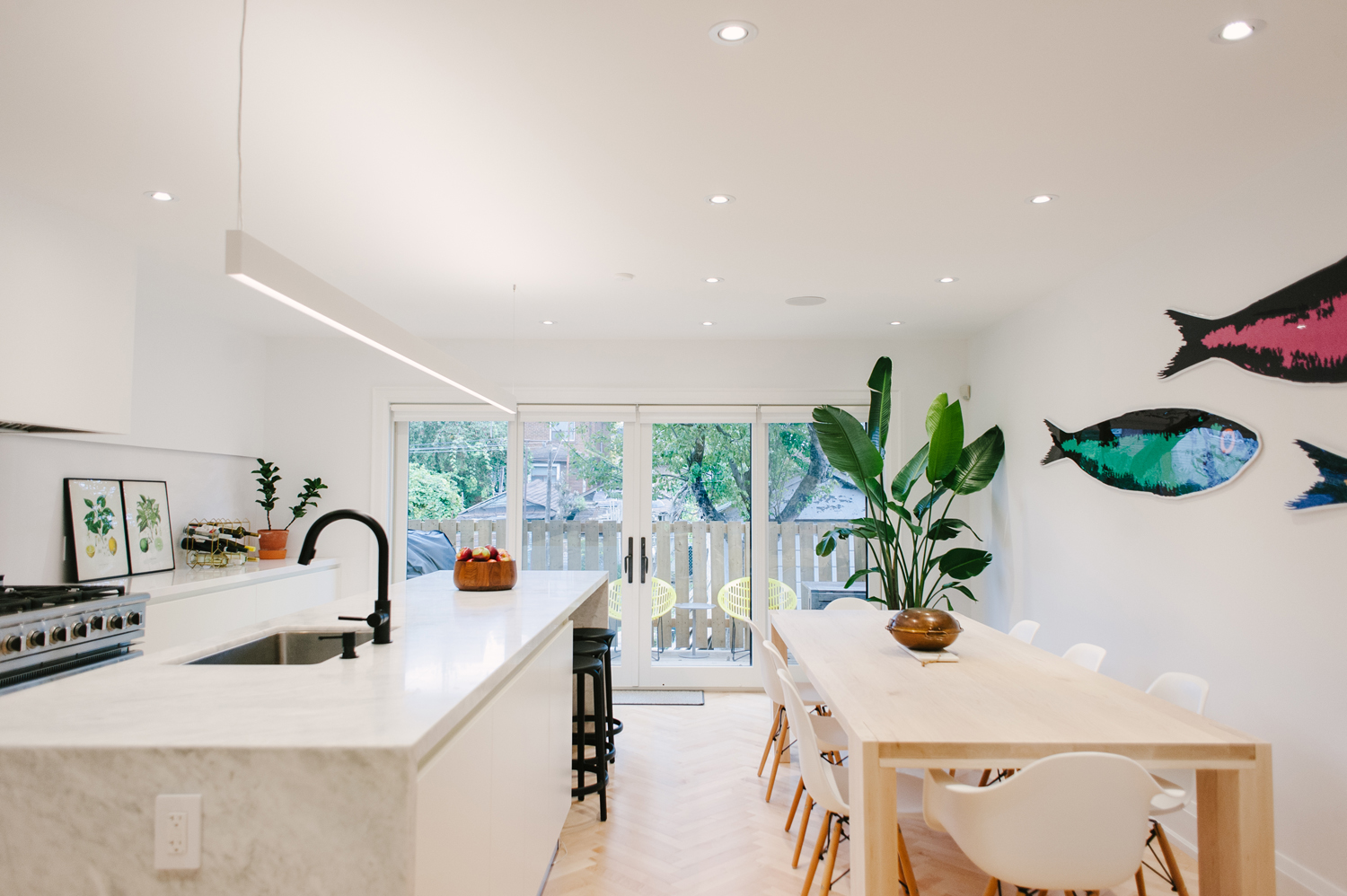
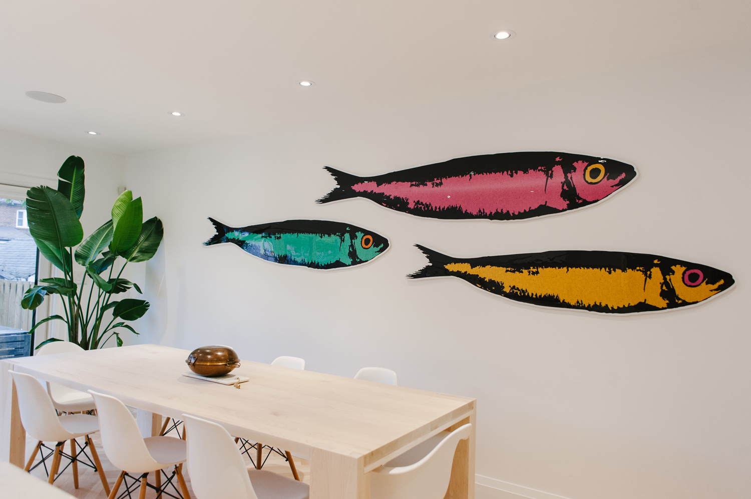
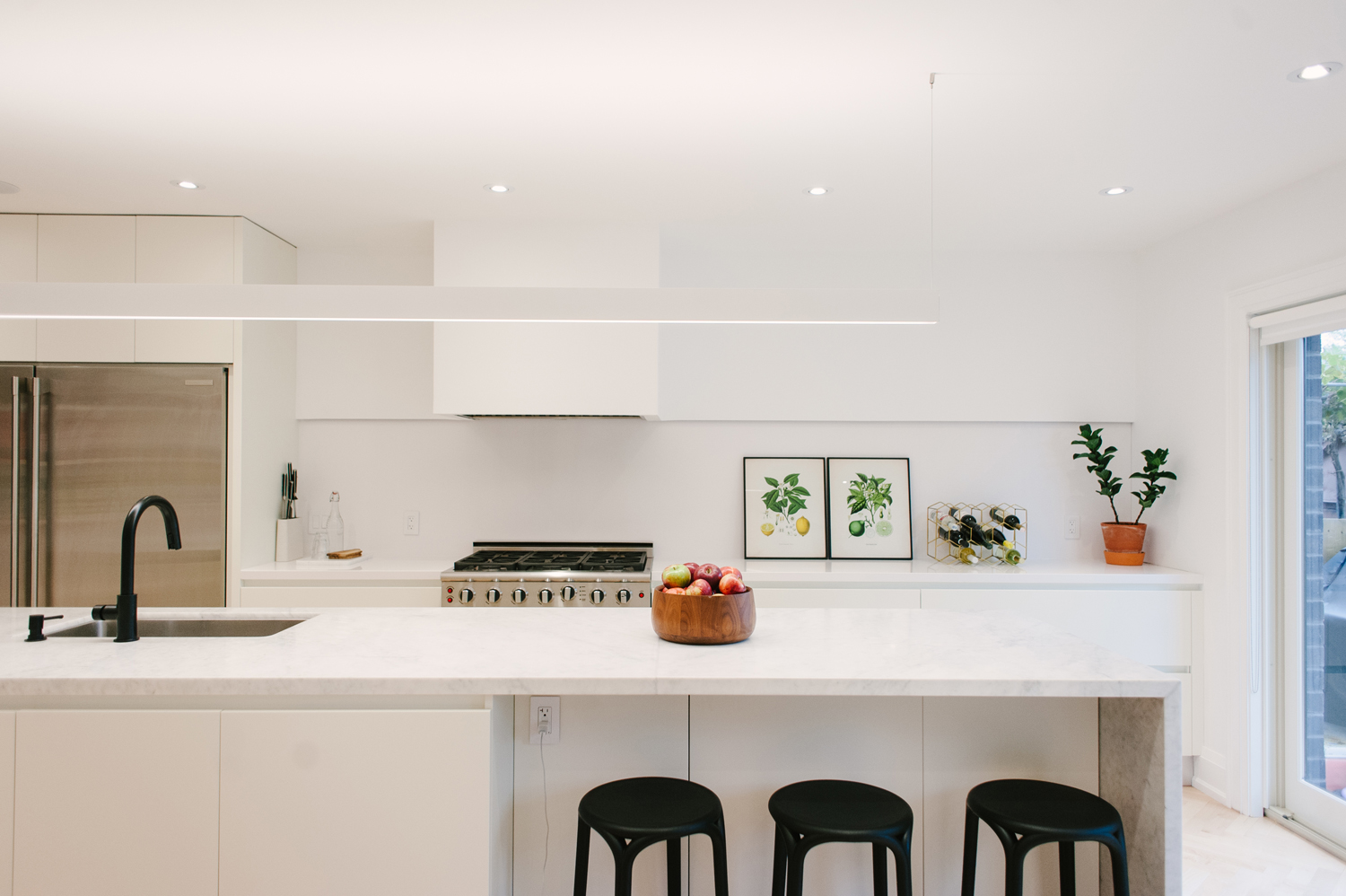
An oversized marble island anchors the bright and airy kitchen. Colourful artwork of Warhol-hued sardines adorns a wall. The pieces were made by Armando and inspired by cultural festivals in Portugal.
Balancing Old and New
The stylish couple both love modern design but began to develop a stronger appreciation for the original beauty of their typical Toronto four square home with modest ‘craftsman’ style elements. Struggling to find a balance between old and new, the front of the house pays homage to the original design with double-hung windows and a restored wooden porch while the addition at the back of the house has a more modern feel with dark espresso-coloured brick and sleek black single pane windows.
All Things Modern
“We wanted to respect the character of this established neighbourhood by maintain the originality of the front façade, but loved the idea that the rest of the house could be made to look modern,” says Armando.
A Home to Explore
“When we visited the house for the first time, we immediately fell in love with the front entrance. It was big enough so that you didn’t feel claustrophobic but small enough that you only got a glimpse of the surrounding rooms. It made you want to explore the next room. This was our inspiration when it came time to redesigning the layout of the first floor.” explained Armando.
One Room Leads to the Next
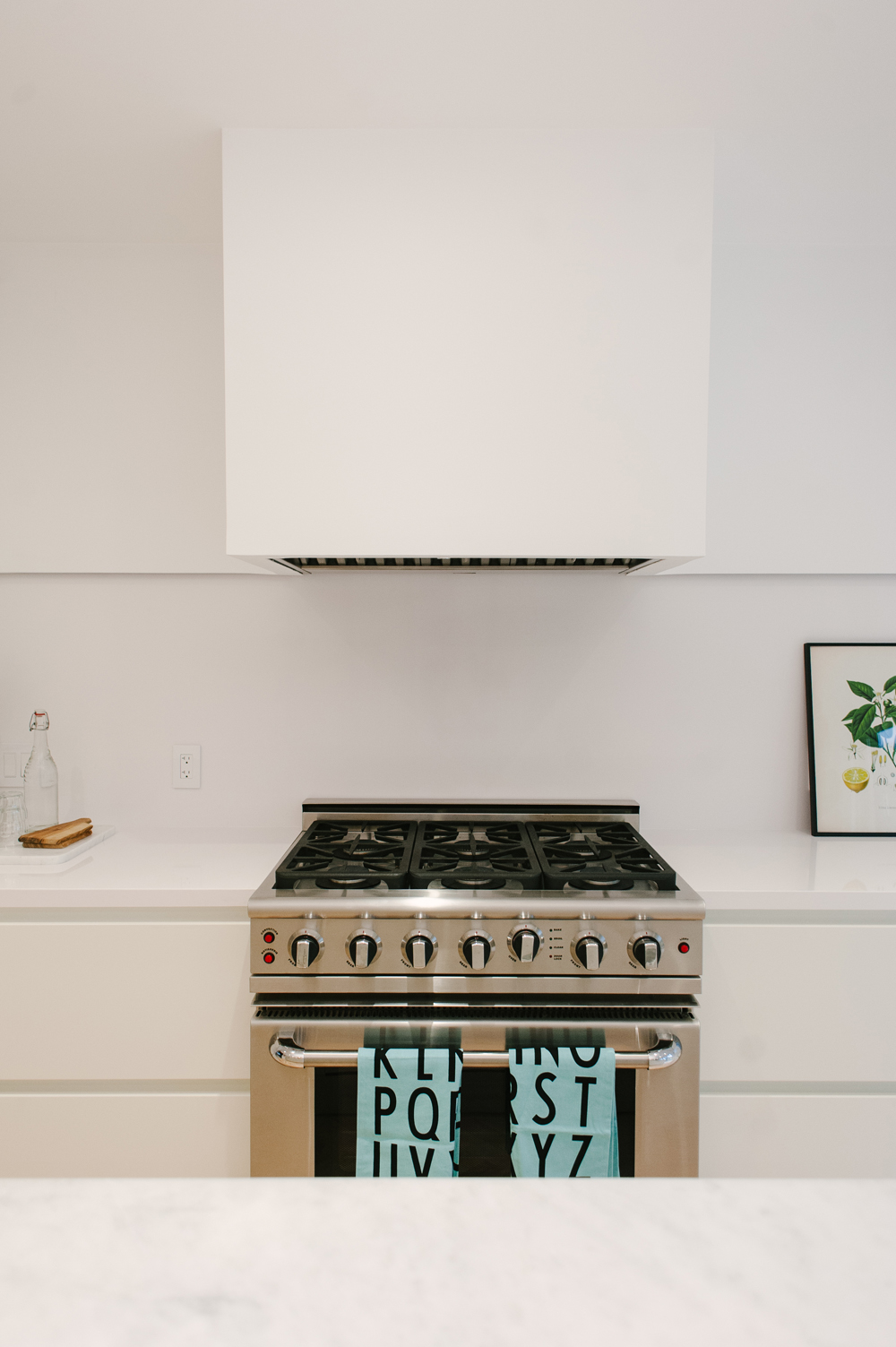
“We kept the rooms divided but connected, which created a racetrack layout and made the house feel more intriguing as you walk from one space to another-there are no dead ends, which makes it really easy to move around,” says Armando.

The Bare Minimum
The family keeps their kitchen counters bare, thanks in large part to the hidden pantry that houses appliances as well as preserves, but permissions are made for a few key items, like a pair of vintage green prints, a big bowl of red apples, and a gold hexagon wine rack.
The Appeal of Black Hardware
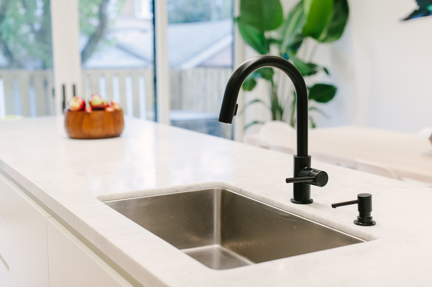
Set against the pristine white backdrop of the family kitchen, black fixtures pop in a fresh and modern way, and are mirrored by the stark black stools featured under the counter.
Modern Meets Family Friendly in the Kitchen
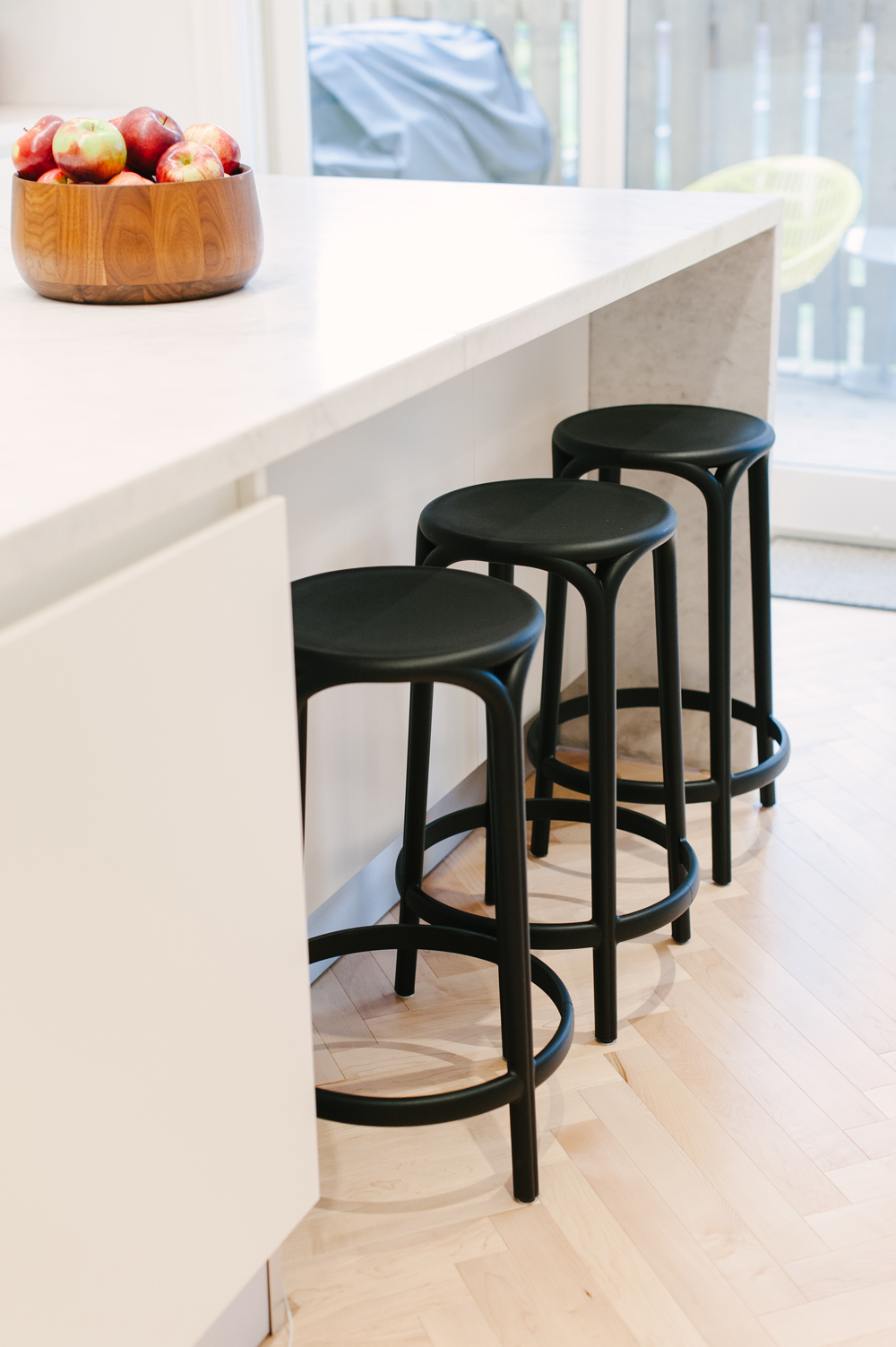
The addition of a few simple black stools under the kitchen counter give the kitchen an informal vibe that invites friends to pull up a chair as dinner’s being prepped!
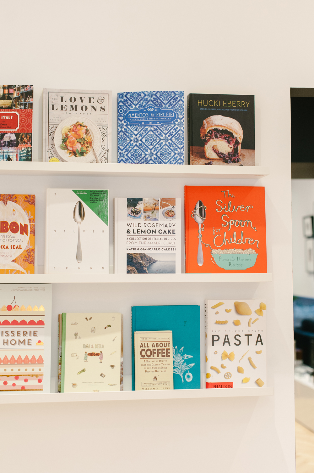
Well Read (and Fed)
The same floating white shelves used to display Penelope’s books were used in the kitchen to show off the family’s collection of cookbooks. (And if their library is any indication, a seat at their table is an enviable invitation!).

A Bowl Full of Apples
A big bowl of apples sitting on the counter serves as a good reminder to get your daily servings of fruit, and adds a brilliant burst of seasonal red.
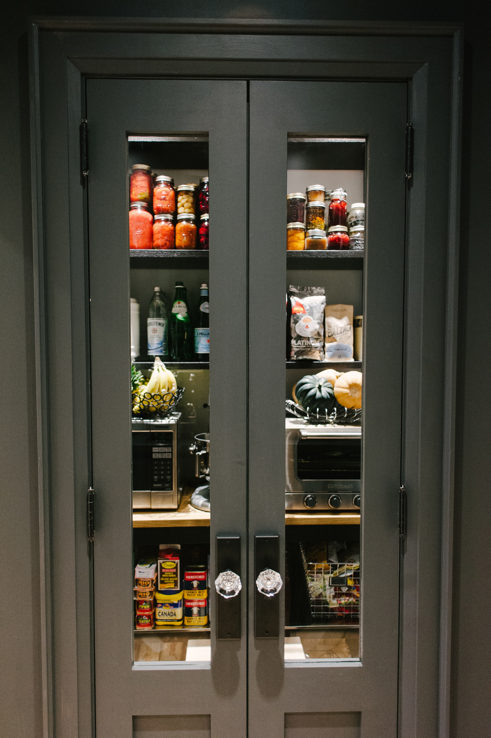
Prepare Yourself for Major Pantry Envy
A dramatic nook by the kitchen hides a perfectly-stocked pantry and bar area to mix cocktails and prepare coffee.
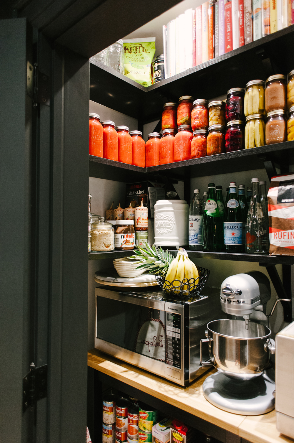
A Perfectly Organized Pantry
Though small, the pantry is incredibly efficient thanks to tightly stacked shelves with perfectly aligned goods and equipment.
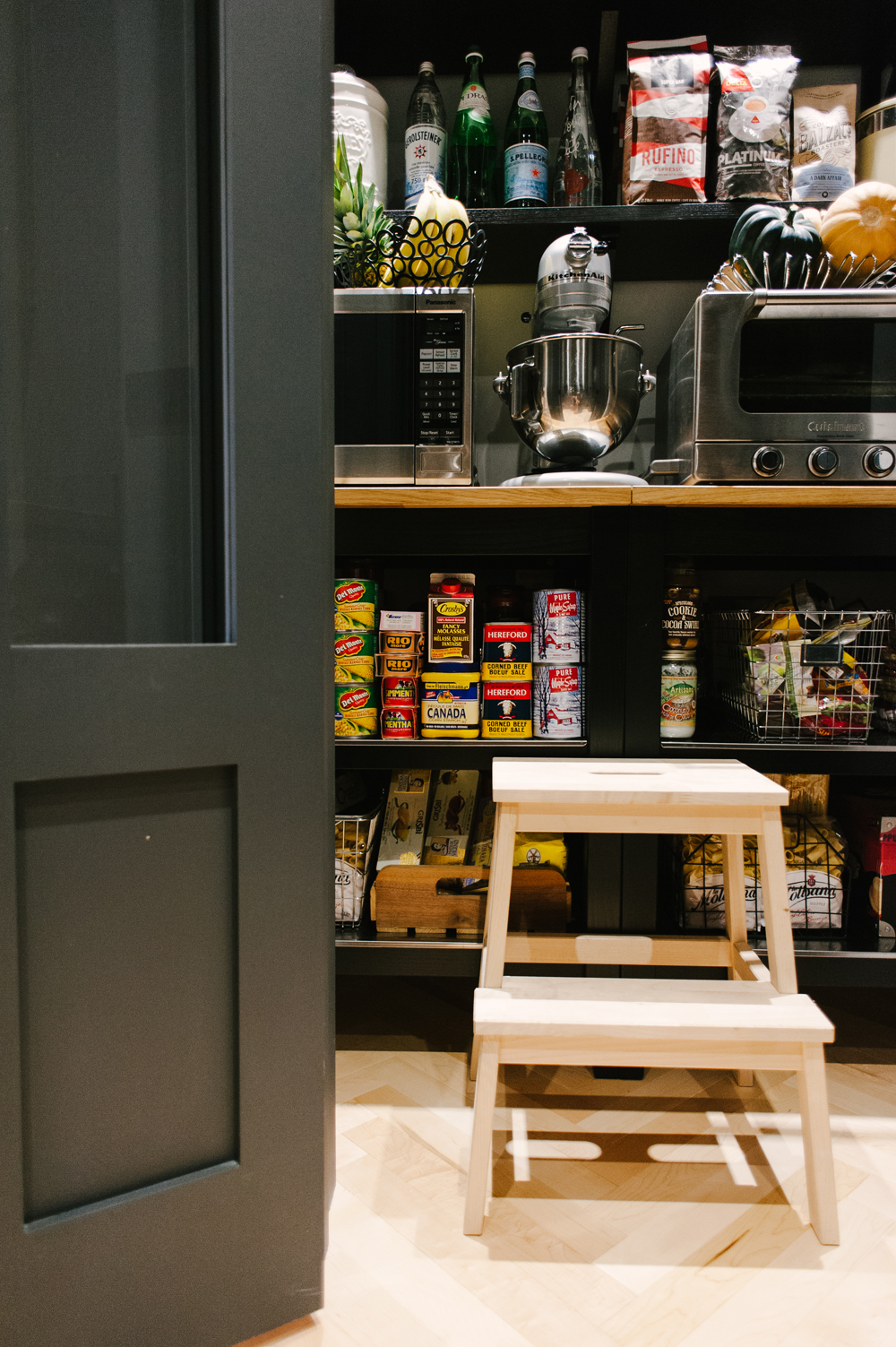
Waste Not, Want Not
Every inch of storage space is utilized, with shelving that runs from the floor to the ceiling. Wire baskets were brought in to help keep like items stored together, while still providing visibility into what tasty snacks are tucked away.

Well-Stocked for Winter
With bags and bags of coffee beans and jars of preserves, Emily and Armando are well stocked for the winter months! We love how the colourful jars add a festive fall colour palette to the dramatic black pantry.
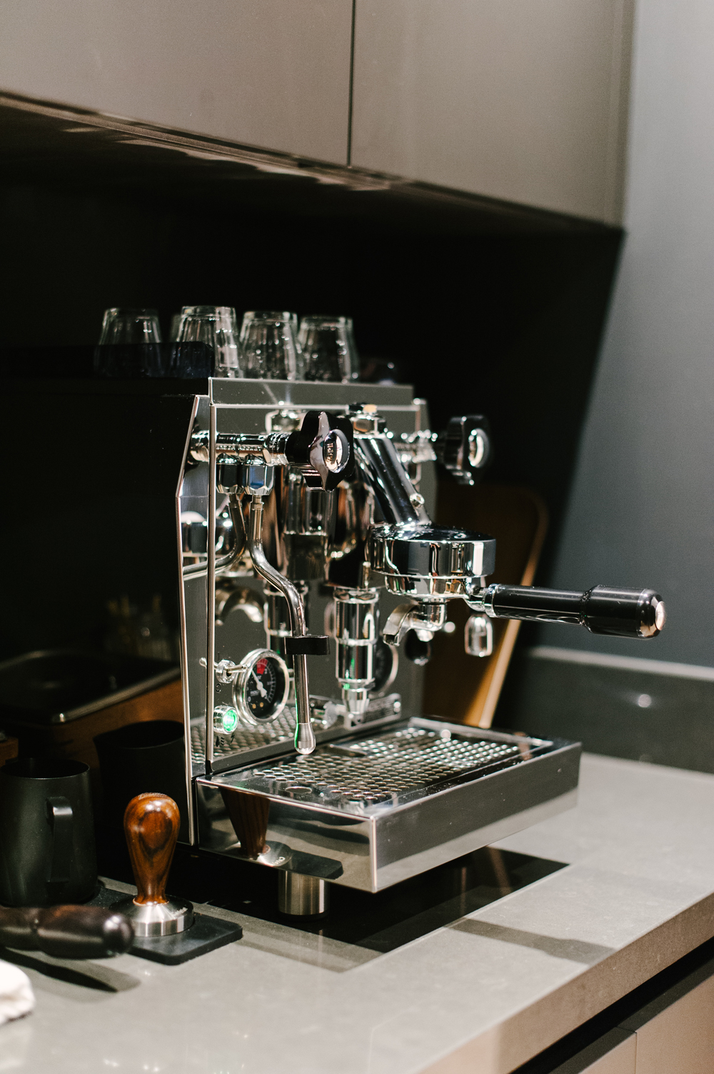
Express Yourself
A bonafide coffee station is set up with all the ingredients and tools need to make a perfect cup of coffee. With everything at your fingertips, mornings must be a breeze in this house (at least after the first cup of coffee is consumed!),
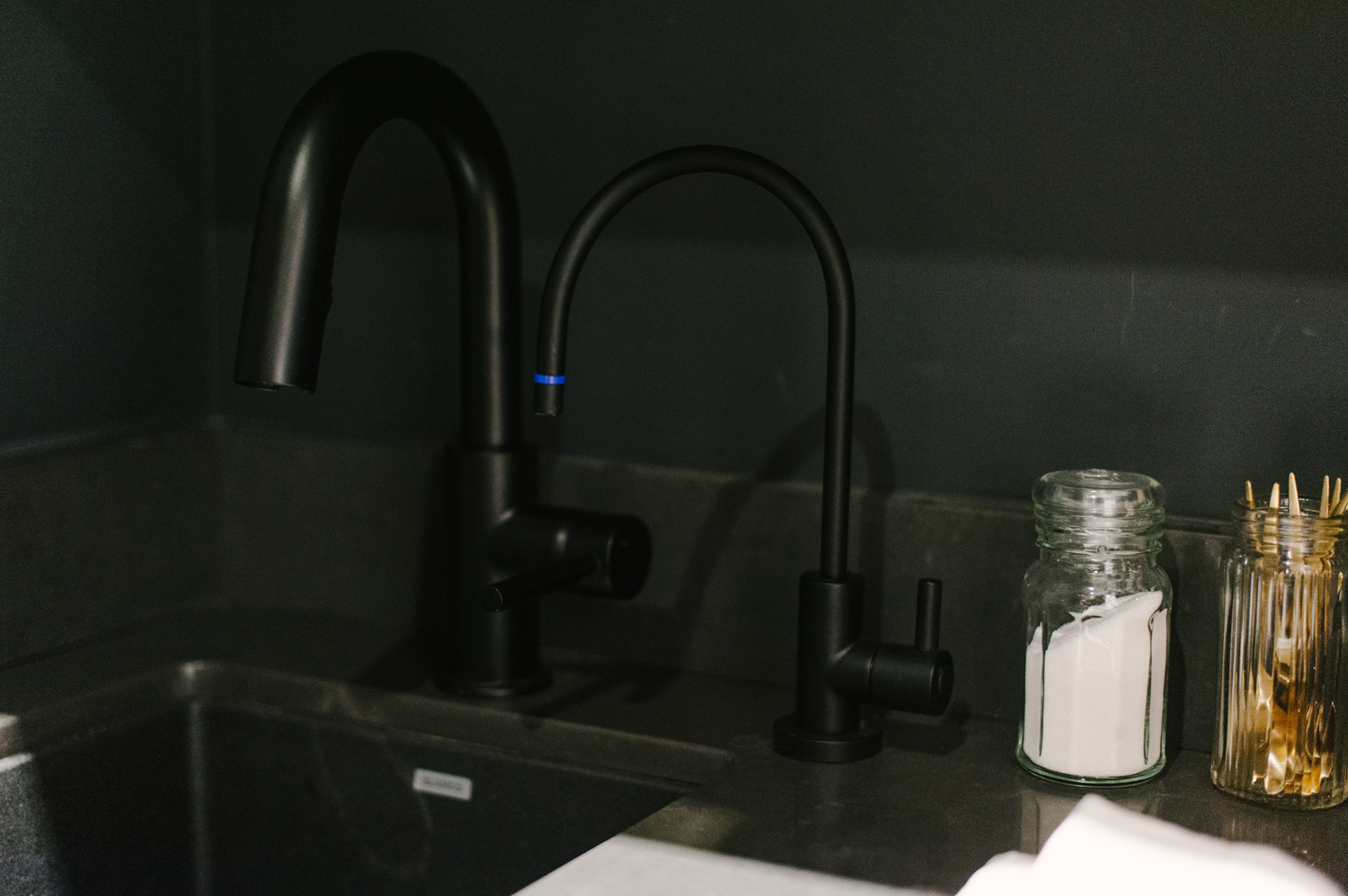
Seeing Double
With a small secondary kitchen sink and drinking faucet installed, Emily and Armando have a little extra breathing room when prepping and hosting larger dinners. (And how glam is the black on black kitchen faucet and sink?)
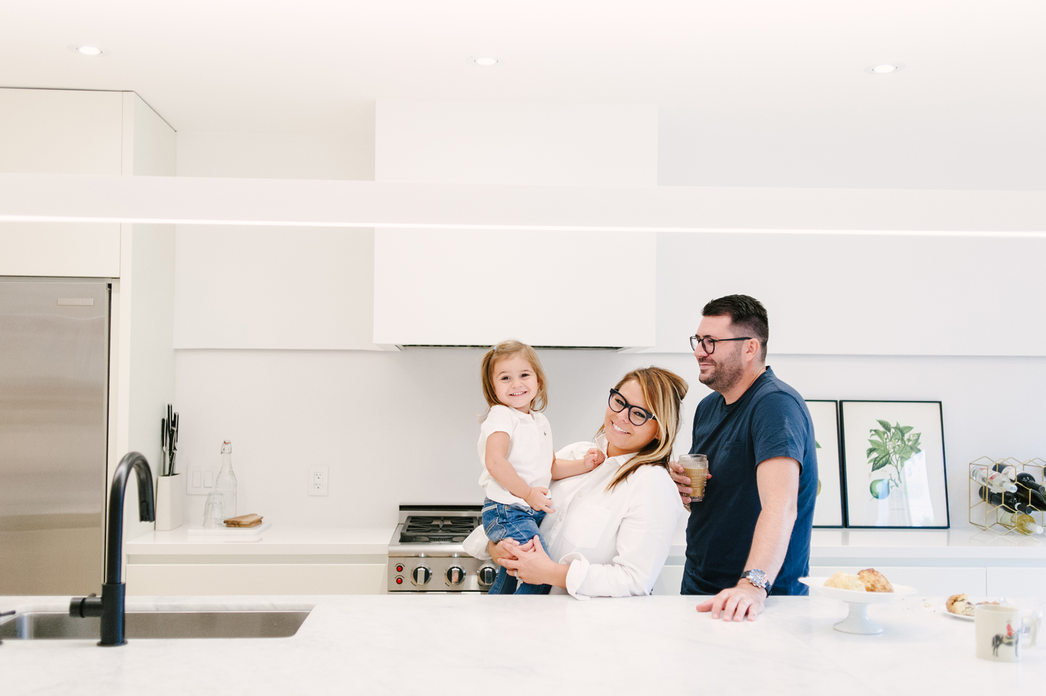
A Labour of Love
“Renovating an older home from top to bottom is not for the faint-hearted,” says Emily. “It’s totally worth it but you have to be willing to put in the hard work and sacrifice for the end result.”
HGTV your inbox.
By clicking "SIGN UP” you agree to receive emails from HGTV and accept Corus' Terms of Use and Corus' Privacy Policy.


