It sounds like a dream: taking over a family-owned rental property as your very own. For Sandy Caetano, founder of Casa Caetano Designs, the dream of acquiring the 800-square-foot house came with some reality checks. Specifically tiny, awkward rooms and finishes from the last millennium. A luxury look that was chic, peaceful and filled with art and mementos was Sandy’s dream and she aptly made it a reality.
Grey Matter
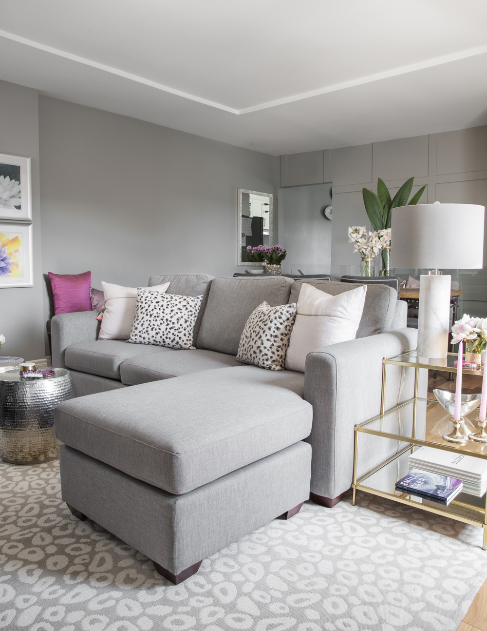
Layers of one colour, from the welcoming sectional and area rug to the walls which are painted grey, radiate easy elegance. A mix of metallic finishes and pops of purple-y pink keep the look lively. The overall effect is inviting and for such cool colours, invitingly warm.
Related: This Eco-Conscious Montreal Home Definitely Isn’t Afraid of Colour
Mixed Media
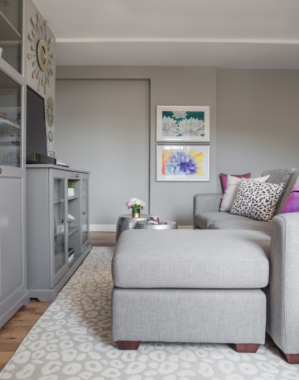
Custom cushions from Tonic Living and a patterned rug from Dash and Albert aren’t the only accessories enlivening the TV area. “My niece is an artist and these Georgia O’Keefe-inspired florals are hers,” says Sandy. They layer in personality and have a curated effect that gives the IKEA cabinetry a custom look.
Divide and Conquer
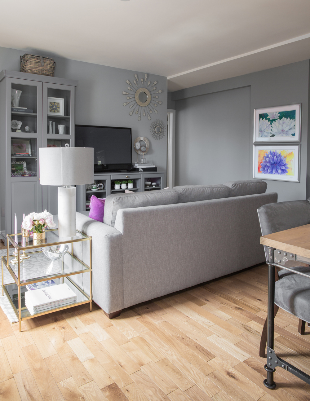
This one is for the furniture-against-the-wall decorators! We love how Sandy positioned her sofa in the middle of the room as a boundary that divides the open-concept living space. It is visually interesting and effective – the living area feels cozy and the small space now boasts an open dining room.
Expert Panel
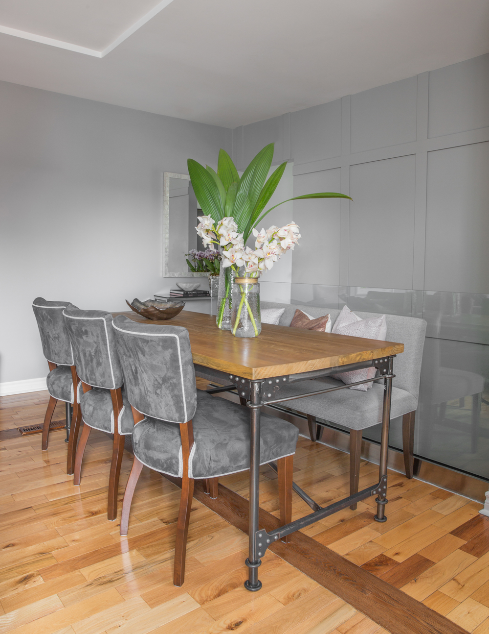
In the dining area, Sandy adding panelling to dress up the narrow staircase leading to the basement and replaced a very dated-looking metal railing with super sleek glass panels. The seating is custom-made and the addition of a bench is a refreshing alternative to the more expected set of matching chairs.
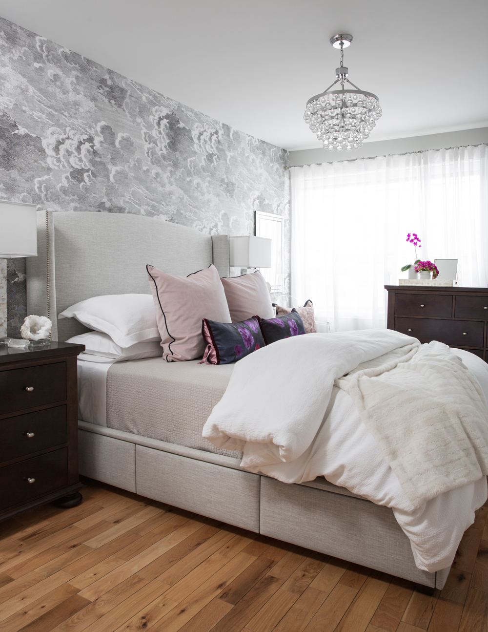
Boutique Retreat
How dreamy is this bedroom? Sandy’s vision for a luxury hotel suite is on point in this elegant haven thanks to an energetic mix of elements from sparkling light fixtures to layers of the most tactile fabrics. Splurge alert: the custom-made bed was built to maximize storage (those are hidden drawers along the side). It is a genius furniture design for a small space.
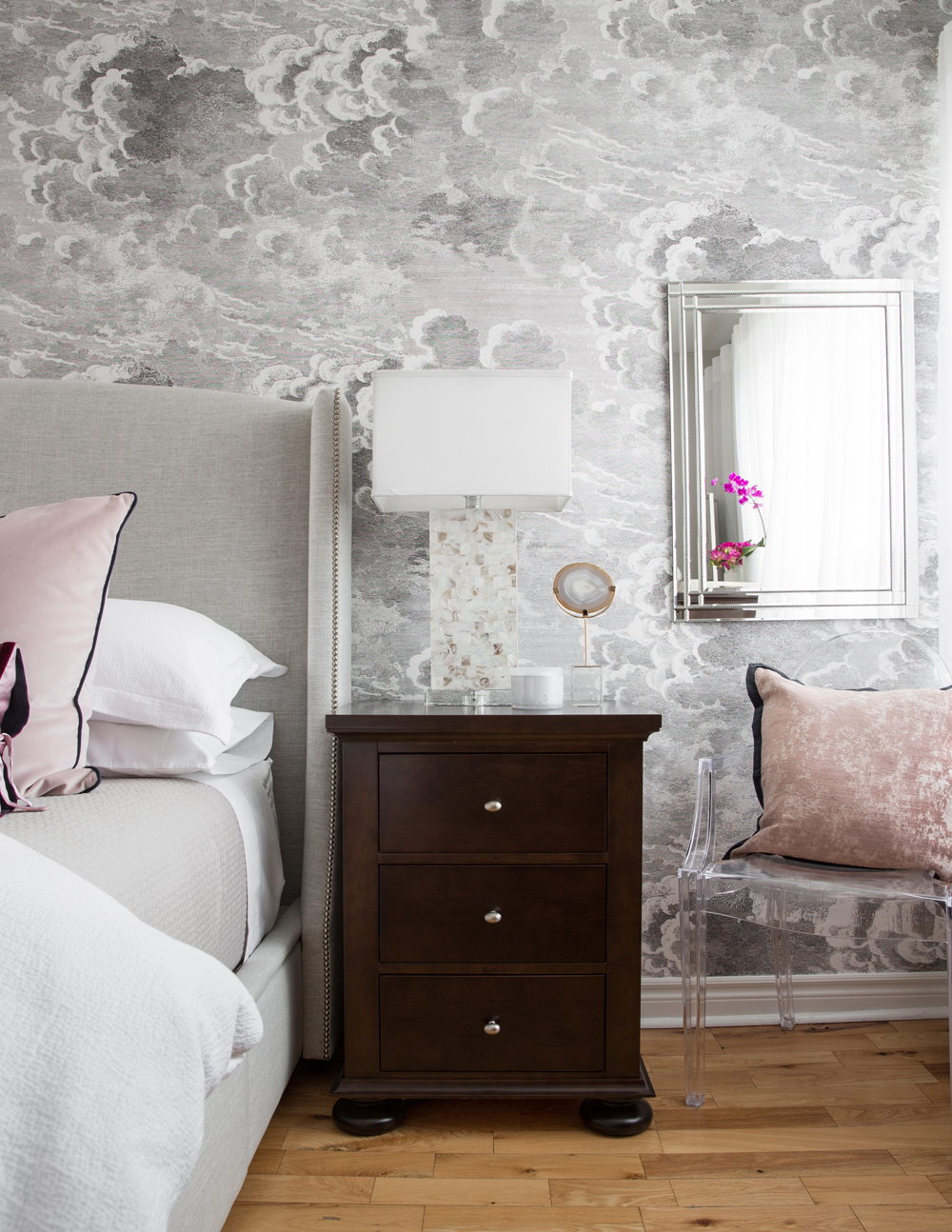
Cloud Cover
Upscale details, like this focal wall dressed in Cole & Son Nuvolette cloudy sky wallpaper, create a nuanced elegance. The combination of a solid wood side-table, clear chair and reflective surfaces crank up the visual interest in a playfully pretty way.
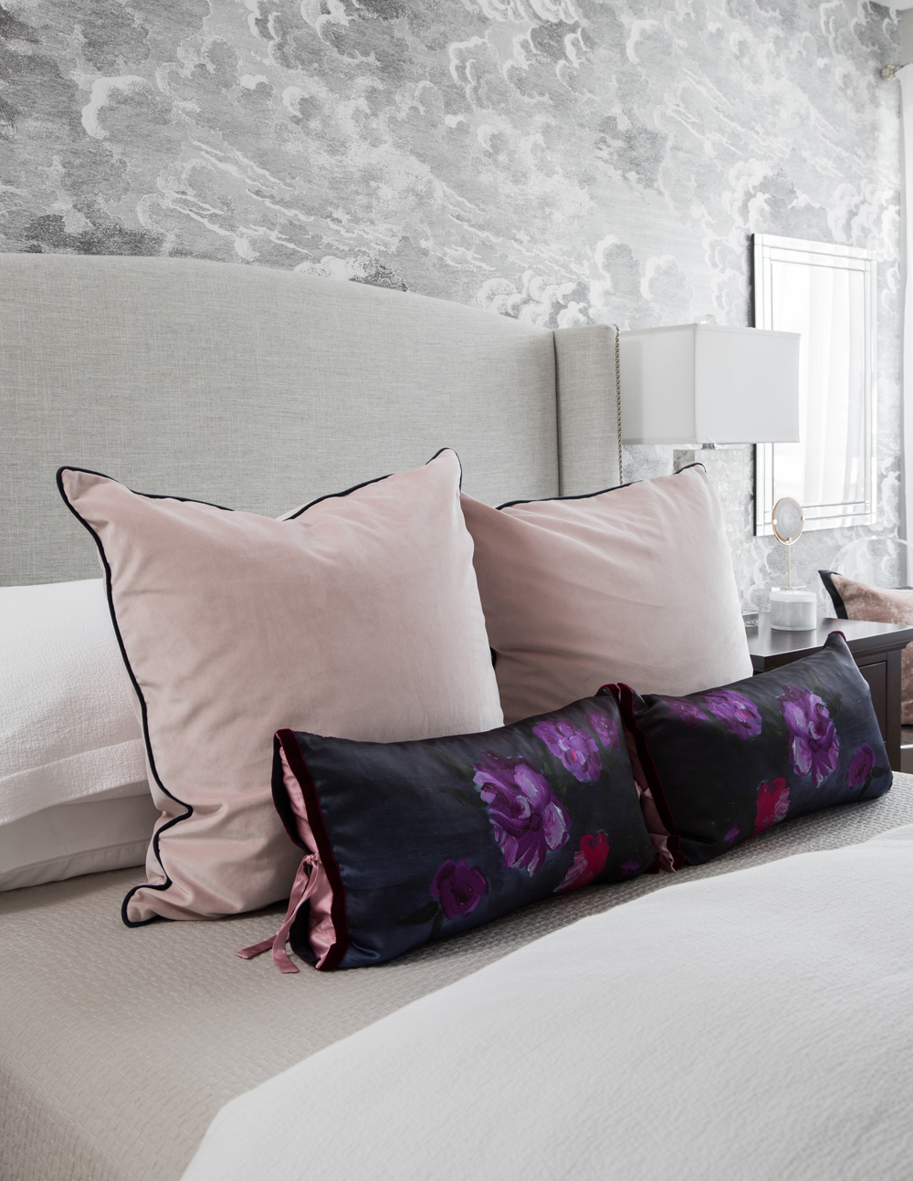
Made to Measure
The edgy dynamic between the custom-made bed’s taut tailoring and the soft cushions feels fresh and unfussy. Strong style inspo on display too: note, beds need more than just sleeping pillows!
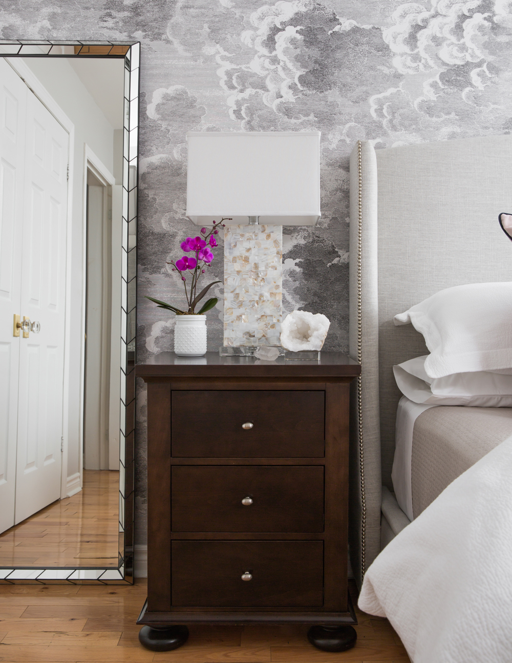
Take a Stand
The handsome bed stands are from Geovin and can be semi-customized in terms of stain, paint colour and hardware. We love that Sandy chose a dark finish to punctuate the space and the nickel brings together the grey found throughout the home.
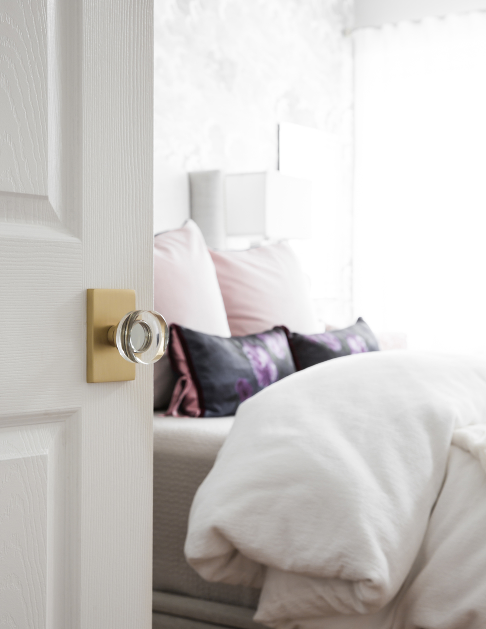
Clearly Beautiful
Often overlooked, door knobs really are a barometer of design acumen (and an easy way to upgrade any space). This brass and crystal beauty is from Emtek.
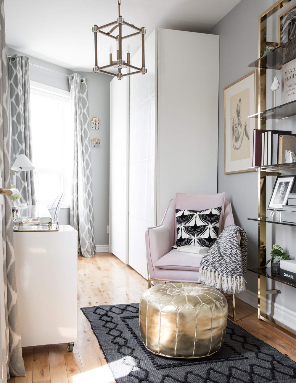
Business Casual
Carrie Bradshaw, eat your heart out. Sandy has created the most covetable home office/clothing storage space a girl could want. The IKEA cupboards stash everything from paperclips to pullovers, while a HomeSense chair injects a shot of pink. It’s nicely contrasted with a dark rug from Saudade Toronto.
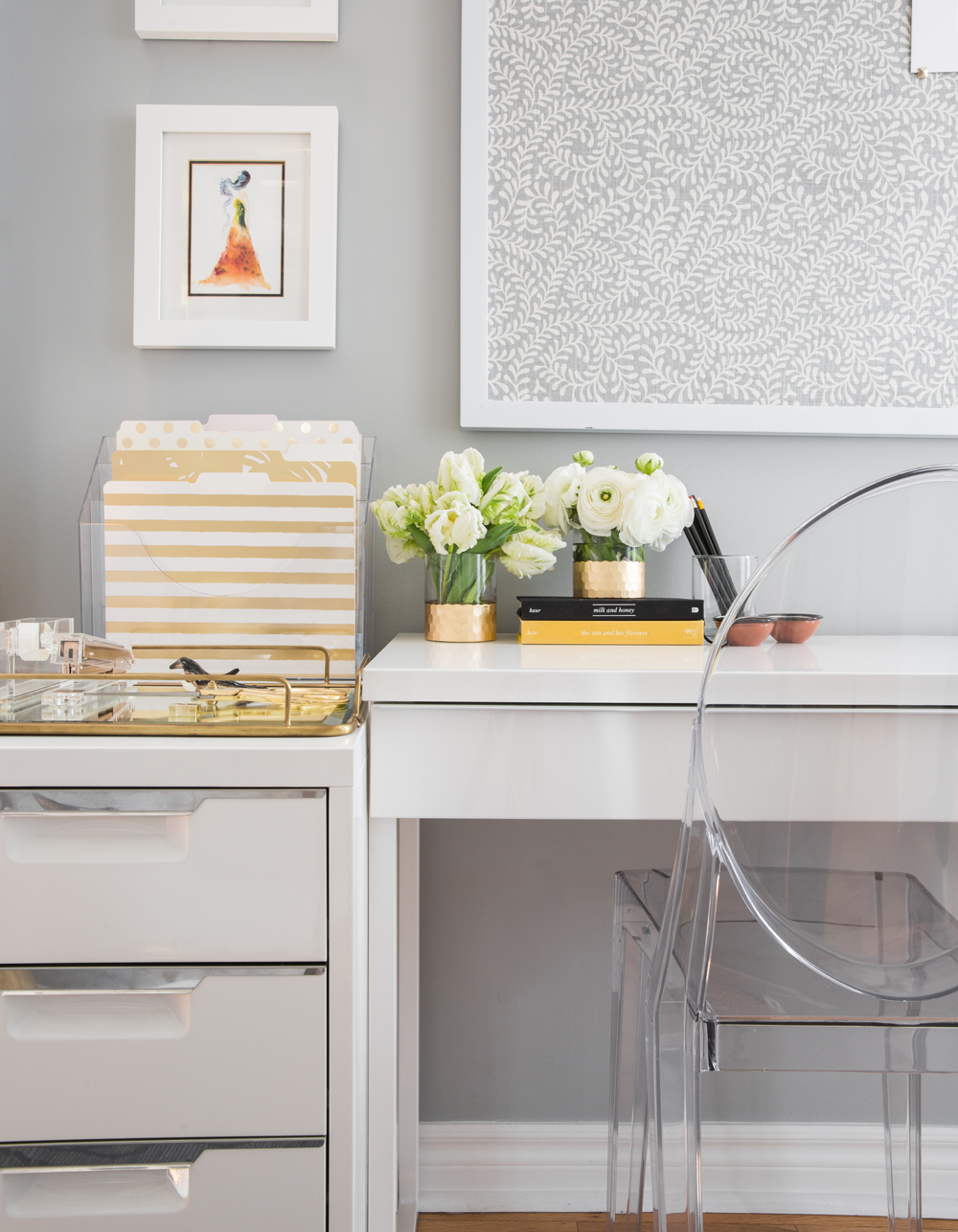
Style by the Yard
Thanks to Sandy, you will never accept a plain old corkboard again. This one above her office desk is wrapped in fabric that complements the colour scheme and layers in pretty pattern. A Lucite chair keeps the look clean and uncluttered.
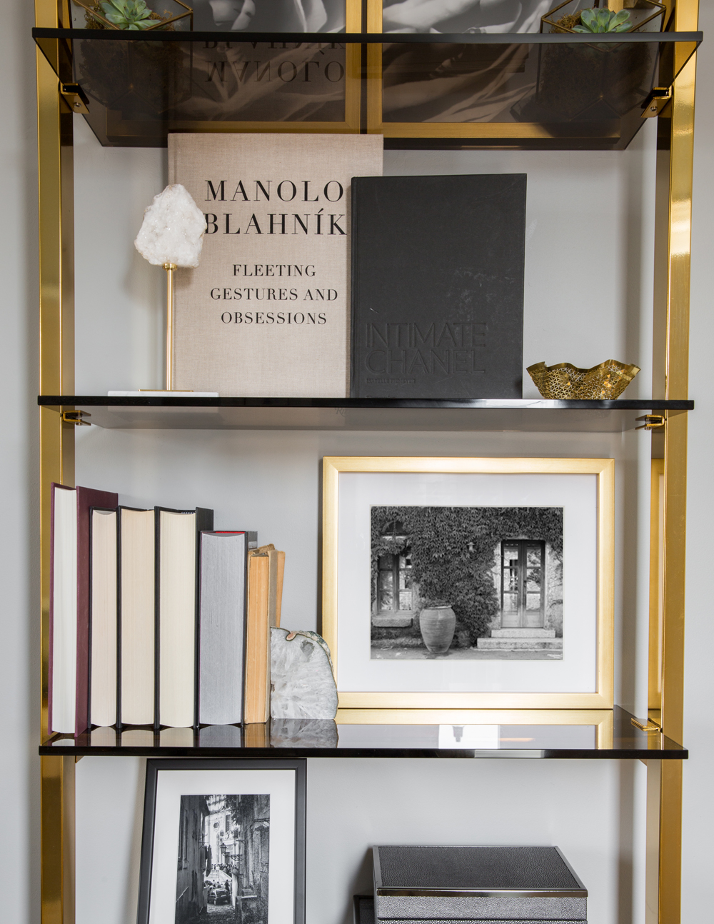
Heavy Metal
The office shelving feels both on-trend and slightly retro thanks to its neat mix of brass and smoked glass. At-home stylists take note: book shelves are not just for books. Sandy peppers hers with artwork and travel mementos.
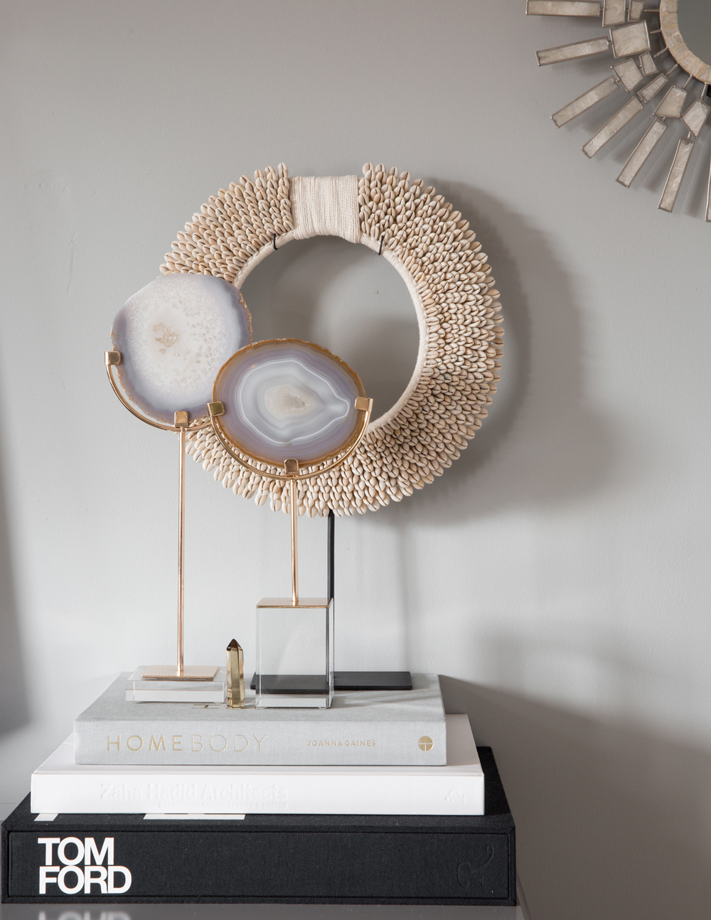
World Traveller
“I’ve collected so many great pieces throughout my travels,” says Sandy. “I like to showcase these treasured items as part of the mix.” They also factor in personality and interest.
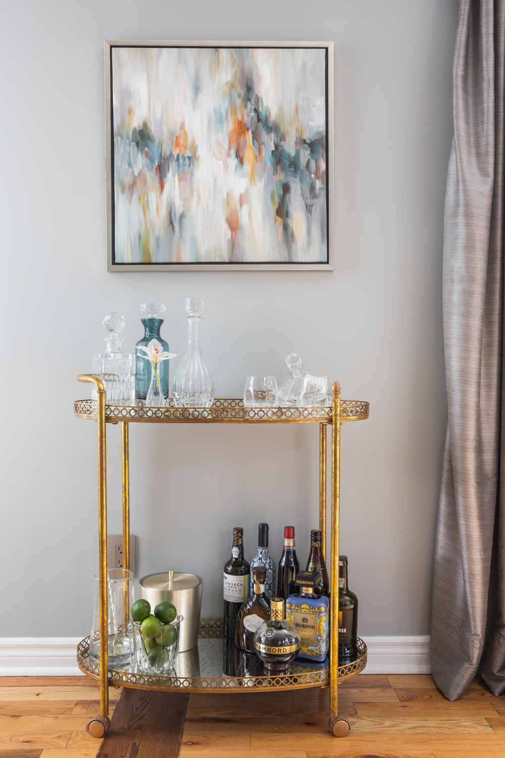
Artful Touches
A characterful bar cart is nicely accessorized with custom drapery and a piece of art that was a gift. The array of shapes, colours and textures that make up this vignette are compelling.
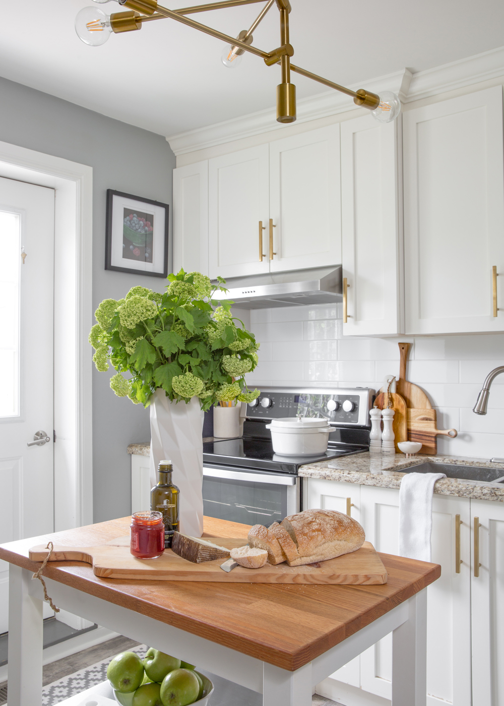
Golden Touch
It’s amazing how hardware can transform the look of a kitchen. Brass pulls (from Emtek) and a brass pendant light shift the space into overdrive: imagine brushed steel instead and it becomes ho-hum. A small but practical butcher-block topped cart adds a welcome work surface and storage.
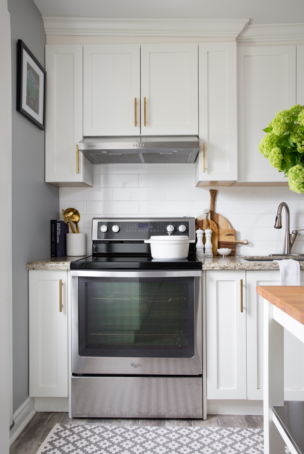
Recipe for Style
Kitchens should offer more than just practicality. We love how Sandy painted one wall grey, hung art, corralled brass utensils and layered in a graphic pattern underfoot. “I think a space, even a kitchen, should look and feel like its inhabitants,” she says. “I wanted to curate my home the way I curate my personal style.”
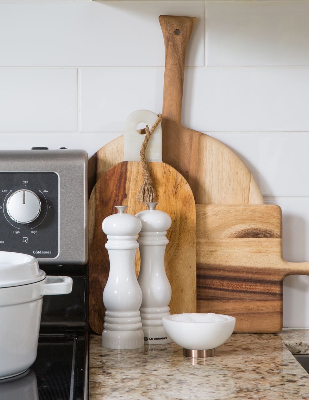
Natural Elements
Displaying cutting boards in plain sight is win-win – they’re always within reach and when this beautiful, they layer in warmth, colour and interesting shapes.
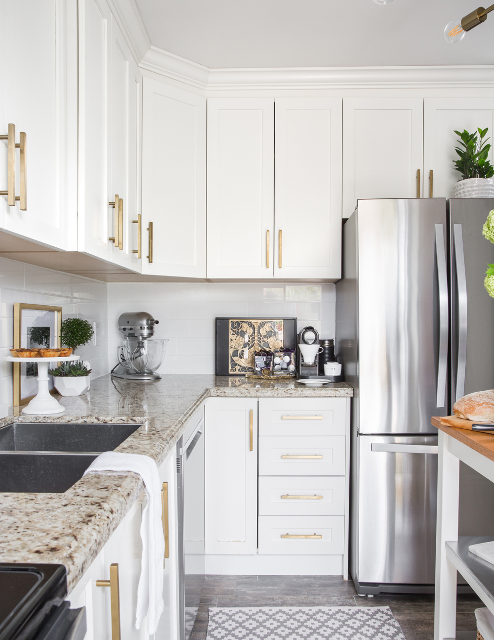
Counter Culture
Sandy’s penchant for styling continues on the countertops where artwork and greenery share the stage with everyday utensils – a simple and inexpensive way to freshen up any kitchen. This angle highlights the great energy that’s created when brass and stainless-steel are paired.
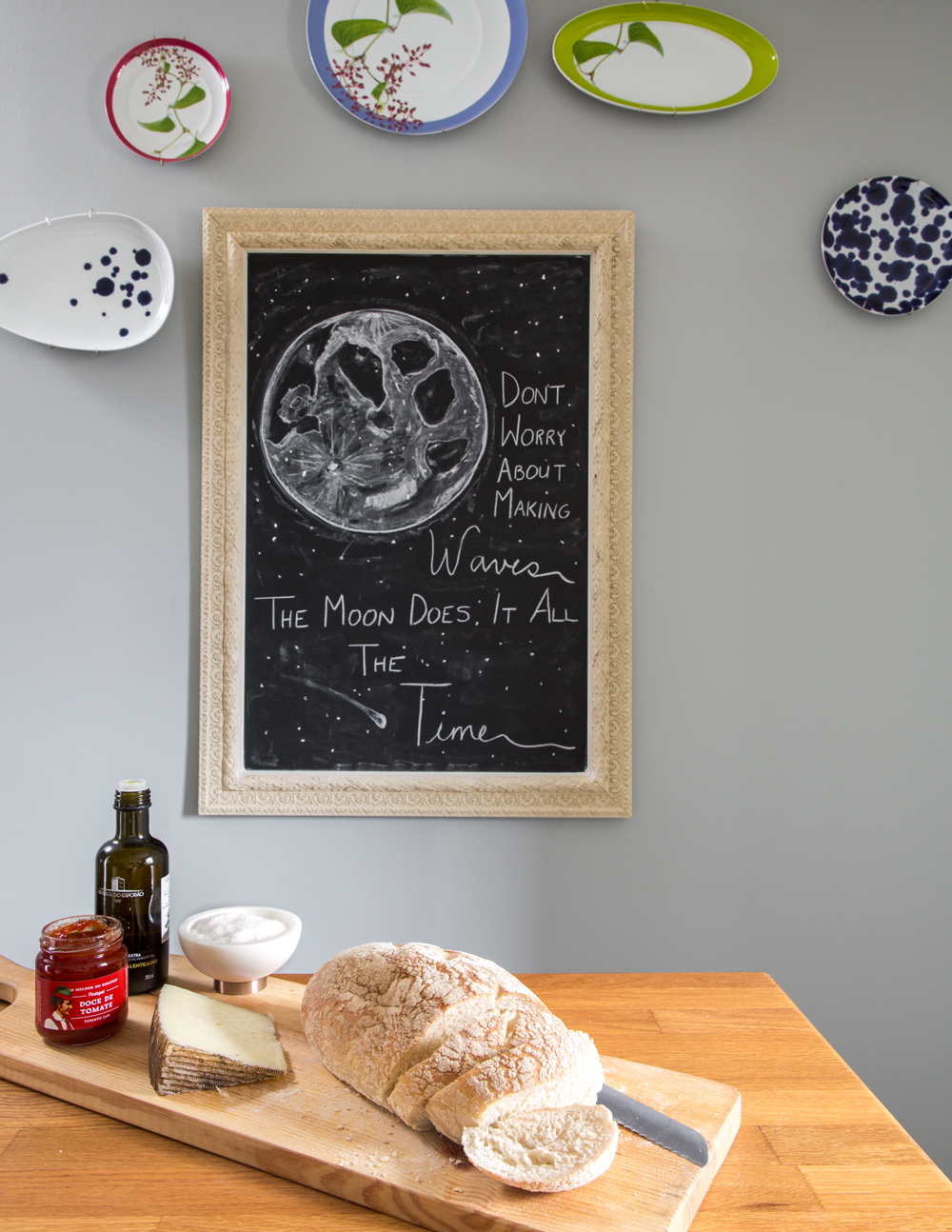
Artistic Leanings
A framed blackboard in the kitchen need not be relegated to grocery lists. Sandy takes a more artistic approach and changes the message often. “This is a fun way to create your own art,” she says. The gorgeous Portuguese plates are from Saudade Toronto.
Related: This Entire Toronto Apartment Was Furnished and Decorated for Less Than $2,500
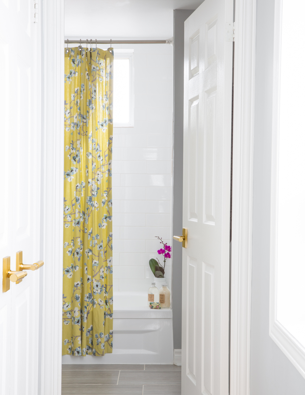
Flower Power
A showstopper shower curtain from Tonic Living sets the lively tone for the bathroom. We love how its yellow hues complement the brass door handles. A fresh orchid beside the tub nicely riffs on the floral pattern.
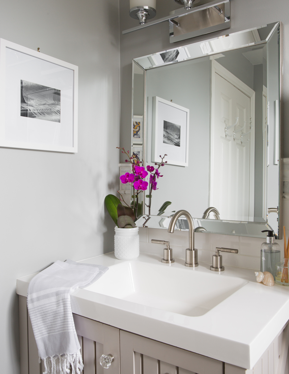
So Edgy
The bathroom’s bevelled edge mirror channels a glam art deco vibe and elevates the more traditional style vanity. Artwork and tiny touches – an orchid, that sweet shell in front of the soap – speak to Sandy’s style. “I very much live and design with the philosophy that everything in a space should be beautiful or useful.” Mission accomplished.
HGTV your inbox.
By clicking "SIGN UP” you agree to receive emails from HGTV and accept Corus' Terms of Use and Corus' Privacy Policy.


