When you step into Melissa Agostino and Henry Tyminski’s loft in Toronto’s Little Portugal, it’s impossible not to be struck by the space’s originality. As graphic designers, Melissa and Henry have filled the home with colourful odds and ends: traffic signs from Europe, kitschy collectibles salvaged from flea markets, and a dramatic gallery wall of paint-by-numbers pictures in their original frames. The building was converted from an old factory built in 1917. These days, it looks more like an art gallery thanks to the ultra-high ceilings, plywood tile and thoughtful finishing touches from the two designers-in-residence.
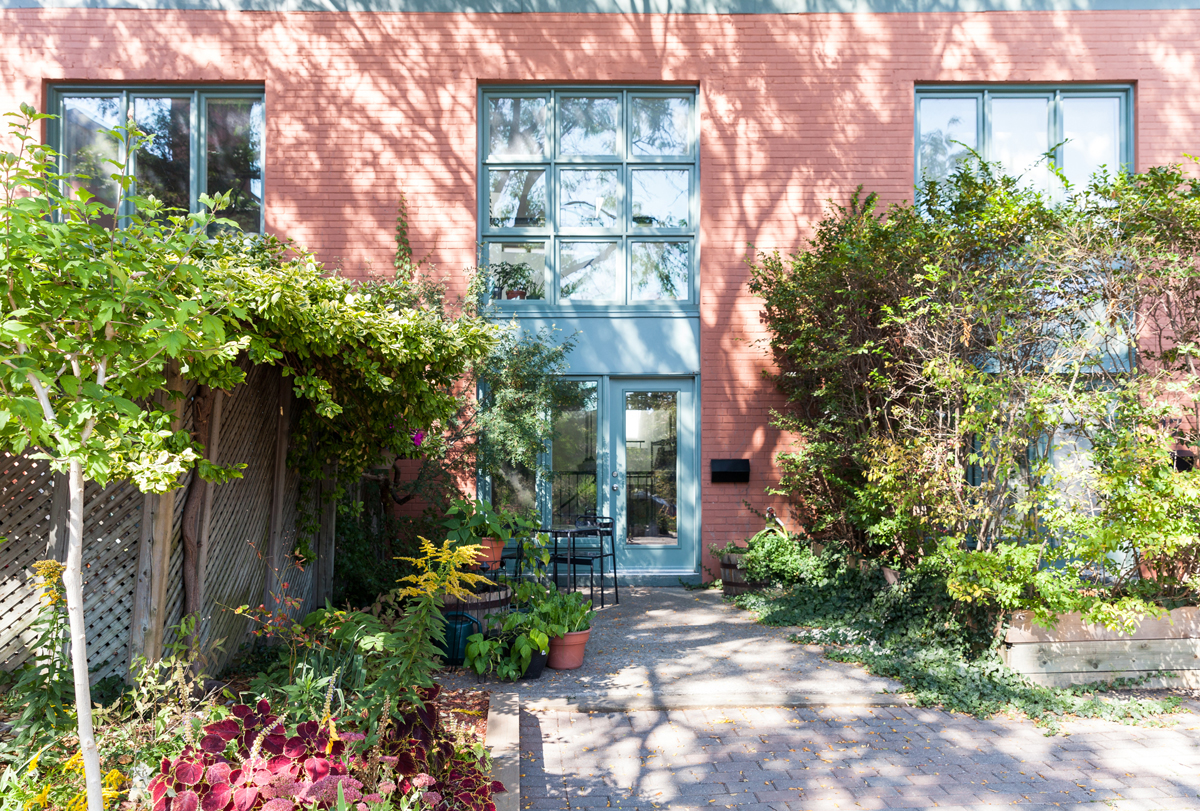
Private Garden
The leafy entrance to the home is a peaceful garden. The building is tucked along a quiet lane, which adds some built-in privacy. The café table and chairs from IKEA are a great spot for a morning coffee.
Planning a move? Read the 10 things you need to know before moving from a condo to a house.
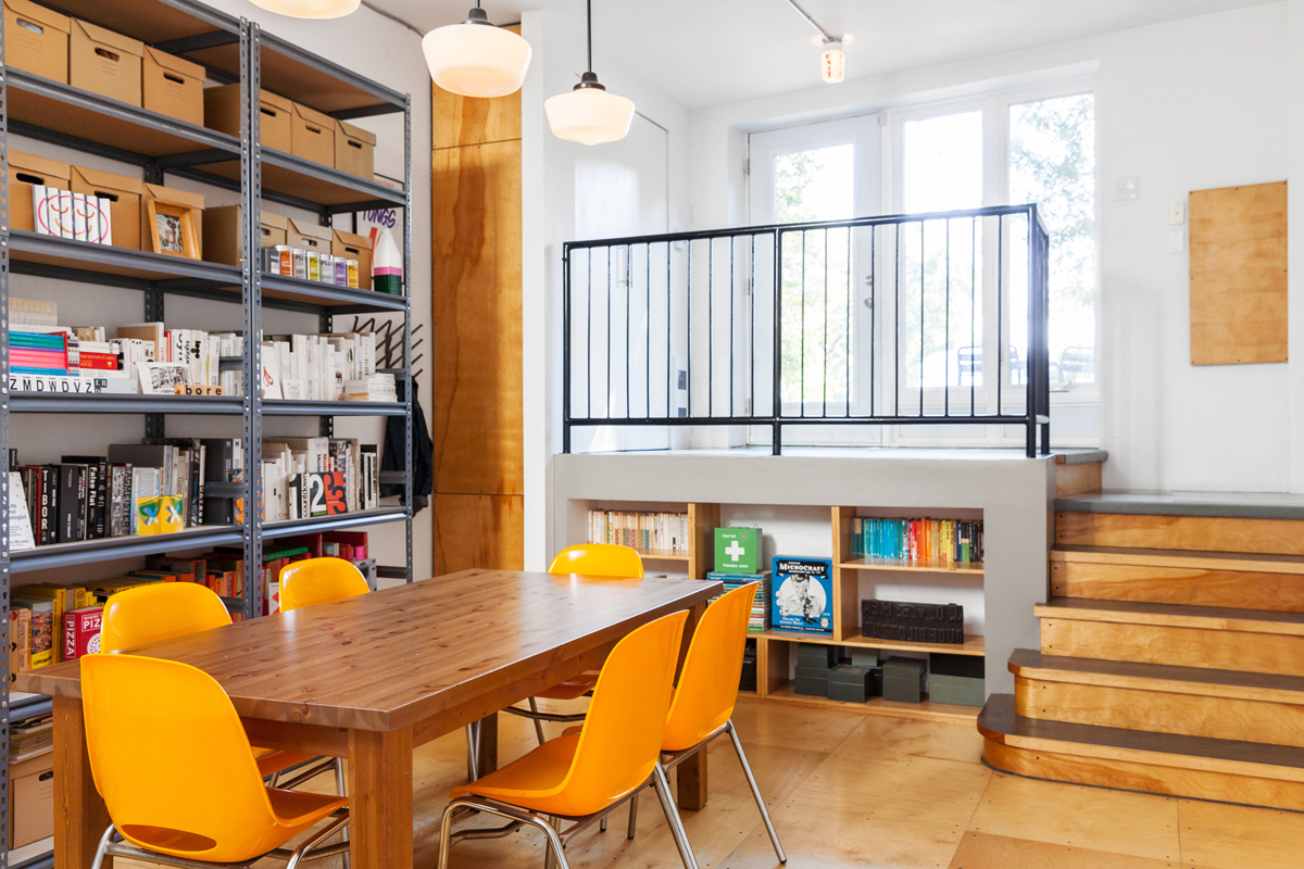
Orange You Glad to See Me?
Melissa and Henry’s loft doubles as a workspace, and they run their graphic design studio, Sali Tabacchi, from home. Meetings with clients are often held at the table, which is surrounded by six clementine-orange chairs from Red Indian, a shuttered vintage shop on Queen West. The room’s go-to conversation piece is an old potato stamp from the Netherlands, on the back shelf, which was once used to brand a farmer’s name on a sack of spuds.
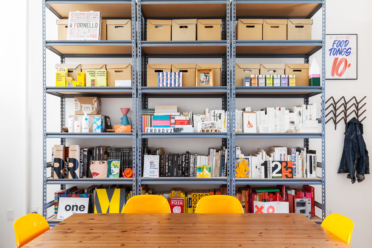
Best in Show
To showcase some of their best work, Melissa and Henry bought this industrial shelving unit from Home Depot. They’ve also tucked some of their favourite design books here. Before the iconic department store Honest Ed’s closed down, they nabbed a poster for food tongs (only 10 cents!) with the store’s signature calligraphy.
Love this colourful loft? Check out a fashion-savvy designer’s daring Toronto condo.
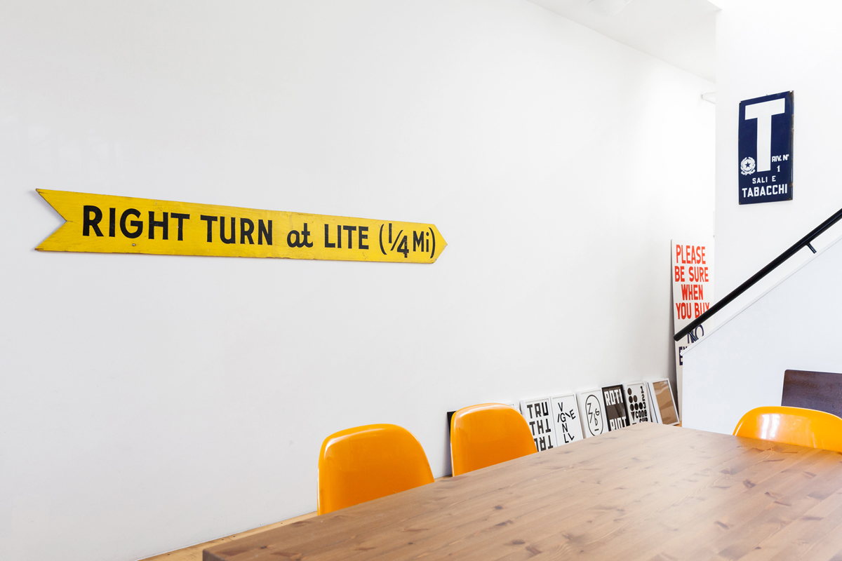
Over Yonder
This hand-painted wood sign from Post and Beam Architectural Reclamation in the Junction is a fun way of pointing guests towards the office space – which, thankfully, is less than a 1/4 mile away.
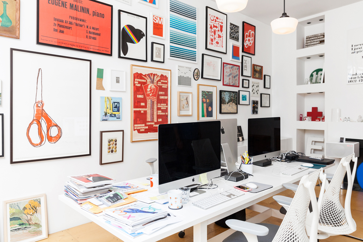
Desk With a View
This, as they say, is where the magic happens. Melissa and Henry positioned their work space directly across from an inspiration wall bursting with a mishmash of design influences. The big orange scissors are a print by Canadian illustrator Alanna Cavanagh, and the rainbow-striped beaver is a vintage poster from the 1976 Montreal Olympics. For a personal touch, they included a painting by Henry’s grandmother.
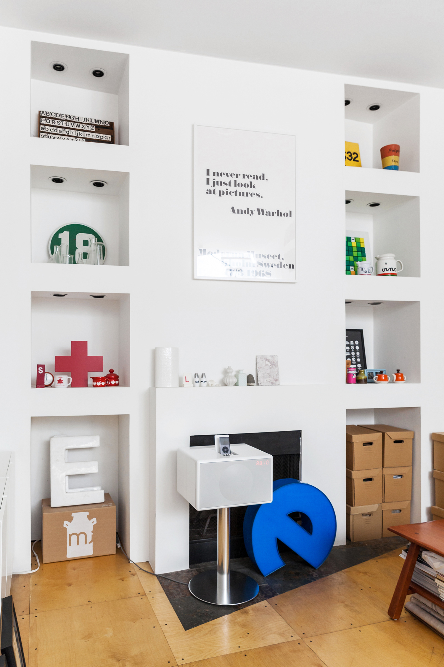
Pop Art
Melissa and Henry don’t use the wood-burning fireplace, but this corner alcove is brimming with other pieces they love. Melissa jokes that the Andy Warhol quote above the mantel – “I never read. I just look at pictures.” – is fitting for a pair of graphic designers. The blue “e” is from an old Mark’s Work Warehouse sign.
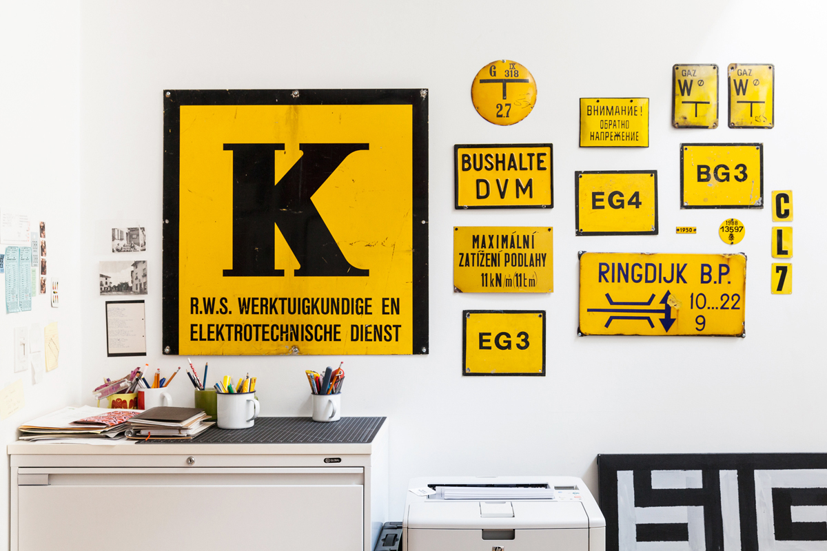
Mellow Yellow
Utilitarian design is a subtle theme throughout the house, and Melissa and Henry loved these road signs they collected across Europe. The mix of yellow and black reminded them of the design of No Frills and No Name products. The massive “K” from the Netherlands required its own suitcase home.
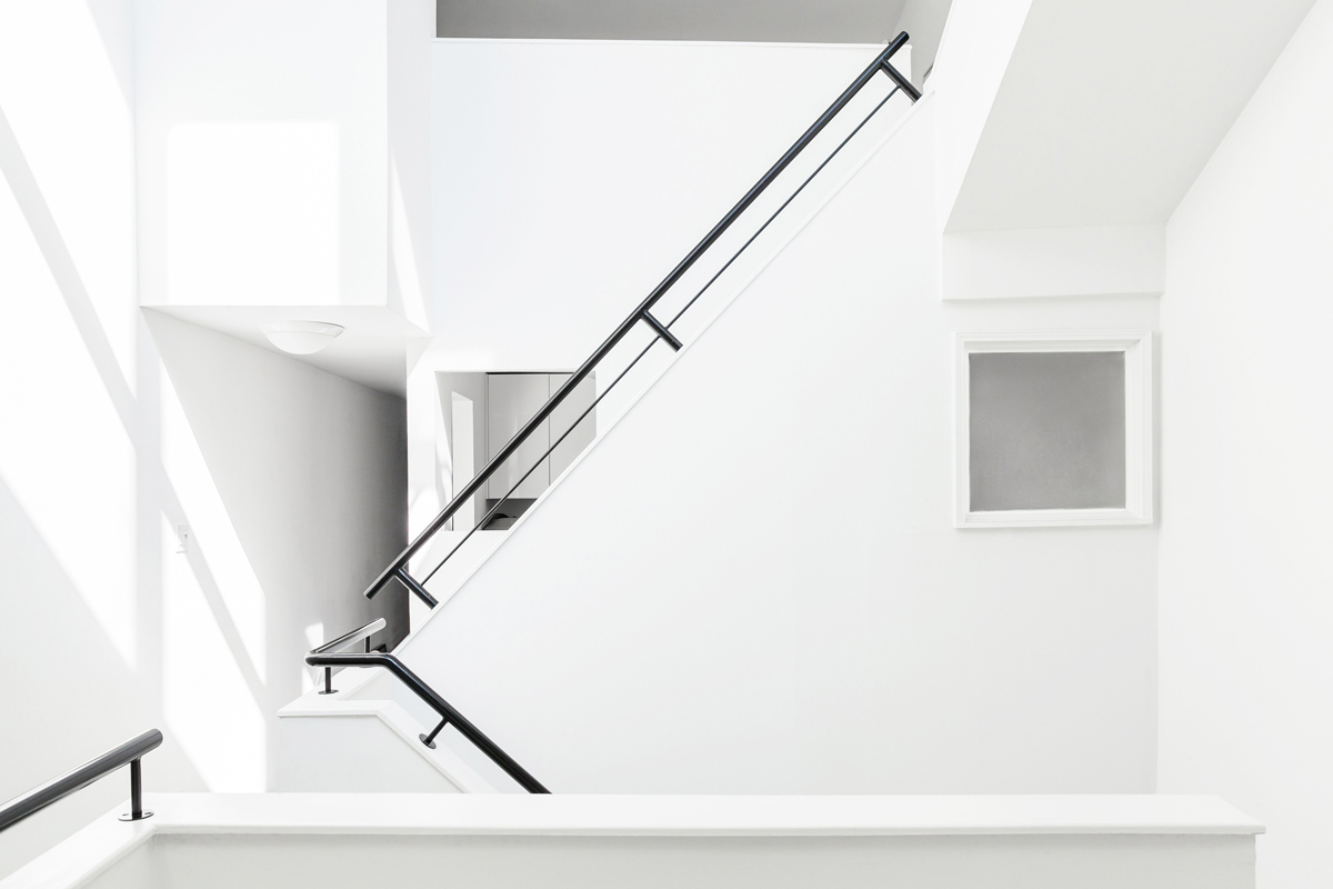
Architect’s Eye
The original owner of the loft commissioned an architect to design this in-between space. The striking combination of light and calculated use of angles makes this hallway one of the most spare but intriguing spaces of the home.
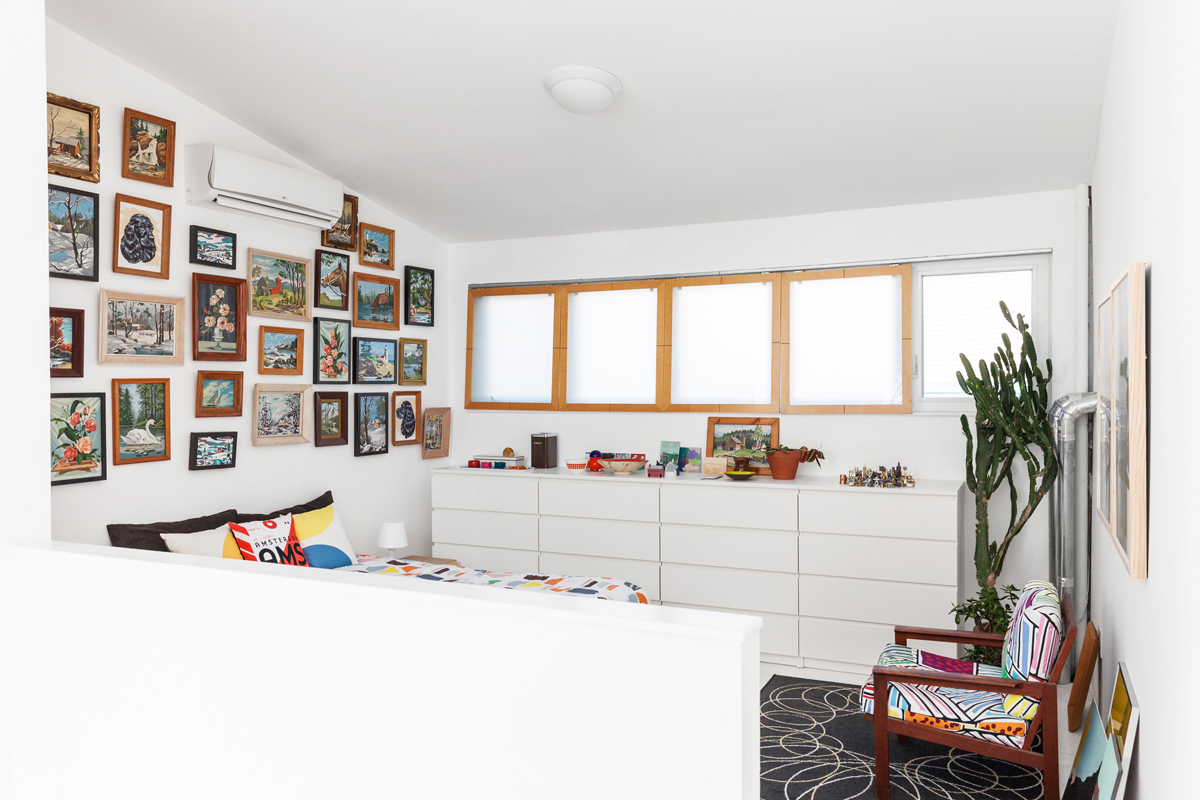
Arts and Crafts
The master bedroom is awash in natural light, which perfectly illuminates the intricate gallery wall above the bed.
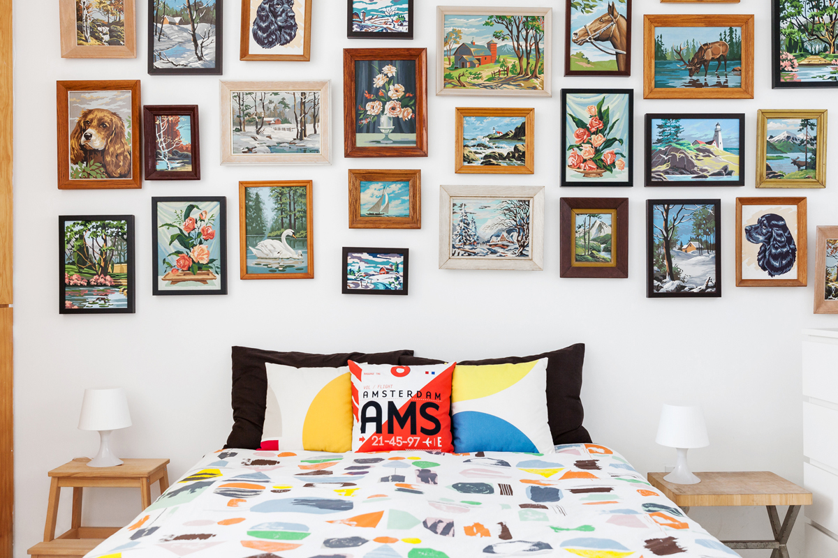
Gallery Gone Good
Henry and Melissa collected already-finished paint-by-numbers pictures from the 1950s – 1970s. They loved the Canadiana kitsch of the scenes, including a moose drinking from a river and a glamour shot of a cocker spaniel.
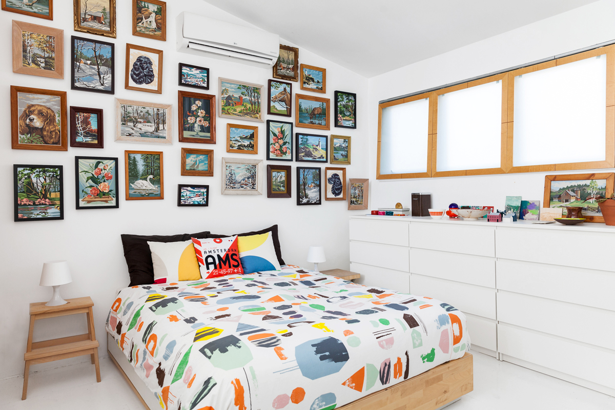
Just for Kids?
The IKEA bedspread is a colourful reflection of the artwork above. Melissa jokes that it’s probably for a kid’s room, but they loved it regardless.
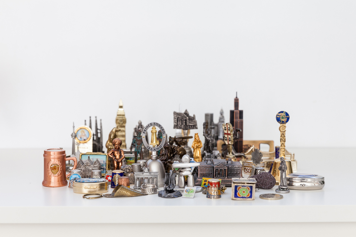
City Slickers
During their travels, Melissa and Henry challenged themselves to find the cheesiest metal ornament possible. Their diminutive collection, showcased on the dresser, includes the White House, Chicago’s Sears Building and the Brandenburg Gate in Berlin.
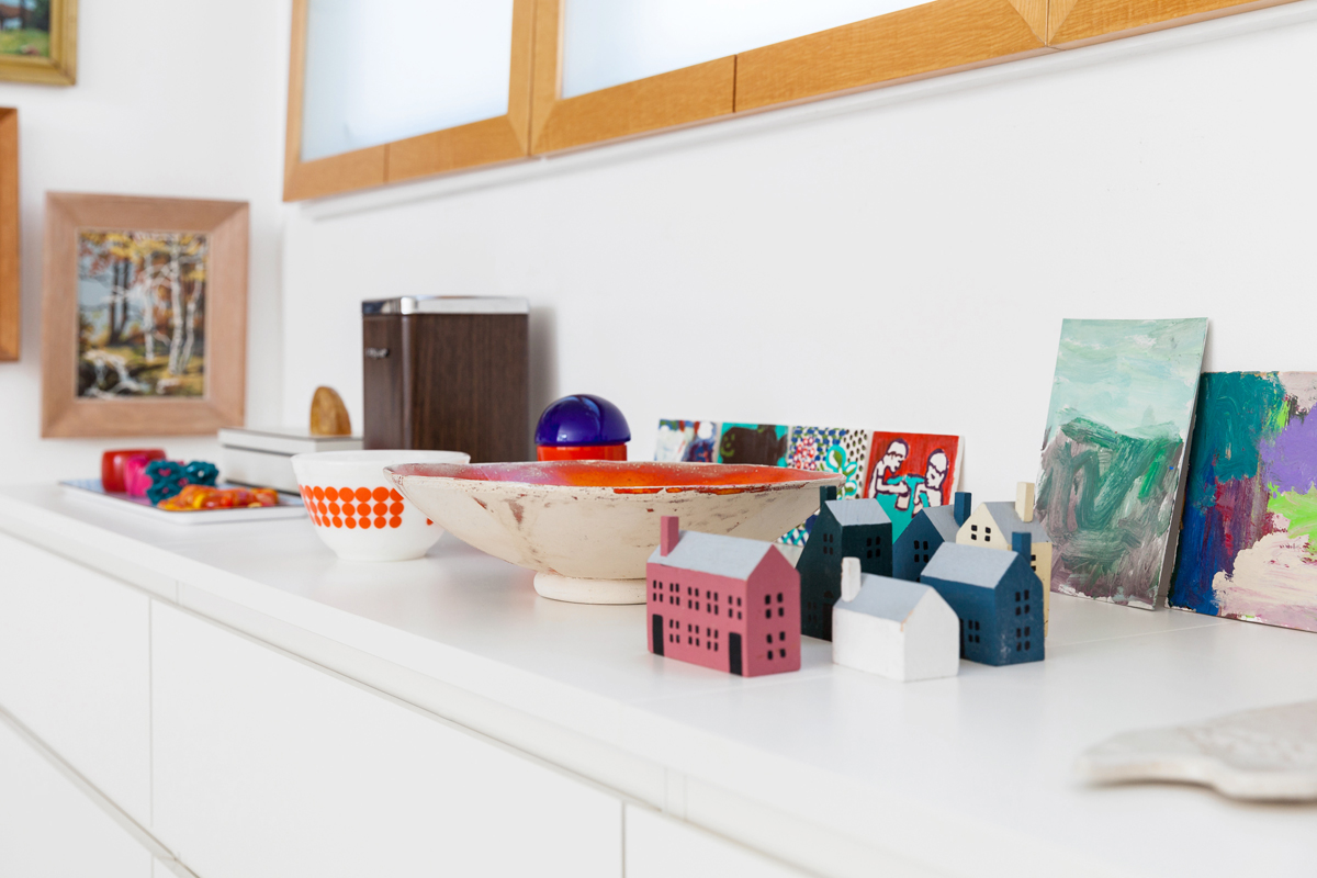
Homemade Touch
As a contrast to some of the home’s more industrial pieces, the bedroom profiles some handmade works. Abstract paintings by Henry and Melissa lean against the wall, and the little houses were found in a vintage shop in northern Ontario.
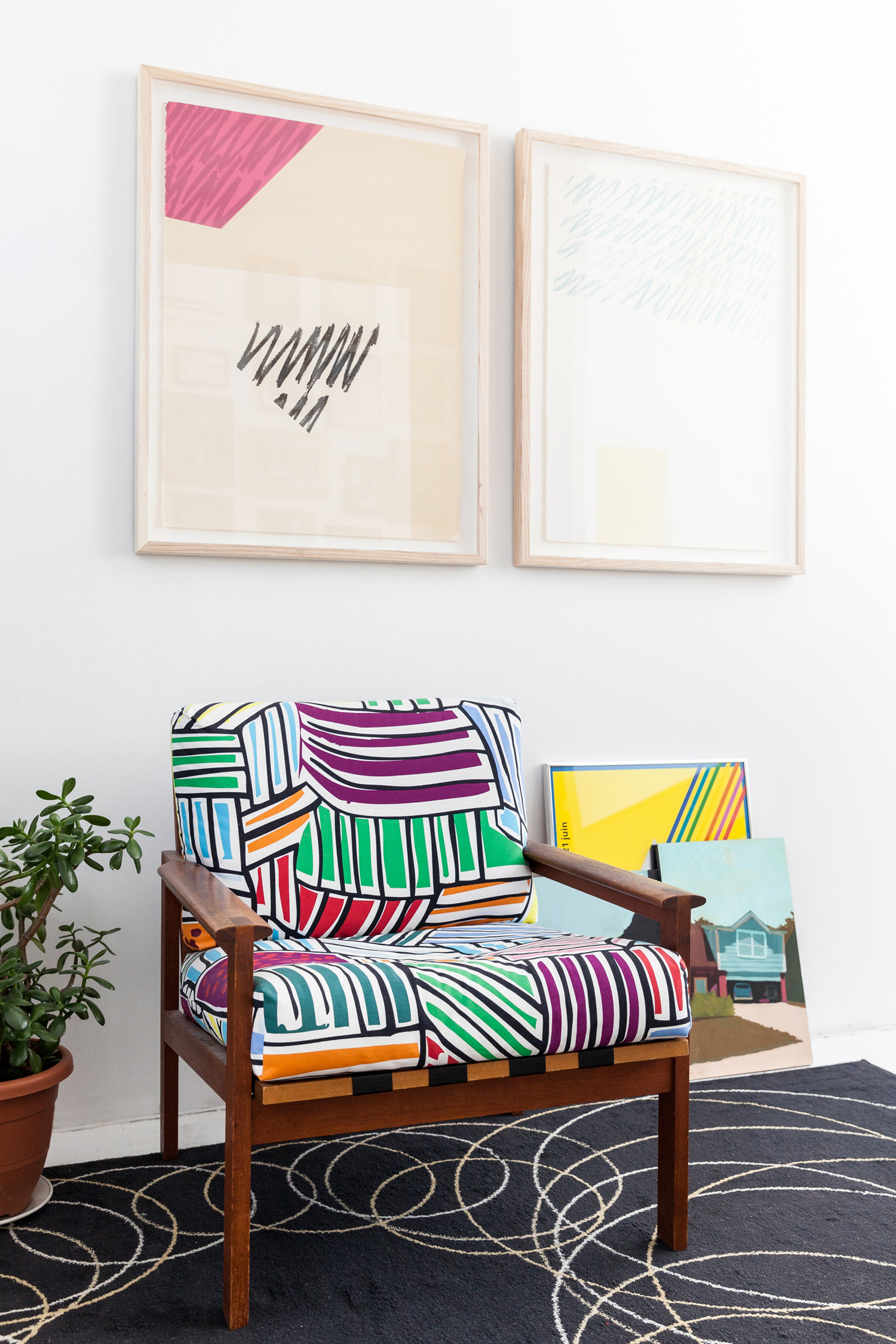
Salvaged Treasure
This chair was found on the curb and given a second life, thanks to the re-upholstery expertise of Henry’s mom, who used a bold fabric from IKEA. The hand-pulled prints above the chair are original pieces from 1979 purchased at a sale at the Ontario College of Art and Design. While the opposite wall is consumed by mass-produced paint-by-numbers pieces, this wall offers a more subdued approach.
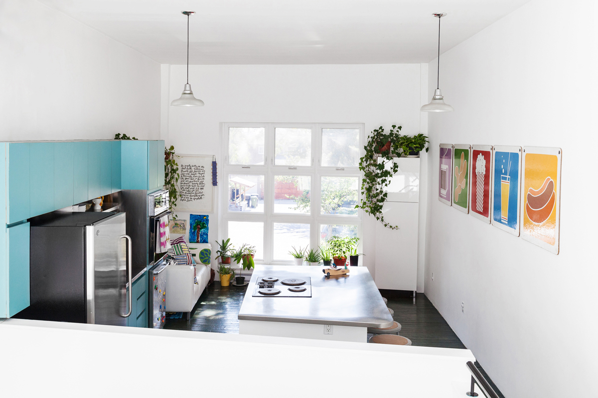
Drive-ins, Diners and Dives
The kitchen, seen here, includes a series of graphic prints from a drive-in snack bar featuring menu items: hot dogs, peanuts, popcorn. It’s also one of the greenest rooms of the house, with ivy, hot pepper plants, aloe and avocados grown near the window. The flooring is original to the building, and Melissa and Henry like that it shows signs of age.
Check out the 2018 kitchen trends you’ll love for years to come!
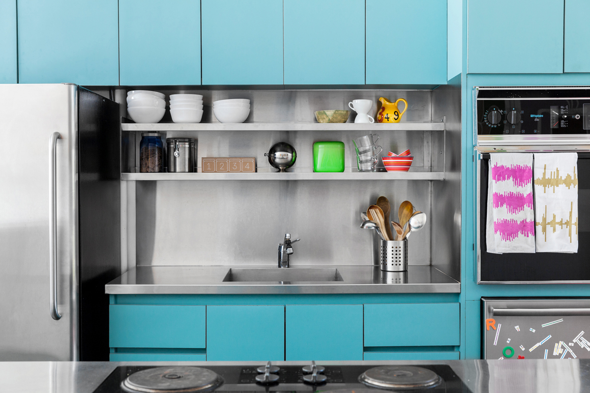
Sights and Sounds
This shade of teal is original to the kitchen, and Melissa and Henry wanted to keep the 1980s vibe. The stove even has small accents that reflect the colour. The tea towels, by Michelle Matsui of Kempton Jones, are visual representations of sound waves of a purring cat (left) and someone slurping coffee (right).
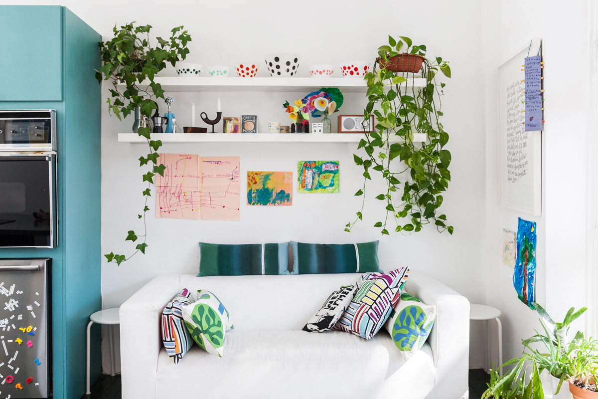
Flooded with Flora
The couch beside the kitchen offers a cozy place to slump down while waiting for water to boil. The vintage pyrex bowls on the floating shelf is one of Melissa’s favourite things to find at vintage shops, on account of the small-town charm. Drawings by their two kids are tacked below. The colourful pillows are another example of Henry’s mother’s handiwork.
Let these timeless living room colour schemes inspire your next makeover!
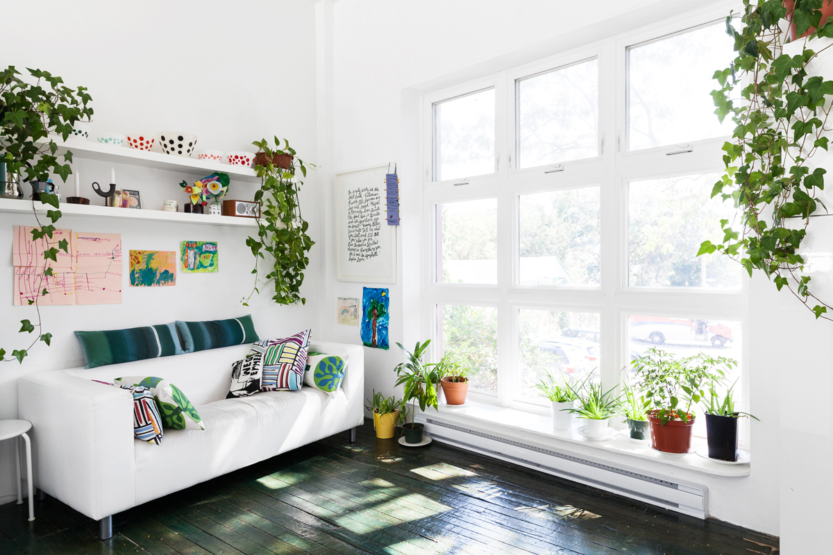
Fun with Food
This black-and-white print, also by Alanna Cavanagh, profiles a series of famous quotes about food – including “Everything you see I own to spaghetti” by Sophia Loren and the Estonian proverb, “An empty belly is the best cook.” This massive window looks out onto the front driveway and offers a powerful blast of natural light.
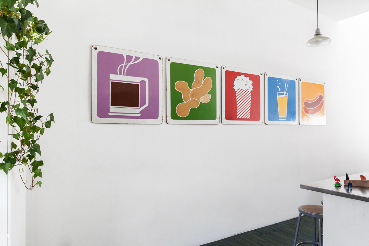
Fast Food
Here’s an up-close look at those drive-in ads, which were found at the Christie Antique Show and hung by their original holes.
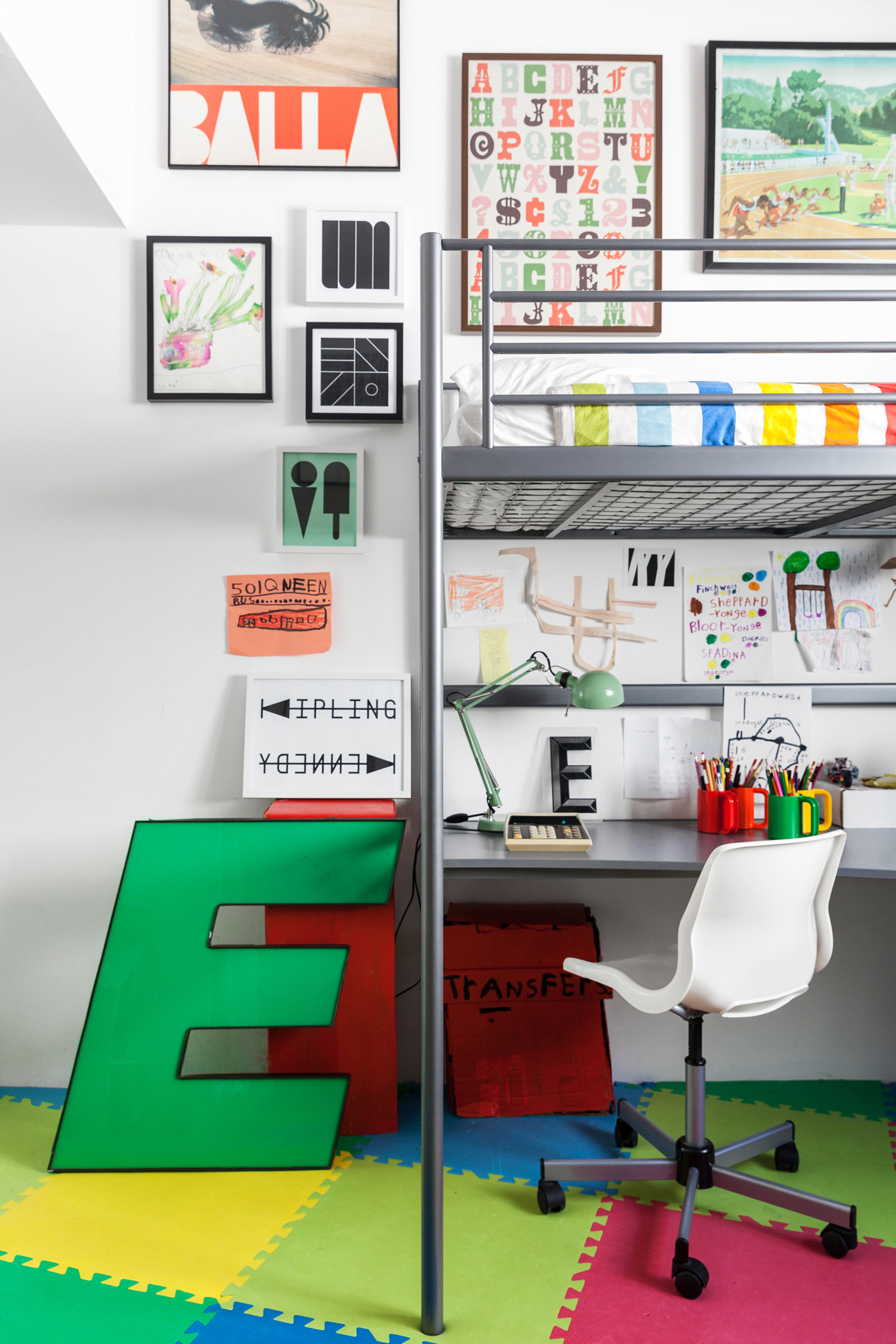
Riding the Rocket
Melissa and Henry’s seven-year-old son is obsessed with the TTC. He knows every single bus by number and can rattle off all subway stops in order. Henry made him a sign showing the two end stops of the Bloor line, Kennedy and Kipling, and a box is tucked beneath the desk for his collection of paper transfers. Their two children share the room, and each has their own loft bed.
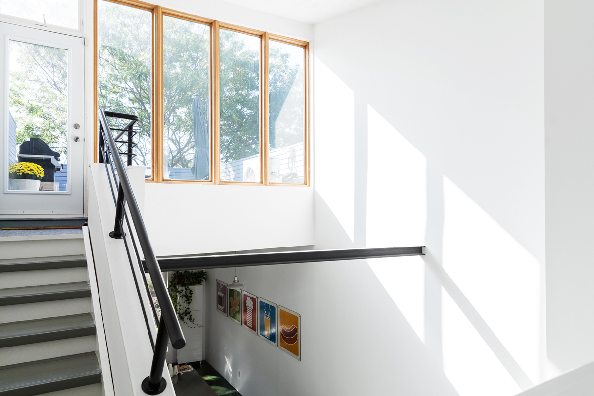
Light and Airy
South-facing windows mean that this space, looking up toward the patio, is one of the hottest parts of the house come winter. Since privacy isn’t an issue, Melissa and Henry decided to forego curtains to maximize light.
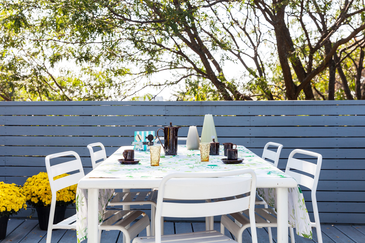
Deck Party
On the top floor, this sweeping deck offers a treetop view of the west end. A simple IKEA table set and a couple floral pops make the space ideal for an open-air dinner party.
Looking to enter the real estate market? Here’s are the best places to buy a home in Canada in 2018.
HGTV your inbox.
By clicking "SIGN UP” you agree to receive emails from HGTV and accept Corus' Terms of Use and Corus' Privacy Policy.


