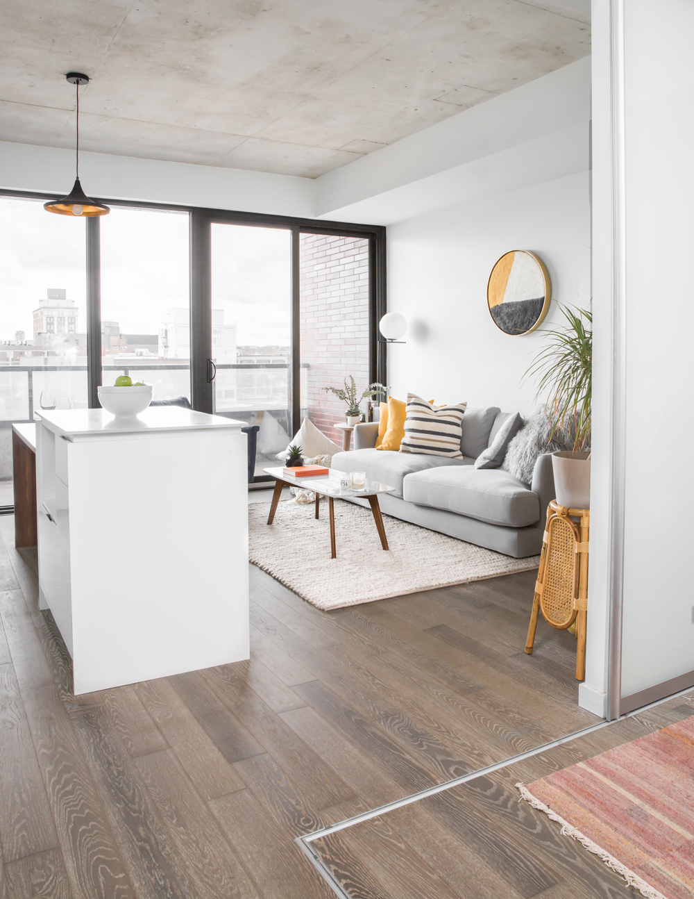
When designer Kathryn Findlay, of Studio Findlay, was asked by one of her oldest friends for a design intervention – she didn’t hesitate. The friend (since they were five years old!) had just rented a condo and in terms of furnishings needed? In a word: everything. Kathryn decided to dress up the neutral new-build with jolts of colour, a mix of furniture styles and some seriously feminine touches.
A Clean Slate
Having recently purged her university-days furniture, this condo dweller moved into her 700-square-foot space in need of a fresh start. “She needed help, as it was a complete blank slate,” says designer Kathryn Findlay. The graphic contrast of the black window frames against the white walls informed Kathryn’s design vision: create a mostly neutral backdrop and enliven it with interesting accents and splashes of colour.
Related: This Entire Toronto Apartment Was Furnished and Decorated for Less Than $2,500
Finishing Touch
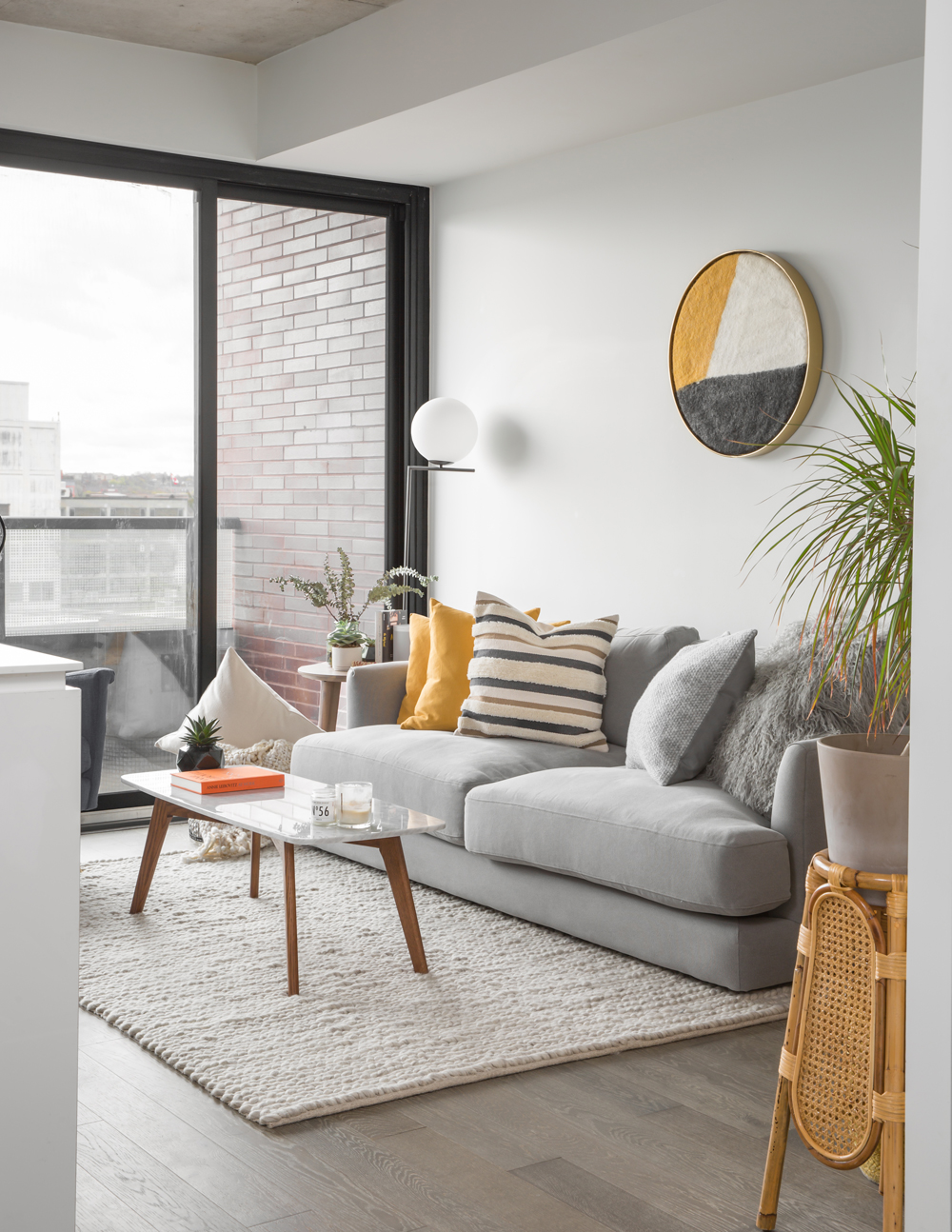
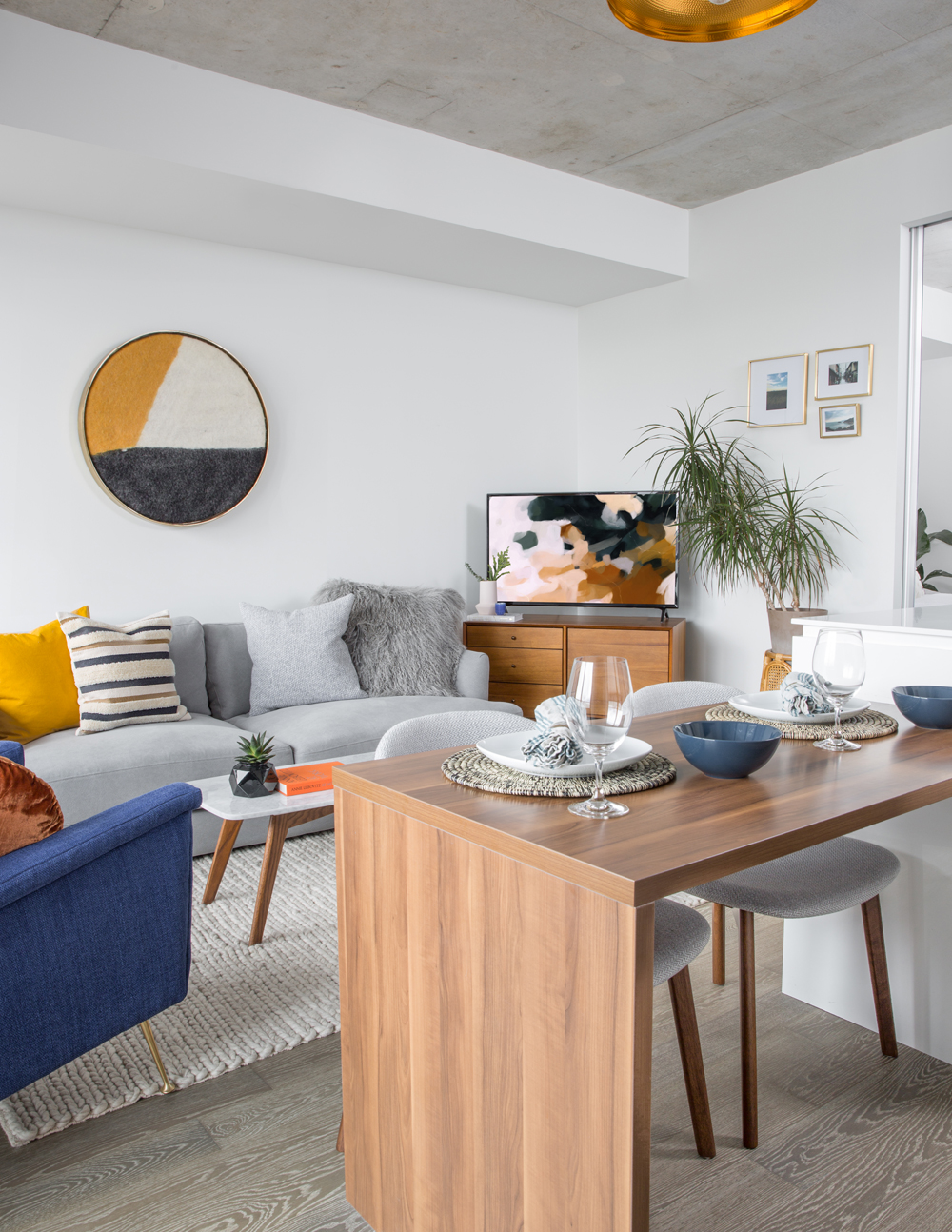
Funnily enough, the round wall hanging of brass-framed fabric (a HomeSense find) was purchased after Kathryn had furnished the apartment. It ties in the room’s colour palette and mood so well it seems like it was custom made. The vintage-looking rattan plant stand, also from HomeSense, elevates the potted plant to a feature piece.
Circular Motion
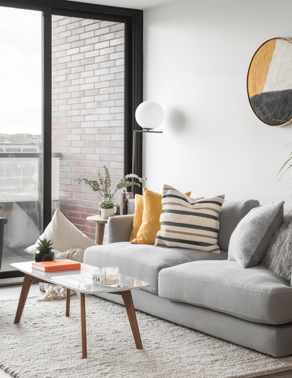
A Structube floor lamp echoes the shape of the wall hanging and introduces some curves into the boxy new-build. A nubby IKEA rug cranks up the cozy, while the Article coffee table channels a mid-century mod look amongst the soft shapes and upholstery.
Into the Blue
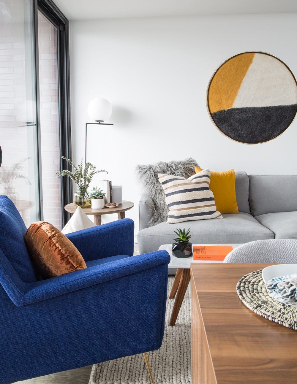
The stunning indigo chair from West Elm was the first piece Kathryn and the owner selected for the space. Its not-shy hue is a fun focal point in the mostly neutral design, yet still nicely references the room’s many shades of grey.
Related: This Eco-Conscious Montreal Home Definitely Isn’t Afraid of Colour
Continuity Girl
The walnut tones of the two-level kitchen island, part of the condo’s design, inspired the space’s wood accents, which are continued in the media console from West Elm. Positioned in the corner, it keeps the TV discreet, yet visible from most vantage points. And even though it’s new, it has a vintage feel and makes the room feel like it’s been decorated over time.
Related: This Adorable Cozy Cottage Near Ottawa is Peak Canadiana
Soft Touch
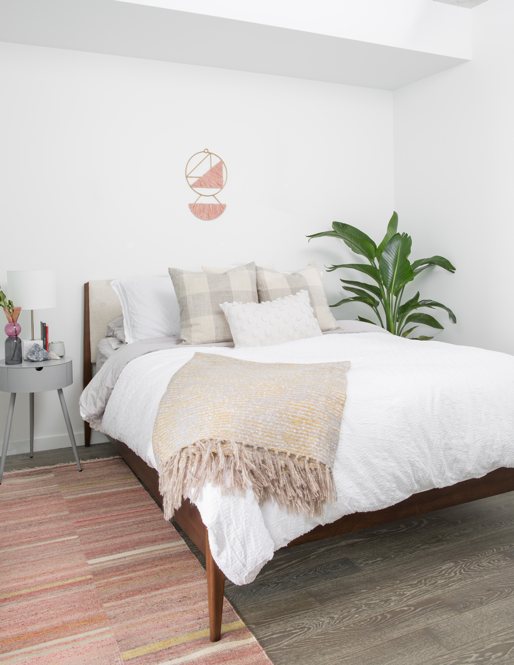
“I wanted the bedroom to be her minimal sanctuary,” says Kathryn. “We wanted to keep things super simple and use restraint here – which is sometimes harder than going deep into the decoration of the space.” All-white bedding and soft accents maintain that simplicity, while pale hues add some nuance and dimension.
Small, but Mighty
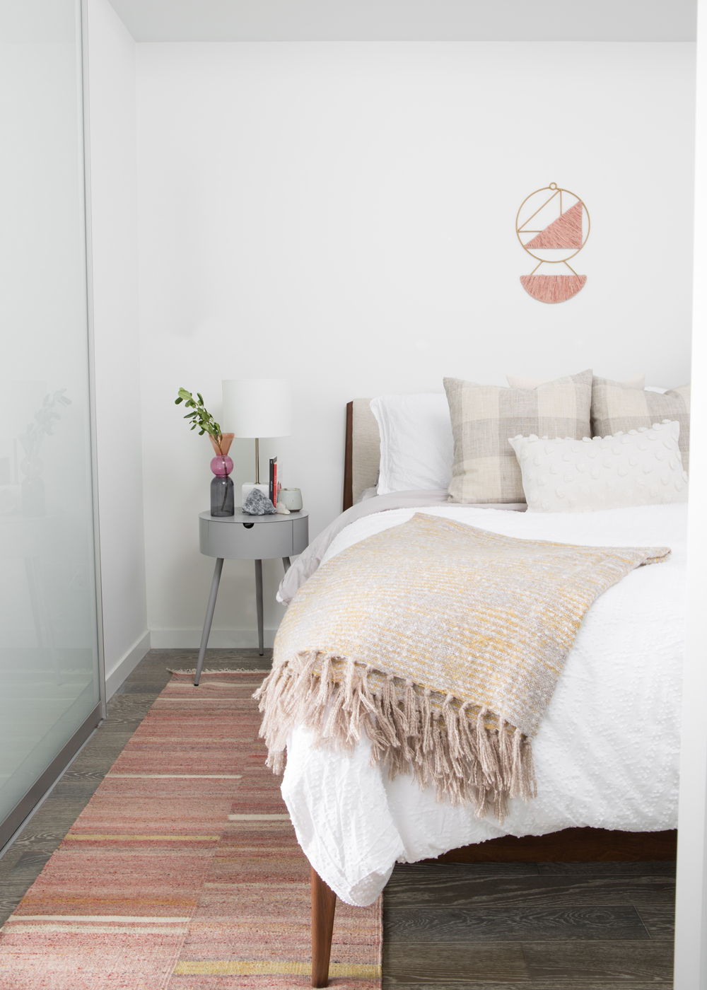
The pink wall hanging, found on sale at West Elm, is a pretty, yet bold finishing touch. “It’s a little unexpected to use something so delicate and small here, rather than a large art piece, but it works,” says Kathryn. The bedside vase picks up on the pastel hues.
Grey Area
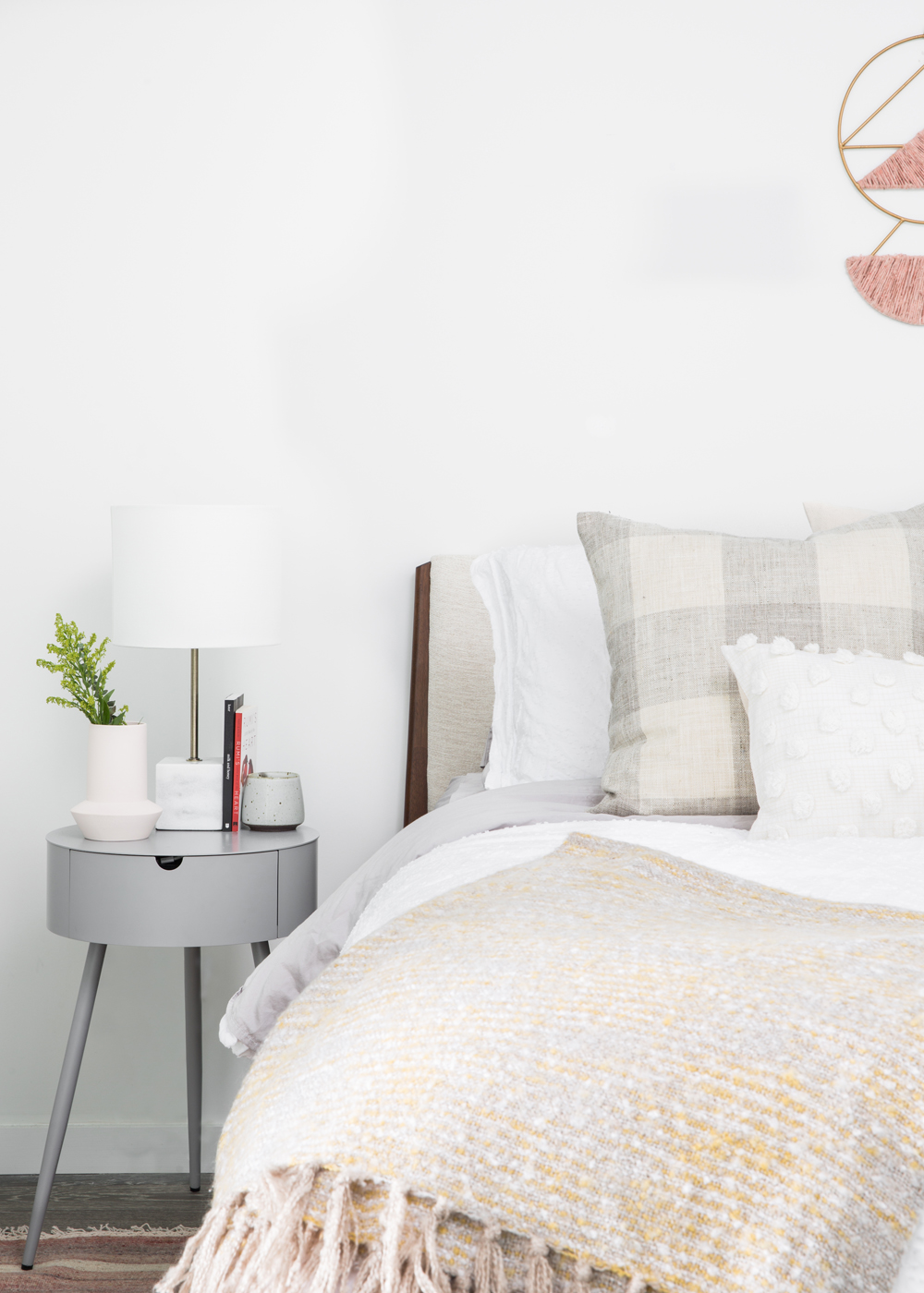
The grey West Elm bedside table is a multi-tasking beauty: it layers in a bit of depth to the white space, references the grey in the main room, has a dynamic, almost sculptural silhouette and provides closed storage. The base of the Structube lamp subtly plays up its cloudy colour.
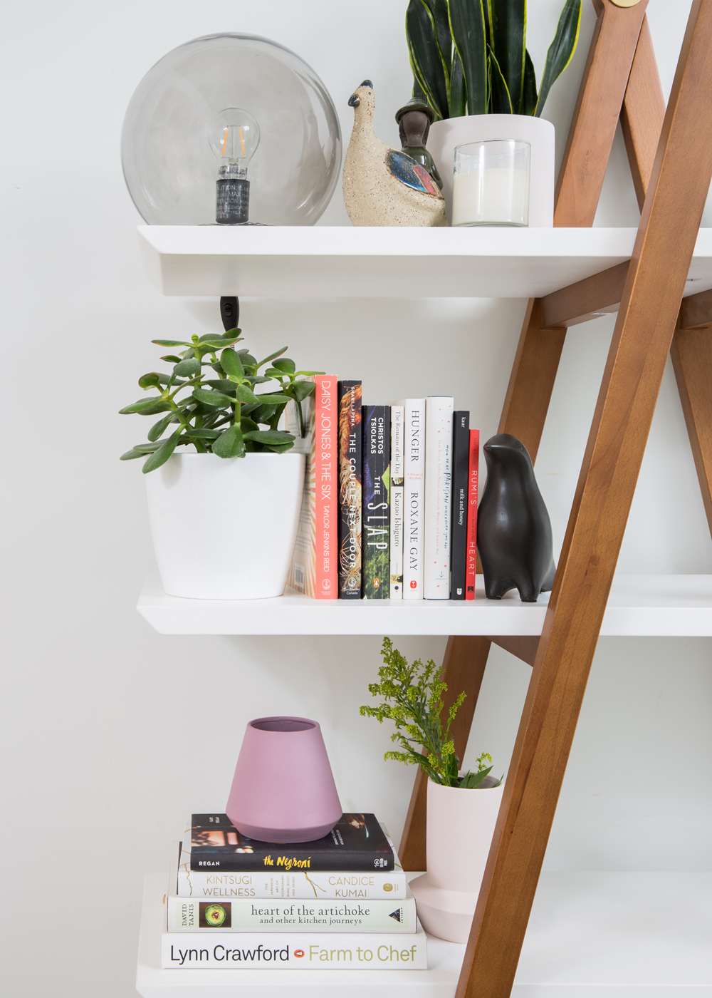
Shelf Life
A book shelf is both practical and stylish. And while the walnut frame complements the island in this rental space, the owner can take this with her when she moves and incorporate it into any room. The pink vessels are another pretty touch.
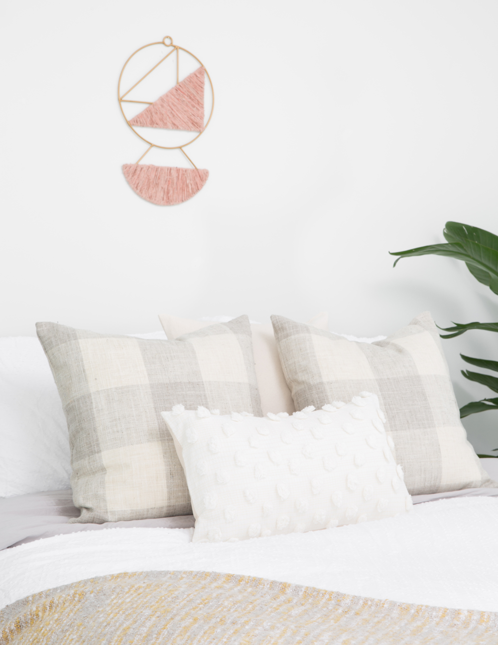
Pillow Talk
Bed pillows love a good cushion – or four! Textured and patterned cushions in varying shapes and sizes are one of the easiest ways to elevate the look of any bed. Here they keep the simple vibe and further the sanctuary feel.
Related: 18 Rejuvenating Zen Bedrooms That’ll Help You De-Stress
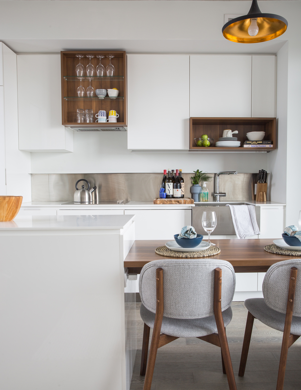
On Display
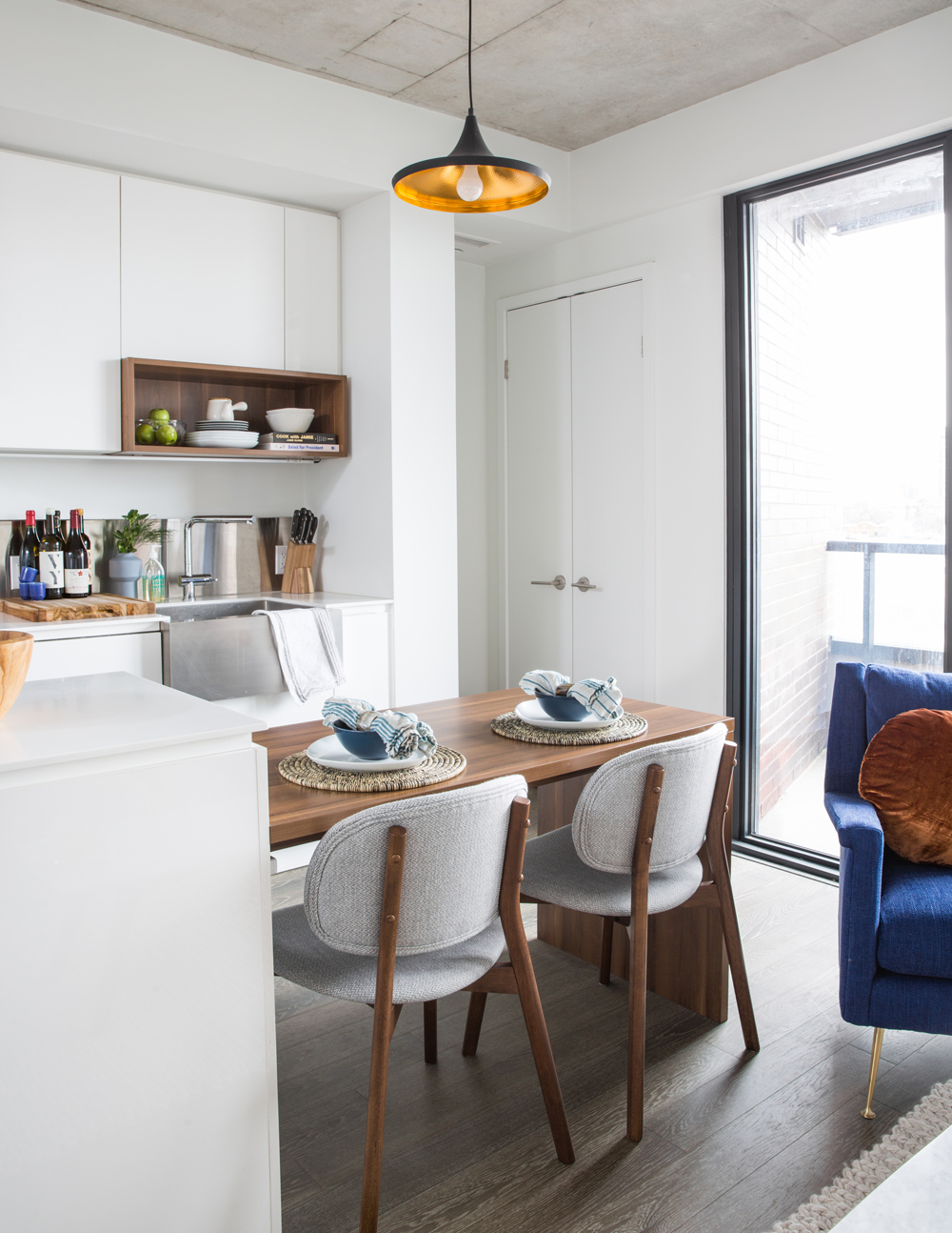
The kitchen‘s sleek walnut inserts came with the condo. “The owner felt challenged by them and wondered if the open display would look too messy,” says Kathryn. “I chose pieces I knew she would love looking at day in and day out and used it as an opportunity to bring some life into a space in a pretty, clean and minimal way.” The burnished metal interior of the pendant light factors in a bit of warmth.
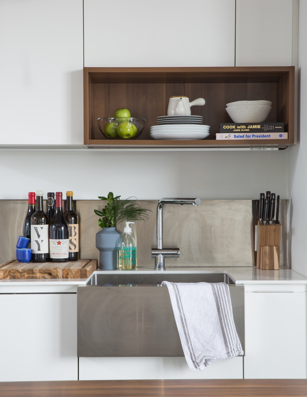
Steel It
The kitchen lacked a backsplash, but the owner didn’t want to invest too much in the rental space. Kathryn came up with a genius solution: a panel of inexpensive stainless steel that protects the wall and complements the apron sink. Corralling wine bottles on a cutting board is a cute idea.
Open Bar
The owner loved the versatility of the kitchen’s two-level island, which serves as a dining area for her and bar/serving space when she entertains friends. Structube chairs look like they were specially made for the island and their soft upholstery links into the living area’s textured rug.
Artful Entry
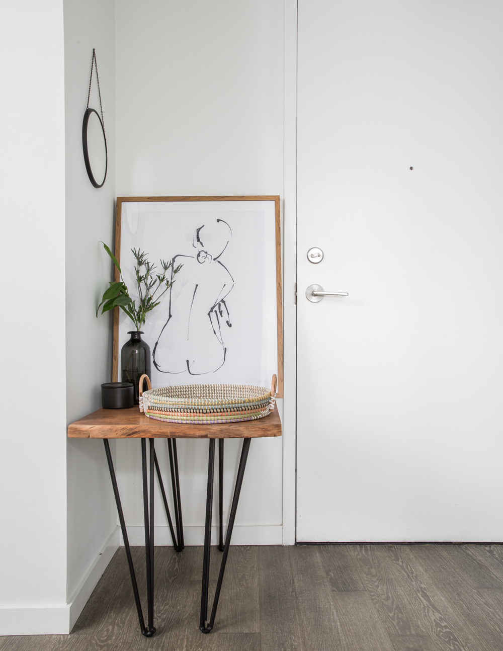
Artwork from HomeSense commands the entryway’s vignette. Kathryn says, “It’s a nod to the graphic inspiration we love and the feminine home we were looking to create.”
Picture This
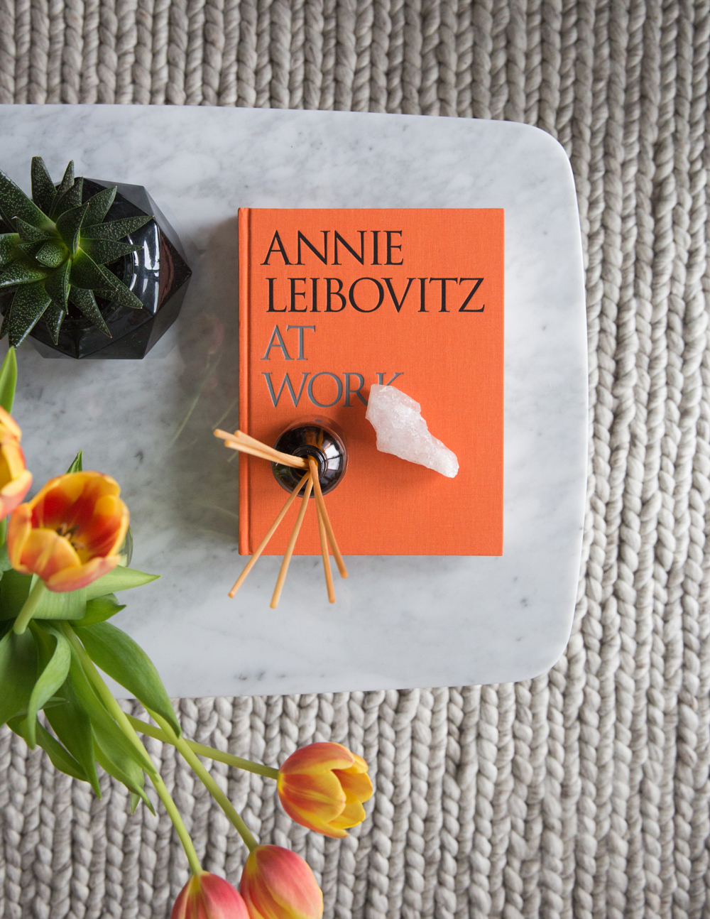
Use what you love! The owner loves photography and Annie Leibovitz is one of her favourites. As in the rest of the space, this styling piece is thoughtfully considered and complemented – here, with fresh flowers in the same vibrant orange. The look is bold and feminine – just what the owner wanted.
HGTV your inbox.
By clicking "SIGN UP” you agree to receive emails from HGTV and accept Corus' Terms of Use and Corus' Privacy Policy.


