The owners of this 2,250-square-foot detached home in Toronto had more than their little boy and girl to consider when making over this space. So, they turned to Jessica McGouran, principle designer at Jessica Leigh Interiors, with a wish list for their first floor. From creating storage to dealing with an unmovable support post – and making it all look like an eclectic mix of old and new – were just some the things the designer accomplished. Here’s how.
Quite the Character
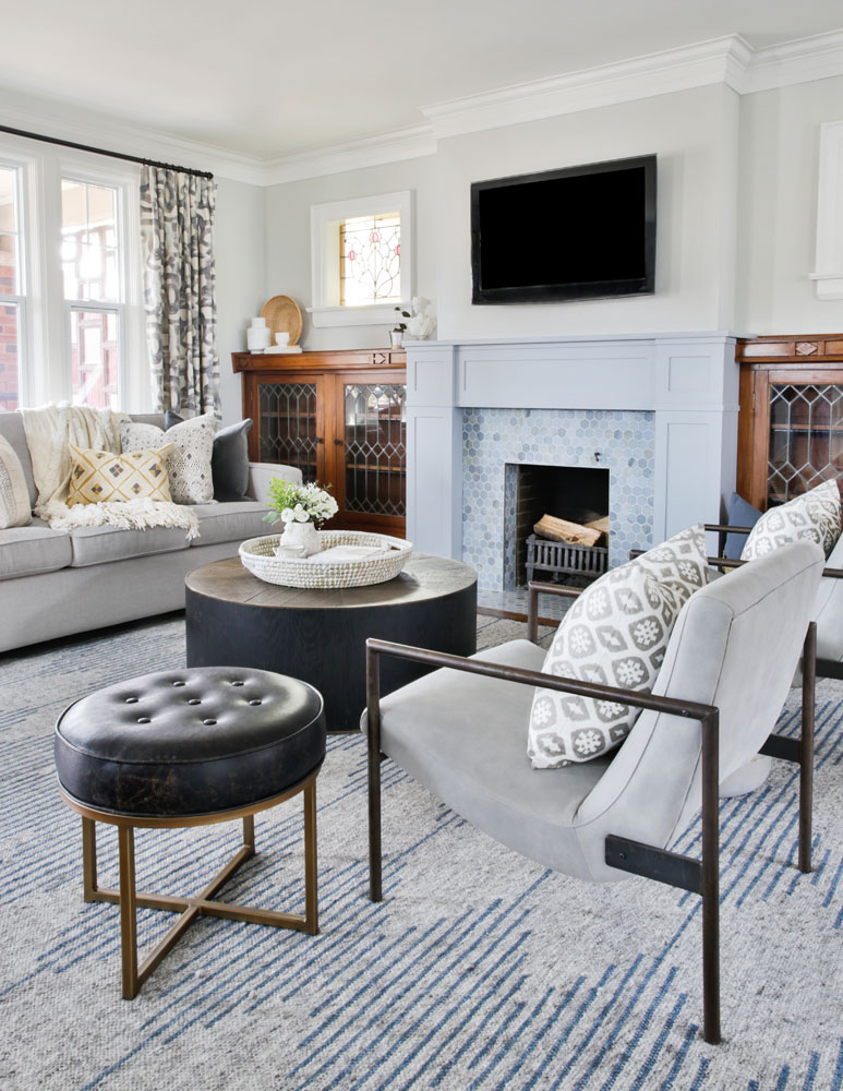
“The vision for the house was to keep most of its original character,” says designer Jessica McGouran. “My job was to maintain that, while making the space a bit more contemporary.” She deftly balanced the trad-mod equation in the living room, where she left original built-in wood cabinets untouched and enlivened the walls with paint. “I chose Benjamin Moore Grey Owl and crisp white for the trim to give the house a bright, neutral backdrop. The new mantel is more contemporary in scale and was painted to balance out the wood tones of the flanking cabinets.” It is complemented by a facade of moonstone marble tiles in varying shades of blue.
Pattern Play
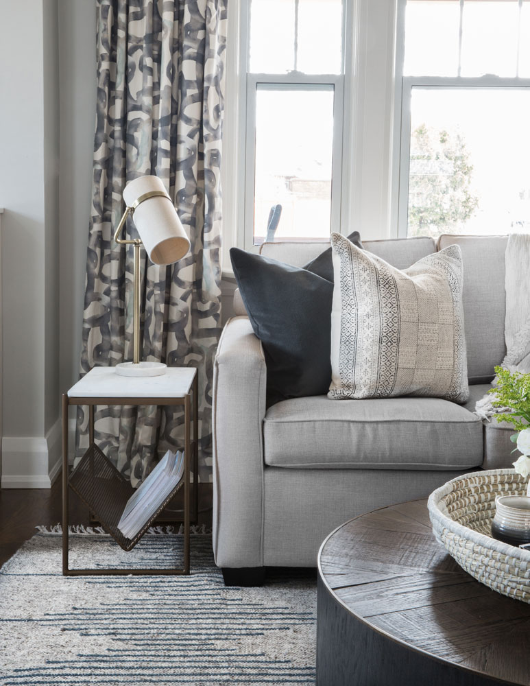
Jessica’s eye to layer in pattern and texture is showcased in this living room vignette. “I really love the drapery panels from Tonic Living,” she says. “The colours perfectly repeat the neutral scheme and create rhythm throughout the space, while the pattern is playful, but not too loud.” The textured wool rug, although not as bold as the drapery, also adds interest. The mix of cushions (these ones are from Elte Market) feels casual and relaxed, apropos for a family home.
Rounding Up
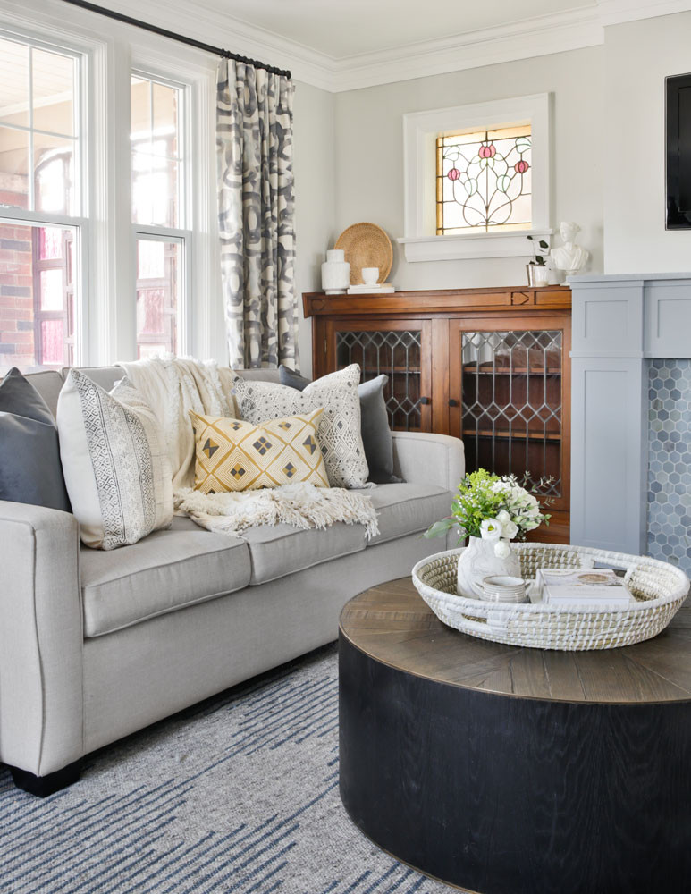
The circular coffee table does more than temper the living room’s straight lines. “The table needed to be family-friendly and casual,” says Jessica. “The round shape means no sharp corners for kids to bump into, and it allows more space to move around.” The worn look of the table’s inlaid wood top lends a casual vibe, while the yellow cushion adds a zing of warm colour.
Tall Order
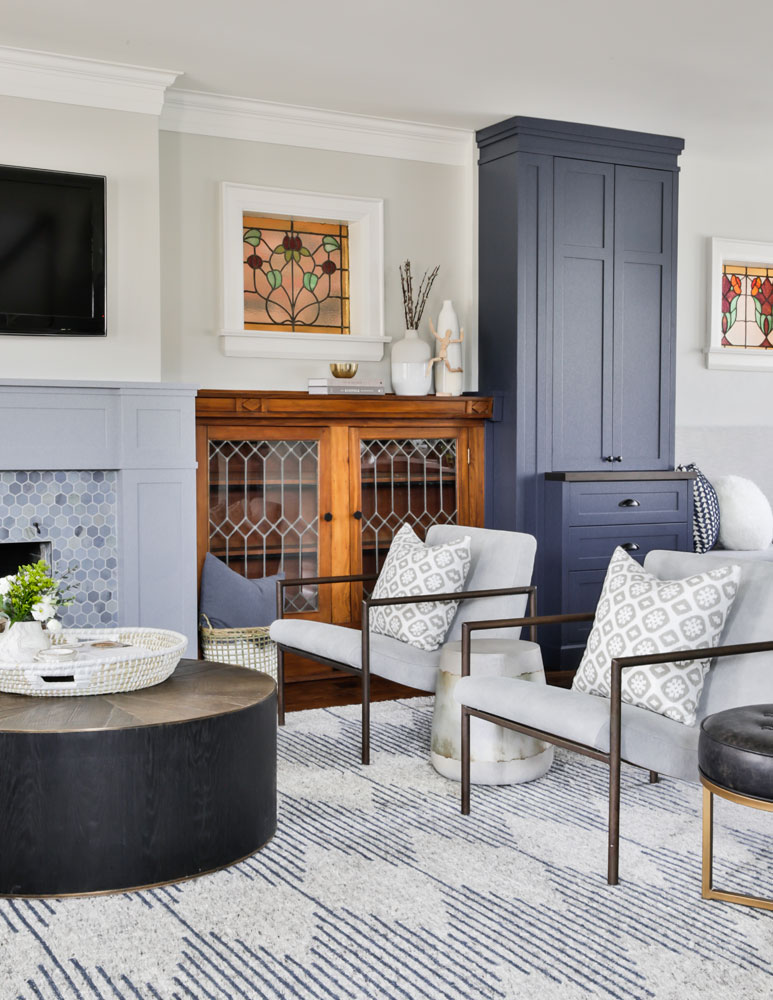
Jessica devised a unique storage solution for the homeowners. “They wanted quick and easy access to the kids’ homework, crafts, games and toys, but still wanted these elements tucked out of sight.” So she created tall built-in storage cabinets (one is shown here) in the same finish as the kitchen. That finish, and Hale Navy paint by Benjamin Moore, nicely marry the two spaces together, while creating a handsome feature wall in the dining room.
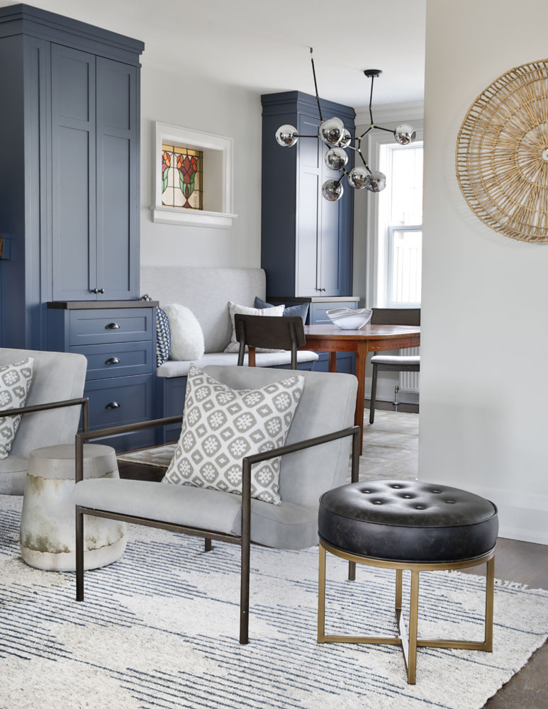
Seating Plan
Jessica’s furniture choices in the living room were made with the desired open floor plan in mind. Two chairs, versus a sofa, keep the space leading into the dining area more open. “They’re also easy to move around if the kids are playing or if the owners are entertaining,” she says. We love the chairs’ clean lines and bronzed frames. “They’re from Elte and add an aged look that’s in keeping with the home’s mix of old and new.”
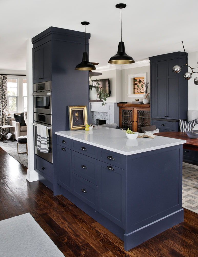
Daily Post
A support post that can’t be moved and is, for some reason, usually positioned right in the thick of things is something many owners of old homes can identify with. Here, it makes an appearance in the kitchen. “We couldn’t remove it, so I decided to incorporate it into our kitchen design to make it seem intentional,” says Jessica. Her go-with-the-flow approach also allowed space for wall ovens, which were on the owners’ kitchen wish list.
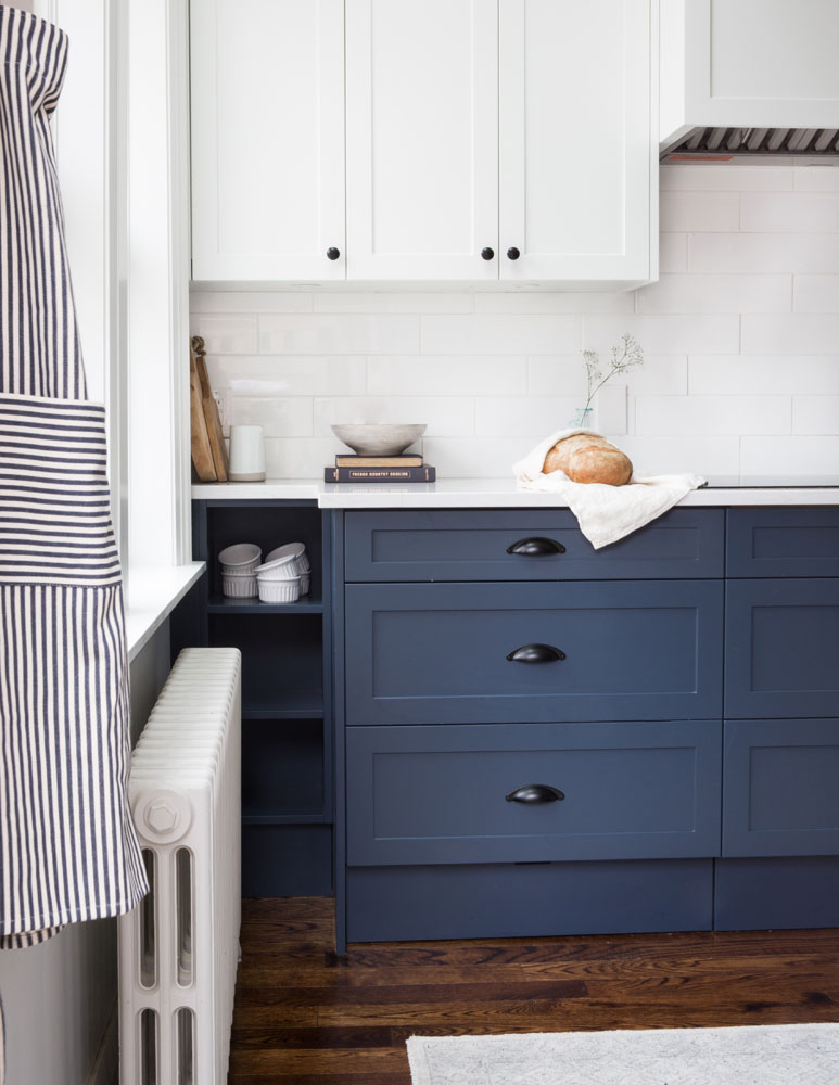
Cutting Corners
Jessica continued her go-with-the-flow expertise in this corner of the kitchen where a large original window wouldn’t allow for the extension of full-depth cabinets. “To remedy that, I stepped the counters back a bit and added open shelves. They break up the lower cabinets and create a smart spot to showcase dishes and decorative items.”
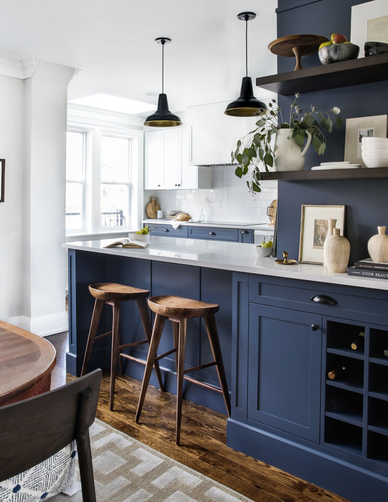
Wood Pattern
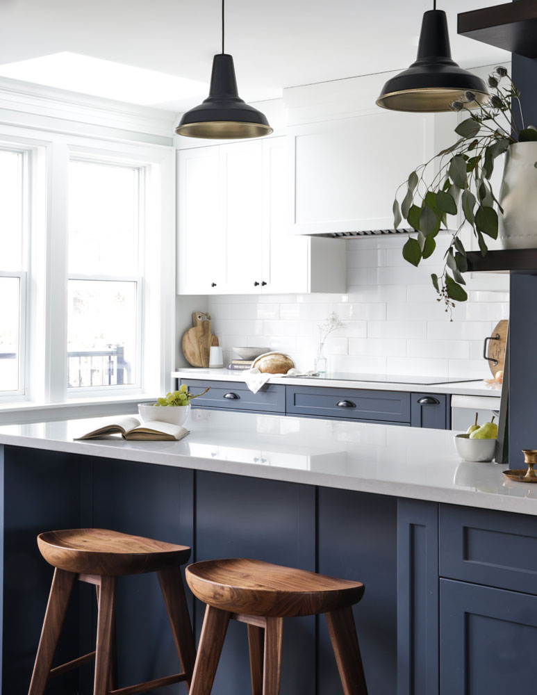
Continuity is key in any well-designed space, and it played a strong role when it came to furniture selection. “I wanted to make sure I repeated certain elements and materials throughout the main floor to connect each room together, which is why I selected wood kitchen counter stools,” says Jessica, adding that they also offer a rustic touch to balance out the modern cabinetry.
In the Open
Tasked with making the home feel open and light, Jessica opted for hits of white. “White upper cabinets keep the look lighter and brighter on top,” she says. “And since there are so many bold colours and finishes in the house, the backsplash features simple porcelain tiles in a larger size to reduce grout lines and keep it less busy.”
Shelf Improvement
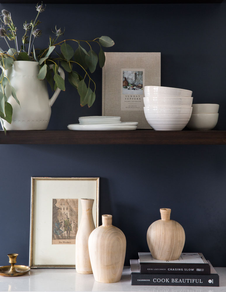
Great design should never look like a showroom, and Jessica ensured the kitchen was wonderfully personalized by adding floating shelves – an easy idea to steal for any room. “They create an area for displaying personal items and greenery, and I like how they break up the blue cabinetry here.”
Old School
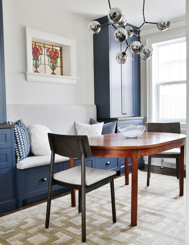
The dining area in particular encapsulates the home’s eclectic blend of old and new with a dynamic mix of furnishings. The homeowners’ natural wood table (which nicely complements the wooden cabinets flanking the fireplace) is dressed up with contemporary chairs and an area rug, both from Elte Market. The cherry on top is the gorgeous light fixture. “I didn’t want anything too large that would block views to outside or compete with the feature wall. This atom style-fixture has a really interesting and contemporary design and keeps things light and airy.”
Bench Mark
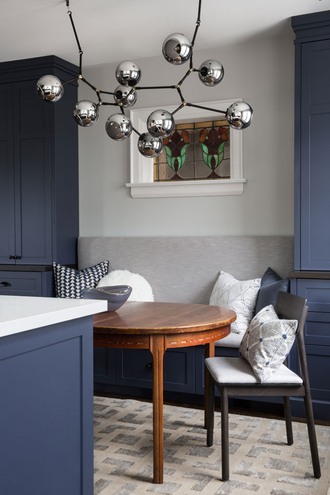
Making the kitchen larger was a no-brainer, but the new peninsula does encroach in the dining area, making that space a little smaller – so Jessica added a built-in banquette. “It shifts the dining area way from the peninsula and against the wall,” she says. The designer upholstered it in fabric, so it’s extremely durable and low maintenance, and its placement nicely frames the original stain-glassed window above. She even snuck in some additional storage below by adding three drawers.
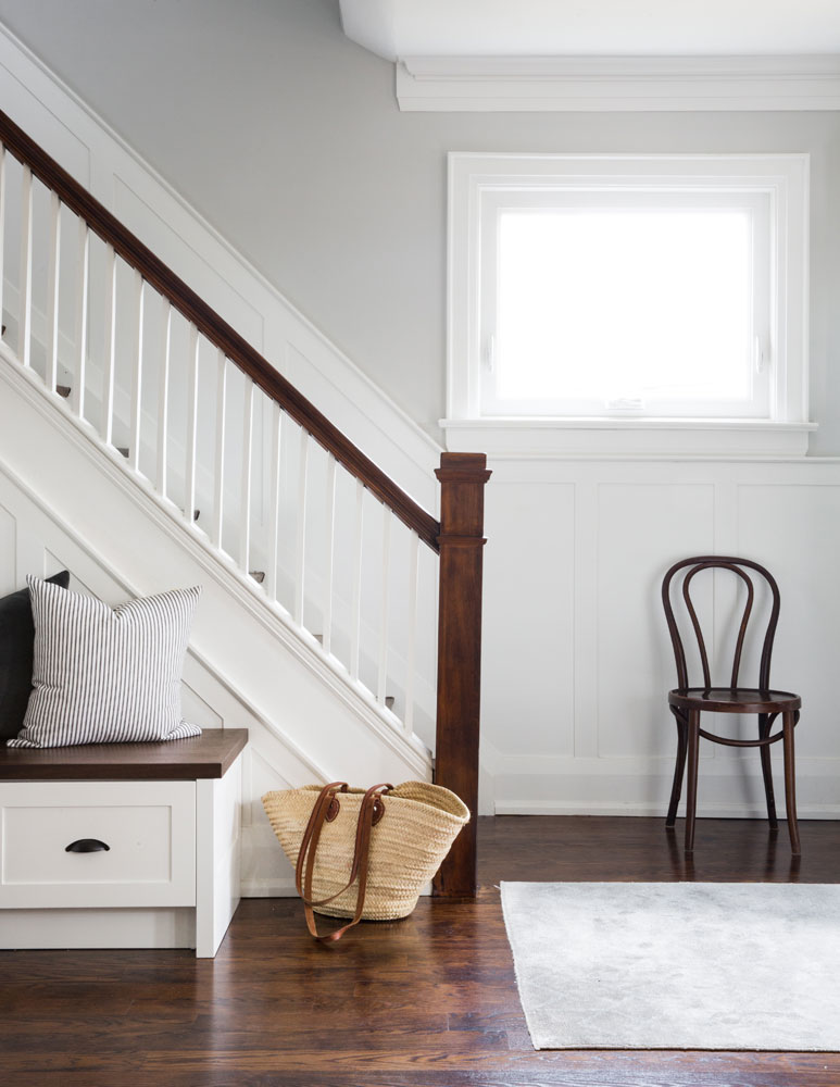
Light and Bright
For those battling the “paint it out” vs. “keep the wood” battle, let this hallway be your peacekeeping compromise. “The staircase previously had gumwood panelling up the walls and on the side of the stairs. We painted out the risers and pickets in the trim colour to freshen it up and kept the wood elements untouched.” A new built-in bench echoes the treatment and, again, offers more concealed storage.
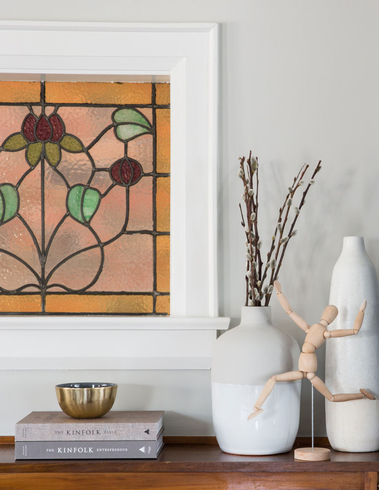
A Fine Display
Such a beautifully hued and detailed original stained-glass window requires little in the way of updating. Jessica chose simple accents and added in organic elements like pussy willows and a fun wooden human figure.

Designing Woman
Designer Jessica McGouran is pleased with the how well the vision for the home became a reality. “This house had to be relaxed and casual to reflect the owners’ lifestyle,” she says. “There is so much personality, but nothing is too formal – I love that.”
HGTV your inbox.
By clicking "SIGN UP” you agree to receive emails from HGTV and accept Corus' Terms of Use and Corus' Privacy Policy.


