When it came to revitalizing this cottage, it was a family affair – literally. “My parents enlisted me to reimagine it as their dream retirement home,” says Vancouver designer Jessica Touhey. And it was a task that would require more than a little imagination. “It was a bit of an ’80s time capsule,” she says. “There was patterned carpeting, heavy oak cabinets and Corian-marble bathrooms galore!”
To get the space up to millennial speed, Jessica initiated a 12-month back-to-the-studs overhaul. Her goal: create an open-plan space that would reflect its Vancouver Island setting, and showcase her parents’ affinity for dynamic, clean-lined design. The result is a personalized home that’s just as adept at hosting grown-up dinner parties as it is groups of grandkids.
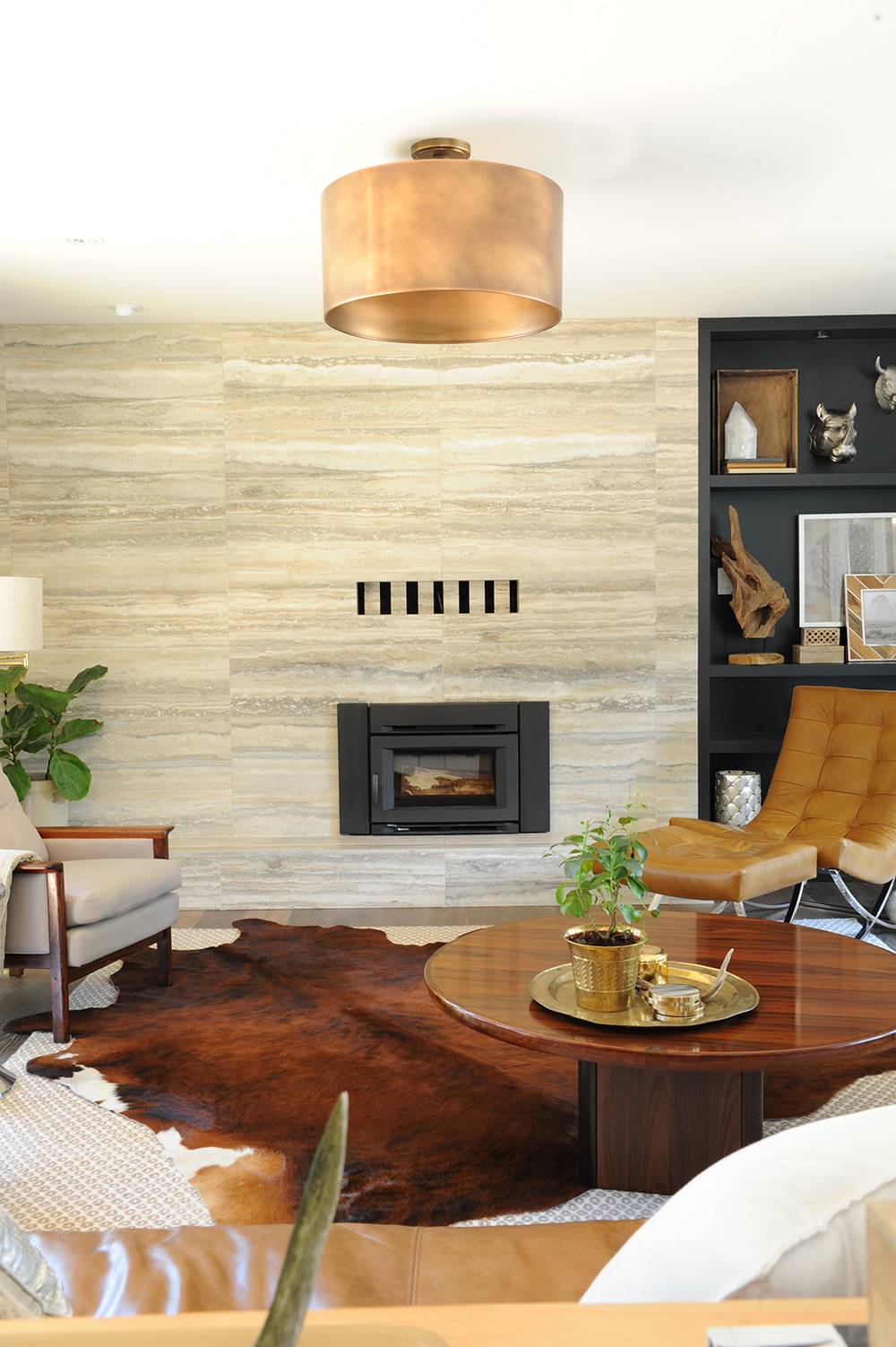
Stone Works
Designer Jessica Touhey nixed the fireplace’s original brick-front in favour of this show-stopping facade. “It’s vein-cut travertine and I absolutely fell in love with it,” she says. The marbling effect feels both dramatic and in sync with the natural surroundings.
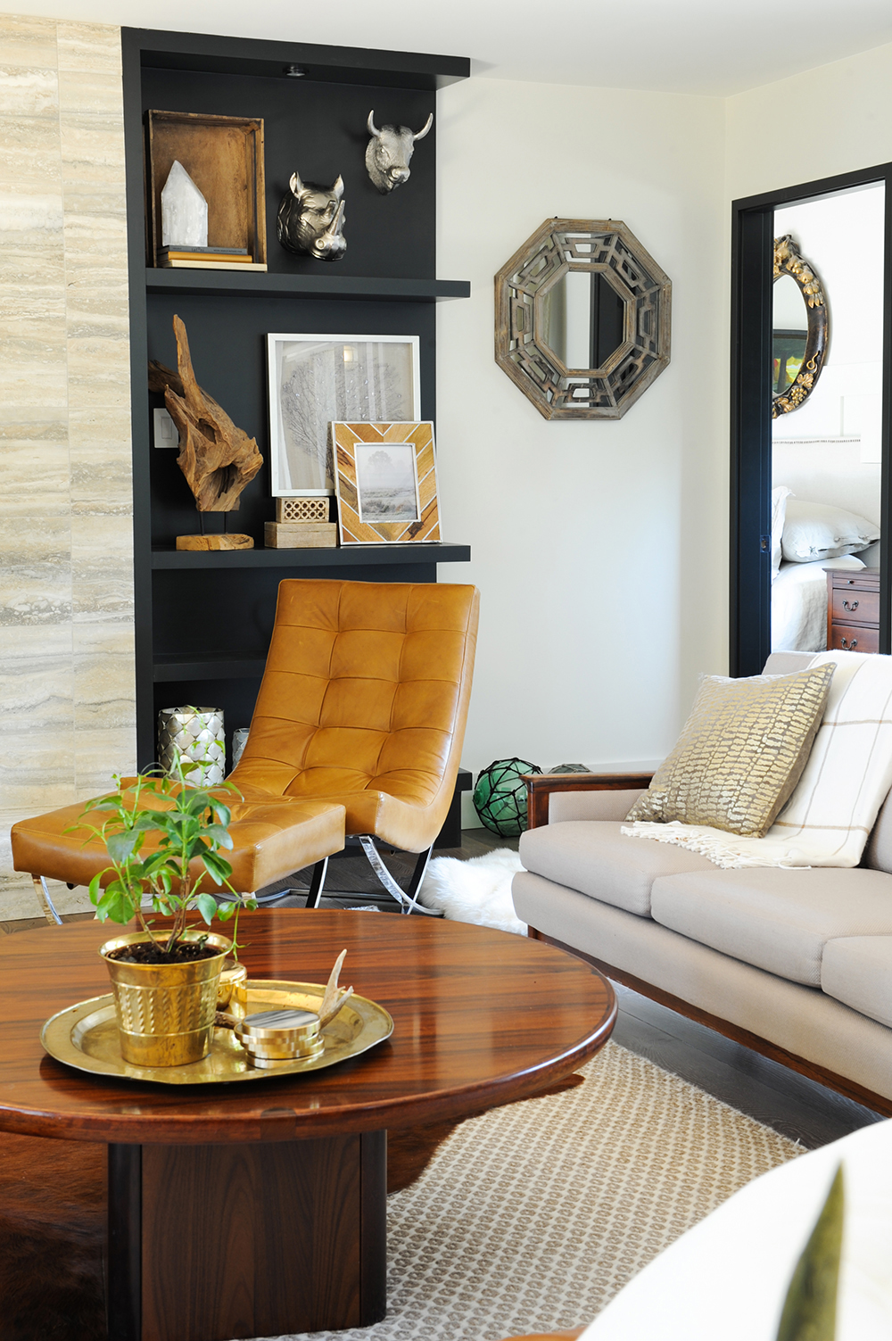
Mix Master
This corner of the cottage’s living area is a shortlist of Jessica’s eclectic style. A chrome-based, cognac leather recliner and stool (a perfect perch for fireside reading) signal sleekness that’s tempered by an upholstered sofa and wooden coffee table that belonged to Jessica’s grandfather. Black shelves with layered accessories introduce a graphic element that keeps the look lively.
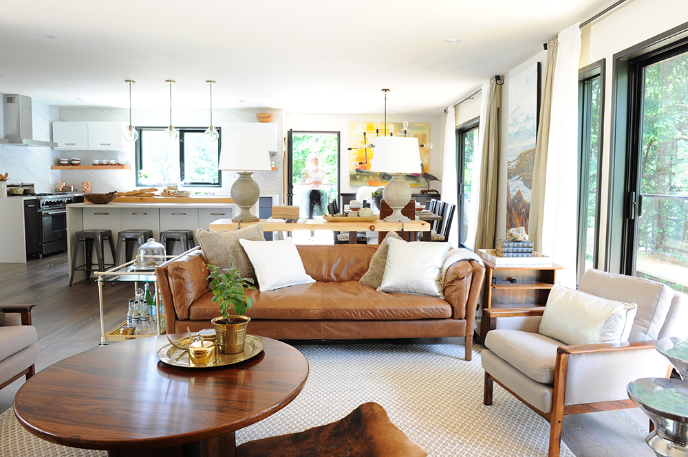
Open Minded
With convivial dinner parties and grandkids running around in mind, Jessica created an open floor plan conducive to how her parents live. “Originally, the kitchen was tiny and galley style,” she says. “Cottages don’t have to be a series of small rooms. Taking down walls opens up the views inside and out.”
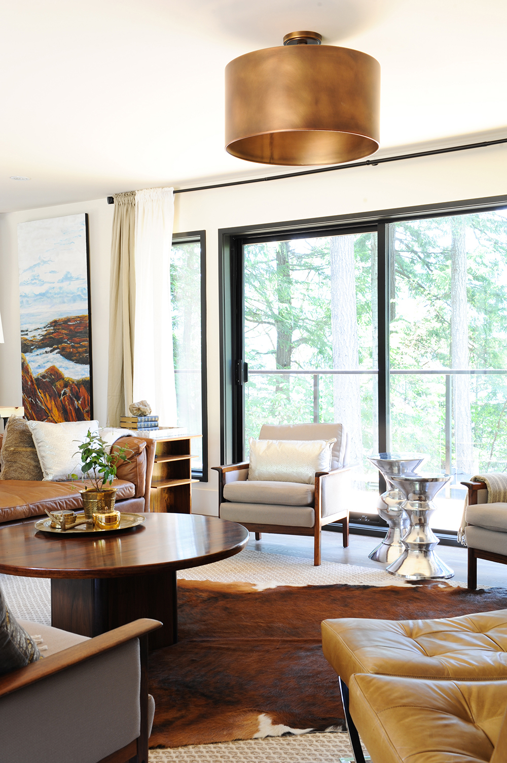
Above All
“The living room needed a little metal glamour,” says Jessica of the copper drum light. “It has just the right amount of strength and masculinity to work in this space.” Its burnished hues nicely complement the furniture’s earthy tones, and it’s perfectly positioned so as not to impede the outdoor view.
Creature Comforts
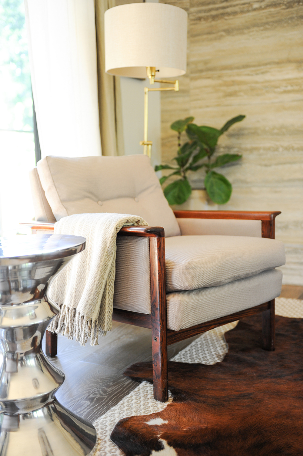
No matter the size or style, every cottage needs throws placed throughout. This one welcomes as it tempers the straight lines of an antique rosewood armchair, one of a pair. “My mom bought them years ago,” says Jessica. “I had them reupholstered and they fit the space perfectly.” The chrome side table activates the vignette and is an energetic foil to the rich chocolatey hues.
Divide and Conquer
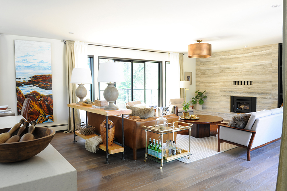
To keep an open floor plan interesting, use art and furniture to define different spaces. Here, Jessica hung a painting by her mother, artist Mary Touhey, between the living and dining areas. It subtly demarcates each spot and that boundary is reaffirmed by the console table behind the sofa. It, and the chic lamps, quietly signal the “start” of the living room.
A La Cart
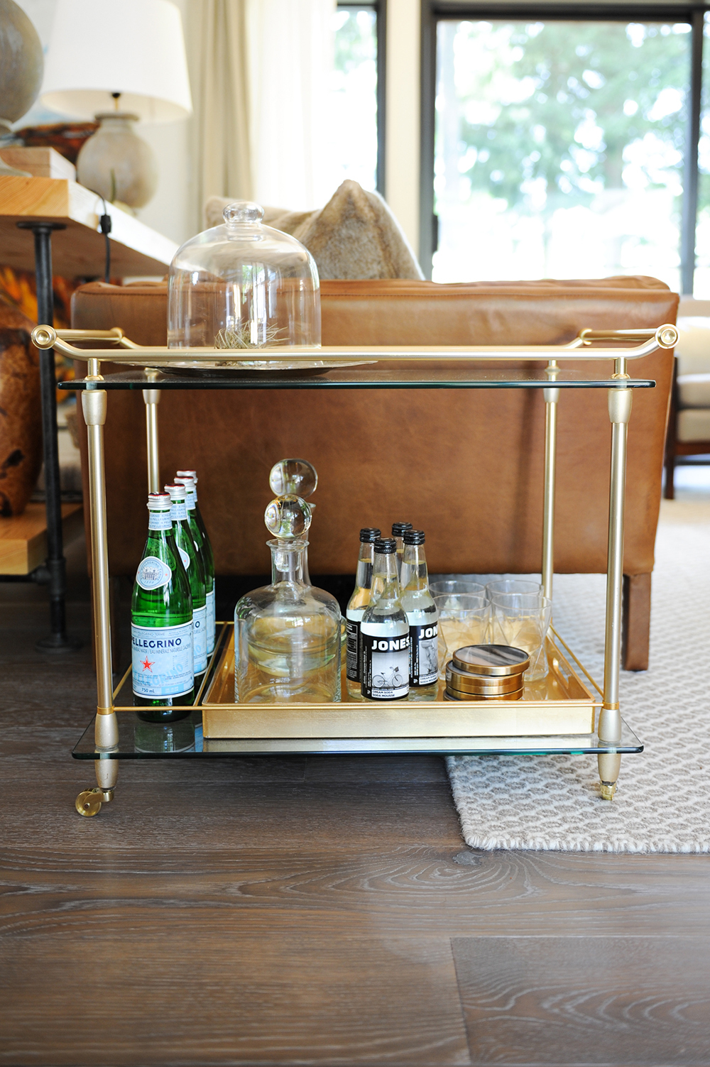
Mixing up styles adds depth and interest in a room. “I love that this bar cart is antique,” says Jessica. “It’s so much more interesting than if it were new. I styled it a bit differently with the bell jar, but during parties it does its job as a perch for drinks and snacks.”
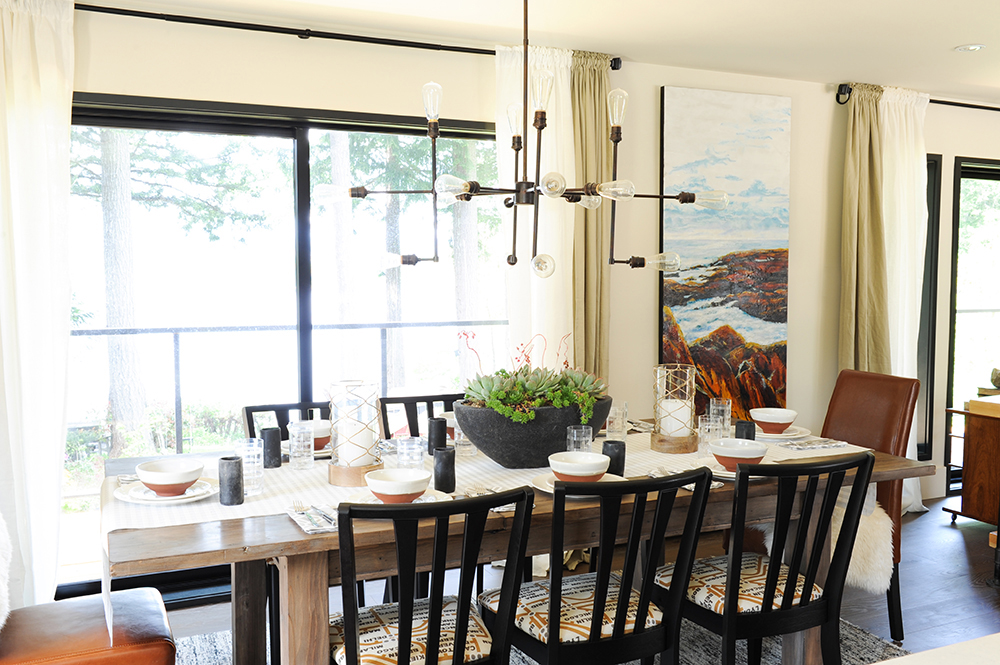
Table Talk
Unmatched dining room furniture feels fresh and fends off an expected look. “The chairs are antique and I had them refinished and upholstered in a modern fabric,” says Jessica. “The table is new – I like how it throws a casual beach vibe into the mix.”
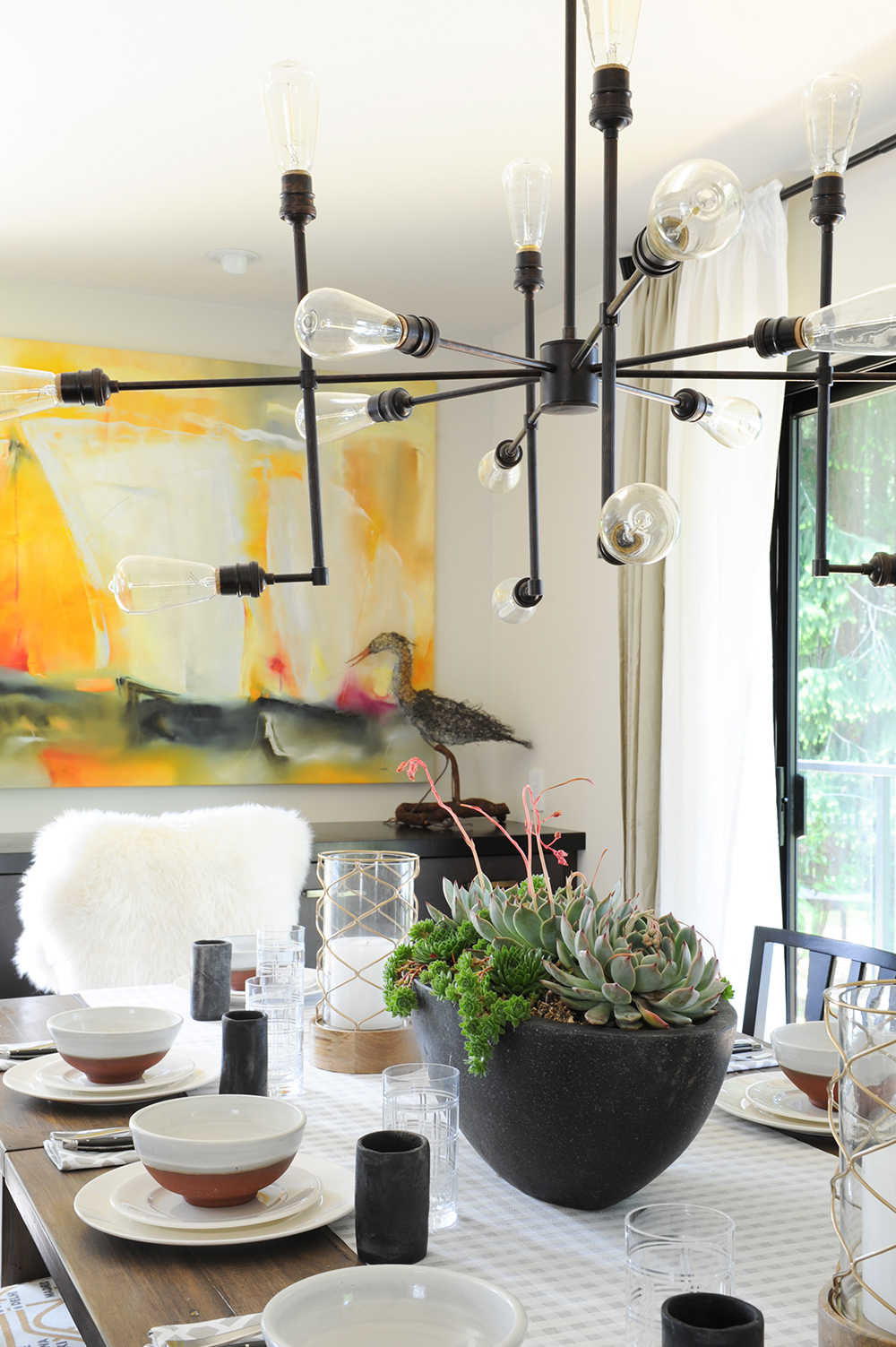
Fusion Menu
Jessica upends the expectation that cottages have to be wholly rustic. Here, a filament-bulb light fixture from Restoration Hardware is resolutely contemporary but right at home with informal potted succulents, a soft faux throw and a casually laid table.
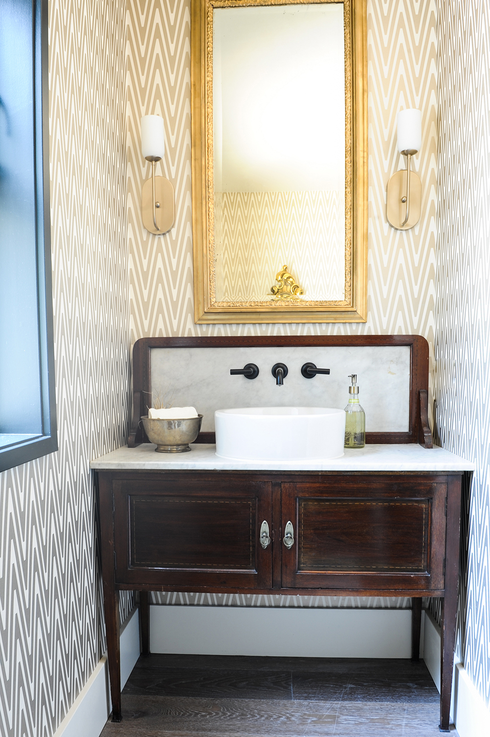
Glam it Up
Jessica transformed the powder room with powerhouse design. “This is one of my favourite spaces,” she says. “This old cabinet has been in the family since I was little and it fit perfectly here. I added the sink, faucet and voila!” Gold wallpaper and sconces feel upscale in a cottage setting.
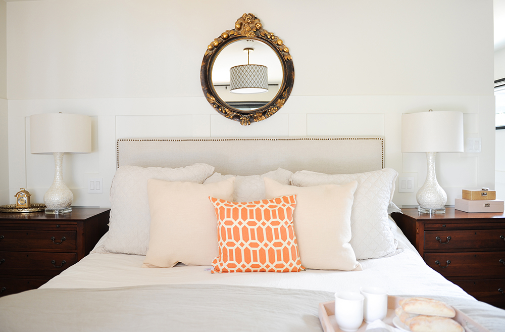
Master Class
Jessica wanted her parents’ bedroom to feel luxurious. “I added tone-on-tone wainscoting for that effect and accessorized with a formal mirror.” The symmetry of the bedside tables and lamps has a welcoming formality that’s lifted by the cheery toss cushions.
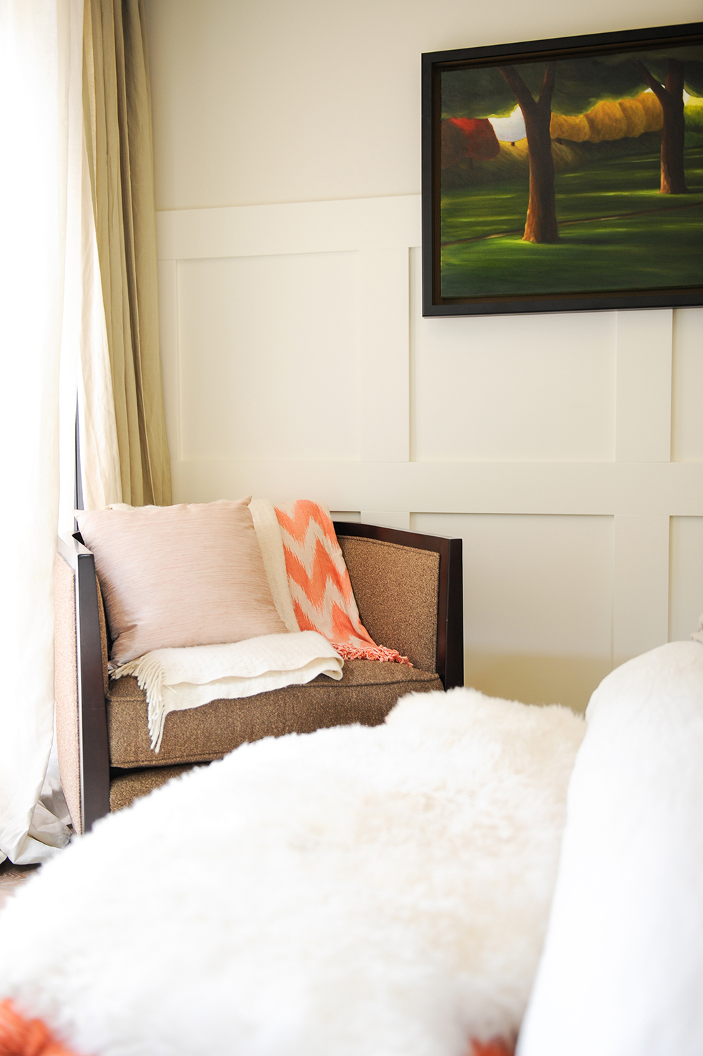
Hint of Colour
Accessories introduce colour and pattern into the neutral palette of the master bedroom. Note how Jessica hung the artwork at eye level, rather than above the wainscoting. It nets an interesting gallery feel.
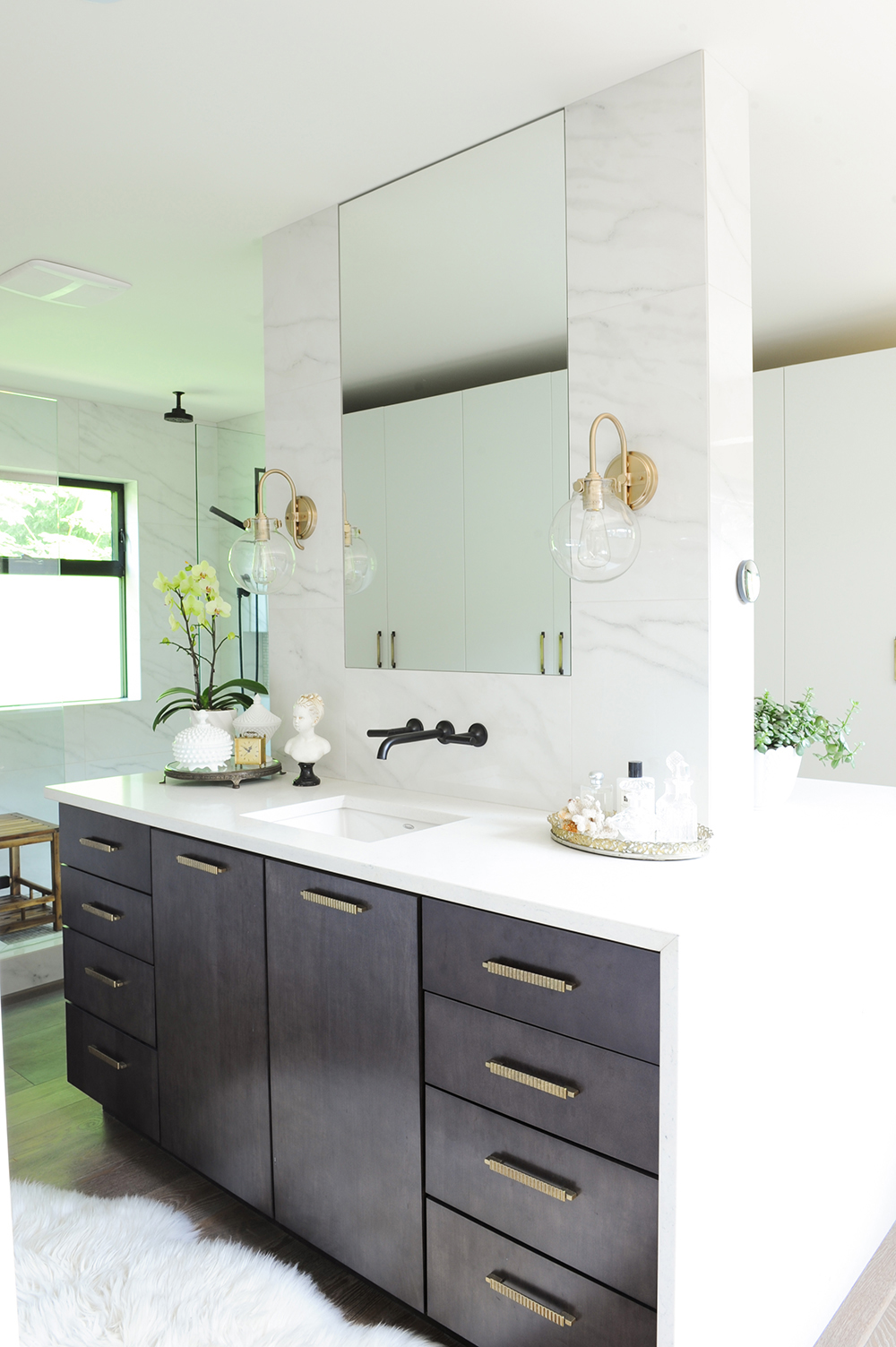
Bathroom Built for Two
Jessica ripped out two tiny bedrooms and a narrow bathroom to create her parents’ drool-worthy master bathroom. “The vanity as an island was just a creative solution to the space,” she says. “Each of them has their own side and I like the flow it gives the space.”
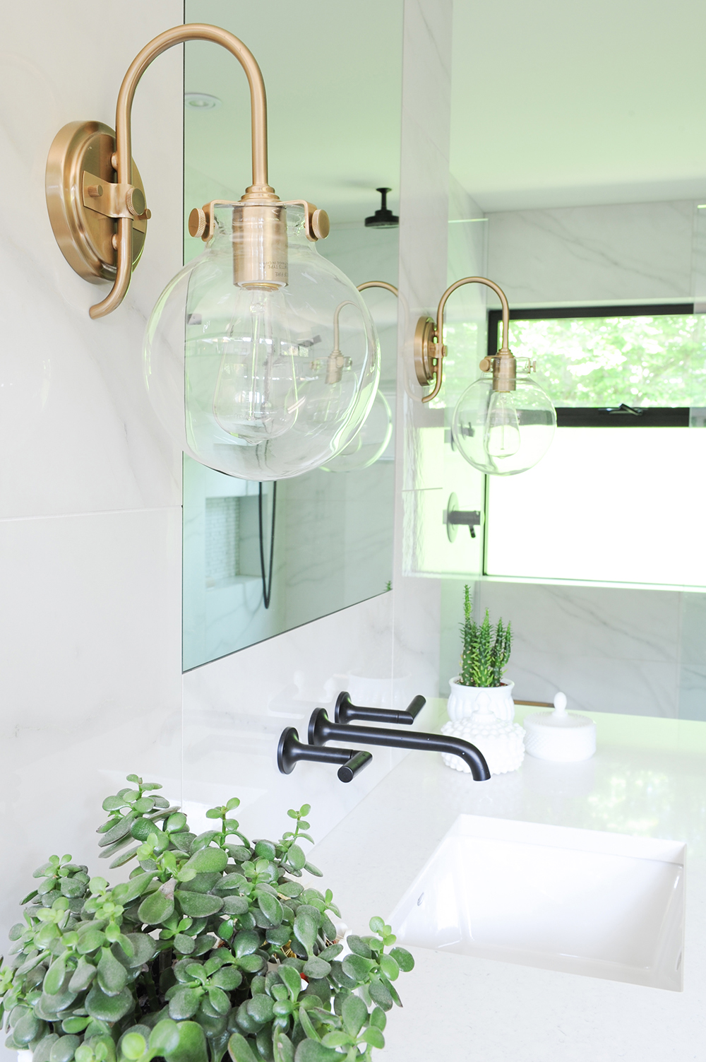
Balancing Act
Jessica didn’t hesitate mixing finishes in the master bathroom. “Black and brass play off of each other in the most powerful way,” she says. “The faucet is striking and grounds the space, while the sconces create warmth, luxury and elegance.”
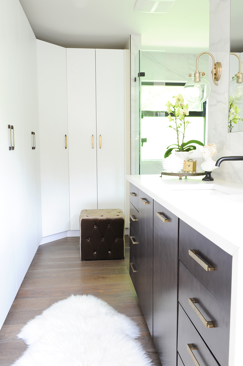
Dressing on the Side
Jessica fitted her mother’s side of the master bathroom with custom closets that maximize storage and create a pretty and practical dressing room. A tufted velvet stool and soft faux runner infuse a feminine touch.
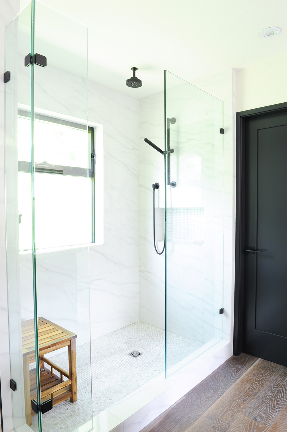
Faux Real
The look of the sleek walk-in shower signals a sumptuousness that belies its price tag. “The marble-look wall tiles are actually porcelain, which is a fraction of the cost of marble,” says Jessica. Mosaic floor tiles add interest and are non-slip. A wooden stool introduces an organic element and is a practical perch.
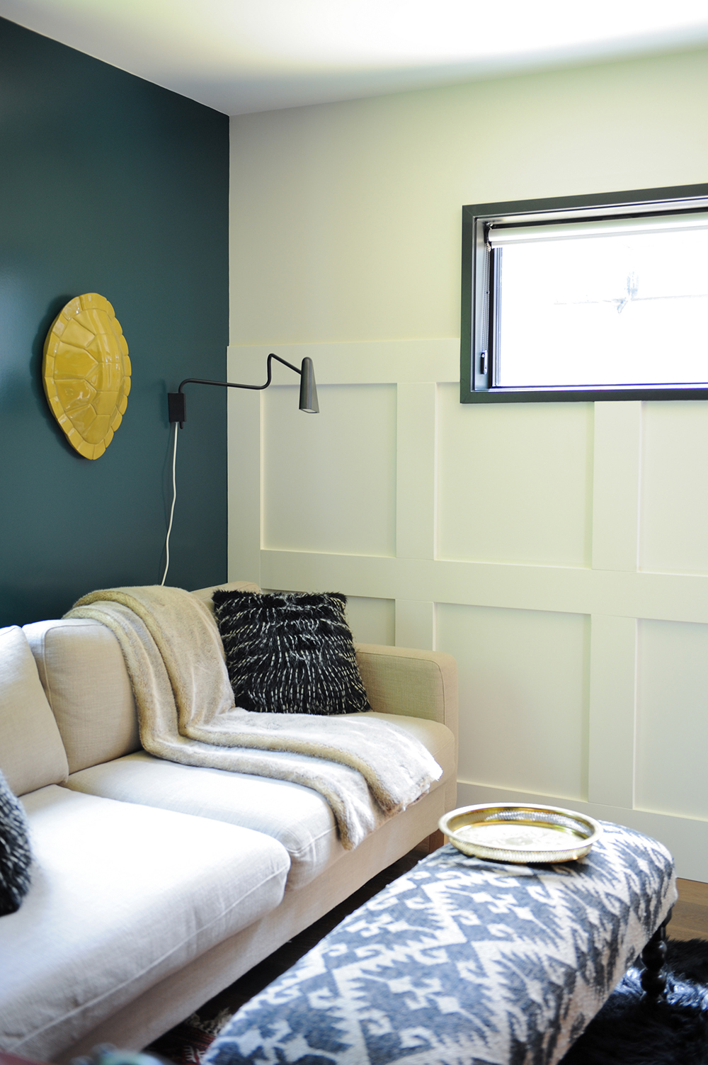
Colour Block
The designer painted one wall of the den a deep inky green. “The colour adds drama but also feels cozy and relaxing when you’re in the space,” she says. Its marine tones also subtly reference the cottage’s Pacific Ocean setting.
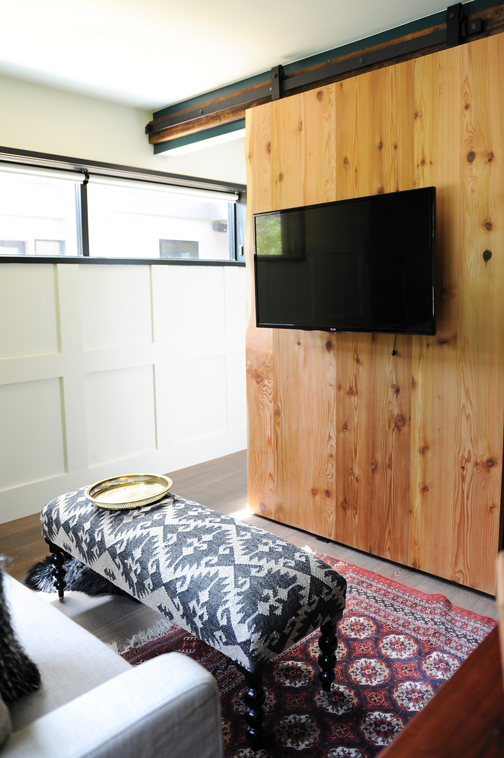
Mixed Media
A sliding barn door maximizes floor space in the den (there’s no door swing) and provides an ingenious home for the TV. It’s an engaging mix of high-tech against humble wood.
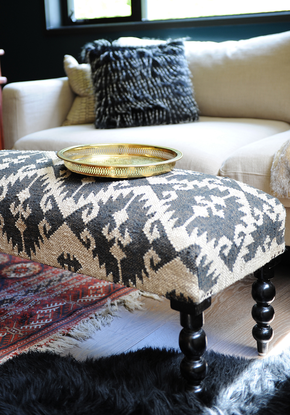
Pattern Play
Tactile luxuries, like a kilim-covered ottoman, Persian rug, faux sheepskin runner and feathered cushion, weave together a luxurious effect in the den.
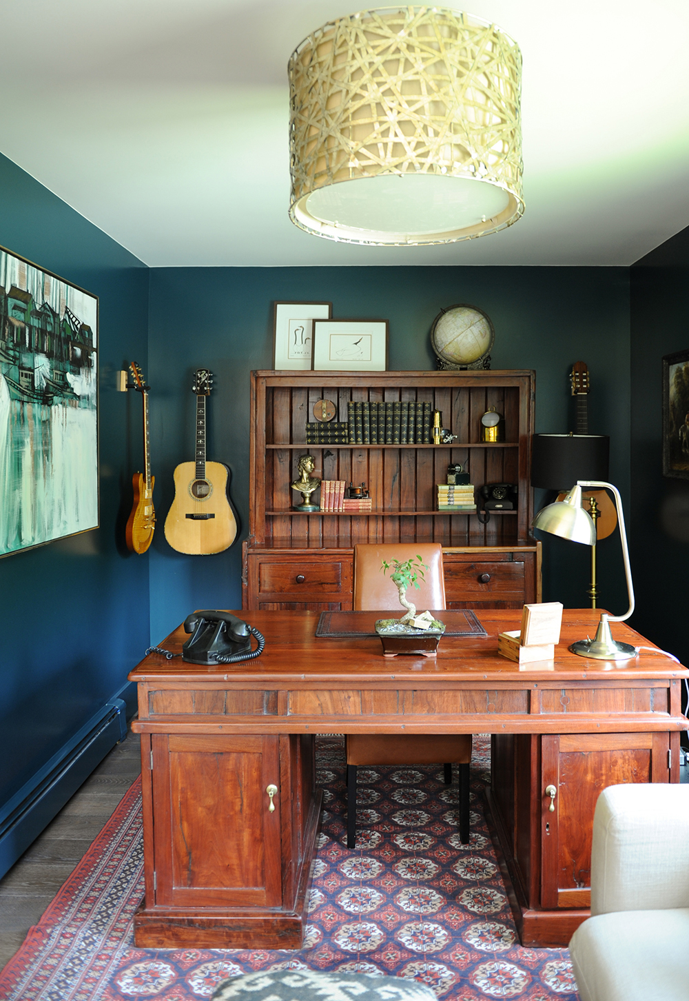
Office Space
To elevate her dad’s home office from utilitarian to personalized, Jessica layered in some of his prized possessions, including his guitars, which she hung like art. Pops of pattern, from the drum light above to the carpet below, give the room a welcoming feel.
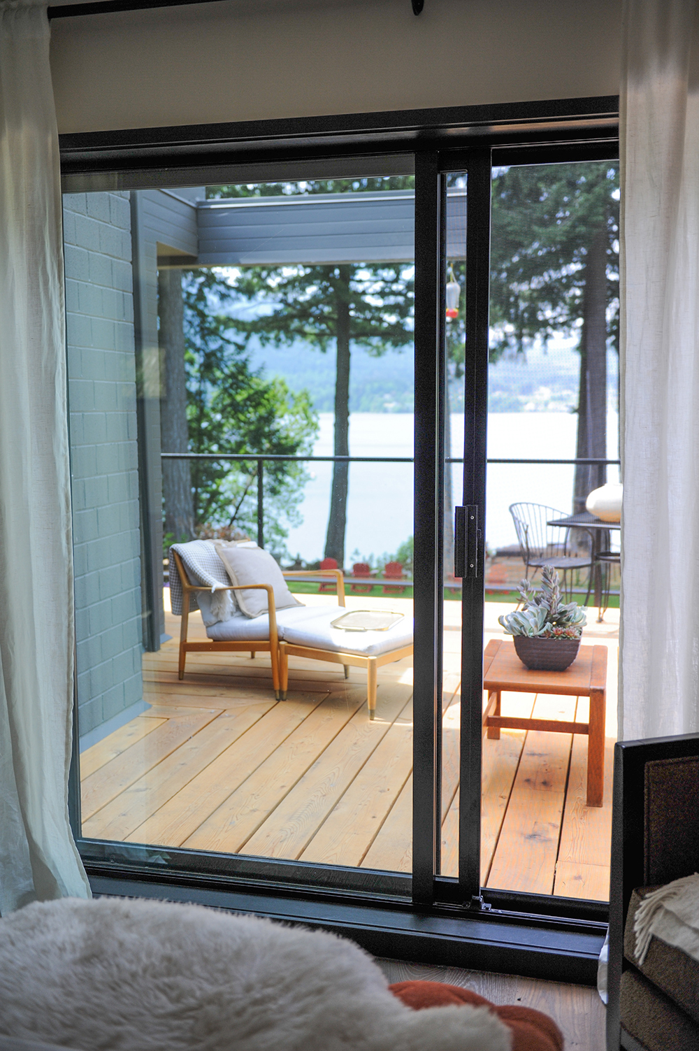
Room With a View
Decking around the cottage (seen here from the master bedroom) provides the perfect place to take in the stunning scenery of Vancouver Island’s Yellow Point. Glass panels ensure the view is unimpeded.
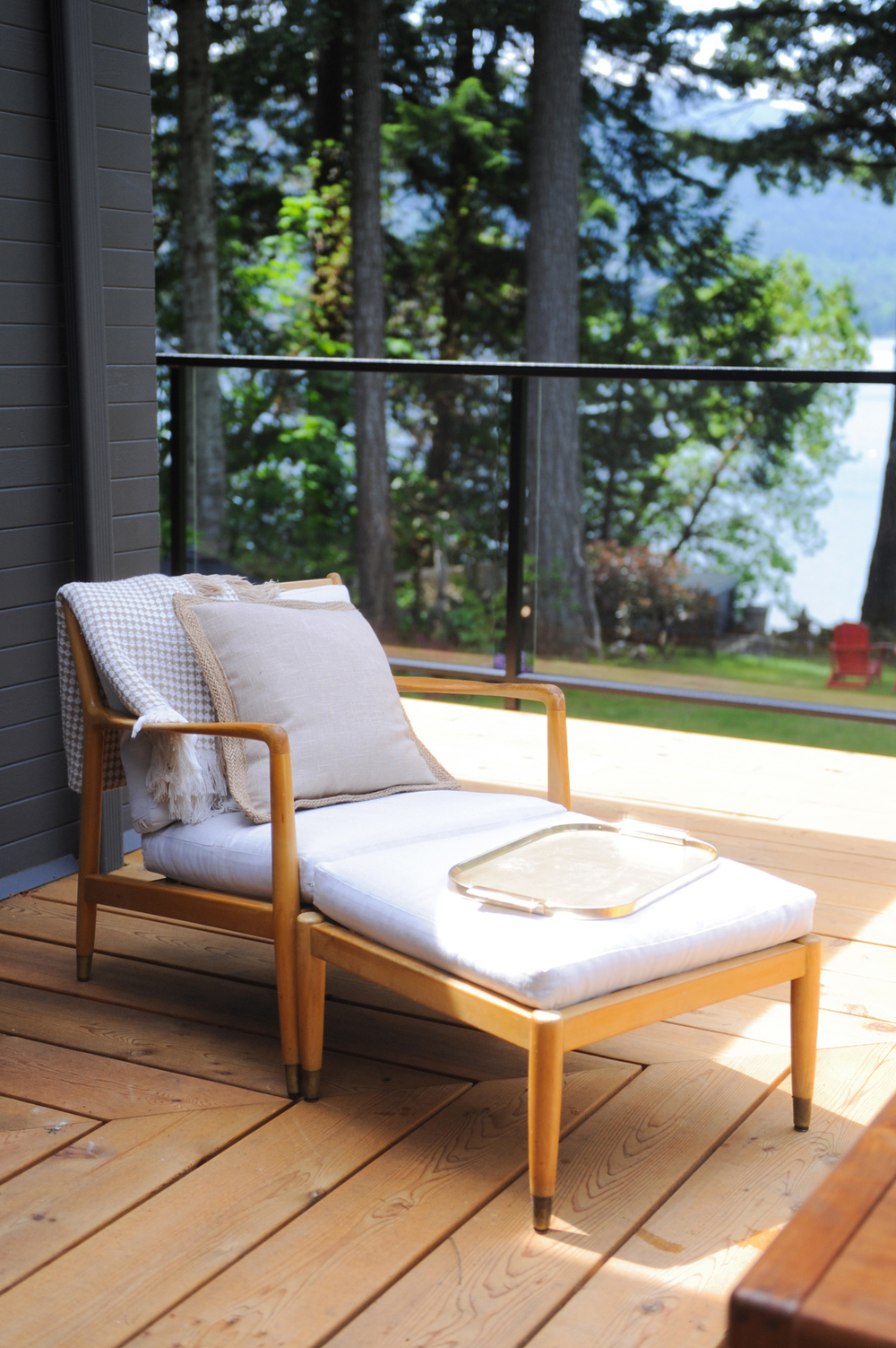
Inside Out
For cohesion throughout the space, Jessica chose outdoor furniture that echoes the clean lines of the cottage’s interior. This new chair and stool are similar to the antique rosewood chairs in the living room.
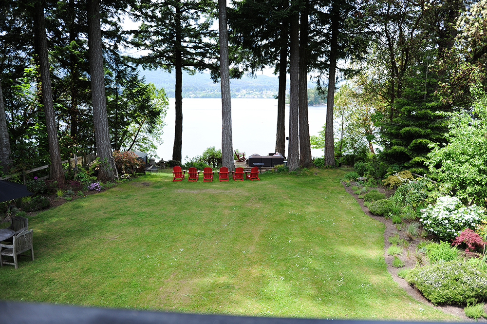
Muskoka West
Placed at the bottom of the property, a row of iconic Muskoka chairs (in patriotic red) invites a stroll down to the shore and a comfy place to take it all in.
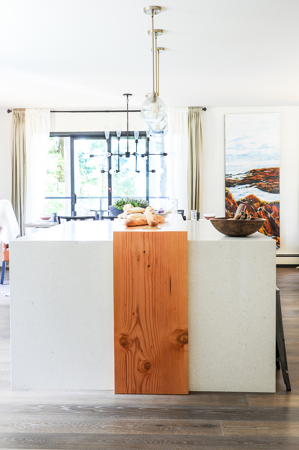
Island Time
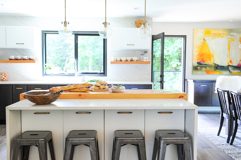
“The kitchen island is gargantuan!” says Jessica. To break up the vast expanse of quartz, she designed a fir wood divider. “It acts as a great delineator of the eating and cooking sides of the island. It’s also a nifty place to lay out food when my parents have parties.”
Silver Metal
Metal stools are a dramatic contrast to the white island, and a nice complement to the dark window and door frames. Built-in storage beneath the island ensures there is no wasted space. Jessica chose clear pendant lights that don’t interfere with the view to outside.
Shelf Help
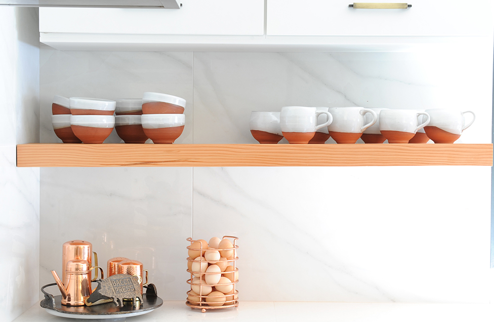
A floating wood shelf beneath the kitchen cabinets introduces a warm counterpoint to the porcelain backdrop and provides a practical place to display dishes. Jessica grouped items with similar shapes and tones for an artful vignette.
The Art of Mixing
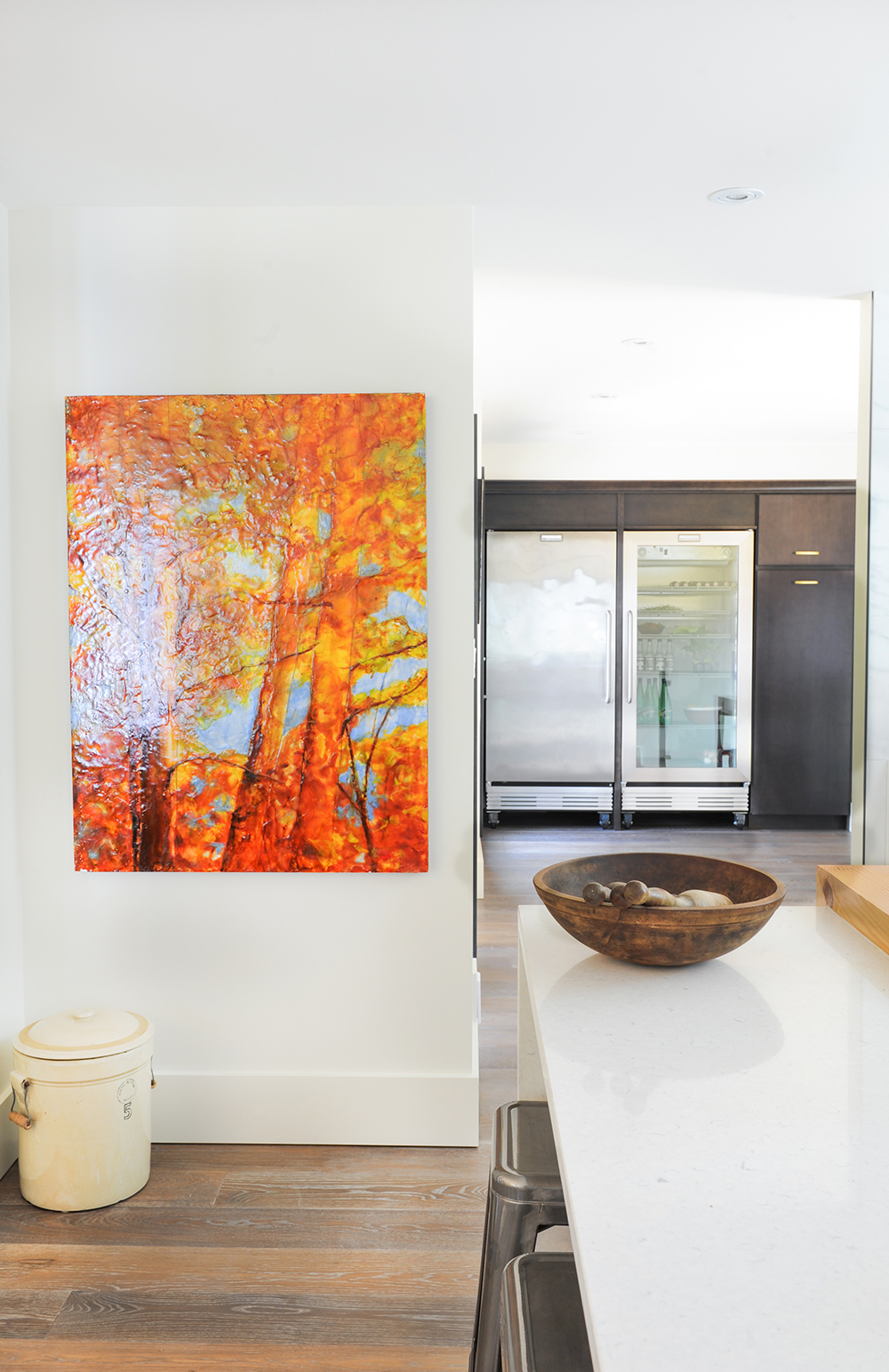
This corner of the kitchen is testament to the cottage’s effortless eclecticism. An old country tin and weathered wooden bowl meld seamlessly with a shockingly bright oil painting and chef-worthy stainless-steel fridge.
Back It Up
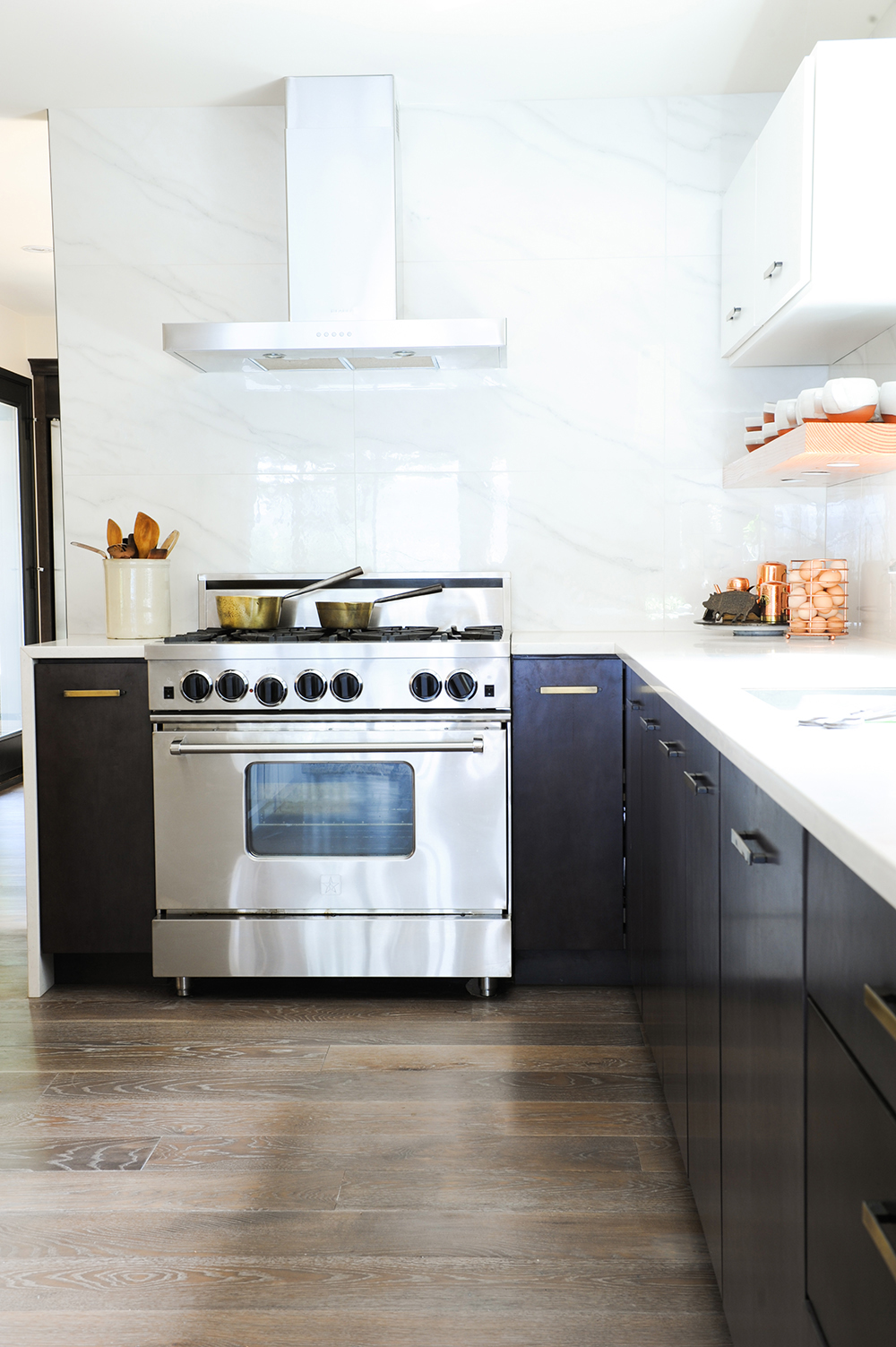
There’s no piddly backsplash in this cottage kitchen. Jessica extended the porcelain tiles all the way to the ceiling for a dramatic effect that is also practical. She says, “They quietly reflect the light and are super easy to wipe down.”
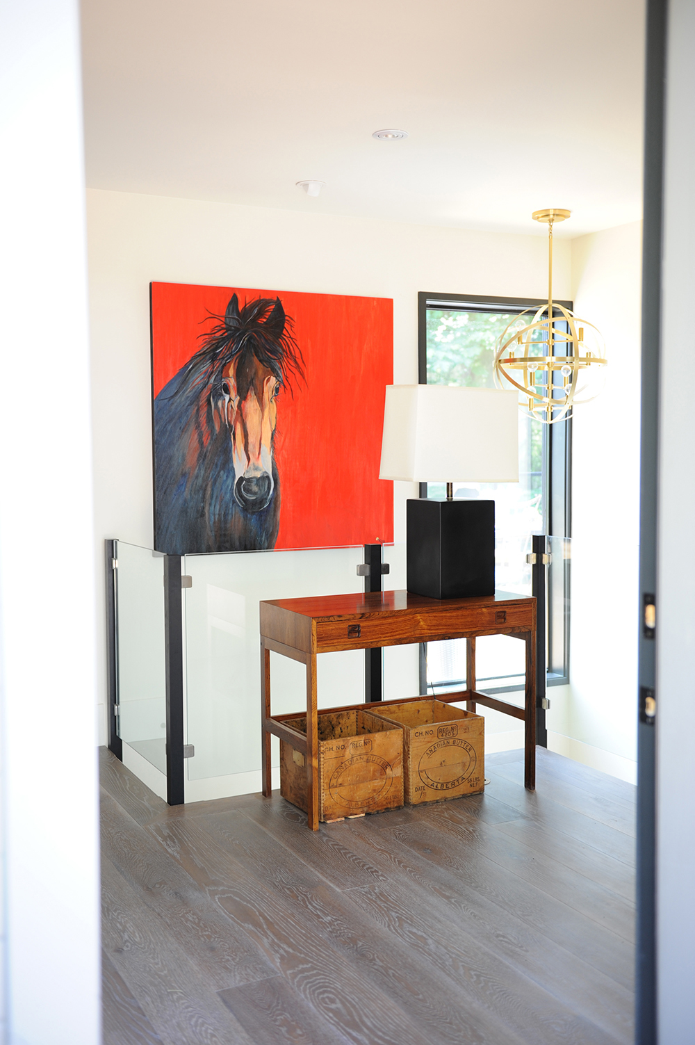
Hall Pass
Often overlooked in terms of decor, landings can be a dead space. Not when Jessica is designing. Here, she combines graphic art with antique wood and modern light fixtures to dramatic effect.
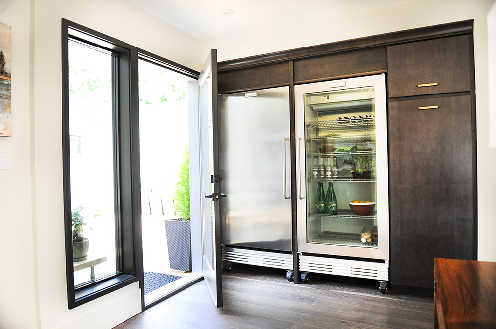
Product Placement
Jessica opted to place the fridge, unconventionally, near the entrance of the cottage. “I didn’t want it in the main kitchen where it would compete with or get in the way of the views.” It acts as a cold pantry, while fridge drawers on one side of the kitchen island keep everyday items close at hand.
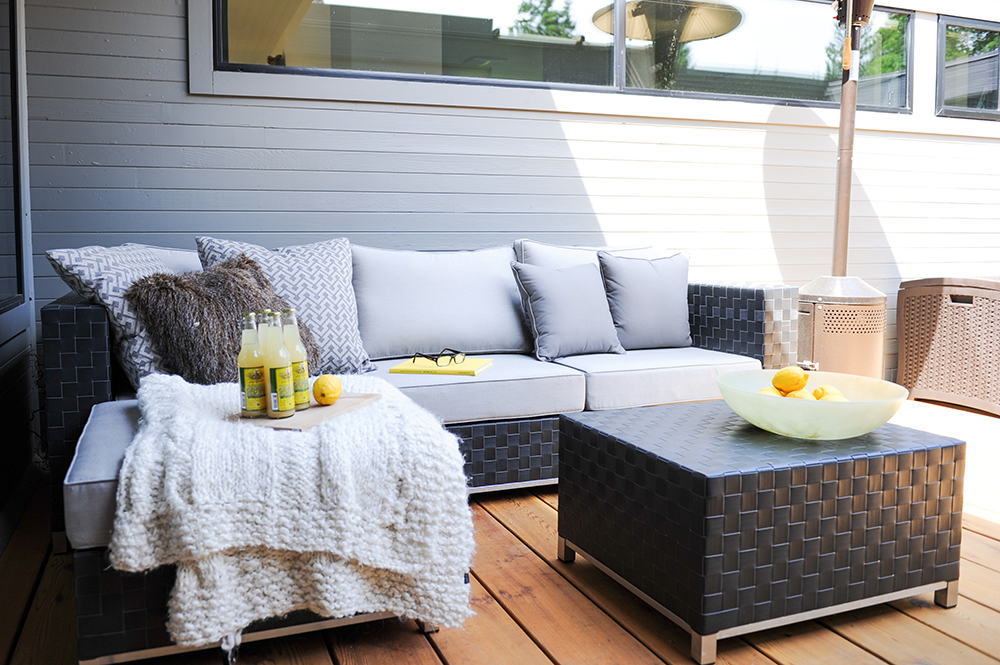
Alfresco Allure
“I love having soft seating outside – it’s just so cozy.” Jessica amped up the coziness in this corner of the deck with an abundance of toss cushions and a nubby throw.
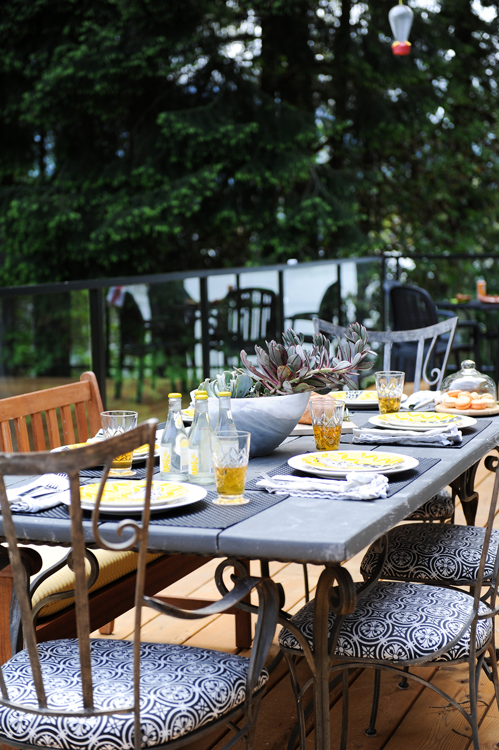
To the Table
Jessica and her parents love to eat outdoors whenever the West Coast weather permits. With that in mind, she added comfy cushions to the dining bench and chairs to make lingering at the table even more pleasurable. The mix of wood, metal and pattern has a casual flair that’s inviting.
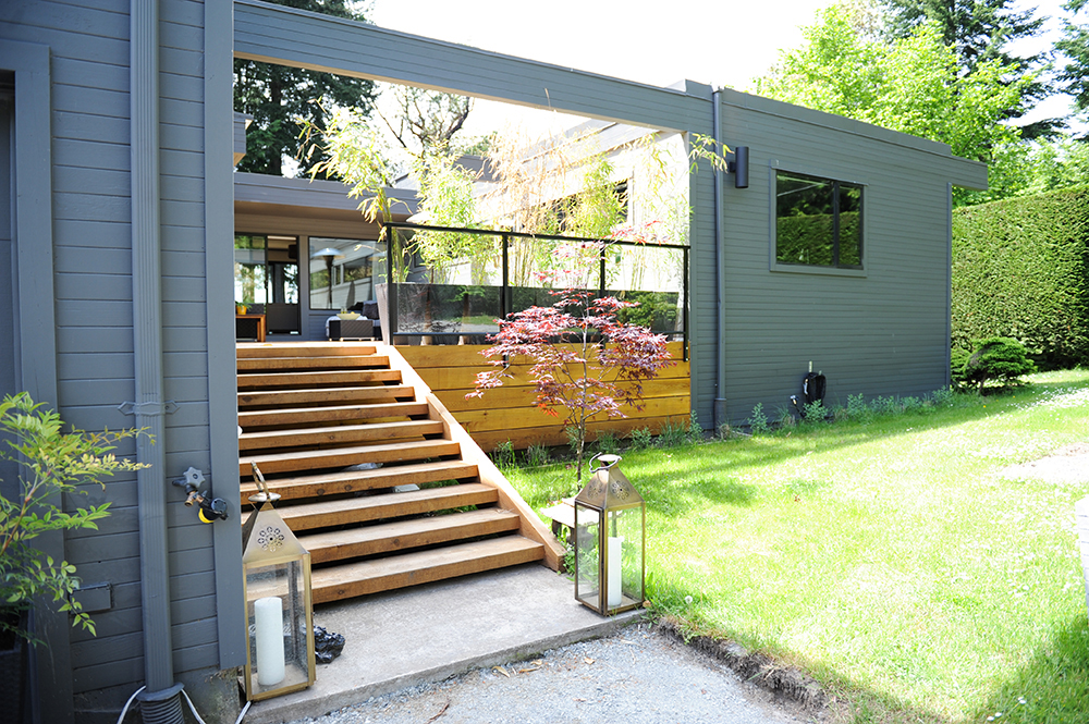
Curb Appeal
Though there’s no curb in sight (it’s beautifully replaced by the shoreline) the Touhey cottage has exterior appeal in spades. “I wanted it to blend in with the landscape when you looked at it from the water,” says Jessica. “I chose colours that reflected the environment and left some wood plain. It’s those fir details that really add warmth here.”
HGTV your inbox.
By clicking "SIGN UP” you agree to receive emails from HGTV and accept Corus' Terms of Use and Corus' Privacy Policy.


