Using English gardens, Eastern influences and modern aesthetics as starting points, architects Graham Smith and Tina Dhillon poured on their eclectic charm when transforming this 1930s Vancouver space into a home for themselves and their three children. Updated finishes, old finds and original artwork (he’s also an artist) were just some of the ways they created this gem of a place.
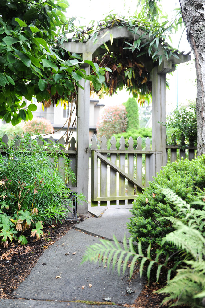
Curve Ahead
The owners referenced both their home’s idyllic setting and the needs of their young family when planning the front yard. “We custom-designed the curved cedar arbor and picket fence to keep our son in the yard when he was small,” says Tina. “The curve alludes to Asian garden entries because, being on the Pacific Rim, we wanted a blended Anglo-Chinoiserie look that evokes England’s early fascination with Asian gardens.” The arbor is flanked by black-stem bamboo on one side and flowering clematis above.
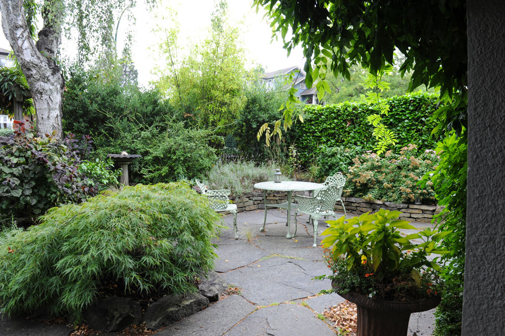
Global Warming
The backyard dials up an English garden oasis with its lush greenery and vintage British bird bath, while the garden furniture lends a twist. “I spotted these elegant cast-metal chairs on the sidewalk frontage of a little second-hand shop in South Vancouver,” says Tina. “I knew they’d be perfect as soon as I saw them. The filigreed vine pattern was the just the right note to complement our vision of a picturesque Anglo-Asian garden.”
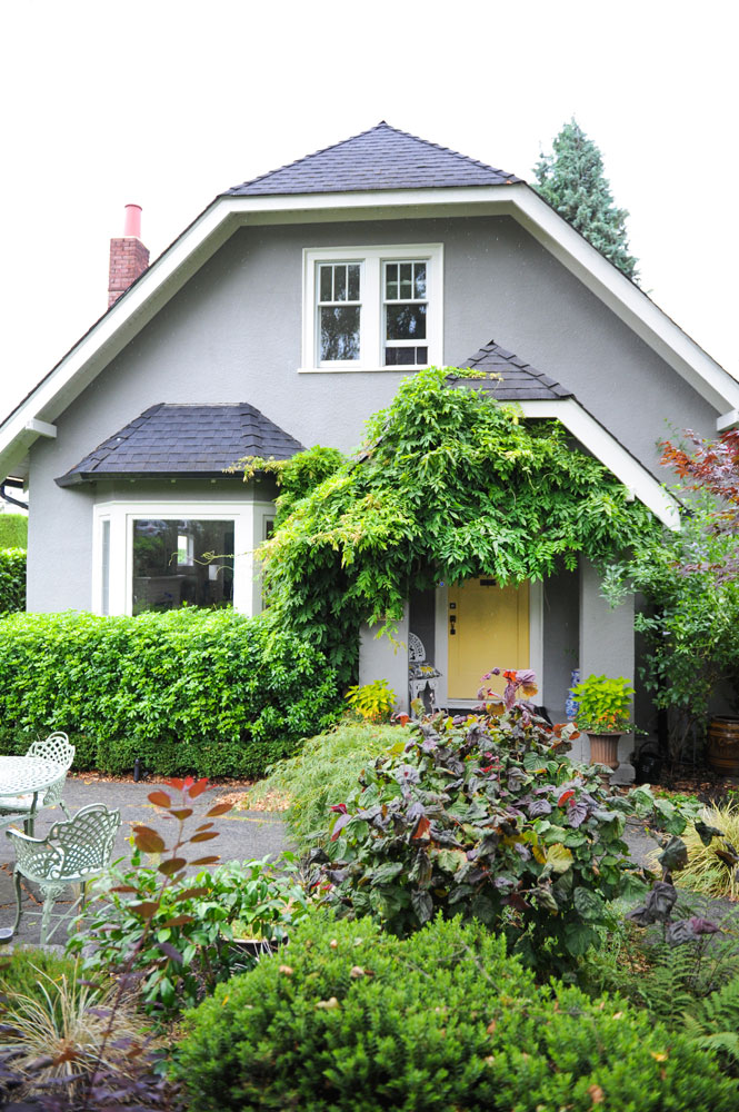
Colour Coded
In a roundabout way, we can take credit for Tina and husband Graham’s sunny front door: “I remember watching an HGTV show years ago, the Lynette Jennings show,” says Tina. “It was one of the first home decorating shows on HGTV. Lynette said if you want to sell your house, paint the door yellow. It always stuck with me. We weren’t selling our house, but I loved the colour. I feel the taupe contrasts beautifully with the warmth of the butter-yellow front door.”
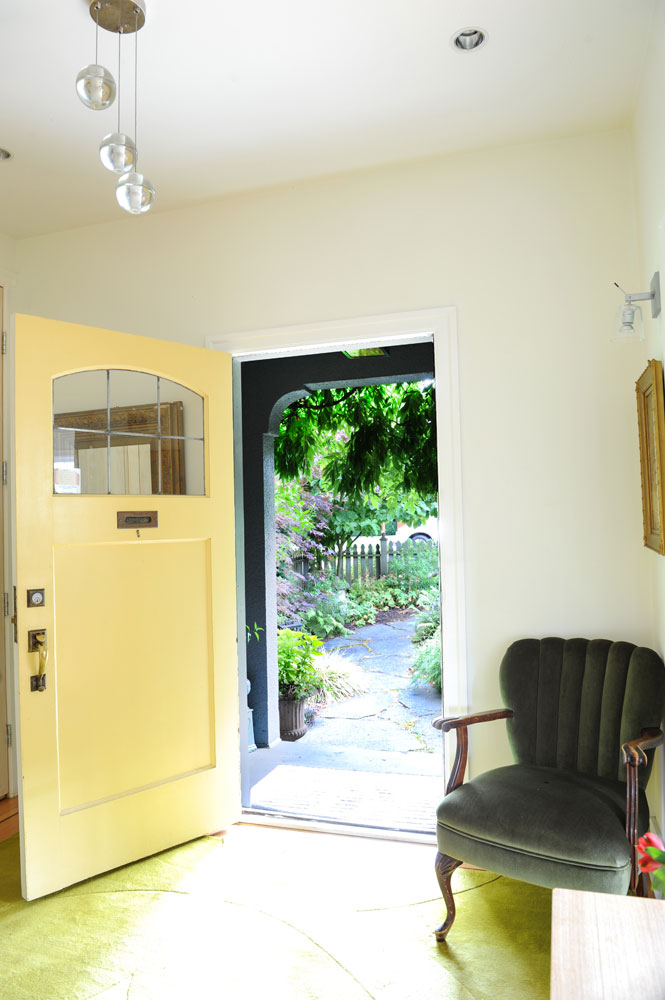
Can Con
The home’s Canadian content continues inside. “The pendant light here is by Omer Arbel, an internationally recognized lighting designer from Vancouver. We are very mindful to use Canadian designers wherever we can.”
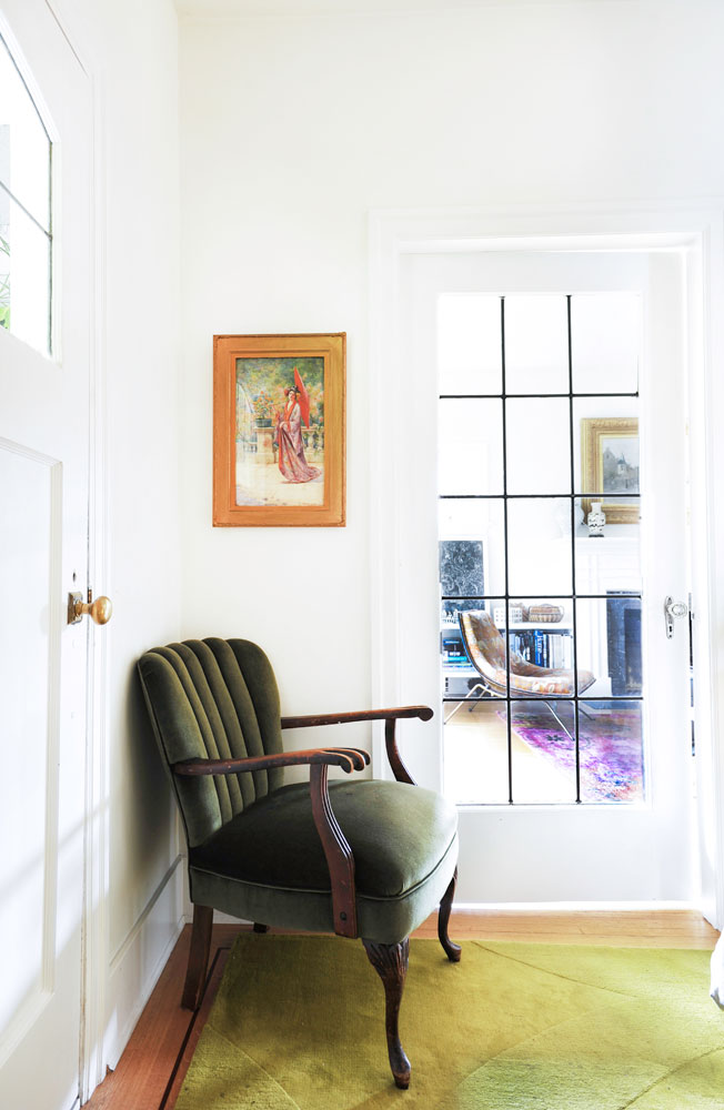
Be Jewelled
The light and airy front hall is punctuated by a jewel-toned velvet armchair in a handsome shade of bottle green. Tina purchased it at an estate sale and says, “I love how its style reflects the age of the house, while its tone introduces a refined palette.” The watercolour above it is an heirloom from Graham’s family.
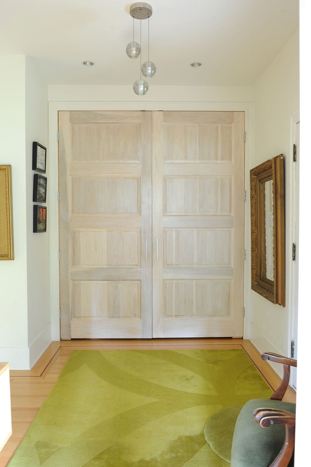
Fir Sure
Simple fir panel doors, that are slightly taller than standard, provide full access to the front hall’s closet. The owners stained them in a pale-grey wash so that the wood grain would still show through. The green rug is from IKEA and adds a bit of warmth and softness to the oak floors.
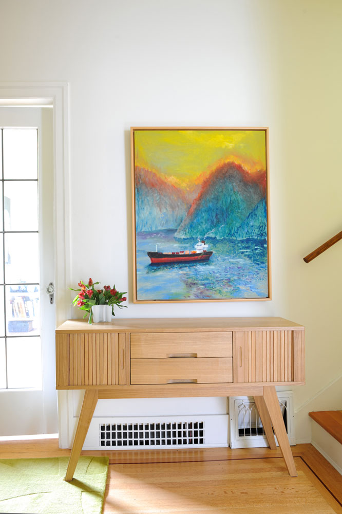
Artist in Residence
An oil painting by Graham hangs above a retro modern console with piloti legs and rolled panels. The console is also attributable to Graham, who found it at a Salvation Army store in North Vancouver.
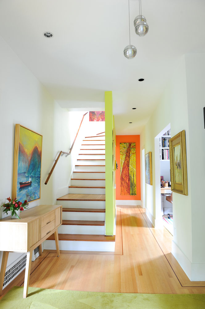
Bold Statement
A shock of lime green kicks up the staircase. “Because entryways are transient spaces, they are a great place to play with bold colours,” says Tina. “Most of our walls are painted white to showcase our art collection, but here the walls are Lime Light by Benjamin Moore to complement the artwork and rug.”
Corner Office
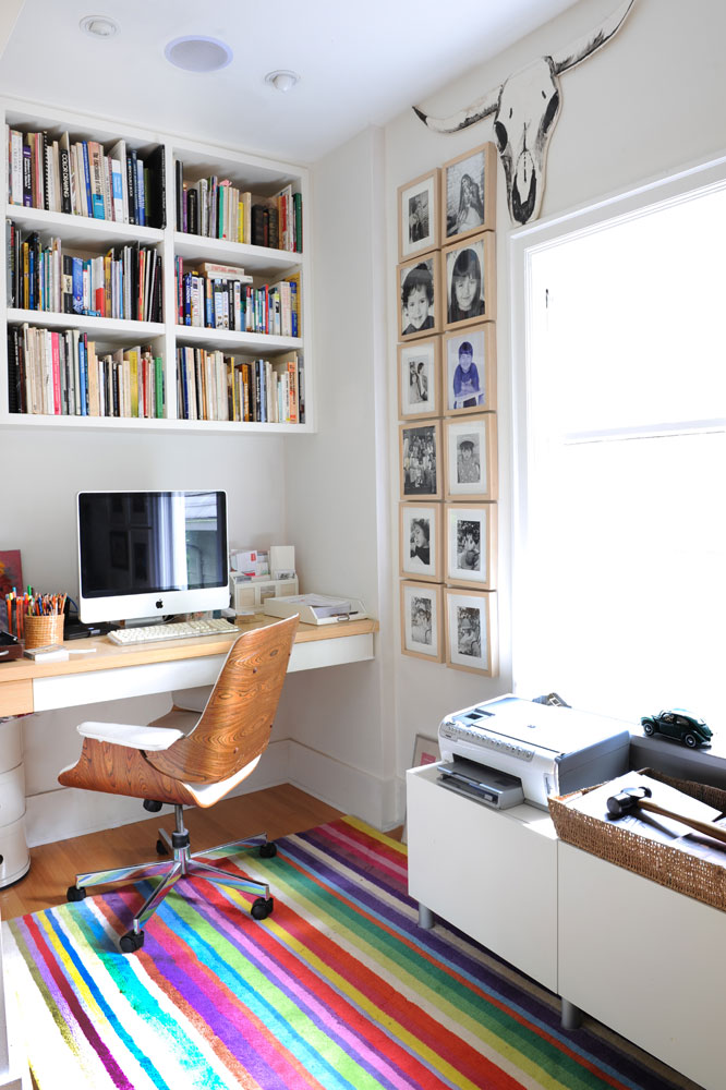
A desk and custom shelving provide ample storage in the home office. The Eames-inspired chair was a giveaway at a community recycling event. “It was covered in hideous fabric, but we loved its moulded plywood back, so had it reupholstered in white leather,” says Tina. Black and white family photos are hung creatively in pale wood frames beside a bull head, which Graham made with foam core board and gouache paint for one of their son’s birthday parties. The colourful rug is from IKEA.
Nature Calls
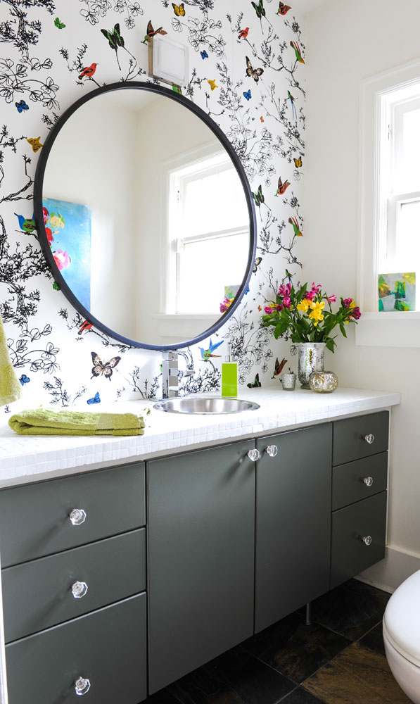
Powder rooms scream for wallpaper, and this one doesn’t disappoint. “We both enjoy this butterfly-patterned wallpaper’s idiosyncratic, hand-sketched look.” A simple round stainless-steel bar sink echoes the large circular mirror. The countertop was originally tiny turquoise glass mosaics. “I always disliked it because the installer used white grout, which took away from the beauty of the colour. So, when we refreshed the powder room, we used white tile paint to refresh the whole counter.”
Artful Detail
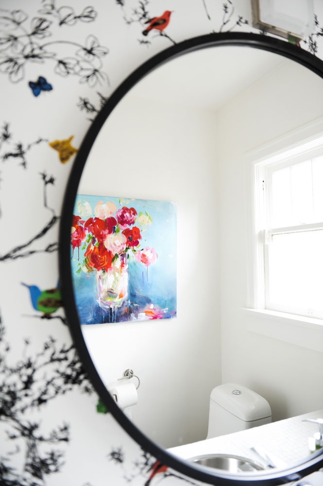
Fiends for fine artwork, Tina and Graham hang it generously throughout their home, even in the powder room. “This floral arrangement is by Vancouver Artist Lauren Morris,” says Tina. “I love this piece’s sense of vigor and panache.”
Spicy Notes
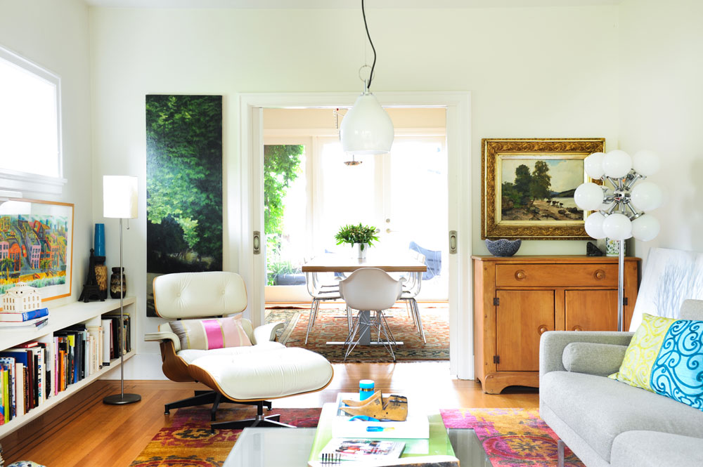
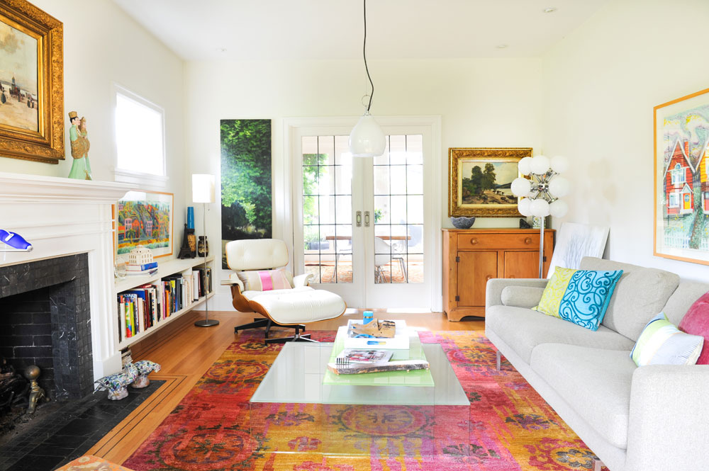
While there are many Instagrammable beauties in the living room, our eye is first drawn to the riveting area rug. “I call the rug ‘Indian Summer’ because of its pink and mustard tones,” says Tina. “Its intense hits of pigment remind me of the Holi Colour Festival in my birthplace of India.”
Lights Fantastic
The couple’s mix-master talent is especially evident here. A retro ’60s starburst floor lamp that their daughter scored at a local thrift shop shares the space with a paper-shaded IKEA one, along with a casual maple cabinet Graham inherited from his parents and a forest painting bought from an art student. In the centre of it all is an Italian glass pendant light. “We purchased it some time ago from Uno Igav’s Italinteriors, formerly in Yaletown,” says Tina. “The late Mr. Igav was a wonderful Vancouver original and a staunch advocate of modern design.”
Clearly Beautiful
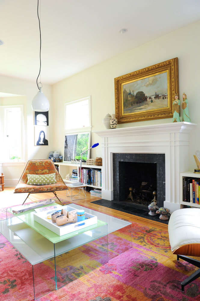
The secret in fashioning a room that works is combining elements and getting the balance just right. Graham and Tina expertly mix patterns, colours and eras, and their coffee table speaks to this skill. “These glass tables are from Inform Interiors and are designed by Niels Bendtsen, another talented Vancouver designer,” says Tina. “We wanted something transparent to allow visual flow through the space.”
Homegrown Talent
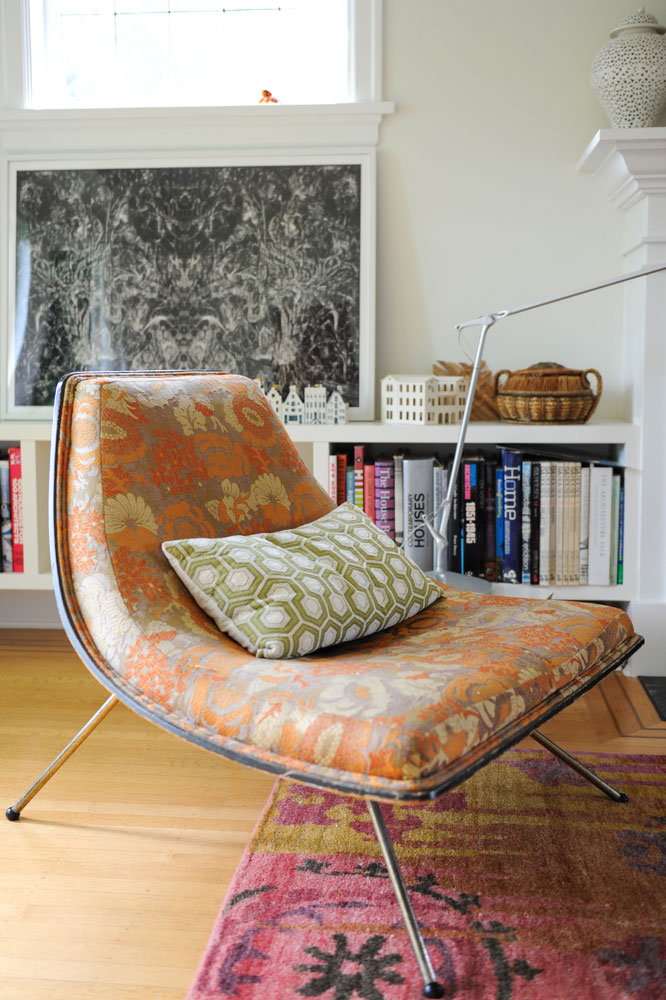
“Graham found this unique chair at our local consignment store,” says Tina. “We did some research and found out it has a name and a very interesting history. It is probably the most important piece of distinctly Canadian modernist history we own.” Dubbed the “Winnipeg Chair” and also known as the “Canadian Coconut Chair,” it was designed by Harvard-educated architect A.J. Donahue and is one of about only 200.
Global Influence
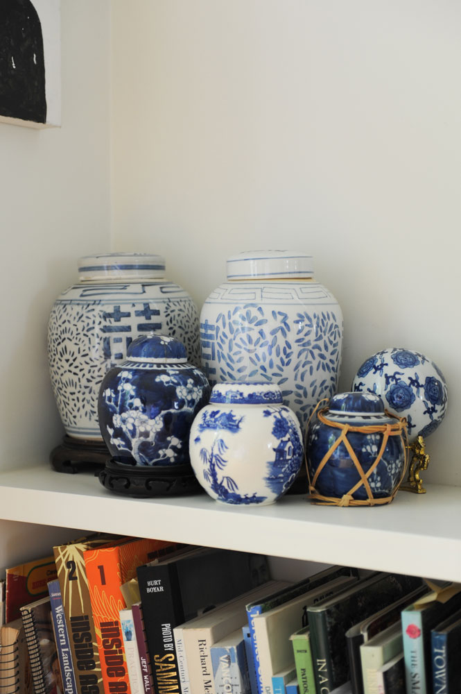
Graham and Tina have been collecting ginger jars over the years and this grouping sits in a corner of the living room. Tina says, “We like Chinese ceramics and how they reflect Vancouver’s rich Eastern influences.”
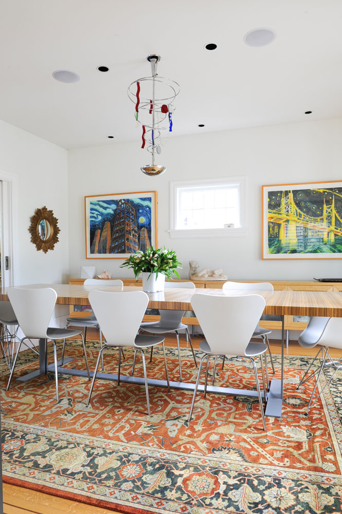
Table for Eight
“Our dining room is really large!” says Tina. “We needed a substantial table to fill the room and were so lucky when a friend offered this massive table to us because she had just bought a new one. The Series 7 chairs, designed by Danish designer Arne Jacobsen, sit on an Indo-Persian rug from East India Carpets that imparts an eclectic feel. The oil paintings are by Graham and the chandelier was designed by Toni Cordero for Artemide.
Mix of Ingredients
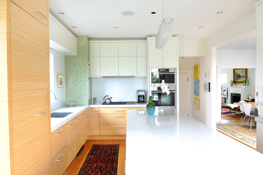
Bamboo cabinets mingle with white painted styles and luminous green glass tiles in the kitchen. Tina says they add a “crucial sparkle.” To keep these stunners a focal point, a simple backsplash of 2×6 stacked white subway tiles was chosen. The spiffy countertop is Caesarstone in Nougat.
Premium Wines
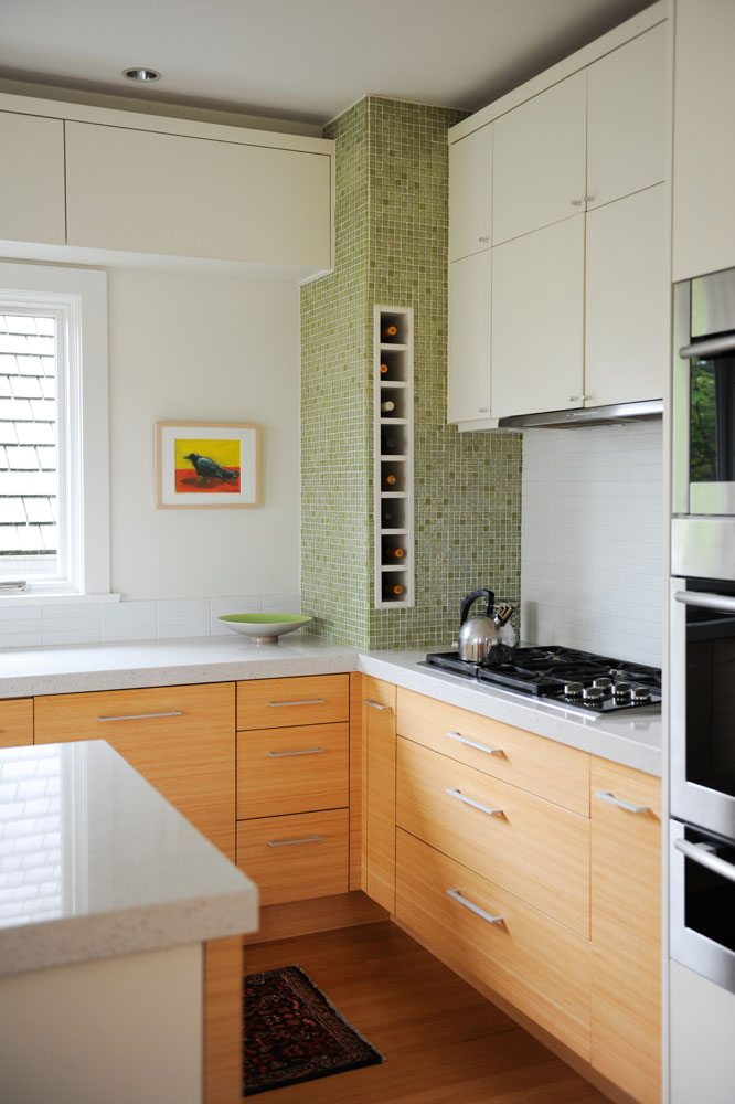
When storage is at a premium, add premium wines! This corner of the kitchen – a formerly underutilized space – was transformed into a stylish wine niche faced with tactile mosaics.
Central Station
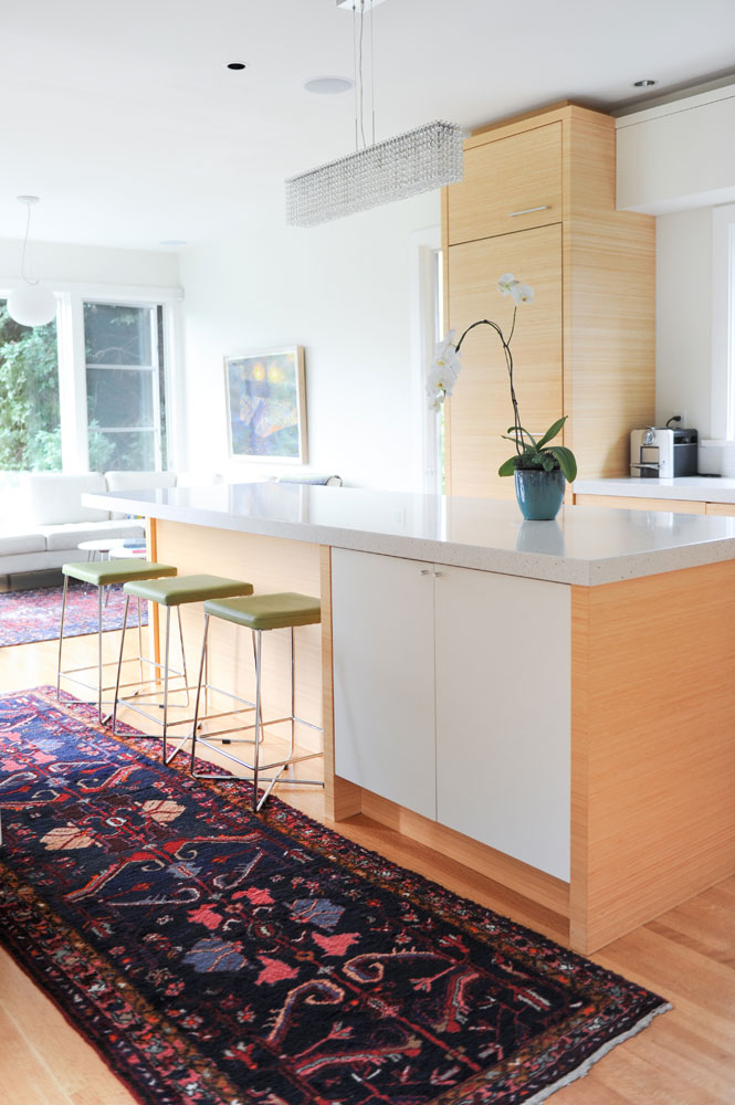
The opposite kitchen counter with the sink in it houses most of the appliances so the island was designed to max out storage. “Graham jokes that it’s so big a horse veterinarian could operate on it!” This side features deep cupboards and the other has drawers for pots, pans and dishes as well as a niche for the microwave. The couple splurged on the vintage Indo-Persian runner after they got married. “We wanted a shred of luxury in those lean early days.”
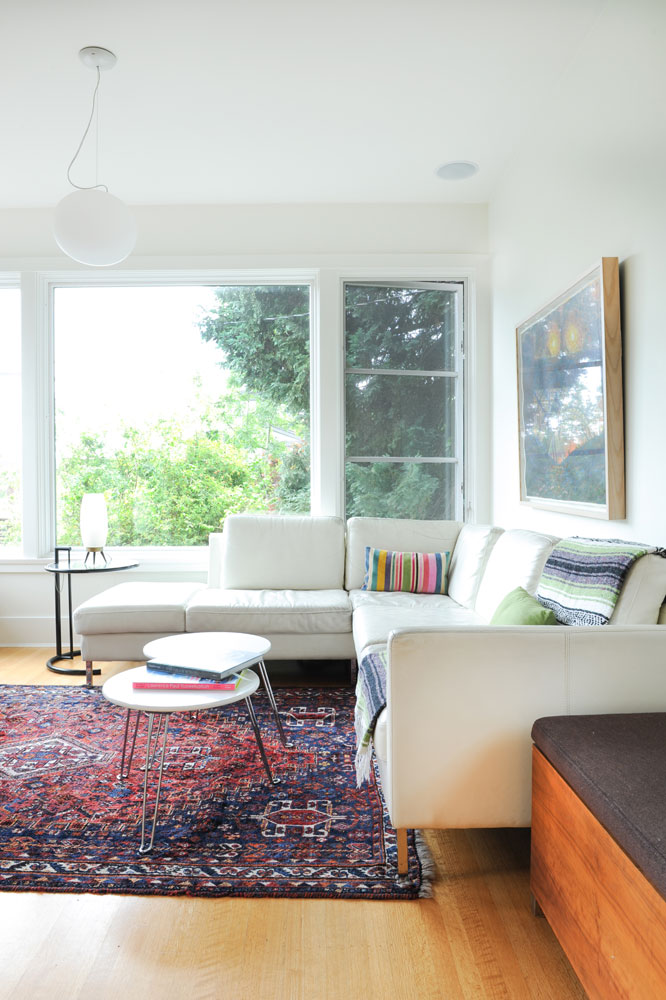
Family Time
This is where the family hangs out and watches TV, so a sectional allows all of them to pile on together. “We tend to lounge here like a family of polar bears.” Because it is covered in leather, it’s easy to clean and fuss-free. The round nesting tables add a contemporary note.
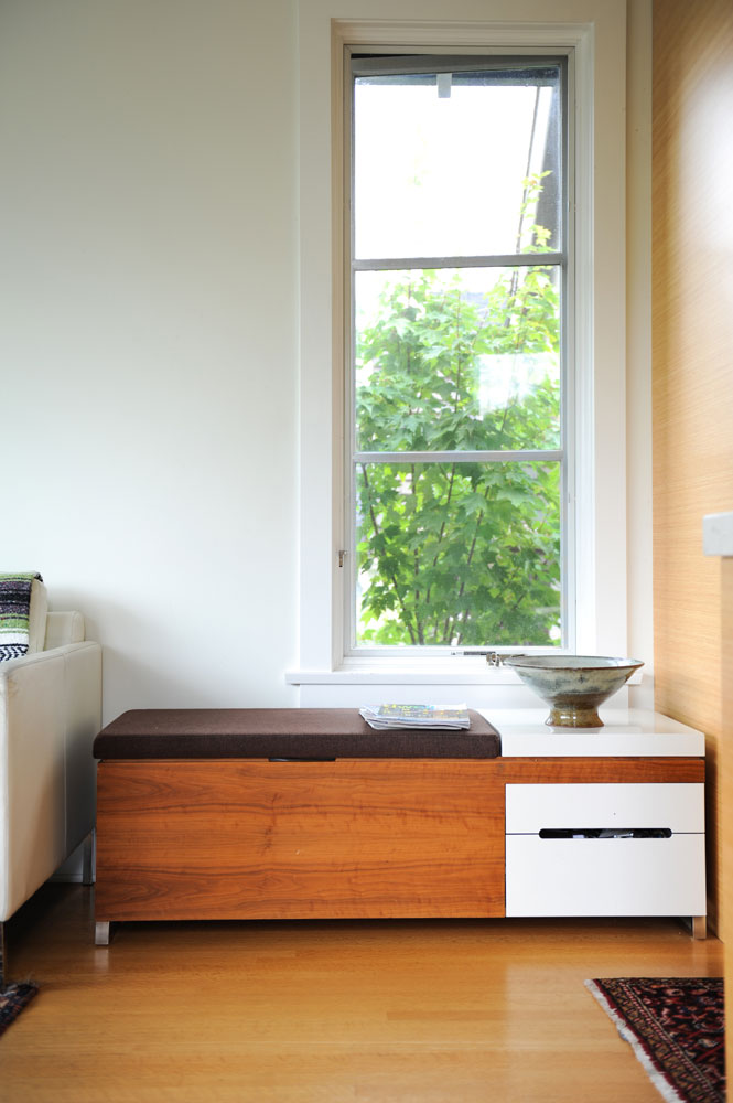
Iconic Style
Like the Eames chair in the living room, this nifty little bench was a splurge. “It’s a Herman Miller Cognita Storage Bench by Eames. Our rational for the price tag is that you can always build around a few key designer pieces.”
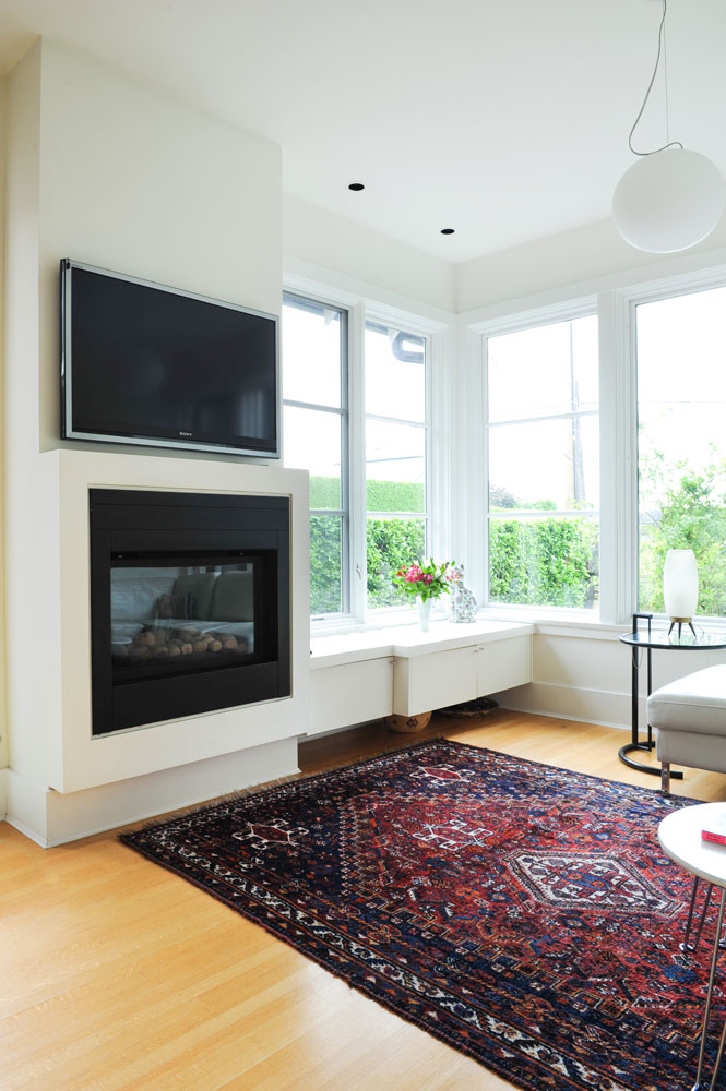
In Tandem
The couple designed the family room to incorporate a gas fireplace and TV. The fireplace is a simple projecting box and its black frame works nicely with the TV above.
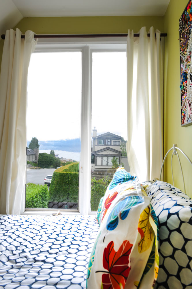
Room with a View
The eldest daughter’s bedroom, while the smallest in the house, boasts an enviable view to the ocean. The blue and white bedding from IKEA picks up on the oceanic vibe, and the walls, painted in Pale Avocado by Benjamin Moore, impart a restful warmth.
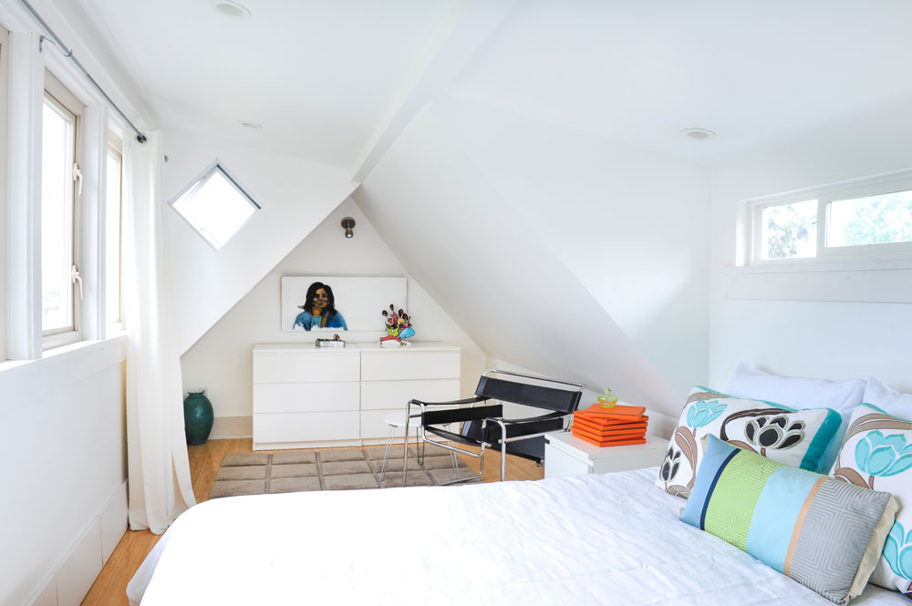
Master Plan
Painting the master bedroom bright white downplays the angles of the pitched roof and lets the well-chosen furnishings pop. The Wassily Chair is by Marcel Breuer and the cushions are from Designers Guild in London. “Trisha Guild is the master of colour and pattern, and the beach-umbrella colours add a note of breeziness to this airy room,” says Tina.
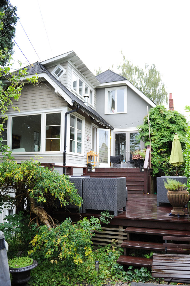
Indoors Out
The back decks are the preferred location for the family’s parties, many of which are Tiki-themed. “Our backyard is divided into four distinct levels – all of them pretty casual. We put out flaming bamboo torches and backlit wooden Tiki masks, fire up the music and light the fire pit. The combination of our largish casual living space inside, coupled with more intimate outdoor areas makes for a fabulous social setting.”
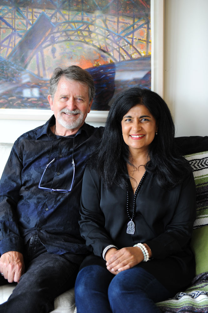
House Proud
Architects and homeowners Graham Smith and Tina Dhillon. “We fell in love with the house when we first saw it,” says Tina. “And after it became ours, we could not believe our luck.”
HGTV your inbox.
By clicking "SIGN UP” you agree to receive emails from HGTV and accept Corus' Terms of Use and Corus' Privacy Policy.


