A heritage house in an East Vancouver neighbourhood filled with young families is a real estate dream come true – almost. Anna and Ryan McNally needed to bring their home up to speed with a design that was both beautiful and suitable for their young children Emily and Evan. They hired designer Cara Hansen from Triple Dot Design Studio to make it bright, storage savvy and easy on the eyes, all without ever forgetting its roots.
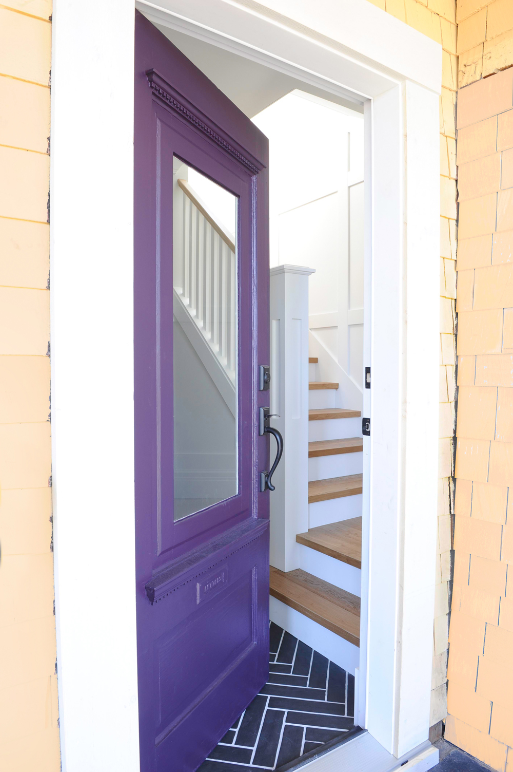
Purple Reigns
The McNally’s home uses colour as a starting point – literally! A punchy purple front door is the entryway to the charming Craftsman-style heritage home built in 1907. And like a lot of great design ideas, it wasn’t part of the initial plan. “It was purple when we bought the house,” says Anne. “We thought, why not keep it and freshen it up with a new coat?”
Related: The Victorian Era is Still Alive in This 106-Year-Old Carriage House in Montreal
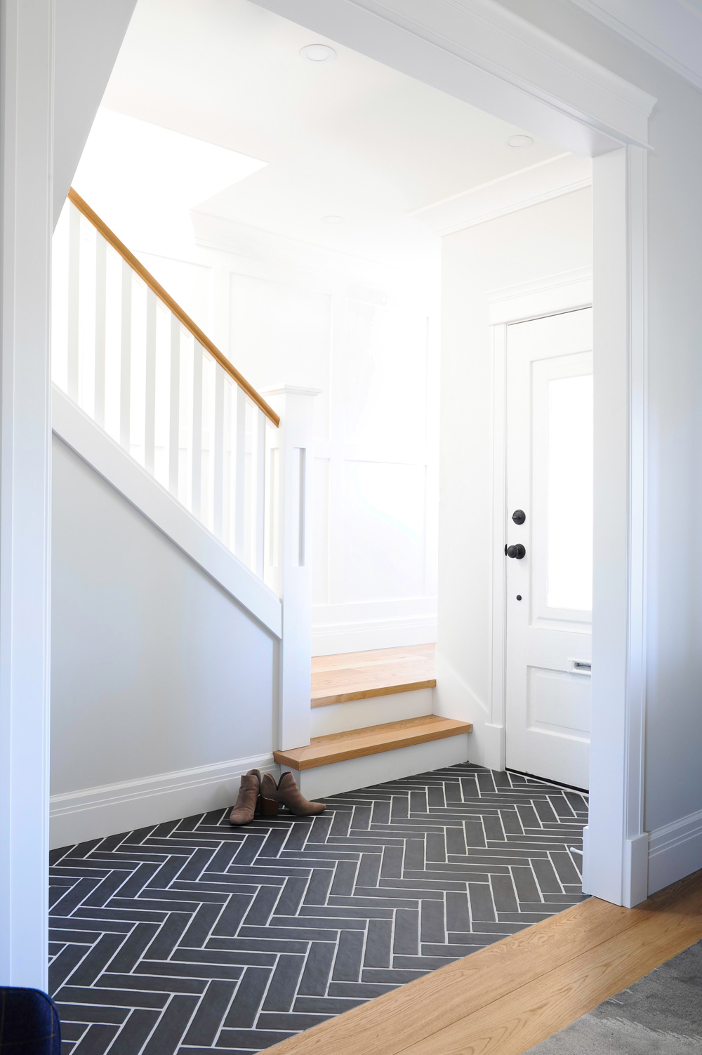
Floor Show
Designer Cara Hansen’s secret to fashioning an Instagrammable family home? Combine form and function. Black brick herringbone in the front hall pops, yet is still classic enough for a heritage home and durable enough for wet Vancouver weather. It’s not the only showstopper here. “Stairs are often a forgotten area of the house,” says Cara. “I added inexpensive wall paneling to dress up the staircase and invite the eye upward.”
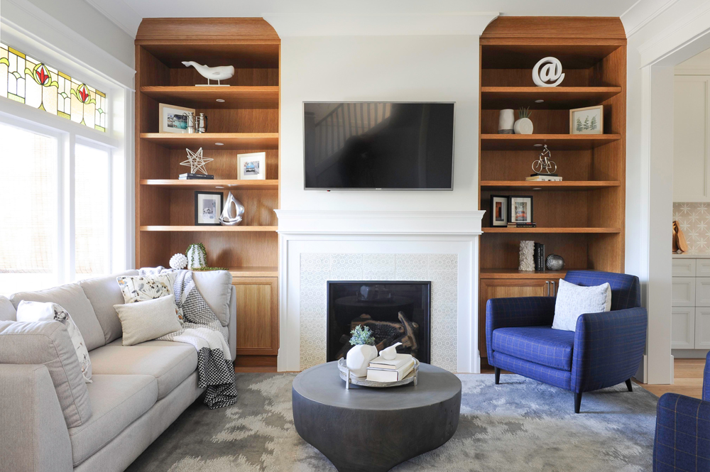
Fire Starter
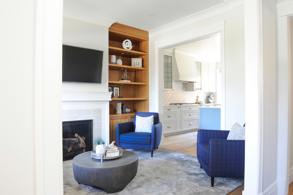
Though this layout appears original to the house, it’s all new. The gas fireplace – a must-have addition for the owners – looks like it has always been there thanks to the built-in shelves that flank it. Crafted from rift-cut oak, they are stained to match the floors and the natural wood feels especially warm in the otherwise cool palette. The fireplace tiles have a hand-crafted crackled finish that furthers the authentic vibe.
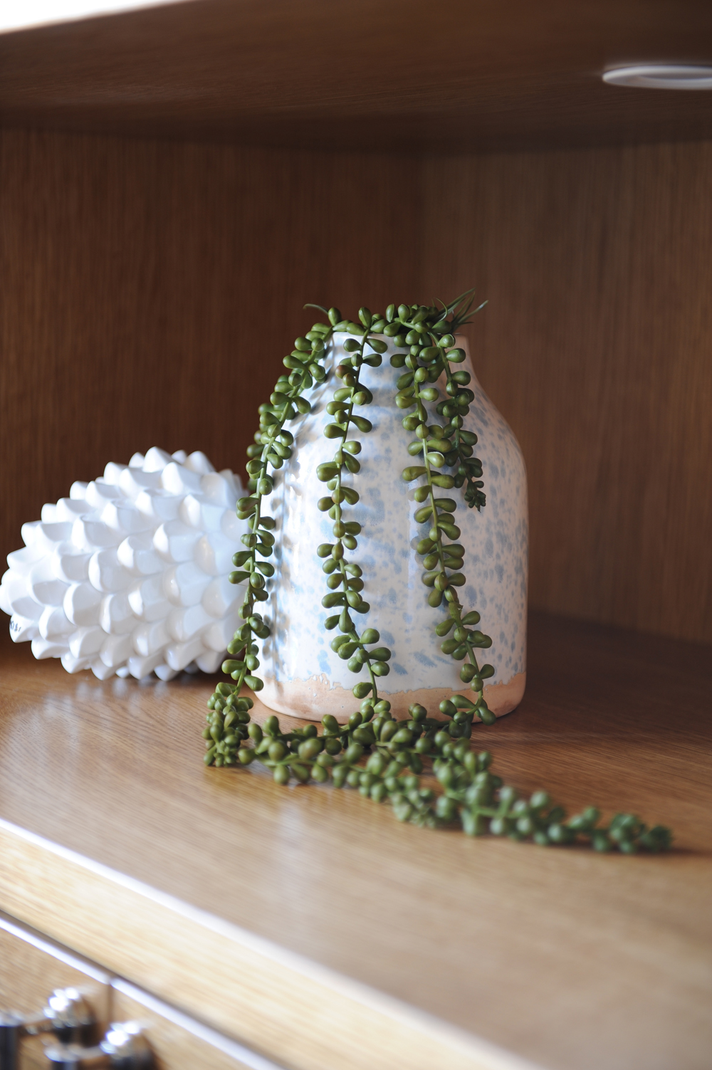
Plant-Based Style
Mostly white vases and accessories pop against the rich tones of the living room’s wooden shelves. They add punchy visual interest and here, provide a vessel for a fresh and unfussy plant.
Related: You’ll Want to Steal the Fine Finishes and Eclectic Art in This Modern Boho Home
Soft Touch
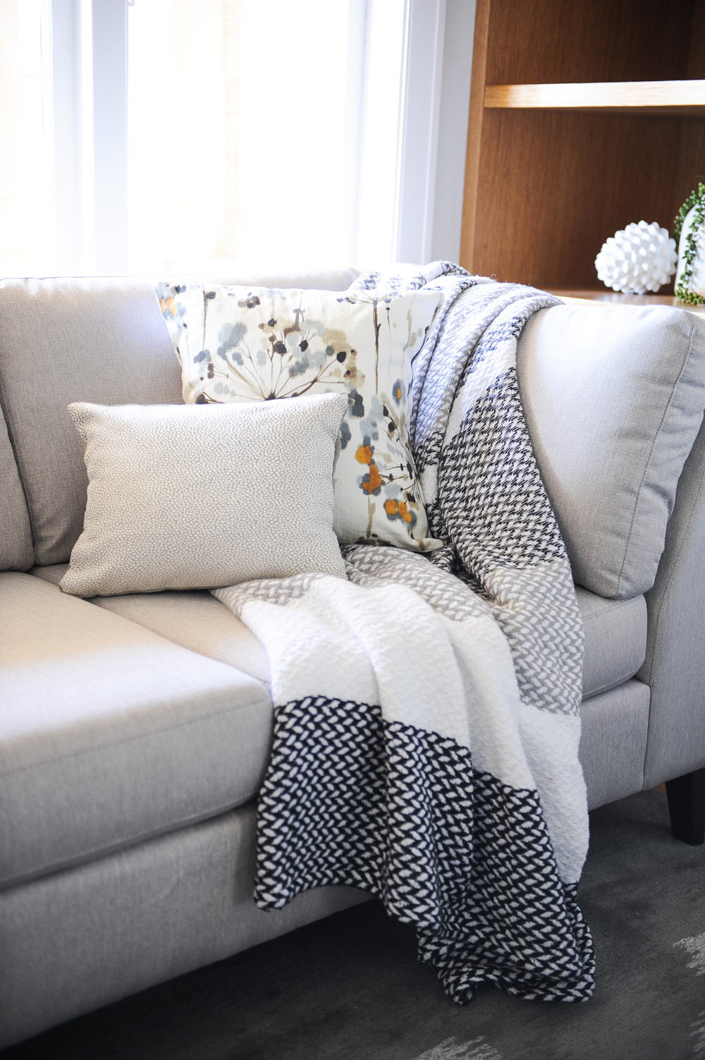
A small-scale sofa from EQ3 is the perfect fit for a not-so-large living room (bonus: it’s Canadian made!). The timeless grey upholstery forms a classic backdrop for a dynamic play of textures, from a nubby throw to silky-to-the-touch cushions.
Related: 20 Small Living Room Design Ideas You’ll Want to Steal
Blue Notes
Snappy mod blue plaid armchairs from CB2 introduce even more texture and fun to the room. They’re also super comfy perches for watching TV or curling up with a book. The sculptural coffee table is from Restoration Hardware. Crafted from a solid block of sustainably harvested suar wood, it acts like a work of art, while its edge-free form makes it kid-friendly too.
Treasure Island
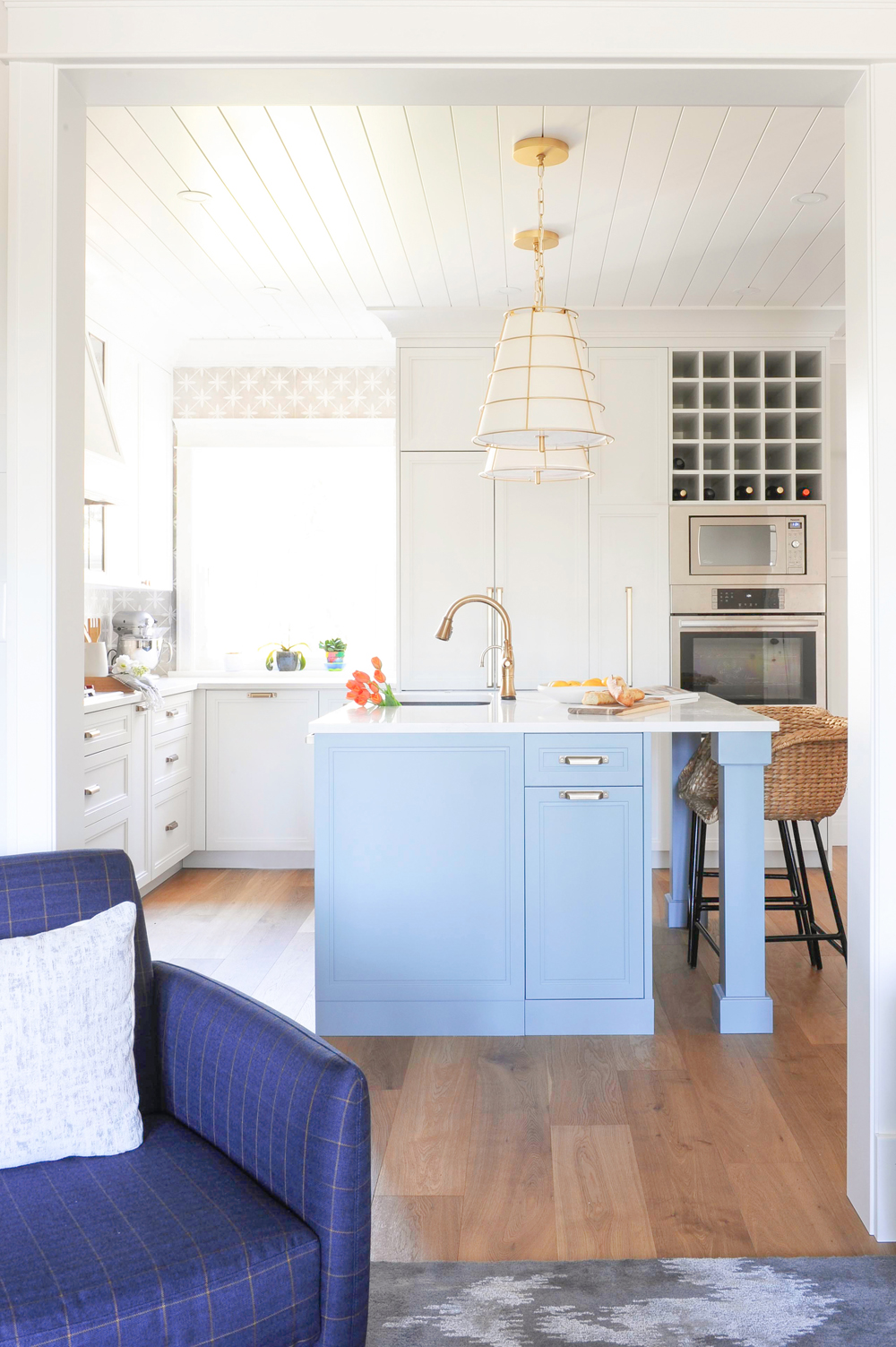
“The kitchen island is a great spot to add a pop of colour,” says Cara. We love the pale blue she chose, both for the way it stands out and for how it still feels freshly neutral. Savvy planning alert: tall integrated space for recycling and waste flank either side of the island and each is topped with a small catch-all drawer. And yes, you can swoon at the smart wine storage.
Grass Roots
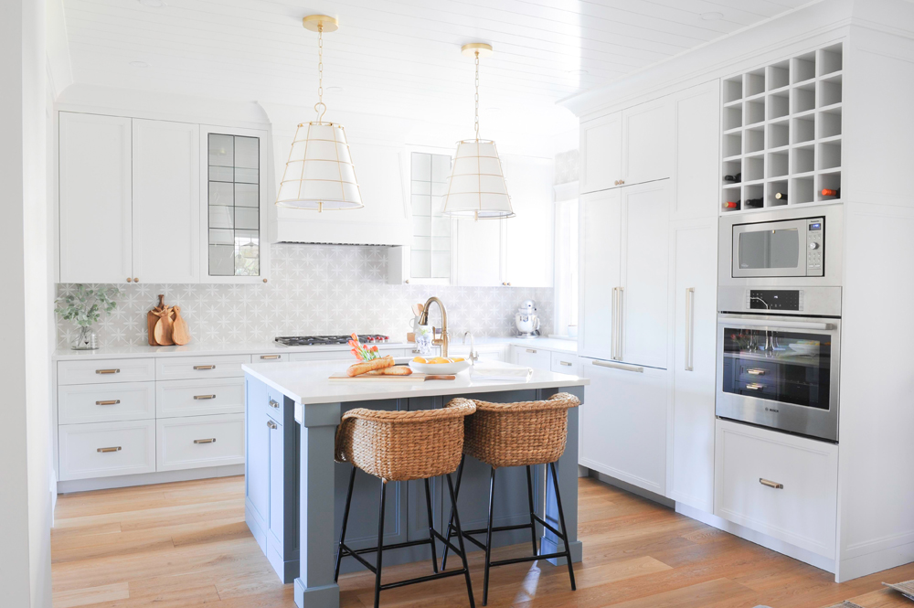
The seagrass bar stools from CB2 shift the cool kitchen into textural overdrive. And spoiler alert: they are a nice complement to the chairs at either end of the dining room table. We love how the two simple cutting boards near the range effortlessly continue the textural, natural feel.
Related: This Historic Langley Farmhouse Will Make You Want to Move to the Country
Pattern Play
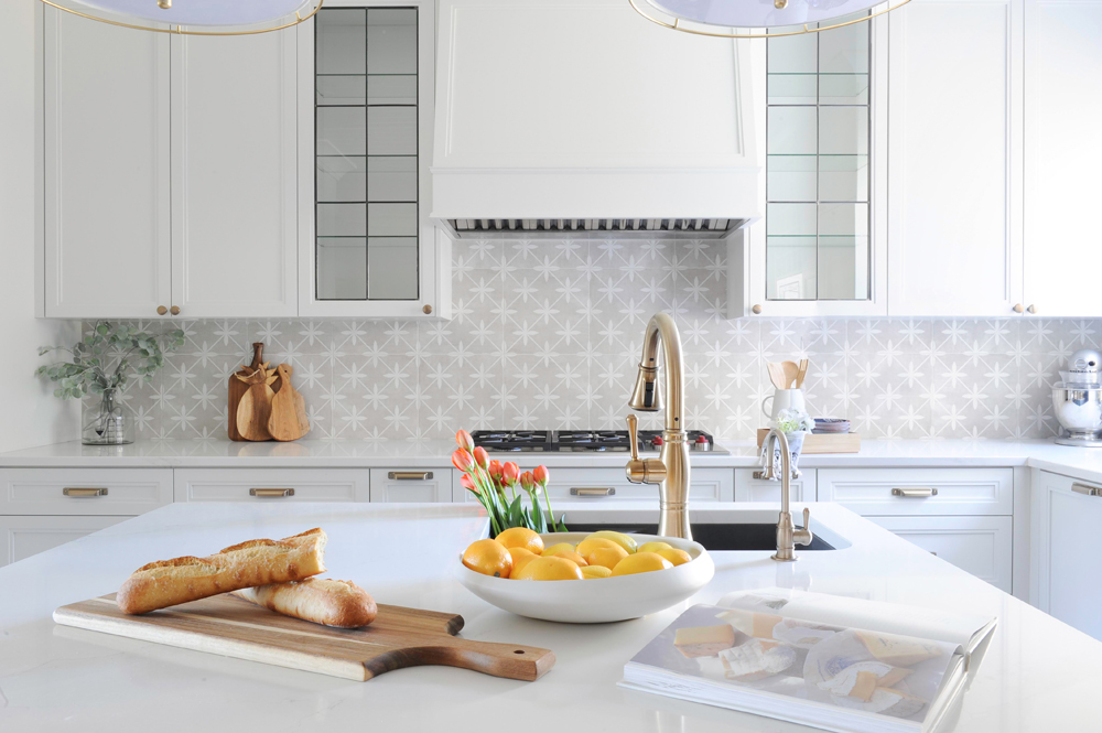
With an element of fun in mind, Cara chose a zingy patterned ceramic tile for the backsplash that mimics the look of on-trend encaustic tiles, but offers more durability. White grout picks up on the pattern and makes it feel seamless.
Recipe for Style
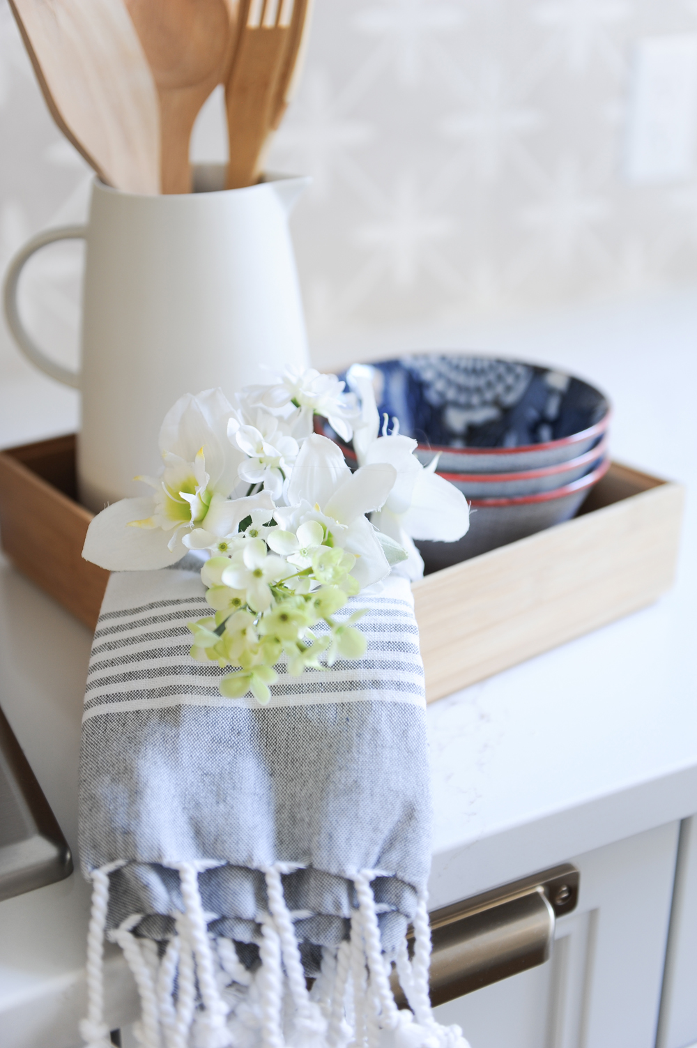
Corral everyday kitchen necessities in a tray and instantly create a magazine-worthy vignette that begs to be finished with a fresh bloom.
Double Duty
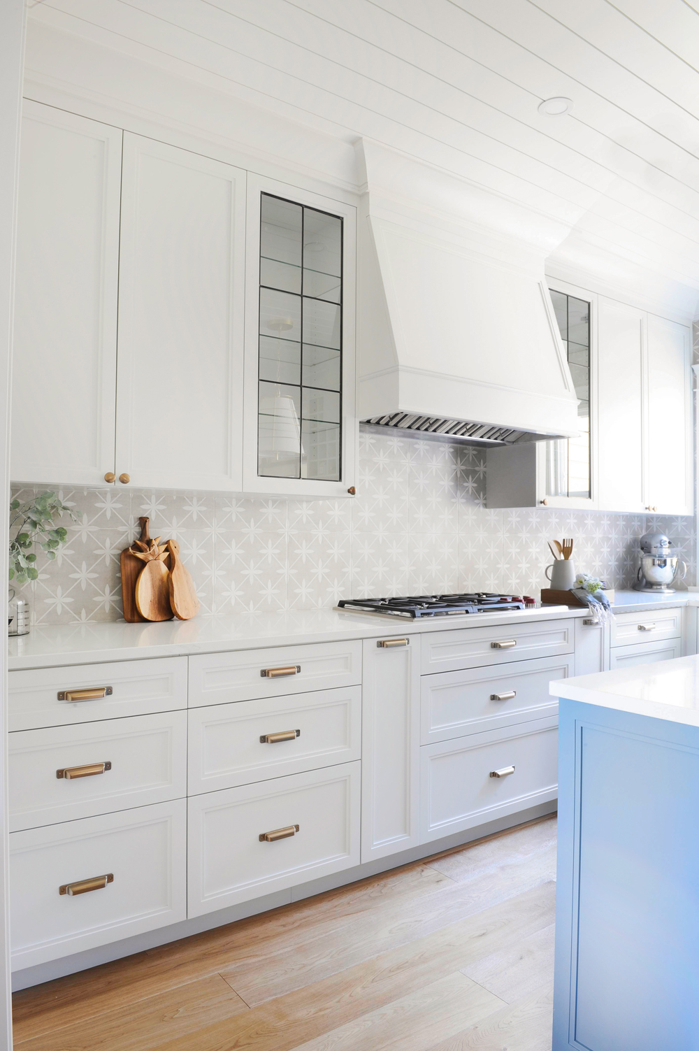
Not only do the handsome glass-front cabinets that flank the range add a lighter element to the solid-front storage, they also impart stylish continuity by referencing the original leaded and stained glass windows found throughout the home. Imagine solid cabinets here and the impact wouldn’t be the same.
Related: This 140-Year-Old Church was Purchased and Converted Into a Cozy Sanctuary for Less Than $200K

Flower Power
A divided sink, versus one large one, comes with its own advantages, like offering a handy spot for flower arranging.
Out of Sight
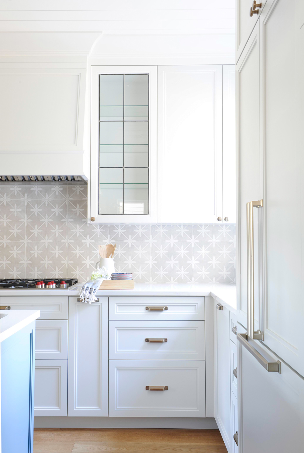
When the fridge is visible from the living and dining areas, do what the experts do. “In spaces like this, it is nice to integrate it so it looks more like cabinetry than a big hunk of stainless steel,” says Cara. “I like to think of it as putting your fridge in formal wear.” We love the mix of upper knobs and lower pulls.

Defining Moments
A Parsons-style Restoration Hardware dining table, durable enough for family life and big enough for entertaining, is framed by Windsor-style chairs in a definitive shade of black.
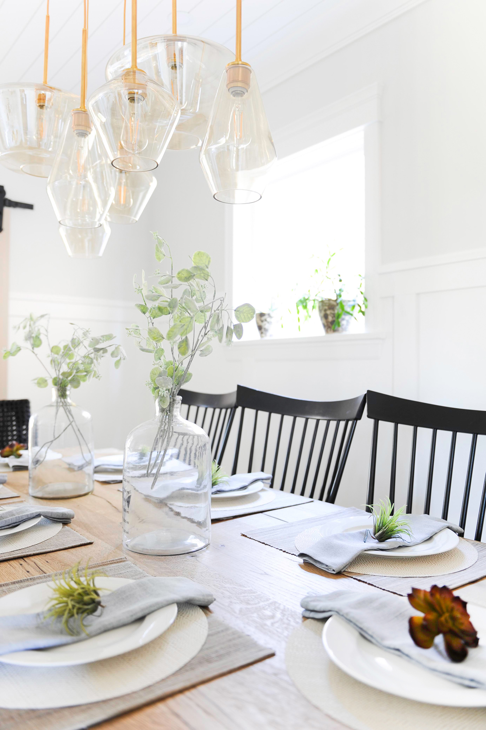
Champagne Wishes
Reminiscent of draped champagne flutes, the pendants that make up this West Elm light fixture are sparkling indeed. The brass furthers the mood which is nicely tempered by the casual, eucalyptus-filled glass jars used as centrepieces.
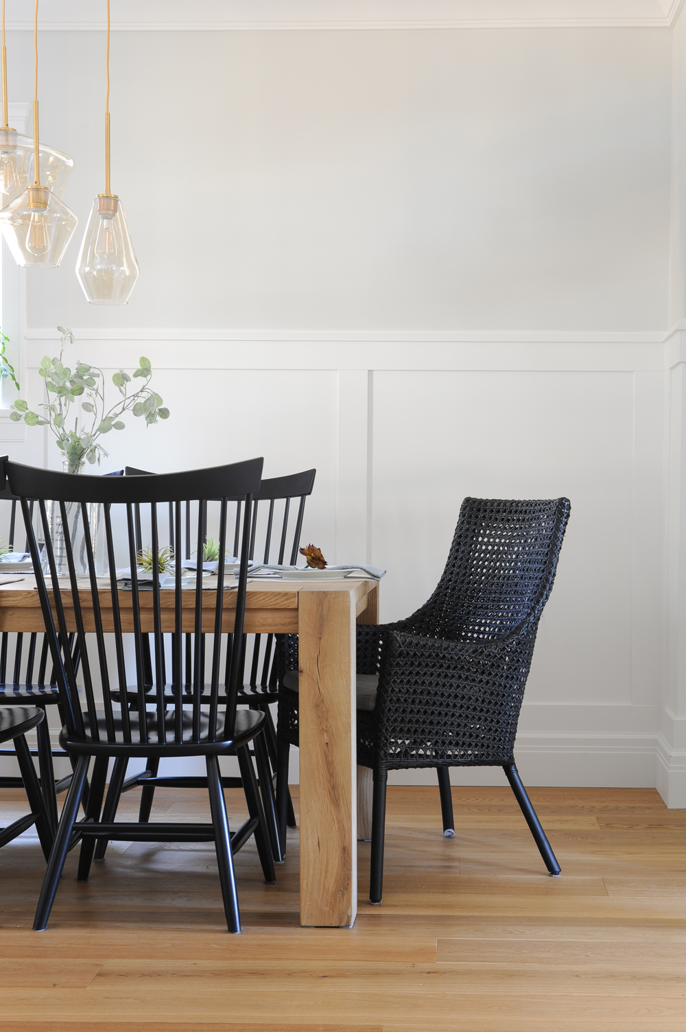
What a Rattan
Remember the textural seagrass stools in the kitchen? These head of table rattan chairs are their more formal dining room counterparts. We adore the layered look they create and how they add even more texture to the space.
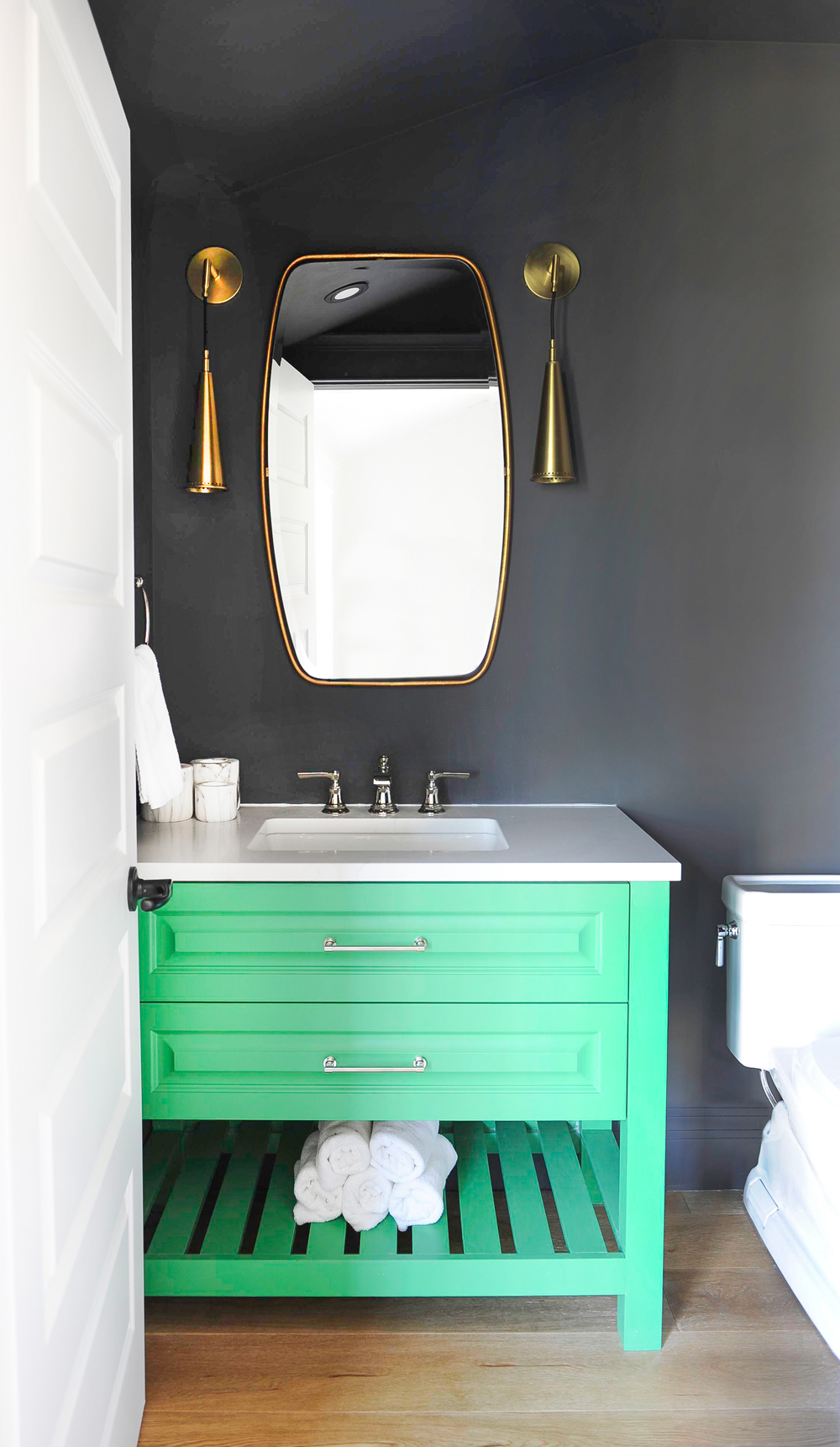
Go Green
You know how designers say the powder room is the place to be bold with decor and have fun? Well, this beauty proves it. Black walls are an intriguing backdrop to a vivid-green vanity, while the overall vibe remains sophisticated thanks to an elegant brass mirror and sconces.
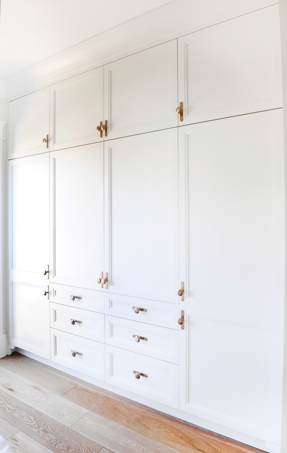
Closet Case
You could call this a custom-designed dream. Smart floor-to-ceiling storage in the master bedroom (squeezed in beneath sloped eaves) means space is maximized so there’s a place for everything and more, a major coup in a house that’s over 100 years old.

Big Brass
The custom-made wardrobe was carefully accessorized by beautiful brass handles that are in keeping with the home’s heritage and character.
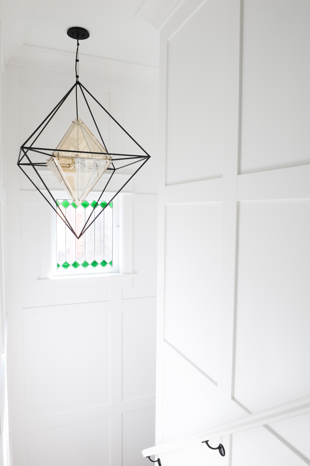
Bright Like a Diamond
The landing’s stunning geometric light fixture is from Troy Lighting and lives up to its name. “The diamond shape plays beautifully with the green diamonds of the stairwell’s original stained glass window,” says Cara. “It lets the home’s character shine.” Continuity buffs will note how the green of the stained glass is reflected in the powder room’s vanity.
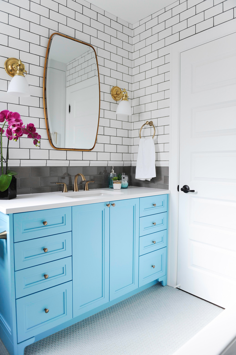
Blues Master
The top floor family bathroom is happy and bright thanks in part to the playful blue vanity. “A vanity is a great place to have a bit more fun and it’s also cost-effective, ” says Cara. “It’s way easier than changing tile if you ever tire of the colour.” The warm brass accents continue here to add character and depth.
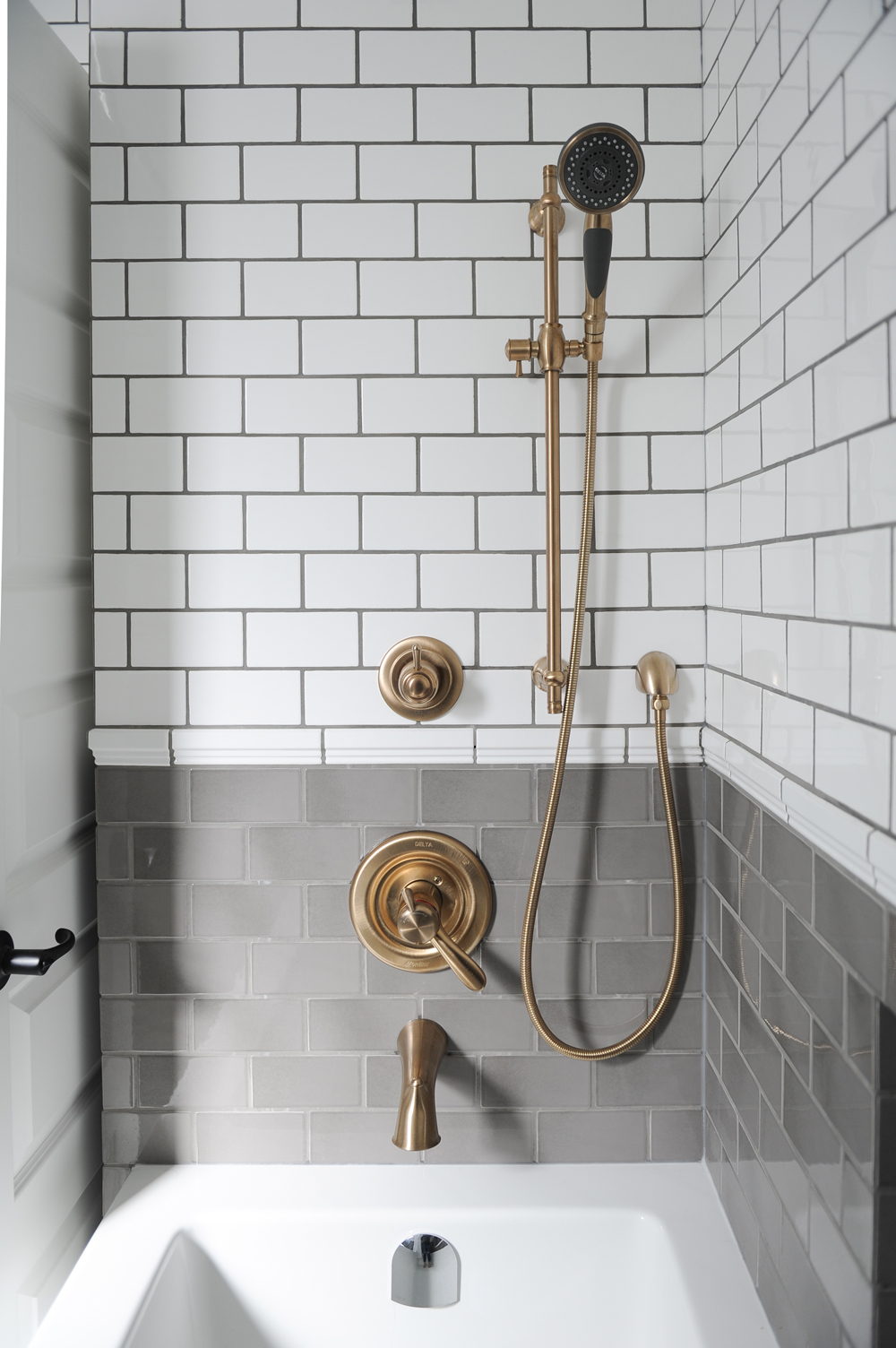
Transitions
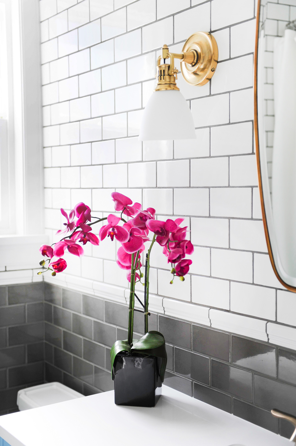
To keep the shower light and inviting versus institutional, Cara chose a charming two-tone colour scheme. A white chair rail marks the transition that is kept cohesive by grey grout. It is super easy to clean and makes the white tiles pop.
Related: New Home Trend: We’re Swooning Over These Exposed Shower Pipes
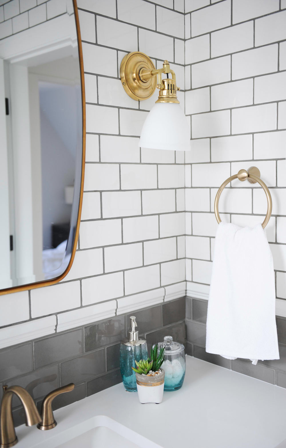
Winning Metals
Various brass finishes create a nuanced look that avoids the predictable. The tones vary slightly, but all are a warm and a rich foil to the monochromatic whites and greys.
Design Details
Cara’s vision for a grown-up, family-friendly space is epitomized in the main bathroom. It, like the rest of the home, brims with smart storage, carefree colours and thoughtful details like a fresh orchid on the vanity. The ease you feel the moment you walk in the home is continued throughout and what could be nicer than that?
HGTV your inbox.
By clicking "SIGN UP” you agree to receive emails from HGTV and accept Corus' Terms of Use and Corus' Privacy Policy.


