They say it takes two to make a thing go right, and Wes Thurn (a self-described interior stylist) and Daphne Nielsen, owner of Once A Tree Furniture, couldn’t agree more. The Vancouver-based duo have worked together for over 15 years creating beautiful interiors, and their latest project doesn’t stray from the course. This 4,500-square-foot home in West Vancouver was designed to suit its empty-nester owners, who craved a modern design with neutral colours. Daphne and Wes also wanted to pay homage to the space’s stunning surroundings. “The ocean-front lot is exceptional, so I had to consider the outstanding views from every angle,” says Wes. “It was imperative that the colours, lighting and furnishings blend in with this environment.” They do, naturally. Here’s an inside look.
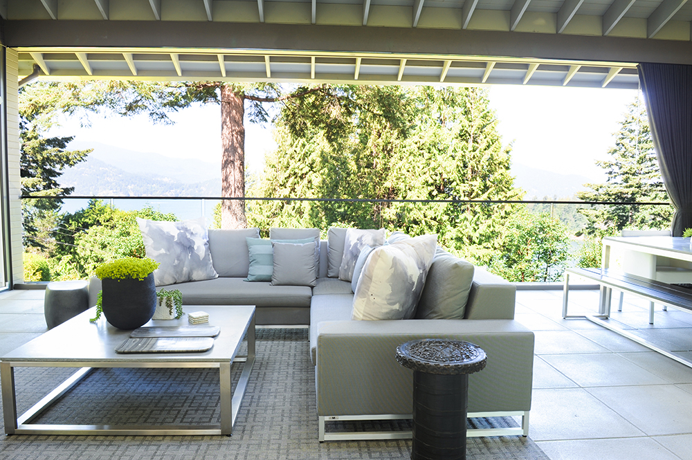
The View
“The covered outdoor area is an important part of this home,” says interior stylist Wes Thurn. “It’s the first thing you see from the front door and the rest of the house is literally built around it.” To make it transition seamlessly with the interior, Wes and Daphne chose neutral-tone furnishings that don’t compete with the view and don’t scream “patio set.”
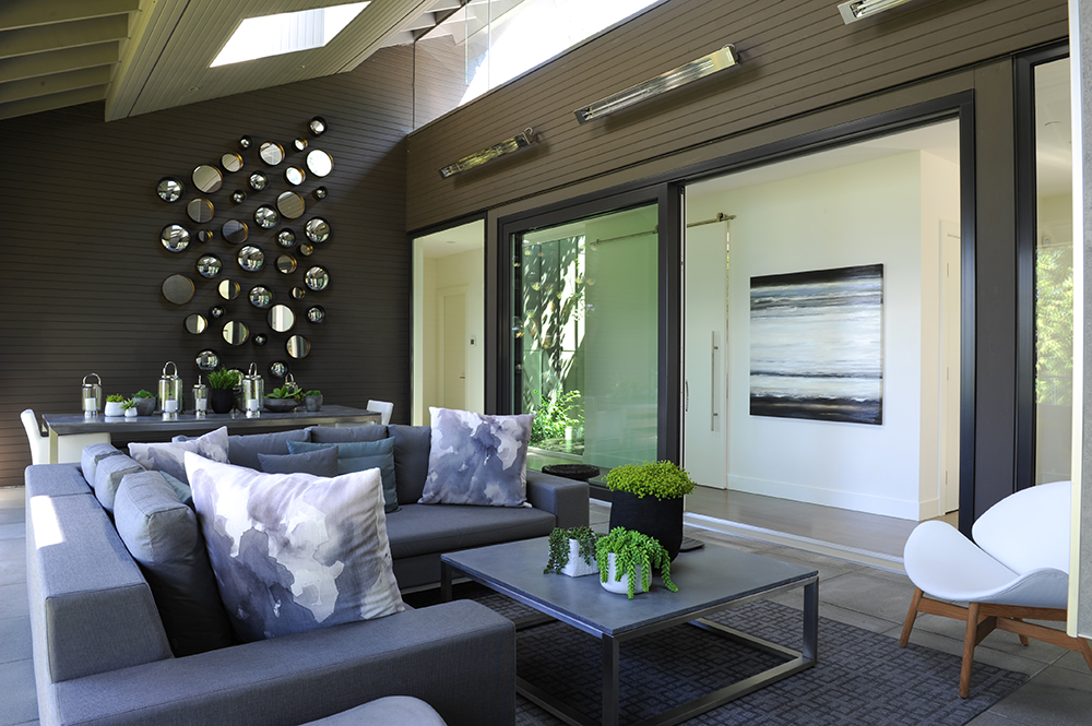
Outdoor Living
Furnishings establish a comfy family-room vibe that practical elements, like outdoor heaters and skylights, bring to life. “Because this area is heated, it’s an obvious choice for entertaining overflow,” says Wes. The skylights keep it bright and banish a closed-in deck feel.
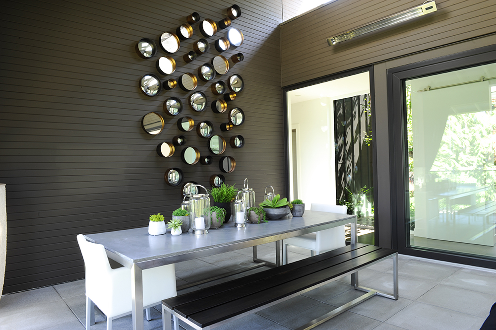
Dining Alfresco
Wes and Daphne’s mantra of “mix it up and keep it interesting” is on display in the alfresco eating area. Wes says, “The table and bench were custom-built to complement the seating area but not match it, which would have looked too contrived.” Bench bonus: it’s cheaper than chairs and accommodates extra spots for squeezing in grandchildren at larger gatherings.
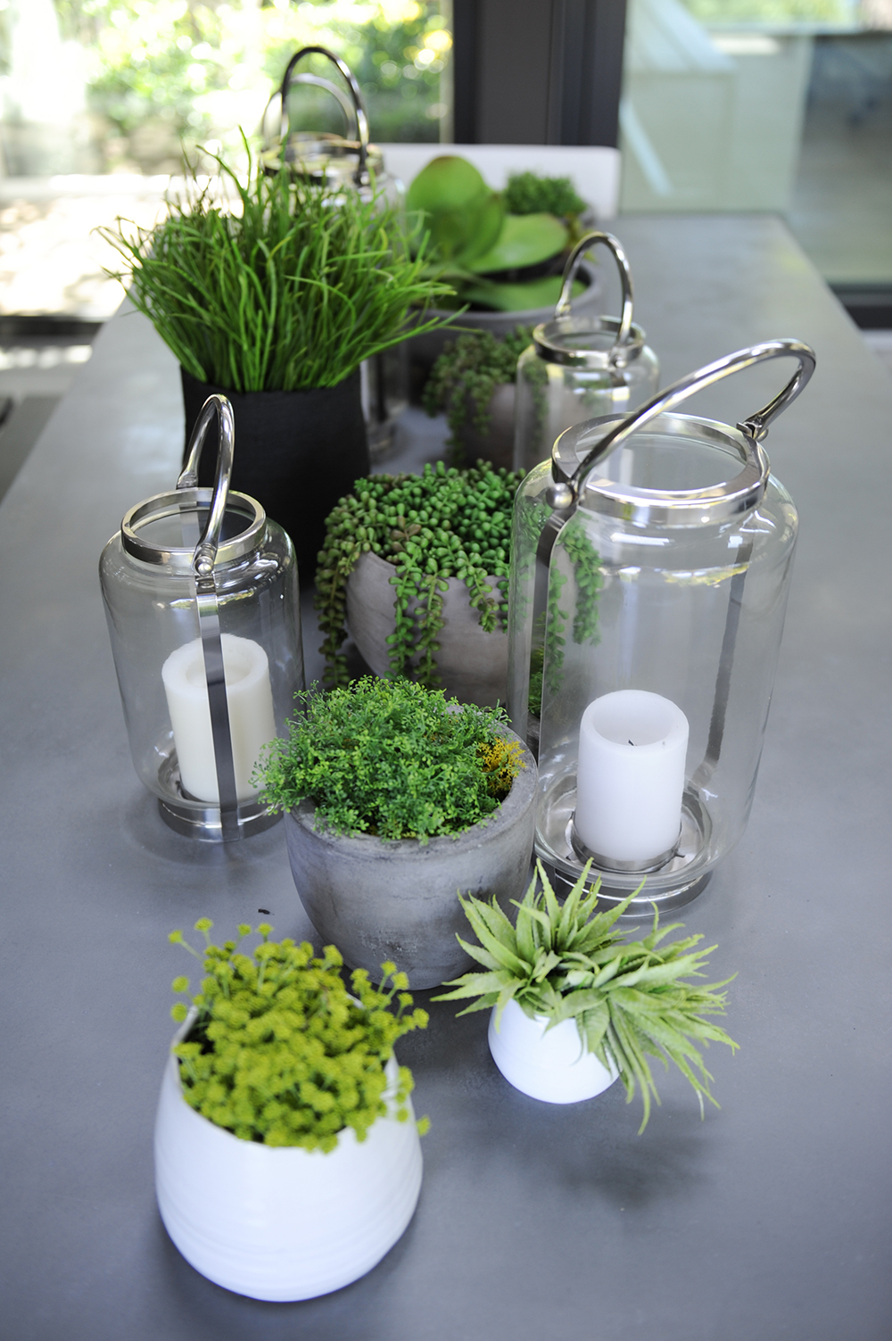
It’s Easy Being Green
The outdoor dining table showcases an artful arrangement of potted greens that complement the wooded property and are easy to maintain – a low-maintenance perk for the empty-nester owners.
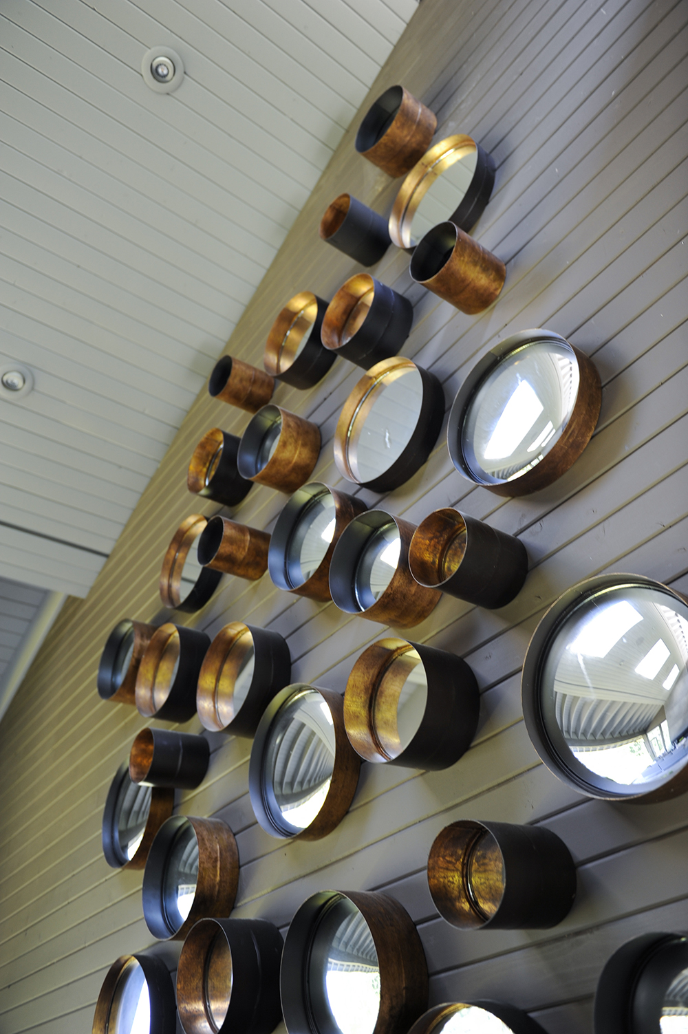
Mirror, Mirror
Wes hung a series of convex mirrors opposite the fireplace, following the slope of the roofline. “This large wall was a perfect opportunity to add another dimension to the space,” he says. “These mirrors reflect the flames of the fire and the surrounding greenery.”

Cruise Control
The home boasts breathtaking views of Howe Sound and Bowen Island.
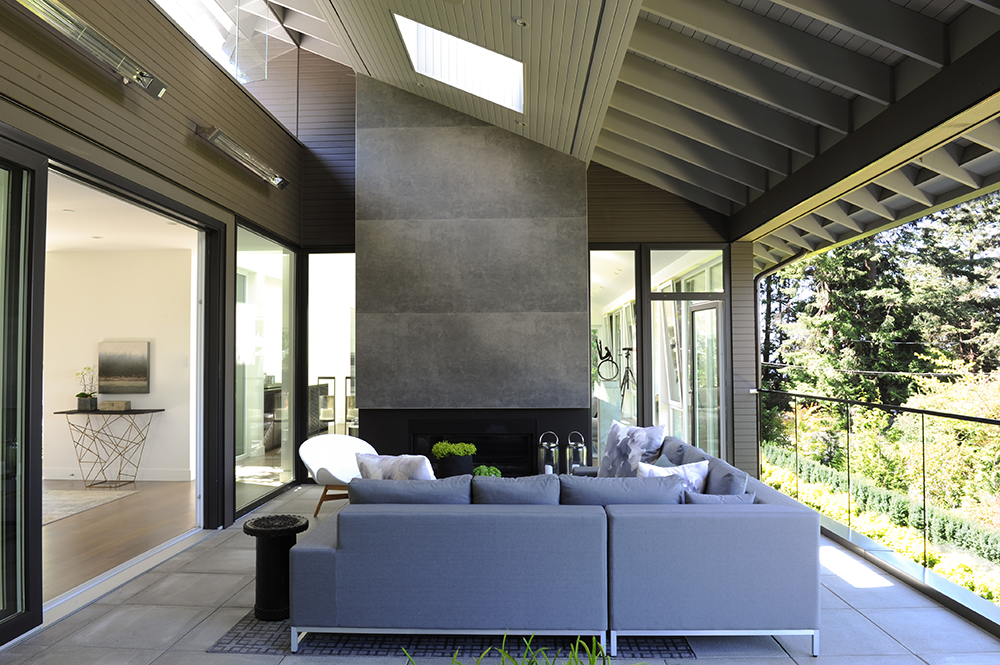
Decked Out Design
“The outdoor fireplace is both form and function,” says Wes. “It generates heat for cooler conditions and also gives the space more of a decorated feel that maximizes the seamless transition from indoors to out.”
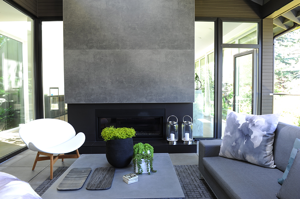
Grey Matter
The white chair, a crisp foil to the grey scheme, introduces the mix that Wes and Daphne love. It complements the living room furniture (visible through the glass panel behind it) and can be moved indoors when extra seating is required.
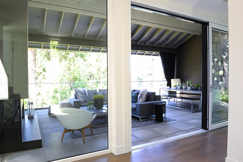
Inside Out
Sliding glass doors were a no-brainer for the living areas. “They’re unadorned to take in the incredible views,” says Wes. “Daphne and I only used window treatments where privacy was required and, even then, they’re minimal. In most rooms, privacy isn’t an issue as the lot is quite secluded.”
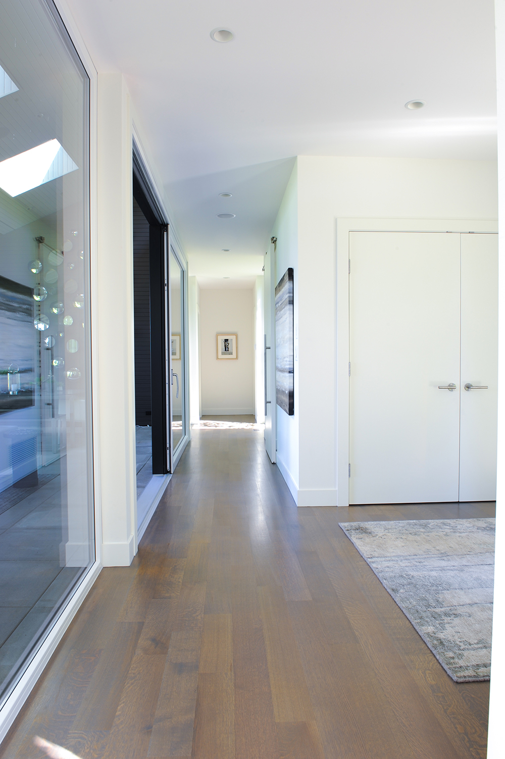
Hall Pass
Inside, uniform flooring material – in this case, flat-sawn European white oak – establish flow and continuity throughout the main floor.
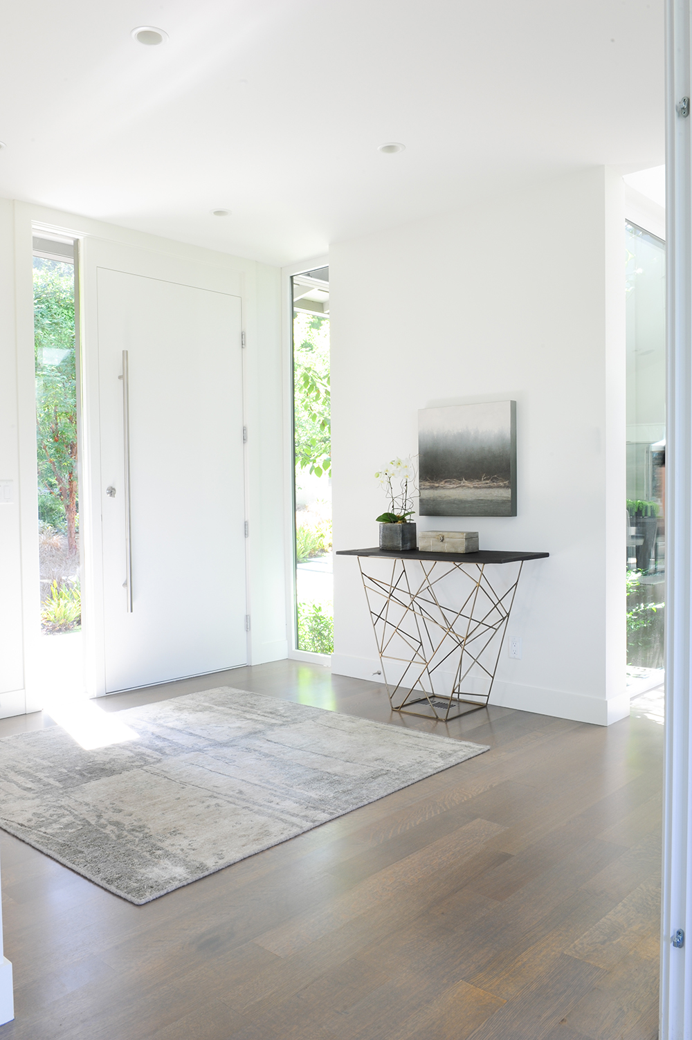
Open Air
A rug, artwork and a single piece of furniture define the entryway. “Because the table is the only furniture item here, it needed to be interesting,” says Wes. “It also introduces warm metals, rather than wood, which there is plenty of already.”
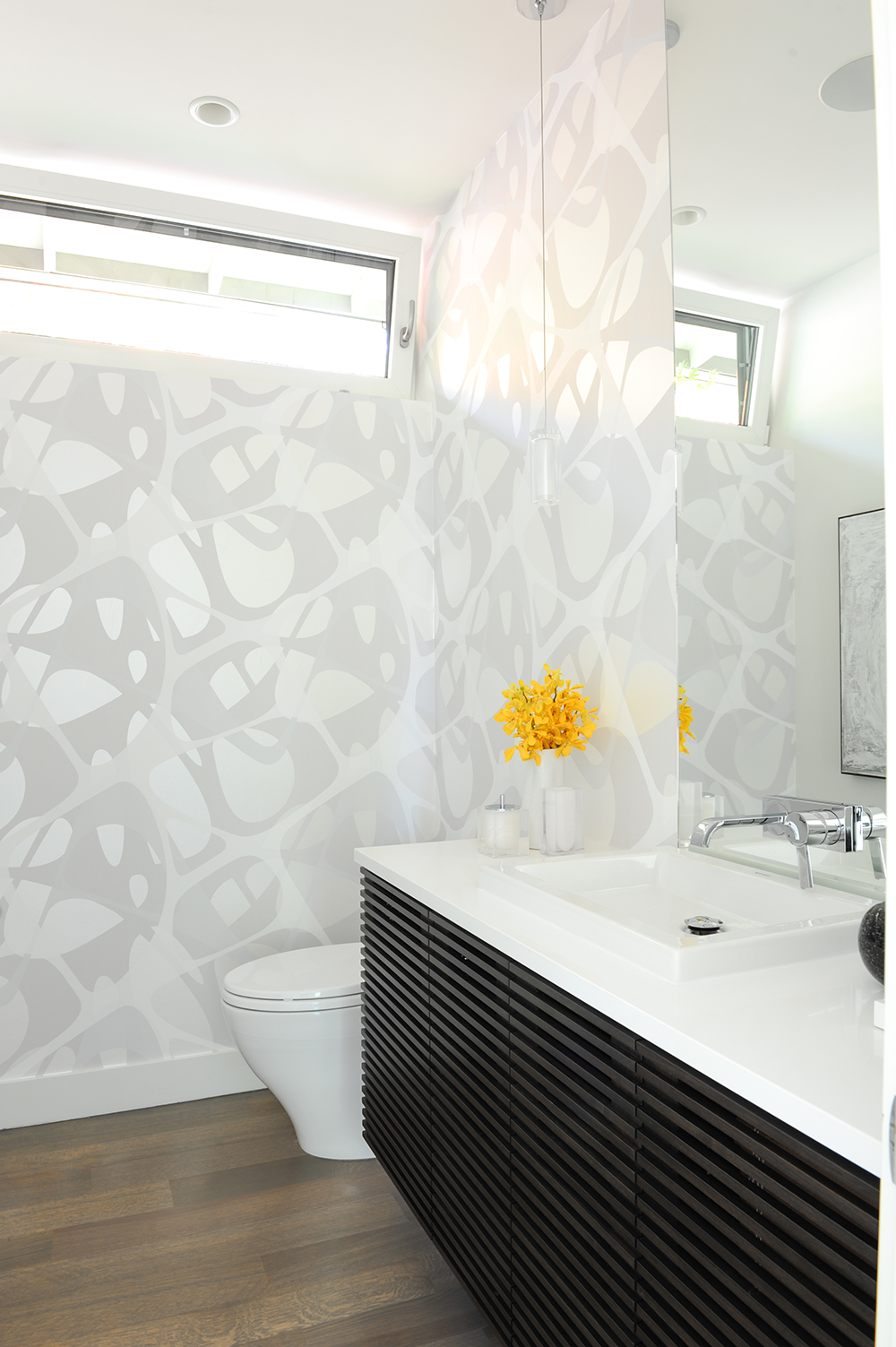
Pattern Play
“You spend less time in a powder room than in other rooms, so it can afford to be bold,” says Wes. Wallpaper, in an exuberant pattern but with subtle tones, ticks the bold box and complements the artwork. The custom-made slatted vanity references the living room’s built-in cabinet for continuity.
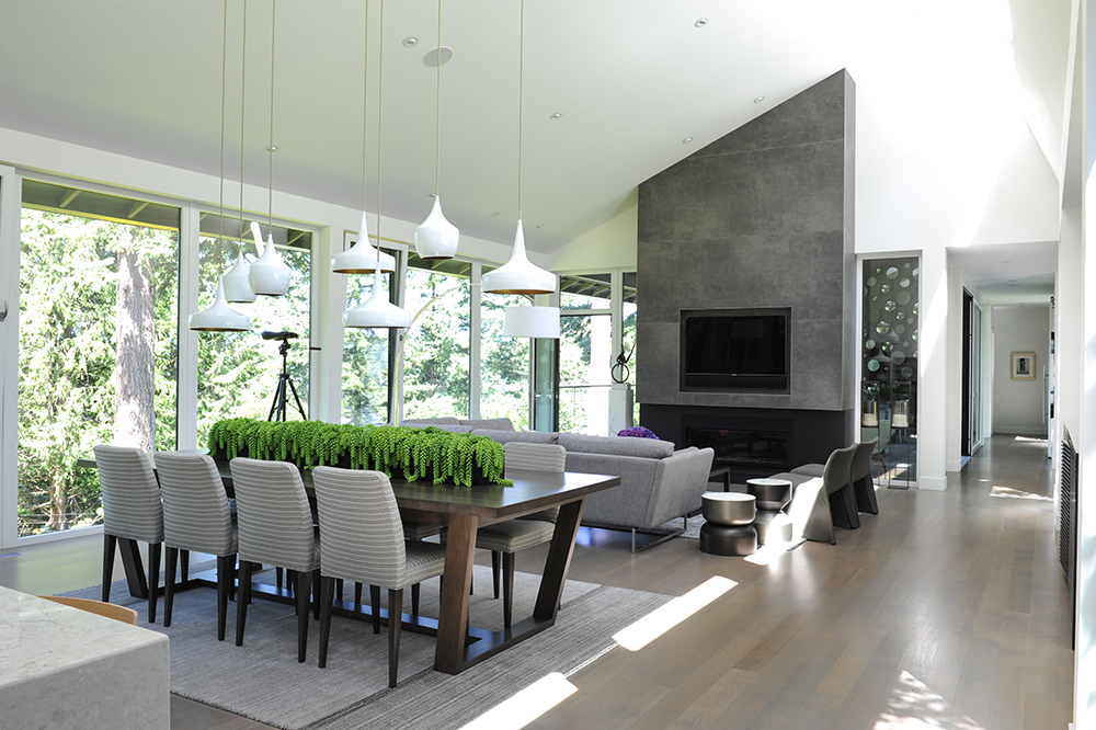
Open Living
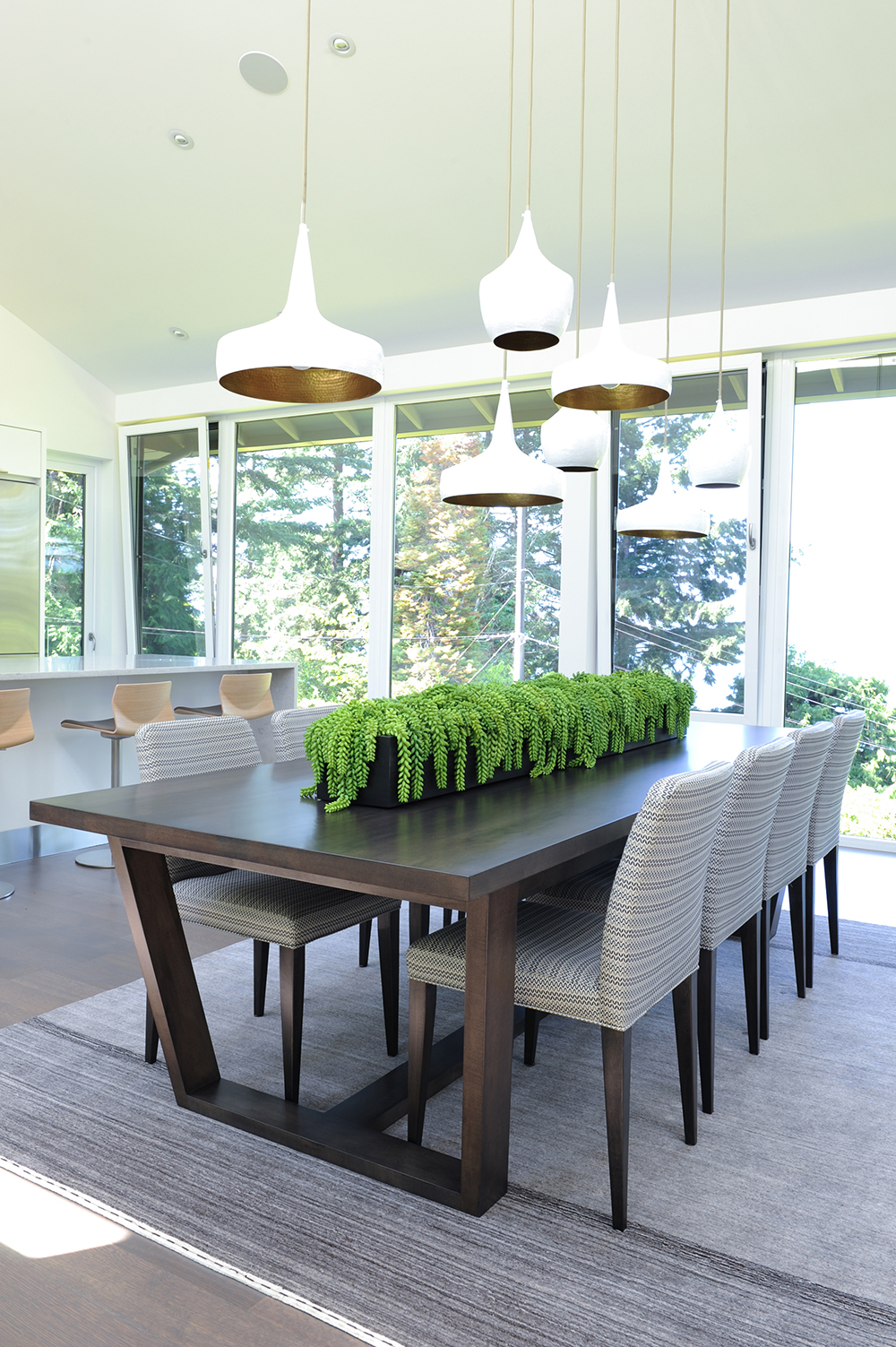
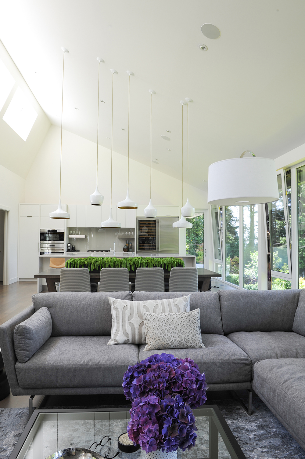
The slope and height of the ceiling above the dining table demanded some ingenuity. “I needed to make this sweeping space more intimate and add interest without creating a focal point that would distract from the view,” says Wes. To do so, he staggered a series of white pendant lights.
Lights the Way
Lined with hammered brass, the pendant lights exude a warm glow while their crisp white exteriors blend in with the rest of the room. An arrangement of greenery, rather than flowers, brings the surrounding outdoors in.
Open-Concept Kitchen
Hydrangea blooms introduce a zing of colour to the monochromatic space. Like all the furniture in the house, the dining room chairs were chosen to look great from every angle – even the back.
Lit from Above
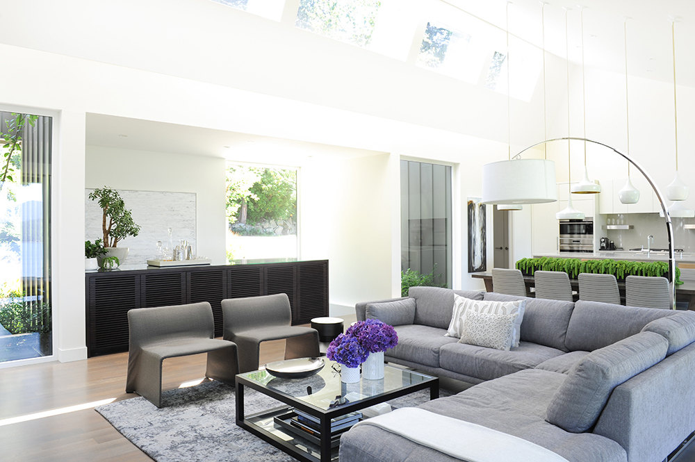
Daphne custom designed an extra-long slatted cabinet for ample storage in the living room. Its clean lines keep it sleek and the dark tone nicely punctuates the light-filled space.
Natural Beauty
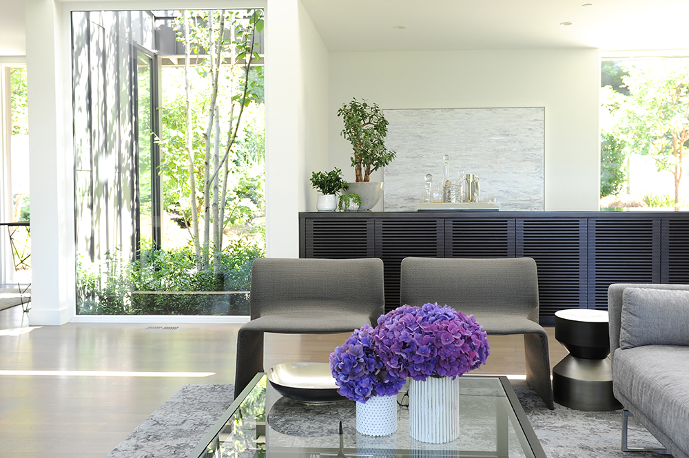
The living room’s glass panels showcase the home’s pastoral setting and, viewed from the sectional, present the outdoors like works of art. Inside, tonal artwork and a few well-placed plants continue that natural aesthetic without competing with it.
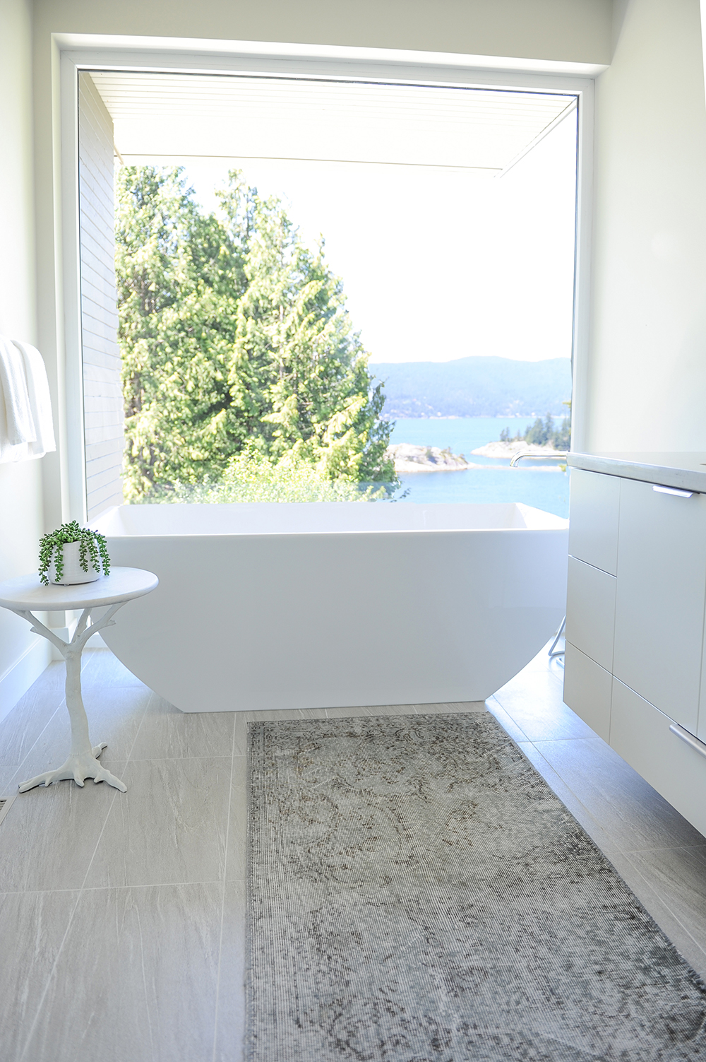
Serenity Now
The show-stopping master ensuite features a sleek vessel tub that is distinctly contemporary, yet has an organic feel echoed by something as magnificent as the glass wall’s view and as simple as the side table’s branch base.
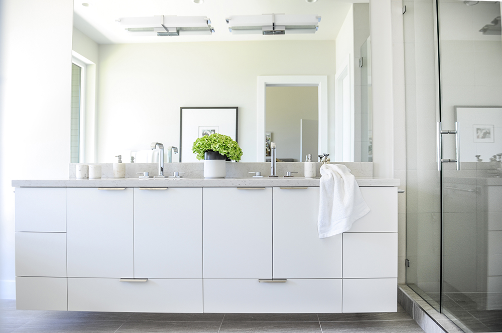
Floating Vanity
The custom-made vanity features ample storage but doesn’t feel bulky thanks to the pale palette and its silhouette. “It’s floating above the floor, so even though it is quite large, it feels light and like it’s above the trees,” says Wes.
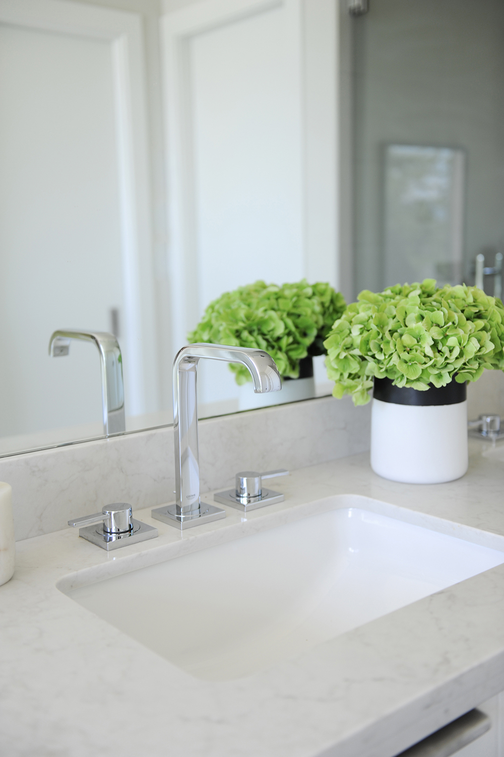
Smooth Finish
Undermount sinks maintain the ensuite’s clean lines and ensure the vessel tub and view are the room’s focal points.
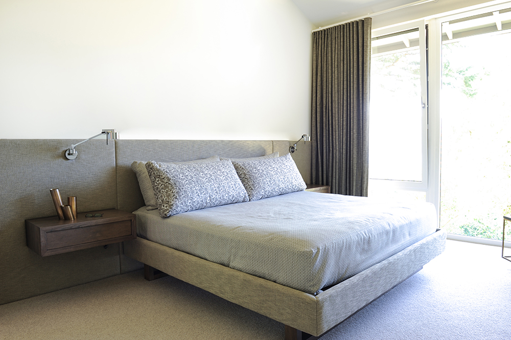
Zen Master
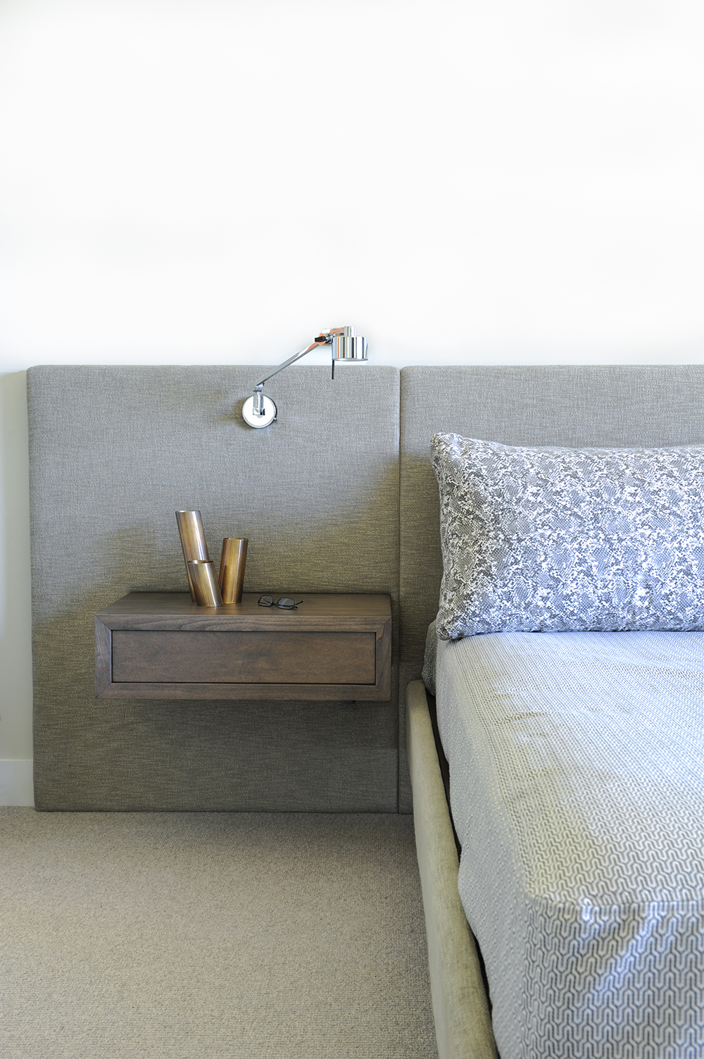
“The master bedroom has a large walk-in closet, which meant there wasn’t a need for much furniture,” says Wes. The custom-designed bed and floating side tables run with that, presenting a streamlined and airy arrangement.
Wall-Mounted Design
Daphne custom-designed the bedroom furniture to be functional and comfortable. The upholstered panels act as a soft headboard behind the bed and extend beyond it to house floating side tables and reading sconces.
Sleek Storage
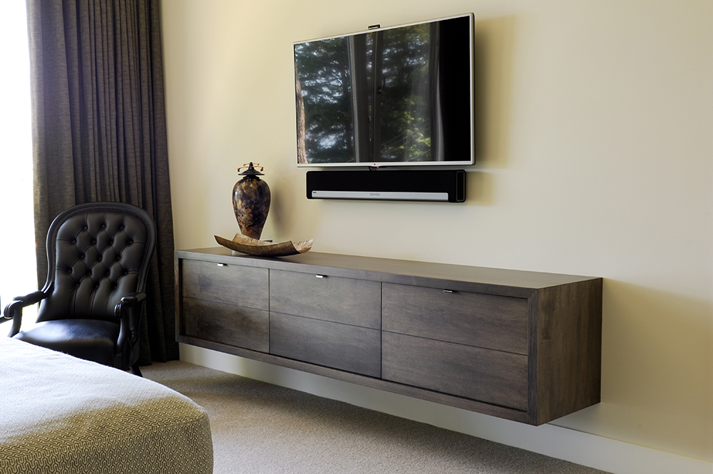
The master bedroom’s floating dresser is a continuum of the vanity in the ensuite. As well as providing storage, it’s a surface to display favourite objects. It also prevents the wall-mounted TV from looking lost on the wall.
Chair the View
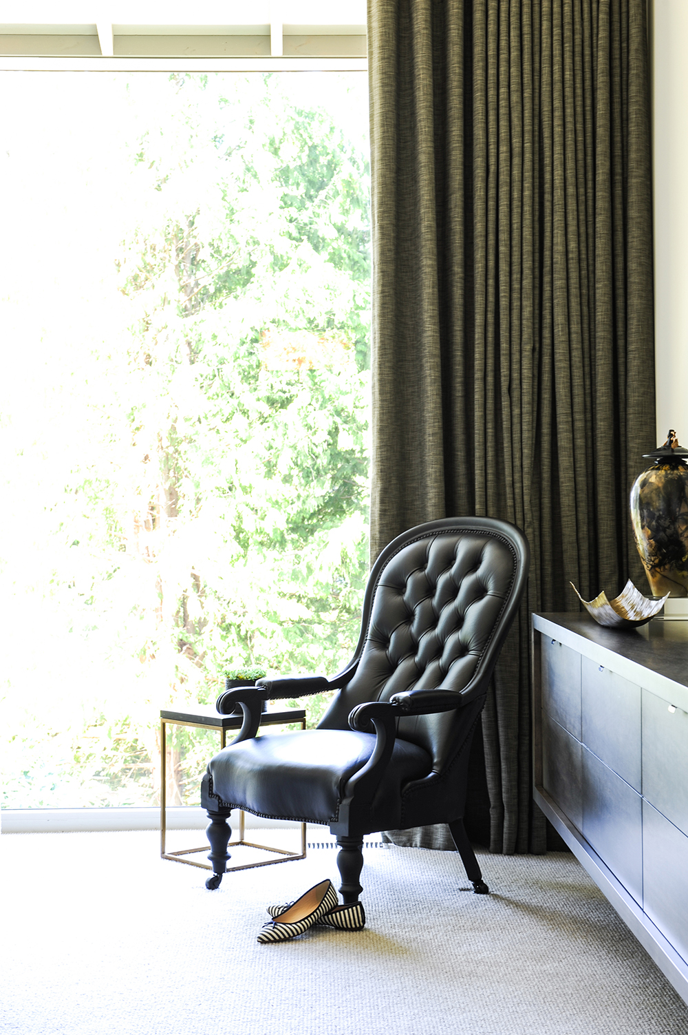
A piece from the homeowners’ previous house, this chair had glossy chestnut woodwork that was revitalized with a coat of black paint. “I like to include something from my clients’ past in a new project,” says Wes. “I also love the way this chair acts as a juxtaposition to all the streamlined pieces in the rest of the bedroom.”
HGTV your inbox.
By clicking "SIGN UP” you agree to receive emails from HGTV and accept Corus' Terms of Use and Corus' Privacy Policy.


