“It’s a combination of audacity and restraint,” says designer Nina Hamilton of this 7,000-square-foot Craftsman-style home. The art- and travel-loving owners had amassed beautiful furniture and art, but needed Nina’s help in putting it all together. She boldly grouped collections to make the space less cluttered, wallpapered, custom-designed new pieces and much more. The result is a highly personalized space that, rather than looking like a makeover, feels as if it evolved over a lifetime.
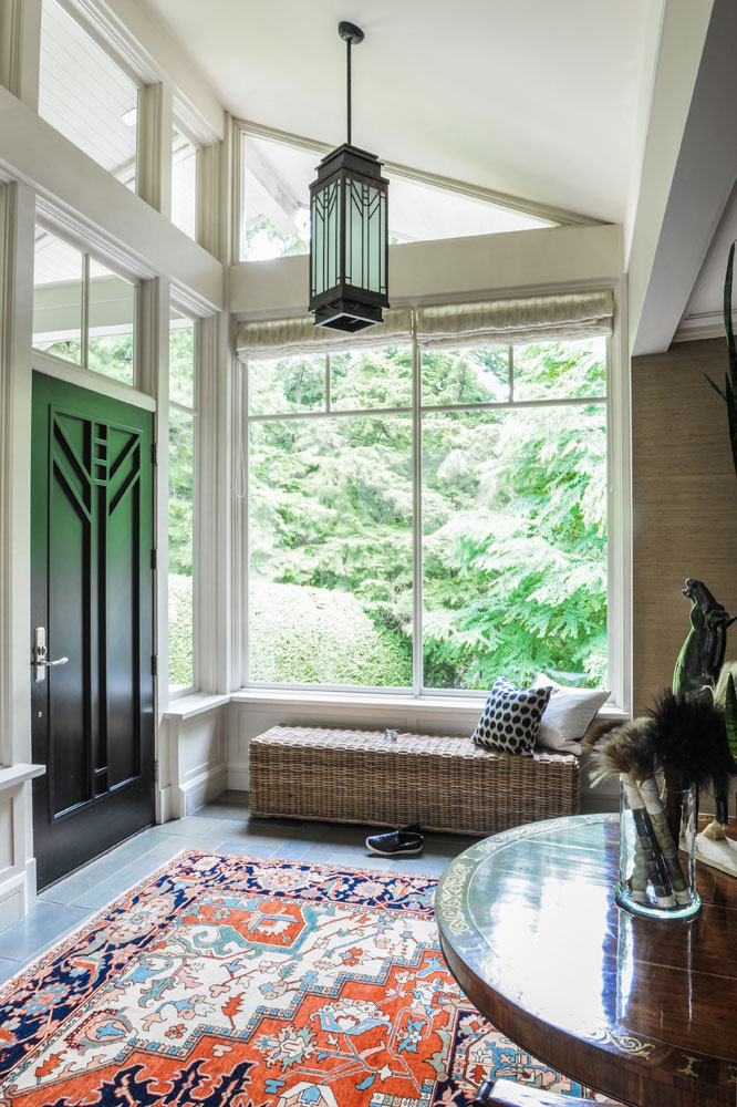
A Fine Balance
The dynamic decor in the front entrance is an intimation of what’s to come in this home that brims with personality. Designer Nina Hamilton chose grasscloth for the walls to highlight the Asian antiques, then relied on an expert mix of furnishings. “I added the centre table and the wicker bench and chose woven blinds. They temper the space’s formality, while the carpet brings back some grandeur.”
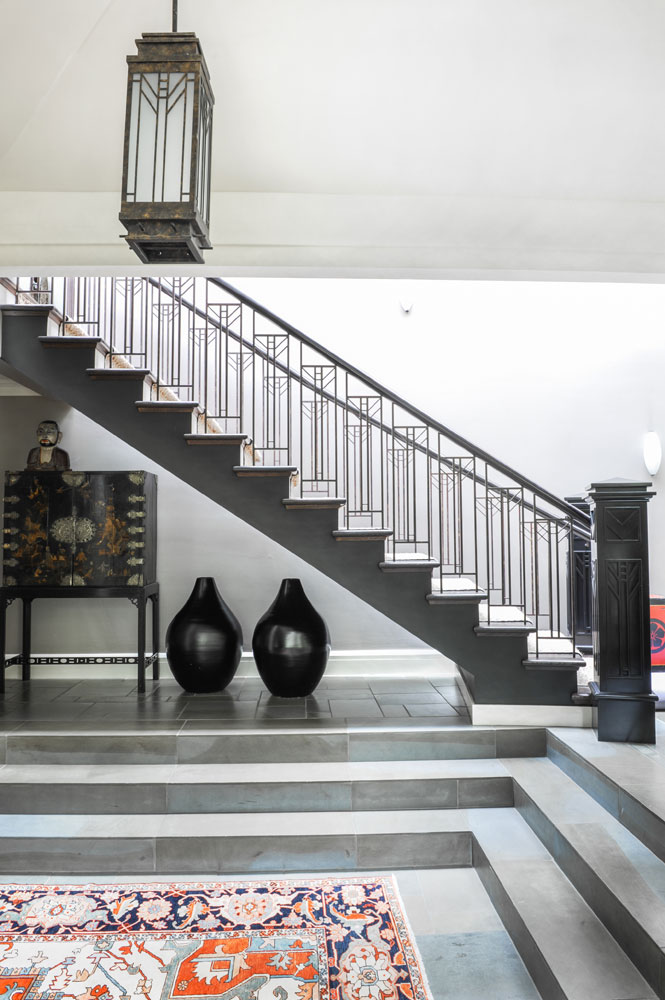
Arts and Crafts
The impressive staircase has a Craftsman flavour – note the intricate metal work – that Nina complemented with the pieces from the homeowners’ collection. We love how she filled the empty space beneath the stairs with an Asian cabinet and sculptural vases, and continued the pattern and colour into the space with a Persian rug. “It’s an easy way to add another layer of interest,” she says.
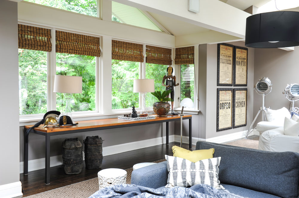
Table Talk
“The extra-long console table was custom-made to display some of the owners’ antiques and artifacts,” says Nina. “I added the lamps and other accessories for an effect I call ‘artful layering.'” As in the entryway, the blinds (here in bamboo) keep the mood informal. “I prefer a mix of styles – old and new, modern and traditional, casual and formal – that reflects the clients’ lifestyle and character.”
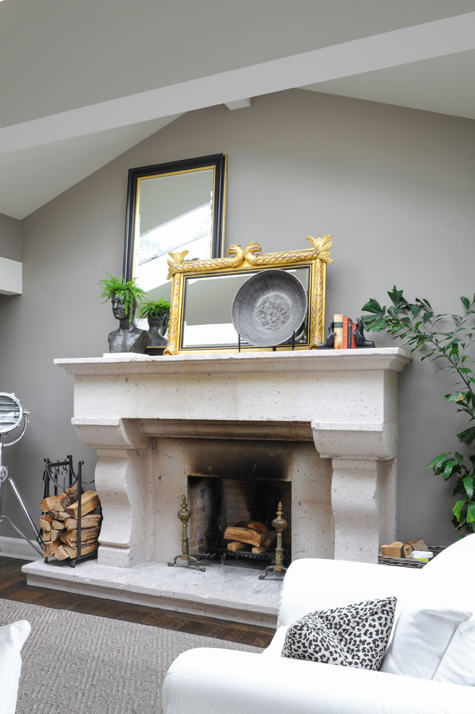
Smoking Style
The living room’s stone fireplace is less than perfect, and Nina wouldn’t have it any other way. “You might notice we left the smoke stains on the front. I prefer things to be a bit worn or even broken – it removes the fear of ruining perfection. It’s human, it’s a lived-in space, you can relax.”
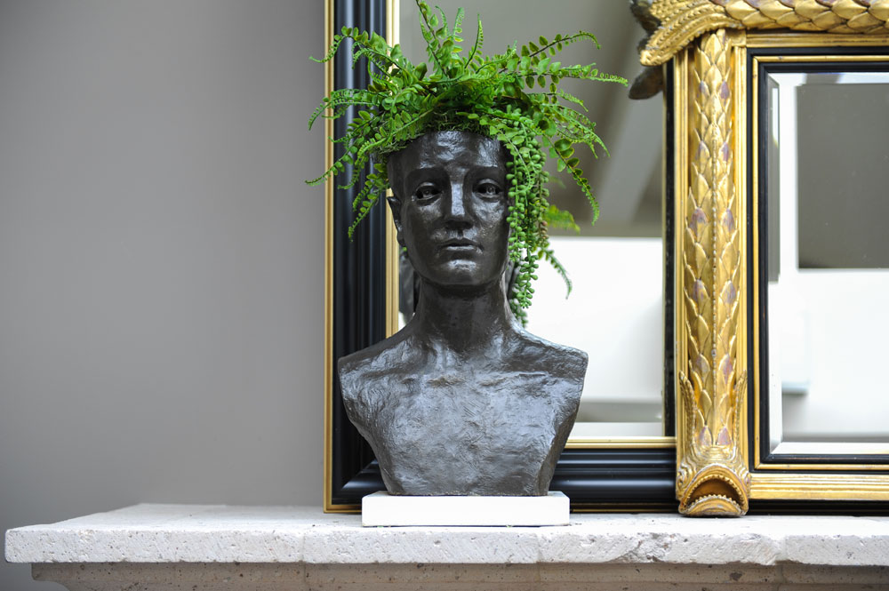
Ferny Business
Nina is a strong proponent of adding humour to a space, and this fern-topped head on the mantel speaks to that.
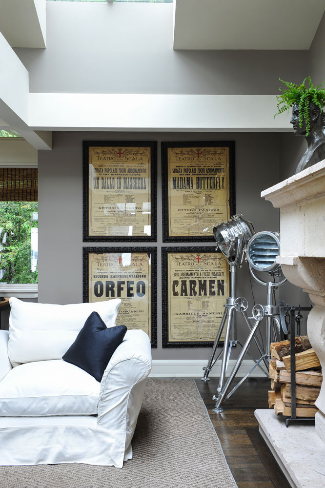
Opening Night
The framed opera posters and klieg lights are part of the owners’ collection. Nina grouped them together for maximum impact and unity.
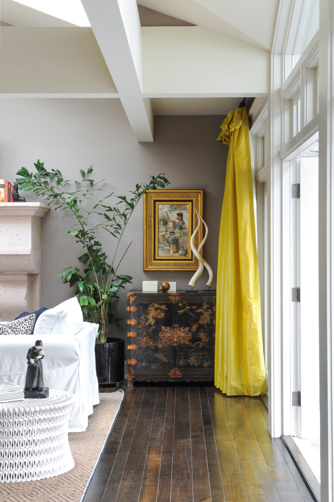
Pop of Colour
These vibrant silk drapes are more than just a pretty colour. “They were the single inspiration the clients gave me when they asked me to redecorate,” says Nina. “I took that to mean modern but quirky – a willingness to step out of a box. The chest was the clients’ but I added the whimsical accessories as a juxtaposition to this formal antique.”
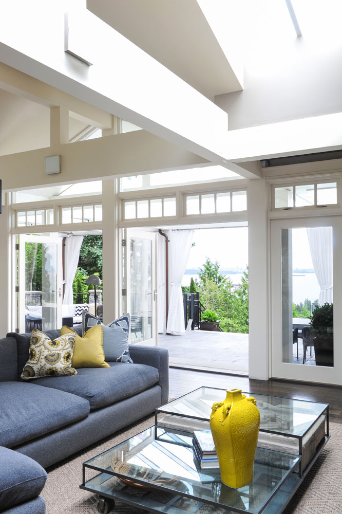
Grey Matters
Nina continued the zingy yellow in the seating area with a bright vase and subdued cushions. The casual sectional is in keeping with Nina’s mix of styles: “The owners loved the comfort of their previous, more traditional white sofas, and since we were combining modern and traditional, we opted for a contemporary charcoal Montauk sectional.”
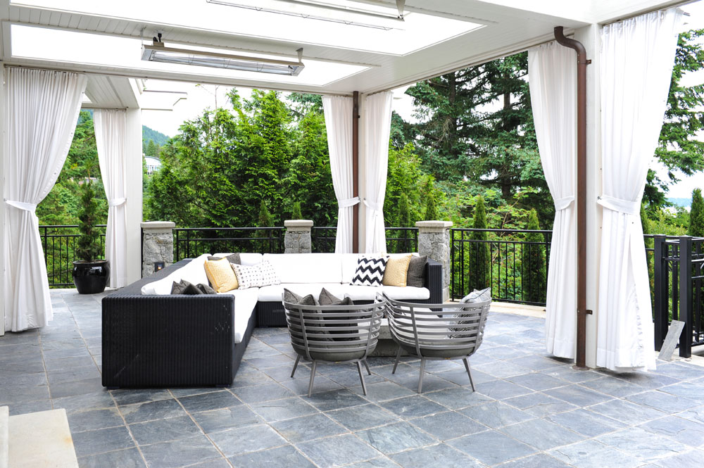
Outdoor Elegance
The inviting conservatory is finished with black slate tiles and custom-made white canvas drapes. The seating area features a comfy sectional and sleek rounded armchairs, all from Bloom Furniture. We like how the cushion colours and patterns reference the interior decor.
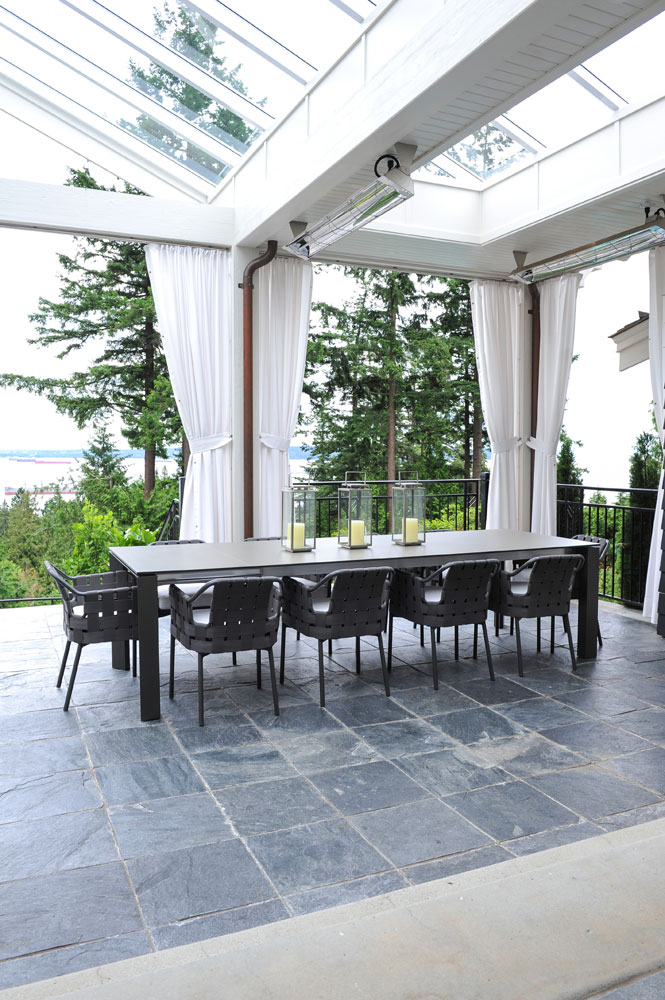
Dining Out
The dining area of the conservatory is minimal, yet elegant. The slate-grey table and chairs almost blend in with the tiles, keeping the unspoiled view the star of the show.
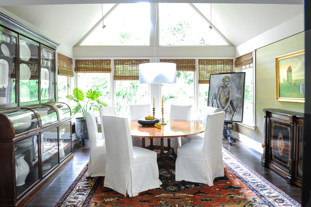
Dining In
Nina accessorized the owners’ formal round wooden dining table with custom-made slip-covered chairs. Their crisp white and soft tailoring are a nice foil to the more serious antiques, artwork and Persian rug.
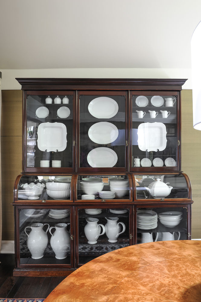
White On
This spectacular glass-fronted china cabinet (part of the owners’ furniture collection) acts as an elegant frame to the dishware inside. Keeping everything white makes a strong visual impact and doesn’t distract from the fluid shape and style of this unusual cabinet. The burled wood tabletop offers a warm contrast.
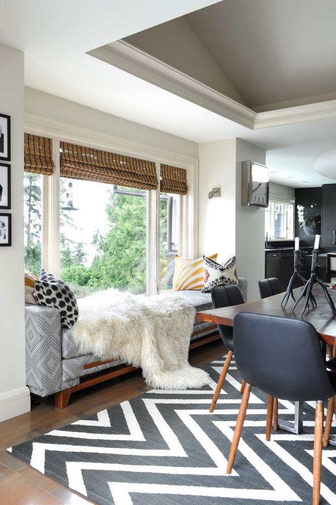
Double Duty
“The owners had an old daybed in this window,” says Nina. “But since they spend so much time here on their laptops, I designed this custom one with USB access built in, along with pull-out trays for coffee or a glass of wine.”
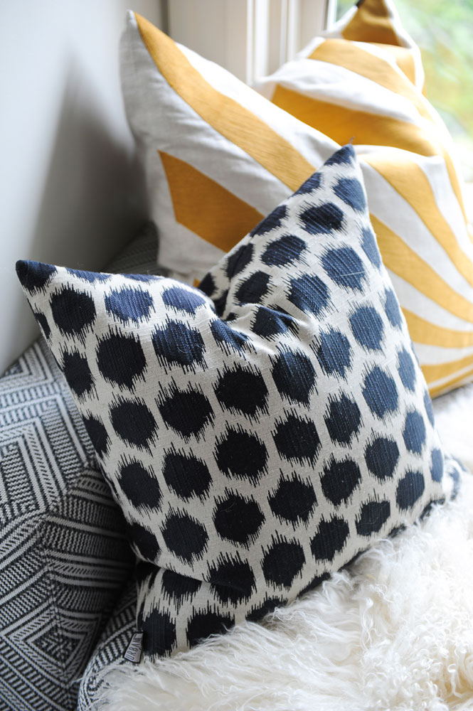
Mix It Up
The cushions Nina chose for the daybed are “traditional and contemporary with a touch of tribal,” she says.
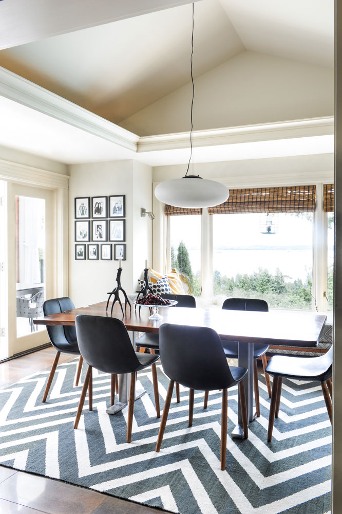
In Black and White
“The dining area reflects the clients’ love of black and white, and my love of modern graphics,” says Nina. “This amazing wool carpet from Colin Campbell grounds the whole room.” Above it sits contemporary Italian chairs from Livingspace mixed with a casual live-edge dining table.
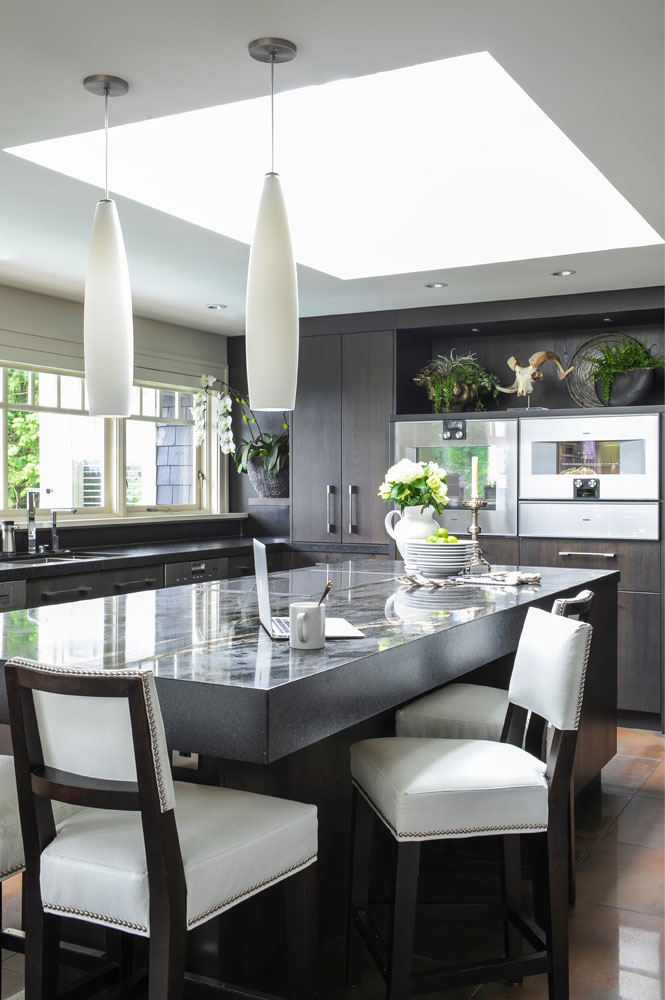
Island Time
Nina punctuated the dark tones of the kitchen with bright white stools that offer comfy backrests and spiffy nailhead detailing. They were custom-made by Western Design. The sleek pendant lights echo their pale shade. We love the way one end of the custom-built island floats so there’s ample room for stools on both sides and lots of legroom.
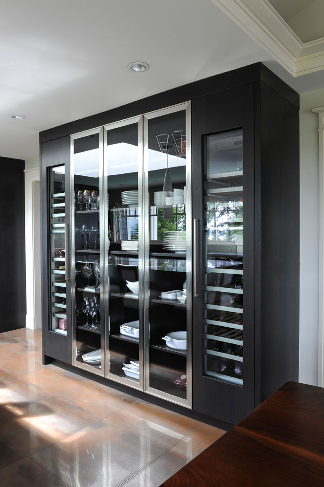
A Place for Everything
A dramatic storage feature like this makes traditional cupboards seem awfully plain. Like the rest of the kitchen cabinetry, it was custom-made by Redl and incorporates dark wood with stainless steel. Shelves for dishware are flanked by refrigerated wine cabinets that lend a nice symmetry.
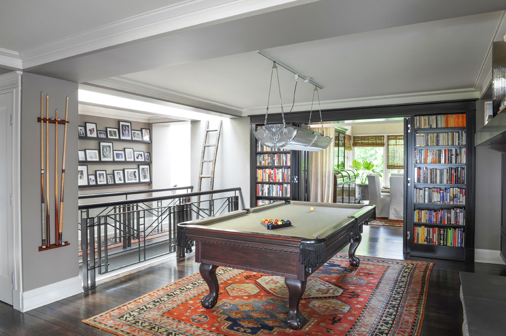
Felt Like It
Nina changed the pool table’s red felt top to grey felt for a more cohesive look that lets the owners’ colourful rug and collection of books and photographs stand out.
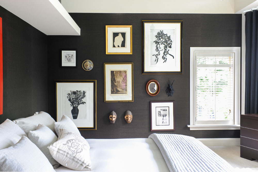
Master Retreat
Nina covered the master bedroom’s walls with charcoal grasscloth. It adds dramatic colour, rich texture and the perfect backdrop for some of the owners’ artwork.
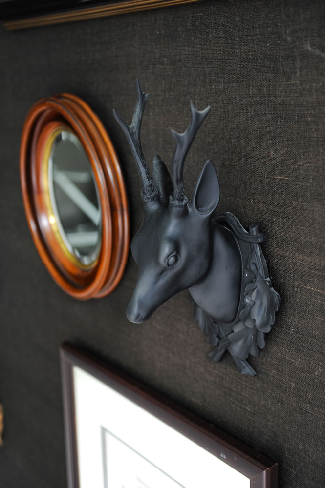
Finishing Touches
“I added playful accents to the bedroom’s artwork wall,” says Nina. Each piece was sourced from local a supplier, such as this stag’s head from The Cross Decor & Design.
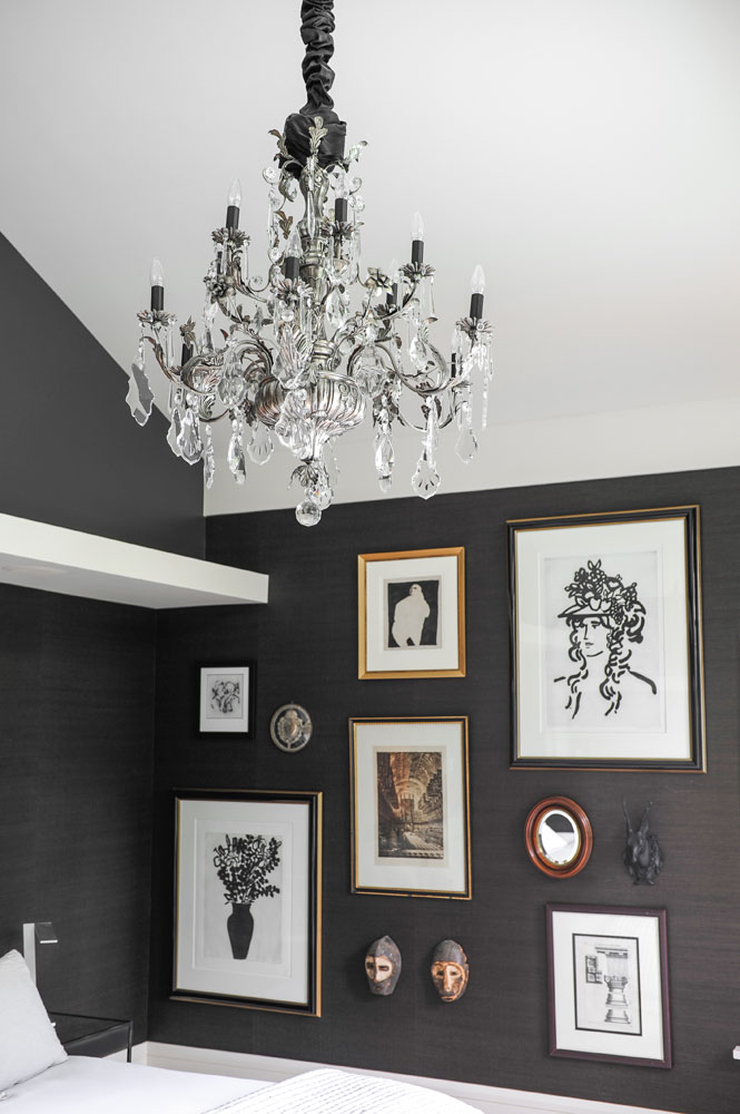
Antique Chic
Nina knew she wanted a showstopper chandelier for the master bedroom, so she asked the owners to help out. “They travel a lot,” she says, “so I asked them to keep an eye out for one on their travels. They found this one at an antique store in London, England. It looks like it was made for the space.”
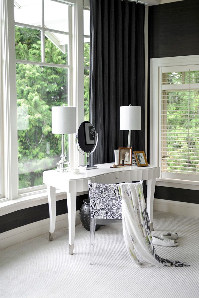
Sitting Pretty
Having the luxury of enough space for a makeup table in the bedroom is a dream come true for many, so that table better live up to the honour. This one that Nina had custom-made certainly does. The lamps add smart symmetry and scale, and the framed family photos layer in personality.
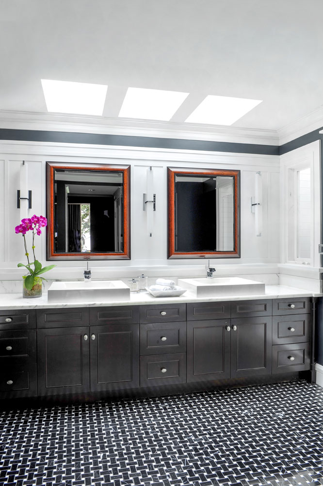
Double Double
Nina painted the master bathroom’s expansive two-sink vanity charcoal to pick up on the woven black and white marble floor tiles. The wooden mirror frames have a warm, rich patina that imbues a soft natural tone to the mostly monochromatic space.
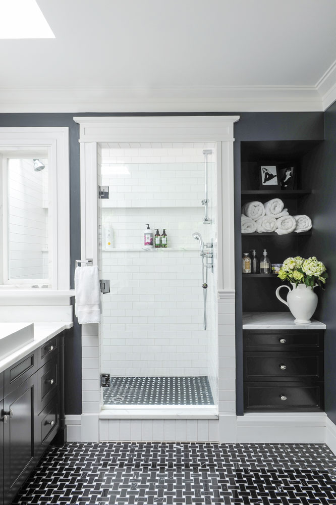
Smart Storage
Shelves and built-in drawers that would work in any room look especially handsome in the master ensuite and provide concealed storage as well as a place to perch pretty things such as photos, soaps and fresh blooms.
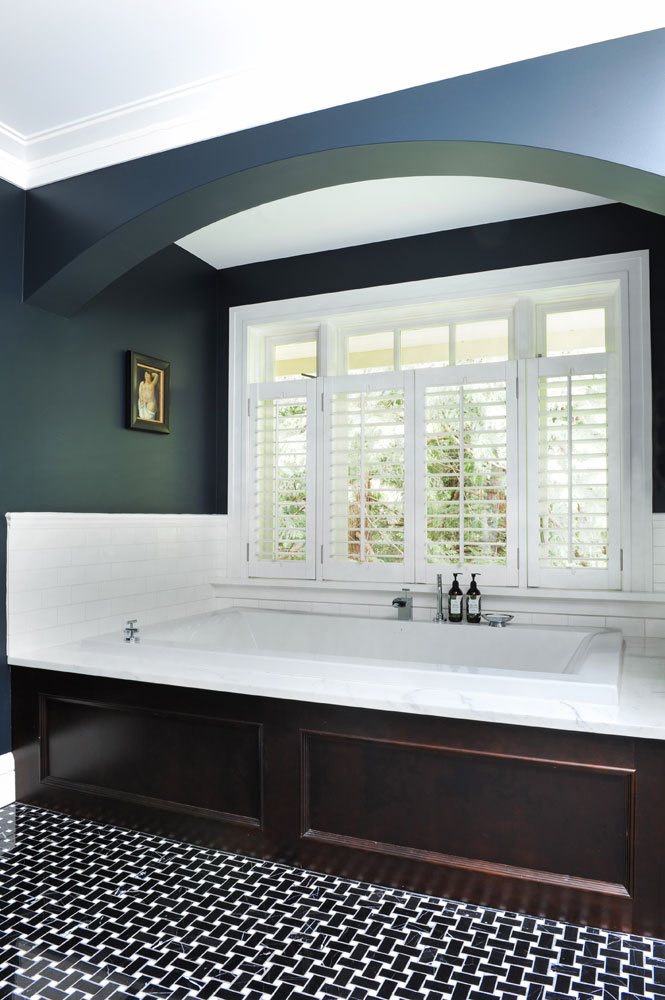
Wood You?
Dark wood panelling in a master bathroom bucks the go-to white palette and makes a bold and warm statement. It has an almost old-world feel that’s energized by bright white subway tiles and shutters.
HGTV your inbox.
By clicking "SIGN UP” you agree to receive emails from HGTV and accept Corus' Terms of Use and Corus' Privacy Policy.


