“The owners wanted the home to be luxurious, with a New York City industrial-loft vibe,” says designer Kelly Reynolds of Vancouver’s Falken Reynolds. But the drywalled, drop-ceiling space (originally two adjacent apartments) was a far cry from that. Combining the units and gutting them revealed a design dream: original beams, bricks and concrete walls. Kelly amped up the backdrop with custom millwork to showcase the owners’ extensive art collection and layered in materials that were luxurious, yet still practical for this professional couple and their five dogs.
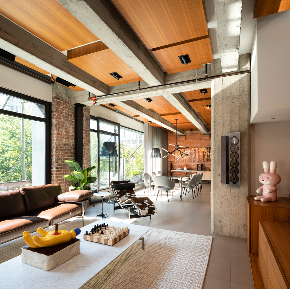
Teak Talk
You know that design is paramount when even the ceilings are compelling points of interest. “I layered in boxes of teak on the ceiling to add warmth and help manage acoustics in the main living space,” says designer Kelly Reynolds. “The rhythm of their varied heights playfully references the clients’ love of music.” Can you spy the vintage Bang & Olufsen CD player?
Related: These 10 Rockin’ Audio Rooms Are Ready for a Major Jam Session
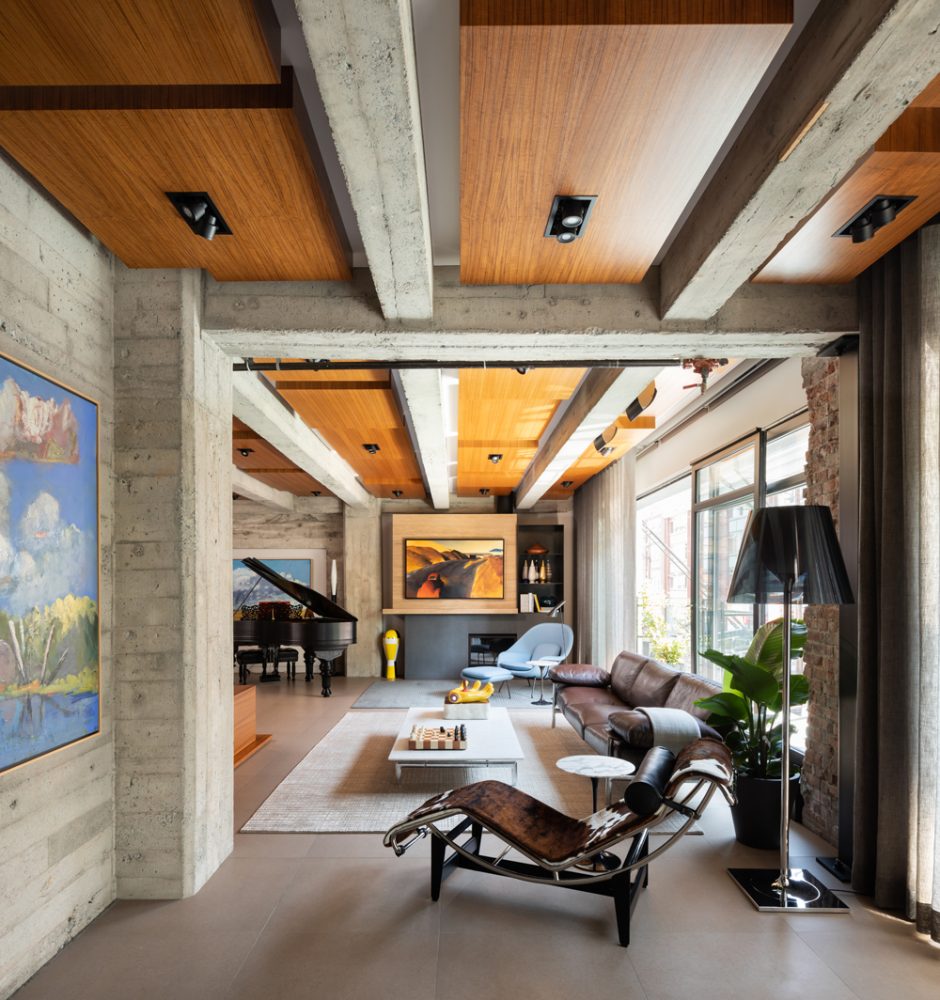
Lounge Wear
An LC4 chaise lounge by Cassina throws some curves into the space, and we love how it’s positioned away from the wall to frame the living area. The Flos floor lamp adds visual interest, while its dark palette doesn’t compete with the bright artwork.
Related: How Do You Strike a Balance Between Modern Design and Warmth? Ask This Vancouver Home
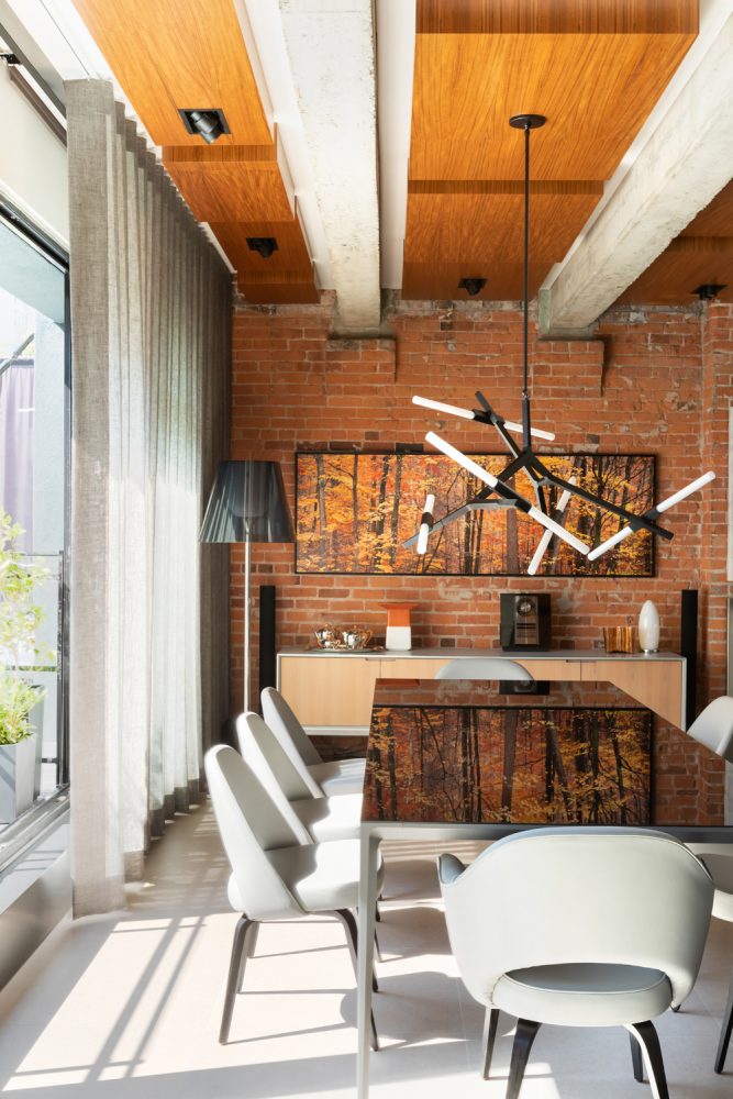
Natural Warmth
The “Maples in Gatineau Park” painting by Steven Friedman seems almost colour-coordinated with the dining room’s original brick walls. The Long Island table by Rimadesio reflects its beauty. Kelly chose the upholstered Saarinen chairs for their comfort and simplicity, while the custom drapery of heathered sheer linen is from Cloth Studio. “It feels light and airy, while providing enough coverage for privacy,” says Kelly. The Agnes Chandelier is from Roll & Hill.
Related: This Polished Condo Will Make You Fall in Love With Exposed Brick All Over Again
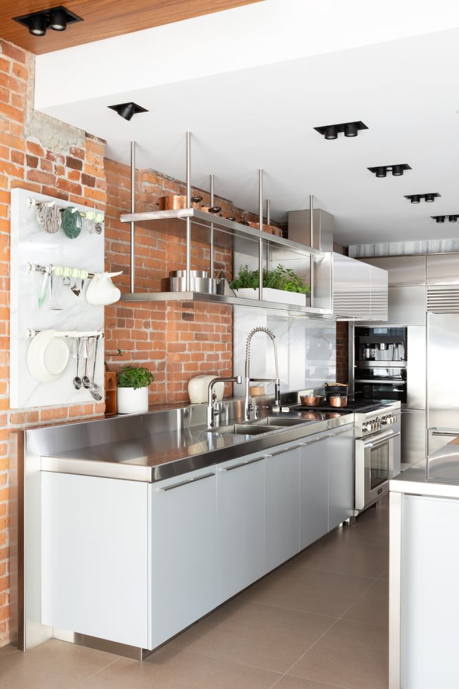
A Mix of Ingredients
The kitchen’s mashup of materials defies categorization, which is precisely why it looks so fantastic. “With so many other clean and polished surfaces in the kitchen, the rough exposed brick acts as a juxtaposing texture,” says Kelly. “It grounds the space, making it feel more casual and referencing the provenance of the building’s industrial origins.”
Related: From Modern to Minimalist: Top Kitchen Design Styles
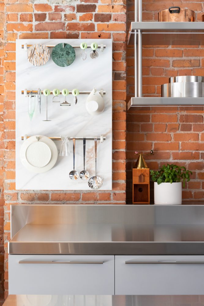
On Display
The textural rough-hewn beauty of the exposed brick was not without its own challenges. Kelly says, “It’s incredibly uneven, so I formed a low backsplash in stainless steel to create a clean interface for the sink cabinets and range, and behind it I added a shelf and marble board that create functional display surfaces for Alessi small appliances and utensils.”
Related: Backsplash, Tile, Cabinetry: The 15 Top Kitchen Trends for 2020
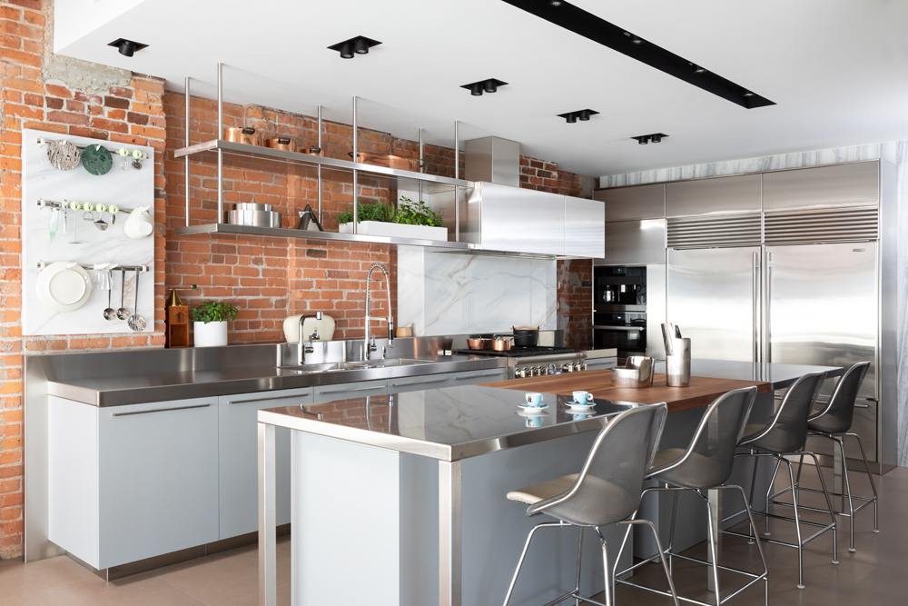
Shelf Life
The kitchen’s open stainless-steel shelves display the owners’ collection of copper cookware and boast a little herb garden. “The shelves were quite complicated to install, since there is no visible connection to the ceiling,” says Kelly. “We knew the shelves would be quite full, so we wanted the connection to be as seamless as possible.” We love how they are in sync with the lines of the adjacent range hood.
Related: This Vancouver Heritage Home is Cool and Contemporary Without Forgetting Its Roots
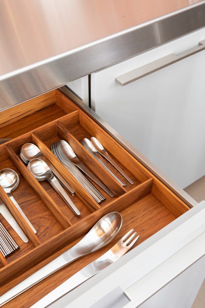
Form Meets Function
If the little details mean a lot, this cutlery drawer has significant heft. The teak in the custom divider references finishes throughout the home, for thoughtful continuity and practical design. “It showcases a set of Alessi cutlery,” says Kelly. “Since the exterior of the drawers are painted white, the teak is like a rich, warm surprise inside.”
Related: 15 Unique Flatware Sets That’ll Be the Talk of Your Next Dinner Party
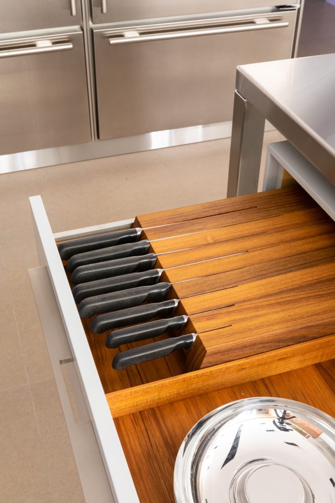
The Sharpest Knife in the Drawer
The kitchen’s custom finishes continue in this ingenious feature: a compact knife block that’s housed in a drawer, so that it’s out of sight and remains free of dust.
Related: This Tablet Stand Doubles as Utensil Storage (and 13 More Dual-Purpose Kitchen Gadgets)
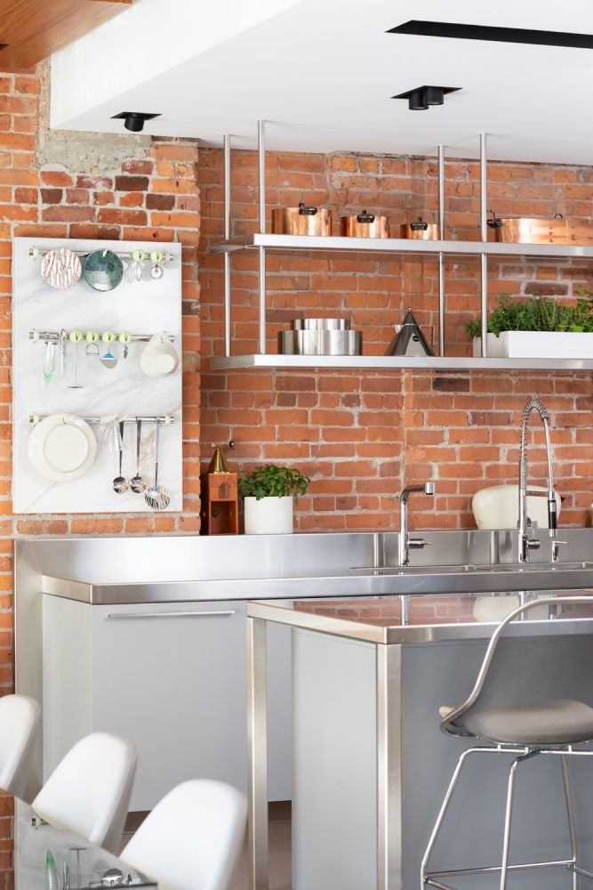
Heritage on the Side
It’s hard to believe that the kitchen’s exposed brick was once covered with drywall. “Before the reno, it was a generic cookie-cutter condo with finishes that hid the history and heritage of the building,” says Kelly.
Related: This Vibrant Vancouver Loft Effortlessly Plays With Colour, Pattern and Style
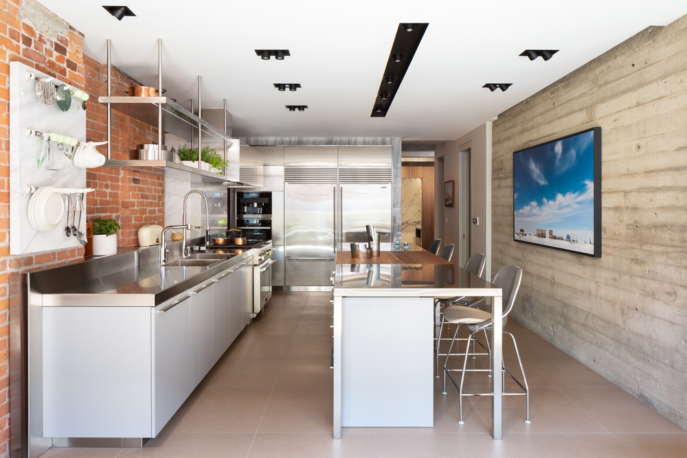
A Cook’s Kitchen
Knowing that the owners use the island as a giant worktop, Kelly incorporated a butcher-block portion into its centre. “It provides a durable and functional work surface amongst the stainless steel and drawer units below, which provide extra storage,” Kelly says. The comfy stools are from B&B Italia, the art is by Danny Singer and the Sub-Zero fridges are from the original apartments. “They’re in great condition, despite their age, so we kept them.”
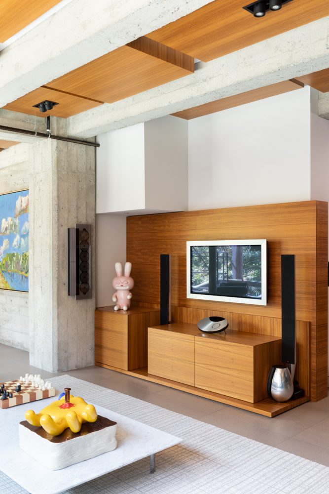
Underneath It All
To counter the living area’s more narrow shape, Kelly opted for a white marble coffee table that draws the eye to the centre of the space and makes it feel more open. It sits on an area rug that wasn’t part of the original plan. “Initially, the owners were hesitant about having rugs, but embraced them when they saw how they completed and defined the sitting areas,” Kelly says. “This rug has subtle geometric texture that adds a layer of warmth without overpowering the space or competing with the art, wood and stone.”
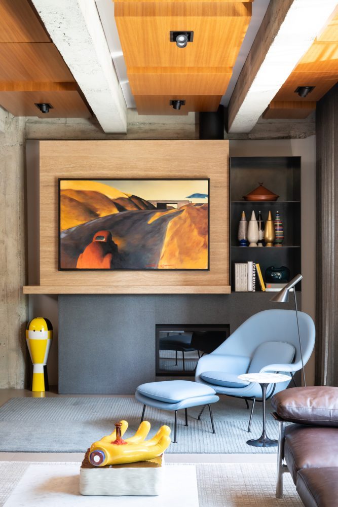
By the Fire
“The fireplace and surround were designed to float away from the wall and make it feel like an independent unit, like the stoves that were used to heat the building a century ago – complete with a black stove pipe at the top, which covers the fireplace venting,” says Kelly. Sheer charcoal linen drapery softens the natural light during the day and complements the warmth and texture of the natural stone and wood. Custom millwork nicely showcases the artwork.
Related: 20 Gorgeous Fireplace Mantel Decorating Ideas That’ll Keep You Cozy
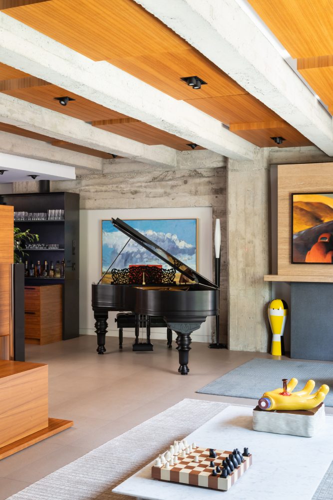
Piano Forte
An antique Steinway piano from the 19th century feels like a work of art here, which is fitting, as the owners have an extensive collection. The painting behind the Steinway, like the others in the home, is framed by millwork specifically designed to highlight it.
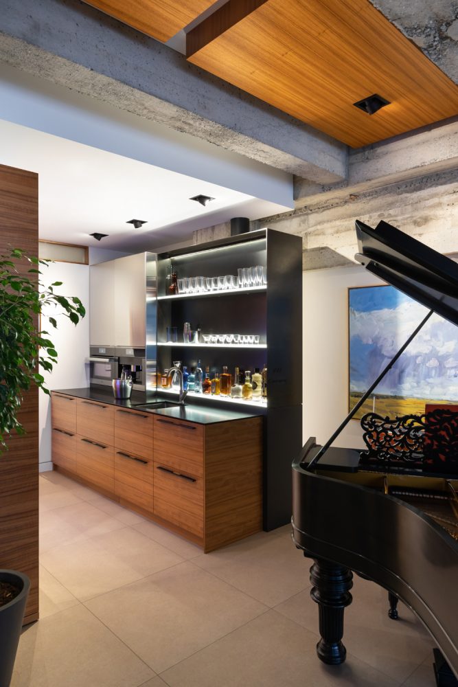
Raise the Bar
A custom wet bar off the living area features uplit display shelves, ample storage and little luxuries like an ice machine. We like how the black framing complements the Steinway.
Related: You’ll Be the Ultimate Party Host With These Beautiful (and Affordable) Bar Carts

A Place for Everything
“The owners wanted the home to be luxurious, like a New York industrial warehouse loft,” says Kelly. The custom-designed bar is just one example of features that speak to the luxury element.
Related: This Vancouver Home Proves That Contemporary Can Have Texture and Warmth
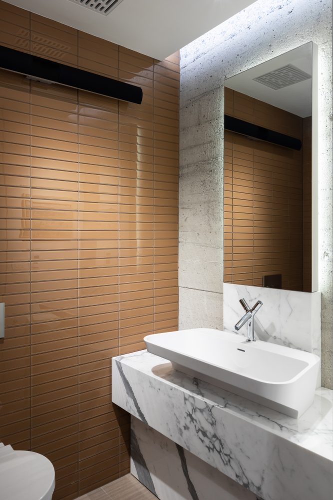
Guest Privileges
The guest bathroom features exposed concrete, glass tiles and Bianco Pearl marble slabs. The interesting faucet is designed by Philippe Starck for AXOR.
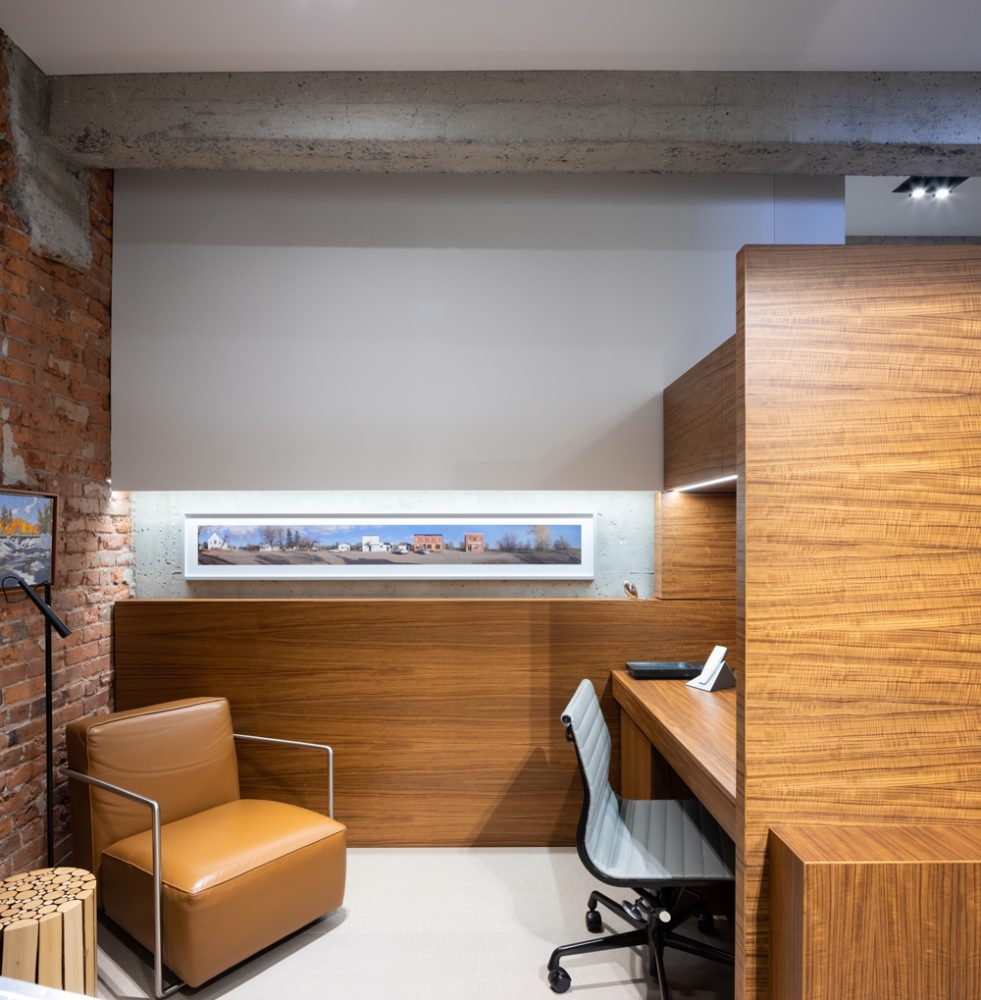
Office Space
The lower-level home office is defined by custom teak millwork, which acts as a space divider that separates it from the media and games room. The caramel leather A.B.C. Chair is from Flexform.
Related: 14 Insanely Stylish Small Home Office Ideas to Copy
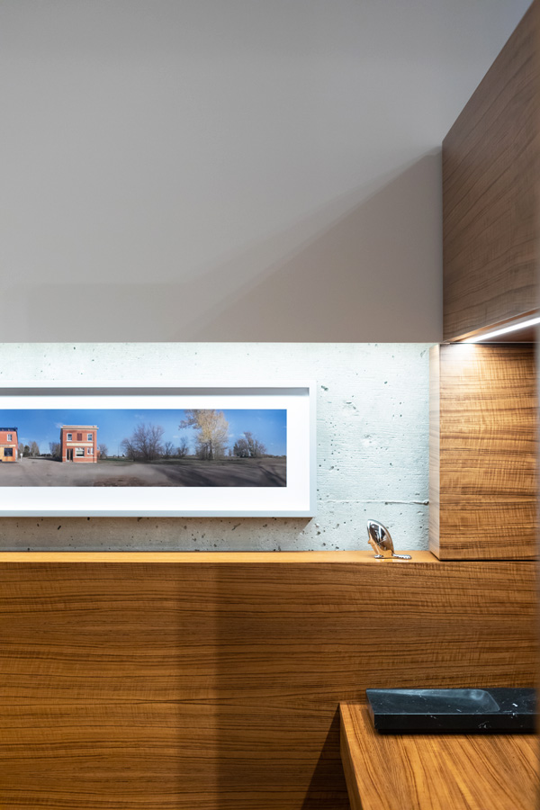
Artful Touch
The office’s millwork, as in the rest of the home, was designed with the owners’ art in mind. Here, an artwork by Danny Singer is a focal point.
Related: You’ll Want to Steal the Fine Finishes and Eclectic Art in This Modern Boho Home
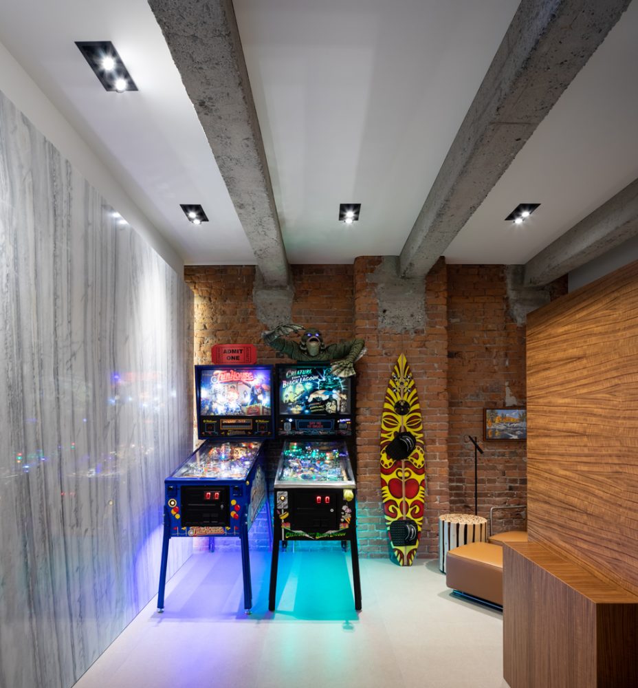
Let the Games Begin
Just outside the office space is the games room, which boasts pinball machines (one adorned with its namesake, Creature from the Black Lagoon) and a surfboard. The juxtaposition of the smooth porcelain wall with the concrete beams and exposed brick feels cool and playful.
Related: How a Young Couple Brought Coastal Charm to Their Cool City Loft
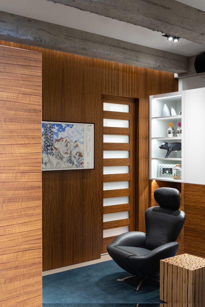
Comfy Chair
A K10 Dodo Chair by Cassina is sits in front of the media room’s television. The teak-and-white wall behind it hides a Murphy bed that allows the owners’ to easily convert this space to a guest bedroom.
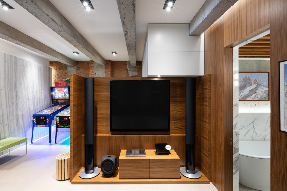
Well Laid Out
This view of the media room showcases the teak millwork that keeps the office and desk area, just behind the screen, out of view. It also offers a glimpse of the marble-clad guest bathroom.
Related: A Coastal-Inspired Vancouver Condo We’d Happily Move Into Right Now
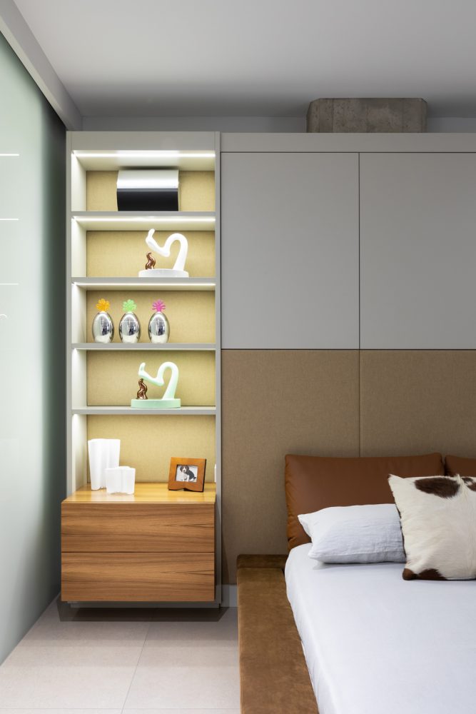
Built-In Beauty
Built-in teak nightstands with open shelving above display a collection of vintage design pieces and personal photos. “I designed an upholstered three-panel headboard to create a clean transition to the additional built-in storage above the bed,” says Kelly. The headboard also conceals a large concrete structural post (you can just see the top of it). The linen bedding from Cloth Studio is a soft contrast to the structured leather cushions.
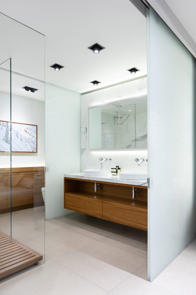
Material World
The stunning master bathroom features a stylish mix of materials, including porcelain floor tiles from Cotto D’Este, a teak vanity with marble tops and frosted and clear glass walls. The semi-recessed vessel sinks are from Flaminia and the painting is Kootenay Pine-Scape by Peter Corbett.
Related: 19 Bathroom Vanity Designs That’ll Make You Want to Reno Immediately
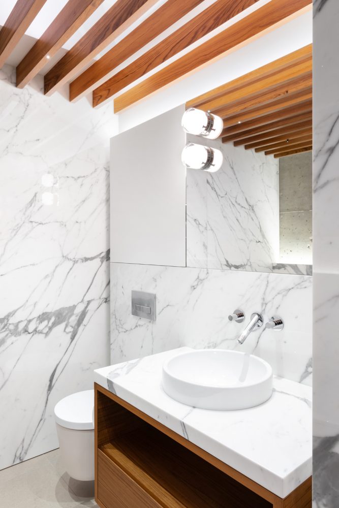
Look Up
Teak panels layer in continuity, warmth and interest to the master bathroom’s ceiling.
Related: 12 Modern, Minimalist Bathroom Ideas to Inspire You
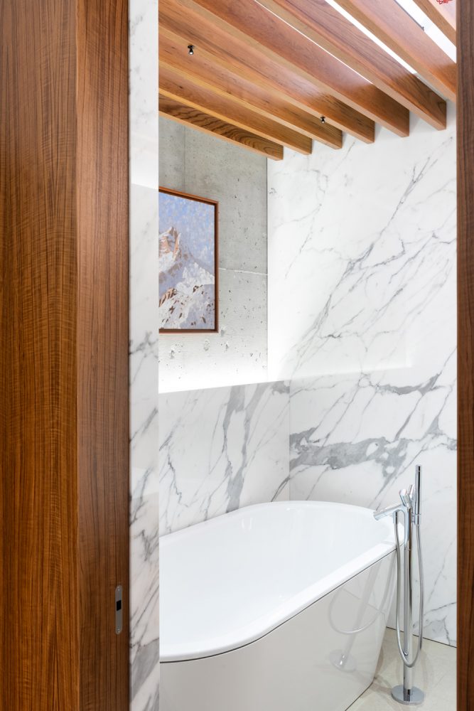
Mixed Media
In the master bathroom, teak panels, concrete and marble are a natural backdrop to framed artwork. We love the teeny-tiny spots over the tub.
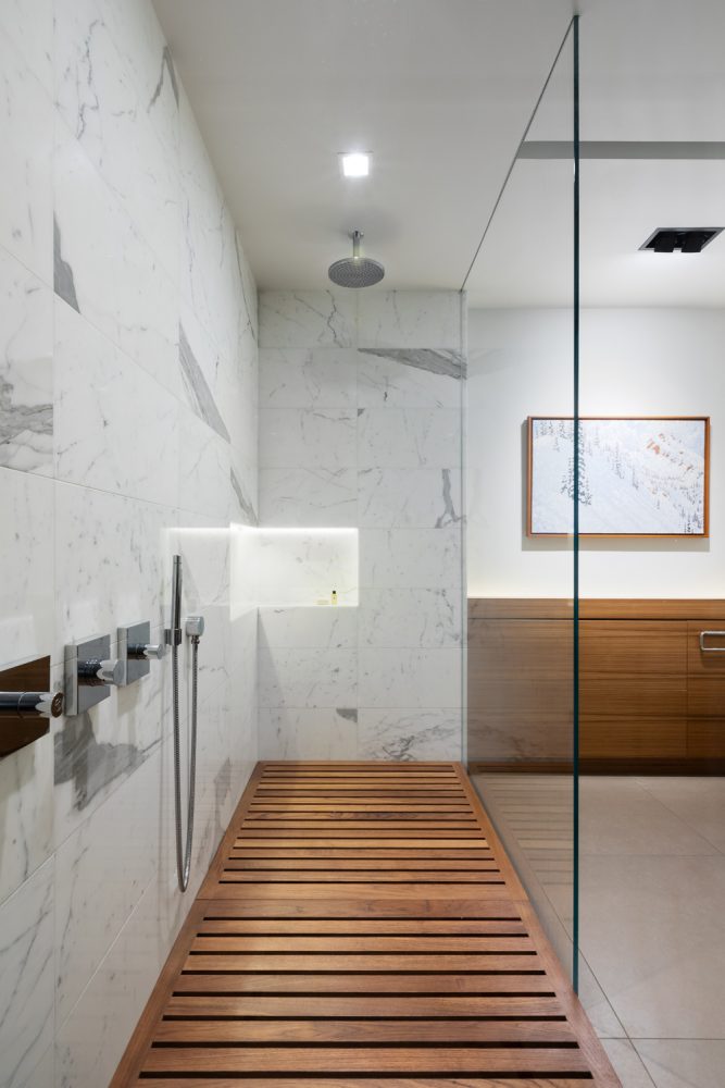
Glass Act
“The glass walls of the shower, as well as the sliding glass doors to the WC, show no visible hardware,” says Kelly. “The sliding door track is concealed in a niche above the ceiling, and this keeps the space incredibly clean and gives it a spa-like quietness.” The shower’s removable teak floor tiles conceal the drain and are removable – so very easy to clean.
Related: Modern Shower Ideas That Will Turn Your Bathroom Into a Masterpiece
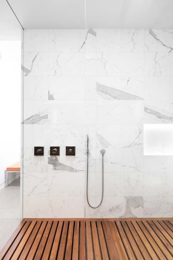
Stone and Wood
The master bath’s shower features Bianco Pearl wall tiles from Aeon. They are a cool counterpoint to the teak floor panels.
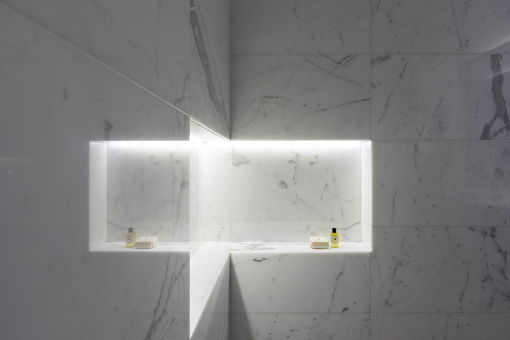
Good Design
Forget piddly pre-made inserts and soap trays – this architectural shower features a custom-built wraparound niche with lighting. It displays simple toiletries like art.
Related: You’ll Be Shocked to See What This Spa-Like Bathroom Looked Like Before the Renovation
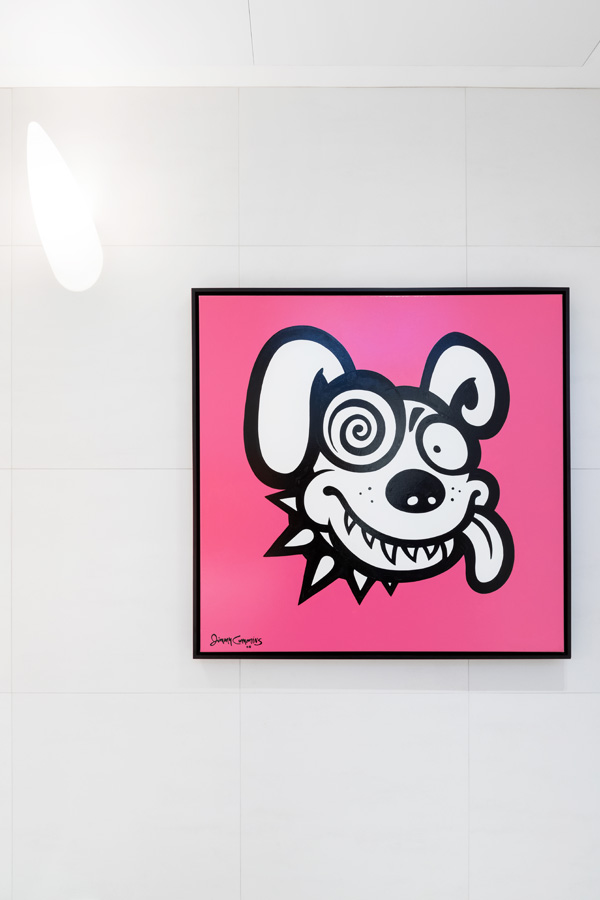
Pop Art
This vivid artwork is not only a fun splash of colour – it has also has meaning for the owners, who are parents to five dogs.
Related: These HGTV Canada Stars With Their Beloved Pups Will Make Your Day
HGTV your inbox.
By clicking "SIGN UP” you agree to receive emails from HGTV and accept Corus' Terms of Use and Corus' Privacy Policy.


