While most people assume an interior designer can decorate a space with ease, sometimes it’s refreshing his or her own space that proves most challenging. Such was the case for Calgary-based Katie Rioux of DWK Interiors, who quickly found that combining her chic, modern aesthetic with her husband Andre’s penchant for bold hues was the ultimate balancing act. The resulting compromise is an airy 3,000-square-foot oasis with meticulous pops of colour that will satisfy tastes on either end of the design spectrum.
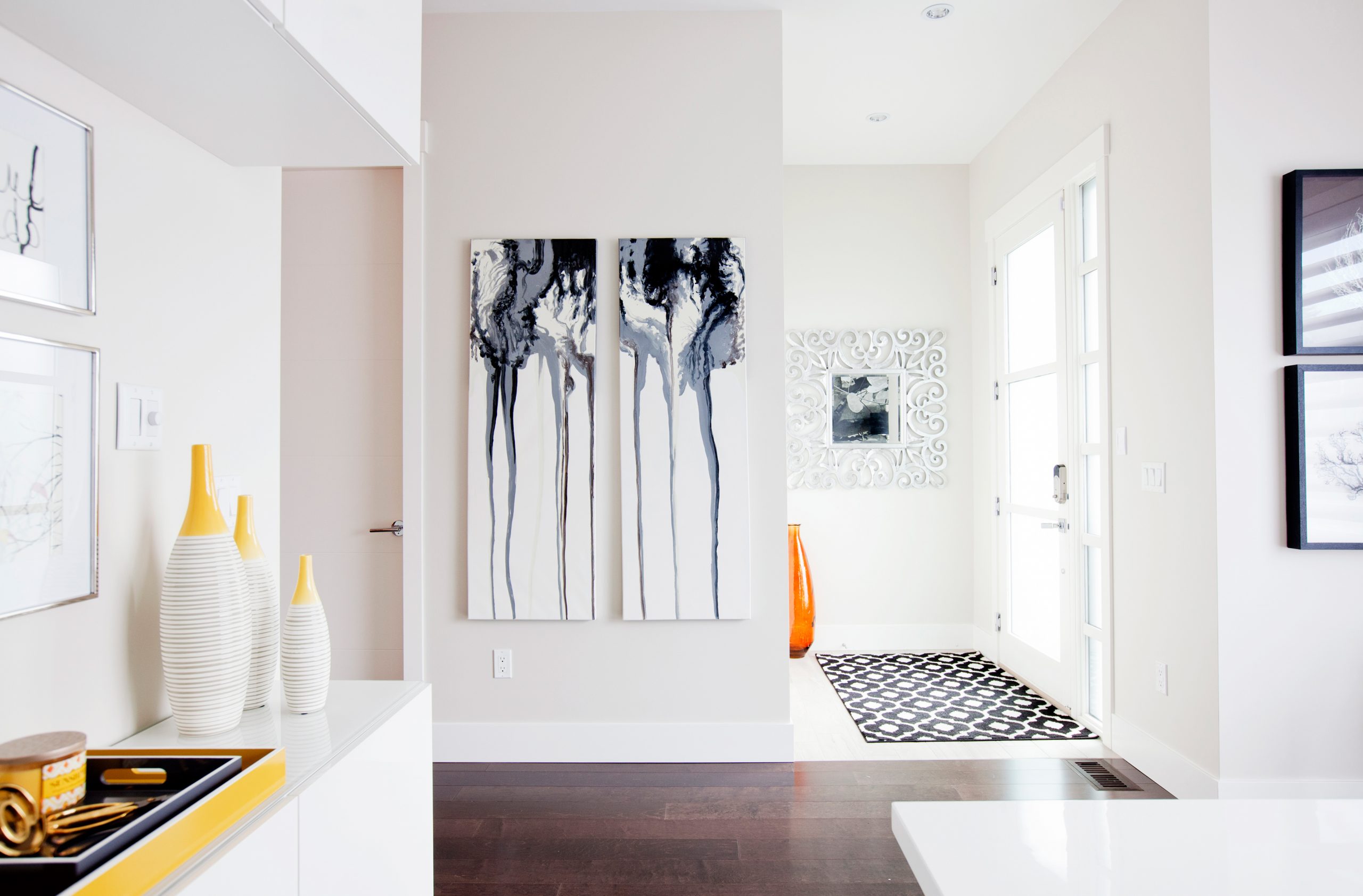
Follow the Light
This modern build illuminates in the daytime. Upon entering, you’re introduced to the design language spoken throughout Katie’s home; it’s crisp, modern and airy.
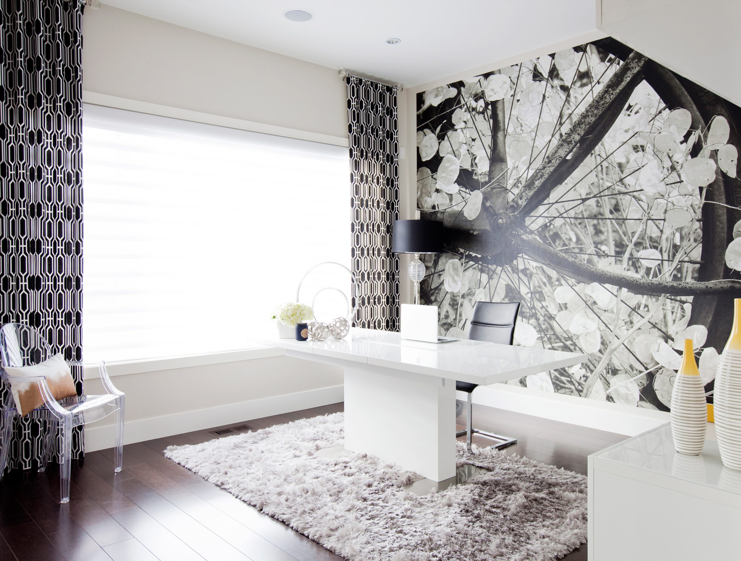
Mural Mandate
A sizable office was a necessity for Katie, and since this room is just off the front entrance, she wanted it to have a punch. The designer fell in love with this mural years ago, and jumped at the chance to use it now that she finally has the perfect space. The stunning feature wall is easily the focal point of the room.
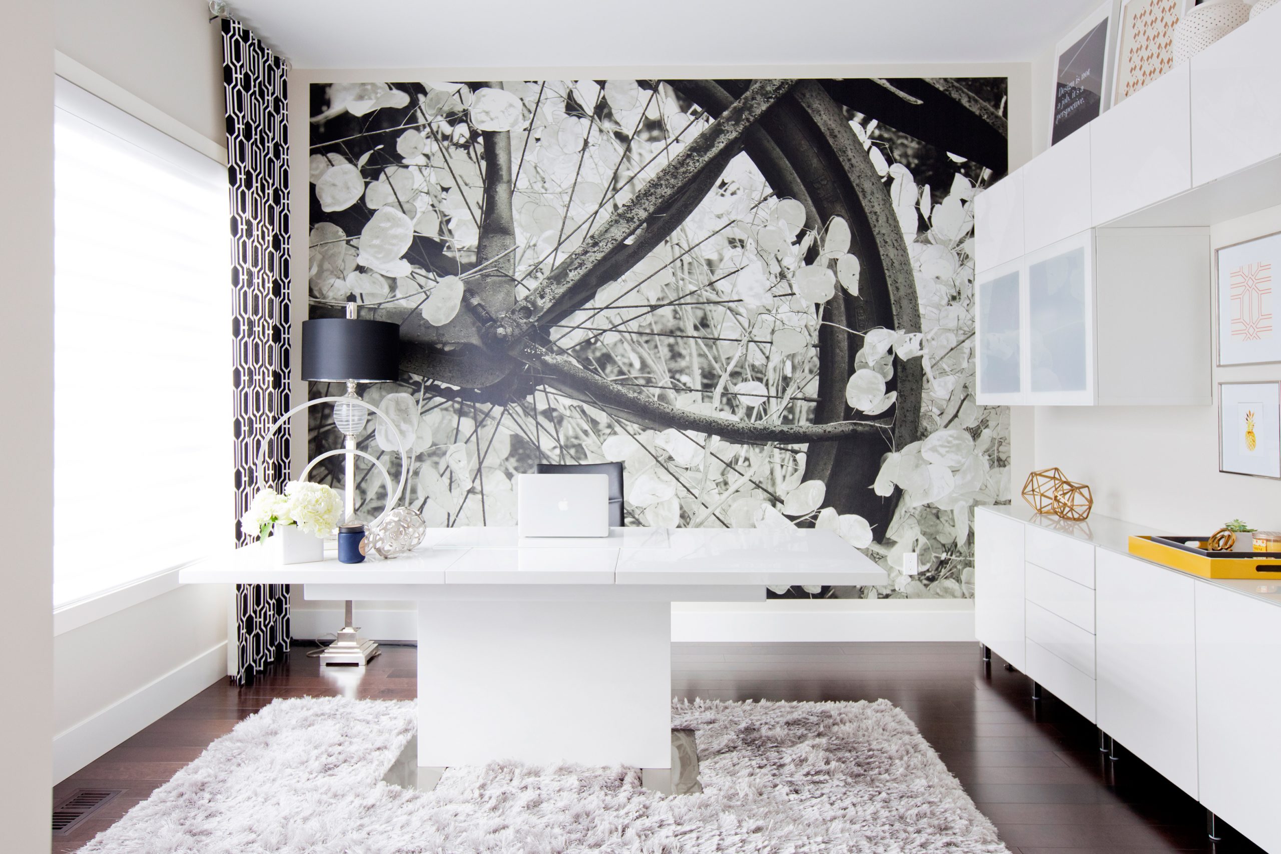
Double Duty
When Katie first viewed the house with her husband, this space was staged as a formal dining room. While the designer might be using it as an office, her desk is actually an over-sized dining room table. So in terms of function, all she has to do is clear her table and she’s able to comfortably host a dinner party. The duality of the area and the simple execution of design quickly turned this office into Katie’s favourite room in the house.
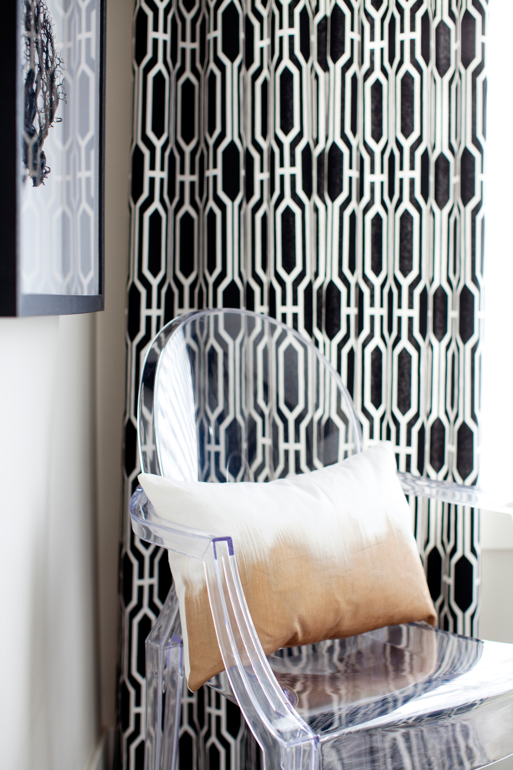
Subtle Pops
Accessories add subtle hints of colour in an otherwise monochromatic space.
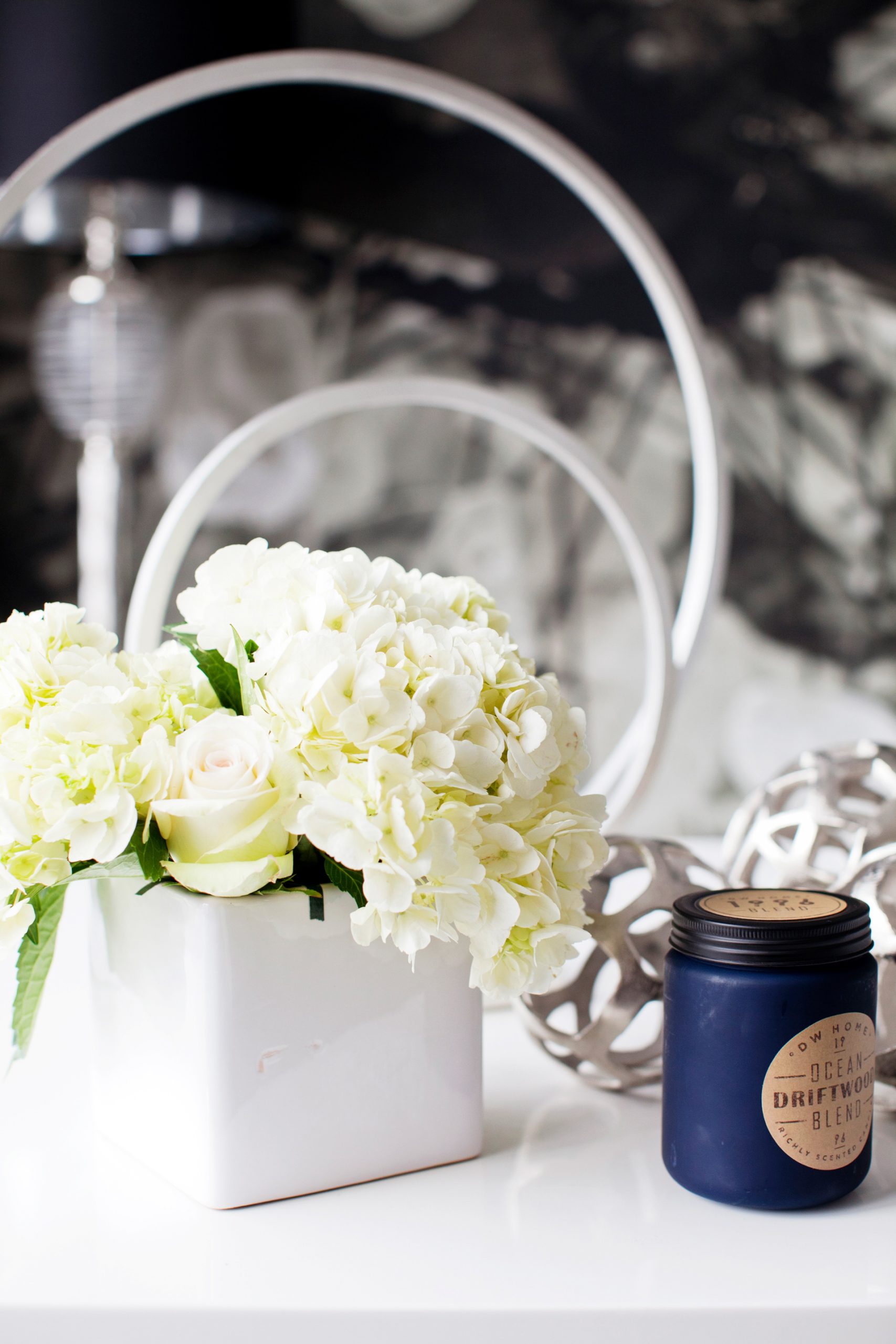
Breath of Fresh
White flowers and calming scents will help anyone get to work.
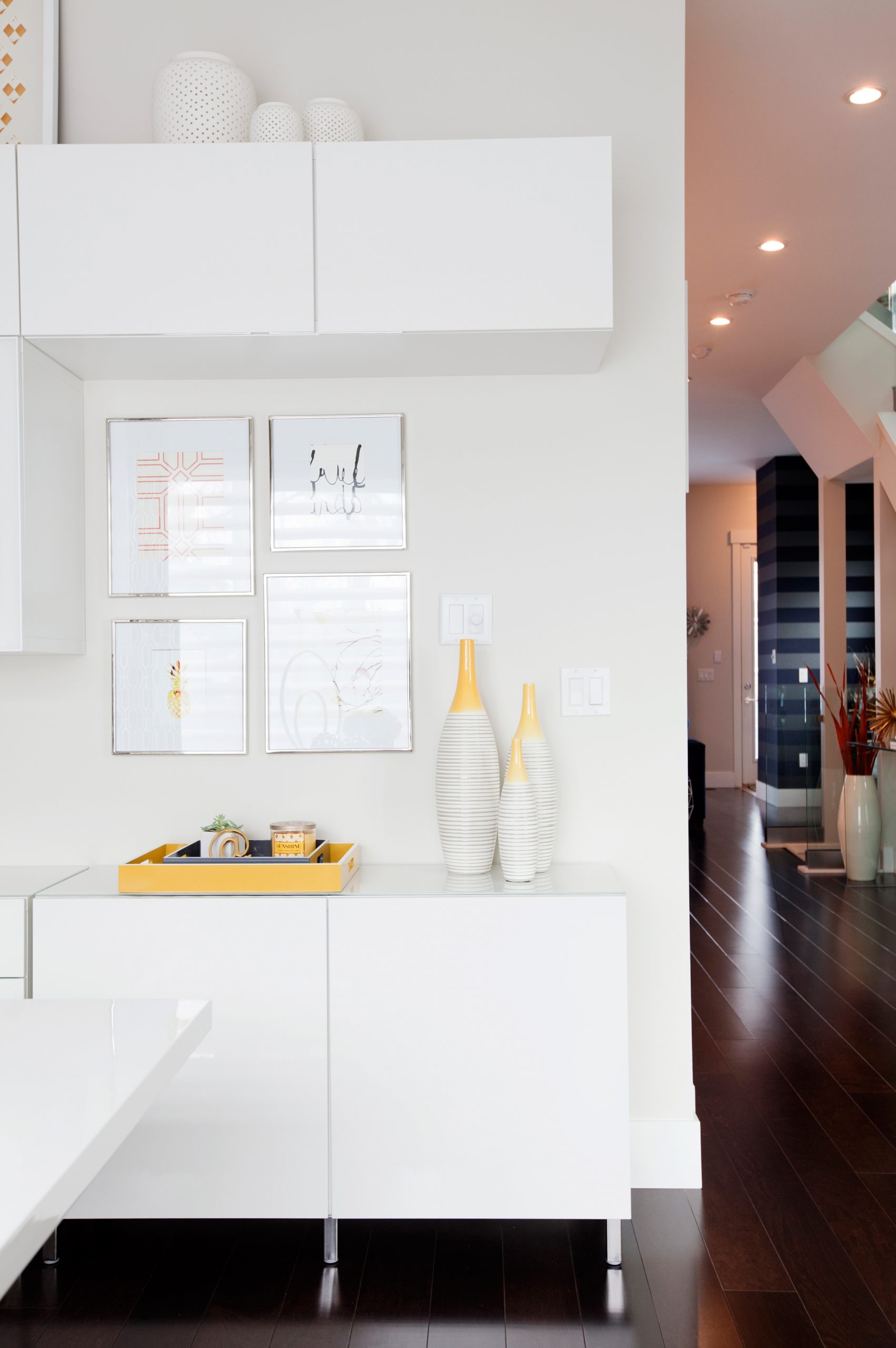
Tucked Away
These high-gloss white cabinets light up the office every time the sun shines in. The unit is perfect for storing Katie’s documents. She decided against open shelving to ensure the space felt clean, sophisticated, and most importantly, uncluttered.
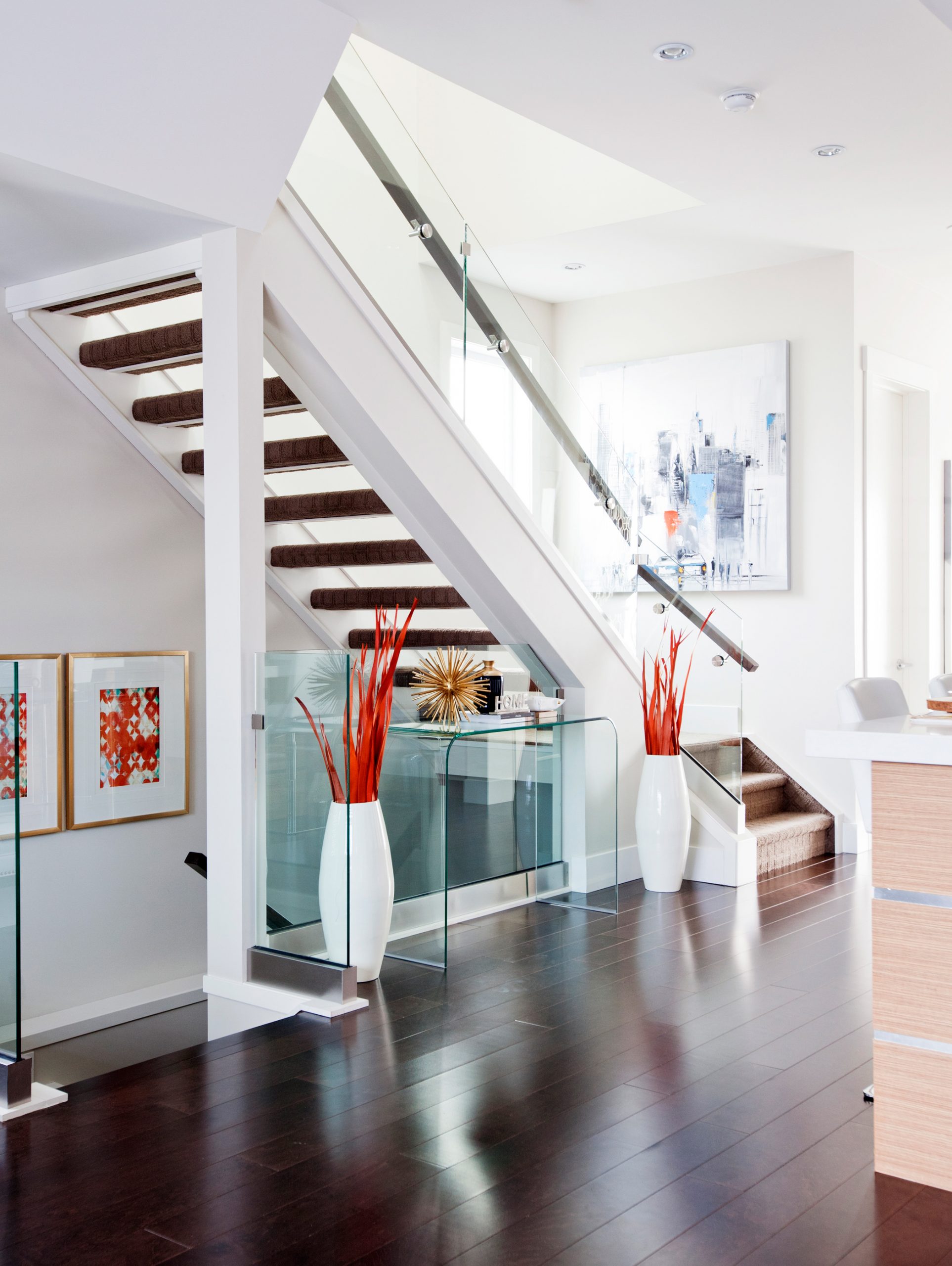
Consistent Design
Varying textures mixed with large geometric shapes and bright hits of coral gives the main floor a statement look that suits both Katie and Andre’s decor tastes.
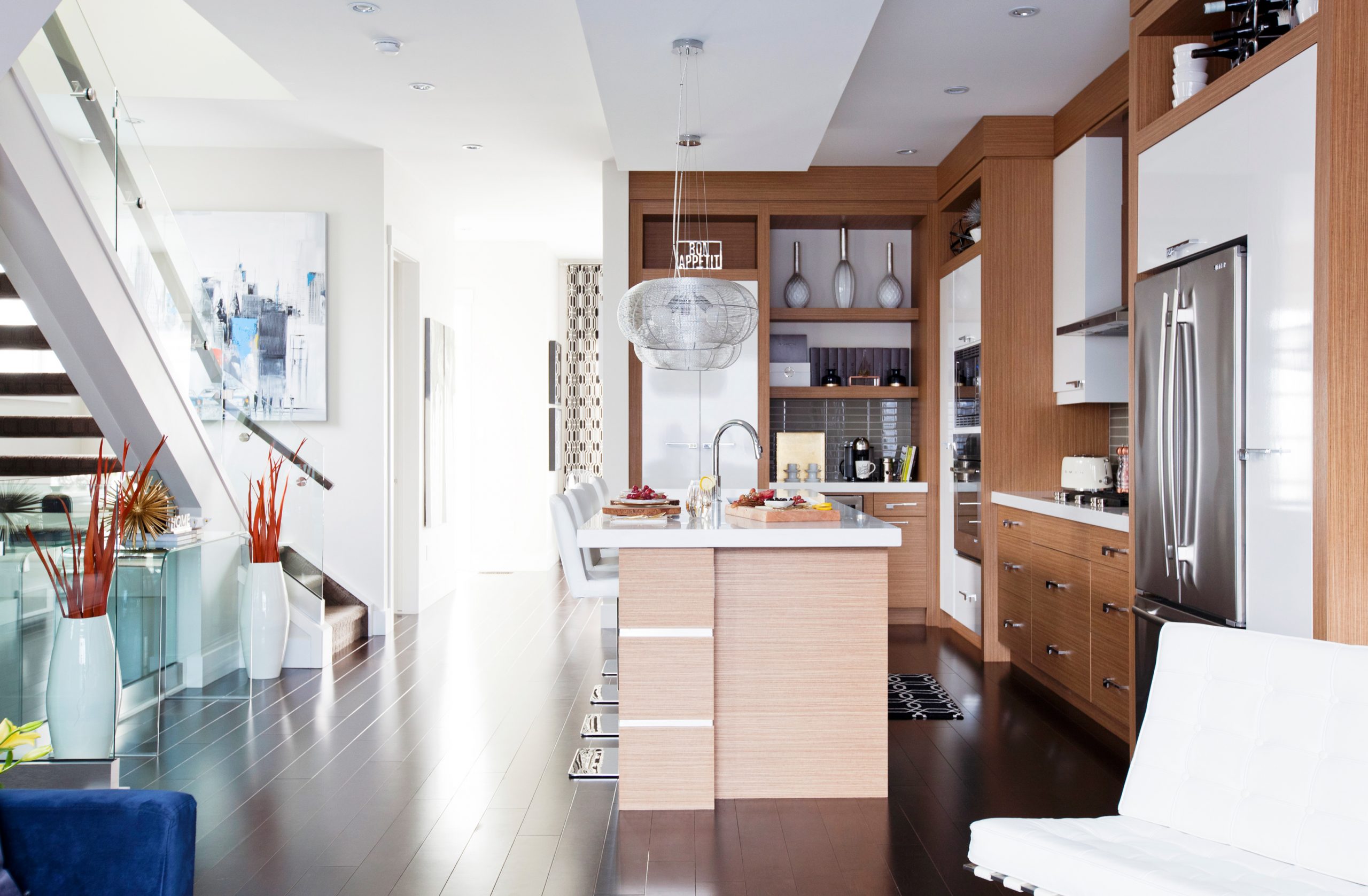
Coming Together
Katie says people often think it must be easy for a designer to complete his or her own space, but it’s a total myth. With her attachment to the home and her knowledge of the options available, narrowing down her ideas became a problem. Another challenge was trying to meld Andre’s taste with her own. While she’s more drawn to a modern palette of black and white, her husband is a passionate Frenchman who craves colour and bold design. Though the thought of going bold worried Katie, she stepped outside her comfort zone to find a suitable compromise.
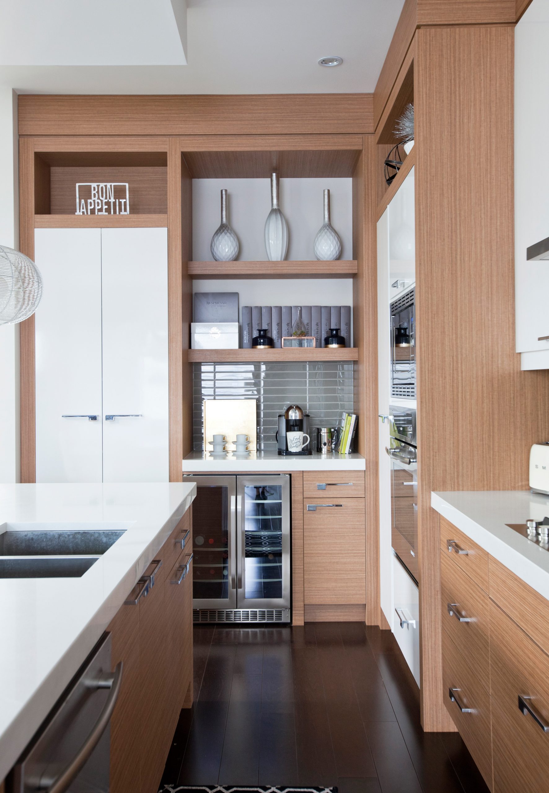
On Display
The over-use of accessories on the floating shelves could have turned this kitchen into a cluttered nightmare. Katie kept it light and sweet, filling open spaces with just a few statement pieces.
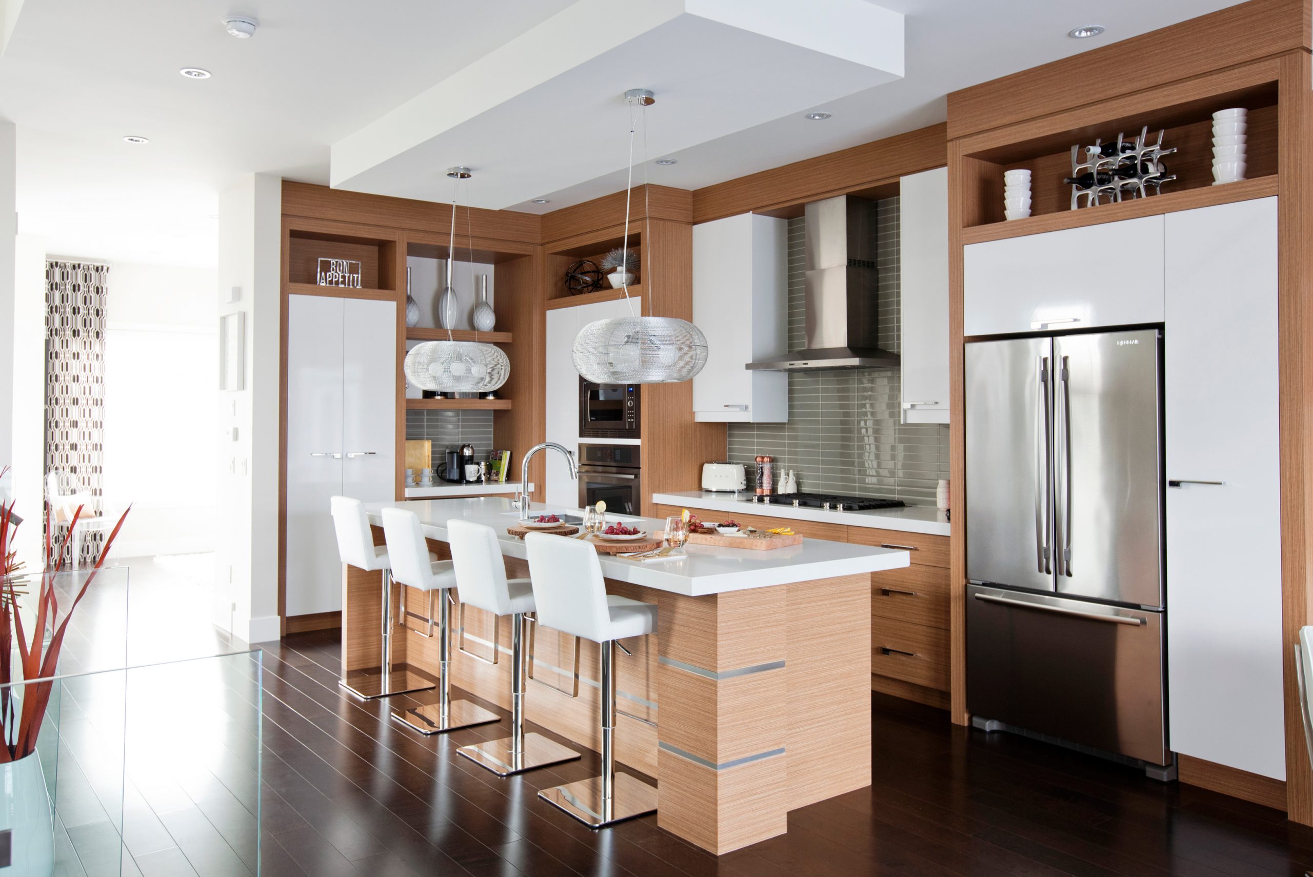
Complete Package
The combination of the over-sized white cabinets and the bamboo wood were one of the design features that sold Katie and Andre on this home. The high-gloss cabinets help bring cohesion to the main floor and match the quartz countertop. Above the island, the designer opted for wide, circular pendants that add industrial flair to the kitchen.
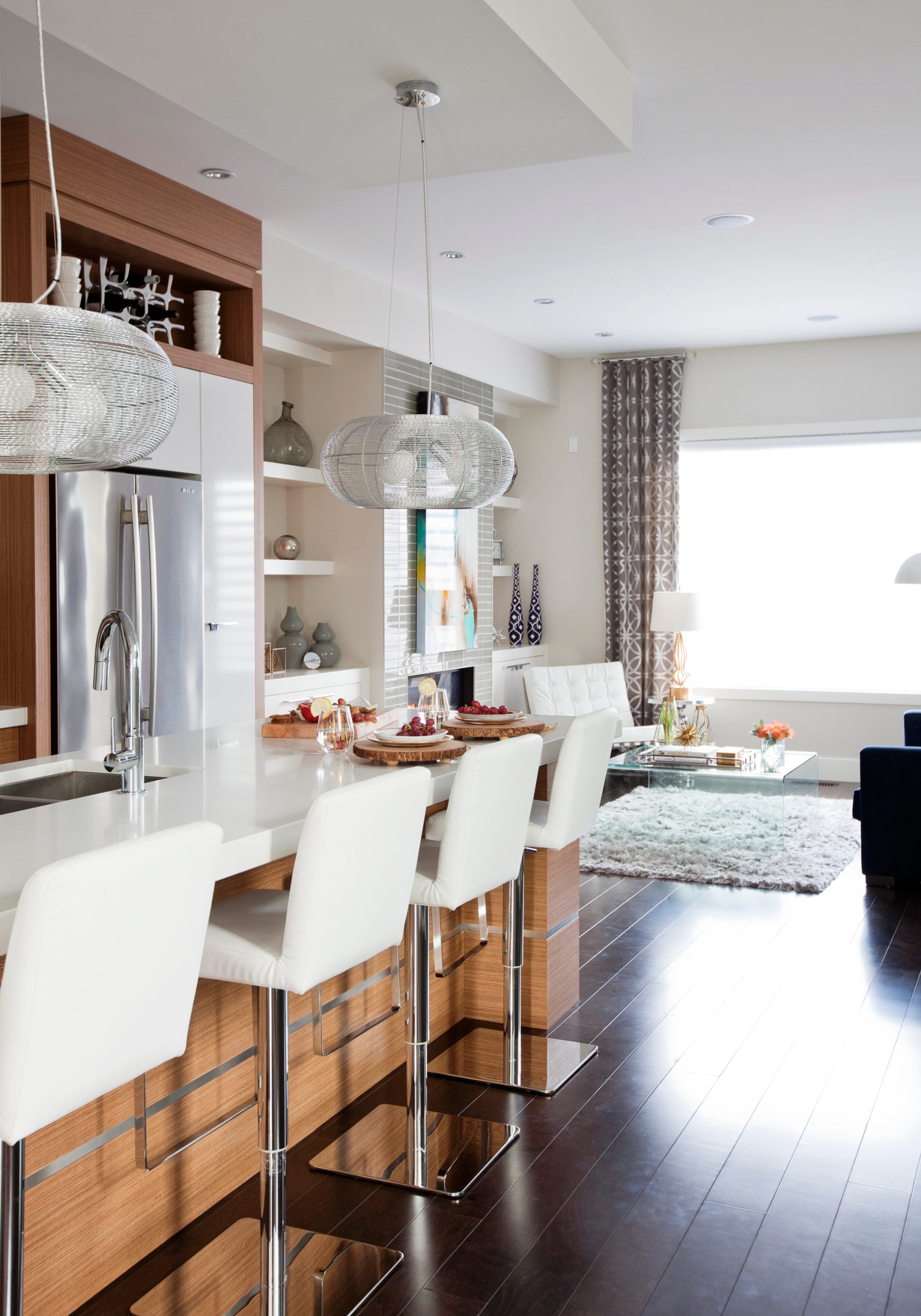
Repetition
One of the challenges of decorating an open-concept space is that it’s hard to create distinct areas. But Katie made it happen by carrying the white palette from the kitchen to the living room for a seamless transition.
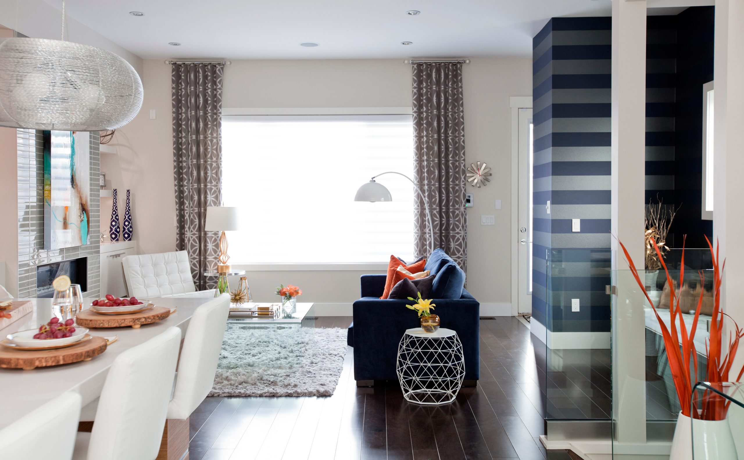
Colour Association
The designer and her husband have an affinity for navy blue; it was in their wedding colours, so it holds a special memory for the couple.
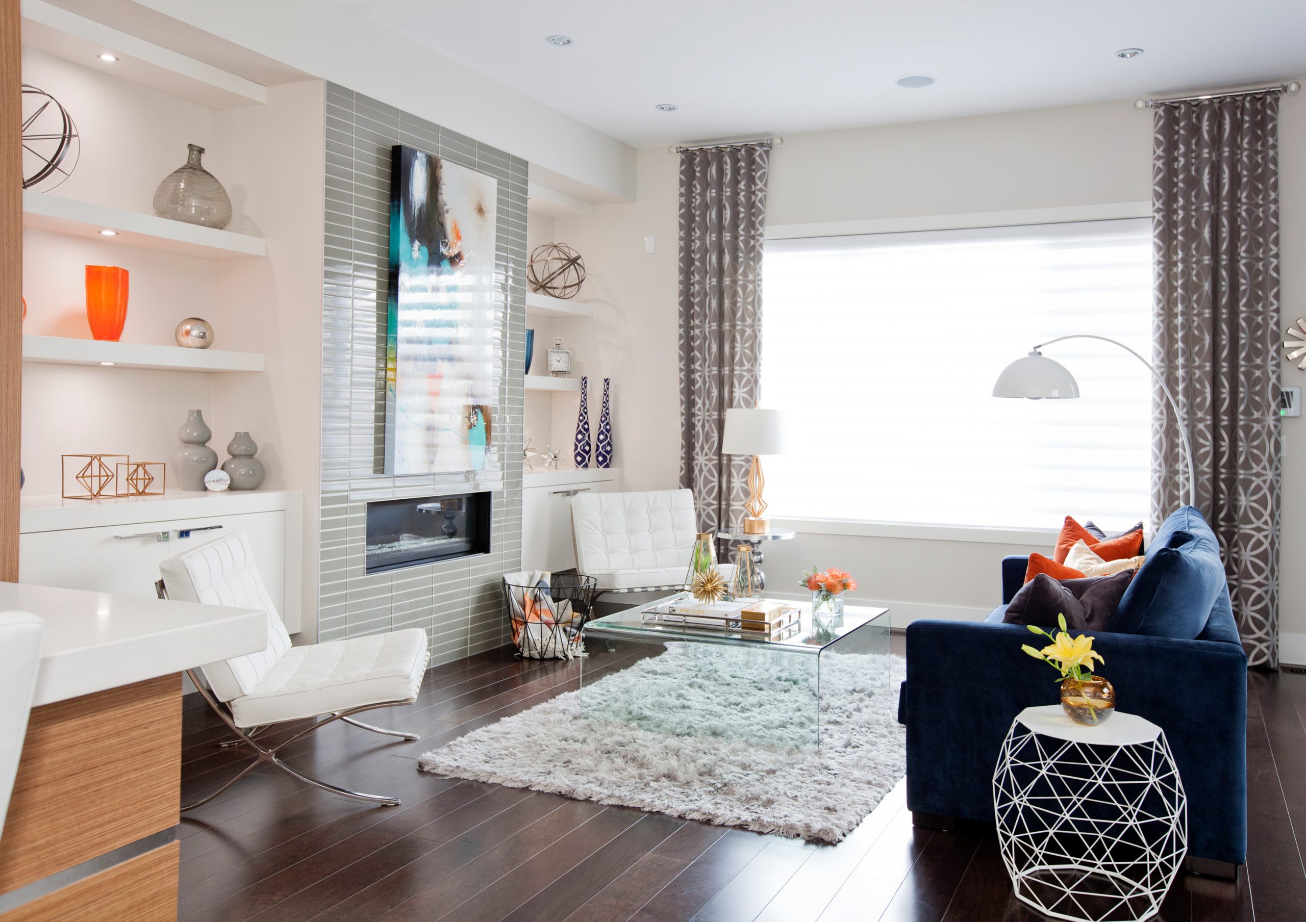
Hesitant, but Successful
Andre was obsessed with these Barcelona chairs, and while they’re not something Katie would have gone for herself, she got them in white to offset the bold navy blue sofa.
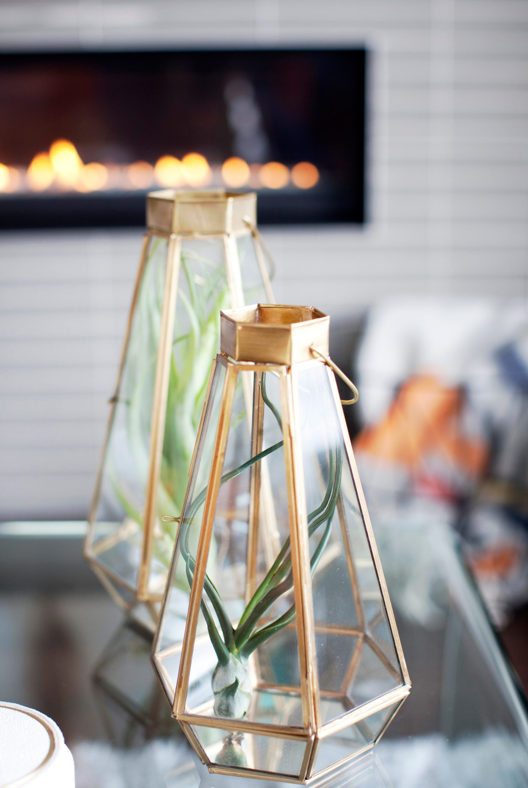
Go for Gold
Katie admits she’s a big fan of trying to use a square, rectangle and a triangle in every space. This room is proof that it can be done successfully.
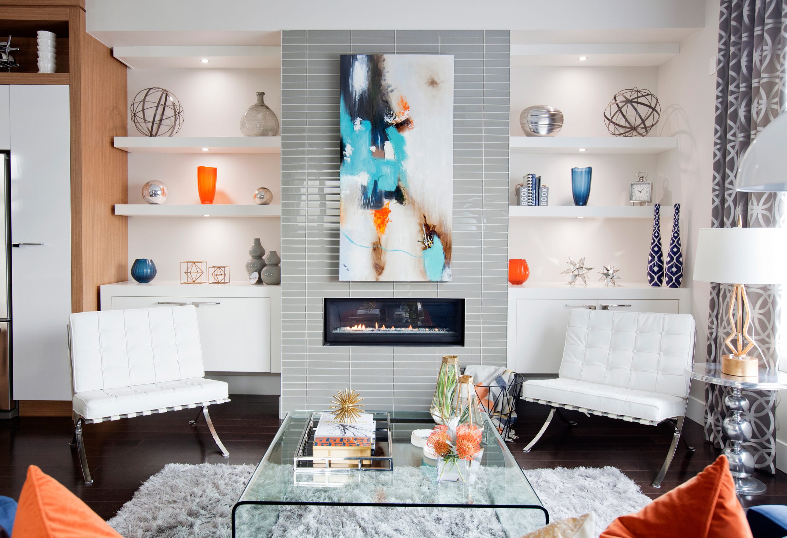
Cut the Noise
The couple chose not to have a TV in their formal living area. They wanted a space where they could chat together and cook dinner without any background noise – that’s why there’s such a strong piece of artwork above the fireplace. The artwork ended up dictating the accent pieces located throughout the room.
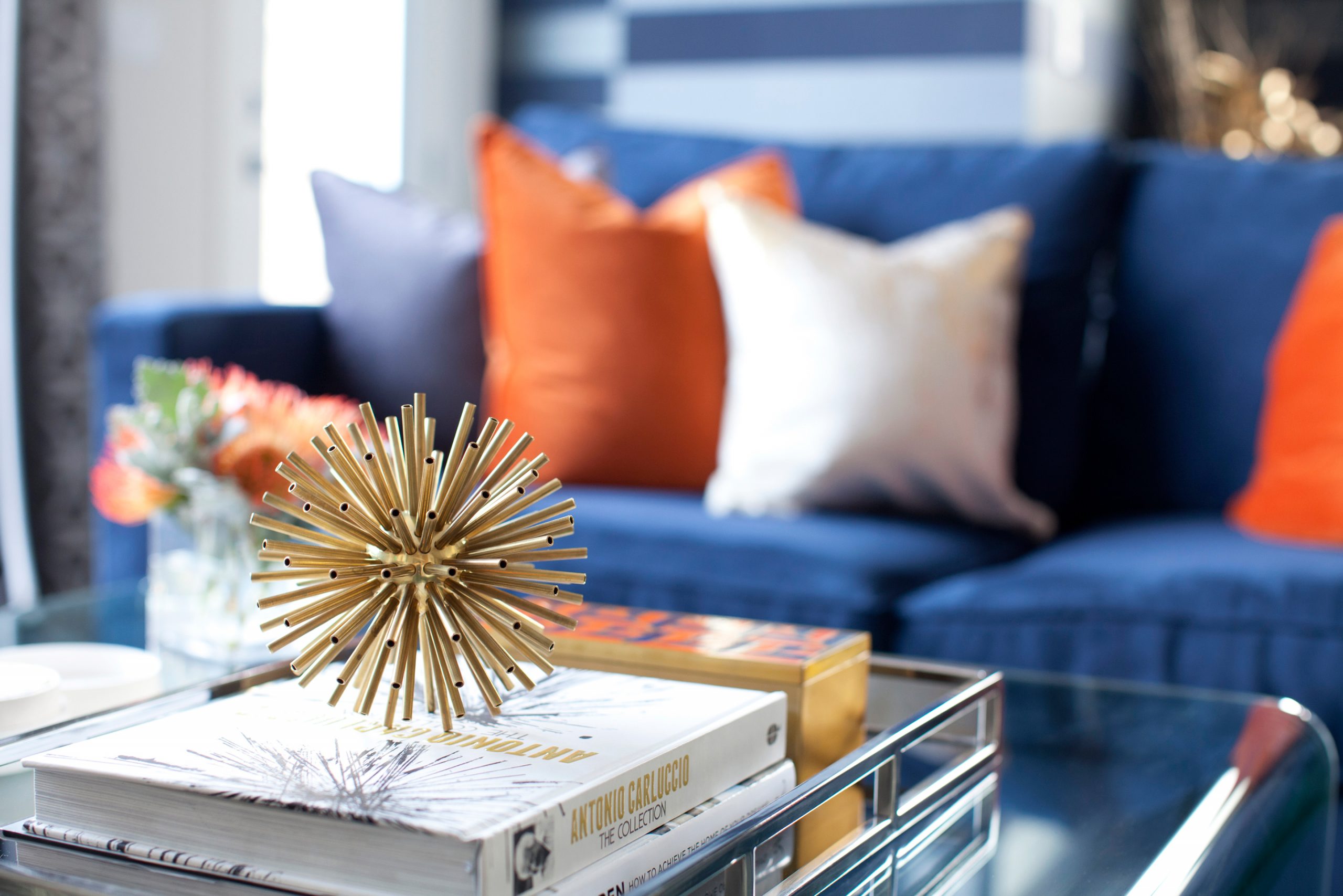
Texturize
The designer is a big fan of mixing textures. The combination of plush pillows, fresh flowers, and geometric shapes creates a truly energizing living room.
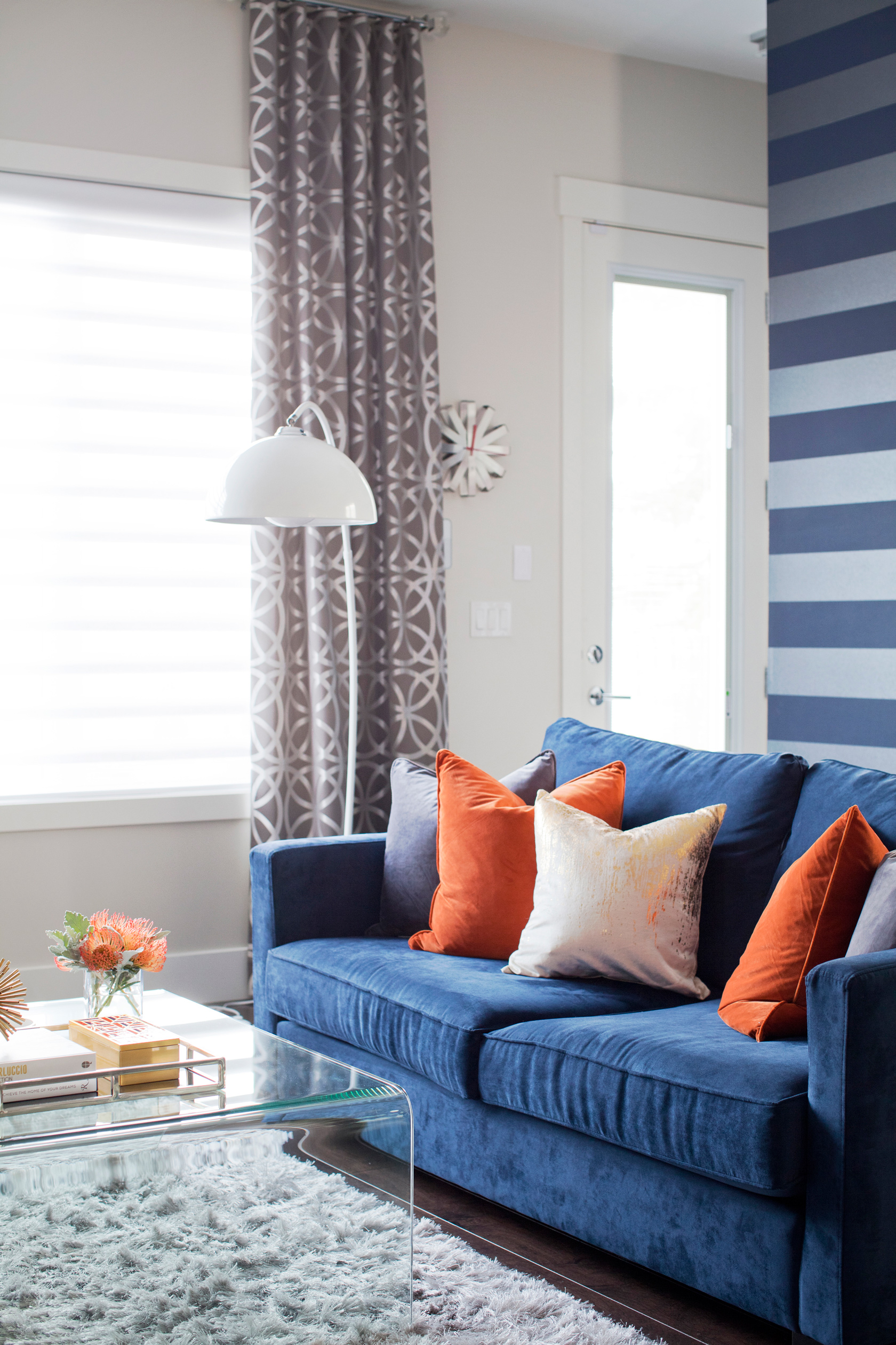
Anchor Table
A tempered glass table highlights the collision of different textures and helps tie the shag carpet to the geometric experimentation happening throughout the living room.
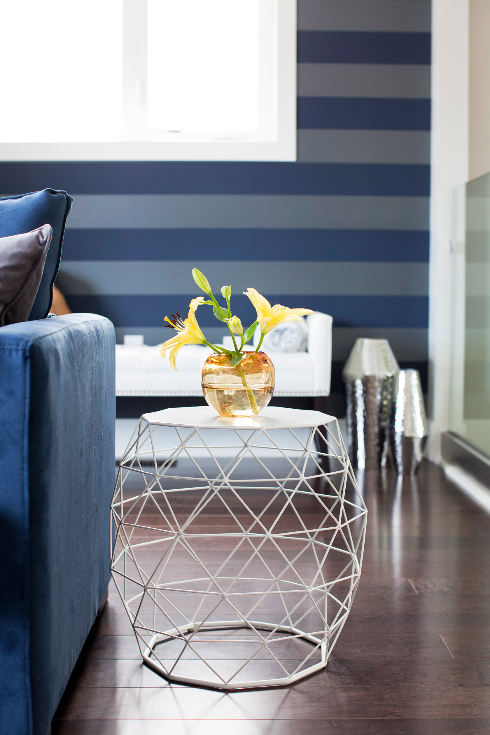
Subtlety is Key
This barely-there side table offers functionality without intruding on the bold design happening around it.
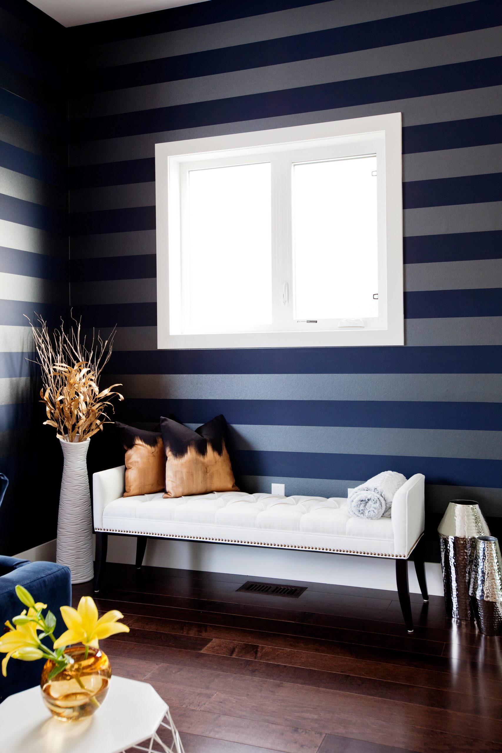
Magic Corner
The horizontal lines of the wallpaper give the illusion of a larger room. A white bench and vase add brightness to the corner even when the sun goes down.
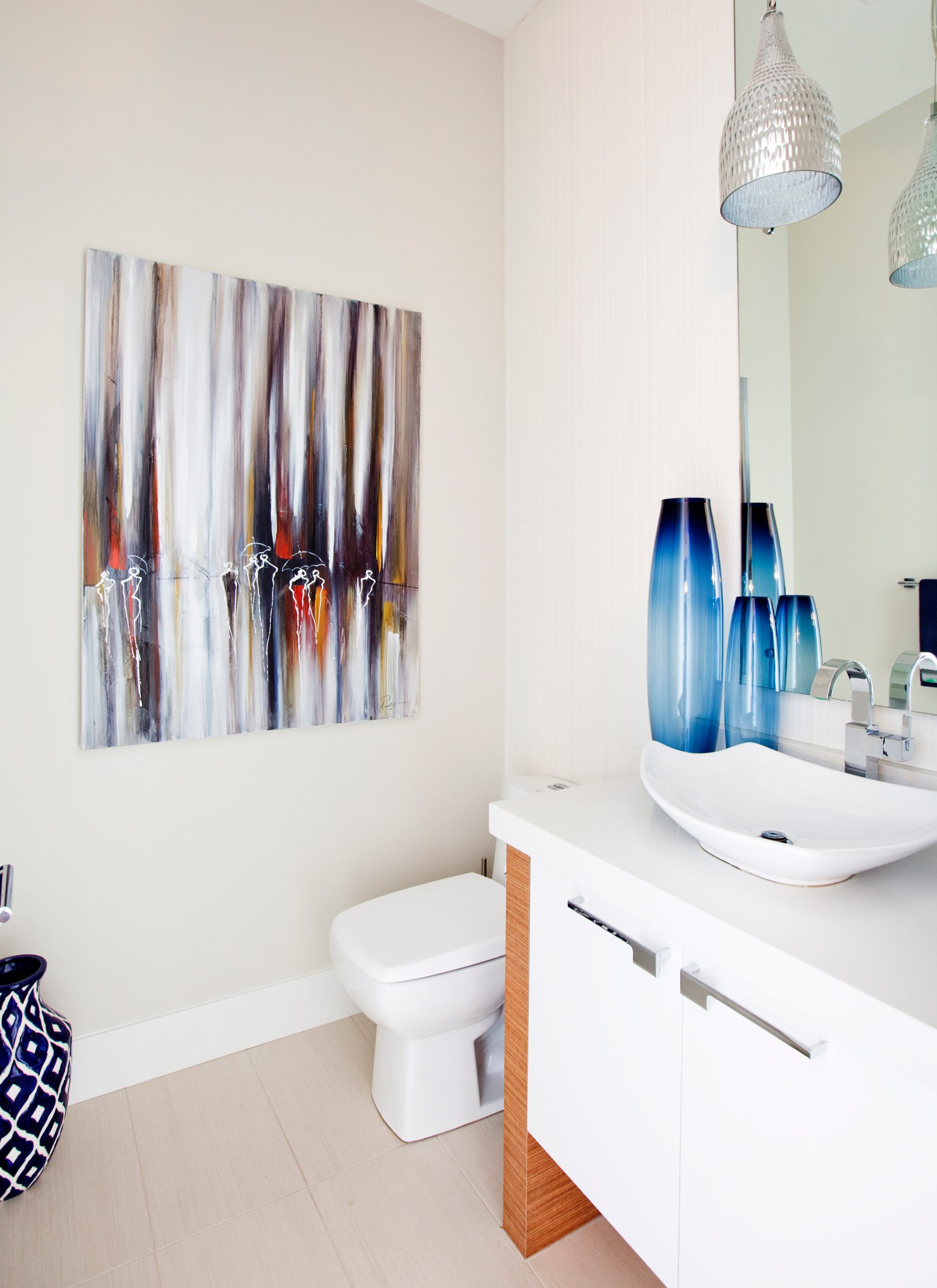
Shades of Blue
Similar to the artwork in the living area, this bright piece in the main floor bathroom dictated the colour story of the room. Blue accessories are spread throughout and act as a fresh counterpoint to the crisp white finishes.
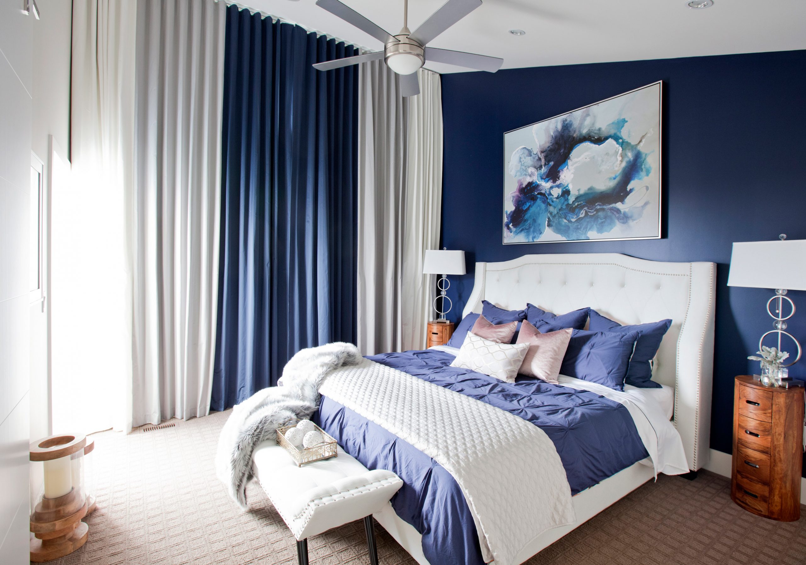
Sound Solution
One of the major challenges with the master bedroom is that it faces a main street in Calgary, meaning plenty of noise. Katie used her window treatment as a genius solution; thick blackout drapes create a noise barrier and cut off the space from the busy street.
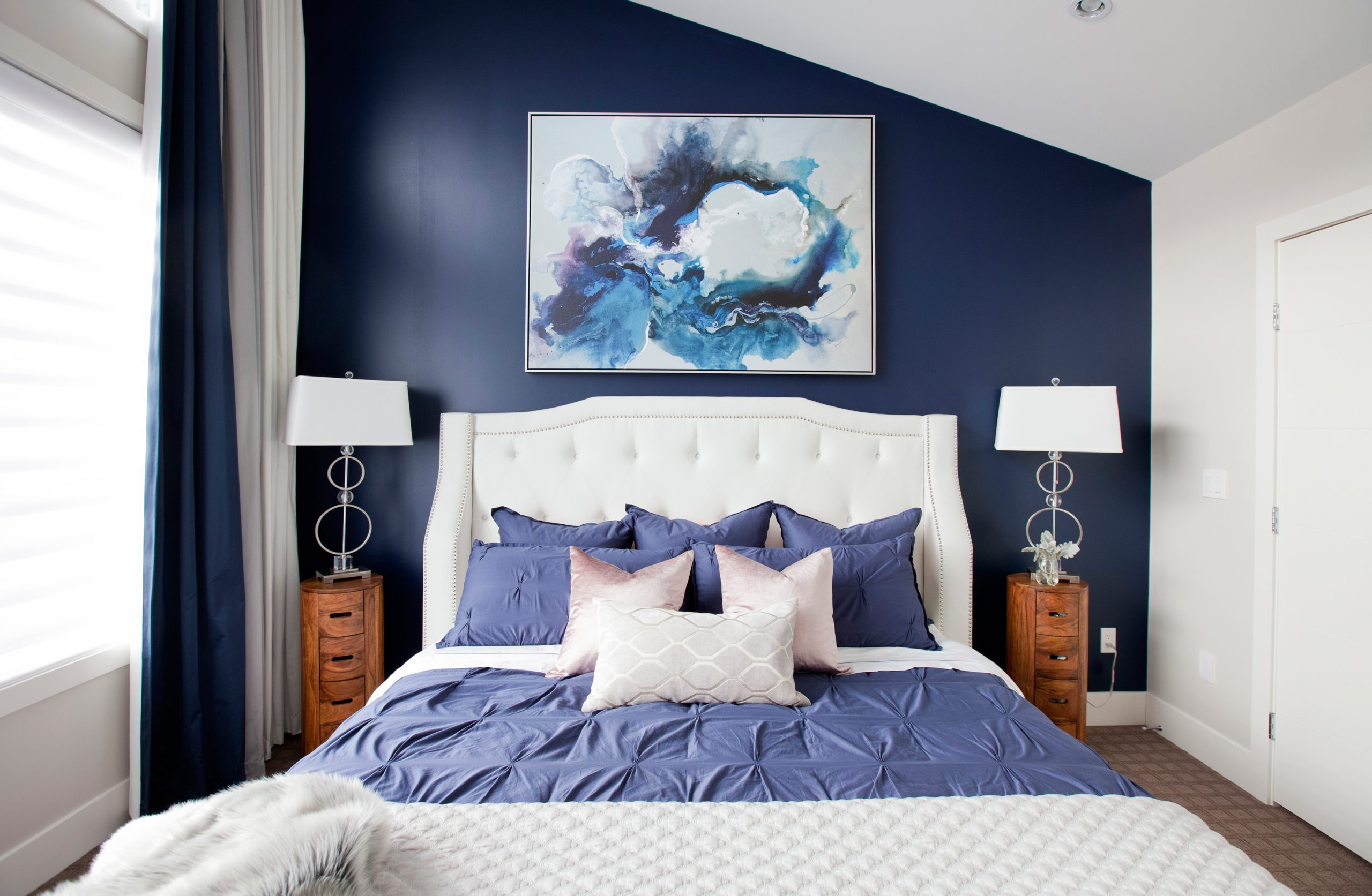
The Illusion of Space
To soften the boldness of the navy blue wall, Katie flanked her tufted upholstered bed with natural wood nightstands. Since the couple was set on having a king-sized bed, it didn’t leave much extra space, so they opted for accent tables intended for a living room.
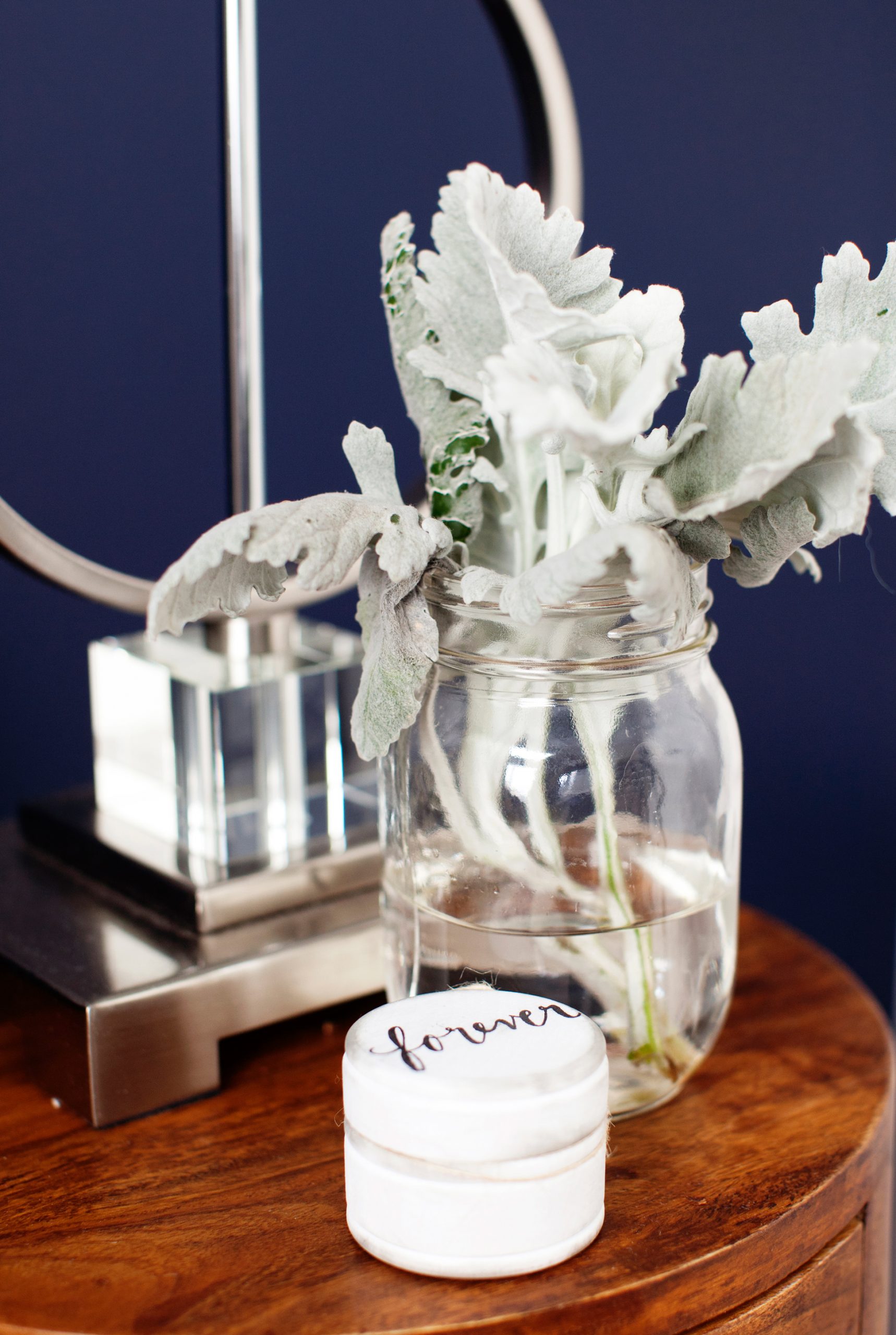
Easy Accessories
Modern lighting and white accessories work together to contrast the boldness of the navy blue wall.
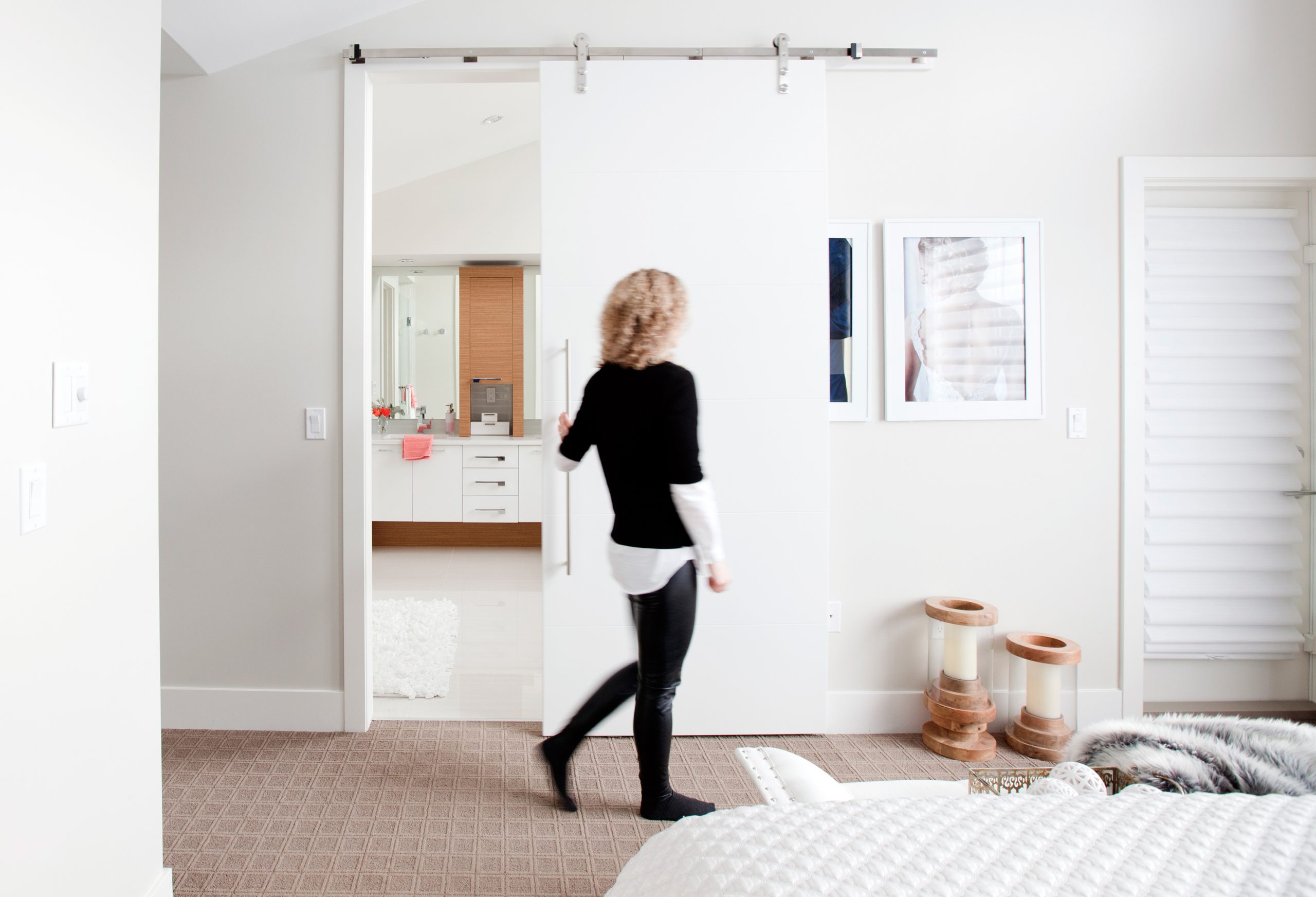
Added Touch
In addition to the blackout drapery, the couple added a genius barn door to the master bathroom to eliminate any light coming through to the bedroom. While it looks expensive, Katie estimates the project cost around $1,500. The addition of an over-sized handle helps make an even bolder statement.
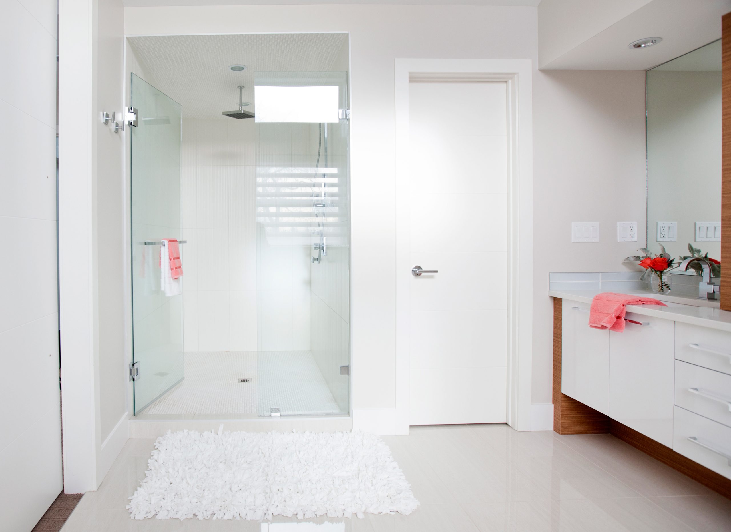
Pristine Ensuite
Walking into the master bedroom gave Katie and her husband their ‘AHHH’ moment. The ensuite features a wide shower, glossy porcelain finishes and more of the soft bamboo tones seen in the kitchen.
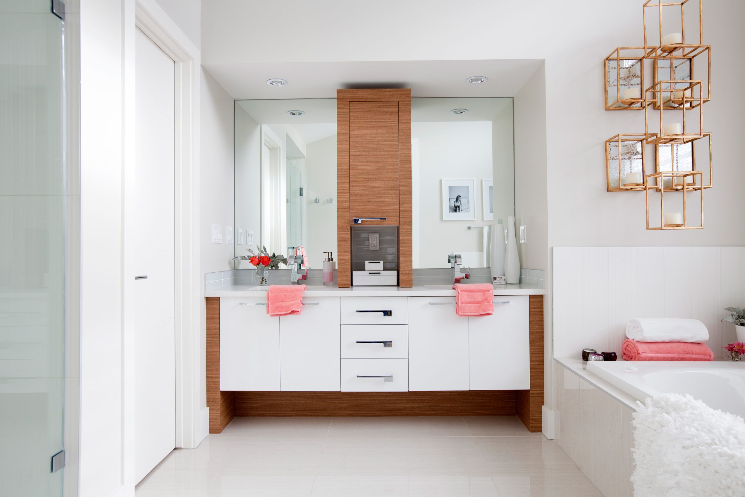
Light Blush
The bones of the bathroom were already so perfect that Katie didn’t want to take away from any of the clean lines. The addition of coral towels help keep the overall tone soft and spa-like.
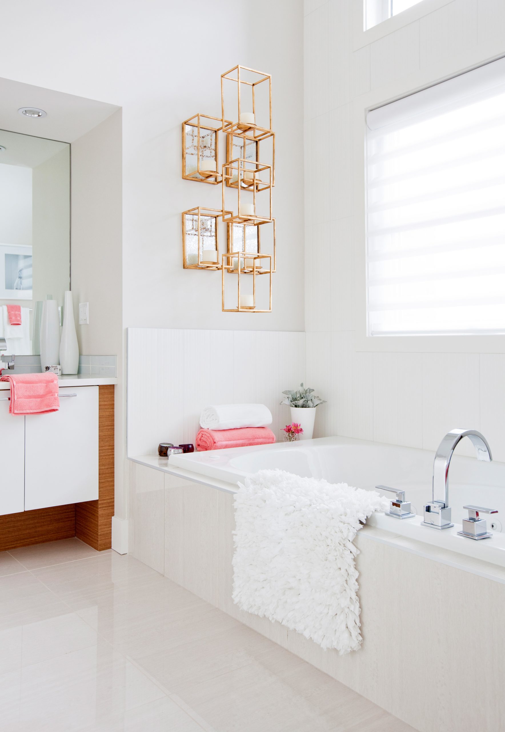
Good as Gold
The ensuite’s major design feature is hands down this statement brass candle holder above the soaker tub. The gold piece shines brilliantly in the morning thanks to the front-facing windows.
HGTV your inbox.
By clicking "SIGN UP” you agree to receive emails from HGTV and accept Corus' Terms of Use and Corus' Privacy Policy.


