All-white kitchens are ever-popular, but they can get a bit boring. But these creatively curated spaces are anything but basic. Foxy, alluring and cool are just some of the ways to describe these modern kitchens. If you have a white kitchen you’re looking to make more personal, take inspo from these expert ideas.
Published November 11, 2017, Updated March 8, 2022
Natural Touches
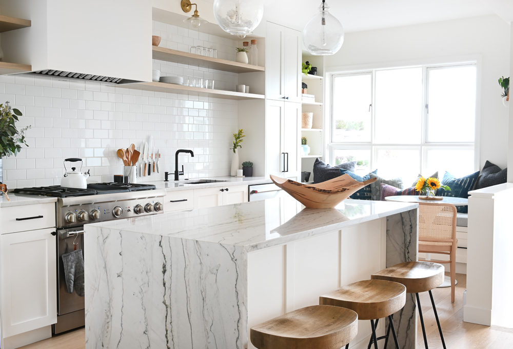
This 1,200-square-foot Kitsilano condo went from cramped to positively spacious thanks to a few epicrenovations. Our favourite part of this glorious white space? The waterfall island with heavy veining and touches of wood such as the sculptural bowl, stunning stools and cane-back chair in the dining nook. These natural elements add a bit of warmth to an otherwise very white kitchen. Note how the homeowners also infuse further elements of nature via the cheerful sprinkling of green life throughout. Peep inside this coastal-inspired Vancouver condo.
Bite-Sized Boho
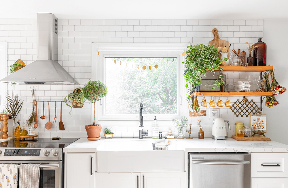
This open-concept white kitchen is bright, airy and full of plants. Though its major components, such as the cabinetry and subway backsplash subway tiles, are stark white, almost every other element is not. Warm wooden open shelves rest on rustic brackets and house tidy clusters of kitchen essentials. Earthy materials like copper, wood, brass and terracotta are scattered throughout. Old and new don’t clash but instead, they compliment each other, like the sleek Smeg kettle next to the vintage-looking cookie jar and ornate picture frame. And of course, as every bohemian space should be, this kitchen is replete with green life.
Related: This Farmhouse Facelift Design Has All the Conveniences of a Modern Home
Break Up the Monotony
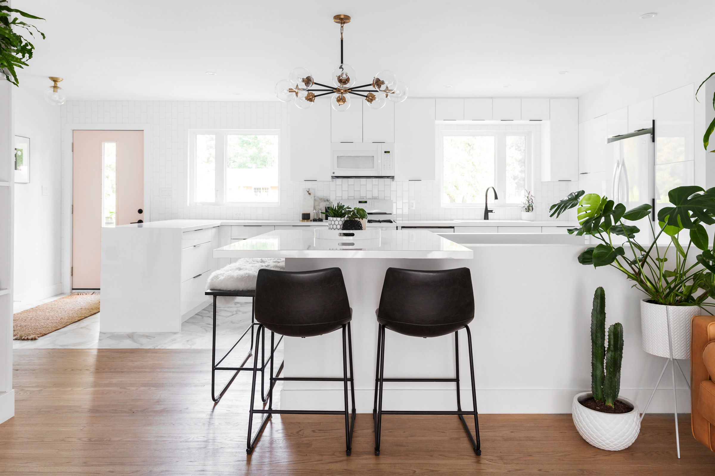
Is this kitchen intensely white? Yes. But is it boring? No! Ontario-based designer Brie Gallagher gave a major ga-ga makeover to this home, where the white kitchen is punctuated with punchy touches to break up the all-white monotony. The plant-filled bungalow features a black, white and gold palette. In the kitchen, black stools and a retro light fixture add pop, while exotic greenery adds warmth. And check out the subtle beauty of that pink door. Can you believe this airy space was once walled off?
Modern Meets Traditional
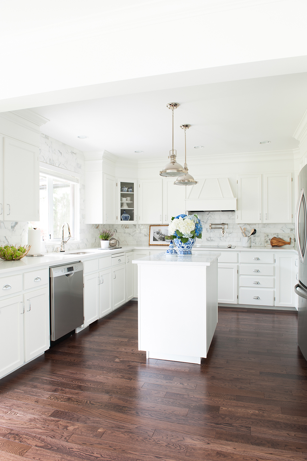
Vancouver’s Marcus Design Inc. transformed an ’80s abode, jettisoning it into the marvel it is today (tour the entire home here). At first glance, this kitchen is undeniably modern, with the all-white theme, simple countertops and gleaming silver hardware. But at closer inspection, you’ll note the old-world touches: The homeowners’ stash of ginger jars, the vintage-looking faucets and, best of all, original cabinetry from 1989! The designer sprayed the honey-hued cabinets in Benjamin Moore’s Chantilly Lace to bring them into the 21st century. It’s balanced beautifully against the luxurious Calacatta backsplash.
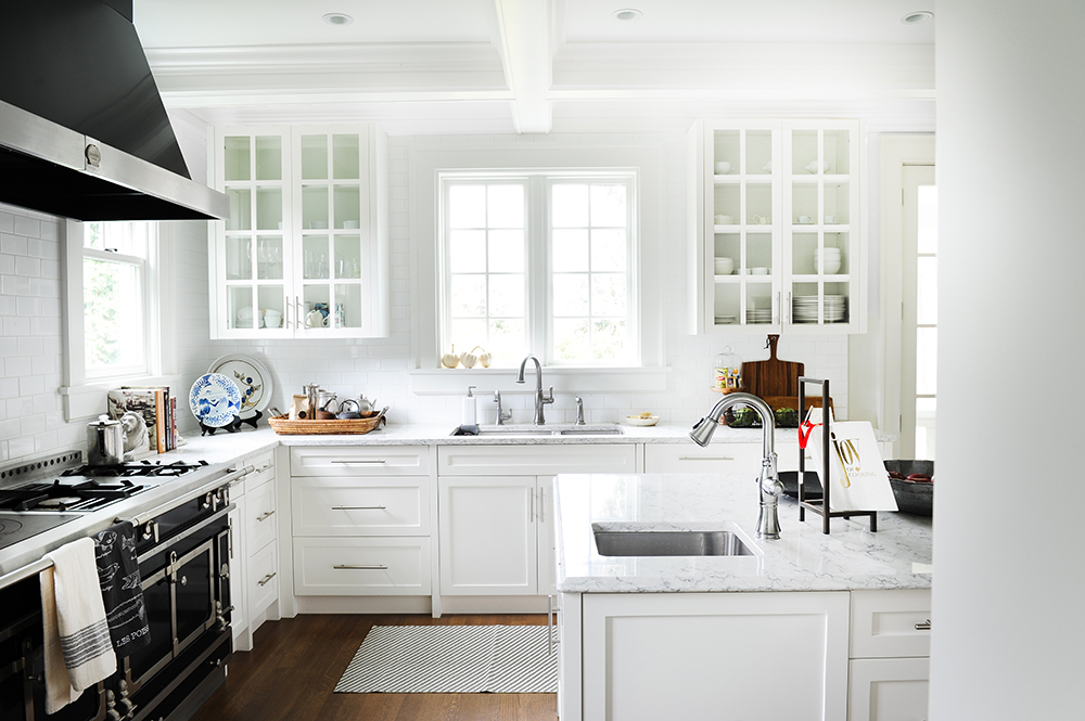
Antique Flourishes
Greer Nelson and Jamie Hamilton of Oliver Simon Design feature a touch of every era in this Vancouver heritage home. The dreamy, chef-worthy kitchen features French doors on the upper cabinets, sleek beveling on the lower cabinets, elegant trim and beams framing the whole room and of course, that hunky La Cornue range! (Psst… there’s also an old-school rotisserie built into a bank of cabinets.)
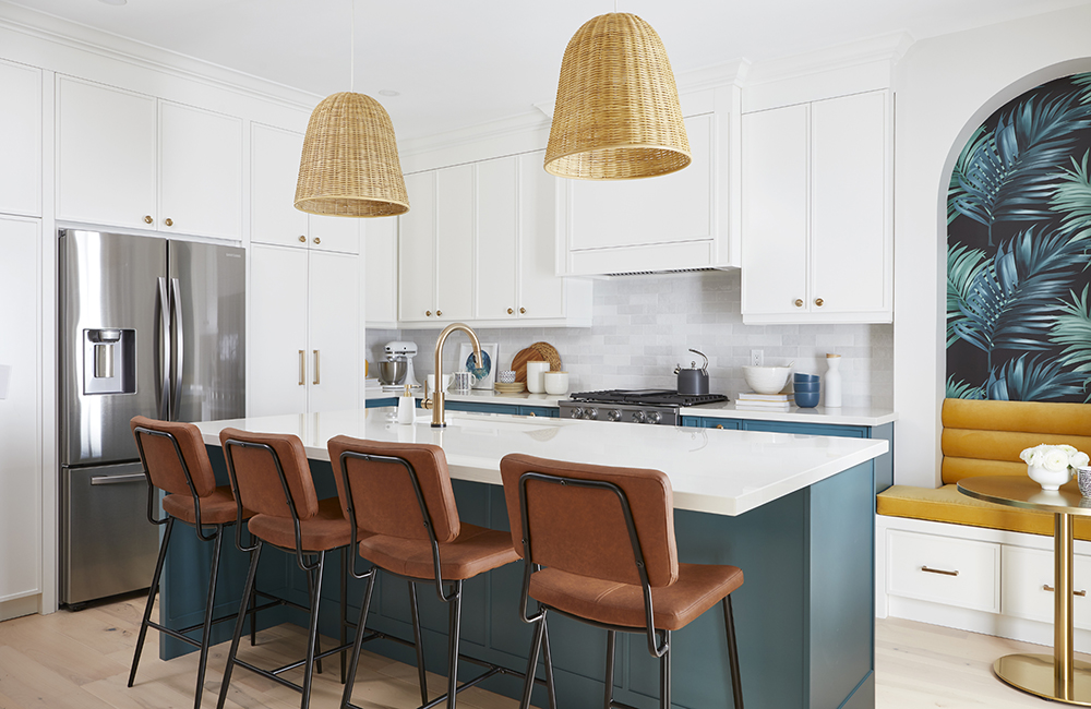
Tropical Paradise
Although the majority of this fabulous upgrade from the Save My Reno team is a fresh and clean white, we’re obsessed with the bold pops of colour and tropical-inspired wallpaper in the breakfast nook. It’s the perfect way to have a white kitchen without completely committing to an entirely white kitchen. Find more breathtaking and budget-conscious transformations.
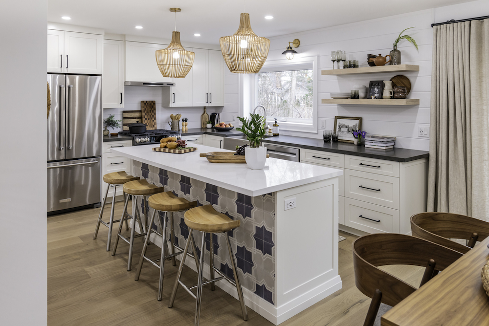
Farmhouse Chic
When it comes to selecting a colour palette, the fresh feel of a white kitchen with a splash of colour to liven things up is the perfect combo. Here, the Property Brothers added a blue patterned tile (inspired, in part, by Jonathan’s signature plaid shirts) to the island for character that’s still cohesive with the modern farmhouse aesthetic. Shaker cabinets, a shiplap-style backsplash and a new farmhouse apron sink round of the light, fresh and functional feel of the room. Find more inspiring Property Brothers kitchen transformation trends to keep an eye on.
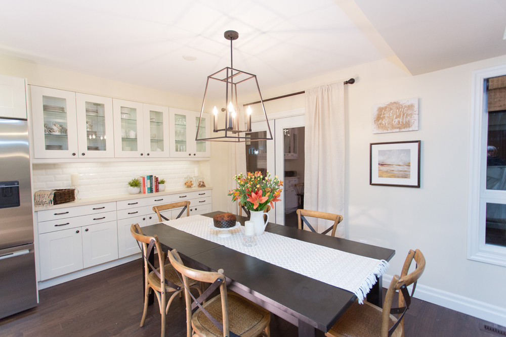
Wood Accents
If your modern white kitchen is feeling too, well, white, break up the palette with warm tones. Dark wood floors and a complementary table with farmhouse chairs does just that in this inviting space by Bryan Baeumler. A large standout light fixture completes the look. By contrast, check out the worst kitchen trends by decade.
Steel Accents
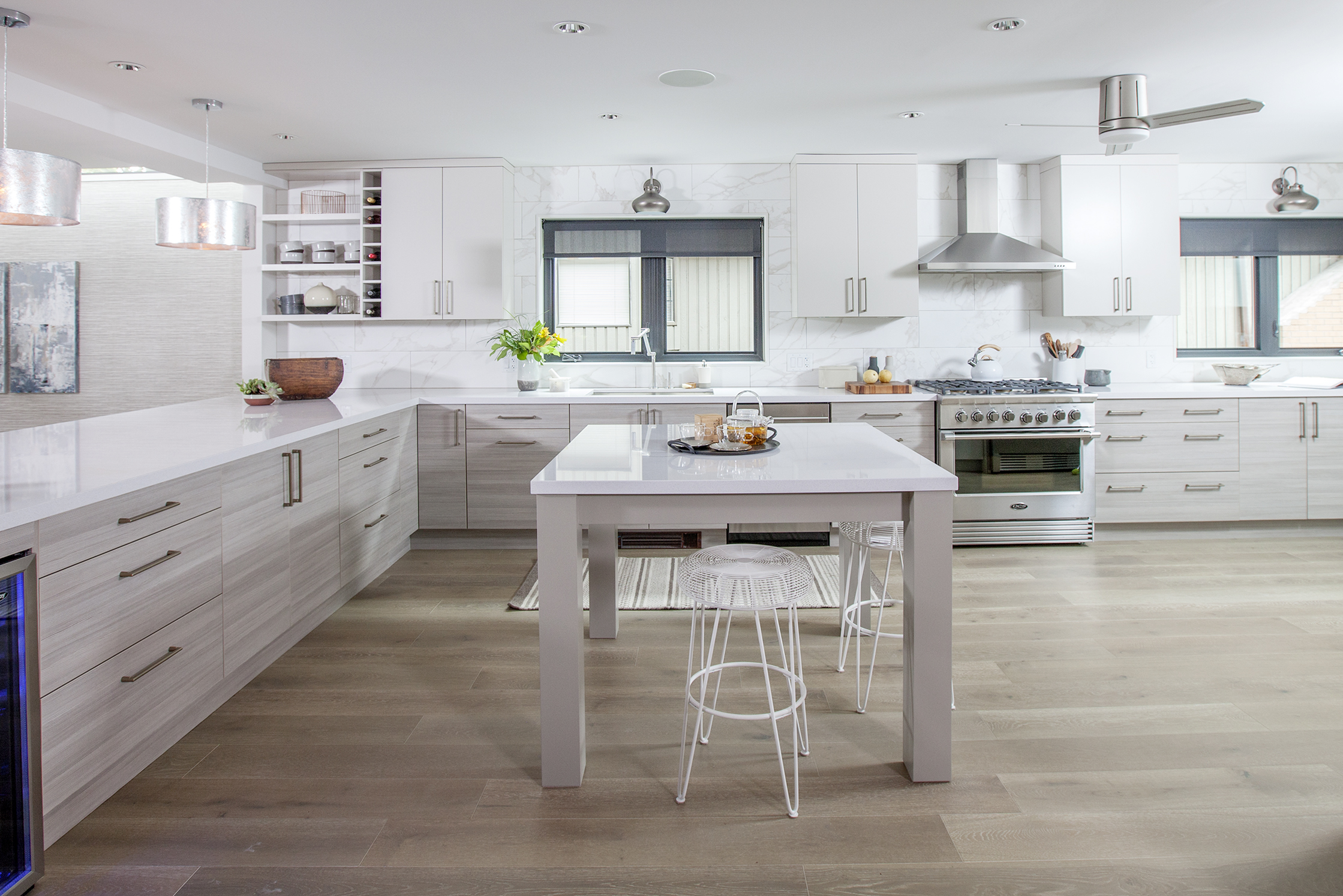
Sure, not all of us own a grand space like this modern white kitchen designed by Love it or List it Vancouver‘s Jillian Harris. But fear not. Steal the look by opting for striking grainy cabinet fronts, a slick island that doubles as a table and stainless-steel accessories including pendants and a ceiling fan that bring on the bling. (Extra points for the grey windows that provide killer contrast against the white.)
Fresh Feel
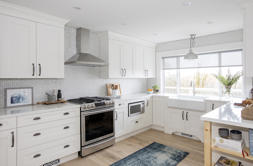
A penny-tile backsplash, matte-black hardware, a cozy runner and an apron sink are stylish talking points in this kitchen designed by Jillian Harris.
Art Attack
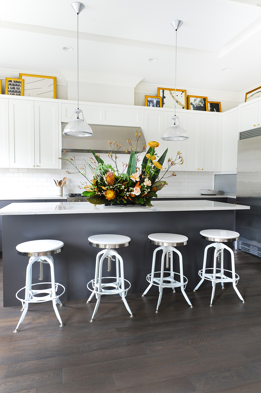
A smart way to add pizzazz to a predominately white kitchen is with art. These cohesive pieces are casually perched above the cabinets, giving emphasis to a usually boring space. Glammed by Gillian Segal Design, this stylish Vancouver home knows how to make a statement. Going two-toned with grey on the bottom cabinets also invites interest.
Warm Welcome
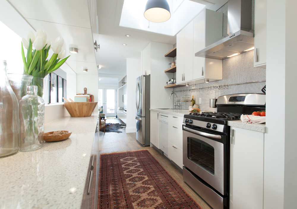
Yes, a white kitchen can be cozy: Add a warm-hued antique kilim runner, wooden accessories and a punchy backsplash like in this light-filled space designed by Scott McGillivray.
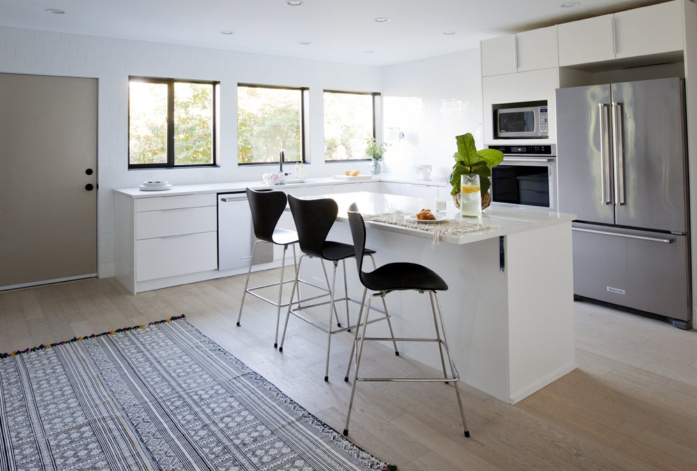
Underground Beauty
White is a great go-to colour for basement kitchens, where you want to open up the space as much as possible and invoke an airy feel to forget that you’re actually underground. This dreamy basement apartment certainly achieves all that, and more. Vancouver interior designer Angela Robinson keeps things from getting boring with warmth via pale oak floors and some visual excitement with a highly patterned rug.
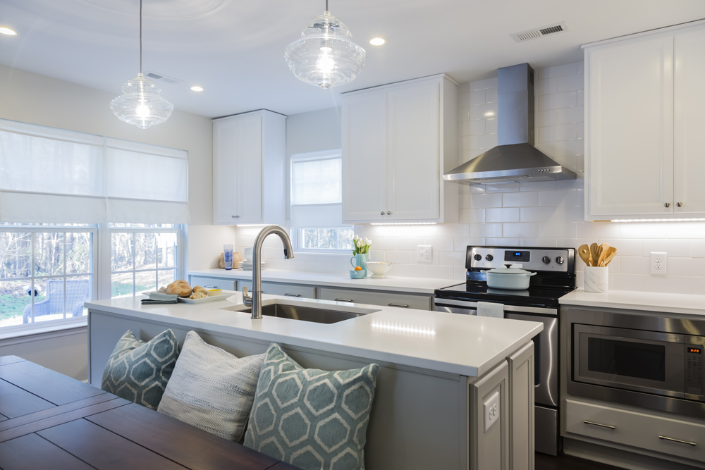
Family Kitchen
Lighting is so important in the kitchen. The Love it or List it team knows it, evidenced by the unique clear schoolhouse pendants used in this space. A few comfy cushions line the kitchenette, adding colour and comfort to the space and making it perfectly family-friendly.
Related: 9 Design Features That Will Boost Your Creativity in the Kitchen
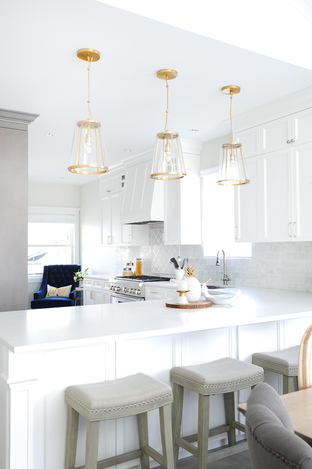
When Lighting Strikes
From the glamorous – and very unexpected – blue velvet chair to the snazzy gold pendants, there’s lots to love about this very un-boring kitchen designed by Huong Nguyen, owner of BC-based furniture boutique The Spotted Frog. Pro tip: For budget-friendly yet gorgeous results, use porcelain tile on the kitchen floor to mimic costly marble.
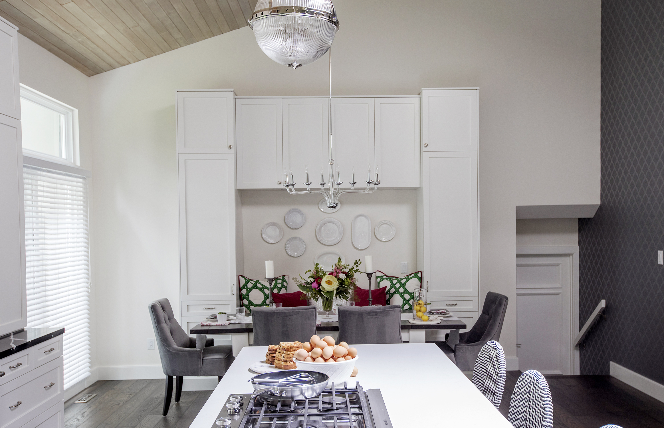
Mixed Materials
White spaces are instantly airy – of course, it helps if the ceilings are vaulted and soar dramatically to 18 feet, like in the case of this home from HGTV Canada’s Worst to First. A tongue-and-groove ceiling and geometric fish-scale wallpaper invite interest and definition to the space. Lesson here: If you’re going all white, mix up the materials.
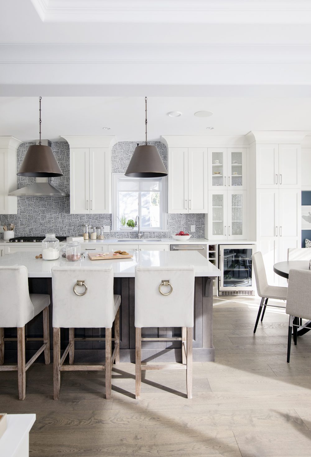
All in the Details
The problem with white kitchens is that your eyes sometimes glaze over from the uniform hue. Here’s how to stop that from happening: Add amazing exotic tiles for mega-contrast, dishy metal pendant lights and one-of-a-kind touches like the steel rings on the backs of the stools. Good job, Jillian Harris!
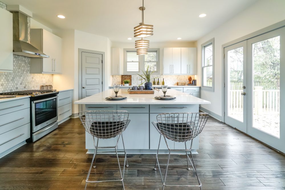
Eclectic Aesthetic
Hexagon tiles on the backsplash, interesting lighting and Bertoia stools put this modern white kitchen, designed by Courtney Wilson of Masters of Flip, firmly in the dream category. The warm-wood floors are a great way to offset all those light tones. This space proves that you shouldn’t be afraid to venture away from white.
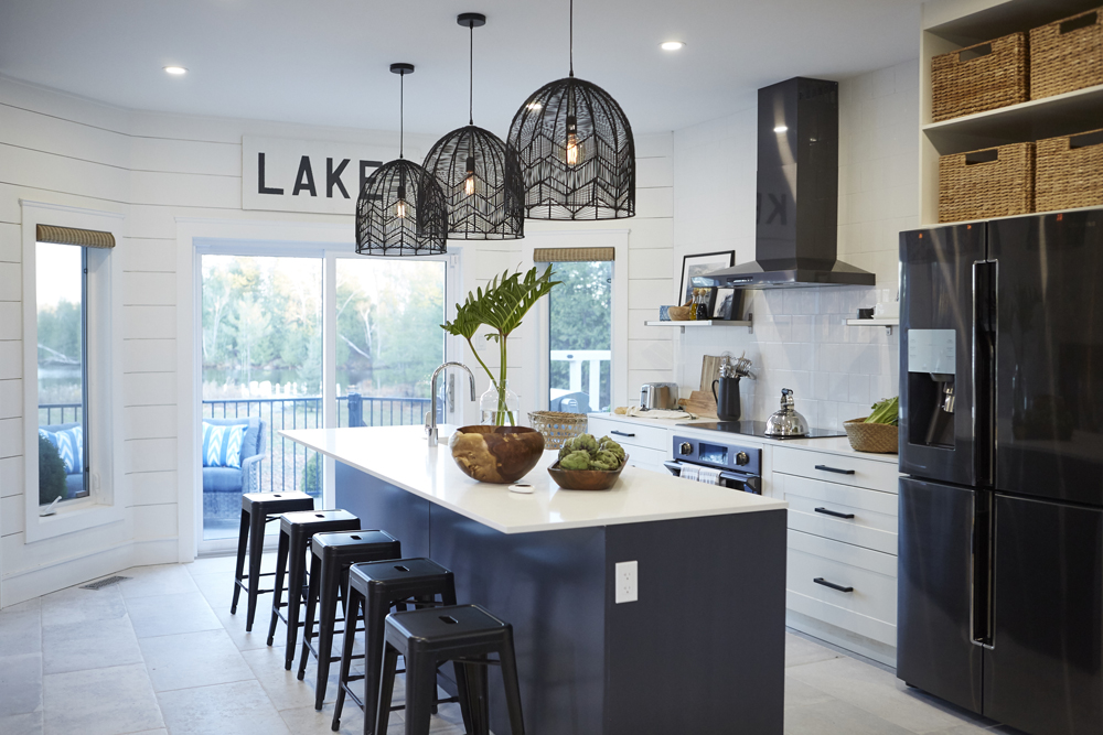
Coastal Vibes
Do you recognize this dreamy cooking space? Chances are you fell for it on season two of Home to Win. This kitchen is the definition of coastal style: Black appliances and details create crisp contrast against the clean white backdrop, while natural materials like wood and wicker bring the outdoors in.
Related: Kitchen Appliances 101: Where to Splurge and Where to Save
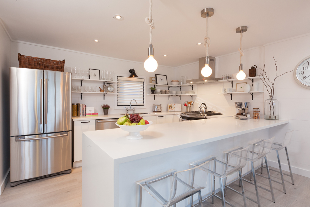
Casually Cool
Open shelving and unique rope pendant lights make for an ultra-cool kitchen designed by Scott McGillivray. (Of course, eschewing upper cabinets means being vigilant when it comes to dusting.)
HGTV your inbox.
By clicking "SIGN UP” you agree to receive emails from HGTV and accept Corus' Terms of Use and Corus' Privacy Policy.


