With this cozy cottage, designer Natalie Chong, of Toronto’s Nest Design Studio, proves that Muskoka can still invite a little luxury long after Labour Day. So, how did she balance all that seadooing with cocooning for a growing family of five? Check out the gallery for pics jam-packed with stylish ideas to steal, including tone-on-tone furniture, oodles of soft textures, just the right splash of nautical nattiness and more …
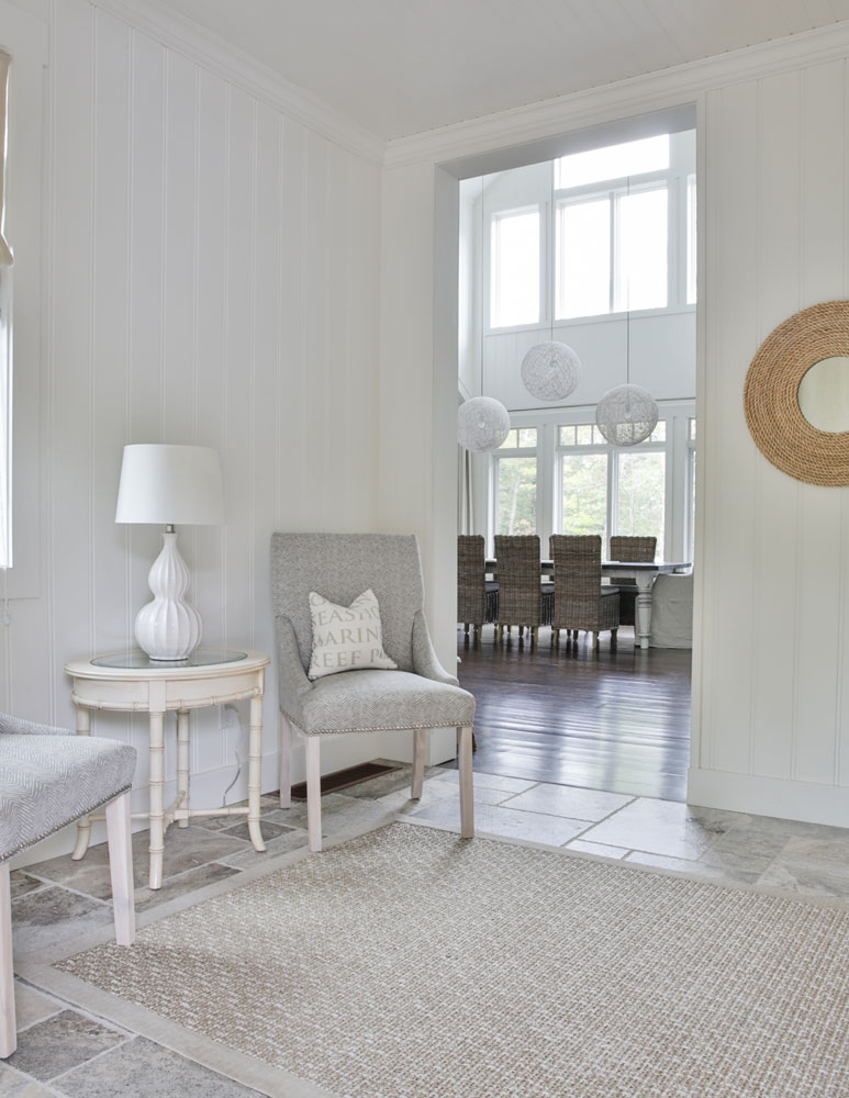
Come In, Sit Down
The cottage entryway has traditional, yet uncluttered, elements that amp up the airy, welcoming effect. Its generous size allowed Natalie to appoint it with furnishings usually reserved for principal rooms. The takeaway? Entryways are intimations of what’s to come and deserve to be decorated.
Related: 25 Eye-Catching Entryways That Make the Ultimate First Impression
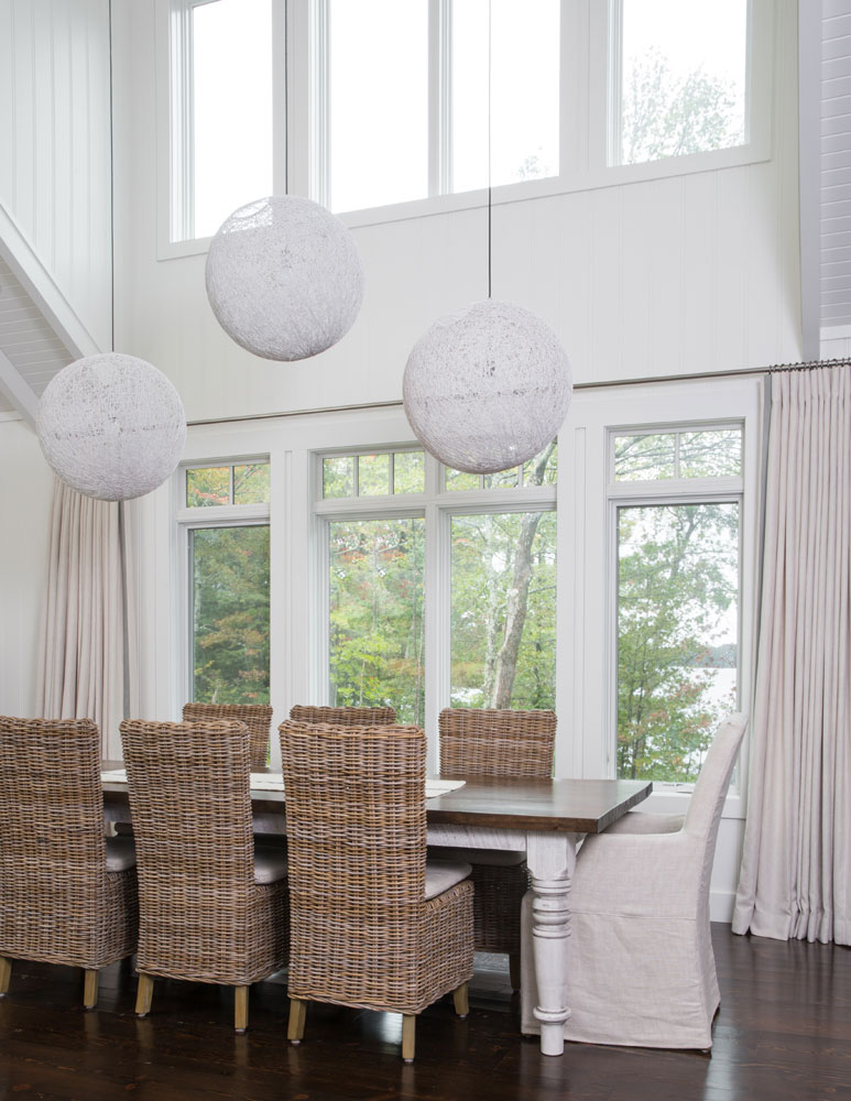
Well Rounded
Double-height rooms can be challenging when it comes to decor. Natalie mastered it by using soft drapes for the lower windows and left the uppers unadorned as privacy at this height isn’t an issue. What’s really genius is her choice of lighting. Three pendant lights, versus one, take command of the space without overpowering it and their staggered height helps blur the line between the lower and upper windows so the soaring space feels cohesive.
Related: The 8 Coolest Lighting Trends That Will Transform Any Room
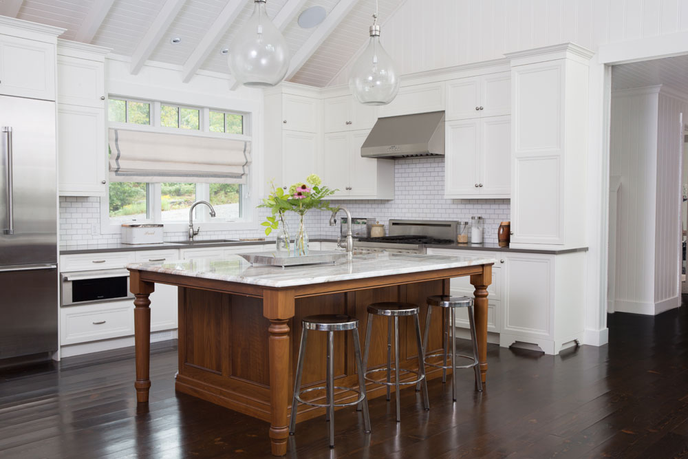
Island Life
Natalie’s design mandate for the cottage veered away from strictly woodsy in favour of a more beachy vibe. The white walls and cabinetry act as a fresh, seaside backdrop to the island which has earthy weight thanks to its natural wooden base. It adds warmth to the space and feels relaxed against the state-of-the-art stainless-steel appliances.
Related: 10 Clever Ways to Make Your Old Kitchen Feel New Again
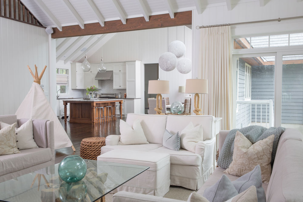
Coastal Code
“I wanted to add furniture and details that felt like they were layered over time,” says Natalie. “In the living room, I balanced the white walls by incorporating warm shades and soft textures and accents. I focused on tone-on-tone furniture and rounder shapes as they reminded me, and the owner, of a coastal getaway.”
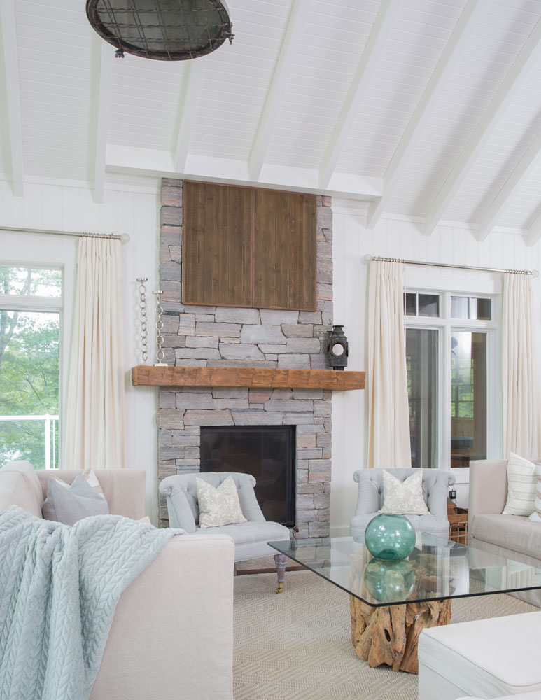
“Ship” Shape
The cottage living room is both organic and elegant thanks a smart mix of soft colours, fabrics and deft punches of natural wood. Natalie enclosed the TV above the fireplace with wooden panels so it wouldn’t become a focal point in this serene setting. The single vase pops in some colour and is reminiscent of sea glass to contribute to the subtle nautical tone. Look up – that light was salvaged from an actual ship. It’s an unexpected feature that reflects Natalie’s decor prowess.
Related: The Property Brothers Share 20 Nautical Decor Inspirations
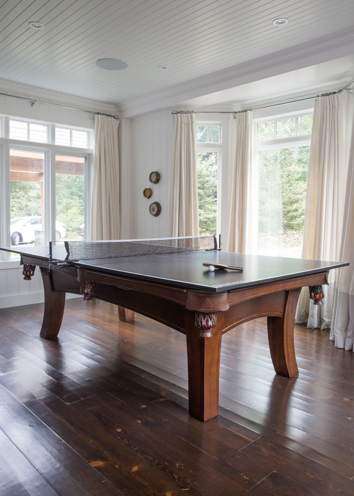
Fun and Games
Downtime at this cottage isn’t just about reading and watching movies. And if you think this is a ping pong table look again! The owners wanted a pool table and the option for ping pong so Natalie came up with this ingenious solution. Remove the top and the net and the pool table is revealed – a smart idea for any games room. The drapery keeps the space feeling decorated, not just sporty.
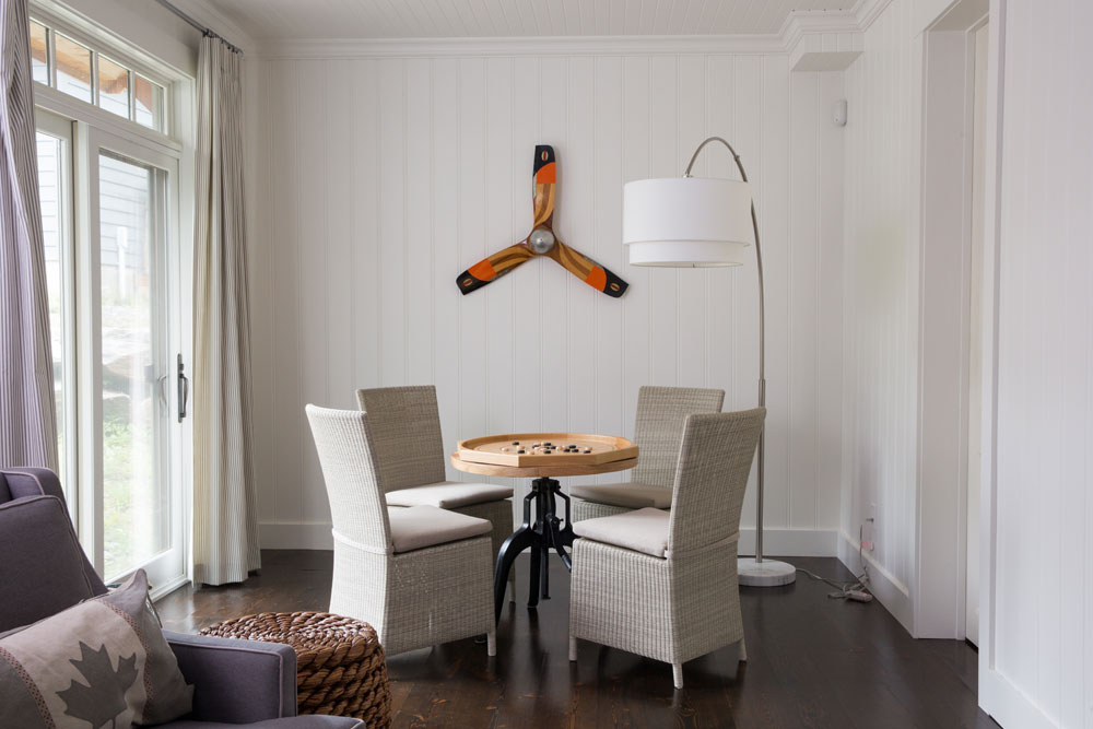
Game On
The playful mood continues with this games table. Its feels almost elegant thanks to smart woven chairs and a contemporary, marble-based floor-lamp. These upscale touches are balanced by cottage-centric accessories, such as a propeller used as a wall-hanging and a sweet Canada flag cushion.
Related: 10 Things You Should Know Before Buying Your First Cottage, According to Scott McGillivray
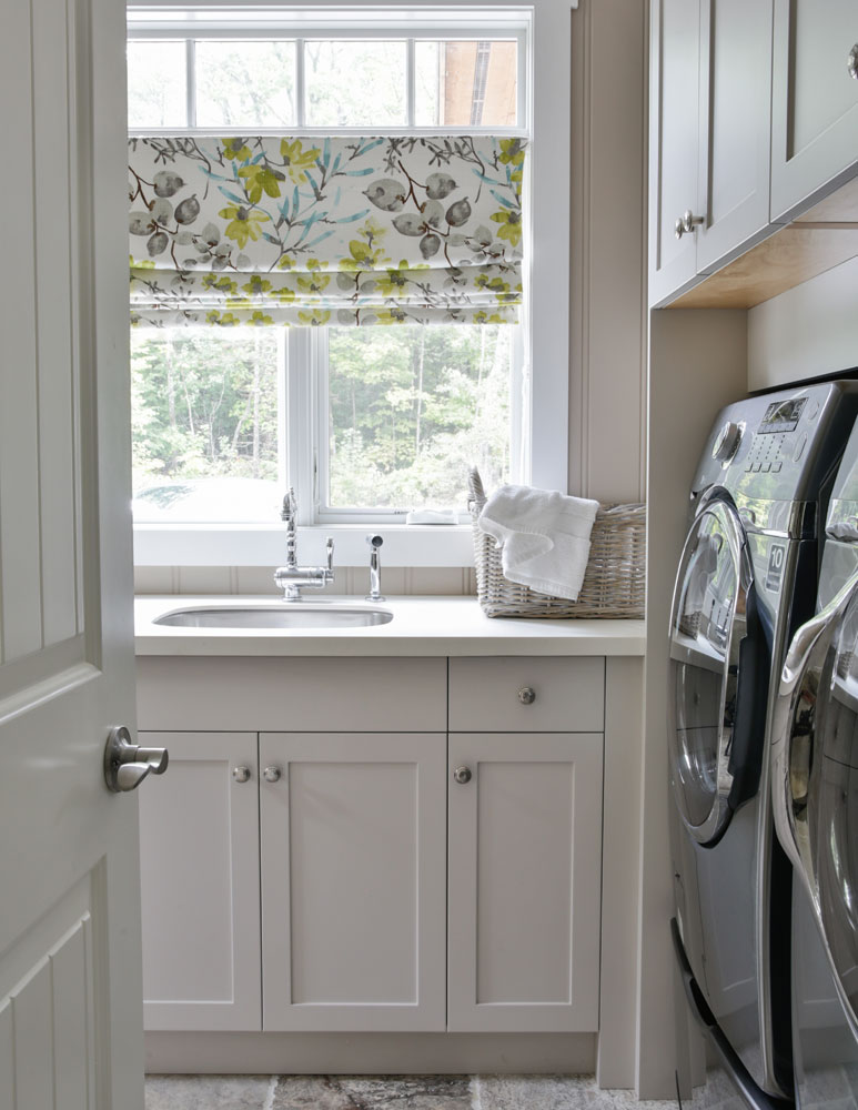
A Clean Finish
The hardworking laundry room boasts custom-made storage that keeps the space organized and clutter-free. Natalie finished this practical space with a floral-print Roman blind for a bit a whimsy.
Related: 18 Laundry Room Ideas That Are Beyond Stylish (and Super Functional)
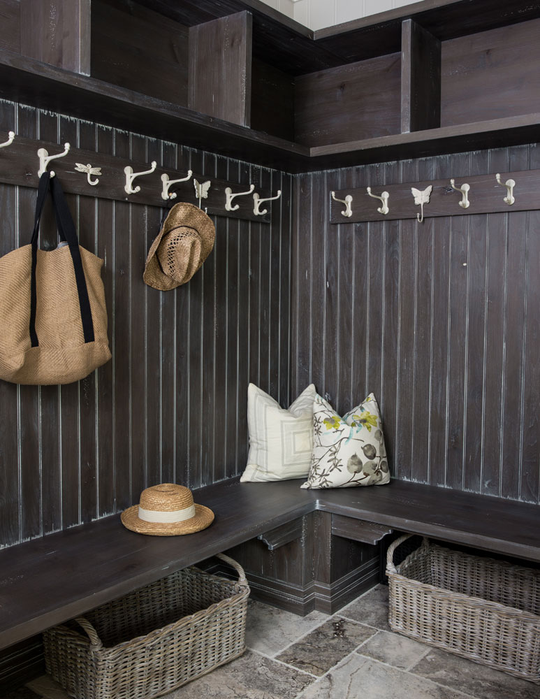
In the Dark
The dark walls and benches of the mudroom are resolutely practical, yet have graphic appeal. It’s a smart design decision that veers away from the cottage’s white walls and handsomely demarcates this area. White hooks break up the dark tones and clever touches, like the addition of cushions, elevate the space and make it feel decorated. Storage baskets that can be tucked beneath the benches are a smart use of space.
Related: Sarah Baeumler’s Five Minutes to Clean: Mastering the Mudroom
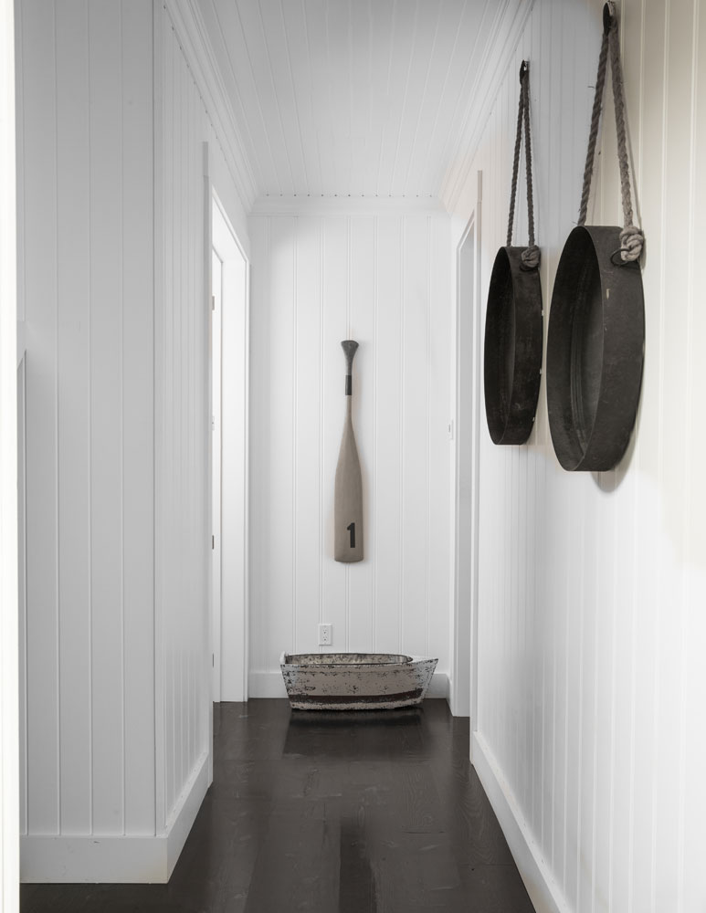
Nice and Simple
Natalie decorated this hallway simply and effectively by using nautical-inspired elements, like an oar and ropes, that channel the beachy feel the owners desired. Keeping everything tonal creates a cohesive effect and the rounded shapes have nice tension against the panelling’s straight lines.
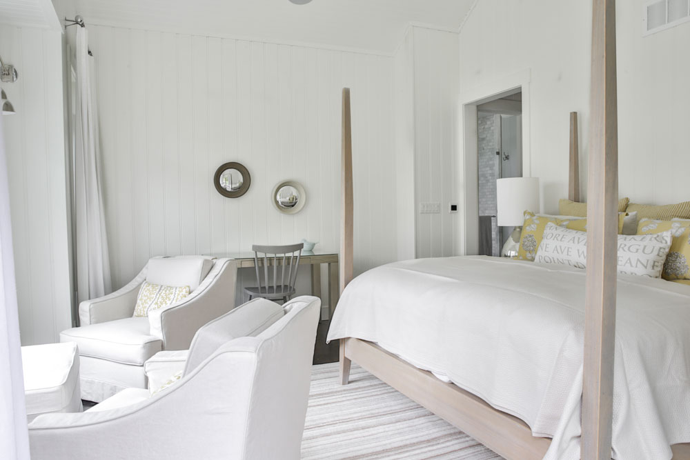
Sweet Dreams
How dreamy is the master suite? “It’s my favourite bedroom in the cottage,” says Natalie. “I wanted something grand here and something that resembled driftwood in colour.” This handsome four-poster bed fits the bill (it was purchased years ago from Crate and Barrel). The furniture placement, which goes beyond just a bed and bedside tables, begs to be copied in any bedroom.
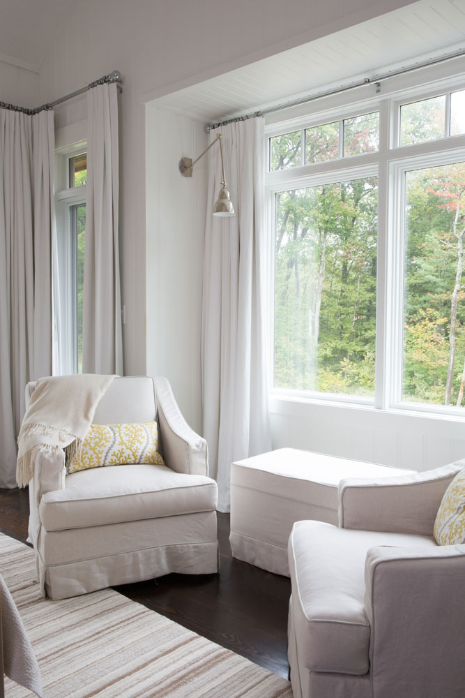
Cozy Corner
This corner of the master bedroom uses colour and fabric to great effect. “Slipcovers make everything super cozy!” says Natalie. “As in the rest of the cottage, I kept the focus on the view and outdoors by using a neutral palette.” A sconce frees up floor space and cushions enliven those neutral tones with just the right amount of colour and pattern.
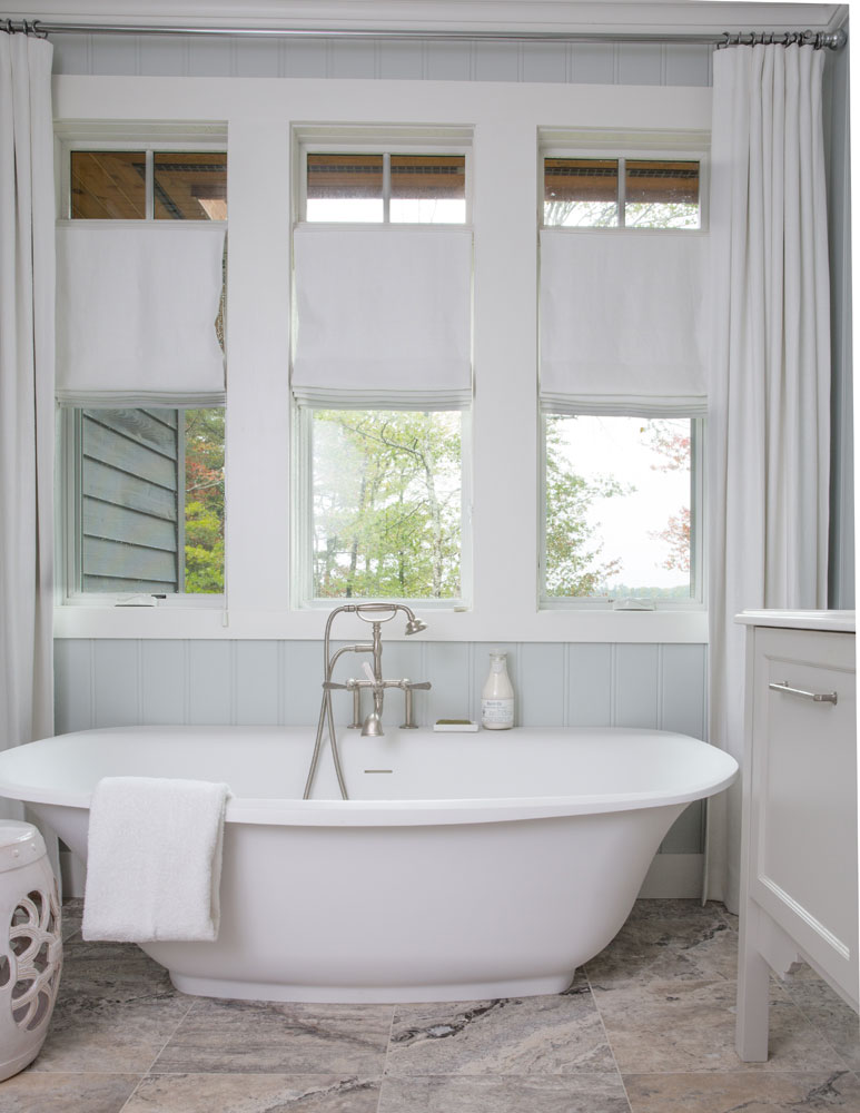
Spa-Like Escape
The master bath is the one space where Natalie strayed from cottage-centric decor. “We wanted this room to feel sophisticated and not look like a cottage bathroom at all! I wanted to create a sense of elegance.” Tailored drapery and blinds and travertine floor tiles do just that while being entirely practical.
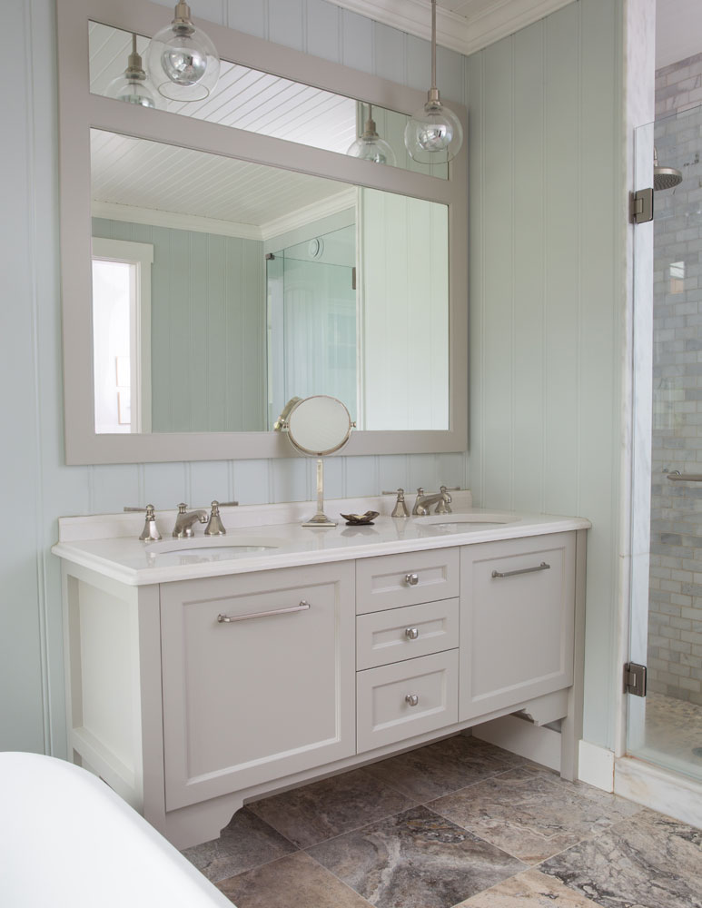
Double Up
The vanity features double sinks illuminated by sleek pendant lights (from Schoolhouse Electric) that speak to the sophisticated spa brief. The walls are painted Benjamin Moore Wickham Gray for a tranquil watery effect.
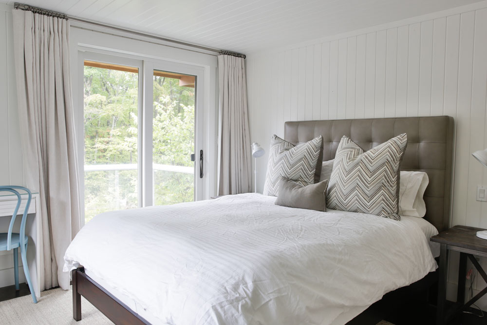
Boy’s Room
The son’s bedroom is simple, contemporary and slightly masculine thanks to its clean lines and colour scheme – with a playful nod to traditional boy’s blue in the desk chair. We like how Natalie used drapes here, as opposed to blinds, for continuity with the rest of the space.
Related: 10 Dreamy Ways to Update Your Kids’ Bedroom on a Budget
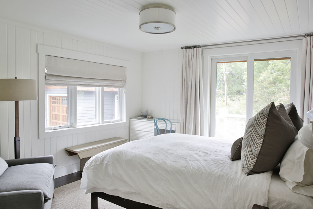
Softly, Softly
Natalie covered the windows in this bedroom with a soft Roman blind that echoes the elegant tailoring of the drapery. As in the master suite, she decorated the space to include a comfy armchair and practical desk. The brown and grey tones are neutral enough to serve as a stylish guest room as well.
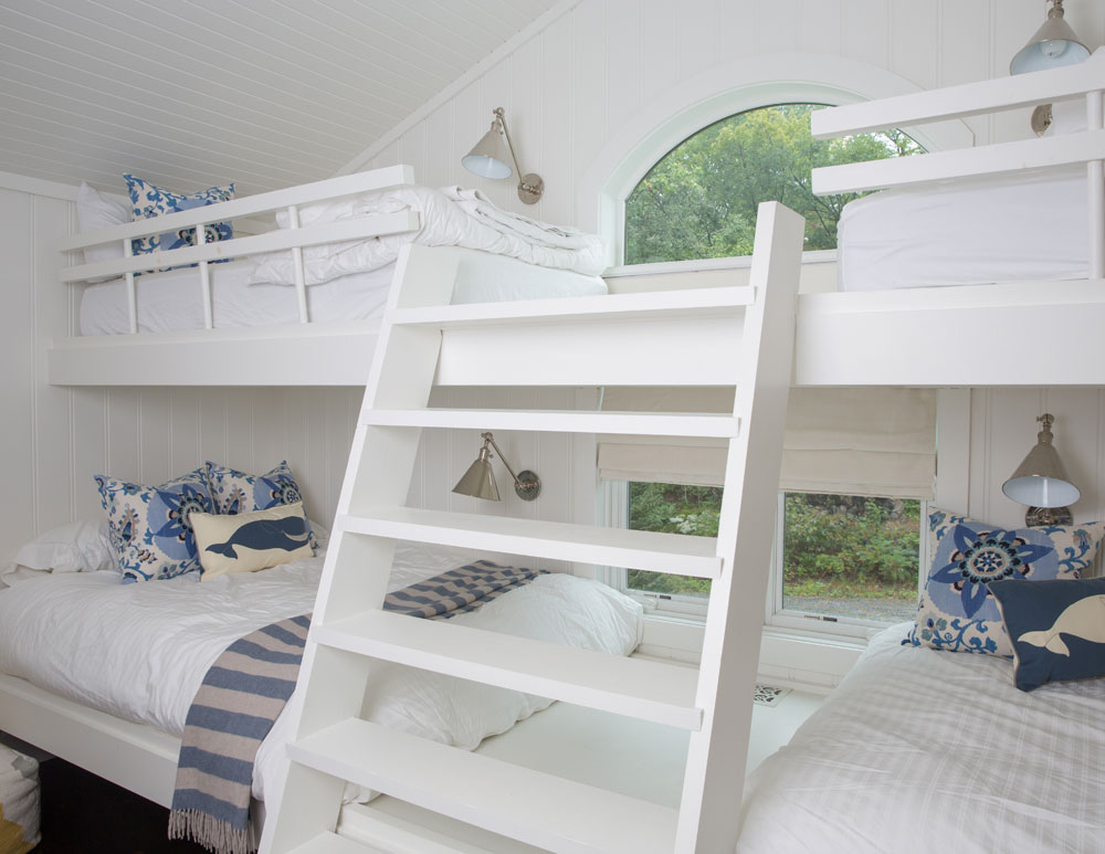
Slam Bunk!
The grandchildren’s bedroom screams fun, from bunk beds that beg to be scrambled over, a ladder that wants climbing and the sweetest placement of reading sconces that create that fort-like effect kids love. Natalie chose whale cushions from Thomas Paul and selected playful fabric for the cushions she had made by Tonic Living. The sconces are from Visual Comfort. While super kid-friendly, this space could also serve as a guest bedroom as Natalie attests she has slept here herself.
Related: 20 Ultra-Stylish Kids’ Rooms Designed by HGTV Canada Stars
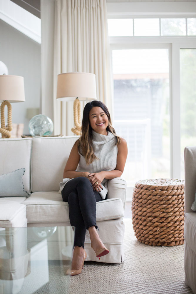
Fine Design
Designer Natalie Chong gets comfy in the living room. “I wanted a cottage that was comfortable, relaxed and stylish,” she says. “I focused on tone-on-tone furniture and rounder shapes to create this beautiful waterside escape.”
Related: 15 Grey Living Room Ideas That Are Anything But Dull
HGTV your inbox.
By clicking "SIGN UP” you agree to receive emails from HGTV and accept Corus' Terms of Use and Corus' Privacy Policy.


