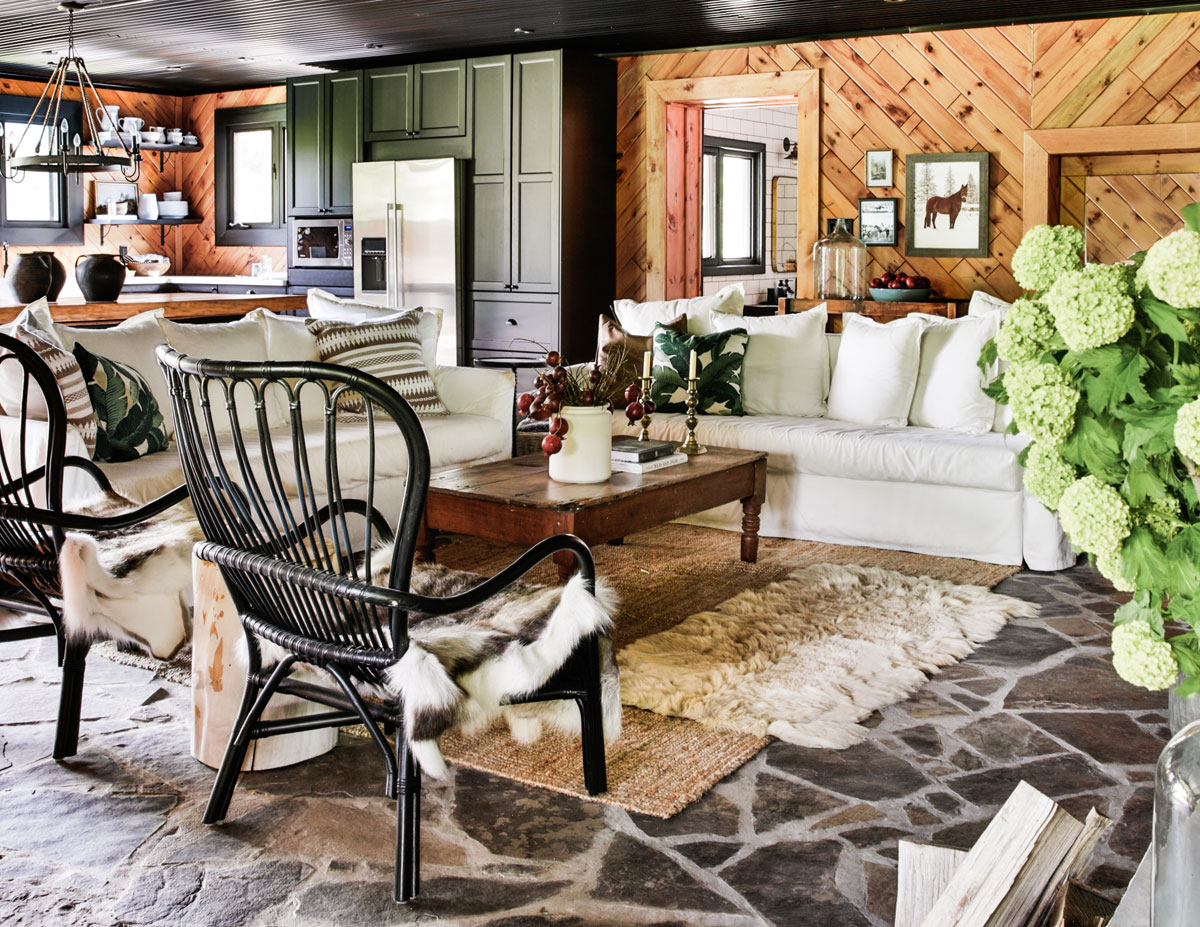
Walking into designer Ashley Davidson’s stylish family cabin, you’d never guess it was once a horse stable that had sat empty for 25 years. Her grandfather built the property, located an hour north of Toronto, in the 1960s – and it just happens to be the place her parents met and fell in love. See how Davidson transformed the unused space into a vintage farmhouse dream while keeping many of the original details intact.
Stable House
“The stables sat empty for about 25 years,” says interior designer Davidson, owner of Ashley Davidson Design. “We didn’t have any horses, so we used it mostly for storage. It wasn’t until recently that our family stated to grow and we realized we need more space to accommodate visitors. The main house on the property doesn’t have any guest rooms, so we decided rather than build something new, we should use what we already have,” she says.
Home on the Range
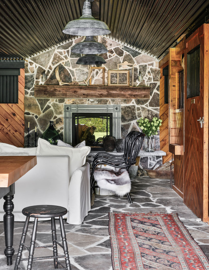
Davidson decided to renovate only half the stable – in other words, four horse stalls – and sealed off the rest of the property to use for storage. “My vision was to create a comfortable, welcoming space that you could entertain in and feel at home, with lots of texture and intriguing objects,” she says. “I love pieces that tell a story.”
Fab Fireplace
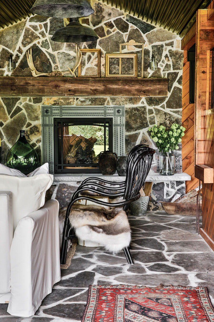
The reno took a mere two and a half months, with Davidson equally focused on practicality and style. “The Napoleon gas fireplace was built to seal off the back half of the stable,” she says. “There used to be a hallway that ran through the middle of the building.” The designer created a mantel using a salvaged beam found by her contractor on the Toronto islands. “The back side of the fireplaces faces the storage area, so for now it’s not double-sided, but maybe one day!” says Davidson.
A Real Steel
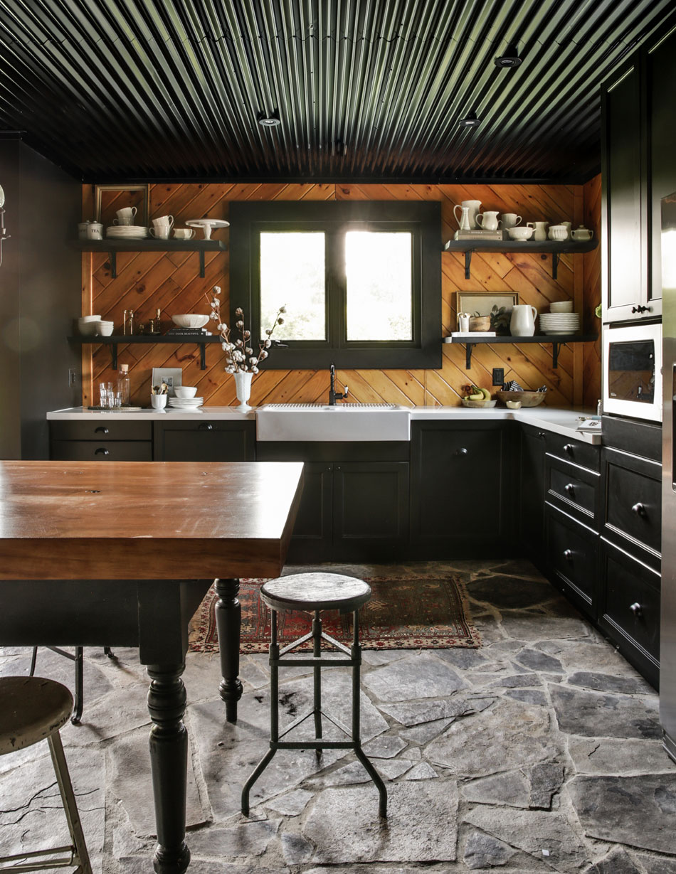
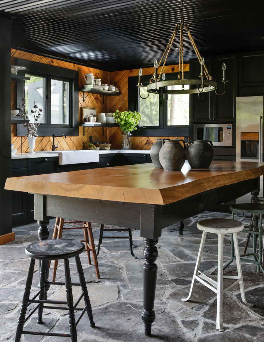
The kitchen’s original ceiling was styrofoam-panelled with fluorescent lighting. “We knew this had to change for aesthetics and safety,” says Davidson. “I came across this corrugated steel that I had seen before on building exteriors, but never on a ceiling. When I told everyone I was choosing black, they thought I was nuts, but I love how the black works with the wood walls and ties in the black iron details,” she says.
Vintage Vibe
Davidson found a vintage base for the dining table and painted it black; the stools are all vintage finds, too, while the chandelier is new from Pottery Barn. “I love the mix of the different stools and the natural materials in the chandelier,” she says. “The round stools and light soften the weight of the table. It took me a while to find all the stools, but they all magically work together.”
Cabinet Fever
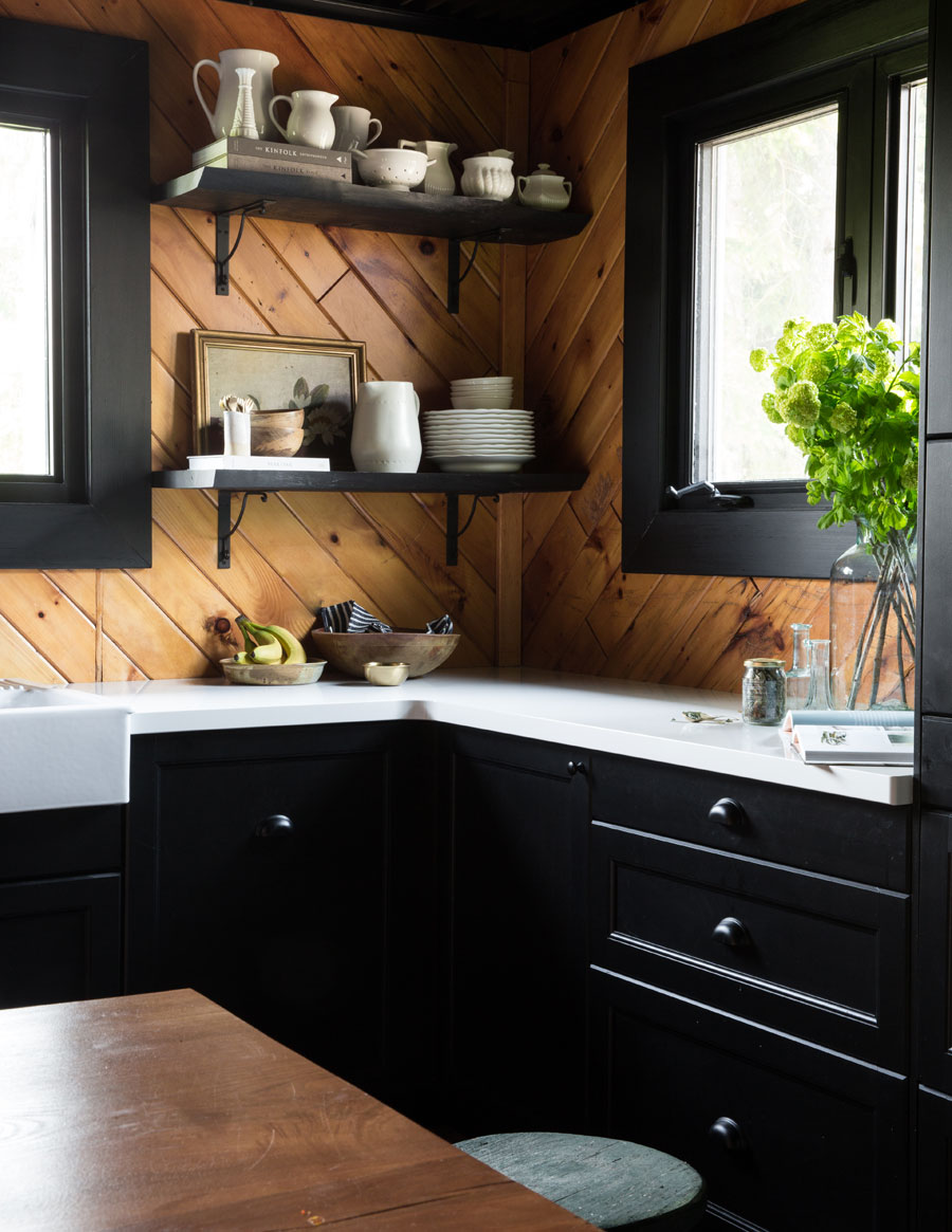
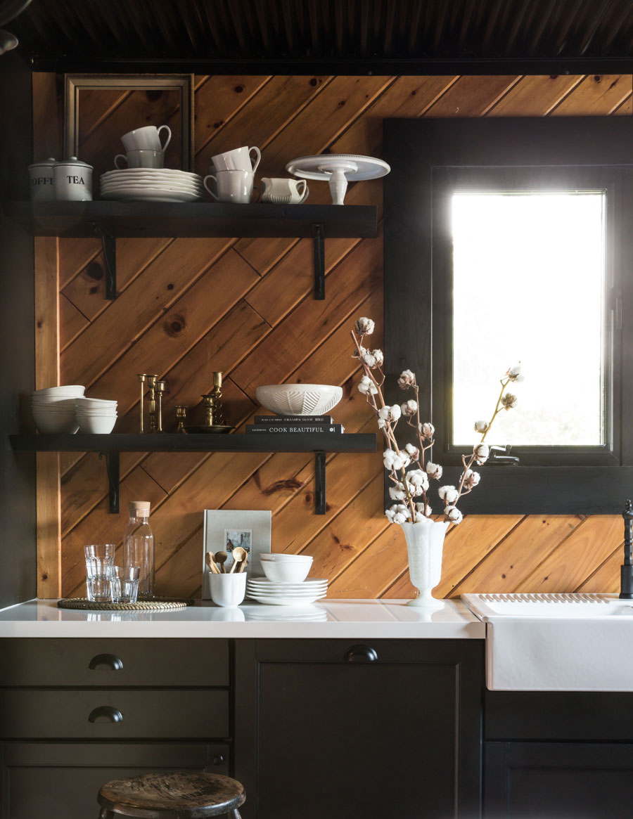
“We wanted simple storage and enough appliances to be able to make almost anything,” says Davidson, who sourced the kitchen cabinets, sink and faucet at IKEA. “The wood shelves are from a tree that we needed to cut down on the property, and we also made the dining table out of that same tree,” she says.
Black and White
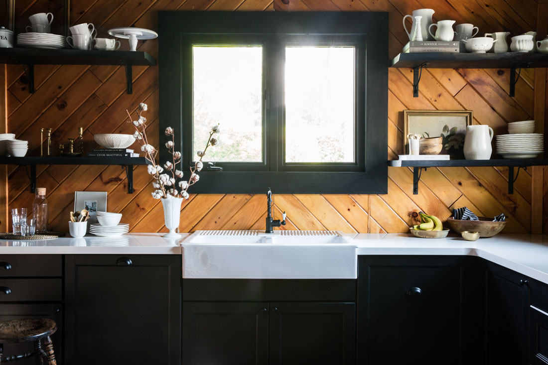
Davidson chose white quartz counters to complement the oversized farmhouse sink. “We wanted something that was going to be durable and make the black black cabinets pop,” she says.
Shelf Life
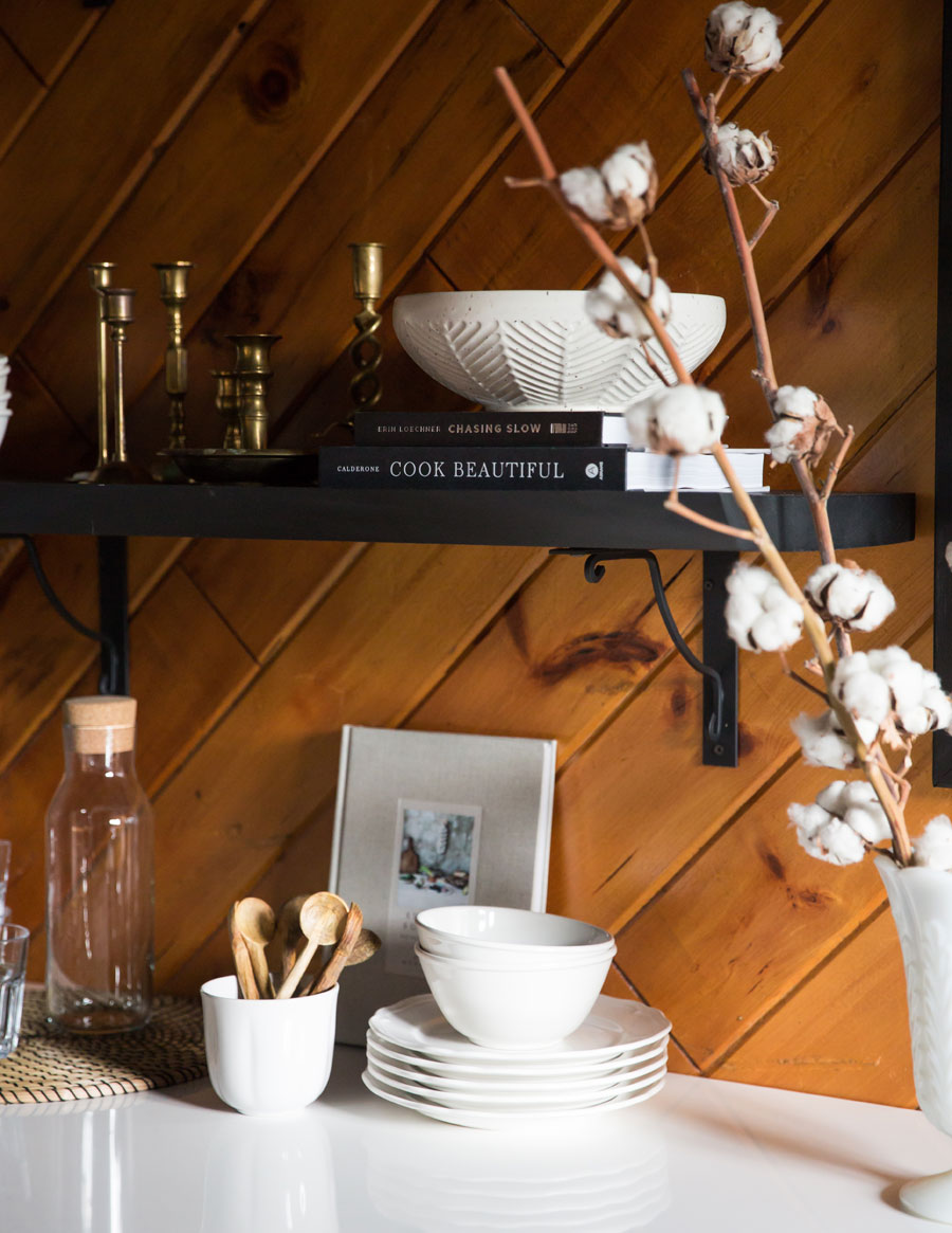
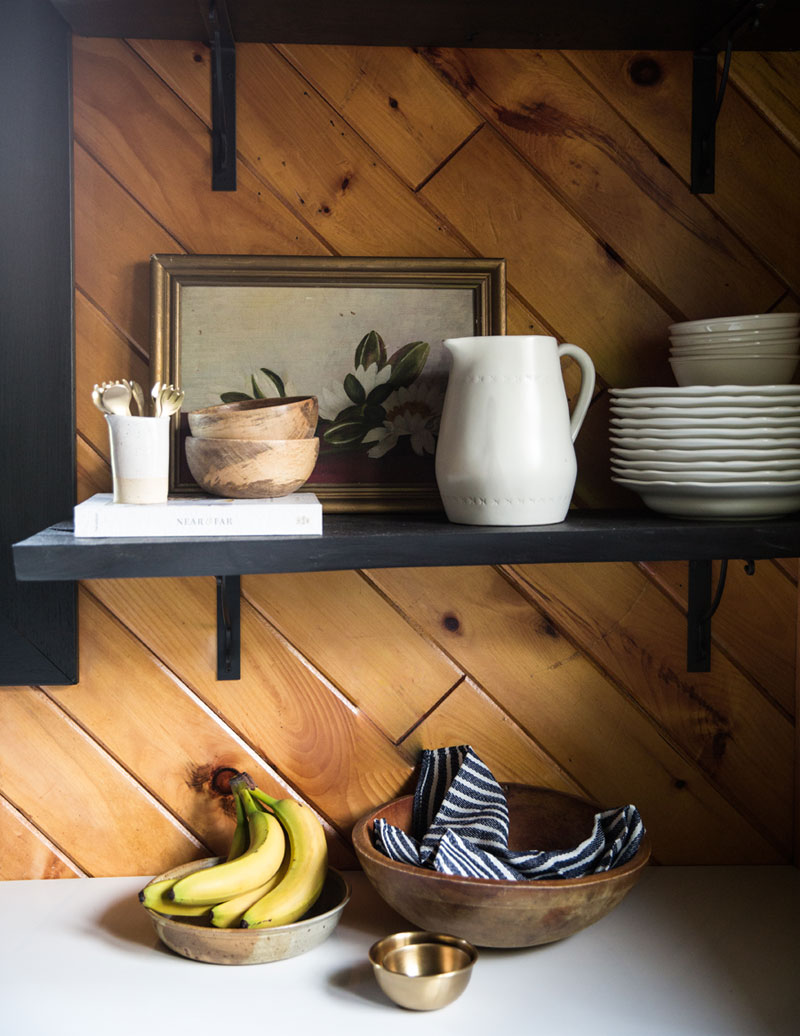
“I really wanted open shelving to display dishes, glasses and other objects to bring the kitchen to life,” says Davidson.
Panel Discussion
The wood panelling throughout the cabin is a key design detail, and it’s all original to the property. “Part of me wanted to paint it out white, but I think we made the right decision by keeping it its natural colour,” says Davidson. “It was in excellent condition and is in the entire space.”
Sweet Dreams
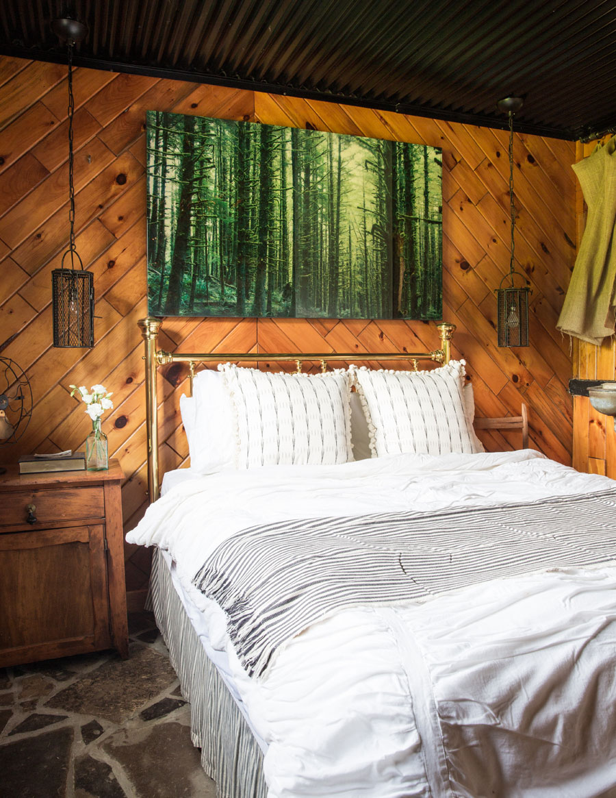
“The brass bed frame was actually the first piece of furniture that my parents purchased when they got married 37 years ago,” says Davidson, whose parents first met at her grandfather’s stables, where her mother kept a horse. “The bedding is from my first apartment when I moved out on my own; I call it vintage West Elm,” she jokes. The striped throw blanket is a chic IKEA find.
Forest From the Trees
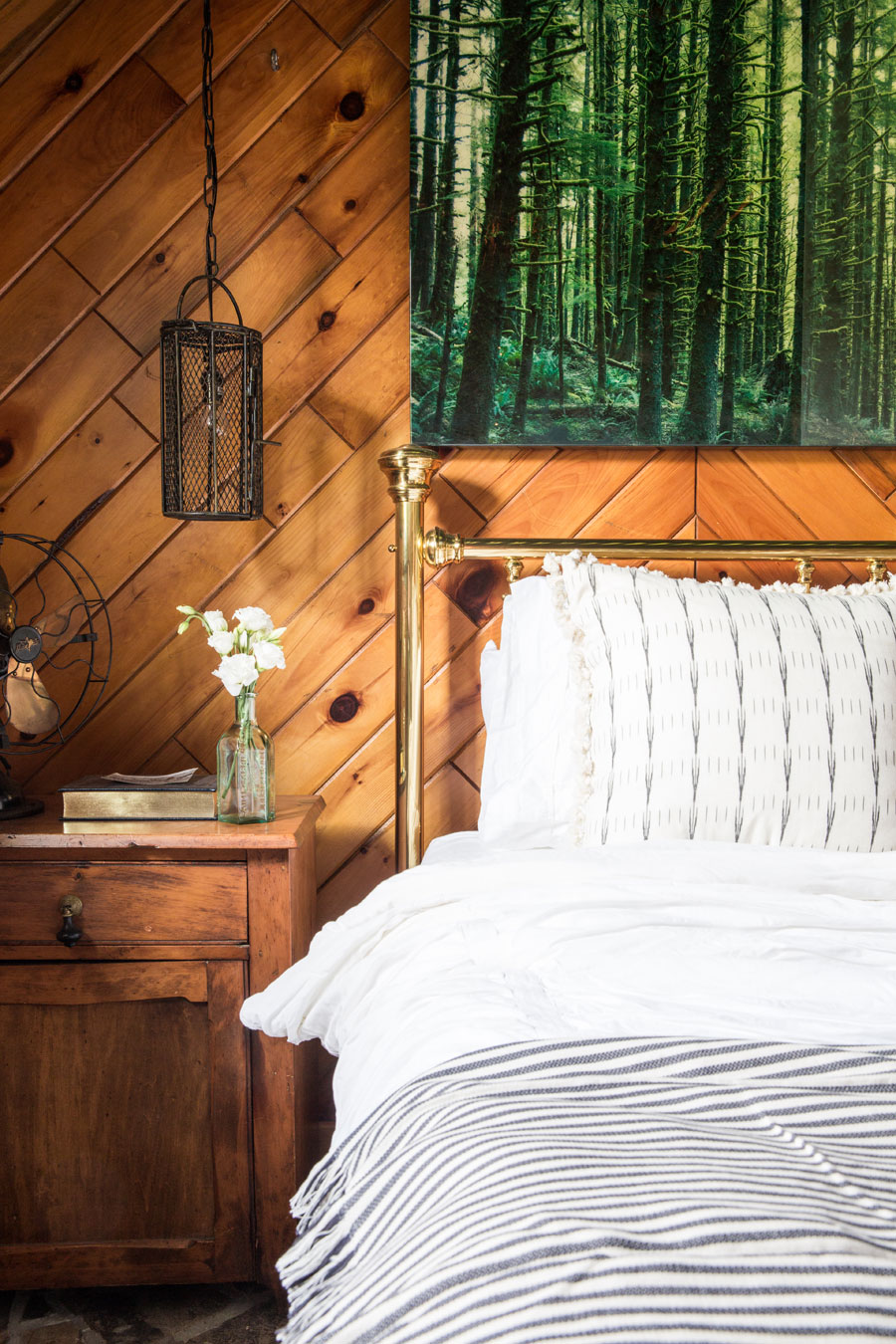
The artwork above the bed is by Toronto artist (and Davidson’s friend) Christine Flynn. The lighting is from L’Atelier in Toronto.
Shower Power
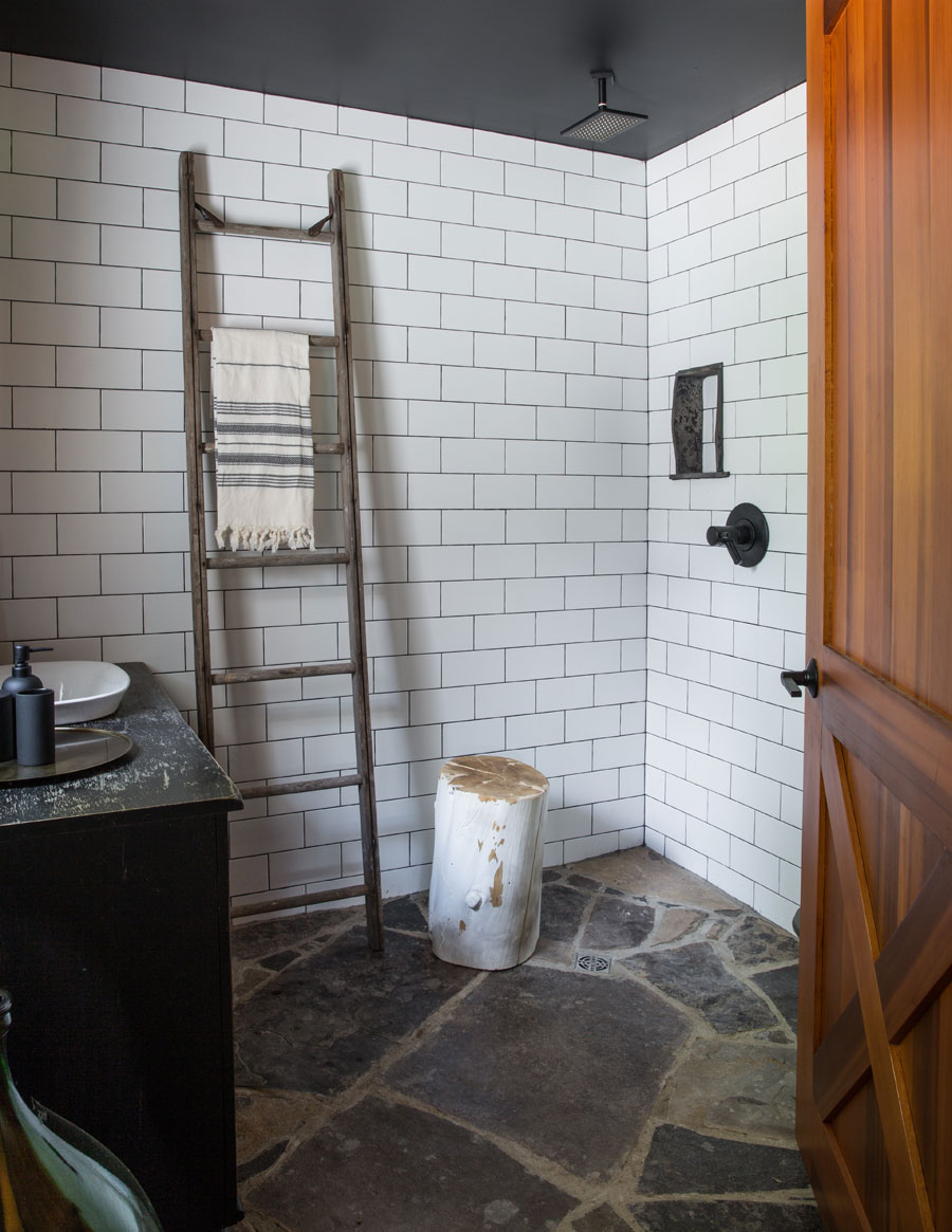
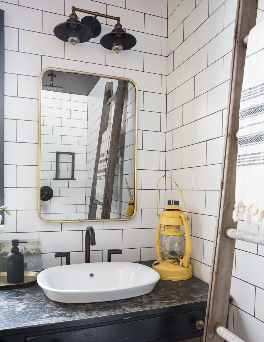
“I love this bathroom,” enthuses Davidson. “We chose to do an open layout, no separated shower area. The floor is slopped to drain the water, and we used a classic white subway tile.” Balancing out the rustic details with modern ones, Davidson picked a matte black faucet and matching shower head.
Vanity Fair
“We used brass accents on the vanity and in the mirror to tie everything together,” says Davidson, who actually upcycled her brother’s old desk from his high school days to create the vanity. “We cut a hole in it and placed the sink in, and we use the bottom opening for towel storage,” she says.
Floor Show
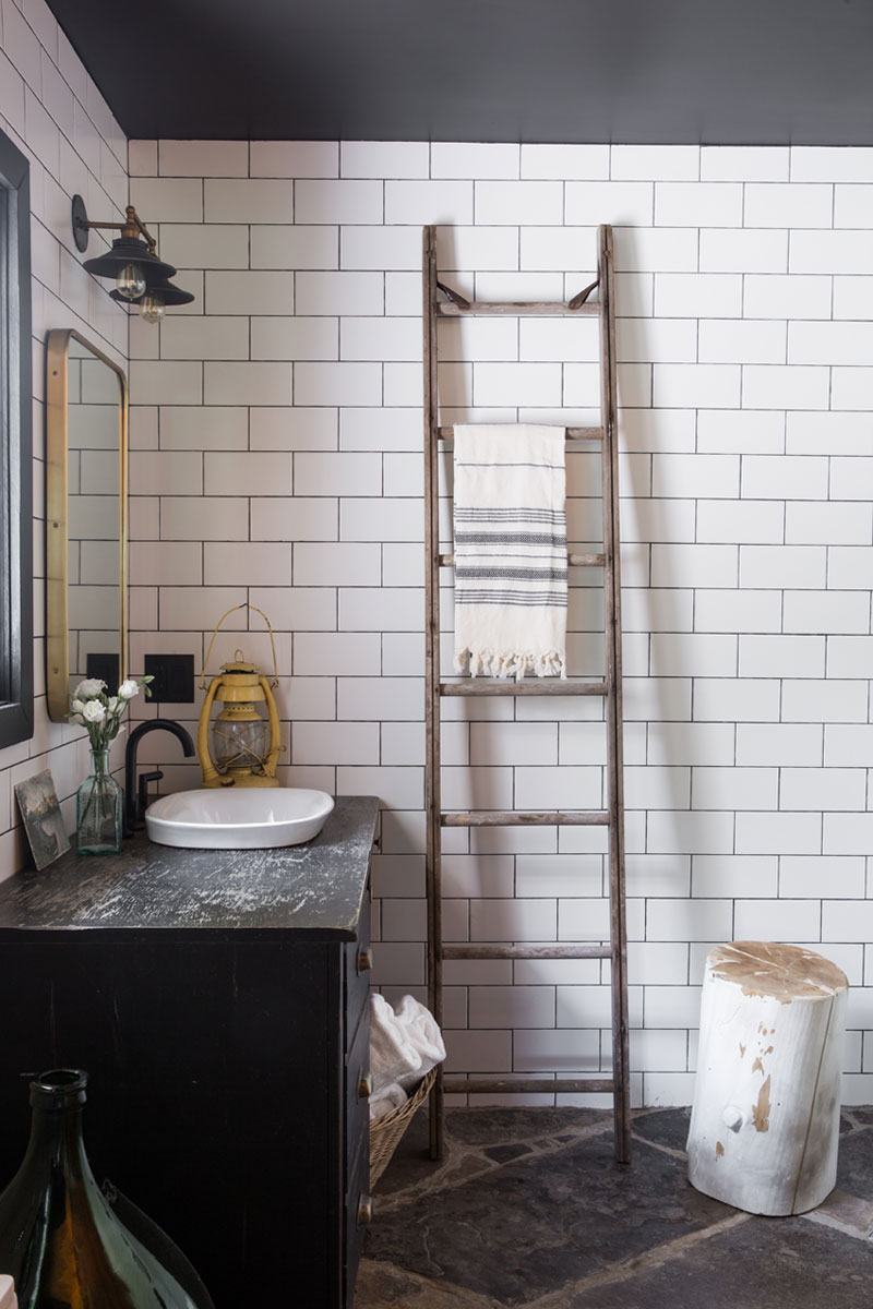
Davidson put a vintage ladder to good use in the bathroom, where it acts as a towel rail. “It’s a great alternative to hooks,” she says. The flooring is a flagstone that Davidson chose for its durability; it’s in every room of the cabin. “We decided to carry it into the bathroom as well as up onto the fireplace for consistency,” she says. “And it doesn’t matter if it gets wet.”
History Lesson
Looking back on the reno, Davidson says the only obstacle she faced was knowing when to stop.”It’s so easy to keep adding things on and coming up with new ideas, but sometimes you have to stand back and remember the original purpose of the project,” she says. “I love that there is so much history to this place. It’s a space that we can all enjoy and all had a part in creating.”
HGTV your inbox.
By clicking "SIGN UP” you agree to receive emails from HGTV and accept Corus' Terms of Use and Corus' Privacy Policy.


